Everybody in the Place
Week One: Observing/Participating
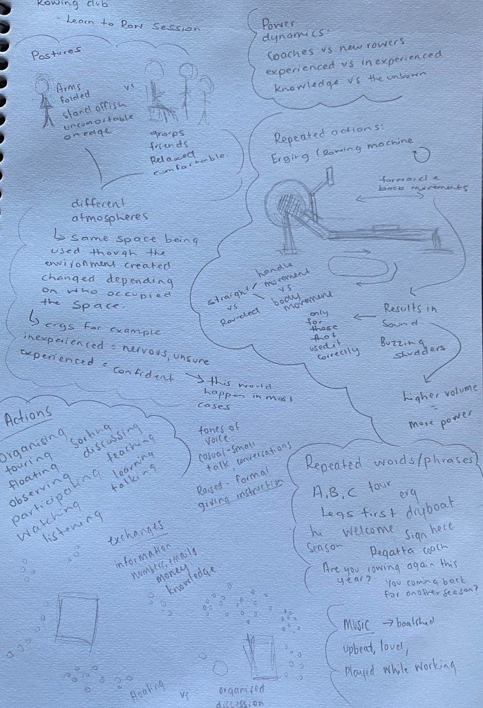
Spaces are created altered, modulated and interfered with when something happens.
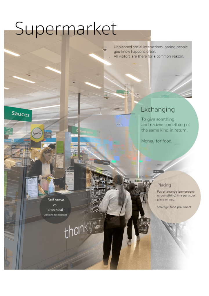
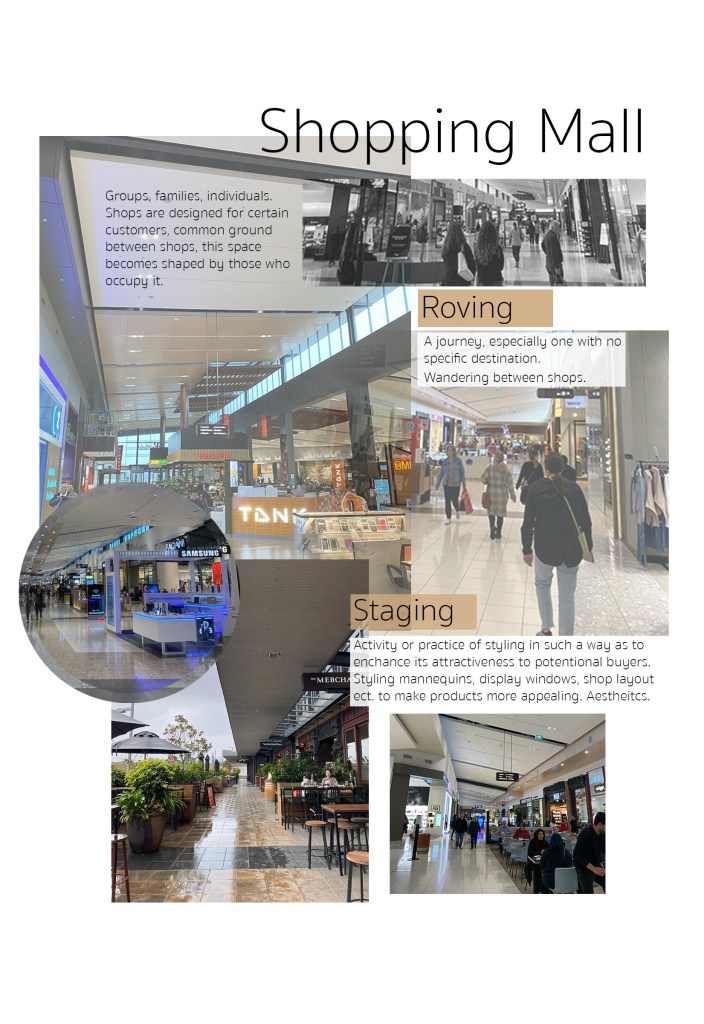
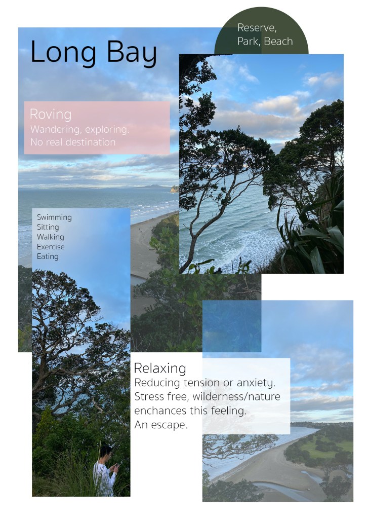
What is ‘social space’? When I first thought about social space I immediately thought of public spaces such as town squares, parks and shopping malls. Places that people can freely access and be with and around others. I then questioned myself as I began to realise that perhaps social space and public space are quite different from one another. Social space could be anywhere that general interactions occur between two people, a bus stop, a club, an elevator, a walkway or doorway. These locations become social space whenever planned or unintentional meetings between individuals occur. The people occupying the space determine the purpose and atmosphere of it. Strangers at a bus stop, awkward, quiet, still, compared to friends at a bus stop, excitement, talking, relaxed. Spaces change depending on when, where and who is around.
Spaces affect they way we relate to each other, and so affecting the way we make spaces. We as designers should be able to notice how these approaches have permitted our ways of designing.
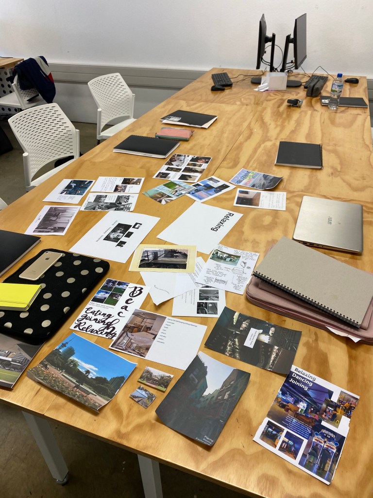
Studio Activity – Placing collages next to the word that was most fitting. As we talked about in class it was interesting to see how the collages had been spread across the room. Words such as relaxing and occupying had many collages surrounding them, messily laid out, sometimes covering the word itself. Other words like staging and placing had few collages next to them, protesting with none.
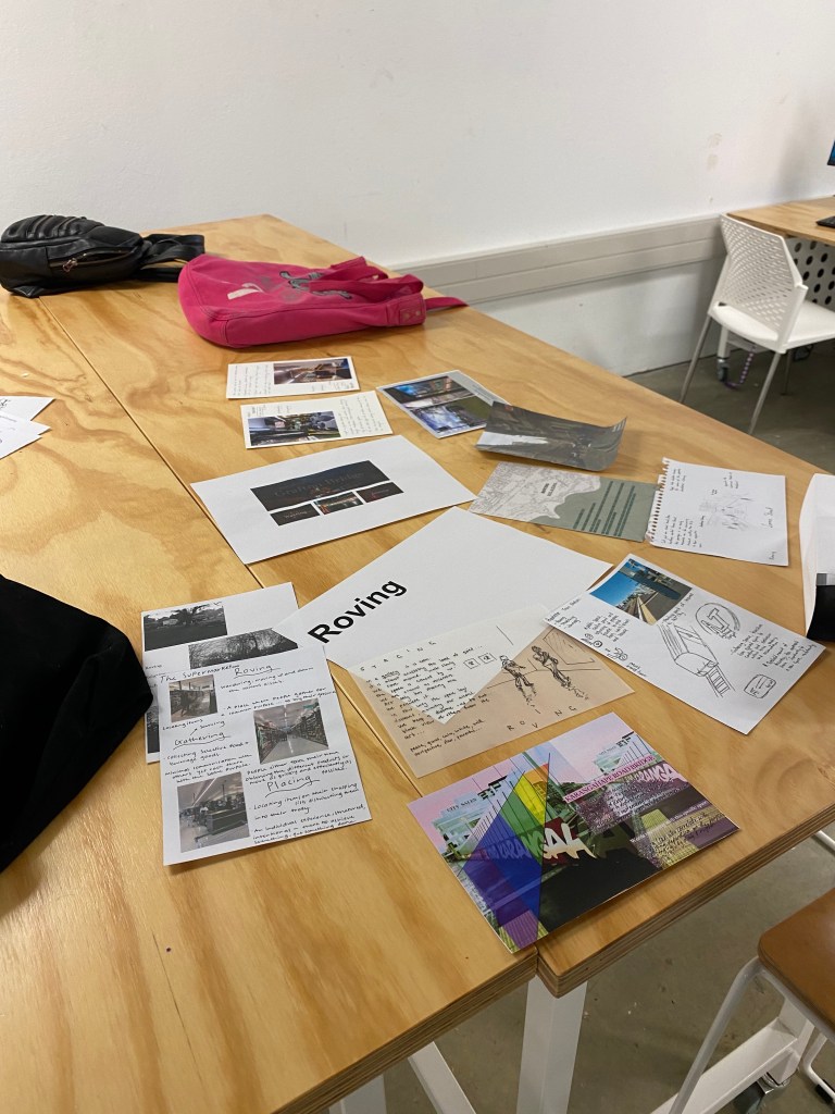
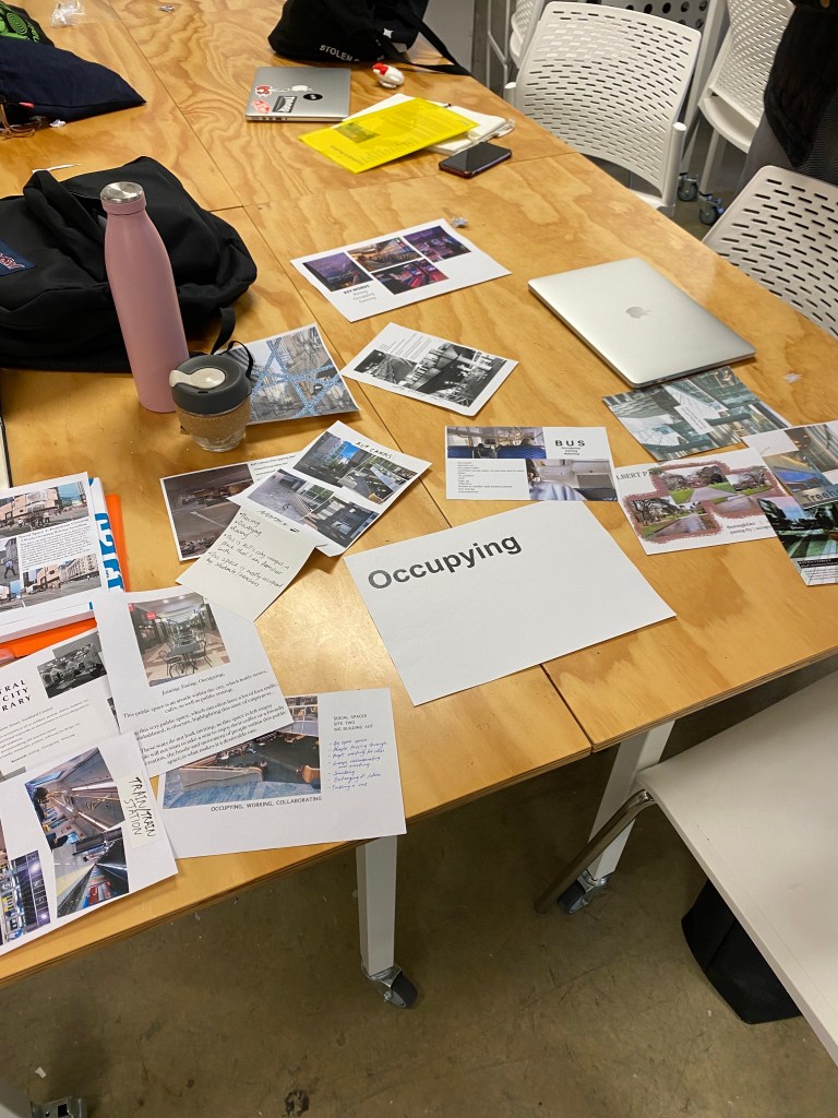
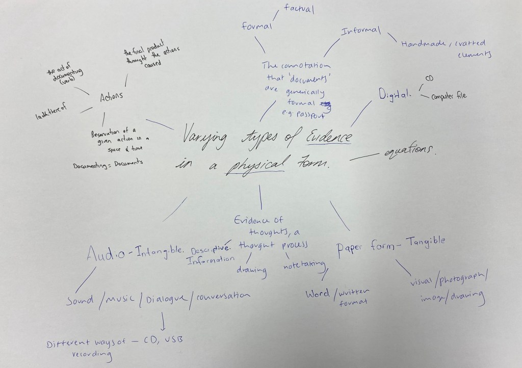
What is a document? Through group discussion the word we kept coming back to was evidence. Proof of an idea, recording a sound, capturing a moment. These are all considered evidence of something that happened or a thought that was had in physical forms whether that be tangible or intangible.
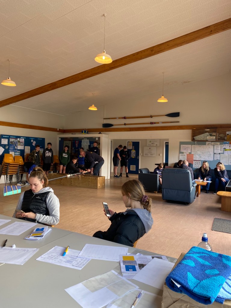
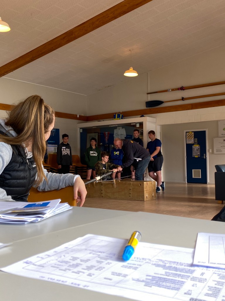
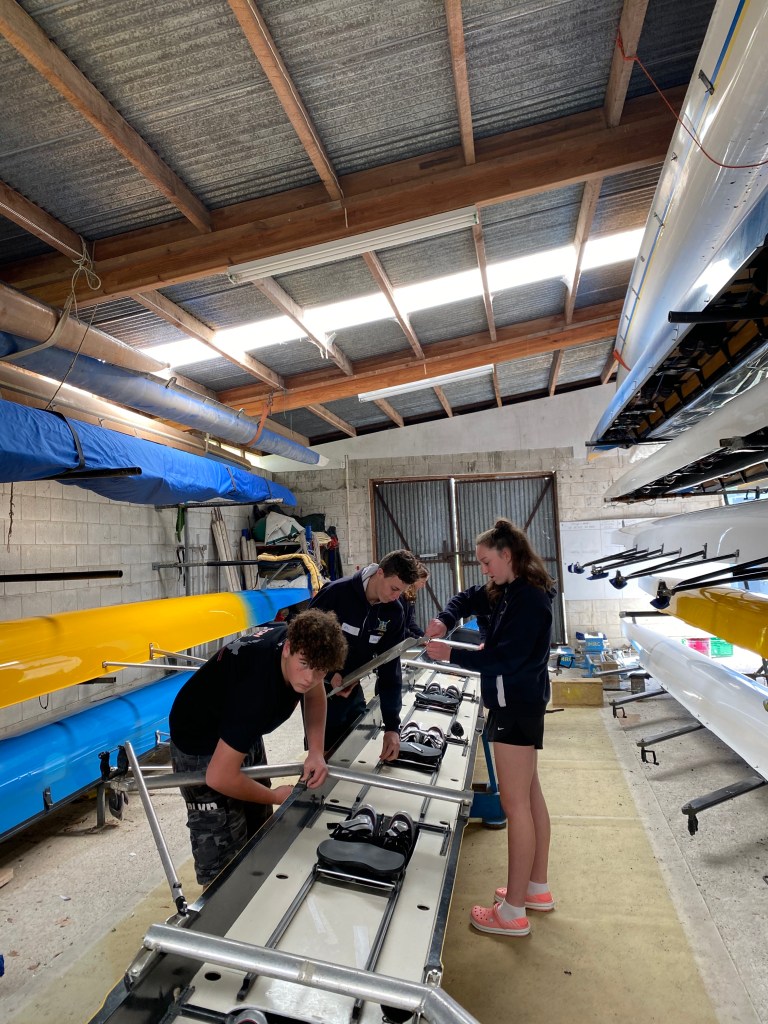
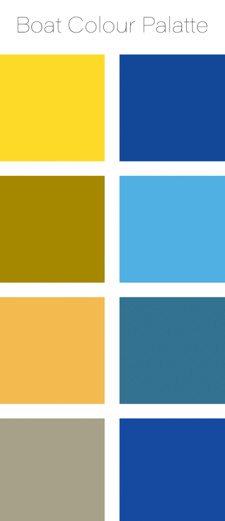
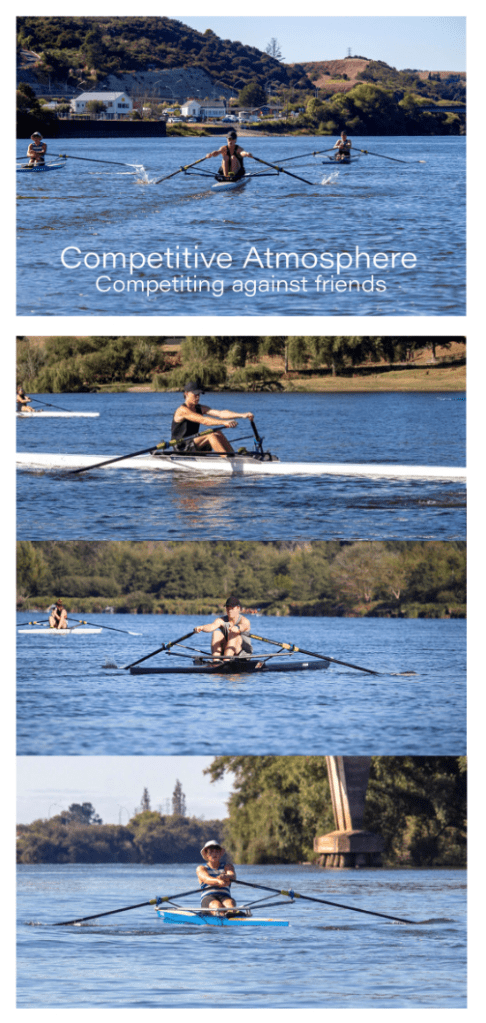
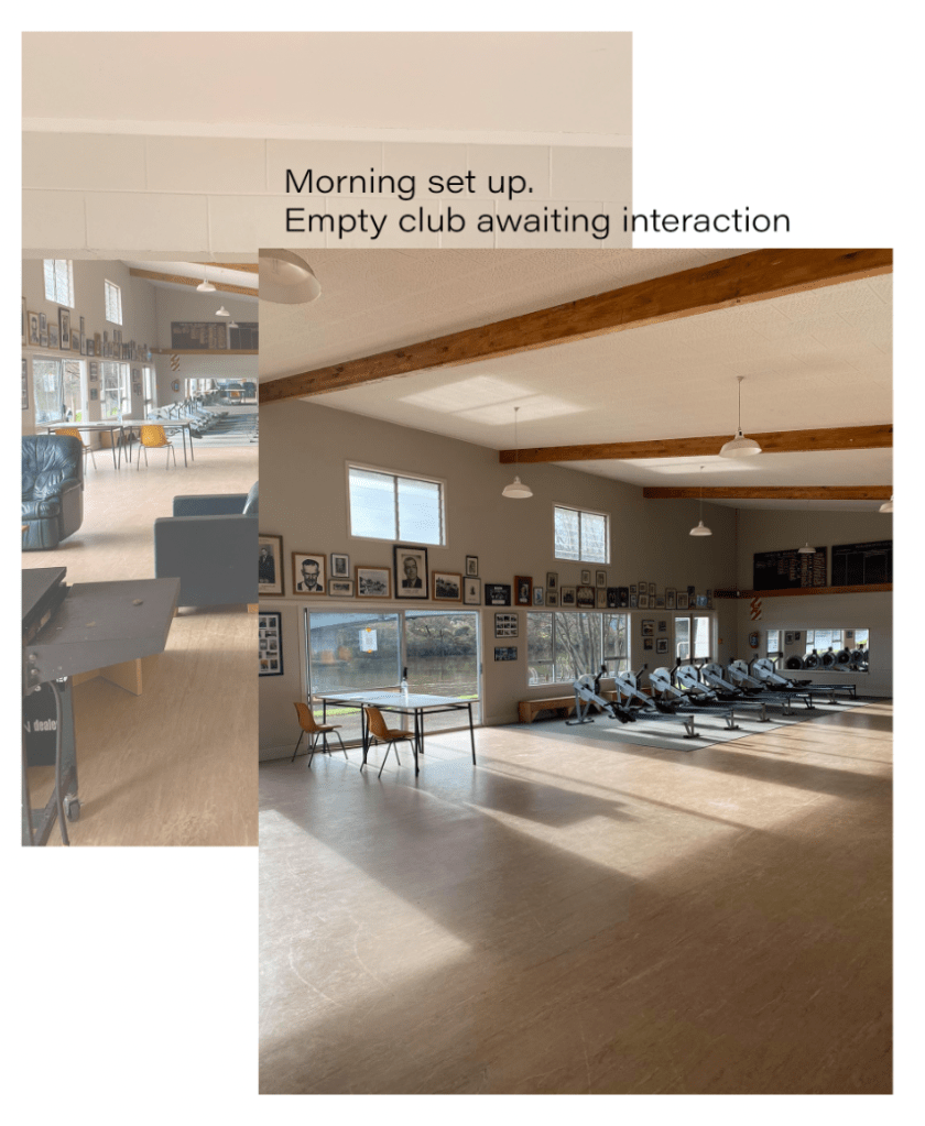
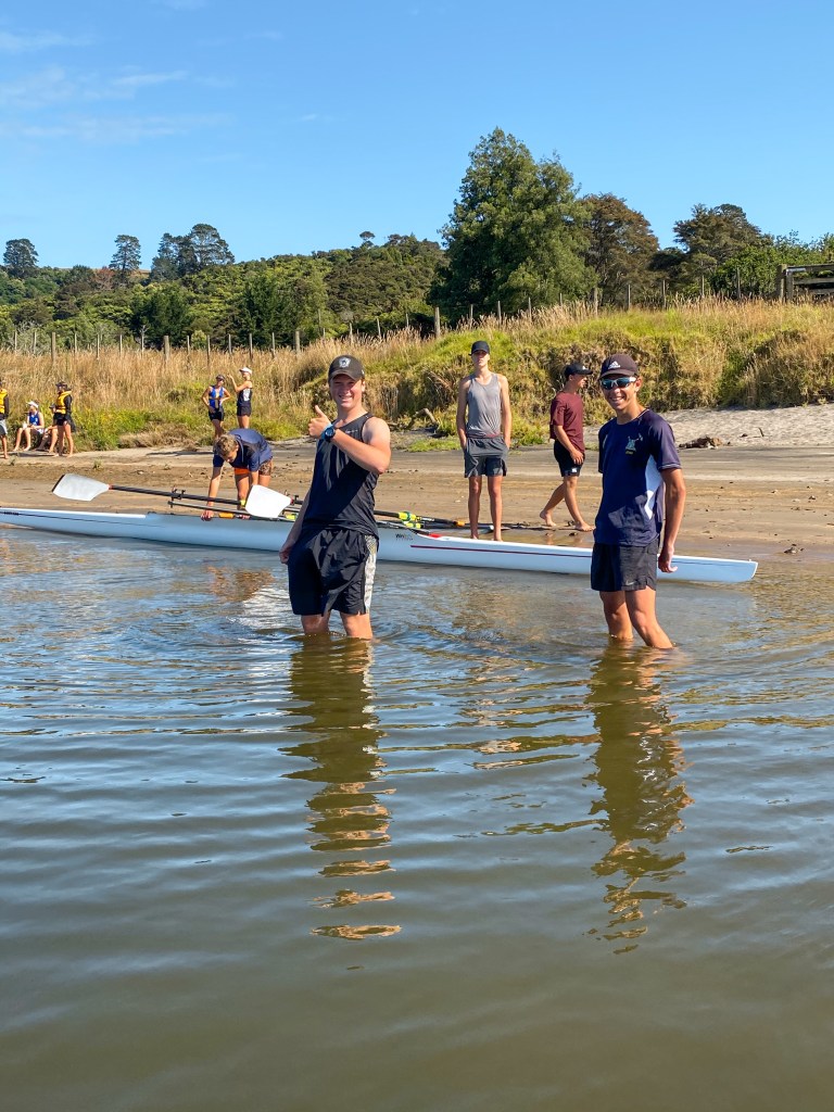
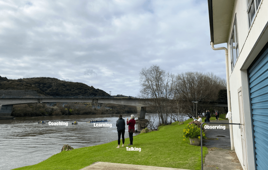
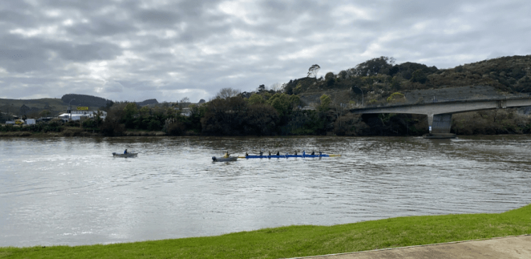
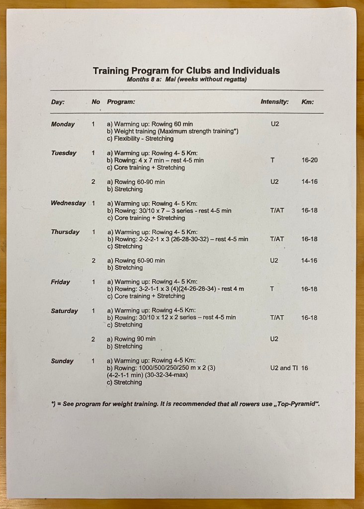
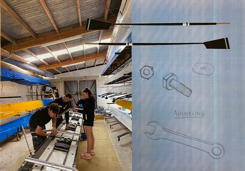
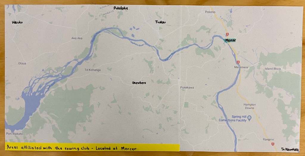
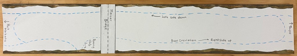
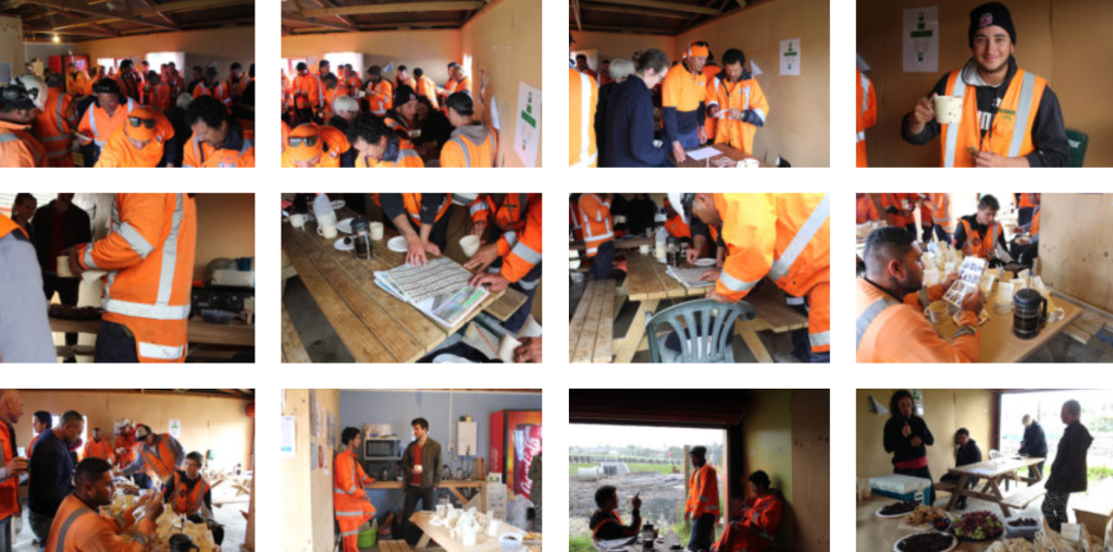
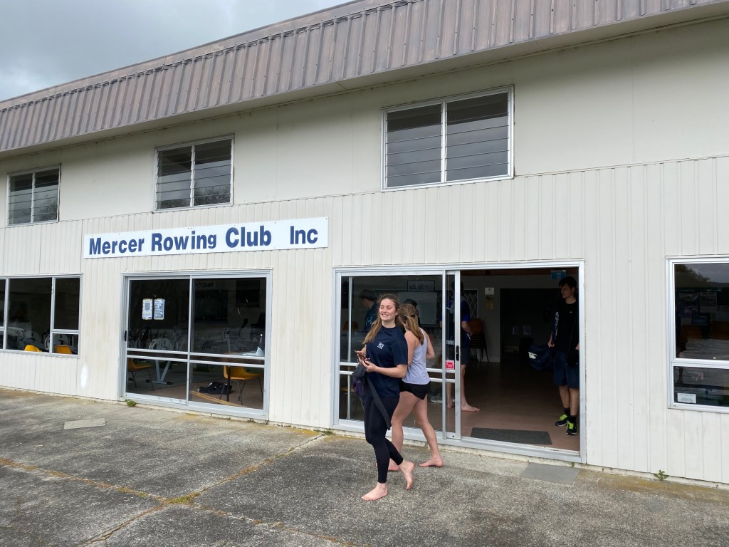
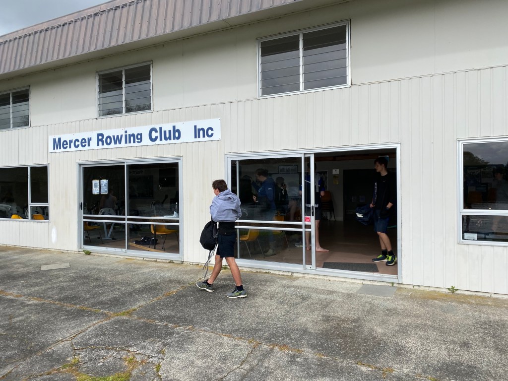
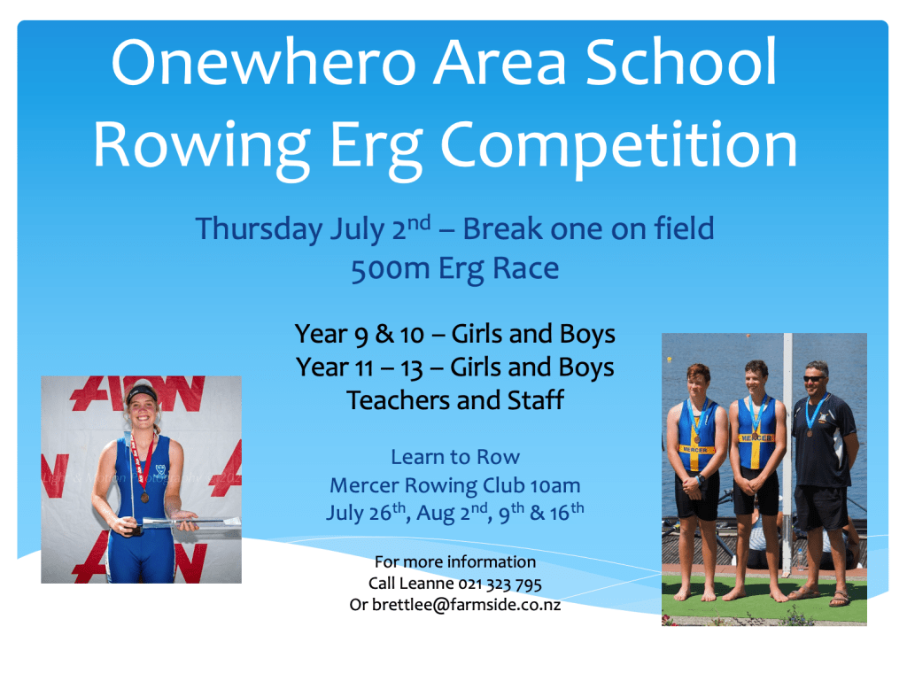
Observing/Participating chosen site: For the first part of our studio brief I have decided to work with Mercer Rowing Club as my chosen social space. I wanted to work with this space as it’s somewhere I spend a lot of time and am interested to think more deeply about the different types of social interactions that occur in and around the club. Due to being at the club a lot I know that certain atmospheres can be created depending on the events taking place and those who are participating. The words I have chosen for this space are assembling, exchanging and joining.
Assembling – (of people) gather together in one place for a common purpose. People who come to the club are all assembling their for a common goal/reason.
Exchanging – to give and receive. Giving up time, showing effort etc. in exchange for knowledge and improvement.
Joining – become linked or connected to. Becoming apart of something. Joining a team, crew, boat etc.
Week Two: Context and relation to site
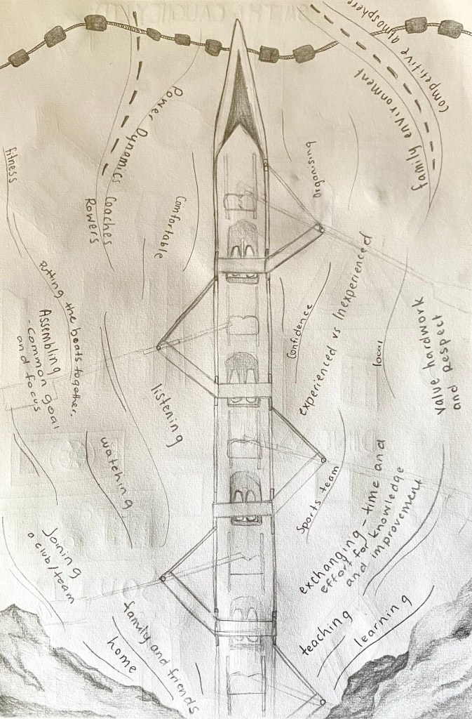
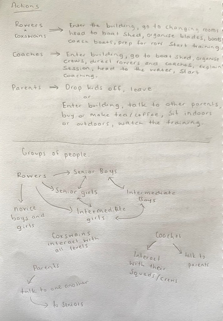
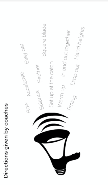
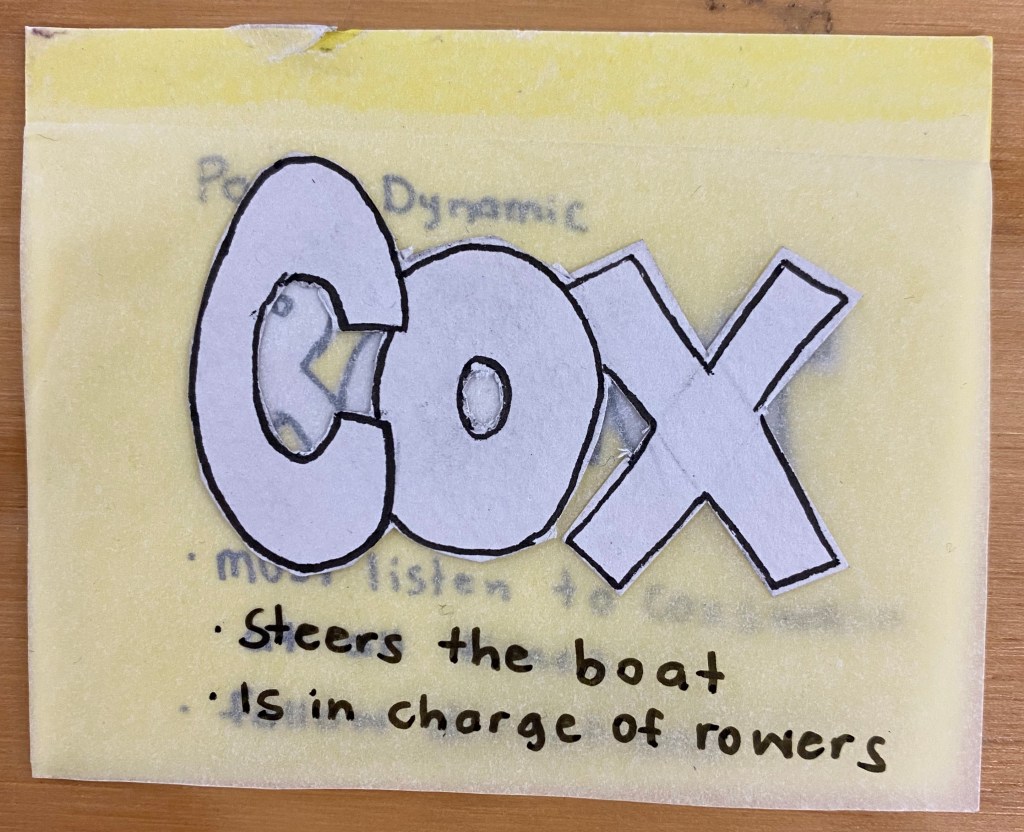
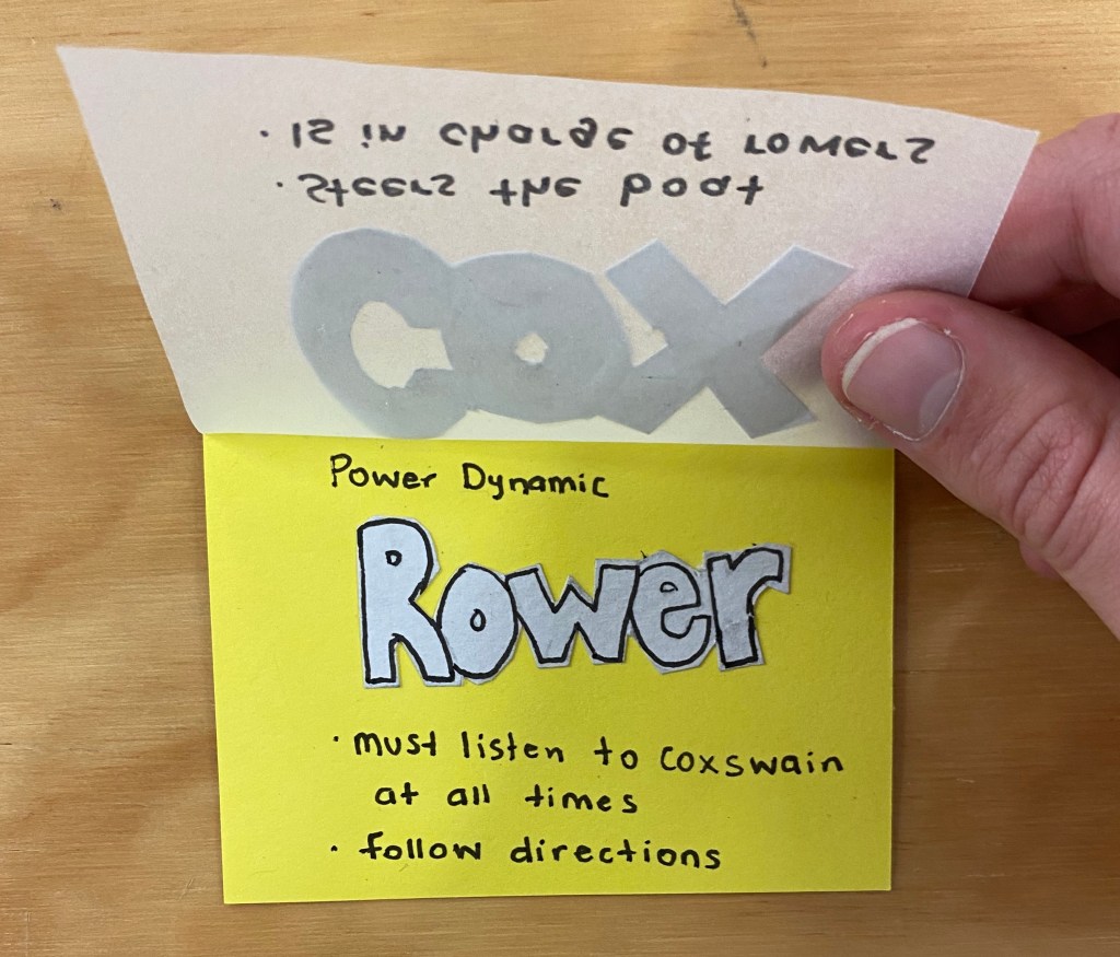
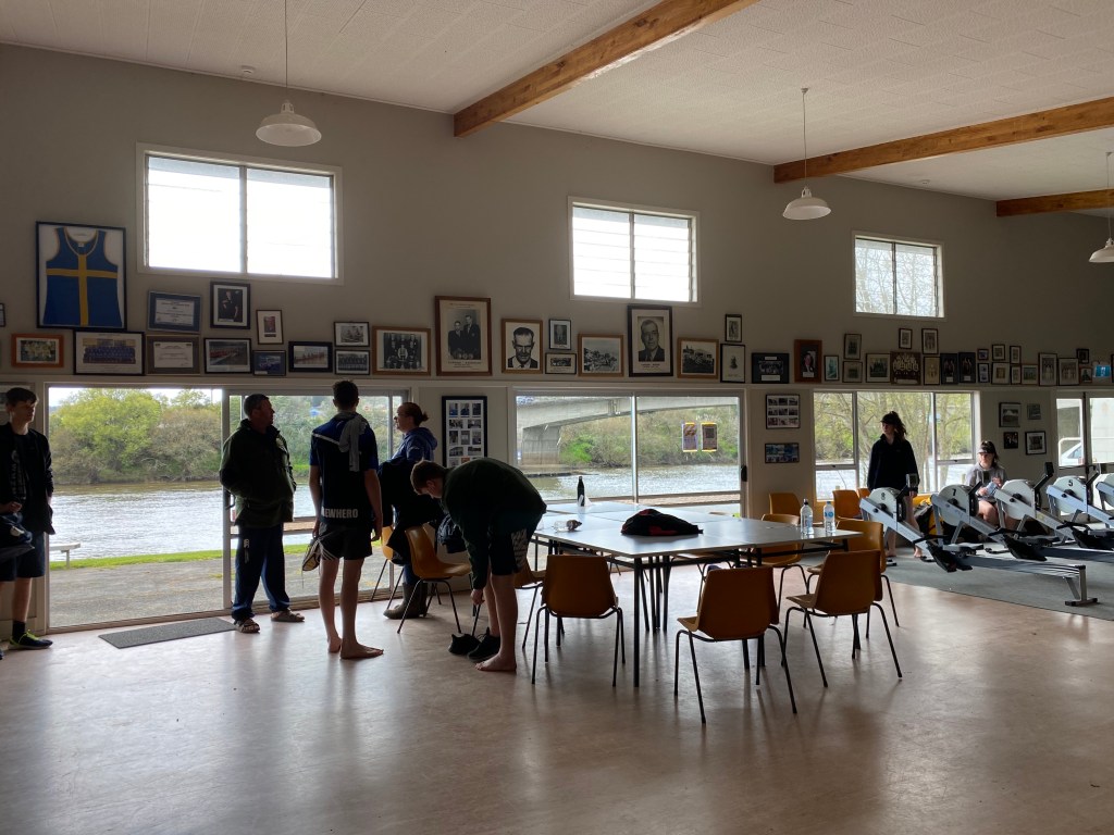
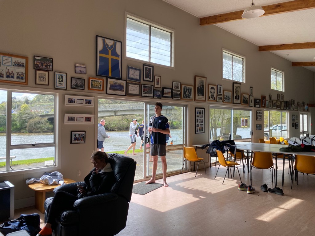
The rowing club, a space where a competitive atmosphere is created, a competition amongst strangers who become friends. A place where participation, effort and respect is valued in exchange for knowledge and improvement of skills. Where individuals assemble together for a common purpose, striving for the same goals. A win, a loss, a mistake or a close call can change the mood in an instance. The sound of ergs humming fills the room while corrections from coaches fades into the background and exhausted bodies continue to push themselves. The welcoming family environment ensures newcomers feel comfortable and at home, joining others to become a part of one big team. Power dynamics become known, with a hierarchy of skills being shown.
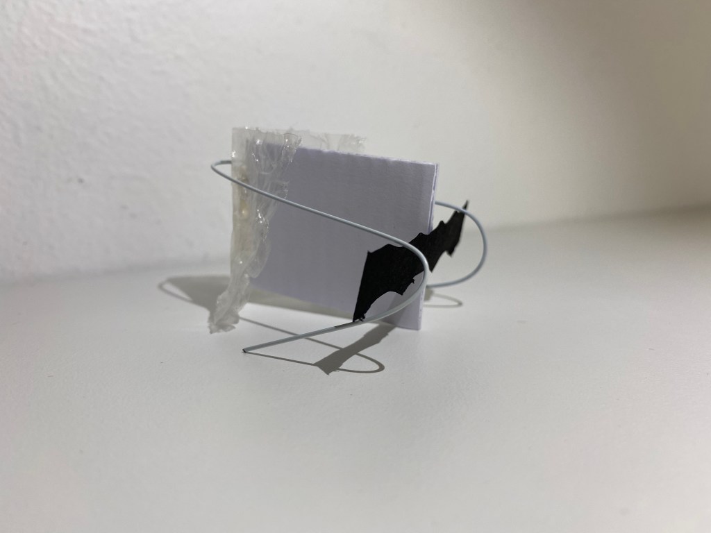
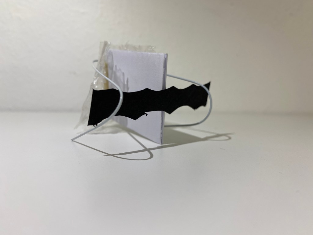
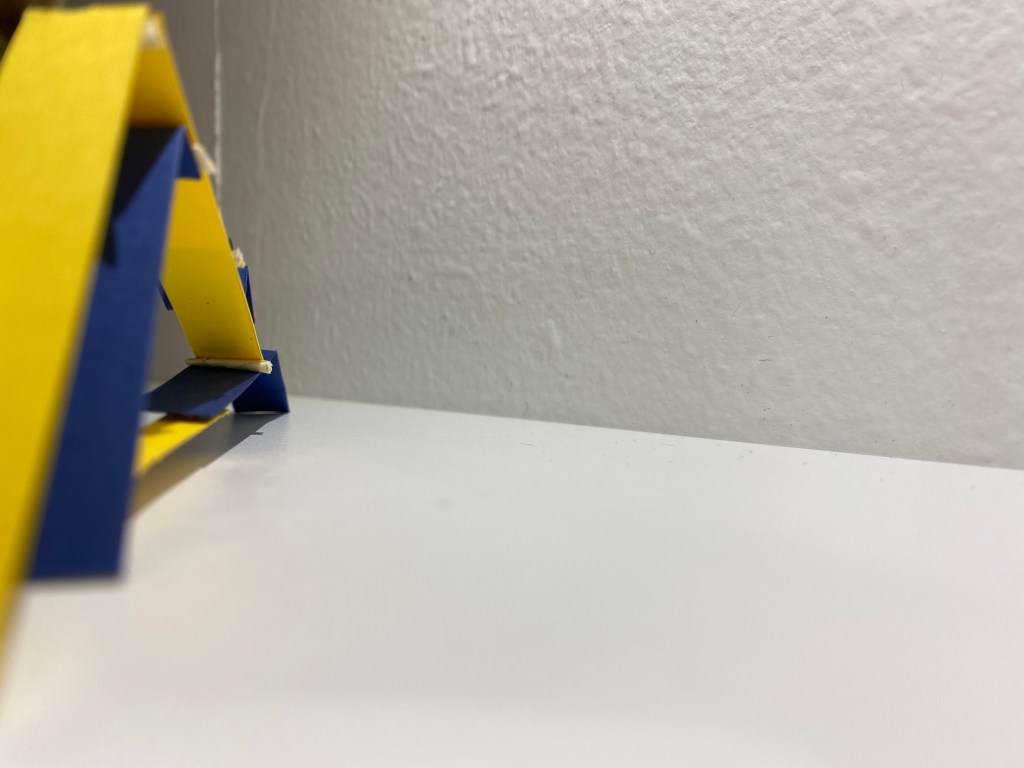
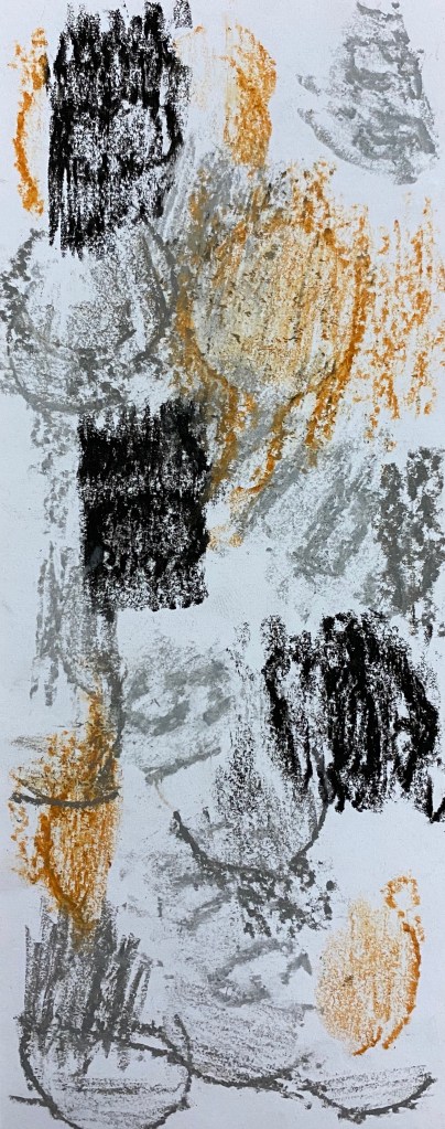
Model Making – 6 models inspired by words paired together that describe my relationship and connection the site. Showcasing the values I have picked up on.
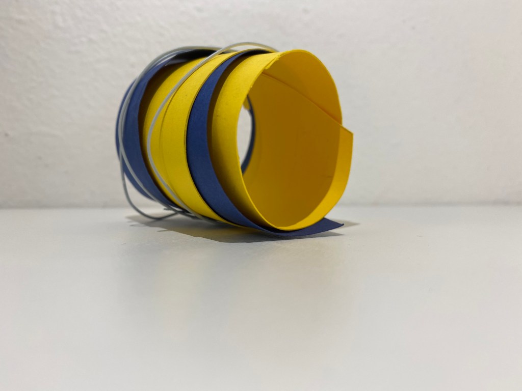
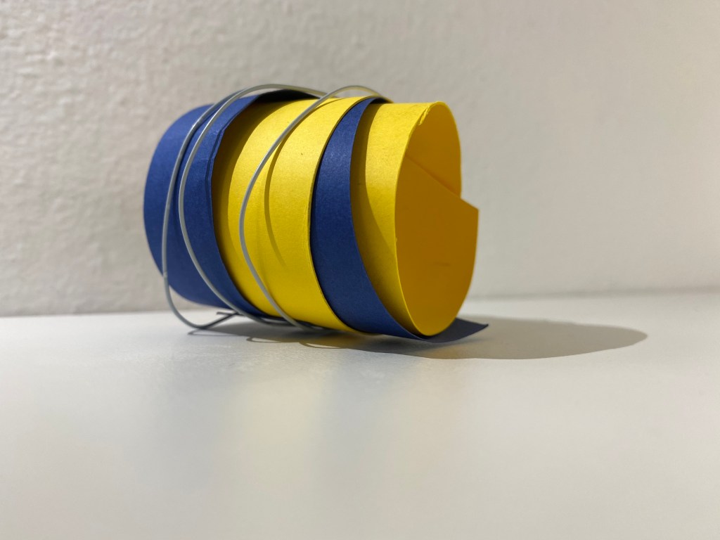
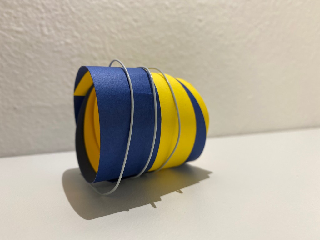
Multiple materials merge and join, rolling together representing the tight bond individuals create with others from different backgrounds.
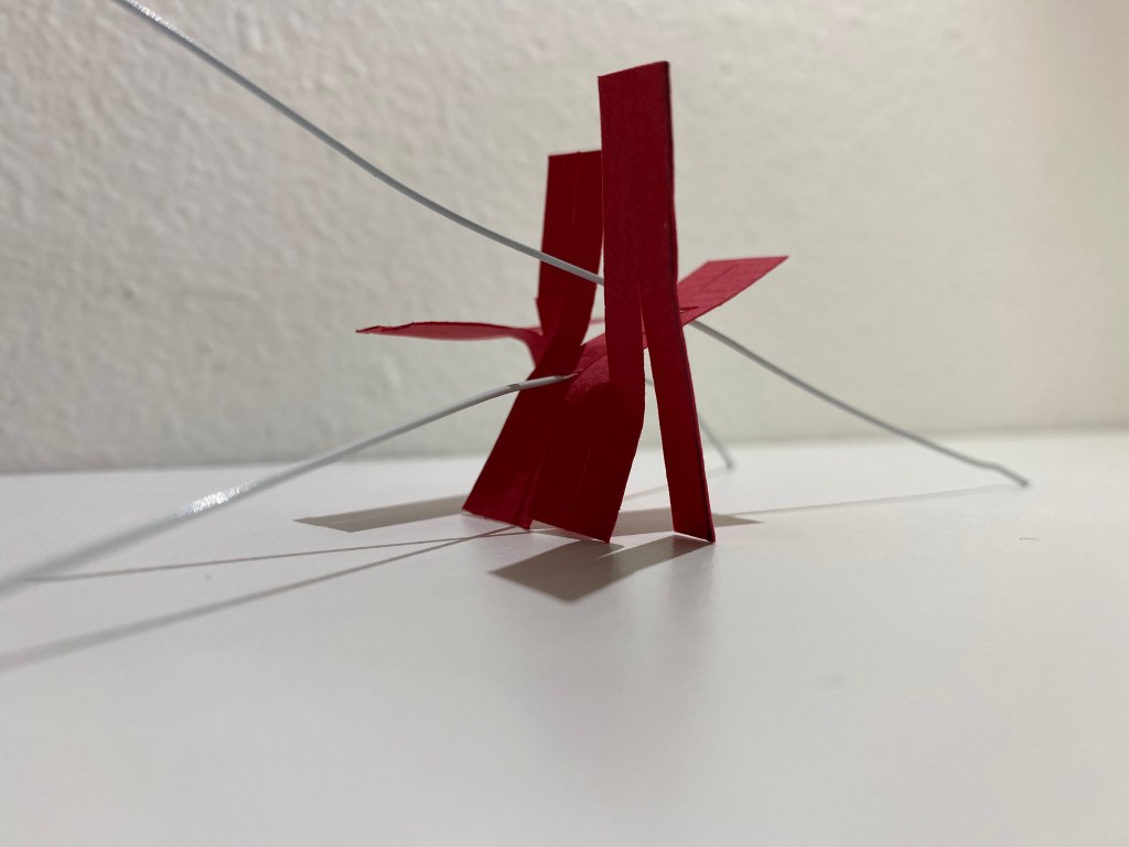
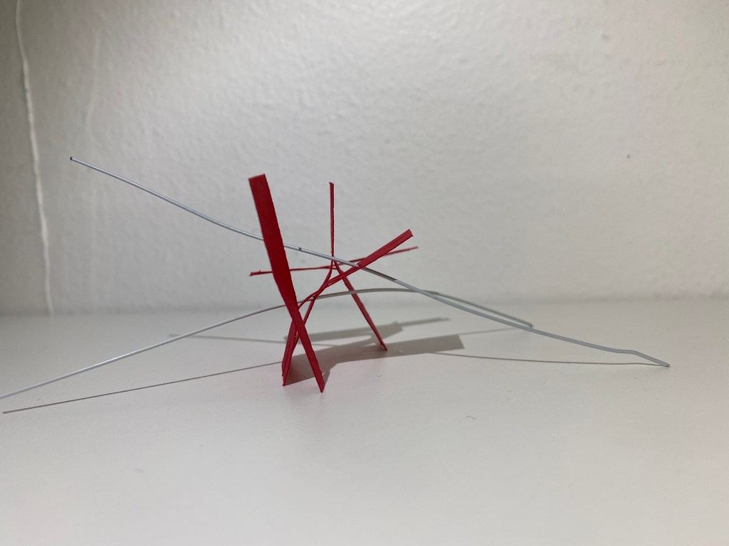
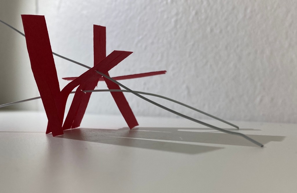
Uneven, unbalanced illustrating the ups and downs of learning new skills. Still standing upright – perseverance.
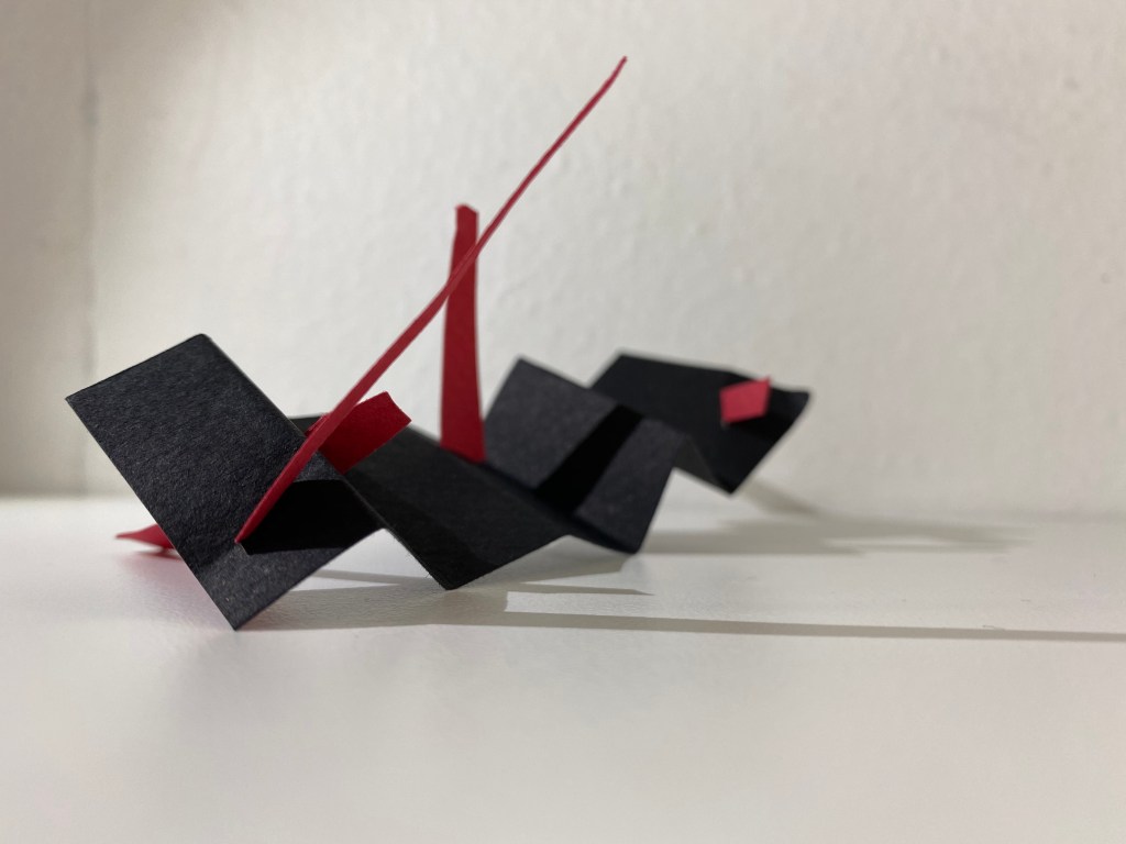
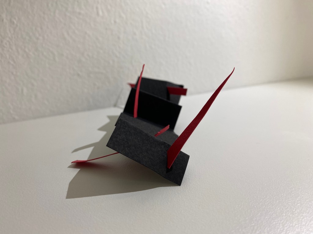
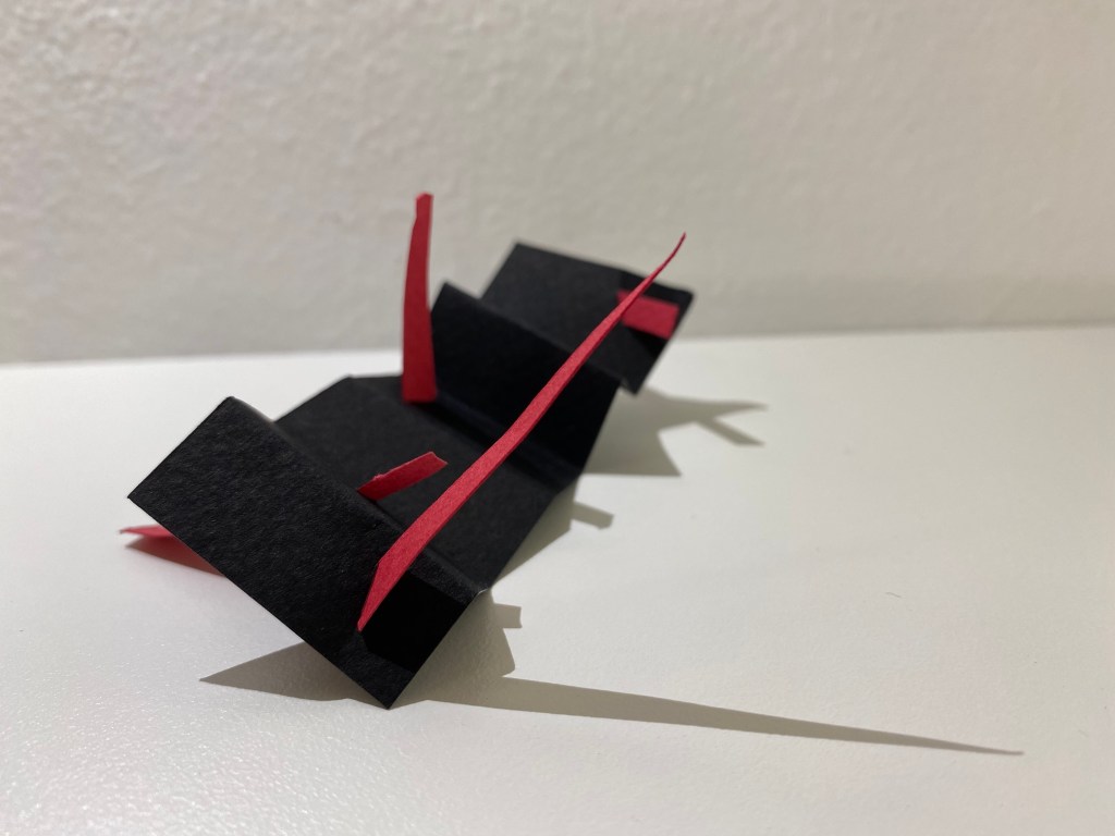
Rough, jagged, sharp edges depicting a tense and sometimes ruthless environment. Clashing of colour, shape and line.
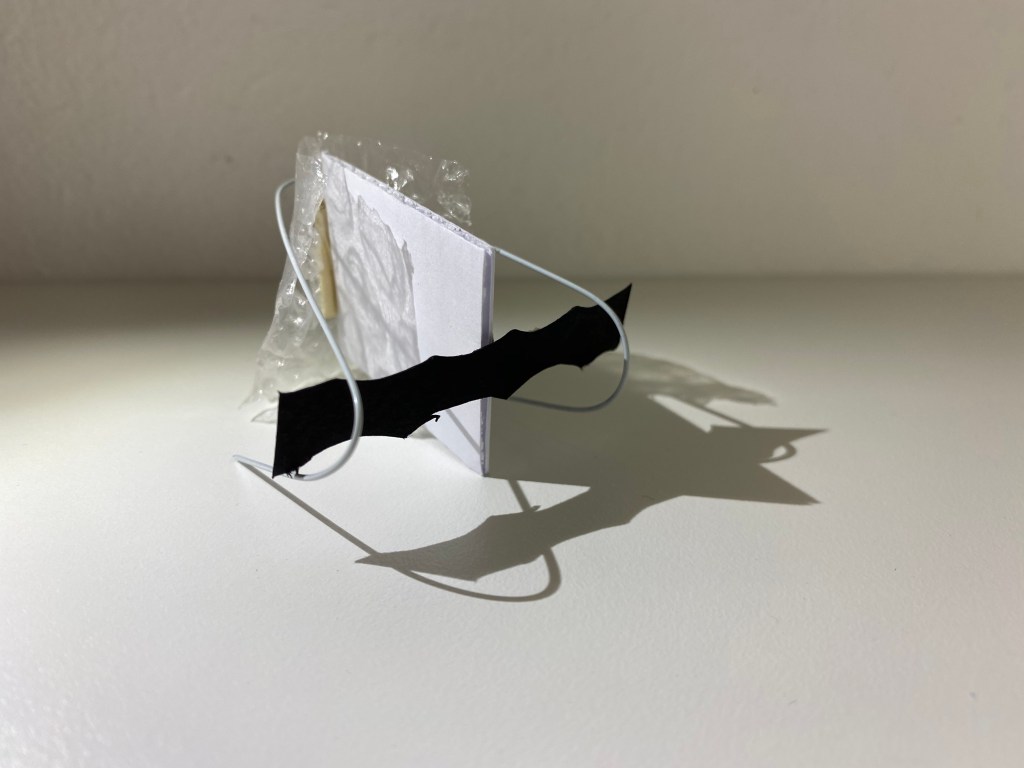
Wire bends and loops around grasping the softer material – now in control. Leading the way.
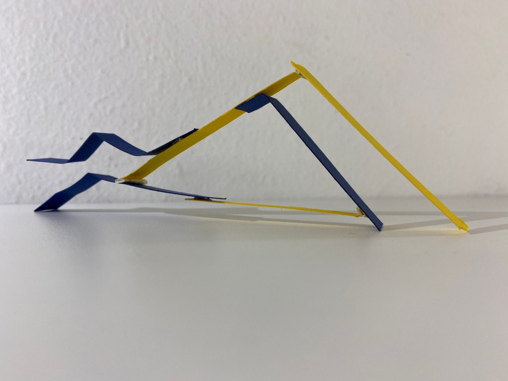
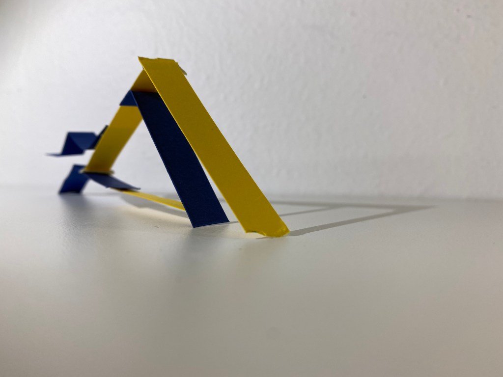
Creating order and strength through placement – finding what works. Establishing form, an effective way to perform.
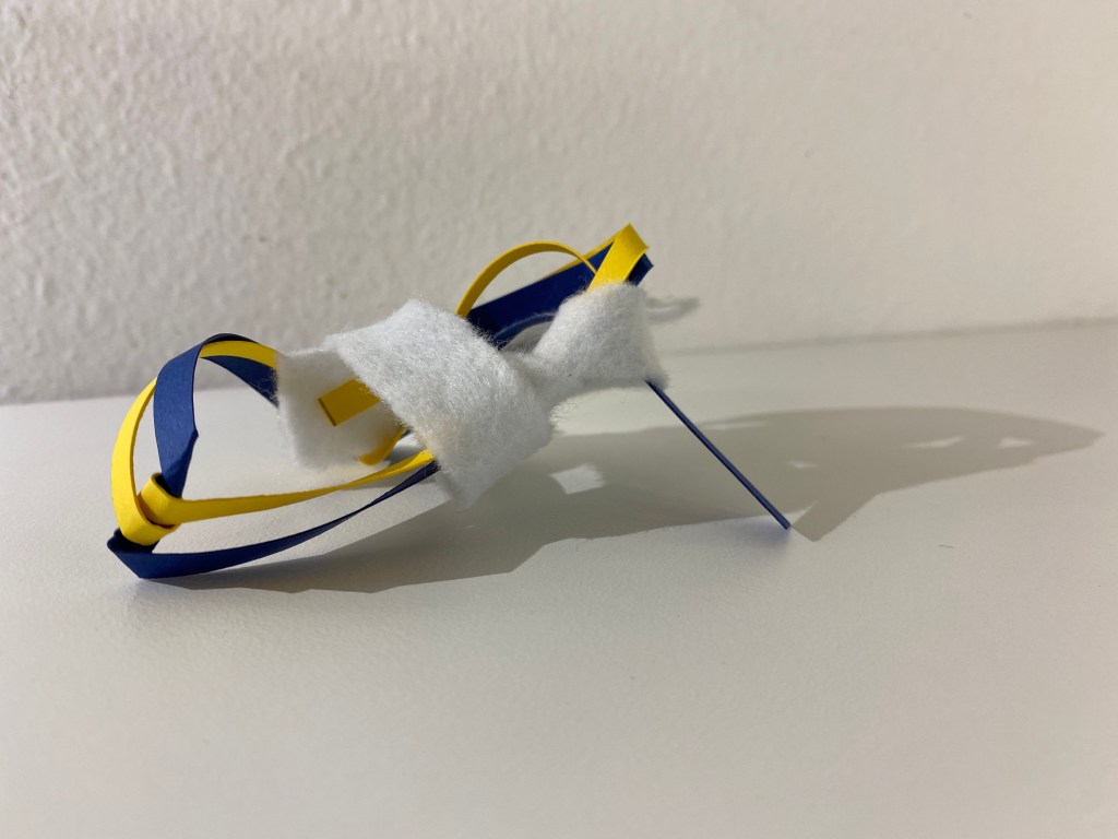
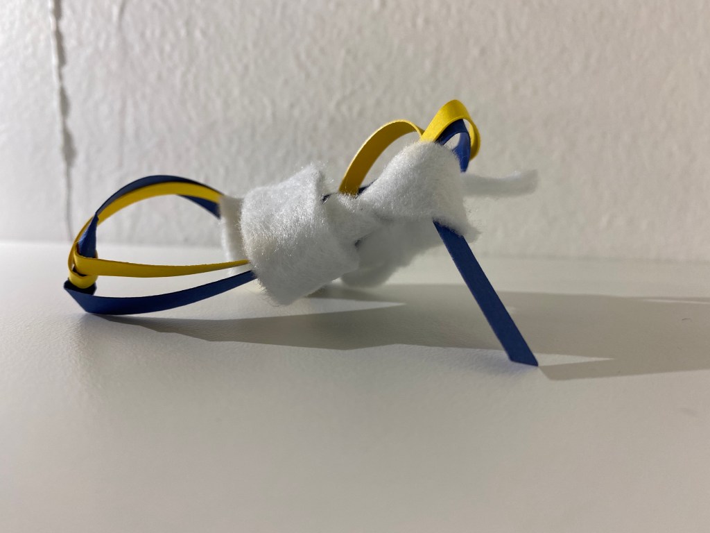
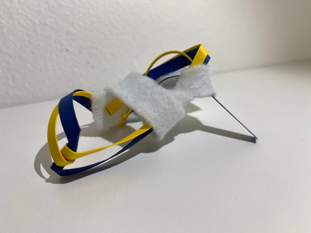
Materials intertwine, bouncing off one another. The softness of the fabric absorbing the information.
Week Three: Beginning Documentation
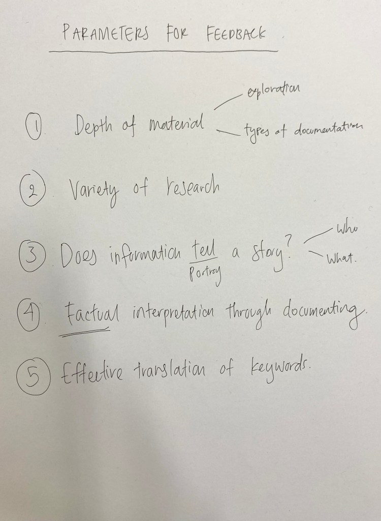
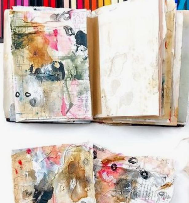
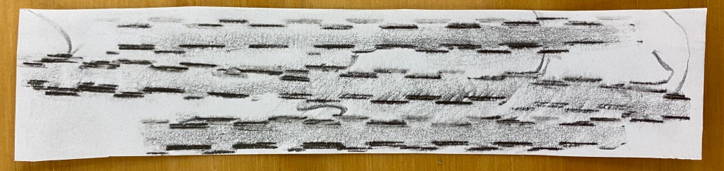
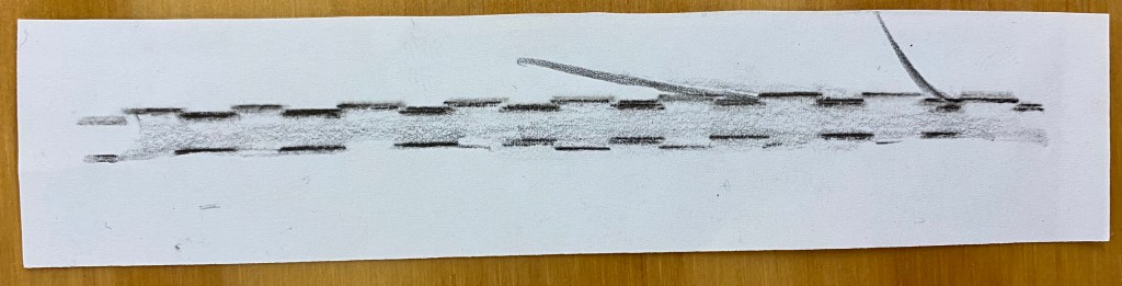
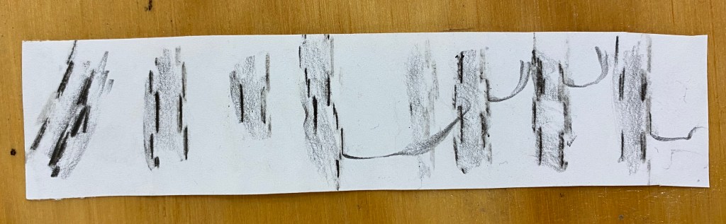
This week I began making my series of 50+ documents of my chosen social space. We were to bring our first 10 into class on Tuesday to receive feedback from our peers to help give each of our projects more drive and direction. As a group we came up with five parameters for feedback when critiquing each others work.
We then shared our first set of documents with each other and worked to provide each person with some positives and work ons moving forwards. Below is the series of documents I shared.
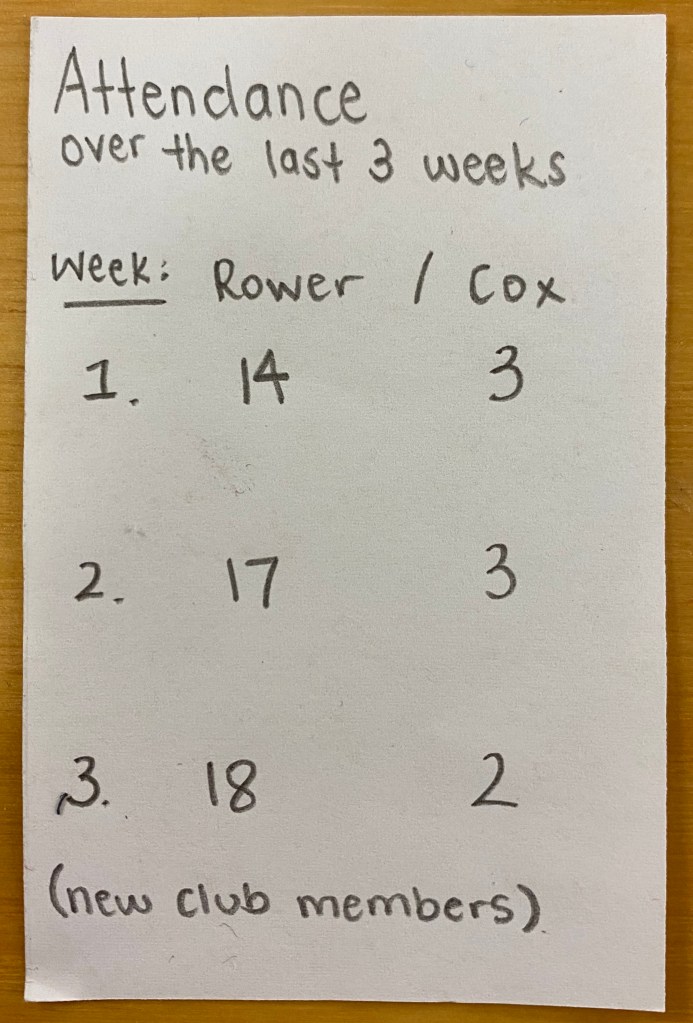
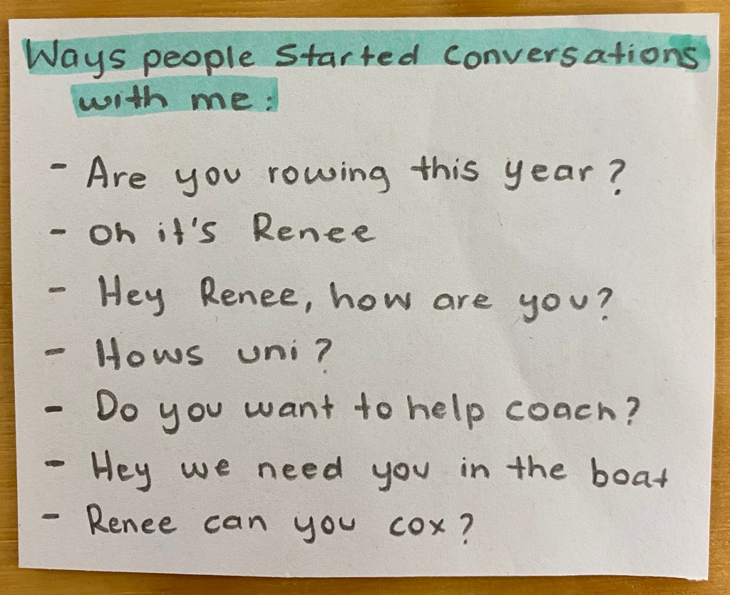
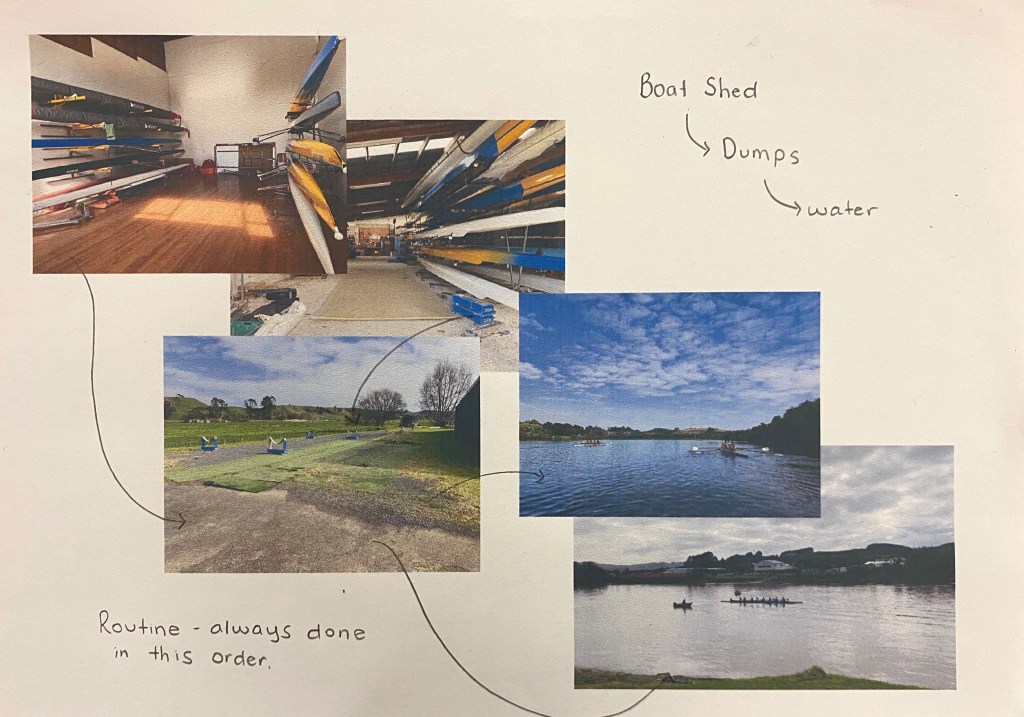
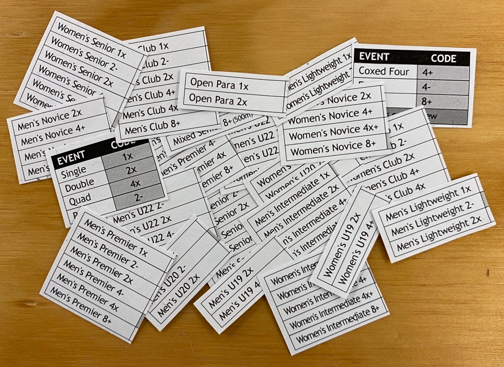
Hierarchy of skills 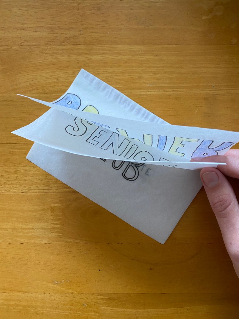
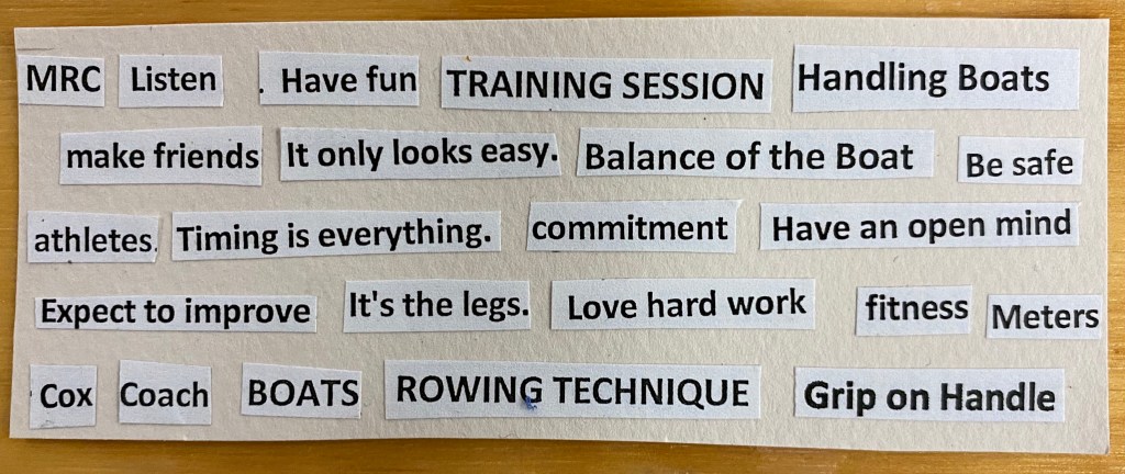
Repeated words/phrases 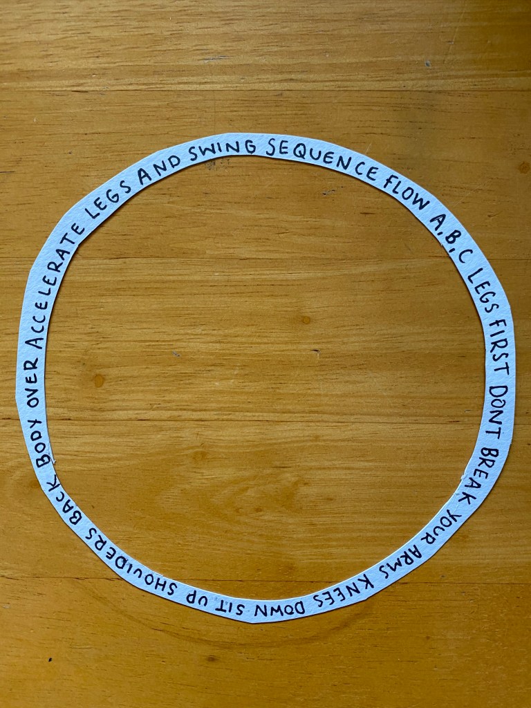
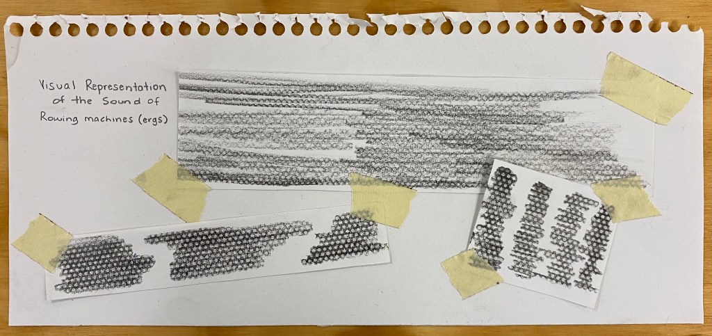
Words heard near ergs 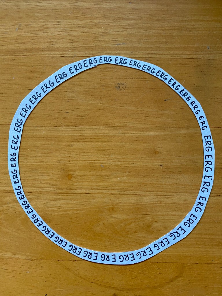
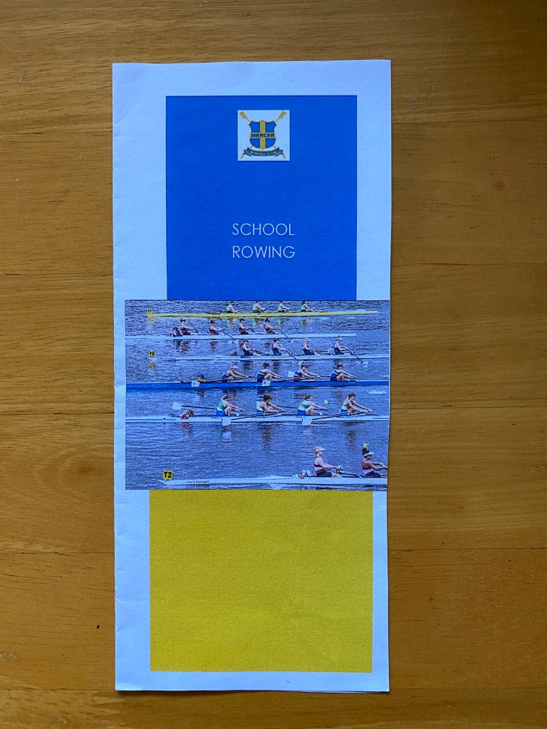
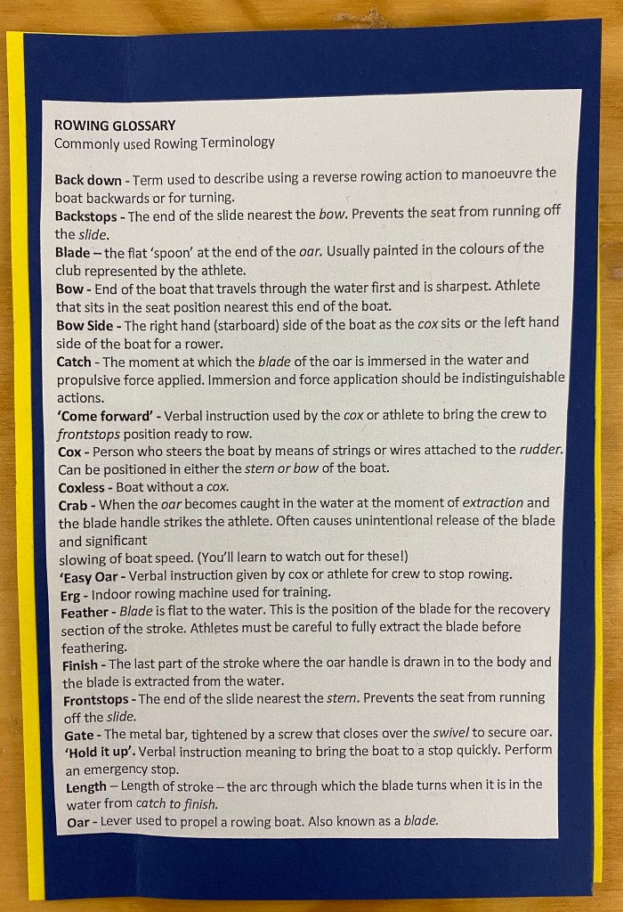
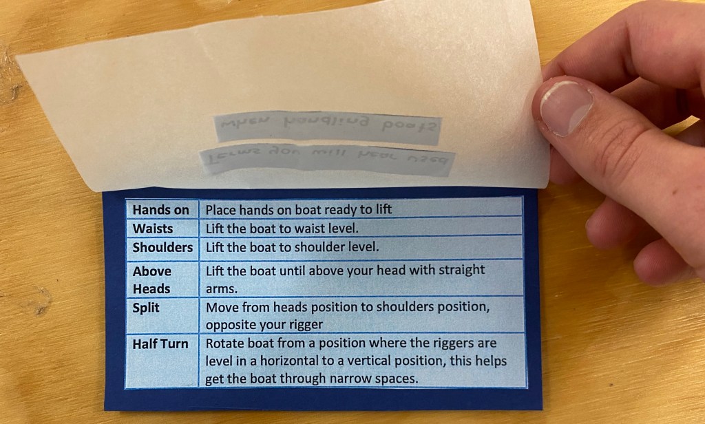
Brochure given on site 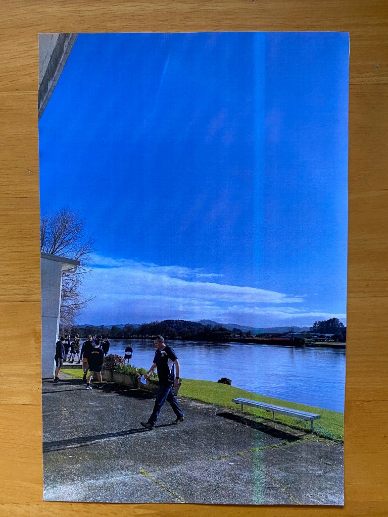
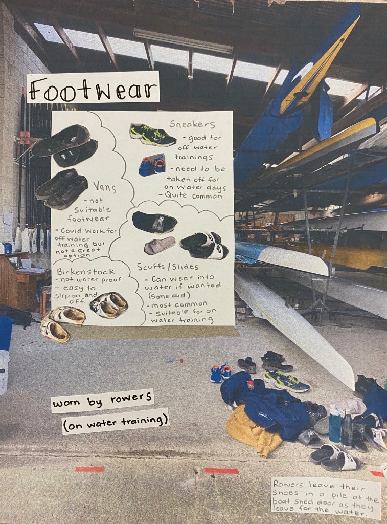
Image showing actions 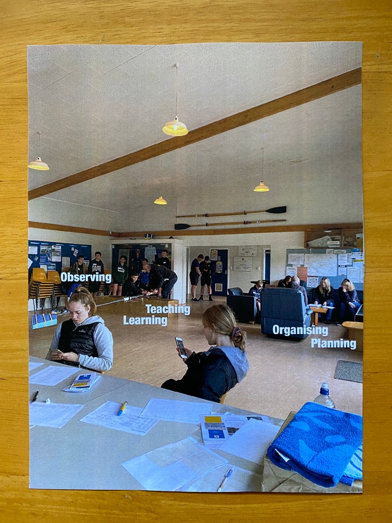
Image showing different activities 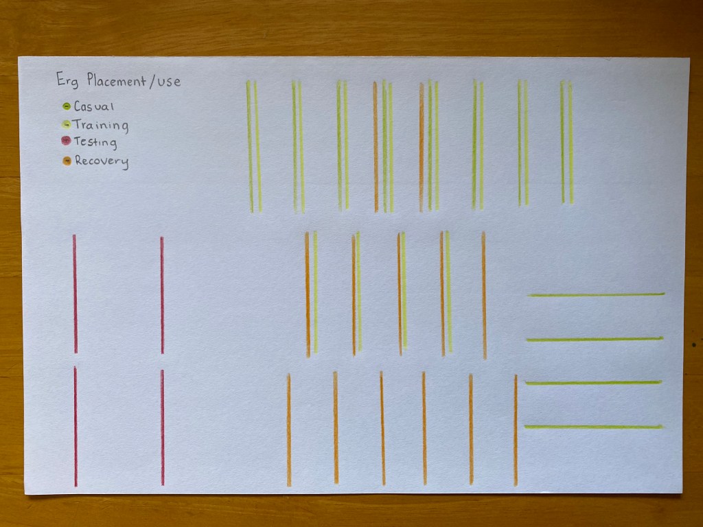
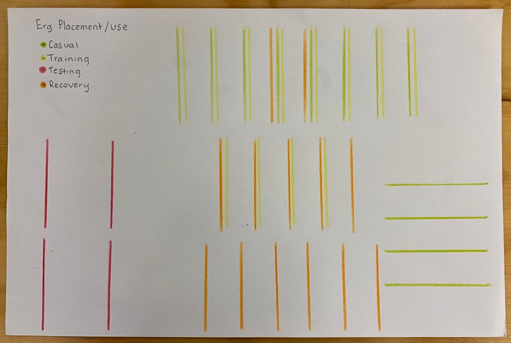
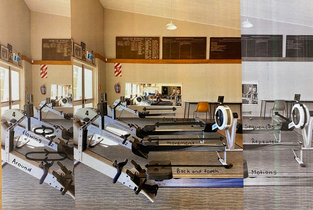
Erg placement/use 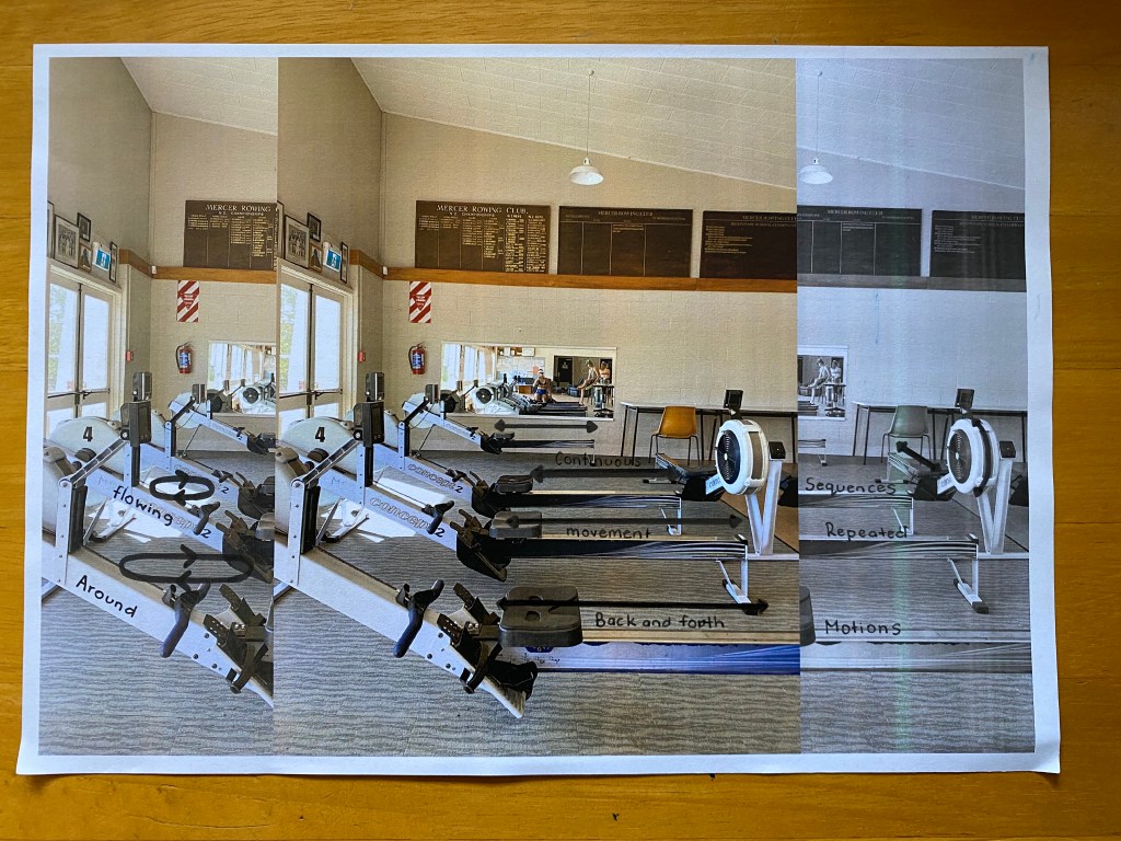
Actions on the ergs 
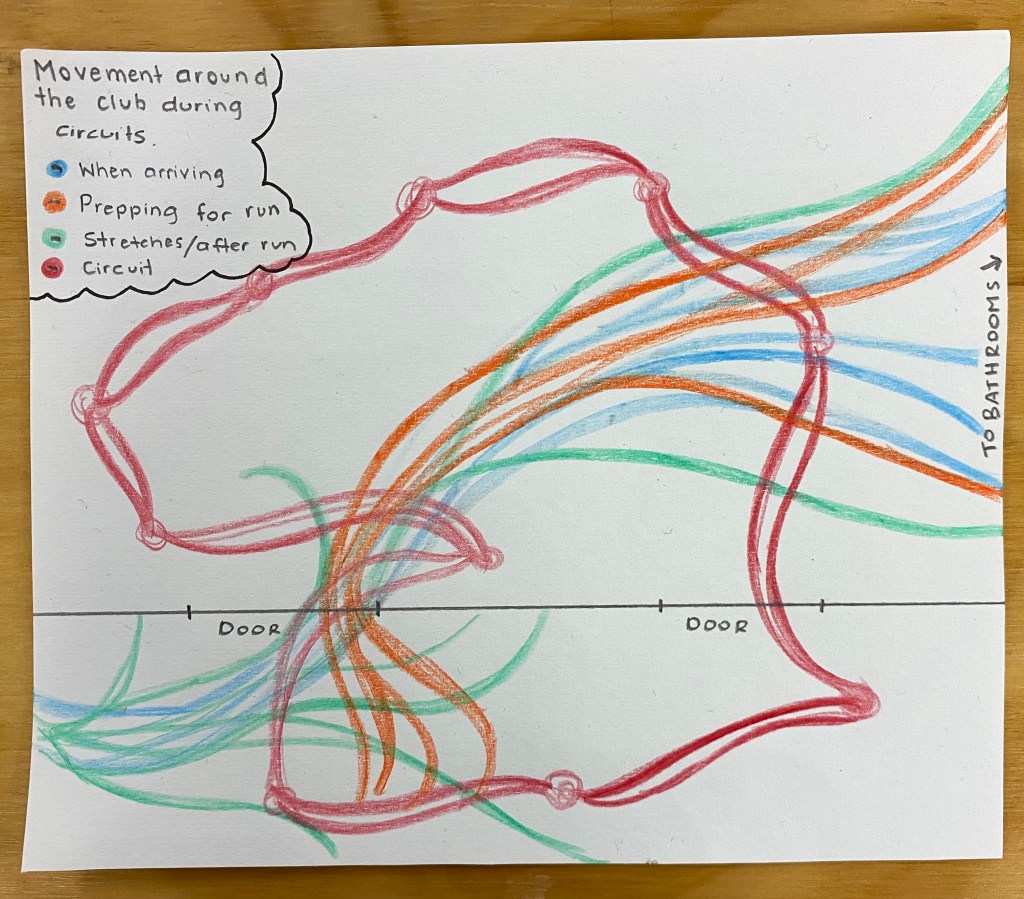
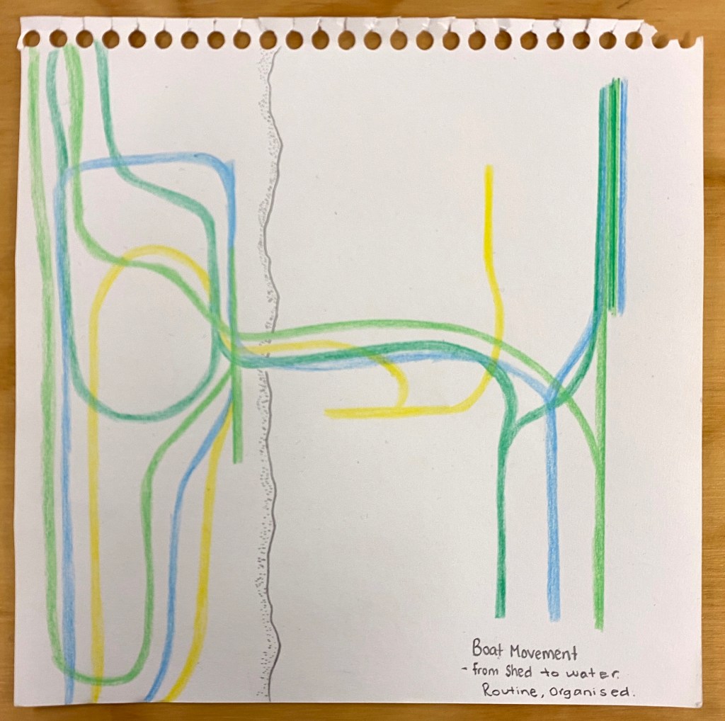
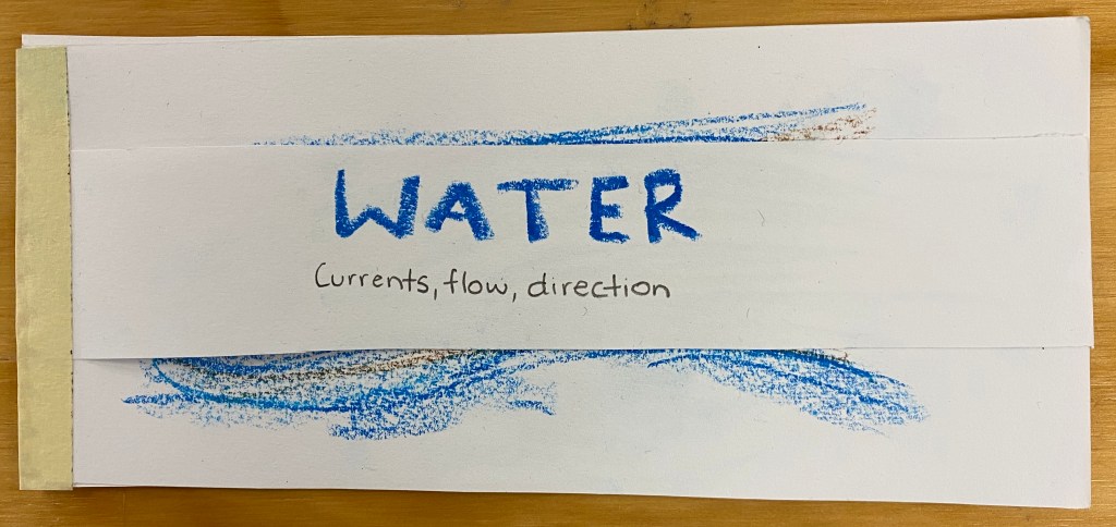
Movement mapping 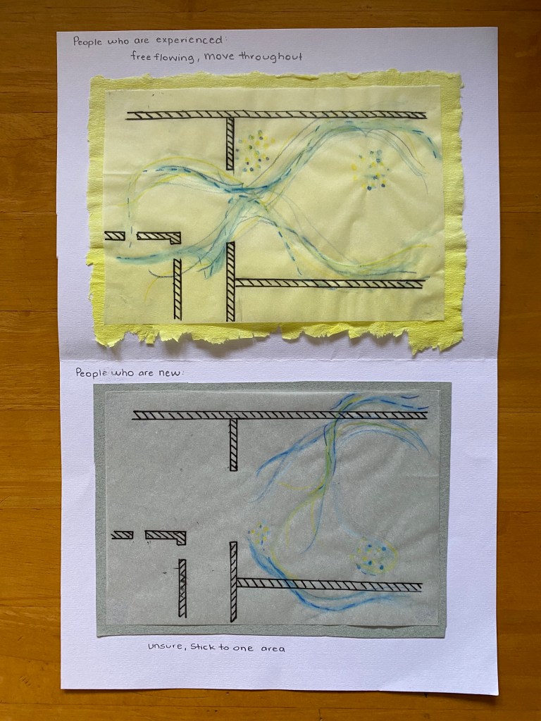
The main points I took away from discussion with my group was to work on how to communicate my key words more clearly. We all also agreed that more variety in material choice and use would be an effective way to create more of a range of documents when it comes to completing the remaining 40+.
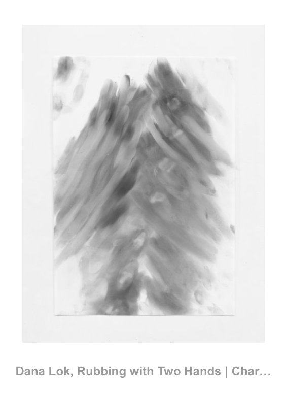
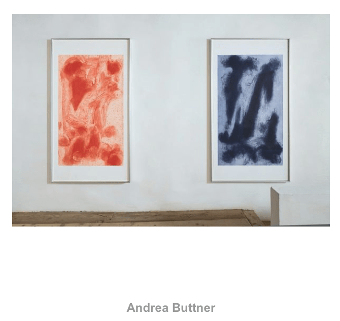
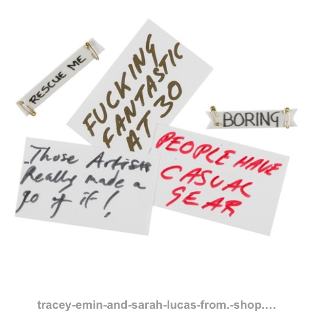
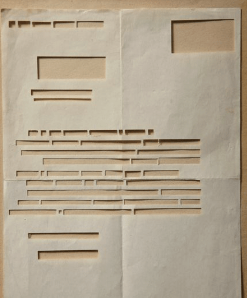
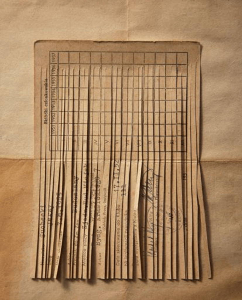
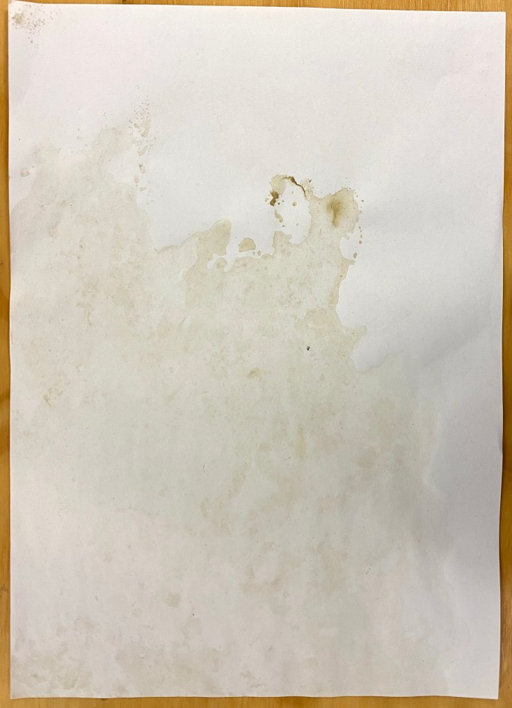
I decided to do some research further into the creative types of documents I could make to communicate my thoughts and observations of the rowing club in terms of social space. After looking through the provided area channel as well as other sources I noticed that I am more drawn to the rough notes, sketches and rubbings as I feel like they are more in the moment and better represent the atmosphere of the site. Below are some of the documentation types I found both interesting and successful.
After researching and getting inspiration for types of documentation I returned to the rowing club to further observe social interactions as well as note down how individuals participated within the club.
Week Four: Part One Presentation
During Tuesdays class we received feedback on our documents from 10-12 from our peers. This was helpful as I was able to better understand how I could improve my communication of ideas. Below I’ve listed some of the most beneficial notes about my work, both positive and improvements/further exploration.
- Interesting approach to documentation
- Covers a lot, good contrast between written and visual pieces
- Shows personal interest
- Detail and informative
- Consistent colour palette and material use
- Could show materials or surfaces of site
- Could expand on how the space makes me feel
I particularly liked a comment that was made about my use of tables as a way of displaying information. It was said that this gave pieces a strict/routine feeling which reflects well with my site. This made me think that perhaps I could have laid out my documents in a more organised and clean way to also replicate the idea of a practice/procedure that is always followed.
Introduction to Part Two: Intervening / Interfering
Part two of this brief involves working with an already existing social space to intervene/intervene within. We are to focus on modulating the space through focusing on action resulting in a short term, momentary or one off event.
When referring to the term intervention in relation to art and design it often applies to projects specifically designed to interact with an existing structure or situation, be it another artwork, the audience, an institution or in the public domain. The popularity of art interventions emerged in the 1960’s when artists attempted to transform the role of an artist in society. These interventions often took place outside of the traditional gallery spaces and were most commonly associated with conceptual art and performance art.
https://www.tate.org.uk/art/art-terms/a/art-intervention
Week Five: Beginning Online Learning, Intervention and Proposal Research
After heading back home and taking a bit of a break after finding out Auckland had moved to back to level 3 I’ve began to adjust back to my online learning routine. After our first class we were asked to read through Lucy’s document Working With What You’ve Got where she asked a group of people from different creative practices questions about how they dealt with the change in working conditions recently. We were to identify who we resonated with, who’s working/thinking best related to our own routine and situation. After reading through the document I particularly liked parts of Abby Cunnanes, Ian Jervis’s and Olivia Webbs responses.
In Abby Cunnanes response I enjoyed the advice she gave, starting and ending the day with fresh air, how discipline is important but its okay to feel unproductive sometimes. When working I always need time to get some fresh air. Heading outside for a break to energise and recharge. After reading this I think its important for me to remember that we all work differently and I don’t need to feel like I’m not doing well when I’m not producing the work I feel like I should be.
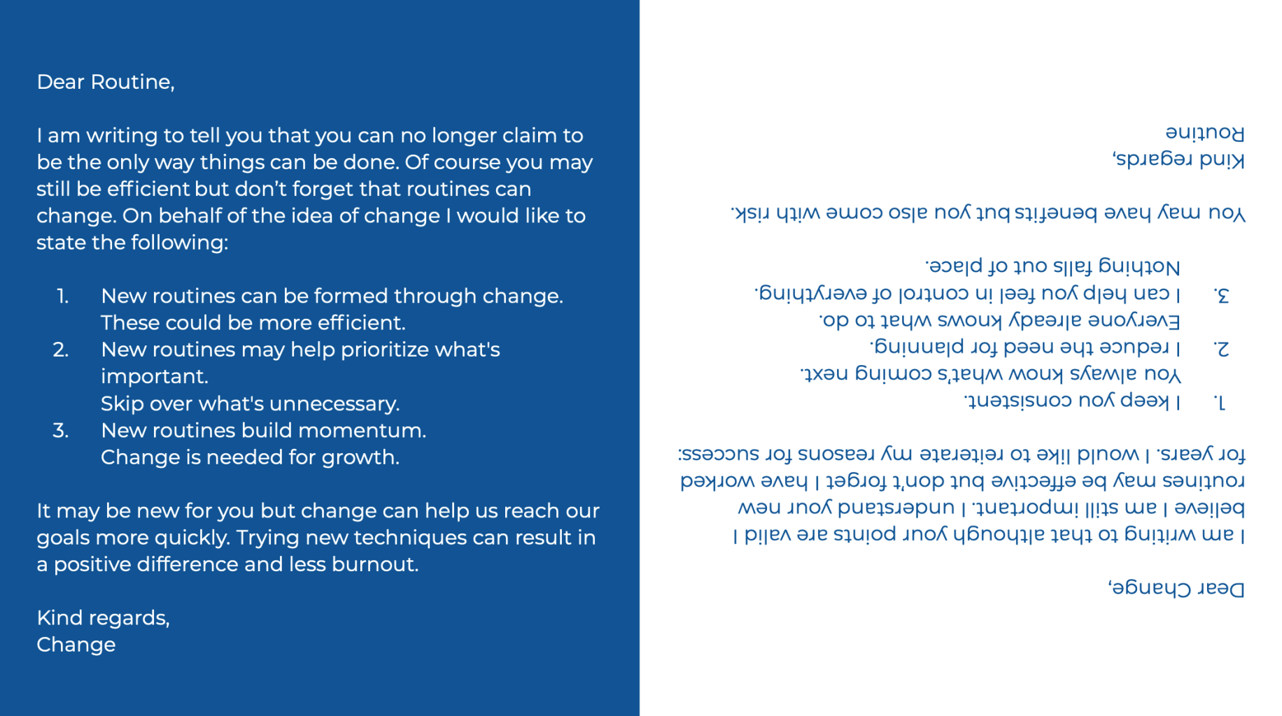
Ian Jervis wrote about change in the same way I believe it should be looked at and understood. Change is good, it gives you a chance for new experiments, to make new things and surprise yourself. The change in working environments pushes us in the right direction to perhaps try a new and interesting way of producing creative ideas.
Olivia Webb talks about establishing a strict routine to follow now that we don’t have as many external timetables. Finding the time that we work best and planning to get things done in that time frame. I liked a tip she gave about leaving something unfinished so you can continue with it the next day allowing you to keep up the same momentum of working. This is something I would normally avoid but she has said it works well for a perfectionist like her so I may give this technique a go.
Overall I know that I need routine in order to get through all of my different commitments each day. I also learnt from last lockdown that I need to have all my tasks written out so I can visually see what I’ve completed and what still needs doing. I think this time around I need to take more time out to let myself refresh and focus more when I am working rather than working and working and feeling like I’m getting no where.
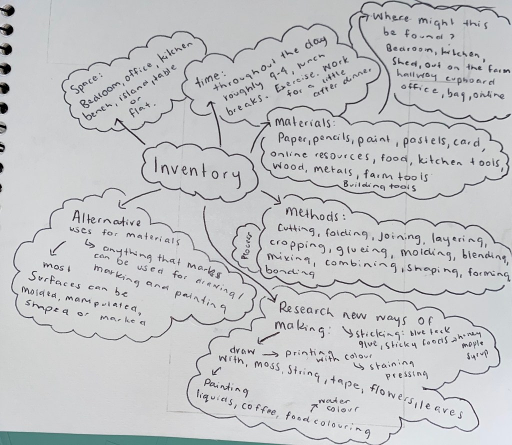
Inventory: Think about what you have available that you can use to make, think, experiment, draw, contrast, note down etc. This is like a toolkit, a making-do for making-doing.
Initial Intervening/Interfering design research:
Project Title: Fluids. A Happening, Allan Kaprow
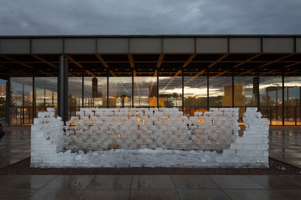
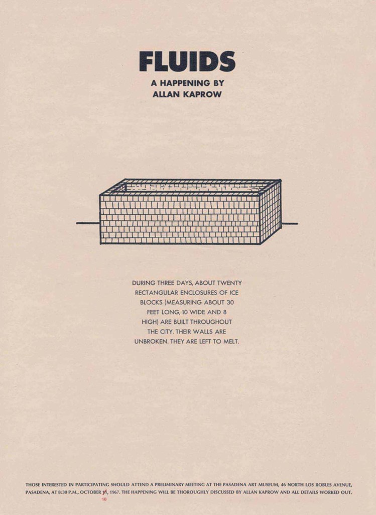
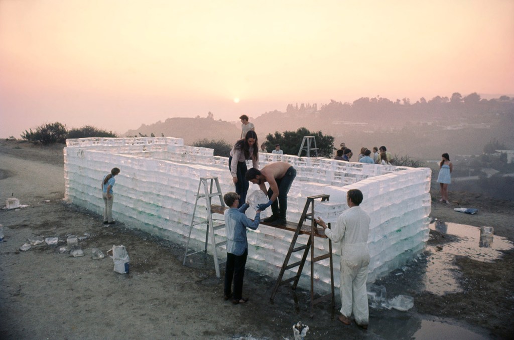
Kaprow built several structures measuring around 9 m long, 3 m wide and 2.4 m high, using ice blocks as his material. Once in place, these ice structures were simply left to melt. In its temporality and materiality, the work represents a challenge to the traditional understanding of art in public space.
I was initially drawn to this artwork as I thought the simplicity and scale of the work was intriguing and the concept of natural change over time is something I’ve always found captivating. After reading further about the project I thought the process behind it being planned, organised and carried out was really interesting. Posters were placed around displaying information about the project as well as a location and time to meet for anyone who wanted to volunteer to help out. This could be an engaging approach to take when thinking about my own intervention proposals, finding out if people would actually volunteer to help create something within my chosen space, whether they contribute to the work or become apart of the project themselves could be another way to explore different approaches to making. I would also like the explore the possibility of working with some type of natural process that could alter the way a work is displayed or understood over time.
This work has been a good starting point for helping me position myself and begin thinking about the type of intervention I could create. It has helped give my current project more direction as I was originally feeling slightly lost with where I wanted to take this brief. Through further research and exploration of ideas displayed on the are.na channel as well as self found resources I know I will be able to come up with a solid 5 intervention proposals that I could realistically carry out.
http://kaprowinberlin.smb.museum/en/
Project Title: Alotted Break(s), Public Share
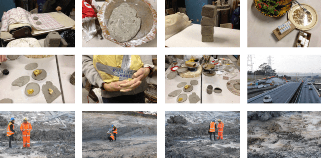
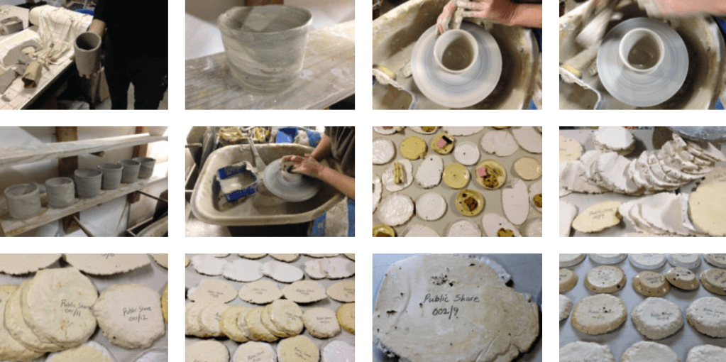
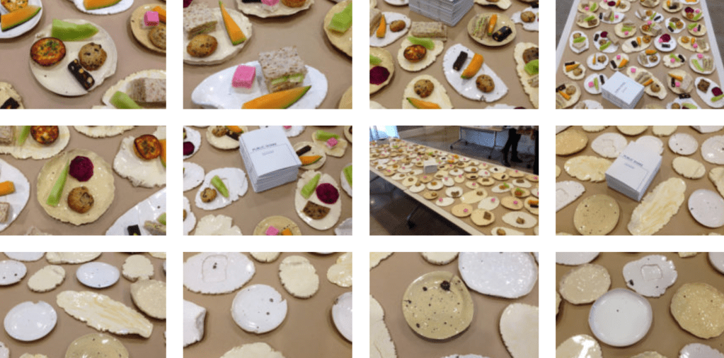
This intervention was held during a tea session at the Engaging Publics/Public Engagement symposium, Auckland Art Gallery, in 2014. Using locally soured clay from Aucklands SH16 Northwestern motorway construction site in Te Atatu, a series of plates and mugs were produced to serve morning tea with and for participants to take away with them. This intervention as been held a number of times in different locations, each time creating the ceramics from the site themselves.
What I like about this project it that it was created through using materials that were sourced from the chosen site. My plan is to continue working with the rowing club as my site so thinking about materials available to me there could help inspire an intervention proposal, perhaps something water based? Something using the ergs? I also thought that the way participants were able to take something away from the experience was interesting. This would mean that although the intervention was only temporary the idea/thought would remain long term through a and/or multiple physical objects.
Project Title – Art is Trash, Francisco de Pajaro
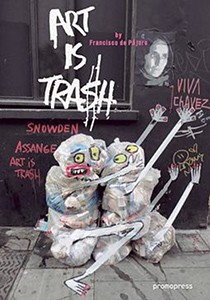
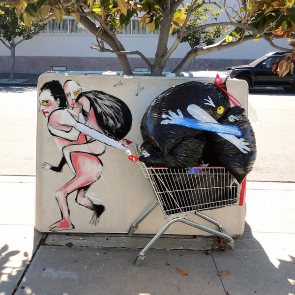
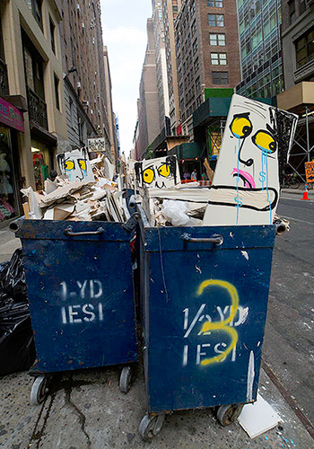
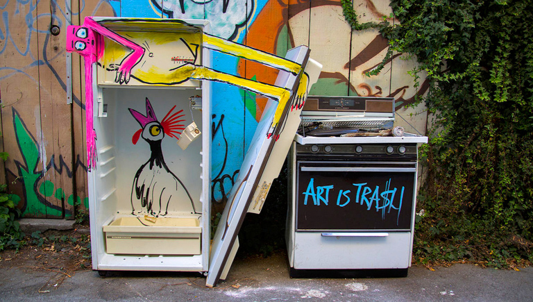
Travelling Spanish street artist Francisco de Pajaro has ventured to cities worldwide rearranging and re-approriating garbage and other discarded objects he finds on the street. His know well known series ‘Art is Trash’ is focused upon playful, yet political temporary trash sculptures that comment on hyper-consumerism and obsession with power. Francisco de Pajaro’s works are almost always discarded, often being swept up by rubbish collectors. Though this is the intended outcome images of the works are spread across social media platforms using the hashtag #artistictrash
I was drawn to this project due to the fact that the temporary interventions of public space made people aware of an ongoing issue that is found all over the world. The bright pops of colour and the appearance of figures/characters draws passerbyers attention to the rubbish they may often look past. Could my intervention convey some type of messag Whether it be serious or just for fun this could a fun concept to explore.
Extra notes:
- The way happenings are visualised highlight the care for design through layout and language.
- Instructions considered as documents in and of themselves. How lists are arranged in relation to images.
Laying out the map: Even within a brief, you should be setting your own ‘parameters’. Most of you did this in the last Part, where your written statement acted like a kind of map for reading the work.
Did something come out of the documentation that might drive these proposals? I found I was drawn to watching how people interacted with one another based on power dynamics/skill hierarchy within the club. This makes me wonder if I could intervene with certain interactions and/or force new interactions to occur. The layout of some of my documents may also drive the layout of my proposals, possibly working with tables/lists to instruct or display information.
Any hunches, intuitions, gravitational pulls? Pulled towards the idea of movement – water, ergs, people, boats
Do you want to extend social activity that occurs, or introduce? Both. Each proposal I do I would like to somehow alter and/or introduce a new type of social activity. Whether that be between certain people or affect the entire club could be an interesting concept to develop.
Parameters (Initial Statement): Mercer Rowing Club, a space where a competitive atmosphere is created, a competition amongst strangers who become friends. A place where participation, effort and respect is valued in exchange for knowledge and improvement of skills. Through observation and participation within the rowing club over part one of this project I found I was drawn to watching how different groups and individuals interacted with one another based on power dynamics/skill hierarchy within the club. This makes we wonder if I could intervene with certain interactions and/or force new interactions to occur between groups that wouldn’t normally engage with one another. These new interactions could be introduced through social activities that wouldn’t often take place at a rowing club or through the opportunity for multiple groups to work together to complete some kind of task or goal. Whether I choose to focus on certain groups of people or the entire club could also be an interesting concept to develop. Another aspect I paid a lot of attention to throughout my documentation process was the types of movements around the club. I analysed the way people moved throughout the space as well as how boats maneuvered around the river. I noticed that most movements seen created a type of routine and procedure that was repeated each visit. Tasks were completed in a certain order and always done quickly and efficiently through repeated practice. I think it could be interesting to somehow disrupt or change these routines to then see the flow-on effect it may have on the rest of the training schedule. Would things be missed? Could a new routine be created that is followed next time around?
Design Proposal Research:
Project Title: Over the River, Christo and Jeanne-Claude
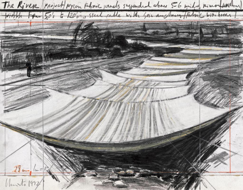
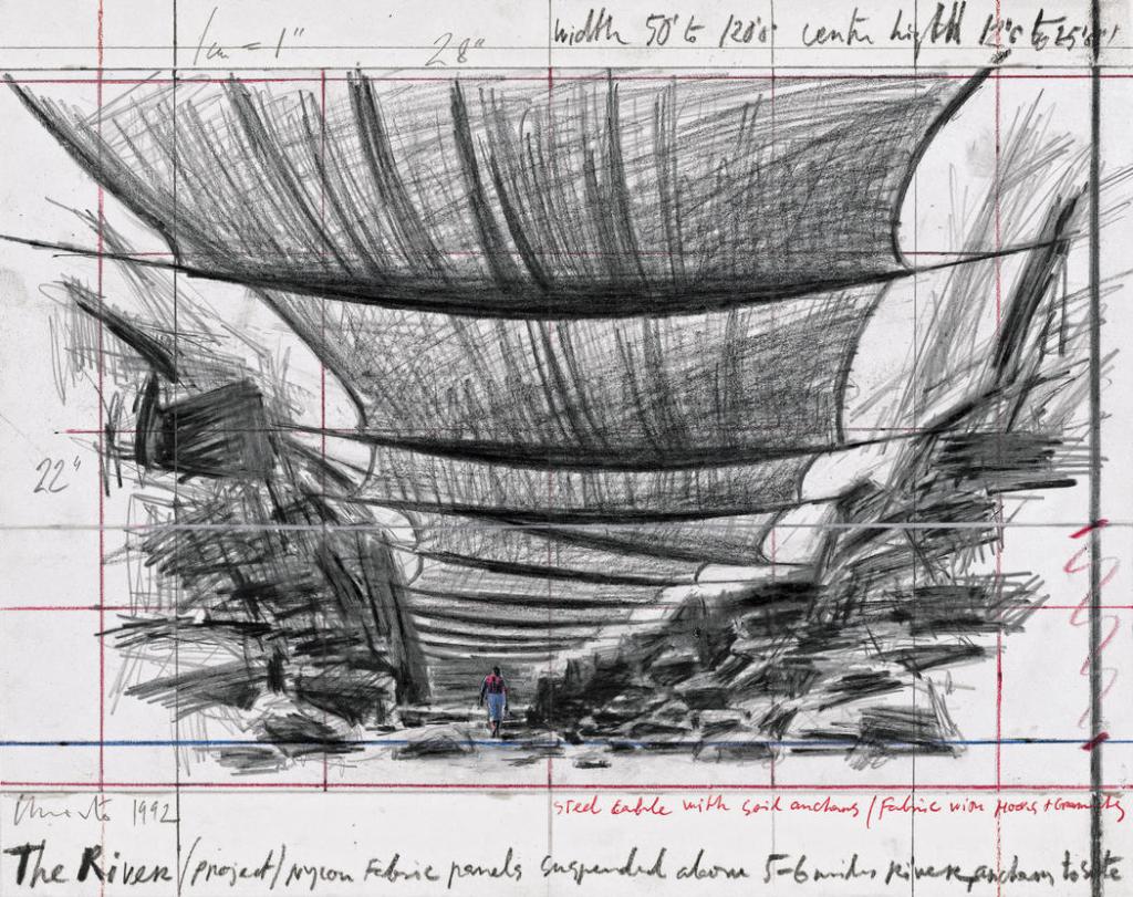
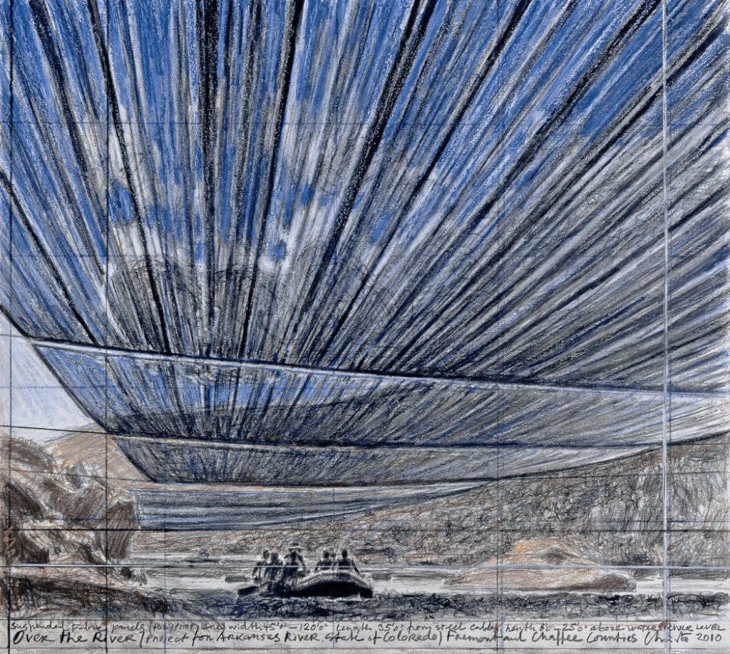
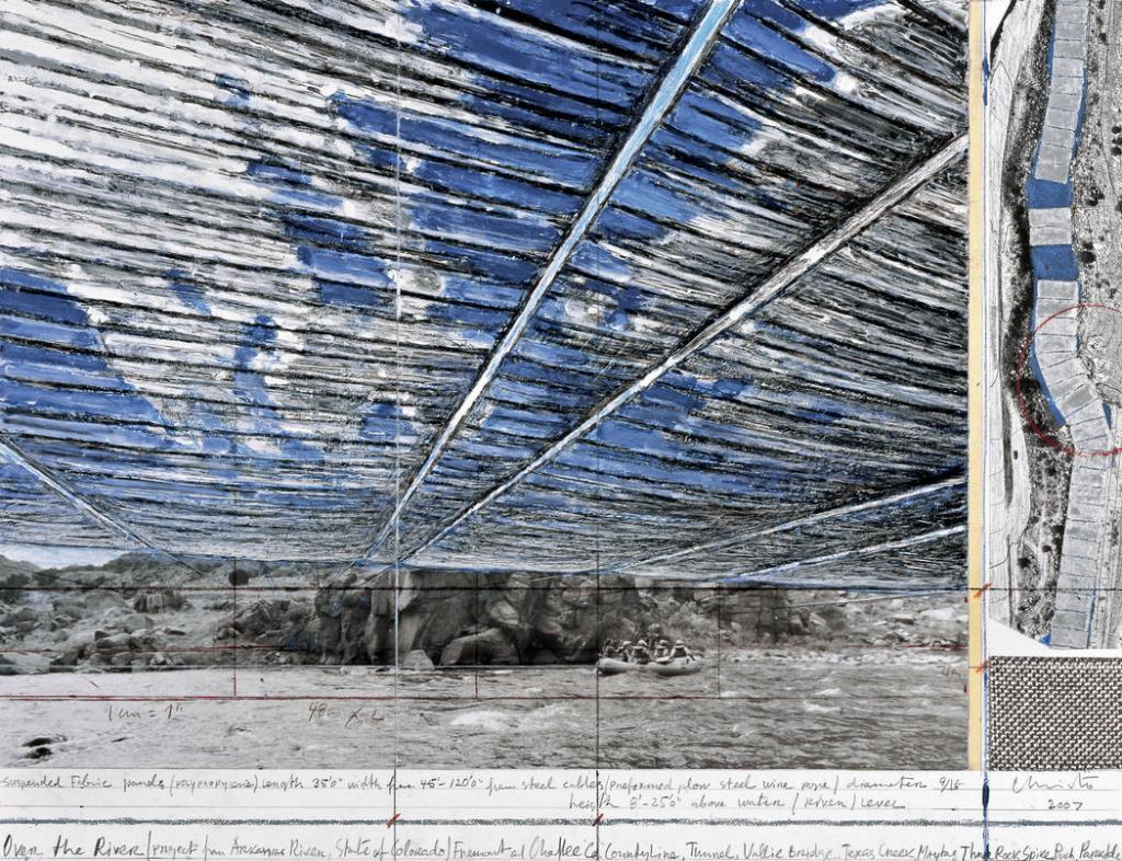
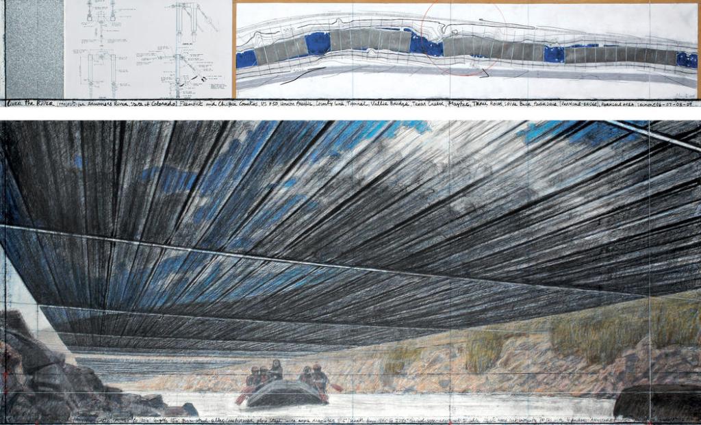
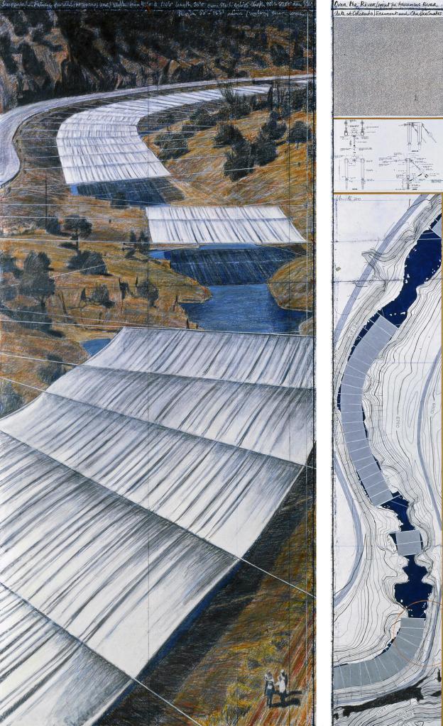
Christo and Jeanne-Claude’s vision for Over The River was conceived in 1992 and included 5.9 miles (9.5 kilometers) of silvery, luminous fabric panels to be suspended clear of and high above the water in eight distinct areas along a 42-mile (67.6 kilometer) stretch of the Arkansas River between Cañon City and Salida in south-central Colorado.
This project/proposal sparked my interest as my chosen social space also gives me the opportunity to use the river as an aspect of my intervention. The first thing I noticed about this proposal was each piece presented spoke using a consistent design language. This was developed and successful through the use of a colour scheme that runs throughout as well as a loose and fluid drawing style being used when sketching. This not only gives the future of the design openness and flexibility but is also well suited to the chosen site with water also giving off a sense of fluidity.
I think that the range of drawing mediums also gives the project more depth and works to create a range of textures when sketching. This results in a sense of materiality being felt amongst each of the drawings. For my proposals I would also like to work with mostly handmade documents to express my ideas. Using multiple drawing techniques and medias will allow me to create/add layers to my sketches bringing them to life. The quickly jotted down notes and annotations also work to bring the proposal together, adding context to the individual pieces, helping the project be understood.
https://christojeanneclaude.net/projects/over-the-river
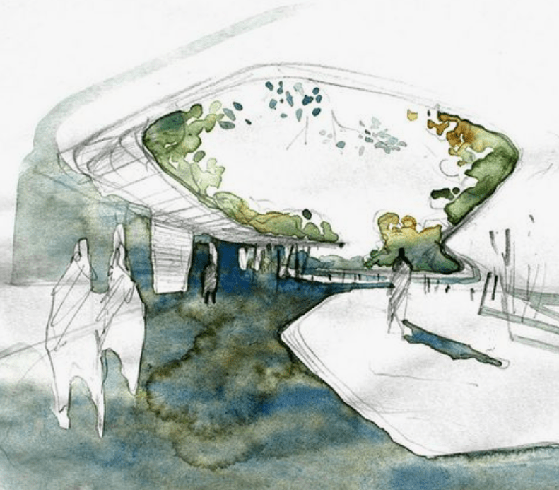
Project Title: Lighter Than Air, Rachely Rotem Studio
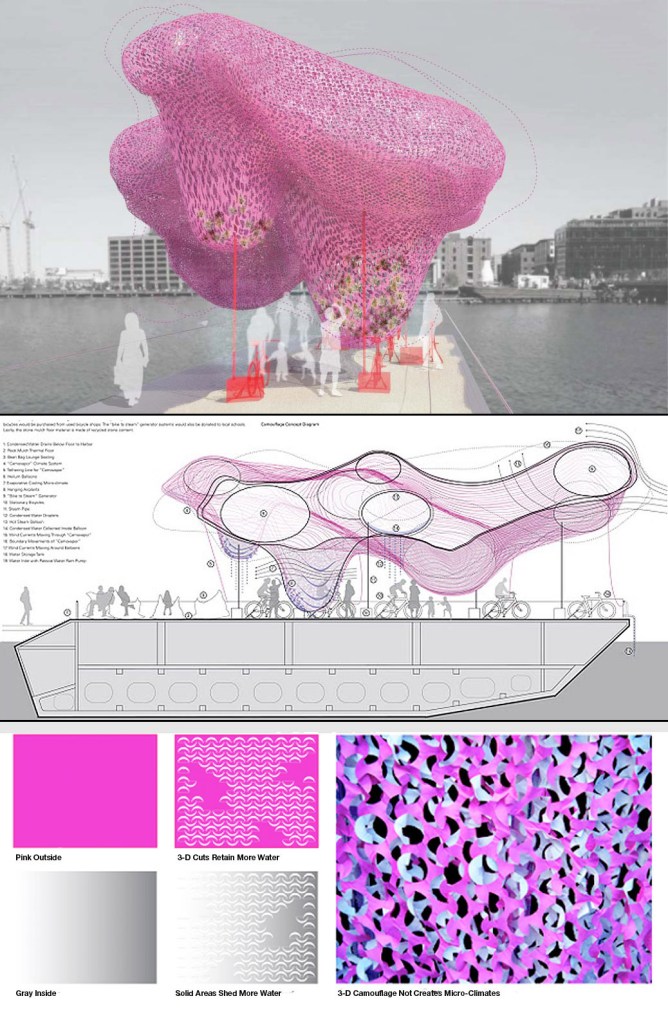
The proposal above was the wining entry for the SHIFTboston’s Barge 2011. The goal of the competition was to create an interactive architectural environment for the public to experience. Lighter Than Air invited visitors to use the outdoor gym, with bicycles that generate “pedal power” that transforms liquid water into vapour mist. As the water vapour condenses on the cool surfaces of the camouflage nets, the three-dimensional surface of the camouflage net will temporarily retain the resulting liquid. This liquid will mingle with the harbor breeze to create cool microclimate zones that invite the public to interact with weather as an ephemeral form of architectural space.
The layout and design of this proposal is strictly digitally created and displays clear information of the procedures that take place. I like how the process are clearly displayed both diagrammatically as well as in perspective view. Like the previous proposal example, this proposal also sticks to a colour scheme as well a particular format, this one looking more serious and precise than the last. This to me reads as a finished project, where all aspects have been finalised (which they would have been considering it was for a competition). Overall I consider this proposal to be successful both in its visuals but also in the way the design is well described and able to be understood through direct instructions and annotations. The use of both section/plan and perspective views also contributes well to the overall concept and context of the site while also showing the scale effectively.
An aspect of this proposal I would like to incorporate into one or more of my five is the clear display of materiality and how factors such as light, shadow, wind and touch may affect the work.
https://moduarchitecture.com/Lighter-than-Air-Boston-SHIFTboston
Project Title: Free Leaves, Layne Waerea
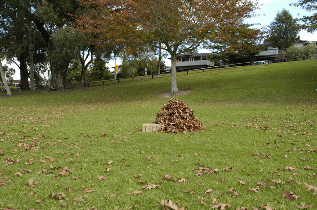
‘Free Leaves’ by Layne Waerea is a simple yet very smart intervention that works with materials from the chosen environment. Fallen leaves have been raked into a pile with a small sign saying ‘FREE’. This intervention creates a subtle change in the way leaves are normally viewed in a park setting. This sparks conversation and potentially interactions between strangers.
I think that this simple and straightforward intervention is similar to the type of approach I would like to take with my 5 proposals for part two. I would like to work with materials and subject matter found at the rowing club to make subtle changes that could have a greater affect on the actions and activities that occur.
https://laynewaerea.wordpress.com/2012/08/01/free-leaves-2/
Imagery that displays techniques I would like to use for my proposals:
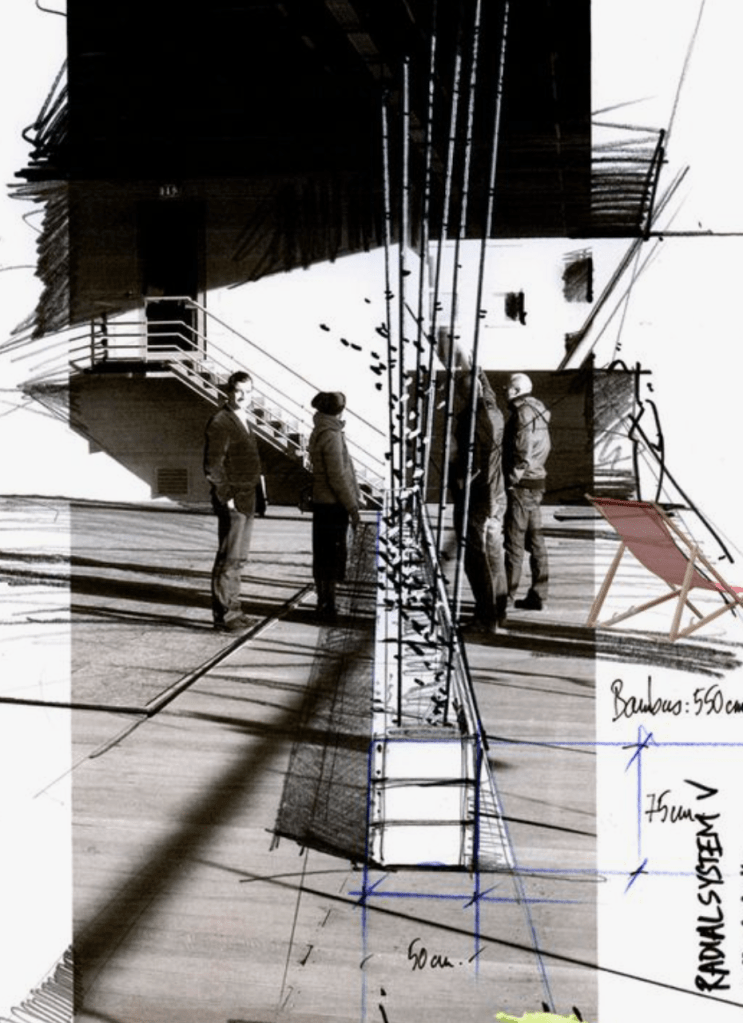
At this stage in my design process I would like to focus on mainly hand drawn elements with a possibility of layering drawings that relate to each other to produce easily read proposals.
Week Six: Proposal Development
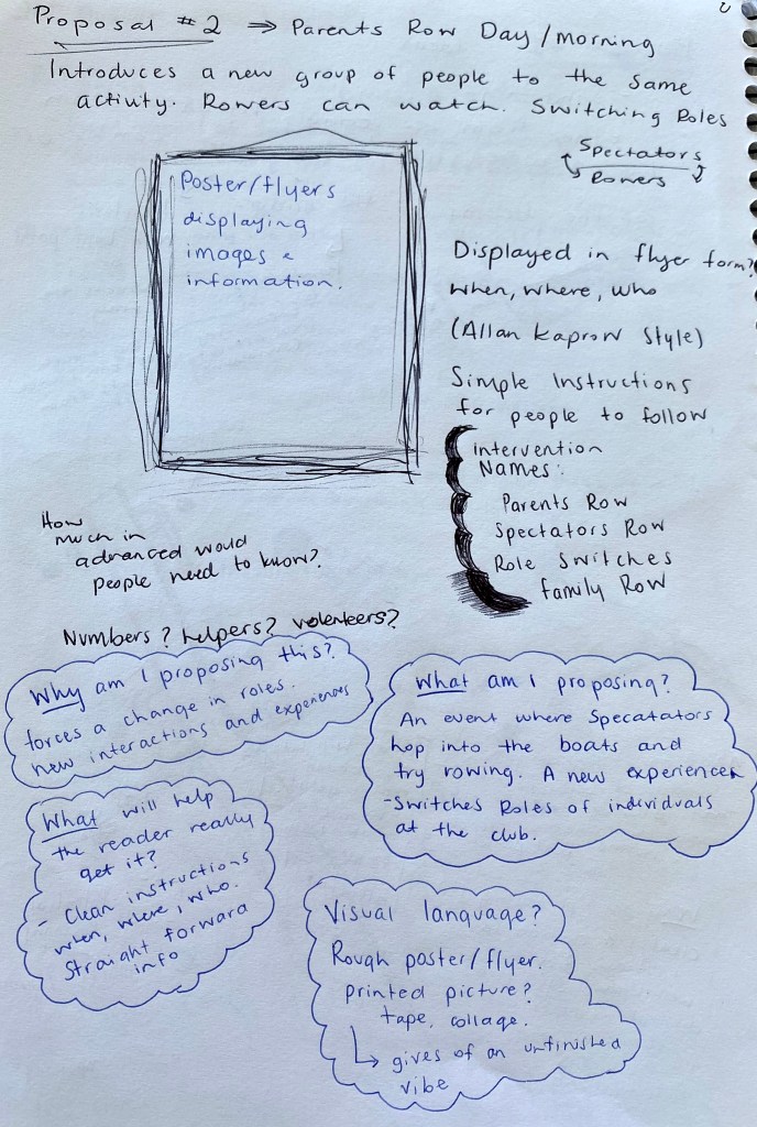
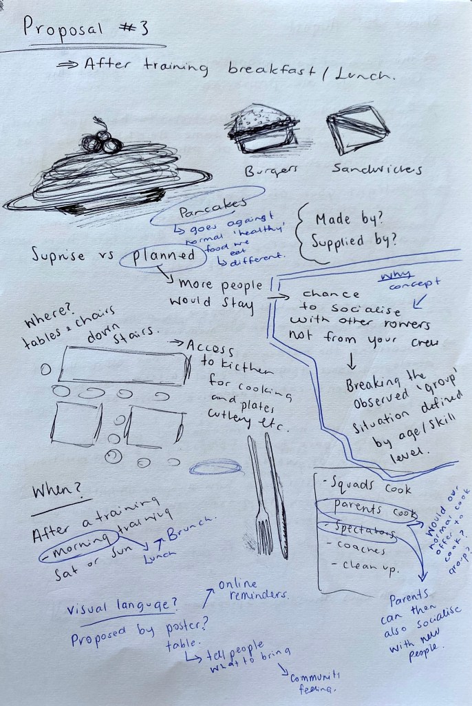
Captured above are my ideas for my proposals. Each idea explores a concept/keyword that I was drawn to throughout my documentation process. These ideas mainly work to further social interactions between different groups of people within the club as well as altering movement patterns of both people and boats. The way in which each proposal is presented will be suited to the type of atmosphere the intervention will create. Using Lucys ‘proposals’ document really helped when it came to identifying the key ideas for each proposal. I went through with the blue pen to add aspects that I felt need to be addressed in each proposal in order for my ideas to be communicated effectively. *some of the ideas above have not been used for my part two submission*
Feedback/thoughts after 1:1 – After talking through my initial proposal ideas with Lucy it has become clear that working with some of my simpler ideas will be more suited to part two of this brief. Focusing on movement patterns and routines will be the driving theme behind most of my 5 proposals. Analysing the movement within the club and how minor changes could affect this will be important when it comes to presenting my ideas.
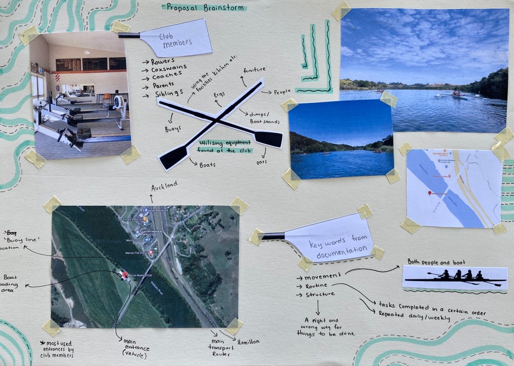
I decided to create a quick brainstorm/mind map that helped me come up with proposal ideas that were more suited to my observations from my documentation. I also focused on thinking about the types of materials I could use and specific locations I could target. From this I was able to come up with my final 5 proposals. Each of the 5 have a focus on disrupting the structure and routines of the club through blocking or redirecting movement. Changing what is familiar.
Final Proposal Ideas –
- Buoy Line
- Changing entry/exit points
- Rearranging furniture
- Turning the ergs to face one another
- Setting out the boat stands differently/incorrectly
Week 7: Intervention Proposals
Statement:
Mercer Rowing Club, a space where a competitive atmosphere is created, competition amongst strangers who become friends. A place where participation, effort and respect is valued in exchange for knowledge and improvement of skills. Where individuals assemble together for a common purpose, striving for the same goals. The welcoming team environment creates a second home for all those who join, ensuring success through both the sport itself and the ability to have fun together.
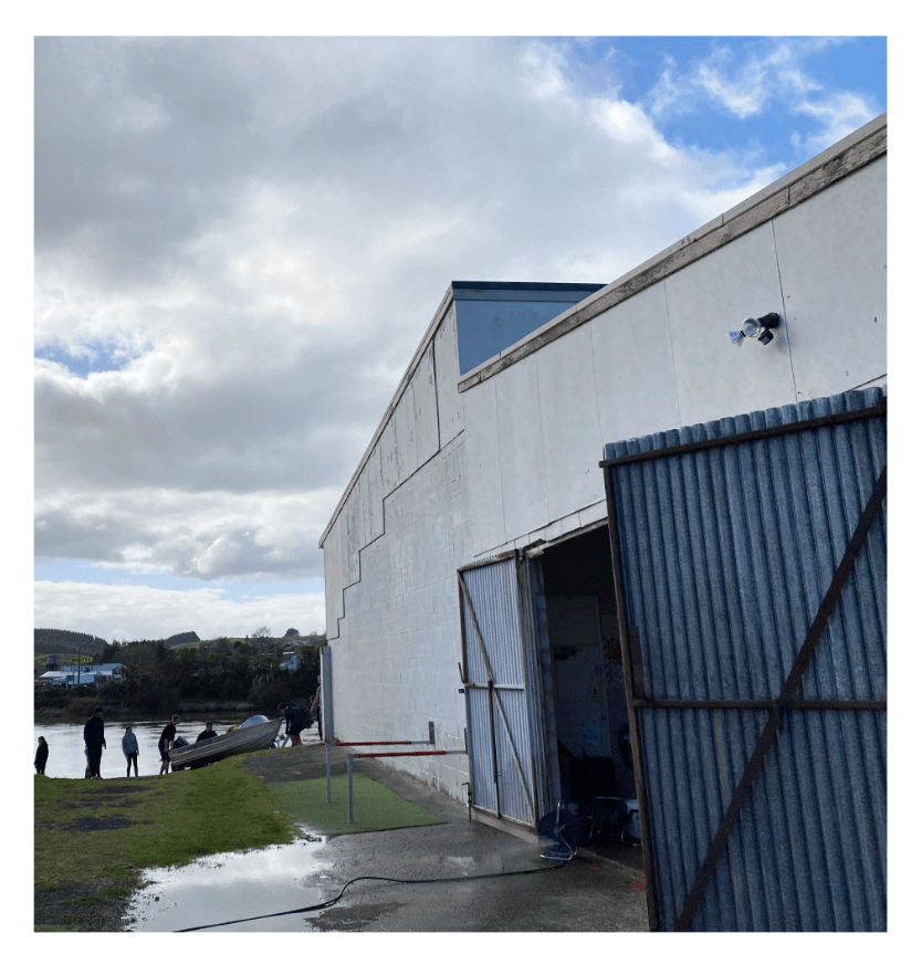
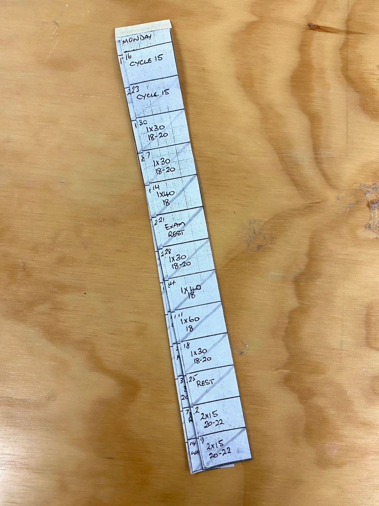
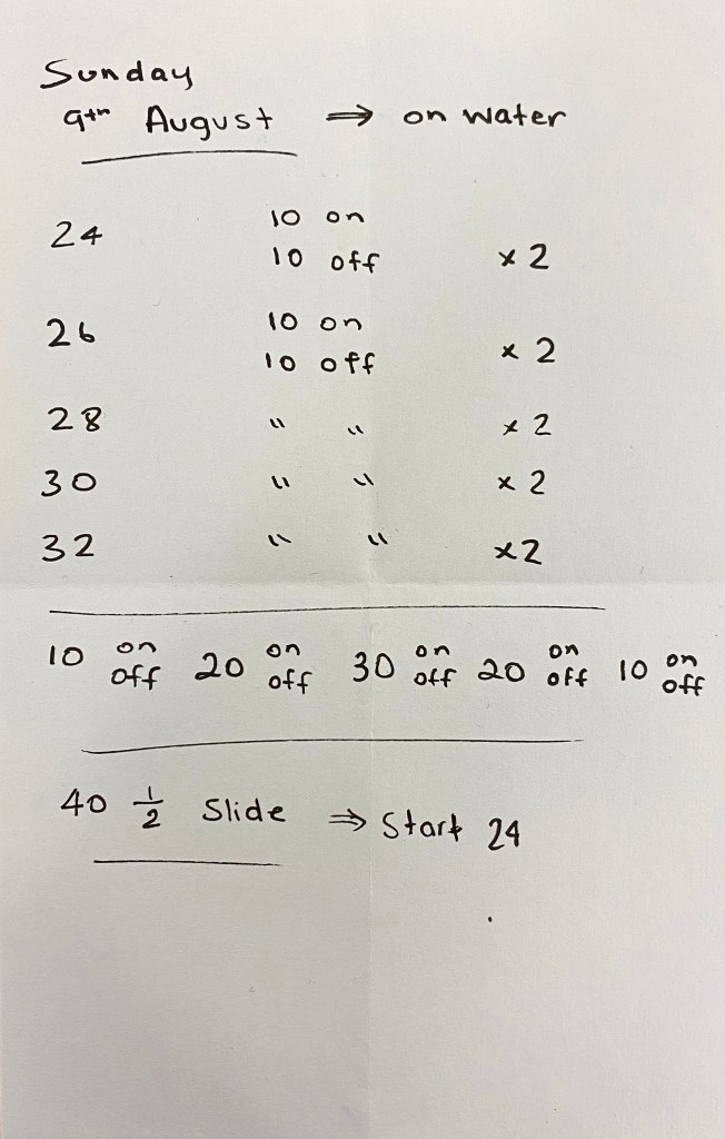
Through both observation and participation within the rowing club over part one of this project I have become intrigued by the types of movements and routines I have seen repeated each visit. I analysed the way people moved throughout the space as well as how boats maneuvered in and out of the shed and onto the river. I noticed that each of these movements and activities followed a strict procedure as everything must be done correctly. All tasks were completed in a certain order and always done quickly and efficiently through repeated practice.
For part two of this brief I have begun to question whether I could disrupt, alter, block or control the types of the movements and routines seen through subtle changes to well known spaces and equipment. I think that it would be interesting to see how a small intervention could change the everyday routines embedded within the rowers to then see the flow-on effect it may have on the rest of the training schedule. Through learning and repetition of practice and skills, rowers become disciplined, always completing tasks correctly and to a high standard. Will the interventions upset what is known and cause details to be missed? Could new routines be created? My five proposals challenge these rules and force new systems to be formed. I am interested to see whether new procedures will be followed by all or if people will resort back to what is familiar and known to be the correct way of doing things.
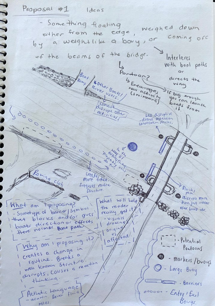
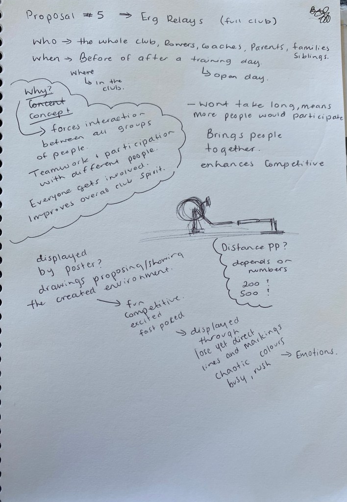
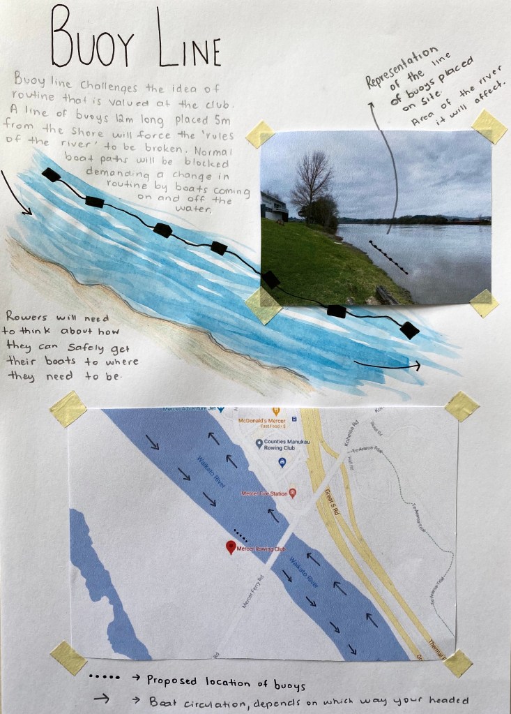
Proposal 1 – Buoy Line
‘Buoy Line’ intervention challenges the idea of routine that is valued at the rowing club. It involves a 12m long buoy line placed 5m from the shoreline that is used to launch boats. The placement of the buoy line is crucial in the effect it will have on those who use the river. There are unspoken rules of the way the river is to be manoeuvred – whether you are supposed to be on the left or right side, which direction your boat should be placed in the water, where you should turn around. This intervention challenges these rules and forces them to be broken as normal boat paths are blocked. This breaks the structure of training and demands a change in routine, causing both groups and individuals to think of ways to work around this obstacle.
I would use the clubs resources they have available to create the line of buoys in the dimensions I need. Setting the buoys up would require other equipment such as a small boat along with someone to help me place them correctly.
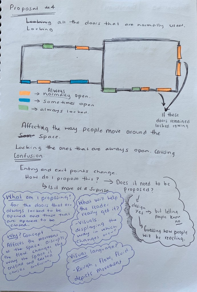
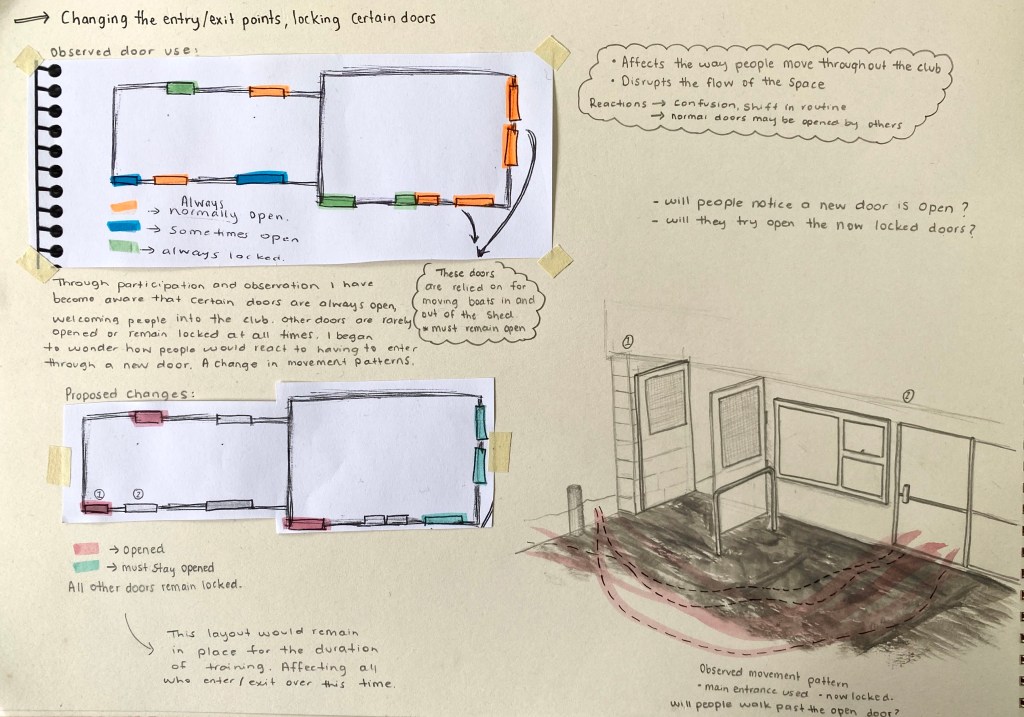
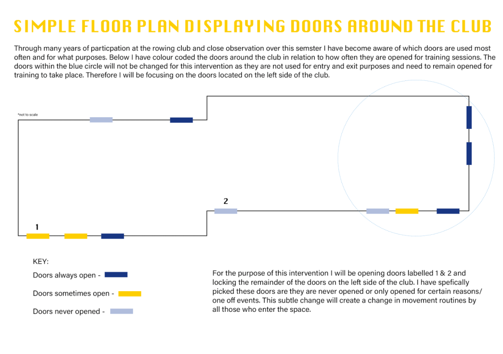
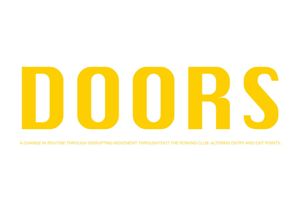
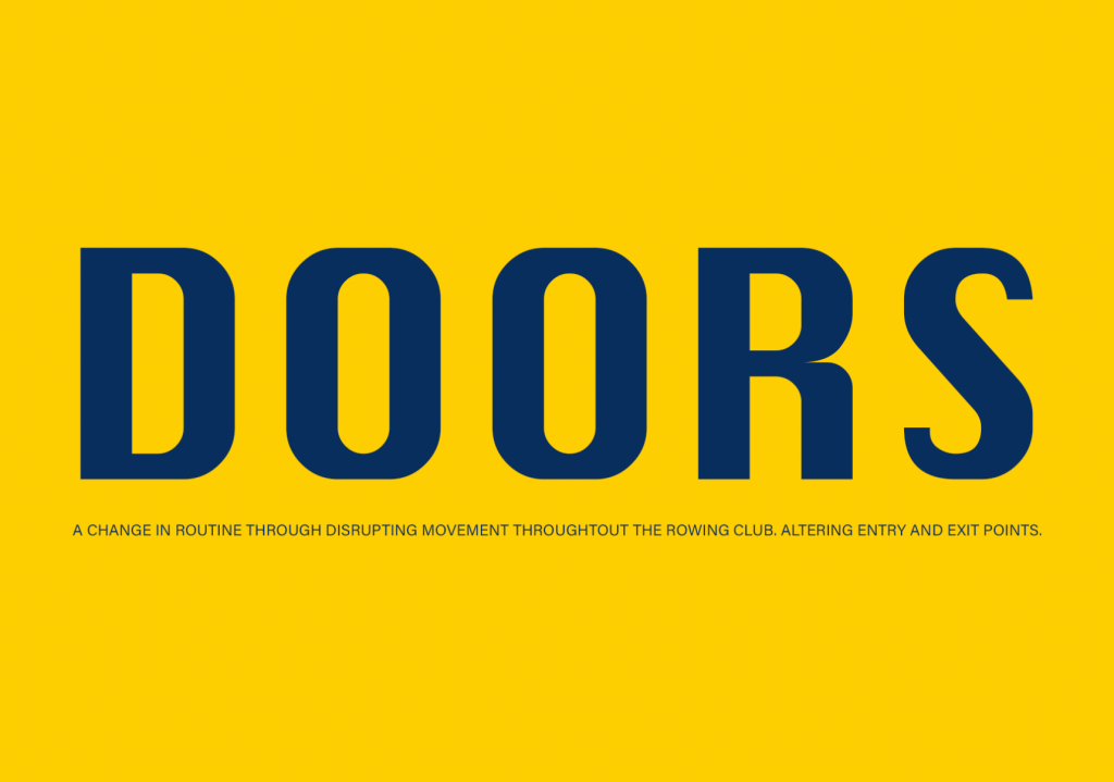
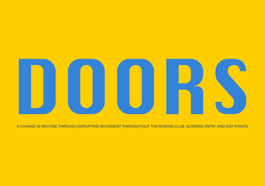
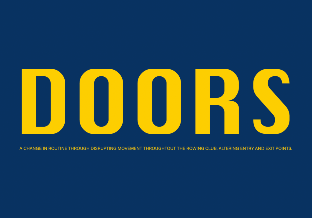
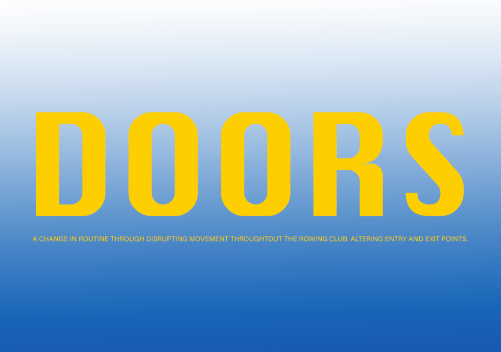
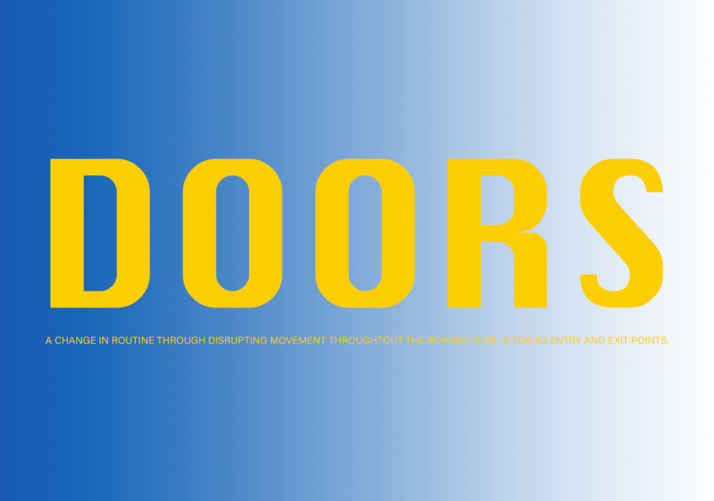
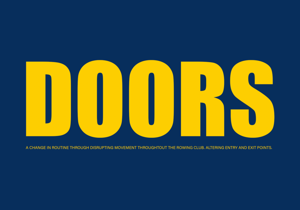
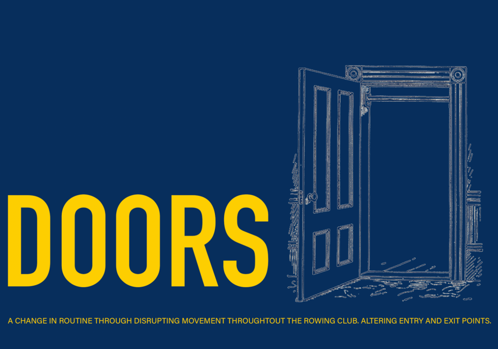
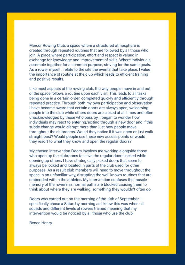
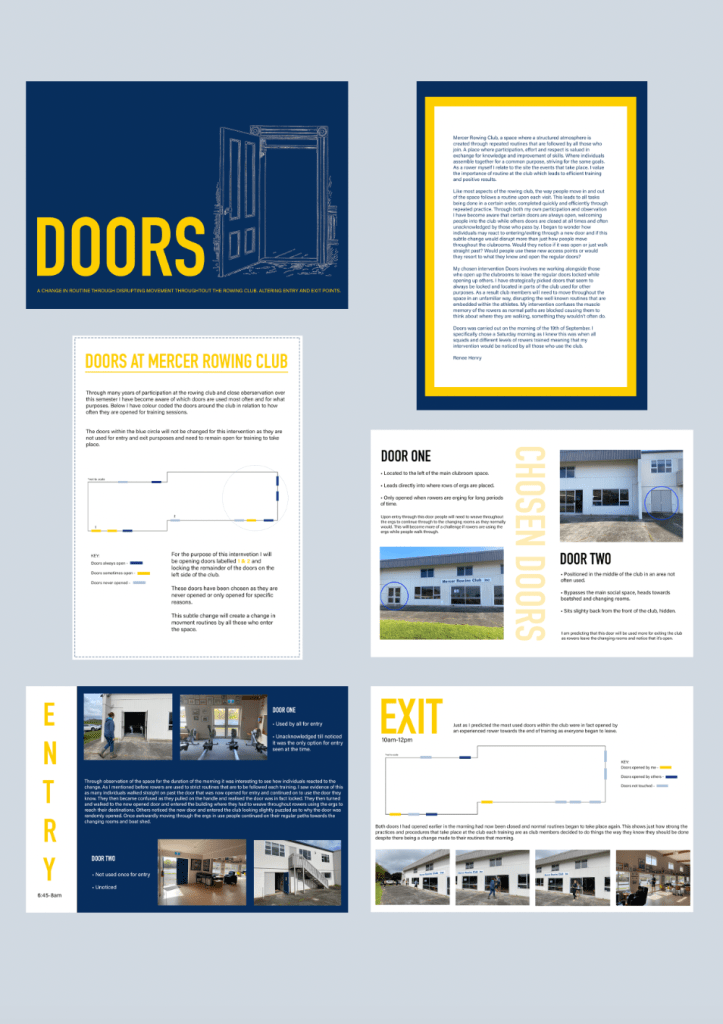
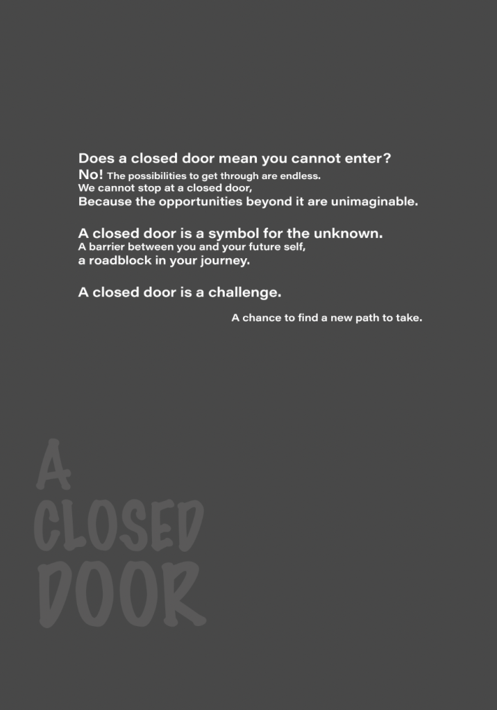
Proposal 2 – Changing entry and exit points, locking certain doors
A change in normal entry and exit points of the club will affect the way people move throughout the space. Through both participation and observation I have become aware that certain doors are always open, welcoming people into the club. Other doors remain closed at all times, often unacknowledged by those who pass by. I began to wonder how individuals may react to entering through a new door. Would they notice if it was open or just walk straight past? Will this cause confusion and a shift in routine? If certain doors remained locked will activities that need to take place be able to happen? Would people use these new access points or would they resort to what they know and open the now locked doors? As a result the movement patterns I documented in part one will change to a new flow throughout the club.
This intervention would require me to work alongside the coaches that open the club rooms for each training, ensuring that I am there before other club members begin to arrive.
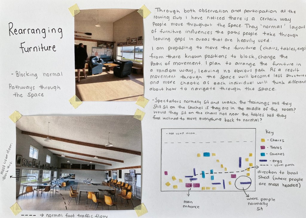
Proposal 3 – Rearranging Furniture
Movement around the club was one of the driving concepts I focused on throughout my documentation process. I noticed that each week movements were repeated by many people who socialise within my chosen site. Rearranging the furniture within the club rooms to block certain paths will cause a change in the routine like motions that are seen each training. The current layout of furniture influences movement throughout the space, leaving gaps in areas that are known to be heavily used. Could a specific layout of furniture create a new pattern of movement that groups follow? Perhaps I could arrange it in a way that creates a pathway? Do I want to control the movement or do I want it to become more random and chaotic? A more random/chaotic movement pattern would be a more effective way to break routine, I could achieve this through spreading furniture throughout the space in a way that reveals no clear pathway. This would cause each individual to think on their own about how they are to navigate throughout the space, creating no obvious structures or routines.
Rearranging furniture will also affect the spectators who use the space while observing trainings. Will they feel awkward sitting on the couches if they were to be placed in the centre of the room? Would they leave it the way it is or feel inclined to move the tables and chairs to where they have always been?
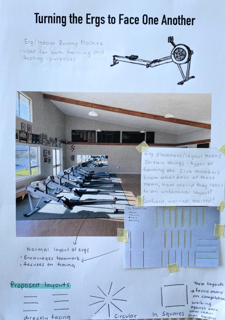
Proposal 4 – Turing the ergs to face one another
During my documentation process I noted how specific erg placements meant certain things, whether it simply be a technical training session or more of a recovery or testing session. Club members are aware of the different layouts and know what each means. I would like to challenge these well known layouts by strategically placing each of the ergs so that they directly face another. This would mean rowers would be looking at one another while erging – moving backwards and forwards, towards and away from each other. This could change the way people approach the ergs themselves. Would people avoid hopping onto an erg that is opposite someone? Would they be worried, confused or excited about what the training session could be? I think this could potentially change the teamwork feeling that is often worked on when erging. Erging next to someone focuses on timing and rhythm, by moving it to face someone it creates more of a competitive feeling, like you’re working against them.
In order for this to work I would need to go to the club before others arrived to set up the ergs. This intervention could work well as it utilises the clubs resources and is a change that would be noticed by all those who enter.
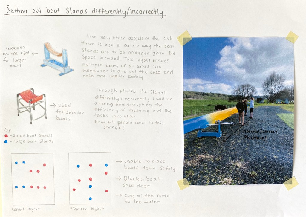
Proposal 5 – Setting out boat stands differently/incorrectly
Boat movement in and out of the shed was also an activity that I analysed throughout my documentation. Like many other aspects of the club there is also a certain way the boat stands are to be arranged around the provided area. The specific layout ensures multiple boats can maneuver in and out of the shed as well as onto the water safely. Through placing the stands differently I will be altering the movement paths that both people and boats will be able to take. This itself will affect the efficiency of training and all the tasks involved. Incorrect placement means individuals will need to take extra time when setting up to change things, resulting in a change of routine and an intervention that fulfills its intentions.
If I were to place the boat stands out incorrectly would people follow suit and put the boats onto the stands or would they just be moved by those who want to use them? Would rowers be frustrated when they see how wrong everything is?
Mid Semester Break
Through analysis of my ideas and discussion during feedback sessions the intervention I will be carrying out is proposal two – Changing entry and exit points. I decided upon this intervention as I felt that this small change would fulfill my goal of disrupting routine without creating a problem/nuisance for the rowers who were there to train. This intervention is also a good choice as it will affect a range of people from rowers to club members and spectators.
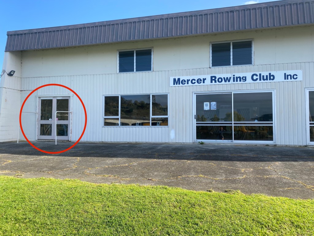
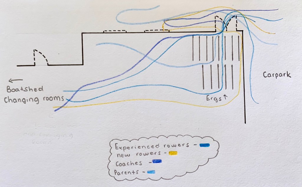
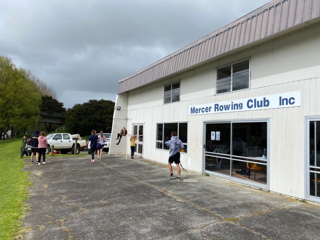
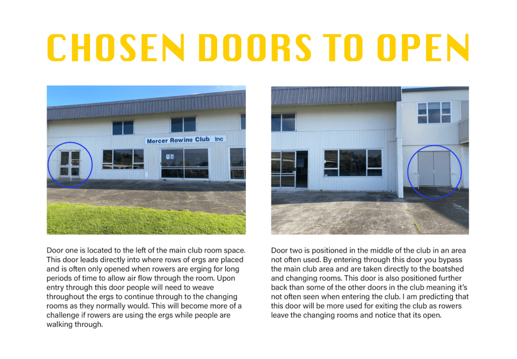
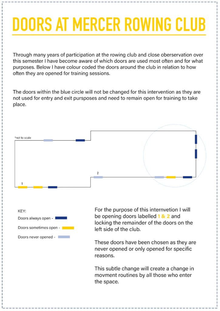
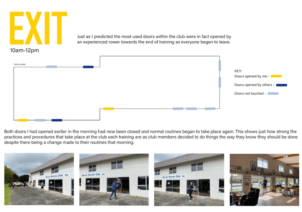
Planning when/how I will carry out the intervention – I am planning on intervening within the rowing club the morning of the 19th of September. This will be a Saturday morning meaning that all squads and different levels of rowers will be training, resulting in a range of people being affected by the change. In order for my intervention to work I will need to arrive at the club before everyone else and work alongside the coaches that regularly open the club. This will meaning arriving at roughly 6:30am to ensure the correct doors are opened while others remained locked. I am going to leave the doors like this for the duration of the training (from around 6:30am-12pm) to see how individuals react to entering and exiting through unfamiliar doors as well as seeing if the normal doors will be opened by someone else within the club. Below are images of the doors I will be working with for this intervention.
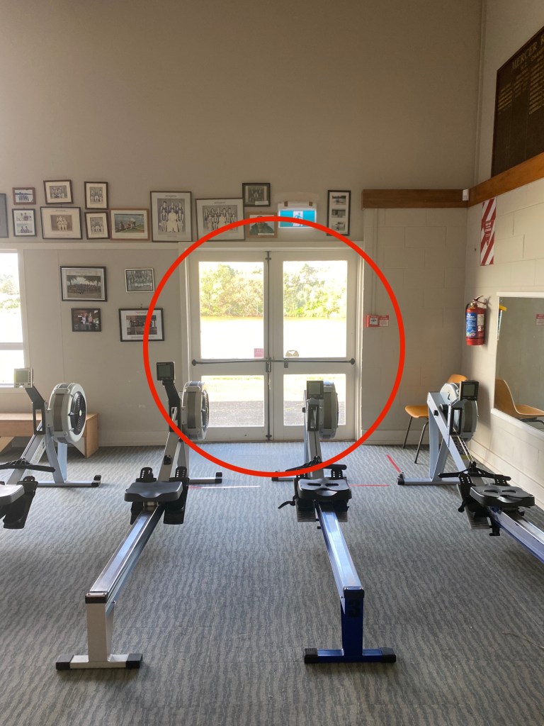
1 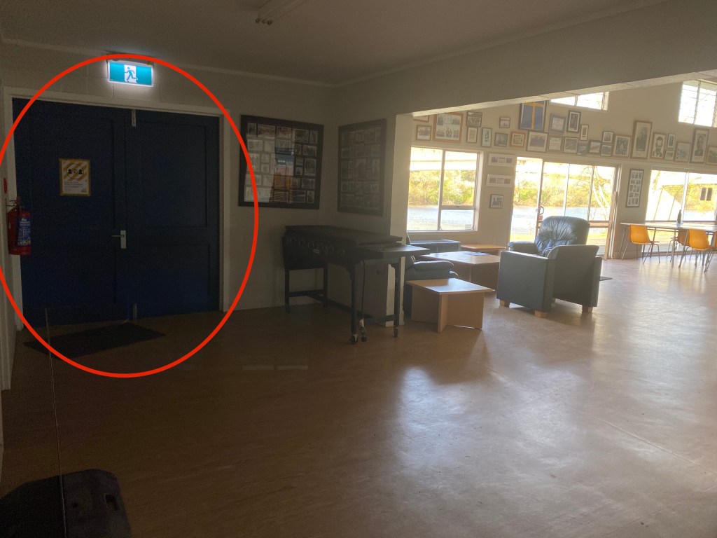
2
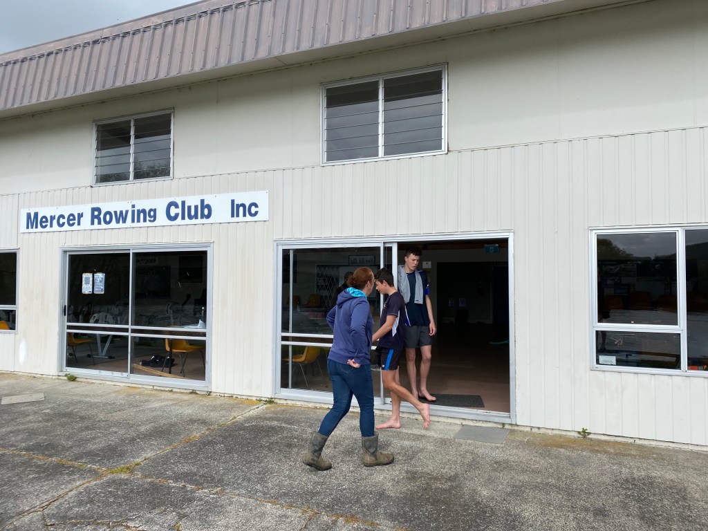
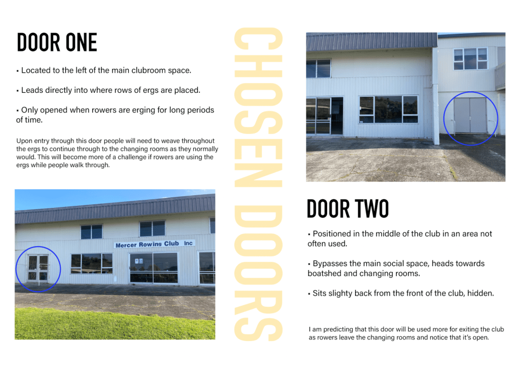
The two doors I will be opening are circled in each of the images above and below. Door one is located to the left of the main club room space. The door leads directly into where rows of ergs are placed and is often only opened when rowers are erging for long periods of time to allow air flow through the room. Upon entry through this door people will need to weave throughout the ergs to continue through to the changing rooms as they normally would. This will become more of a challenge if rowers are using the ergs while people are walking through. Door two is located to the right of the club in an area not often used. By entering through this door you bypass the main club area and are taken directly to the boatshed and clubrooms. This door is also positioned further back than some of the other doors in the club meaning it’s not often seen when entering the club. I am predicting that this door will be more used for exiting the club as rowers leave the changing rooms and notice that its open.
1 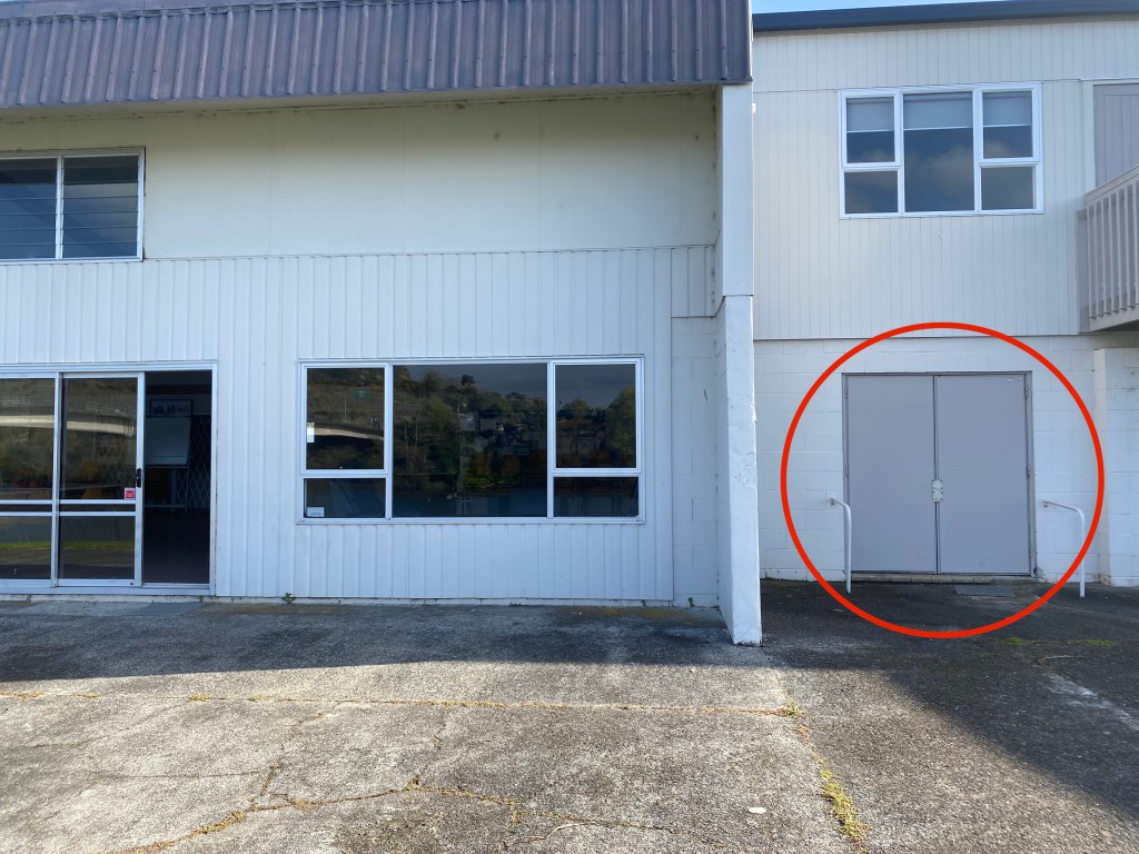
2
Planning my documentation – I jotted down the main points from the documentation page and noted whether I would display the criteria through either written or visual elements. This is just my initial ideas and these may develop as I create my design artefact.
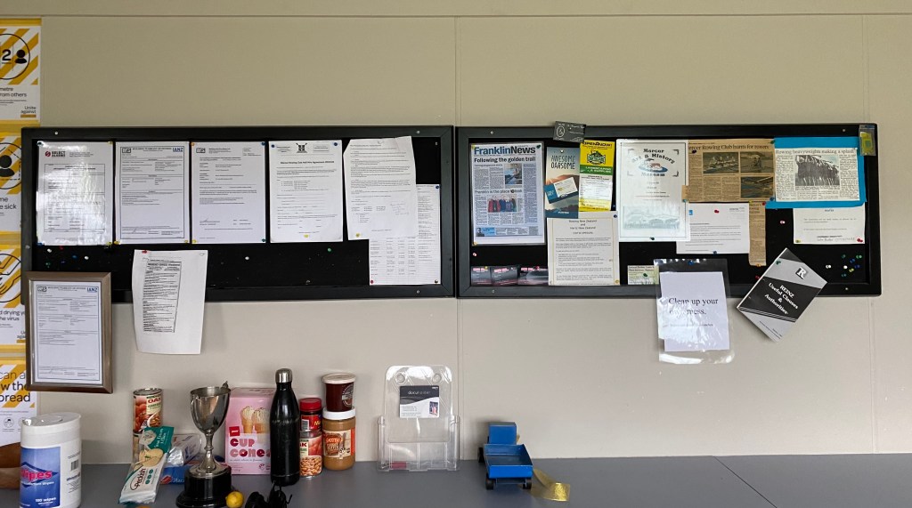
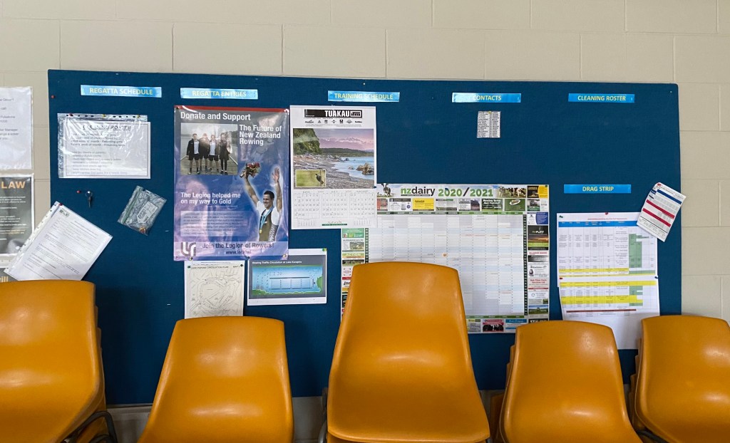
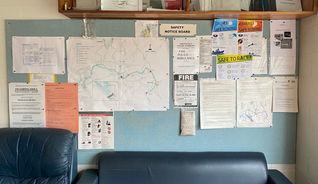
To document my intervention I am planning on creating a booklet/newsletter style design artefact that includes/mimics language and styles from the site to place it within the specific context of my chosen social space. I have gathered together some imagery, emails, pamphlets, newsletters and informative posts to analyse the use of layout, colour, structure and overall designs that I could work with for my own documentation.
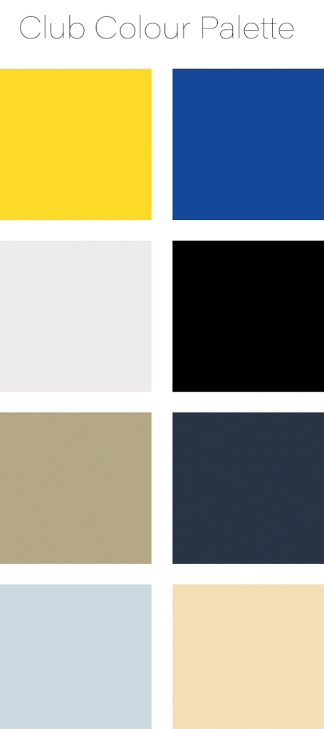
As seen above the use of club colours (blue/yellow) is strong throughout many different types documents. I plan to also use these colours within my own documentation to create a cohesive project as well as having a direct link to the context of the site. Facebook posts and emails that communicate important information are often short and straight to the point leaving no room for confusion. This will be an effective technique to use when it comes to creating annotated images, drawings and diagrams for my documentation. When displaying formal information tables are often used as an effective way to communicate a range of details all at once. Imagery used is often photographs from past trainings and regattas showing rowers in action. Gifs are also often used on facebook posts creating a less serious feeling.
Carrying out my intervention:
On Saturday the 19th of September I headed to the rowing club at 6:30am to meet with the coaches who were scheduled to open the club that morning. Talking to them about my project and what need to be done was easy and they were happy to help me with setting up the space the way I wanted.
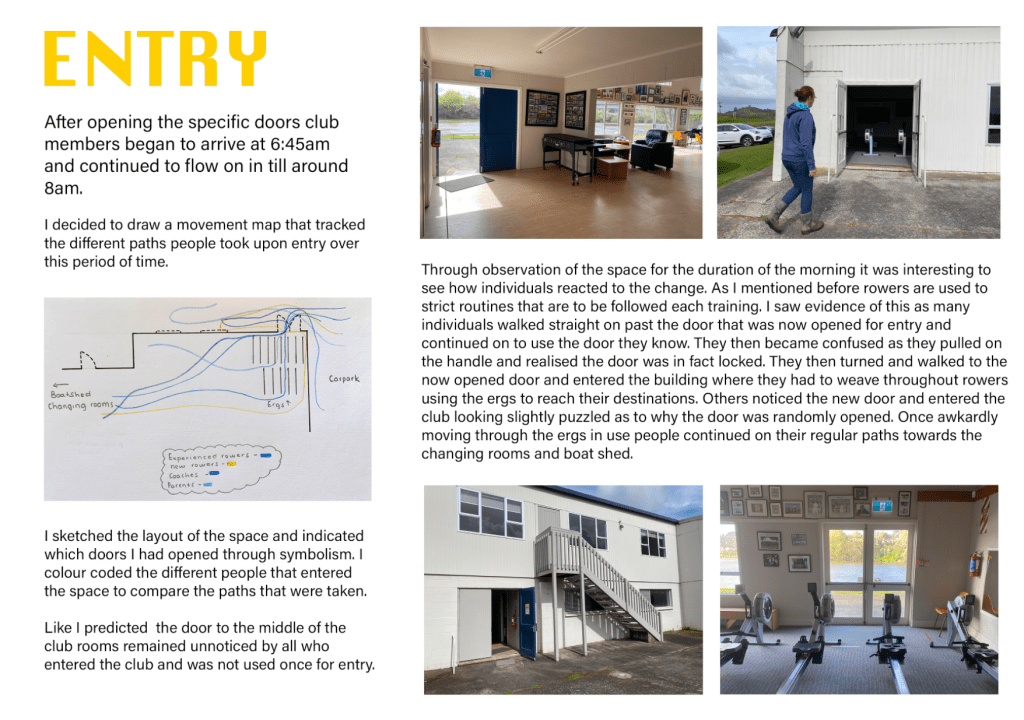
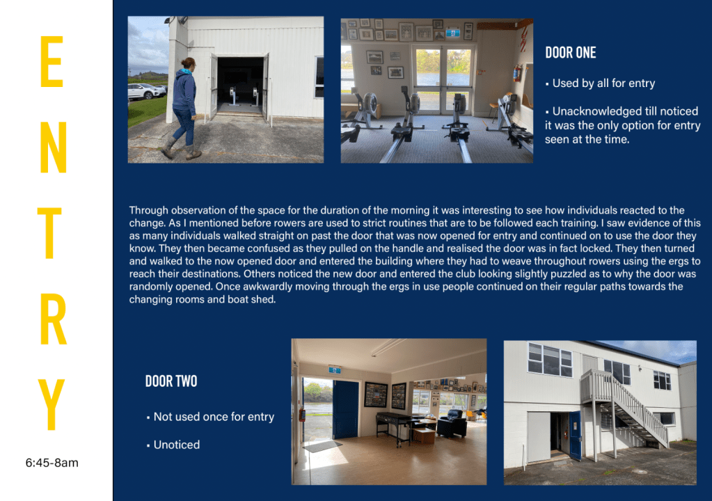
Entry –
The images above show the doors I opened for club members to enter through. People began to arrive around 6:45am and continued to flow on in till roughly 8am. I decided to create a drawing to track the paths people took over this time.
Through observation of the space for the duration of the morning it was interesting to see how individuals reacted to the change. As I mentioned before rowers are used to strict routines that are to be followed each training. I saw evidence of this as many individuals walked straight on past the door that was now opened for entry and continued on to use the door they know. They then became confused as they pulled on the handle and realised the door was in fact locked. They then turned and walked to the now opened door and entered the building where they had to weave throughout rowers using the ergs to reach their destinations. Others noticed the new door and entered the club looking slightly puzzled as to why the door was randomly opened. Like I predicted the door to the right of the club rooms remained unnoticed by all who entered the club and was not used once for entry.
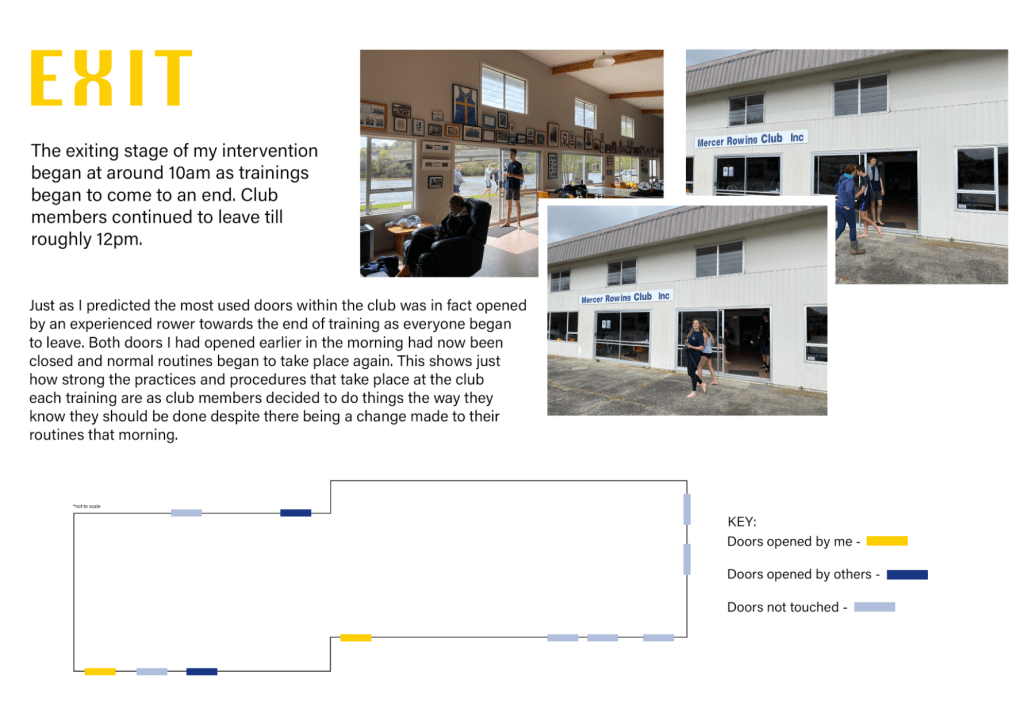
Exit –
Just as I thought the most used door within the club was in fact opened by an experienced rower towards the end of training as everyone began to leave. Both doors I had opened earlier in the morning had now been closed and normal routines began to take place again. This shows just how strong the practices and procedures that take place at the club each training are as club members decided to do things the way they know they should be done despite there being a change made to their routines that morning.
Week 8: Design Artefact
This week I started to work on my design artefact for submission. It is expected that the documentation of our intervention is displayed through a designed artefact that materially reflects the contextual and conceptual concerns we have connected with our interventions.
My initial plan was to create a booklet inspired by some of the research imagery I gathered last week. This involved working with club colours and written statements that clearly communicate ideas without confusion. Below is a series of in progress booklet pages I created to start my thinking around how I would like display the criteria needed.

It was at this stage in my design process that I received feedback about my work that pushed me to further experiment with the ways I could display it. I already knew that I wasn’t liking what I had done so far and planned to try new layouts and with the help of a few different perspectives I decided to look closer at how a series of posters could work as my design artefact. I gathered some more specific poster style resources from the rowing club and analysed the use of fonts, colours, layouts, image styles, negative space and the overall communication of ideas/information.
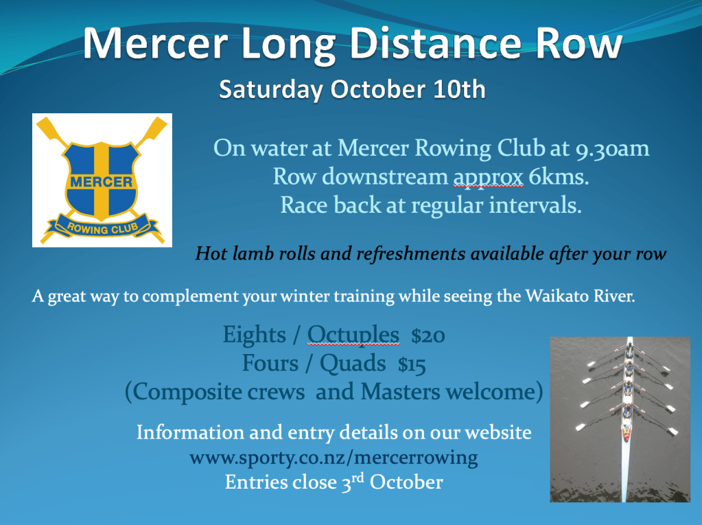
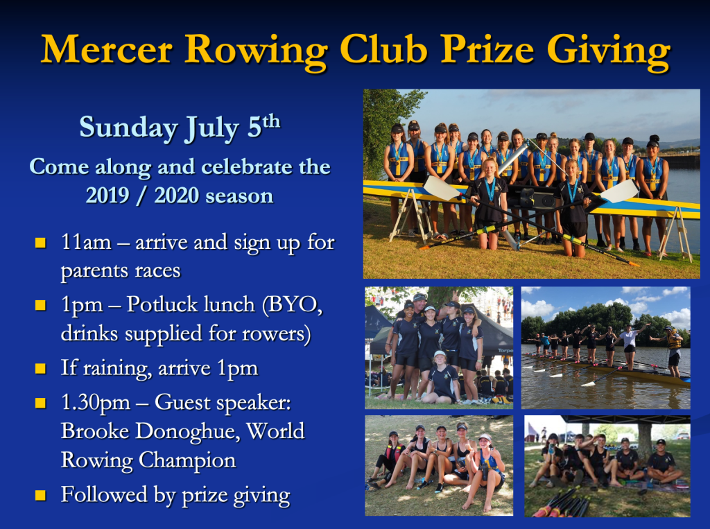
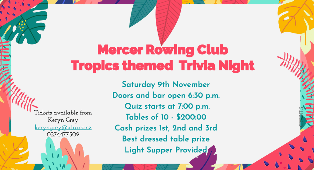
Each of the posters above are specifically designed to display information relevant to the event it is advertising. Colour, symbolism, imagery, borders and font used in each poster all support the main idea that is being communicated. Small paragraphs and bullet points are commonly used and is something I would consider an effective technique as posters are often glanced at for short amounts of time. By using bullet points and keywords readers can quickly gain the information they need without having to read in depth paragraphs. The size, colour and boldness of the text also indicates which information is most important, such as the event titles and dates. I also noticed that a lot of colour is used (mainly club colours) and is often filling the background space of each poster. Bold colour use draws attention and creates striking visuals, something that is important when it comes to posters. When it comes to the size of each poster they are often simply A4 size, some being landscape and others portrait. They are usually printed in a large quantity therefore regular paper stock is normally used.
I now need to plan out how many posters I would like to create and decide on the most important information to display. I need to effectively communicate all of my thinking through visually pleasing posters that draw attention to specific details of my project. At this stage I would like my poster series to cohesively work together through colour and font use with each design looking slightly different. I am aiming to create 5-7 posters as my design artefact. The series is something I can imagine being hung on the boards around the club seen below.
Experimentation –
I personally think the bottom left image (dark blue background, yellow writing) is most attention grabbing. Though using a dark background and a bright foreground the words are able to stand out and pop forwards on the page rather than looking like that are being pulled backwards like other iterations I created.

After choosing my colours for this page I began to work with different fonts and layouts on the page. I ended up liking the bottom right layout however still felt like it needed more work. I referred back to my reference posters and decided that the missing factor was some type of image, drawing or symbol. After experimenting with a few different options I came to a final design for poster #1.
Poster #2 is my project two statement. As there is a lot of writing on this page I decided to simply create a border using the club colours to surround the text in the centre.
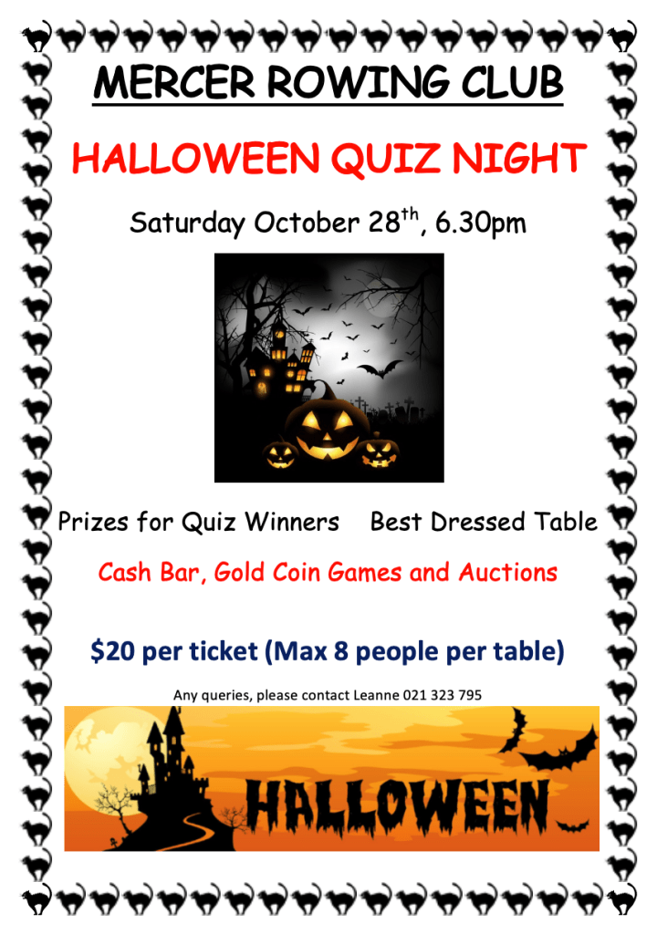
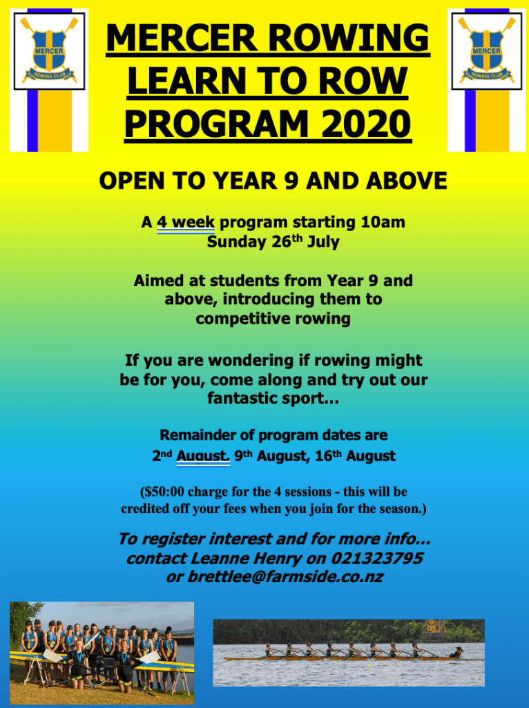
Poster #3 has been directly influenced by the design of the Mercer Rowing Club halloween themed quiz night flyer. I mimicked the page format, border use, underlining of text and text colour to highlight key words.
For poster #4 I decided to take a simple approach and tried to minimise the amount of writing on the page. I worked with bullet points as a way of communicating key thinking as to why I chose each of the doors. Smaller writing is used to add small predictions/thoughts I had about how each doors may be moved through.
Poster #5 focuses on the entry portion of my intervention. I decided to use a combination of images from the morning along with written statements and bullet points to describe what took place.
Poster #6 displays information about the exit time frame of my intervention. I reused the floor plan from poster #2 though this time the colours mean different things, indicating changes that had been made over the morning. A series of images of people using the doorway is aligned along the bottom of the page as seen on many of my reference posters.
Below is the proposed layout of my final 6 poster designs. I decided to work with a combination of both landscape and portrait posters as the flyers seen around the club also use different orientations. By working with a limited colour palette and fonts each of the posters bounce off one another despite each of the layouts being completely different.
Introduction to Part Three: Originating / Positioning
Staking your ground in relation to ‘The Commons’.
Part three invites us to investigate how our research findings might assist us in reprogramming other social spaces. We are to produce a manifesto that positions us as designers, relative to The Commons and the social space that is of interest to you. By reflecting upon our engagement with each part of the brief to date we will further develop our understanding of how social spaces can be understood and how they can be enhanced, changed, modulated, and/or affected through design interventions.
What is a manifesto? The definition for manifesto is a public declaration of policy and aims, especially one issued before an election by a political party or candidate. A manifesto in our context can be more thought of as a statement of intent a persuasive tract of writing, a list of political goals, a rejection of something, and/or a set of instructions for action. Simply making something public in a clear way.
Week 9: Manifesto Research
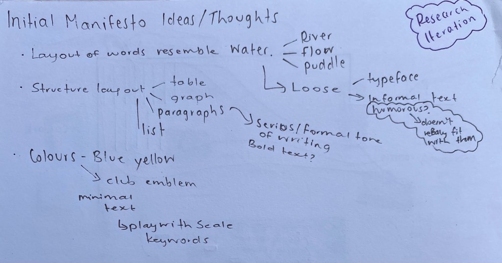
This week we began looking through some manifesto examples on the arena channel, along with some of our own chosen resources. Through reading many manifestos and comparing visuals I have gathered together a series that I have been drawn to through either there layouts, tones of writing, visual appearance or a combination of elements.
Font and font size is the dominant visual seen on this manifesto. The type face is loud and enhanced through explanation marks. The tone of writing is direct and instructional with a persuasive undertone. Creates a bold statement.
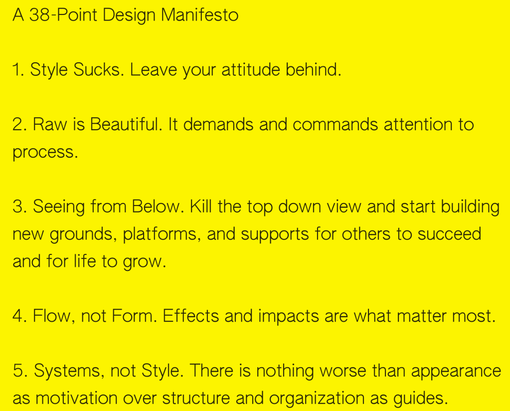
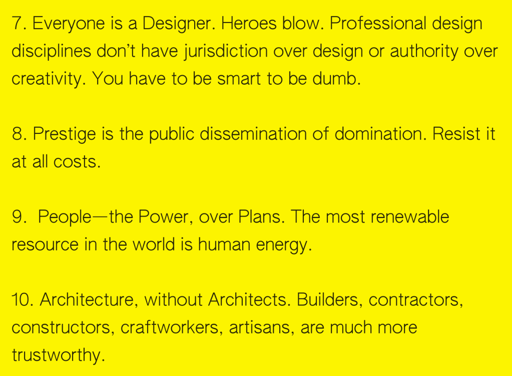
The vibrant yellow background on the manifesto above stands out from others on the arena channel. This manifesto titled A 38 Point Manifesto is by a non-profit organisation called Open Systems. This was by far one of my favourite manifestos that I read as I really enjoyed and connected with many of the points that were made. The type of writing was simple and straight to the point making reading 38 different statements seem effortless. The simple font and background creates a minimal look and allows the reader to focus on what’s important.
The combination of both hand written text and printed text with contrasting background colours give this manifesto a sense of structure and pattern. Keywords and phrases are written in capital letters and are underlined to emphasise certain points.
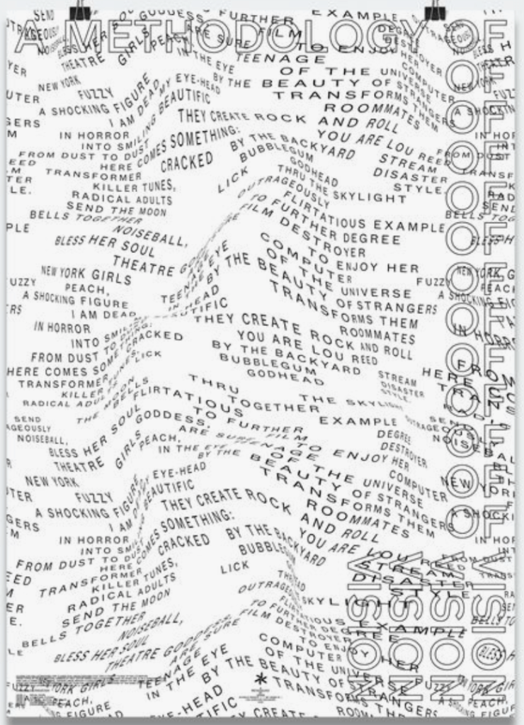
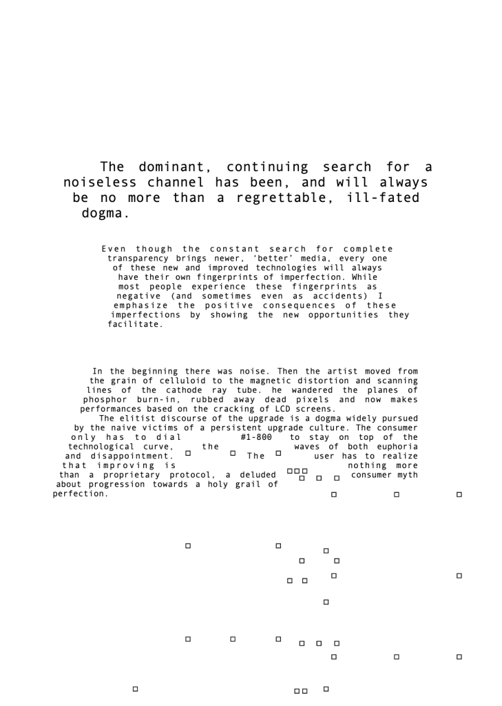
I think that this manifesto is successful in the way it creates an interesting visual through text placement creating the illusion of movement and texture. Though it does look cool it is harder to read than other examples I have come across. It will be important to think about what the main focus of my manifesto will be, whether it heavily relies on either the text or layout or if I work with a combination of both as seen in other examples.
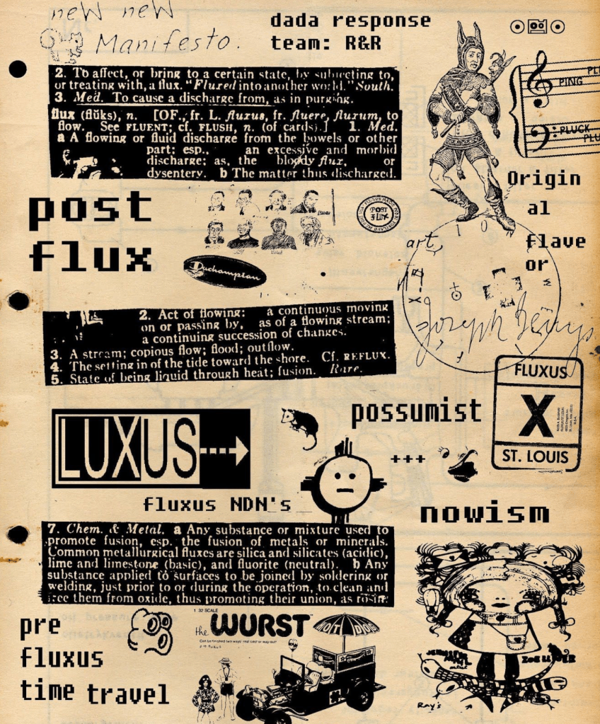
The chaotic and busy style of this manifesto works with both simple and bold text and imagery to create a visual with many interesting elements. This is the type of manifesto that you could spend time looking at as the more you read the more it all ties together.
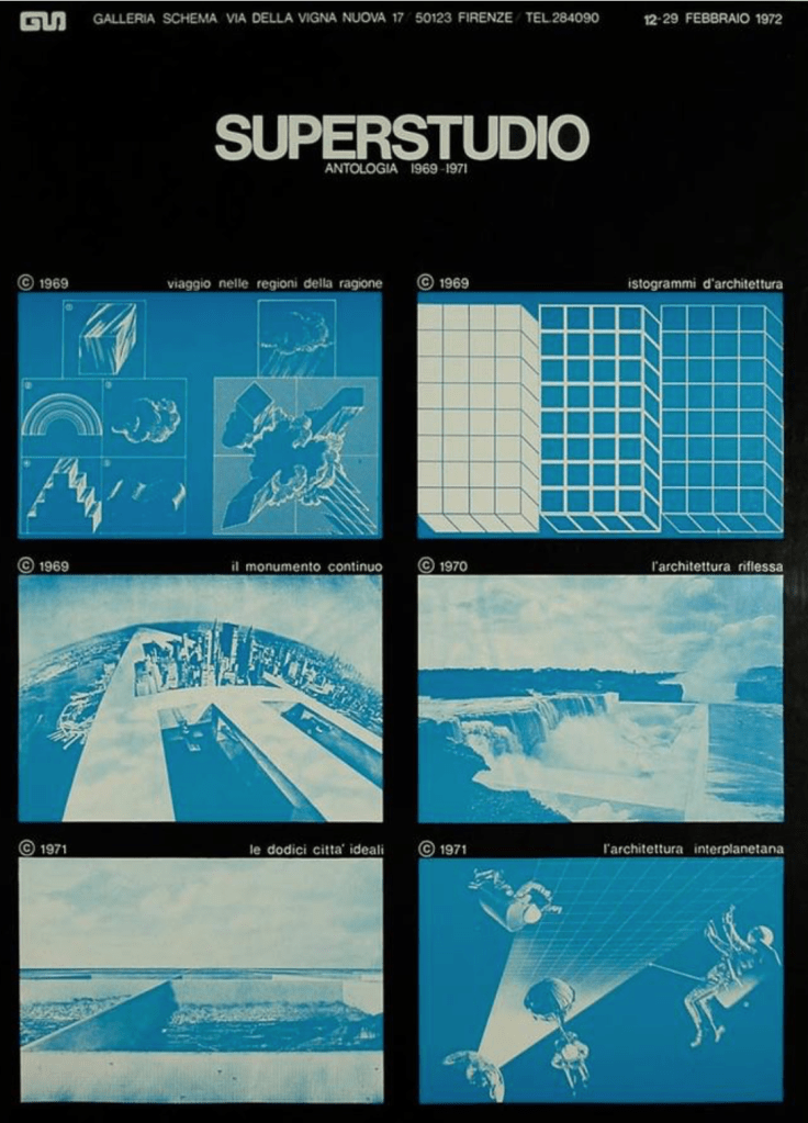
I found this SUPERSTUDIO manifesto eye catching due to the use of contrasting colours. This technique allows certain visual elements to pop forwards and stand out. I think the clean and symmetrical layout also allows the images to have dominance over the text.
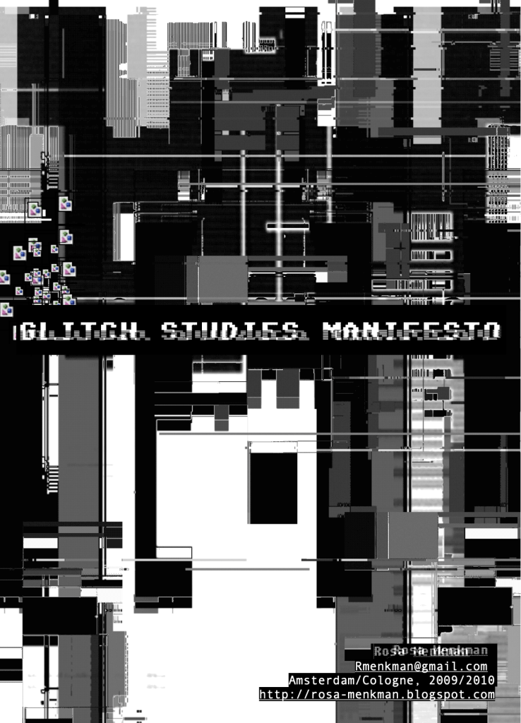
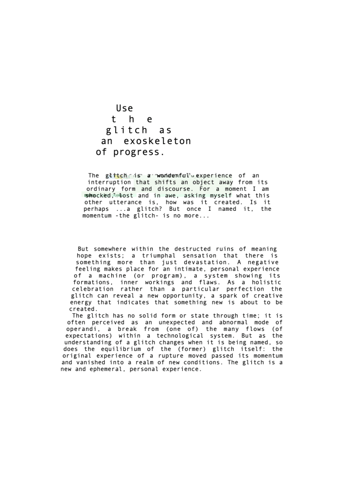
Glitch Studies Manifesto is a successful example of a manifesto that has a strong relationship between the text and the layout. Through working with key ideas within the text unique layout designs can be created, resulting in a both interesting and cohesive manifesto overall.
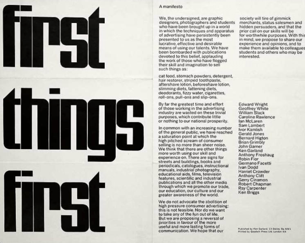
Font/text size caught my eye with the first things first manifesto. The title comes across as very bold which relates to the text itself as being the first thing you see. The statement itself has a simple layout and is written in quite a direct way with the main point being known early on.
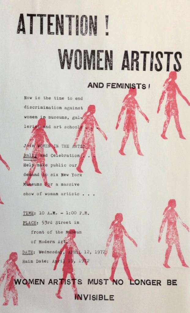
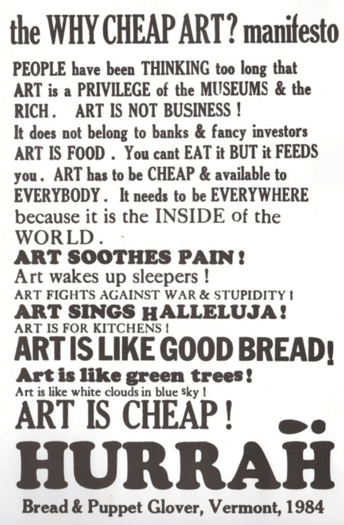
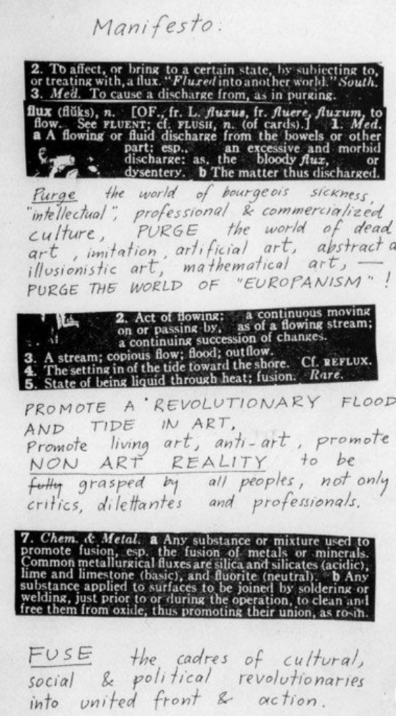
The stamp created look of the red figures gives this manifesto a raw/handmade feeling. The text displayed is direct and straight the point with the title quickly establishing who its intended audience is.
I Am for an Art – Claes Oldenburg
Since I was unable to make it to class I read through I am for an Art by Claes Oldenburg in my own time. I really liked this text and I found his own interpretation of really interesting. As the article says it’s been dubbed a manifesto, though Oldenburg insists otherwise. He views it as “literary effort… not a sort of cry”. He continued saying “There’s a lot of literary intention in that, so many of those things are said for the sounds of them, and I don’t necessarily believe all those things. But I, at some point, might believe it”. I enjoyed the way that the text expressed the endless possibilities there are when using anything in one’s surroundings as a starting point for art. This means even the simplest things have can have the greatest potential for something great. That inspiration is everywhere.
During Thursdays class I was able to view the manifesto library Lucy had displayed. I focused more on reading through the manifestos and analysing the tone of writing and this helped me become more aware of the purpose of many of the layouts. The text and layouts bounce off one another and work to communicate key ideas effectively. Below are some of the specific manifestos I found engaging.
1 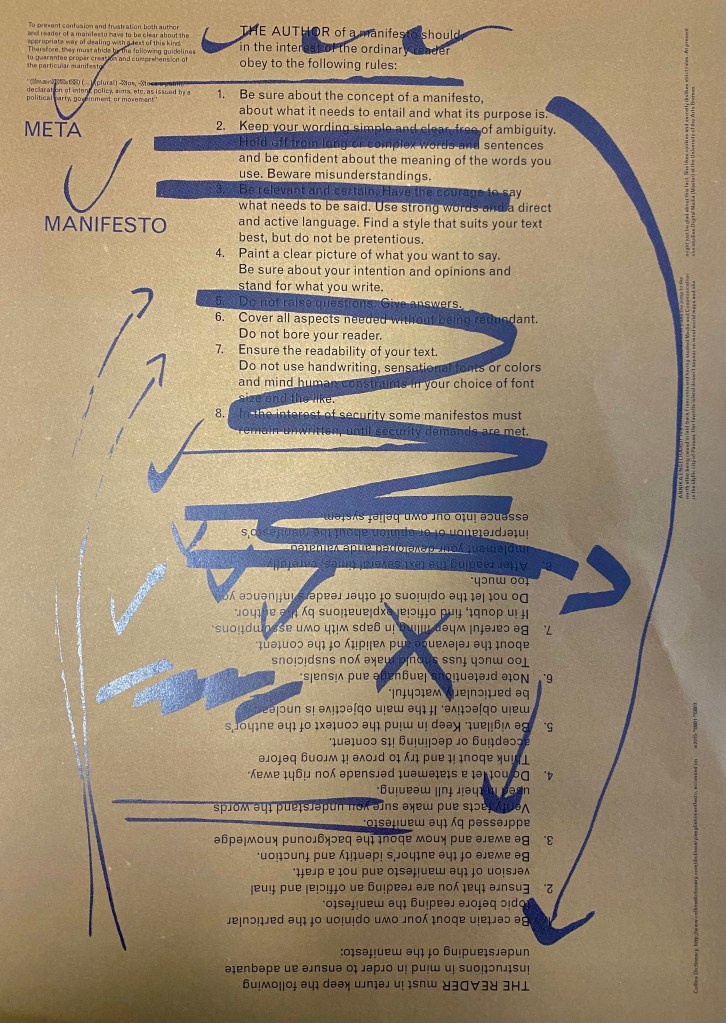
2 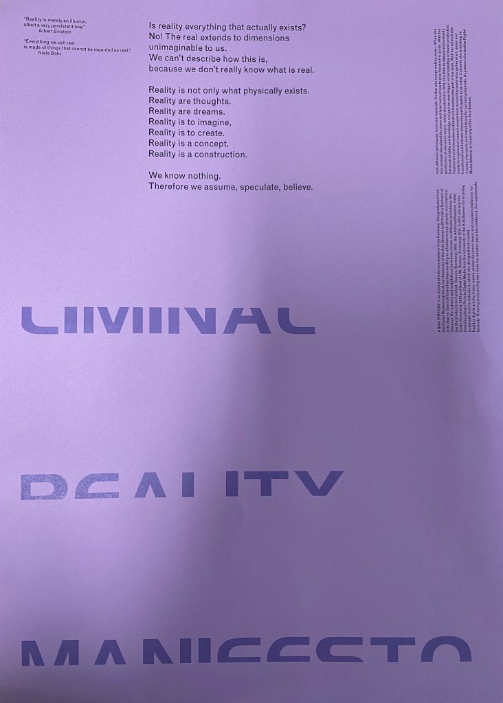
3 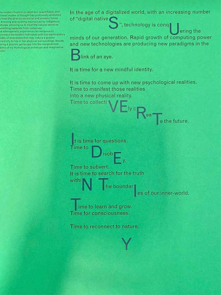
4 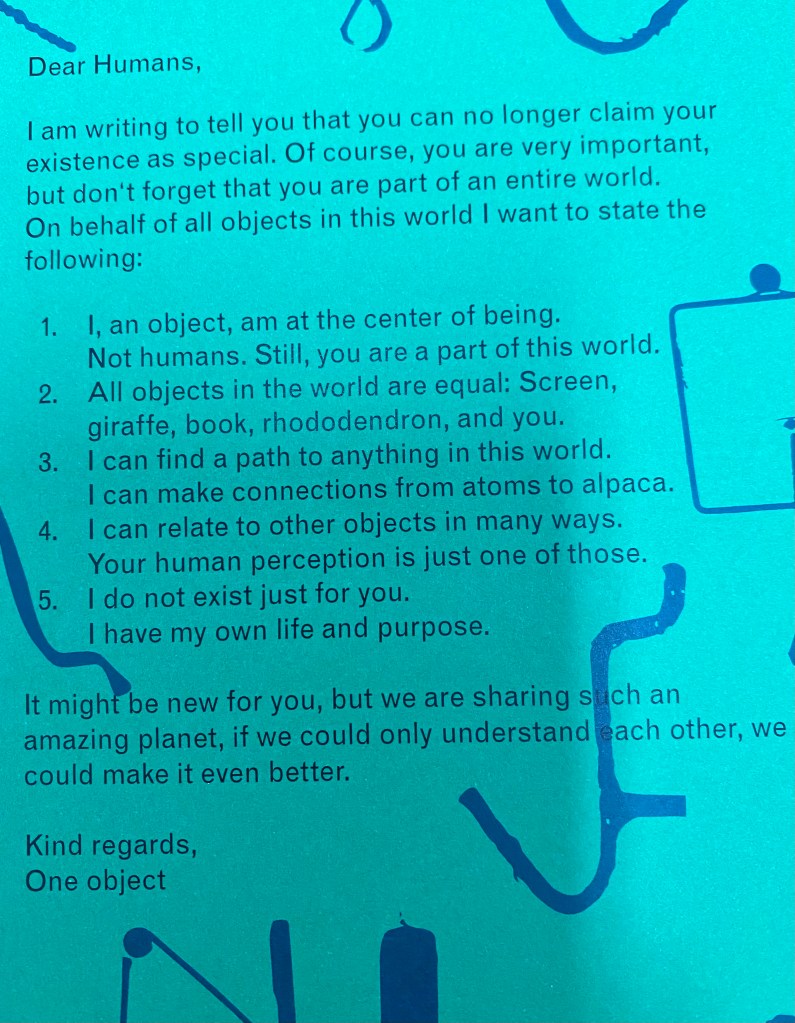
5 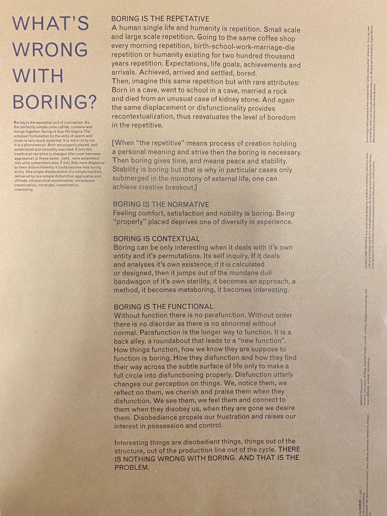
6
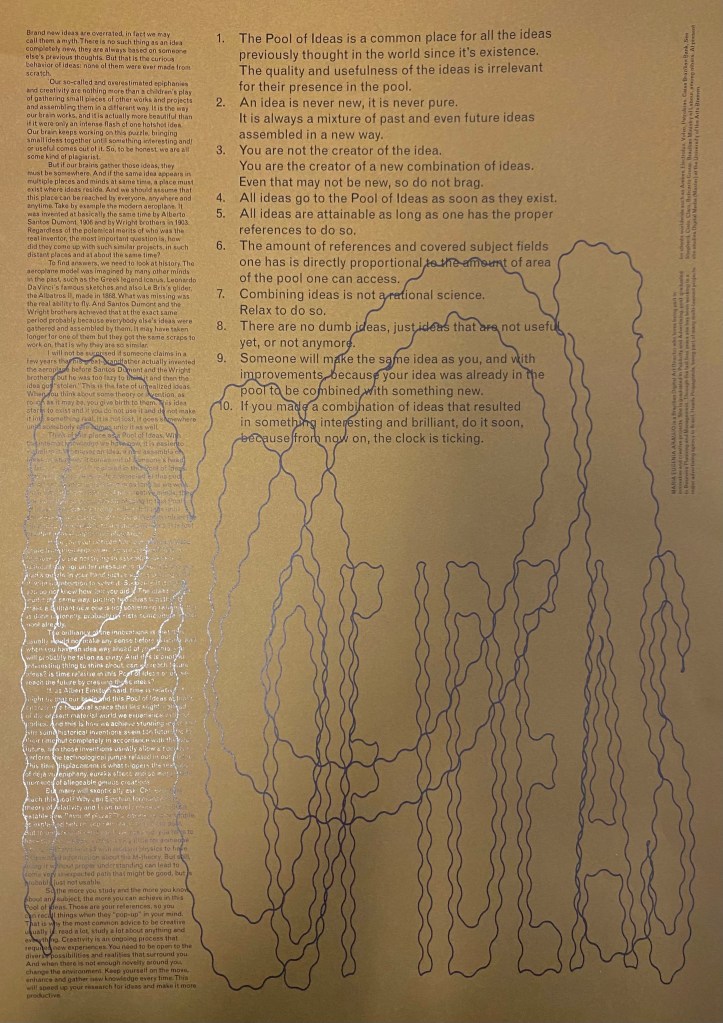
1 – Pool of Ideas works with three different font sizes and type faces each with their own purpose. The title is written in large blue wavy font that resembles water, this directly relates to the concept of the ‘pool’ of ideas. The numbered list describes the main points of the manifesto while the small writing on the left goes into more detail about the purpose of this piece. I like this layout as you can grasp the point go the manifesto from just reading the numbered list. If you want to know more you can read the smaller text as it is more informative yet it is not necessary.
2 – Meta Manifesto was very helpful as it talks about the rules of the both the author and the reader when it comes to manifestos. I see the scribbled arrows and lines over top as resembling the back and forth process of drafting and refining work and figuring out the right and wrongs of a manifesto. The numbered list itself is a list of rules to obey. The authors rules and the readers rules are laid out opposite/upside down to one another as they view the manifesto from differing perspectives. The tone of writing itself is instructional and informative for both set of rules.
3 – Liminal Reality Manifesto starts with a question that is instantly answered in the next sentence. This quickly shifts the readers own opinion of the topic as they are given no chance to think about it. Repetition is then used as evidence to emphasise the point being made. It is written in a very questionative way though it doesn’t allow the reader to think about what they are being told therefore it all moves to quite a persuasive statement.
4 – In Subvert Identity I liked how the title of the manifesto was woven throughout the text by using a different font and scale of text to make it stand out. Singular letters from words were used to create the title overall. This is a creative approach though not at easy to read as other examples.
5 – Dear Humans is formatted like a letter written from an objects perspective. It is written in quite a personal tone using pronouns such as I and you. The letter is also quite light hearted and humorous as something like this would simply not be written by an object. Like many other examples listing is again used as a technique for communicating a series of short sentence that directly relate to the main point. This is something I plan to use when I began to create my own manifesto.
6 – Whats Wrong With Boring? has quite a simple layout that works with a title and parapgrah type structure. This seems quite dull compared to other examples but is fitting given the topic of the manifesto.
The importance of a text – layout relationship is crucial for an effective manifesto. This means working with many different iterations and working with slight changes to continue the progression of my ideas.
Week 10 – Manifesto Iterations
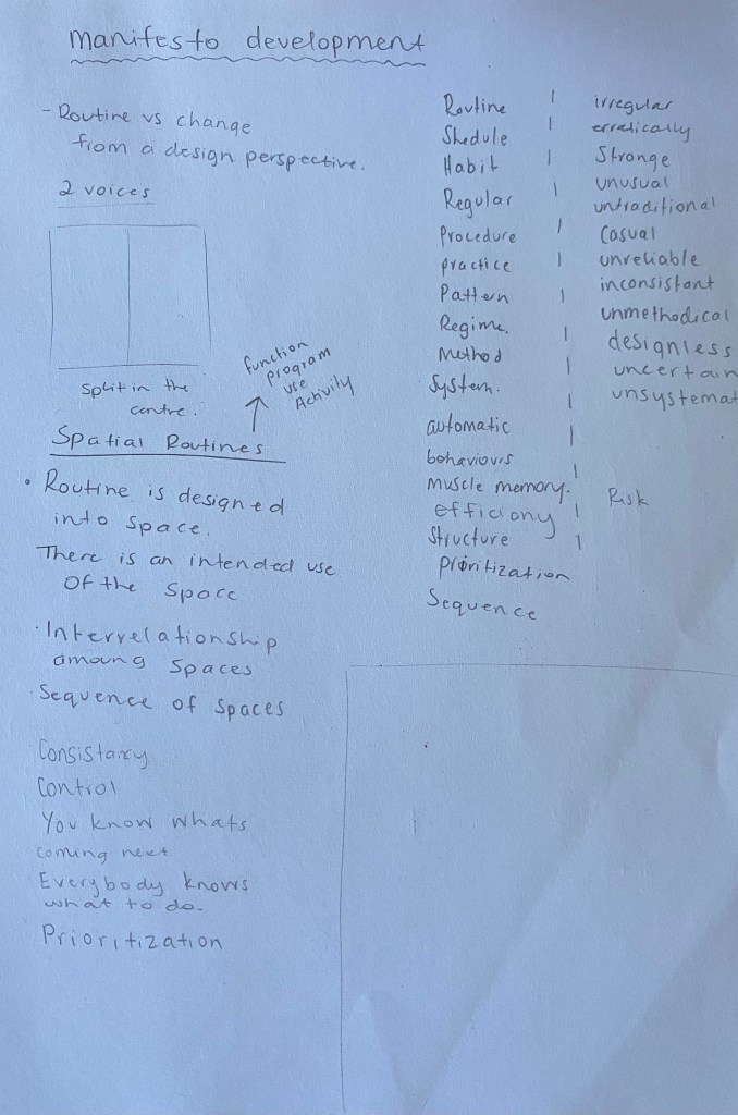
My focus this week is to continue the development of my own manifesto through creating many iterations to find what works. I began by noting down reflections on my main ideas from part one and two to see which concepts were successful and could be explored further.
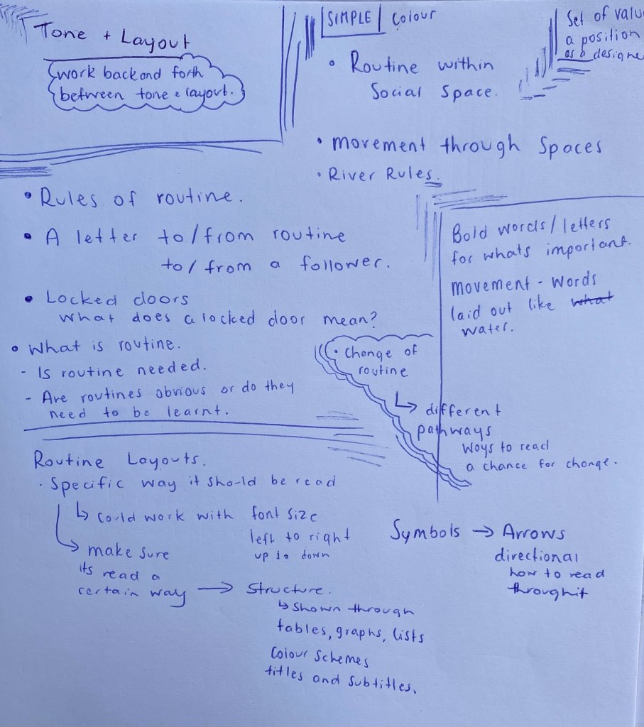
Concepts from part one and two:
- Structure
- Routine
- Movement
- Patterns
- Muscle Memory
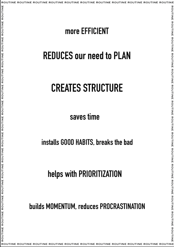
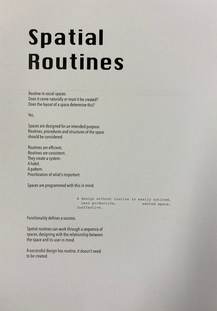
What was the purpose of modulating/programming the space the way that I did? I worked to break the structure and routine within the club. The purpose was to disrupt the ‘normal’ mornings of club members forcing a change in their muscle memory to shift and rethink the way things are done.
Possible manifesto concepts:
- Questioning the idea of a locked door
- A letter to a locked door
- Rules of the rowing club (choose a certain aspect)
- Importance of routine
During Tuesdays class I was still slightly lost with where I wanted to go with my manifesto but talking with my peers and viewing others defiantly helped. I spent time brainstorming possible concepts along with how they could be laid out.
First iterations of initial concepts:
Part two development:
Originally for part two I created a poster series to display information about my intervention. The posters were inspired by other posters around the club and were cohesive through colour, font, language and imagery.
Points from the feedback I received:
- There is an opportunity to push my artefact further through more intentional and sensitive consideration of images and materiality.
- Room to improve on the layouts of my documentation.
- Relies heavily on on descriptive writing and photographs. Perhaps other forms of communication (drawings, maps, sketches) might be more effective in showing frustration, obstruction or blockages within space.
Final design artefact:
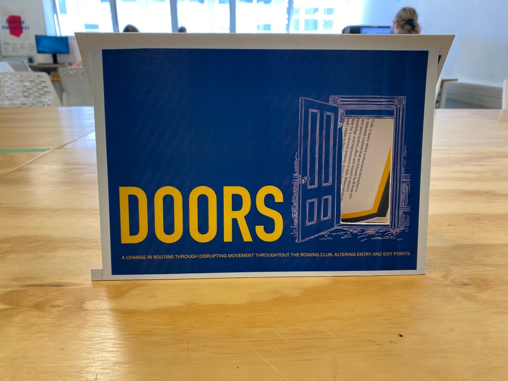
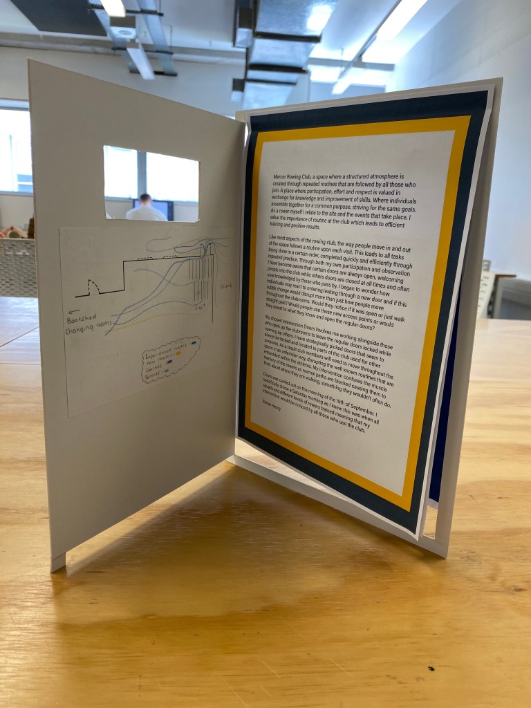
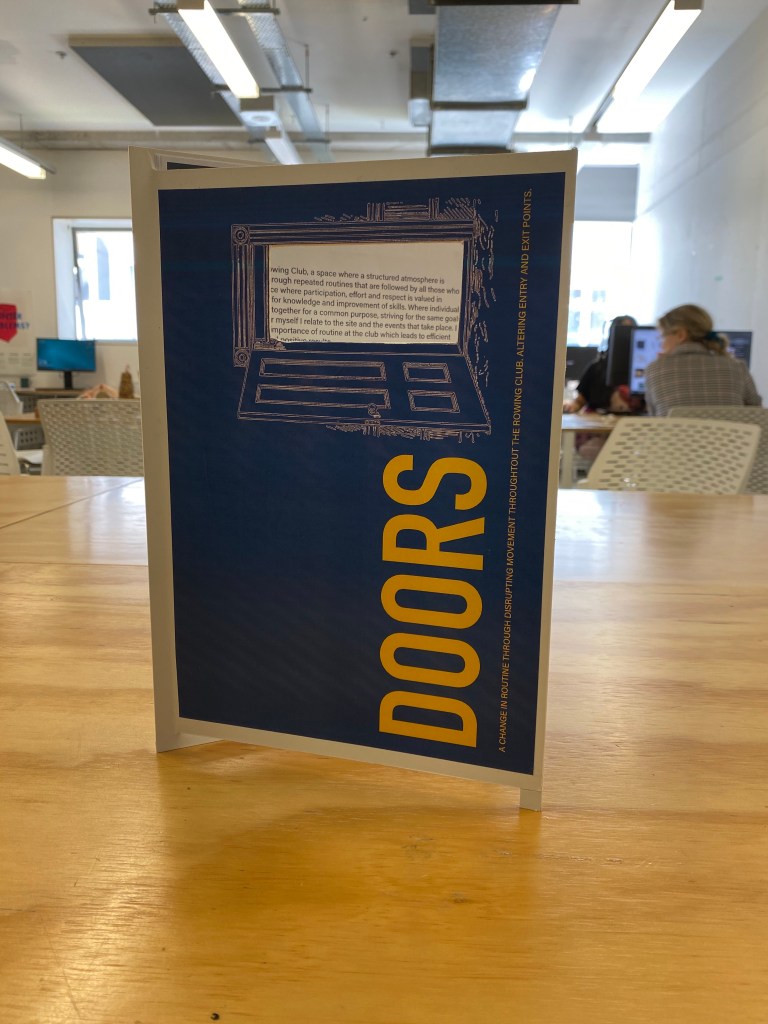
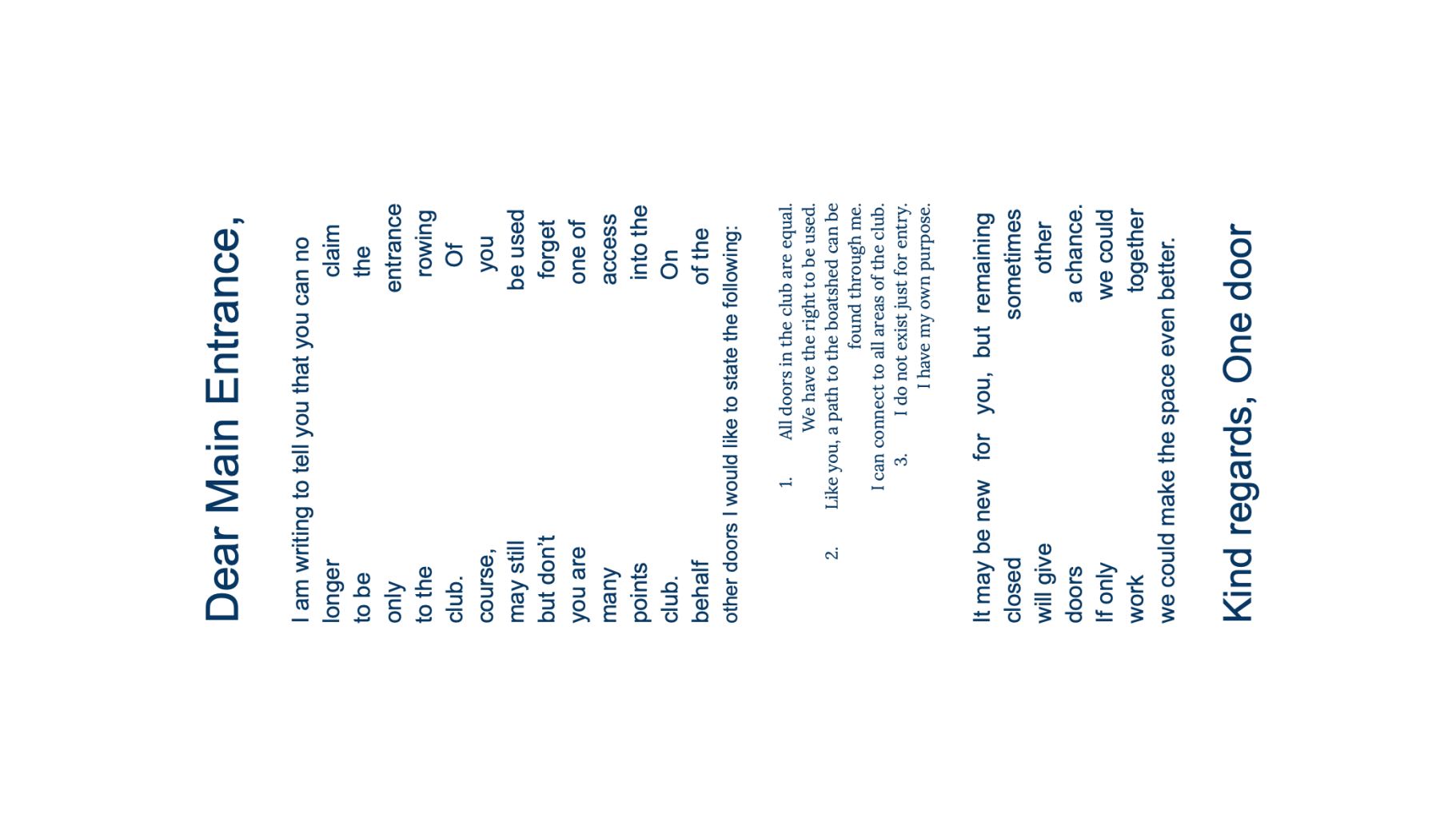
I decided to work with my existing content from part two (with some slight changes) to rework the way it is viewed/displayed. I have created a booklet type shape that resembles the shape and movement of a door.
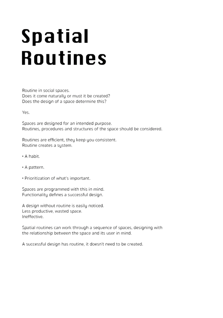
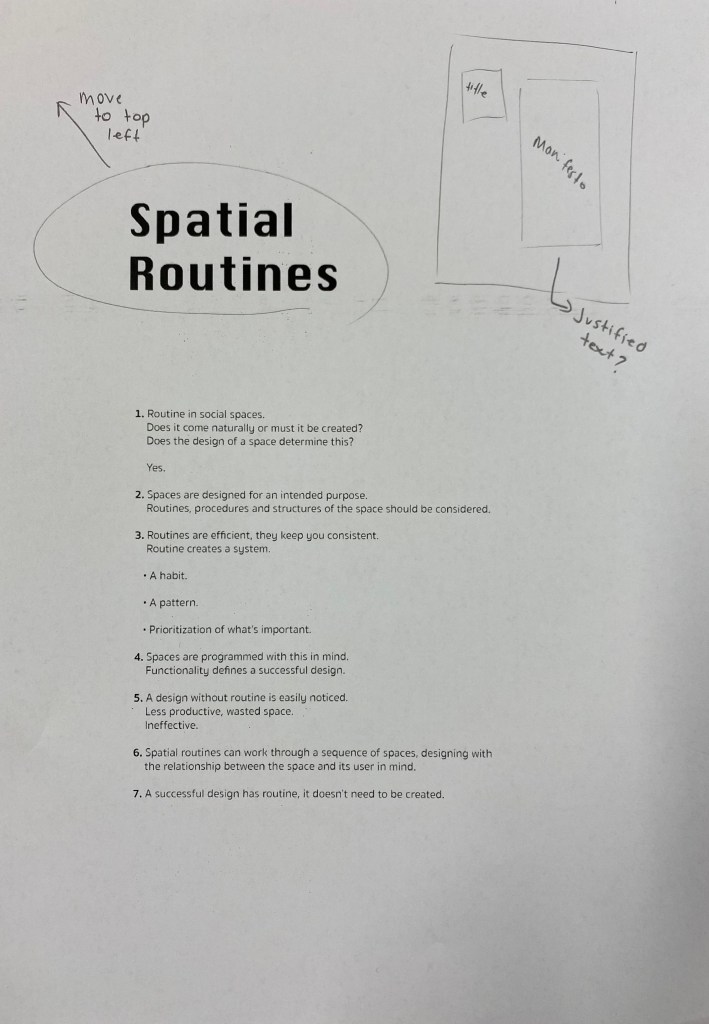
Week 11: Manifesto Development
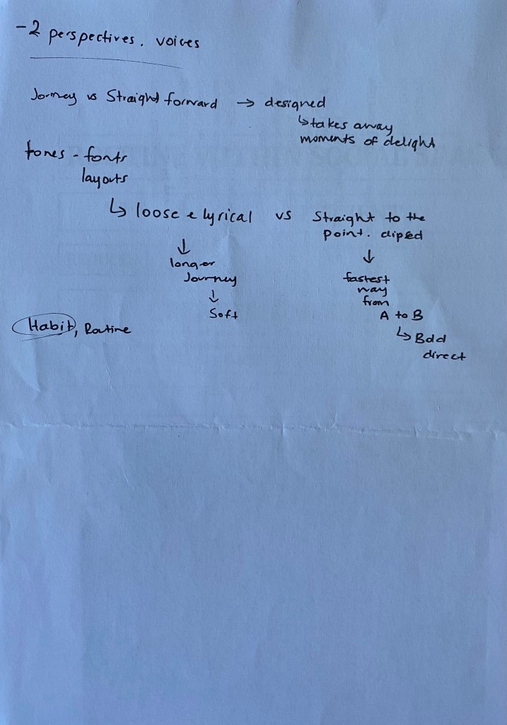
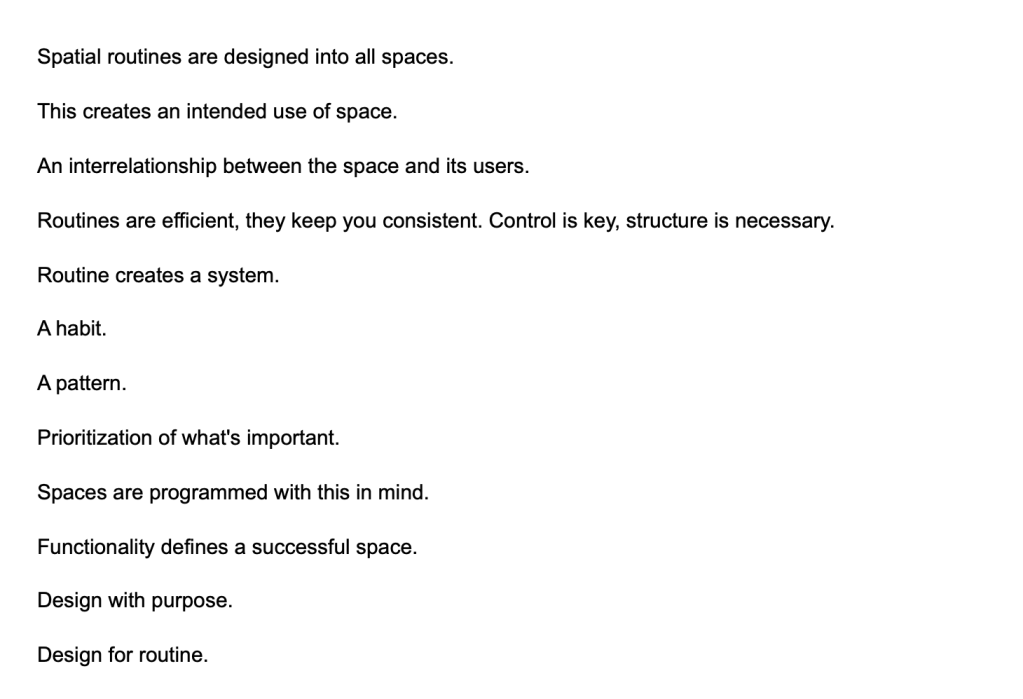
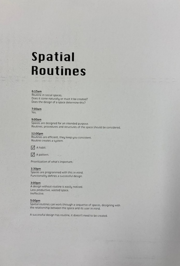
I decided to develop the idea around routines of space as I felt I could relate it more to the idea of spatial design and my manifesto would speak from a design perspective. I began to write out more iterations to do with this idea.
Chosen manifesto text/concept to develop:

Manifesto Iterations:
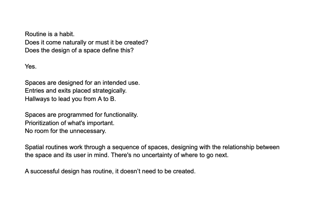
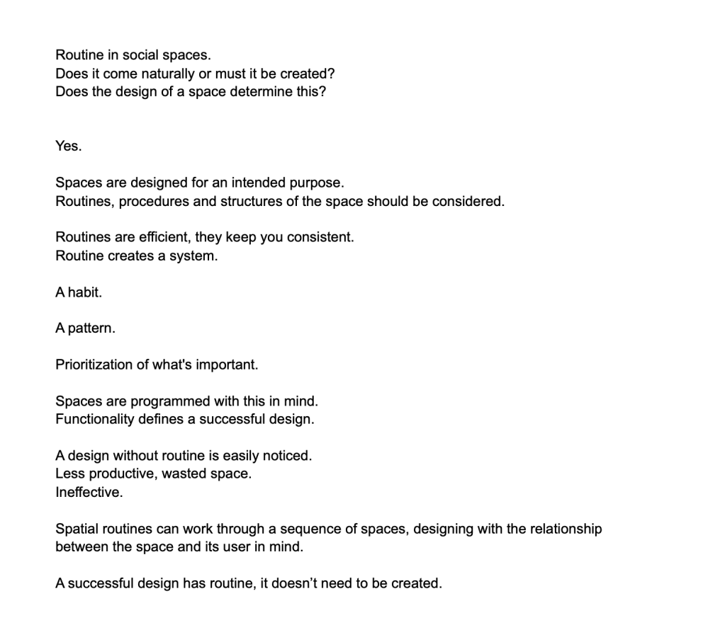
Above are three similar manifestos each with slight changes/approaches to sentence structure and layout. I knew I wanted to work with short sharp sentences that went straight to the point as a solid routine has no room for the unnecessary.
Layout iterations:
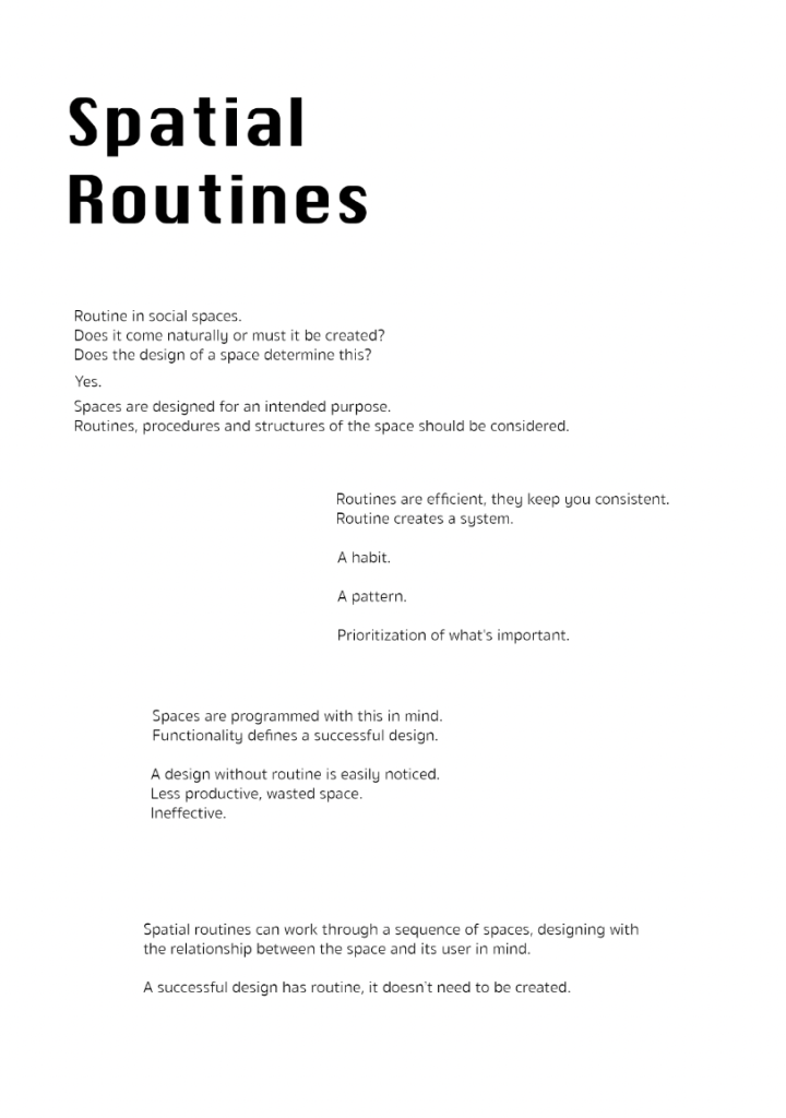
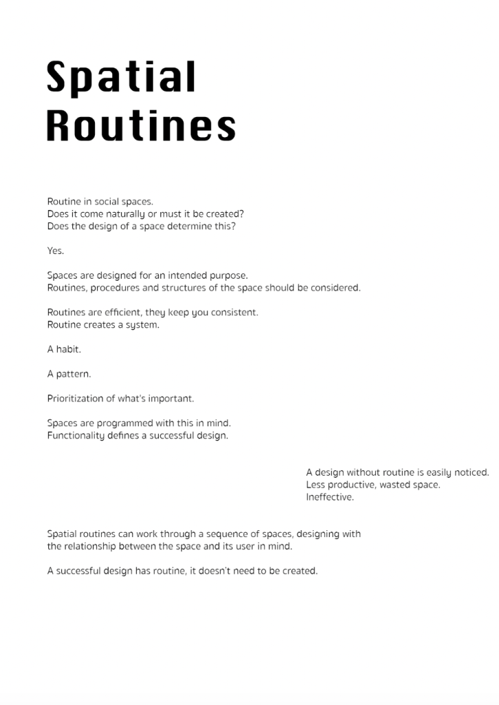
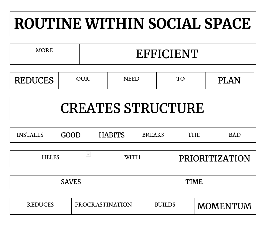
The layouts above experiment with word/paragraph placement in an organised way (sticking the the idea of structure). I quite like the one in the middle as the paragraph that talks about having no routine is out of place, emphasising the point of phrase.
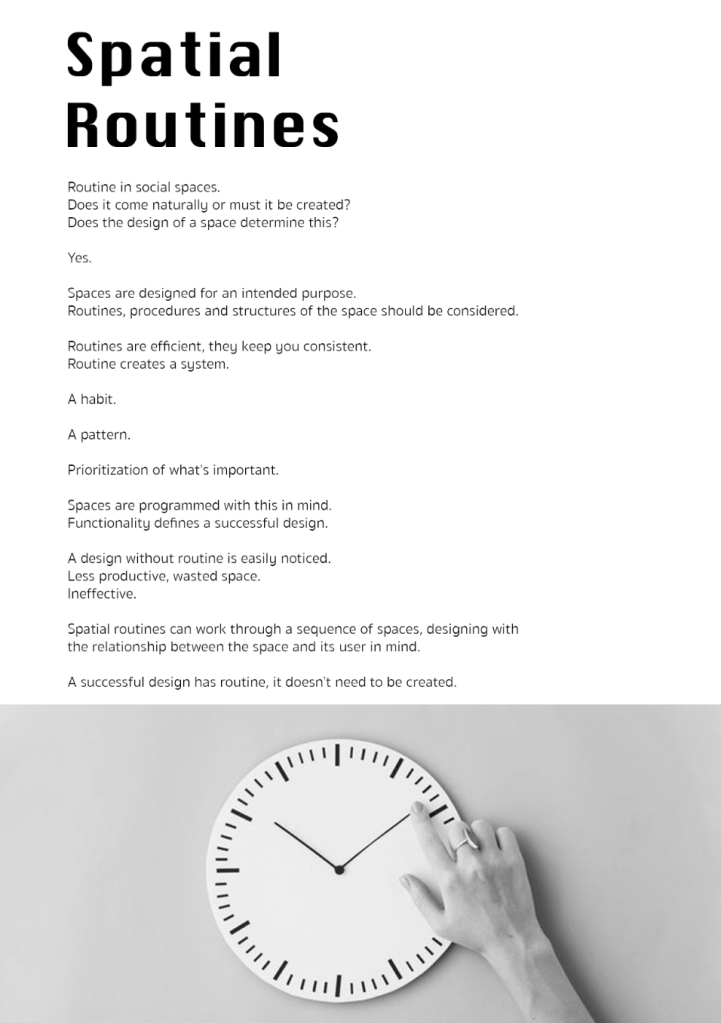
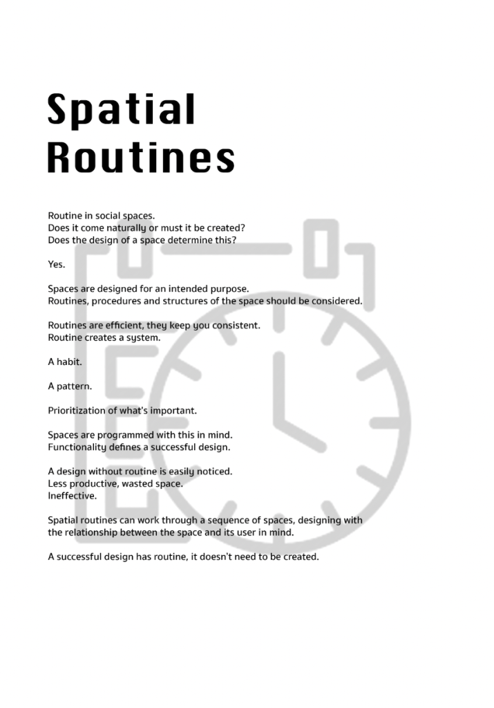
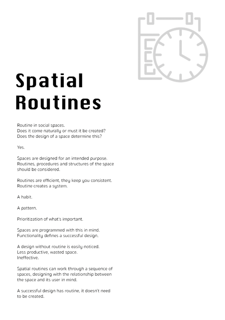
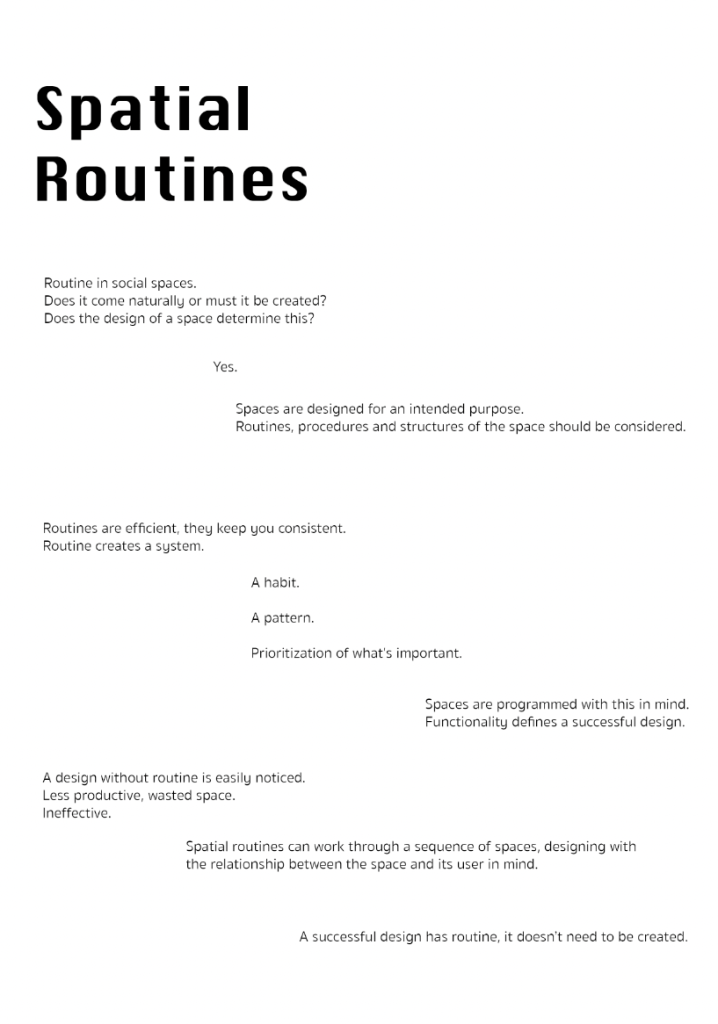
I decided to play around with images and symbols of clocks as I felt this this resembled routine and schedule. I don’t really think any of the above iterations are successful as the images themselves don’t necessarily add any further context or strengthen the concept/main point.
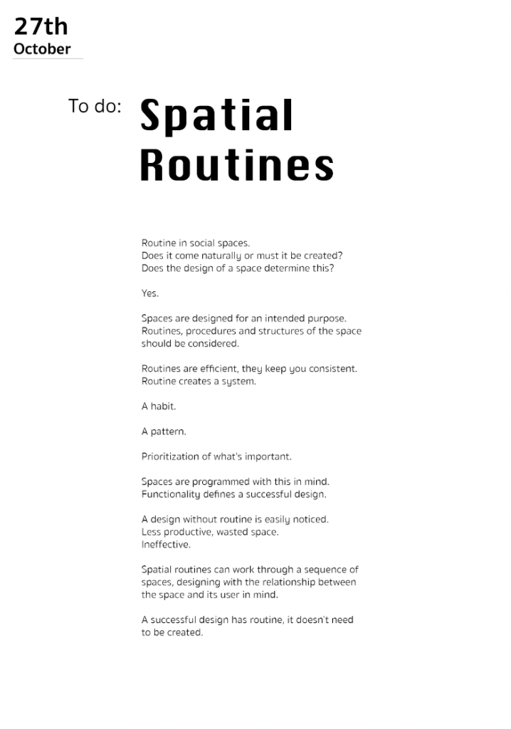
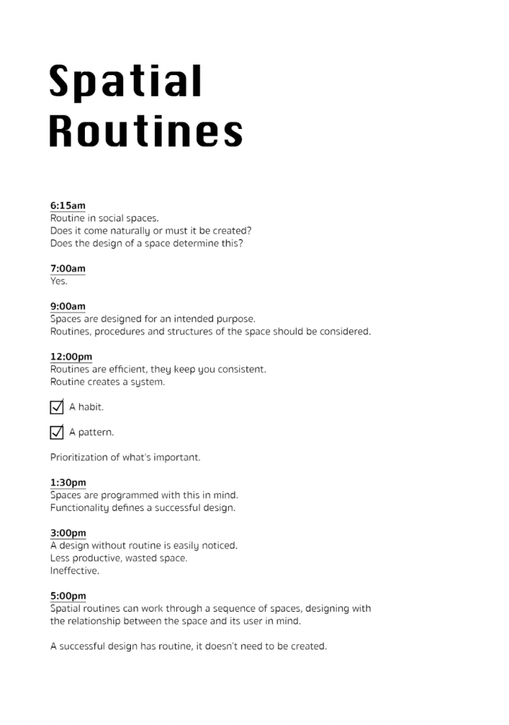
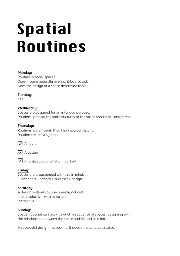
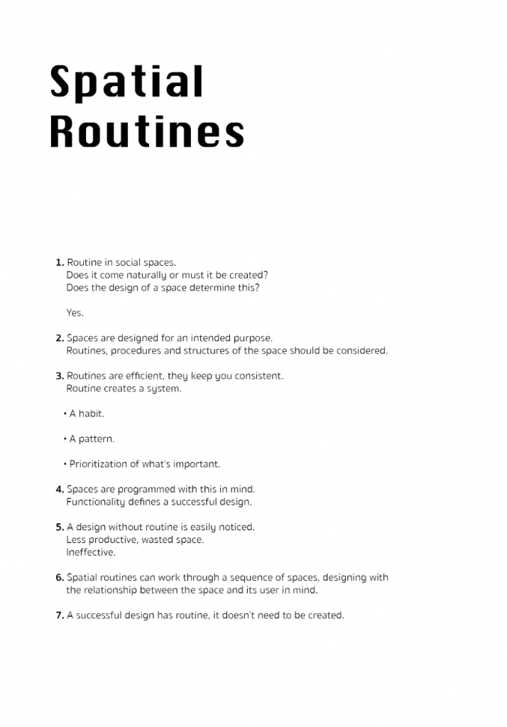
I created a series of layouts that were inspired by to do lists/diary pages where paragraphs were organised by numbers, times and dates etc. I think this style could have been successful had I written the manifesto in a different style. I don’t think its works well with the structure I created.
First test prints:
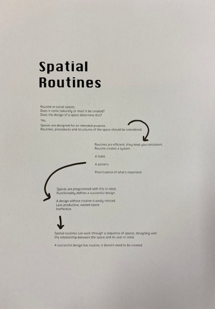
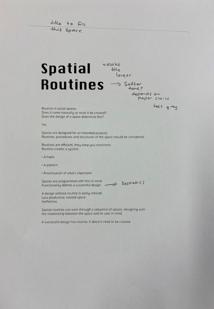
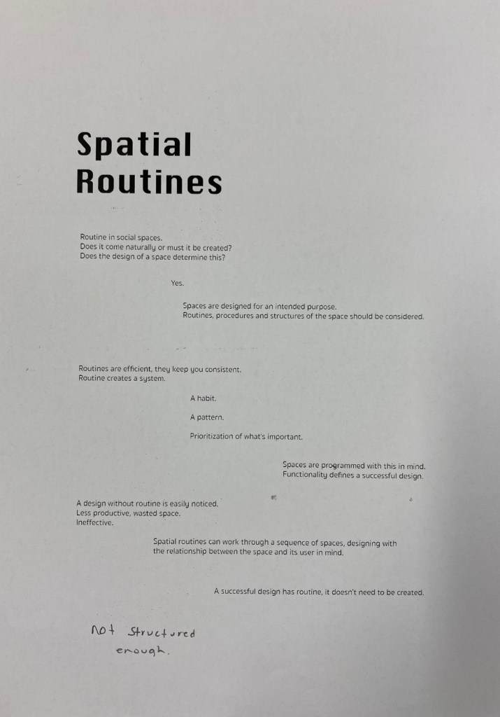
I decided to print a few of my favourite layouts to see how they in real life. This definitely helped with the progression of my layout as I was able to note down what I liked and what I didn’t. Seeing the size of everything on paper also made it easier to rescale certain elements.
Second test prints:
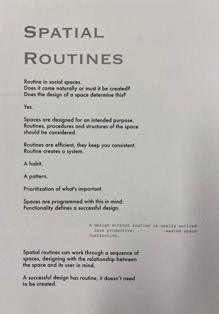
I then printed a second series of test prints in a layout that I felt would be my final/very close to my final. I also made slight changes to wording and paragraph spacing. I decided to move forwards with the layout on the right and began printing on a thicker card paper.
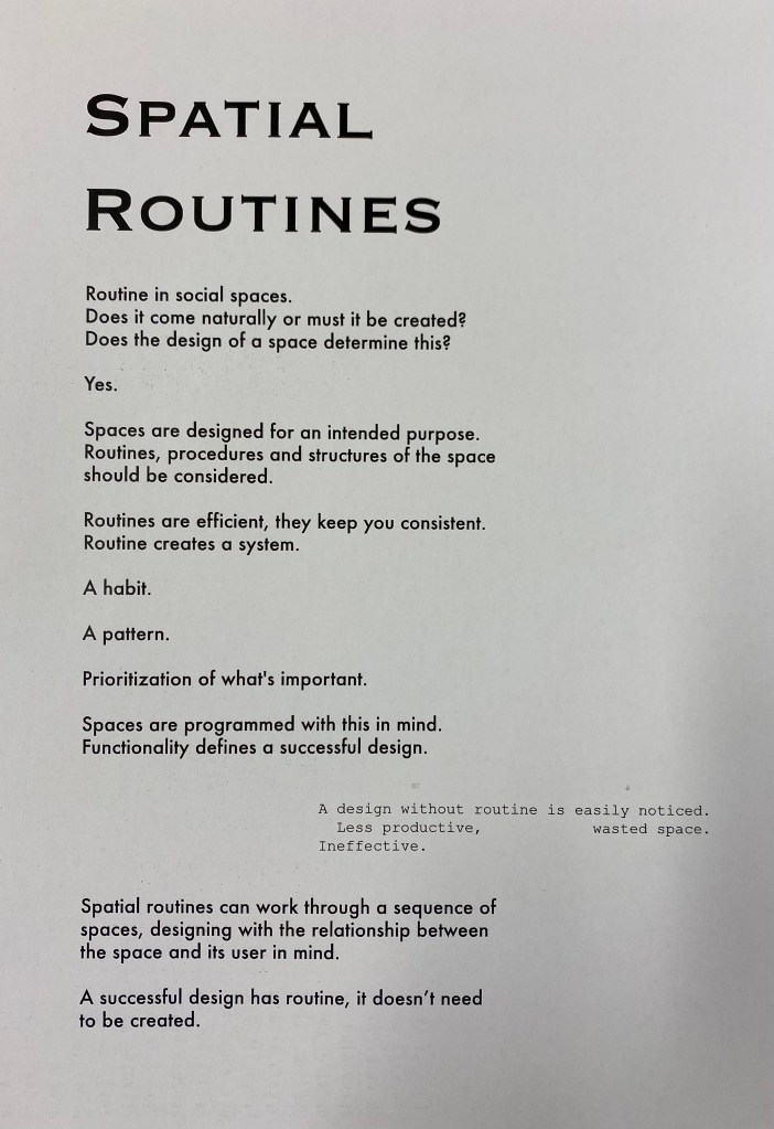
Card paper test prints:
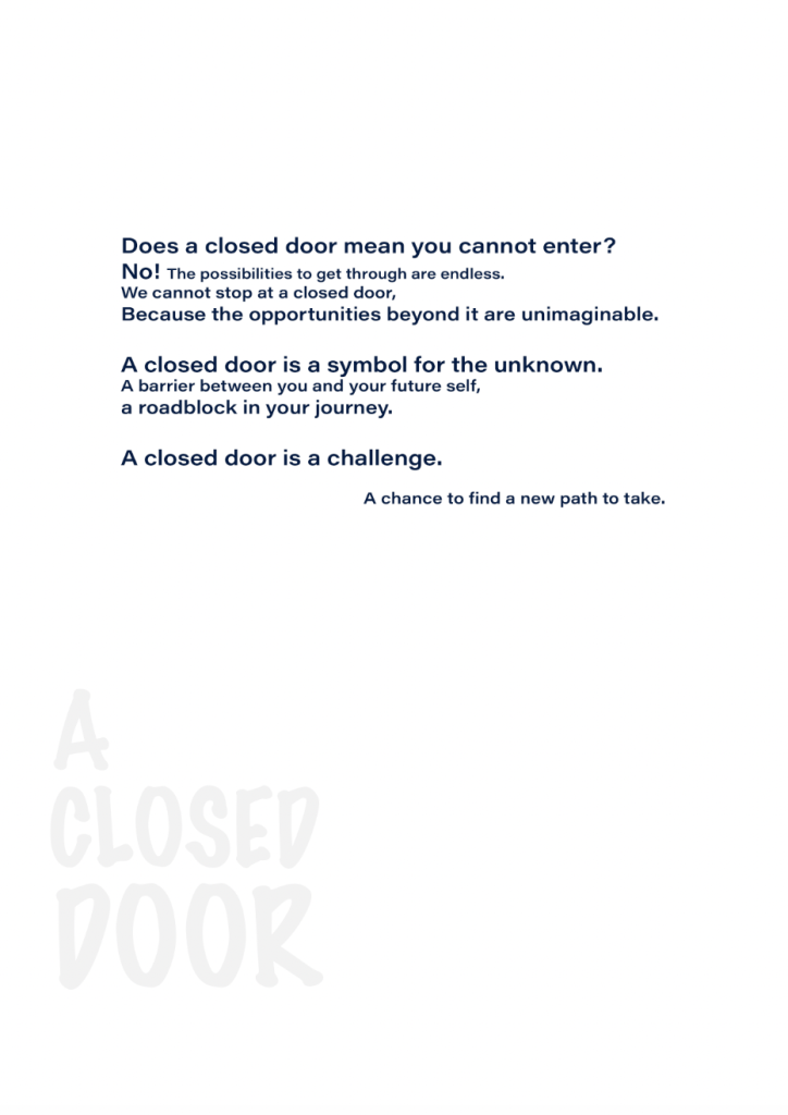
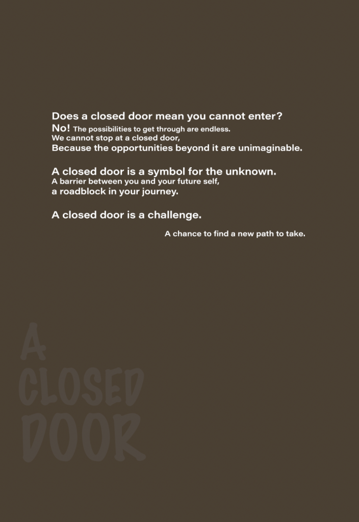
I wanted to print on a slightly thicker card like paper as it is more sturdy and firm than regular paper. This strengthens the overall concept of routine. It’s difficult to tell from the images above but one of the manifestos is printed on slightly creme card while the other is on more of a grey toned card. I decided to use the slightly grey card as my final as it reminded me of the colour of concrete which gave it a hard and to the point feeling which matches the way its written with sharp short sentences.
Week 12: Presentation
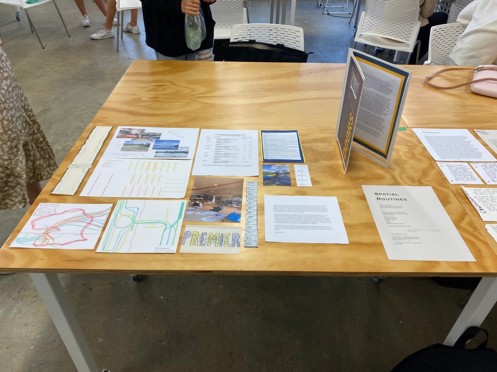
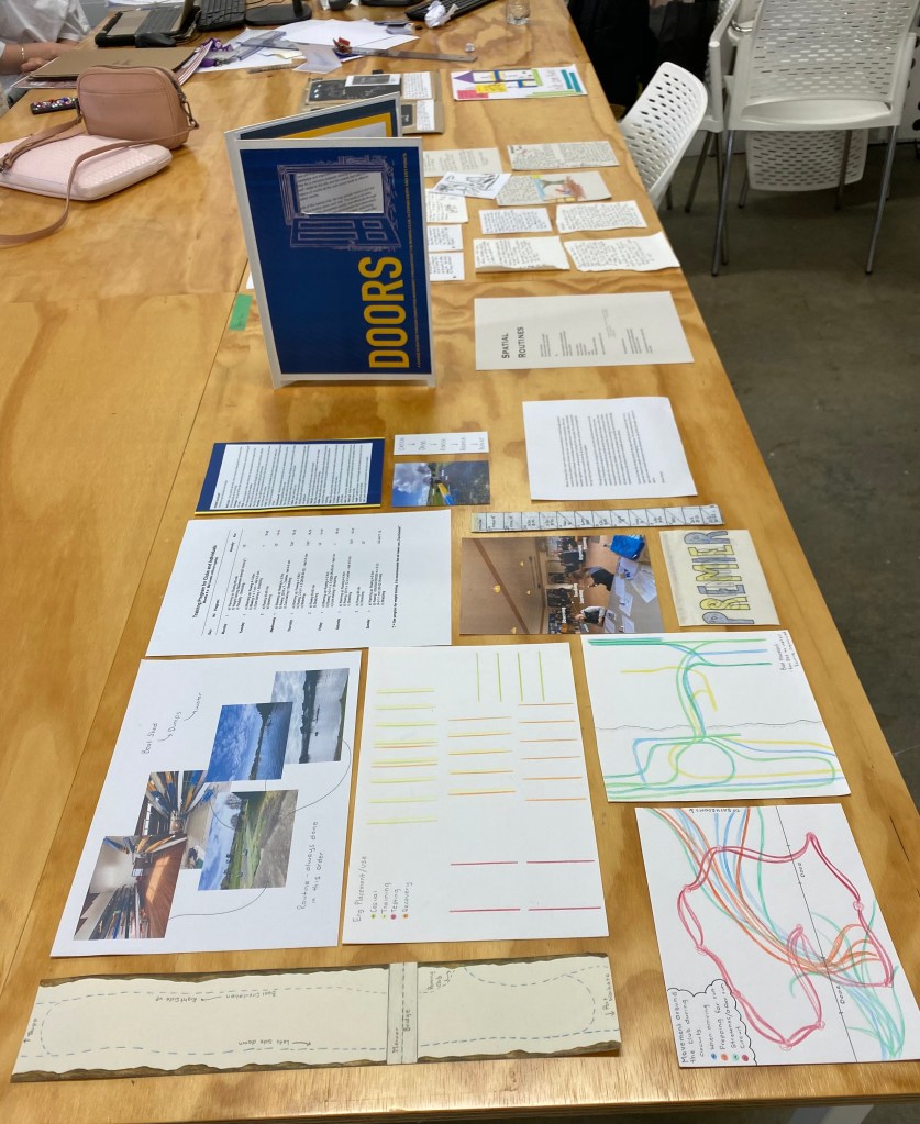
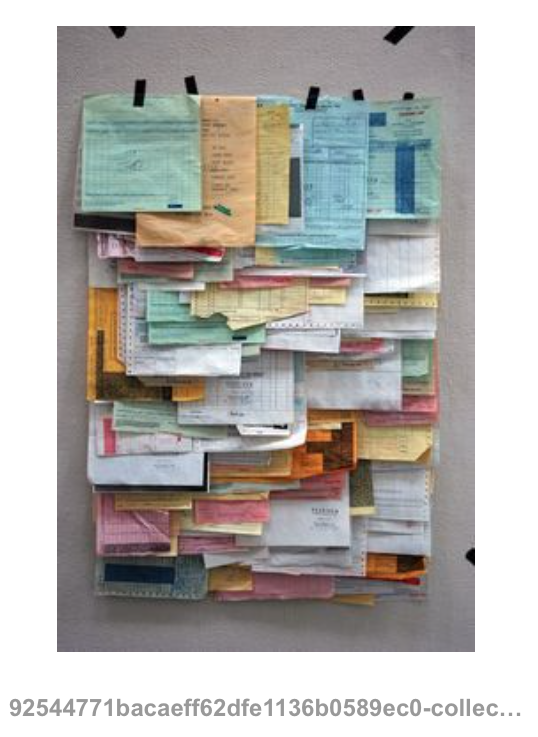
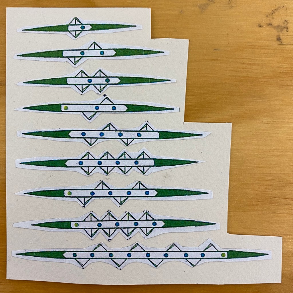
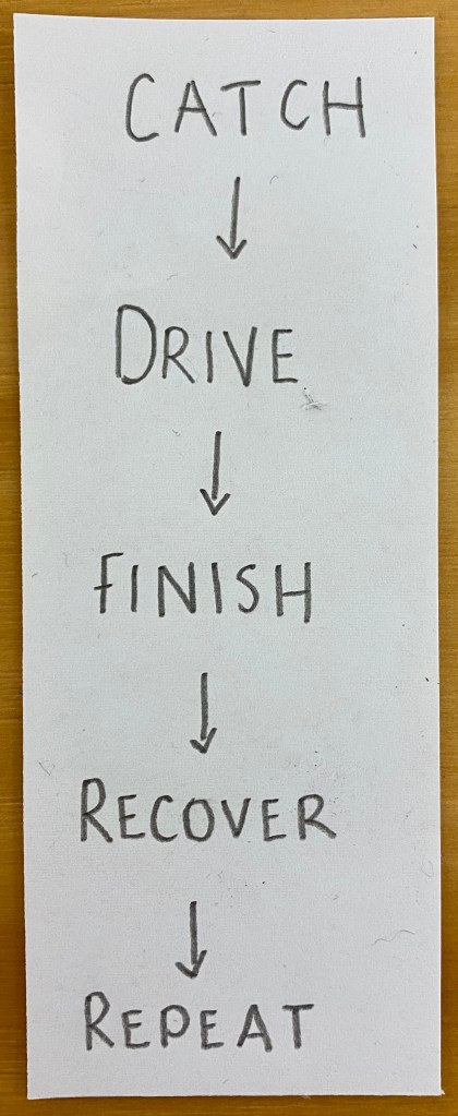
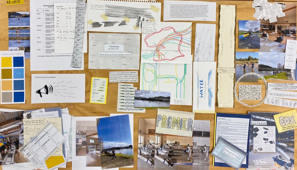
Part one: My chosen documents were the ones that I felt best represented the routines, structures and practices of my chosen site. They ranged from focusing on movements of boats and people to training plans and schedules. I did this because it relates to both my parts two and three with routine being the concept I moved forwards with. I aimed to layout my chosen documents in an even and organised manner to match the overall concept of my presentation.
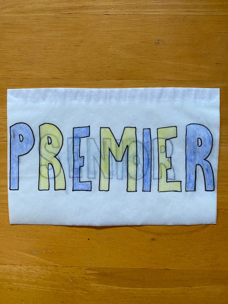
Part two: For part two I created a doorway shaped booklet to display my work from the intervention.
Part three: Part three is my final manifesto ‘Spatial Routines’ where I spoke about the way all space should we designed with routine in mind. This means thinking about what and when certain things take place at any given sites.
