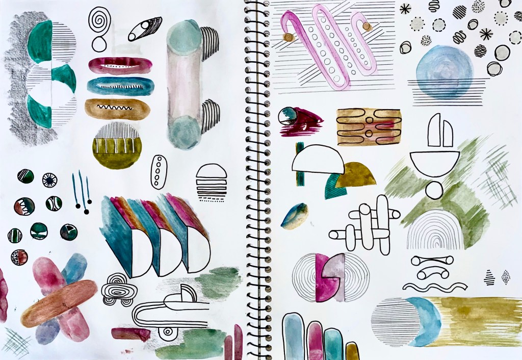
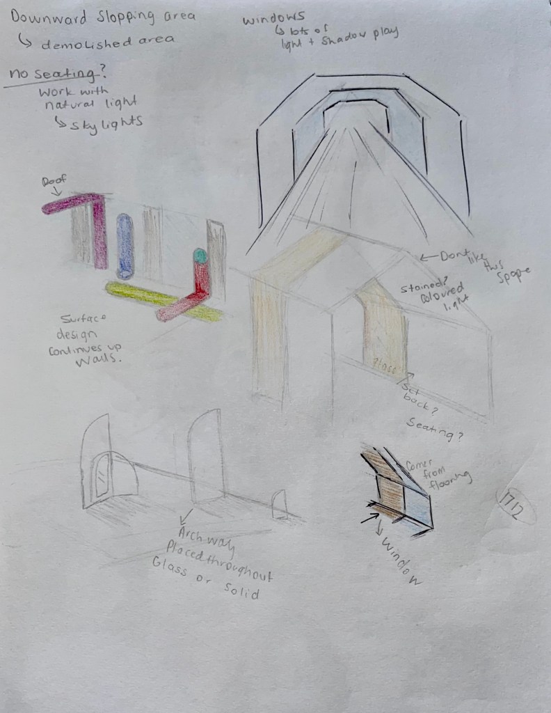
Week One: Colour Mapping
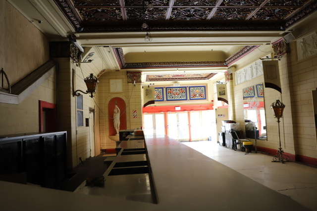
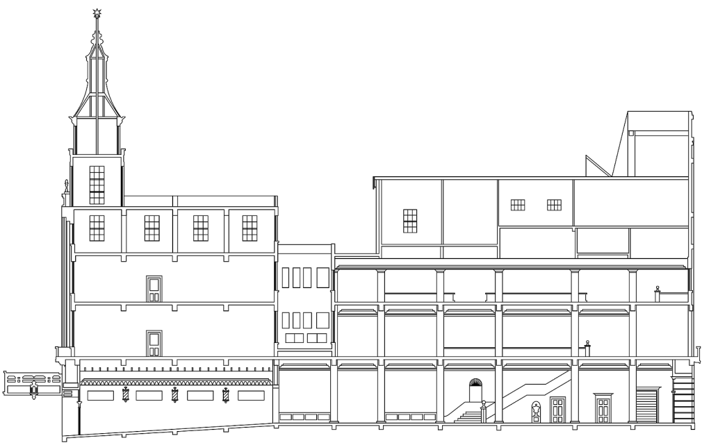
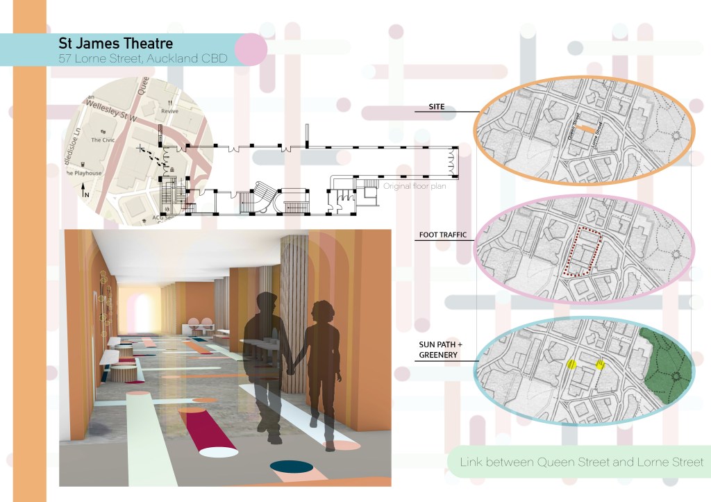
Site: St James Theatre
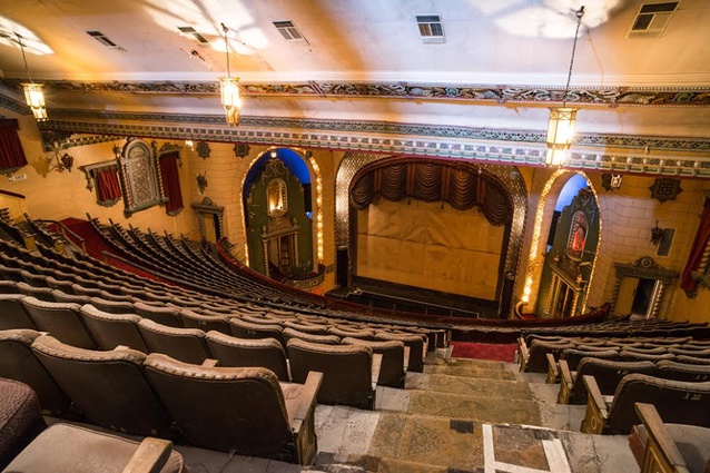
The St James Theatre is a heritage stage theatre and cinema located on Lorne St, Auckland. The theatre is recognised as a place of cultural heritage significance by the New Zealand Historic Places Trust. Built in 1928 the space was originally designed by New Zealand architect Henry Eli White, who previously designed many other famous theatres across Australia and New Zealand.
A fire in 2007 raised concerns about the safety and compliance of the building and the theatre has been closed since. In 2014 the building was purchased by Relianz Holdings and with a contribution of $15 million from the Auckland council surrounding buildings were demolished to make way for the St James Suites, a 39 level apartment project. During July 2019 the funding for the apartment complex was withdrawn as no work had been done on the theatre since 2015. There is no Public access to the theatre.
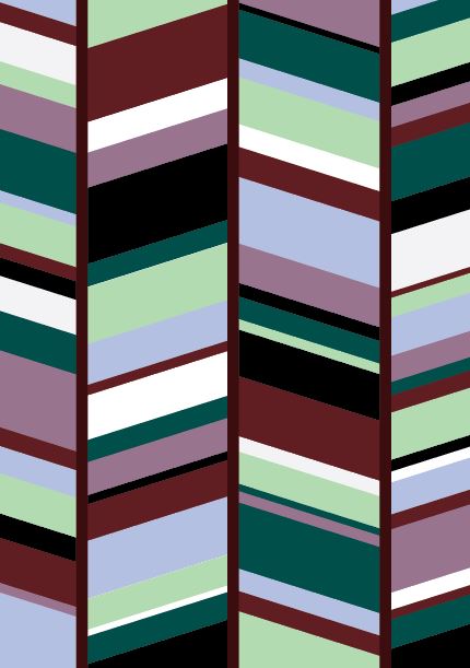
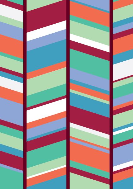
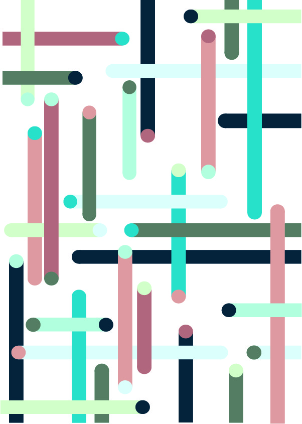
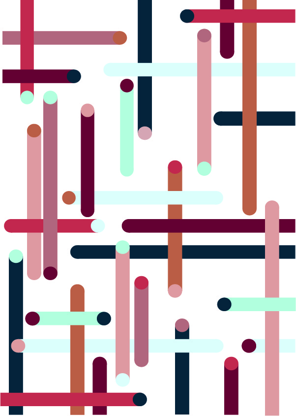
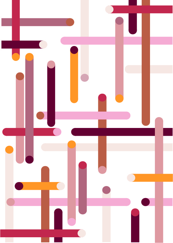
On our walk to the St James Theatre we were asked to document the use of colour in the built environment through drawings and photos/videos. Below are a series of photographs I took while walking that show the use of colours/textures used in the city.
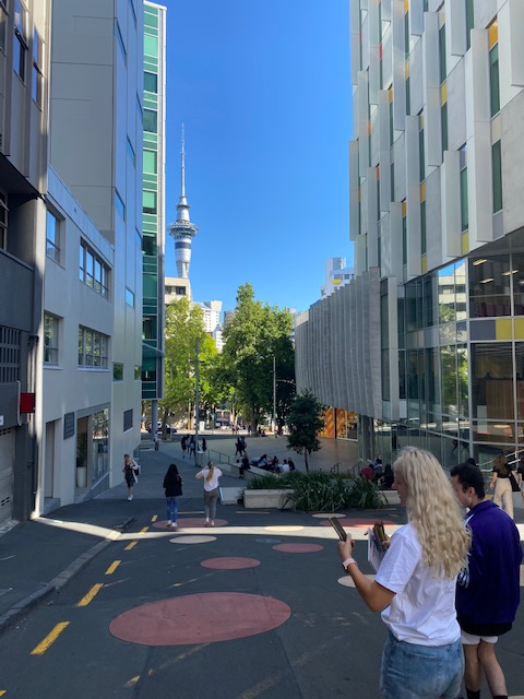

These first images were taken while walking through AUT. I first noticed how many of the buildings used neutral tones such as whites and greys with small pops of warmer tones like reds and oranges. The warm tones were also used on the roads with large circles of colour adding excitement to the plain pathways.
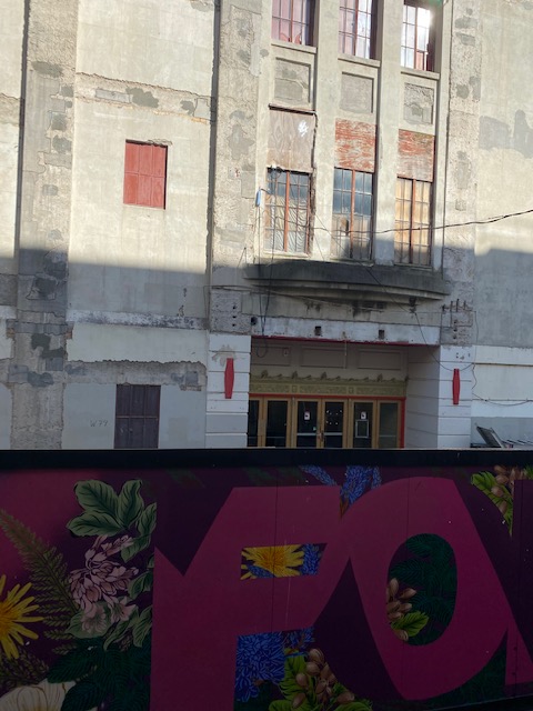
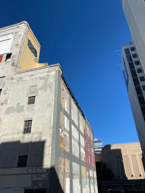
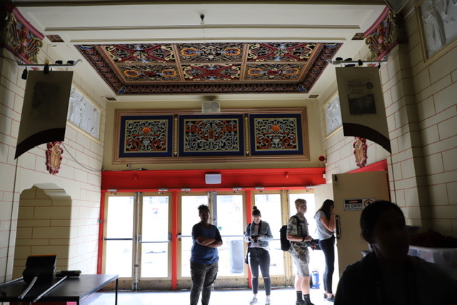
The St James Theatre itself was coloured with many natural earth tones. Similar to the buildings of AUT, the theatre also has smaller pops of colour, specifically around the windows and doors of the building. Again the colours used were also reds, oranges and yellows.
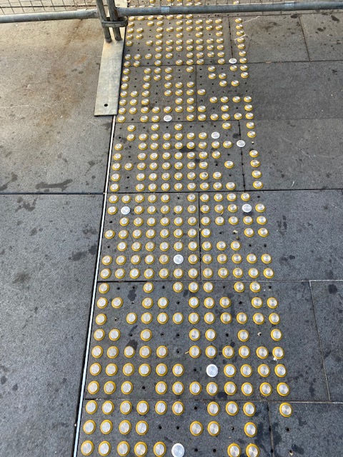
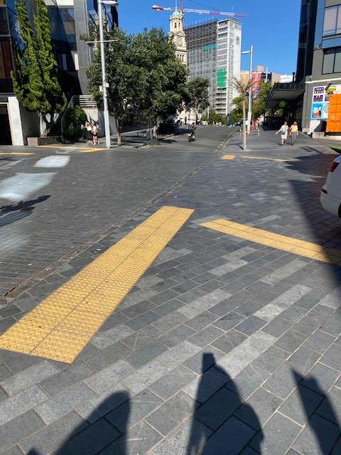
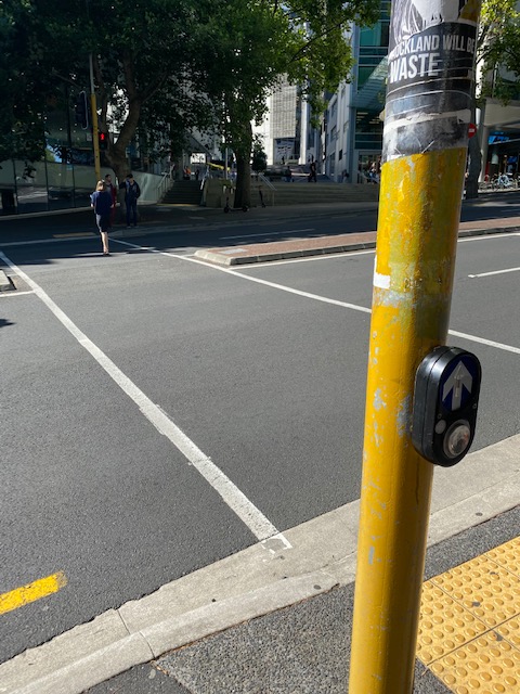
Something that stood out to me while walking to and from the theatre was the use of yellow on the roads and pathways as well as some of the buildings. My friends and I spoke about the use of yellow in the city and how it is used to control human behavior.
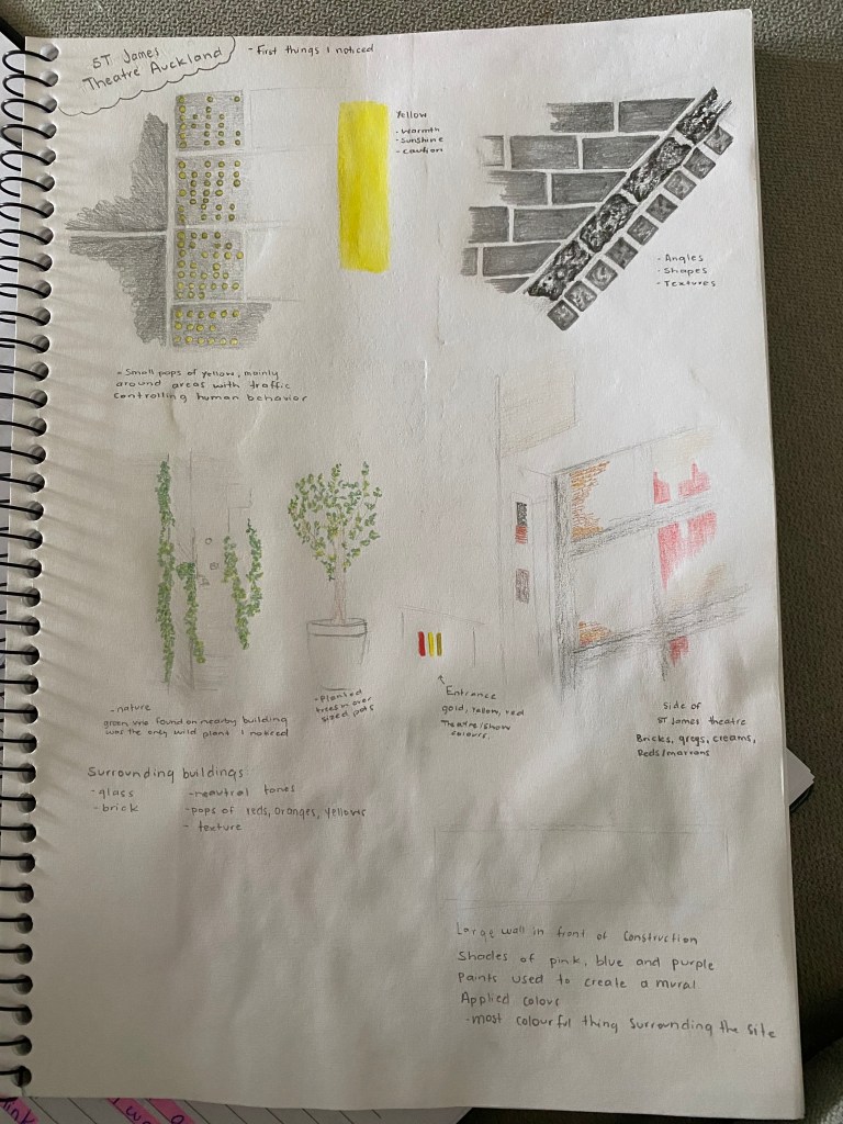
While walking I paid attention to whether the colours of the city were applied or embedded. I noticed that the main colours of the buildings and pathways were greys, whites and creams that are all embedded in the material itself. The brighter colours used as features on buildings looked to have been applied with paint or another media.
The impact of light on many of the surfaces and colours changed the way they looked. When the theatre was in sunlight, the white and creams appeared bright and hard to look at. The parts that were in the shade tended to look more like a grey and made the building look flat.
The proportions of colour used was interesting to look at as each building used very little. When colour was used it was always a shade of red, yellow or orange. One building stood out from many others as the main material used was a red brick.

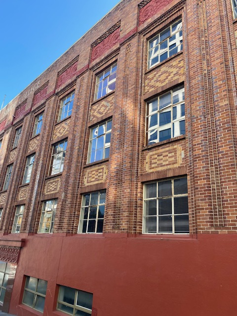
Colour was mainly used around the windows and entries of buildings. From a design perspective these decisions would have been made to draw people to the entrances of the buildings and make them easy to find.
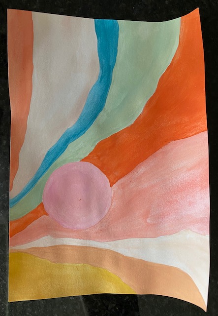
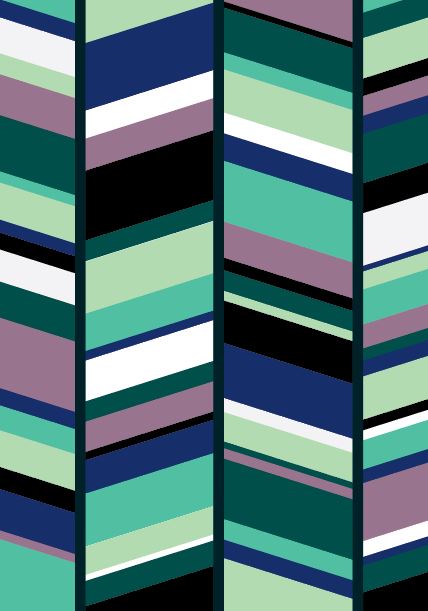
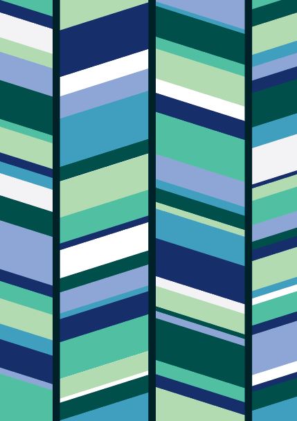
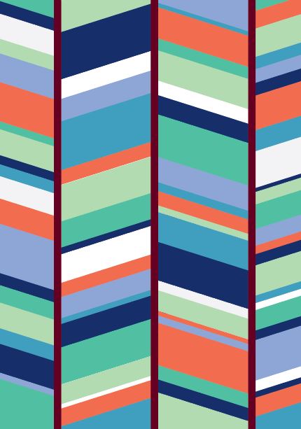
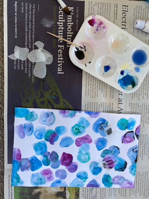
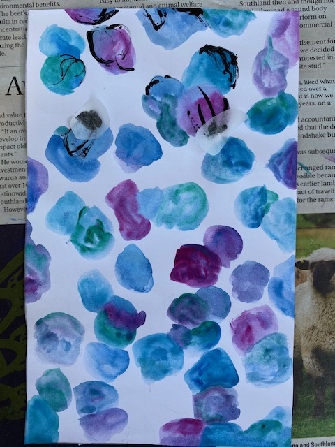
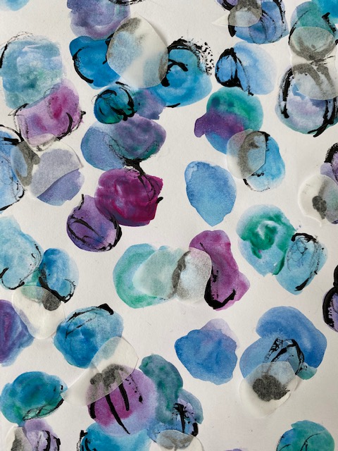
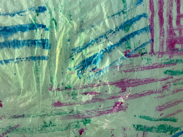
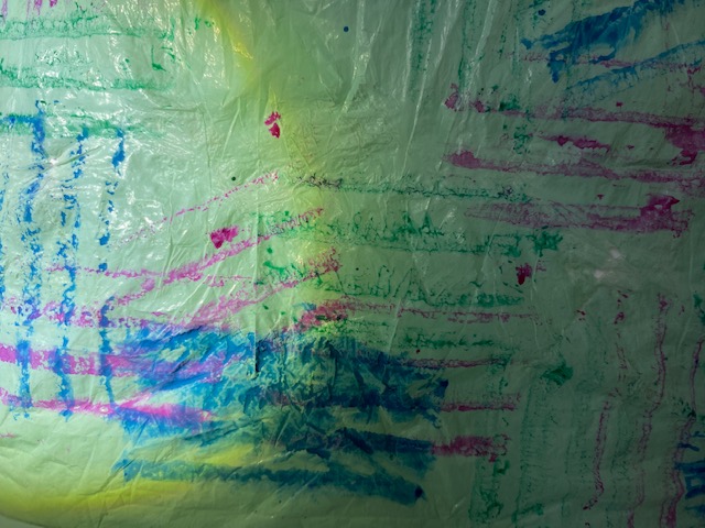
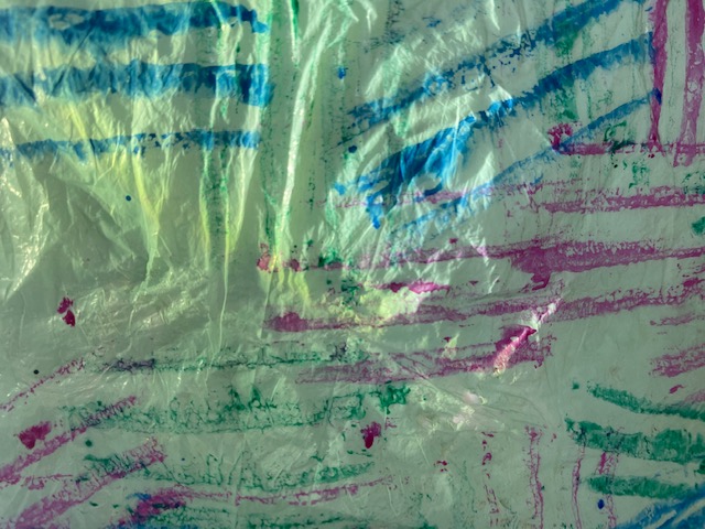
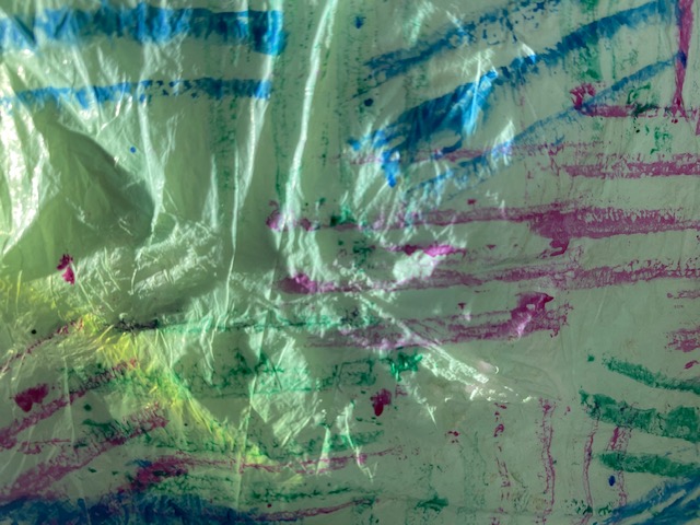
Final Colour Collage:
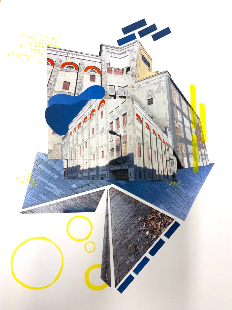
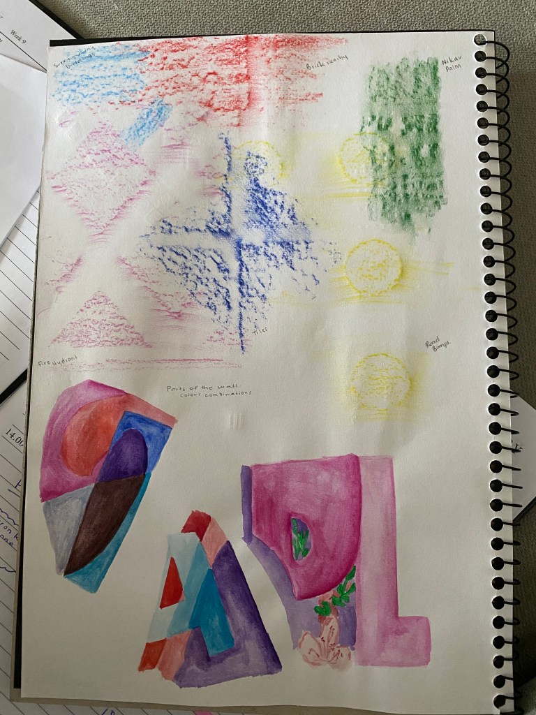
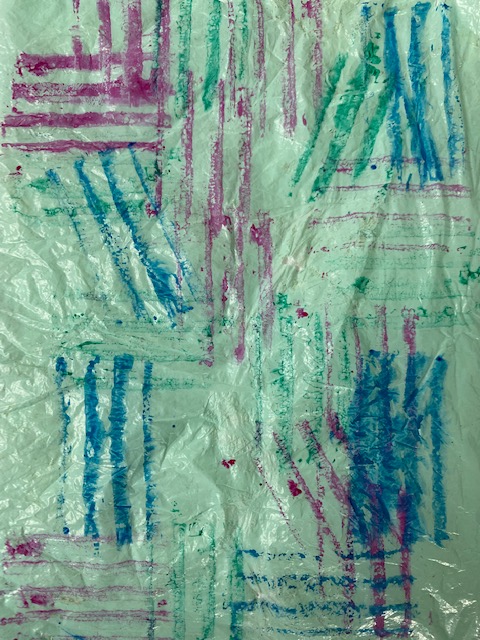
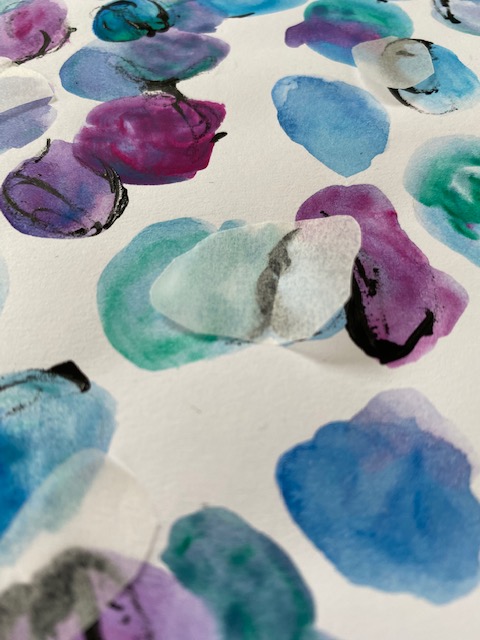
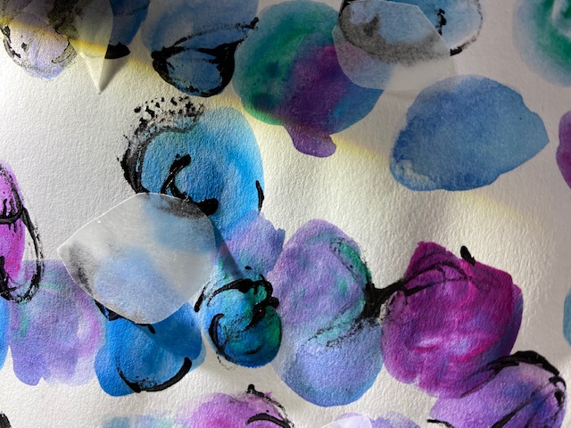
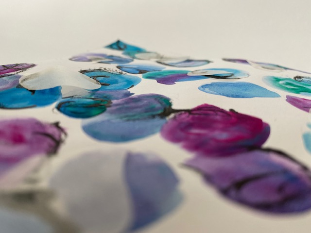
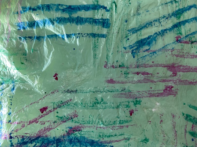
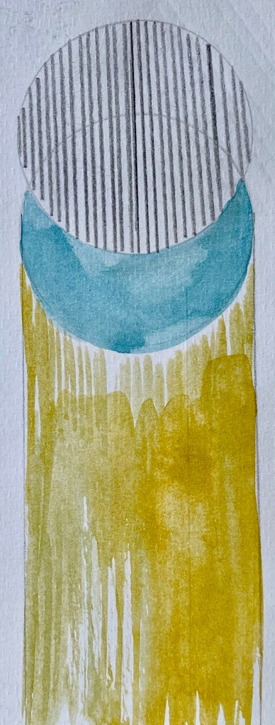
My collage is made up of photographs I took during class as well as acrylic and water colour paint. When I began to collage my images I noticed similarities between many of the shapes and colours. I started with the blue and grey tones of the sky and pathways. In the light the paths/roads looked more blue than they did in the shadow. This inspired me to cut some of the sky from my photos into rectangles to mimic the pavements. The different use of yellow also stood out to me and this is shown on my collage through the pops of yellow paint.
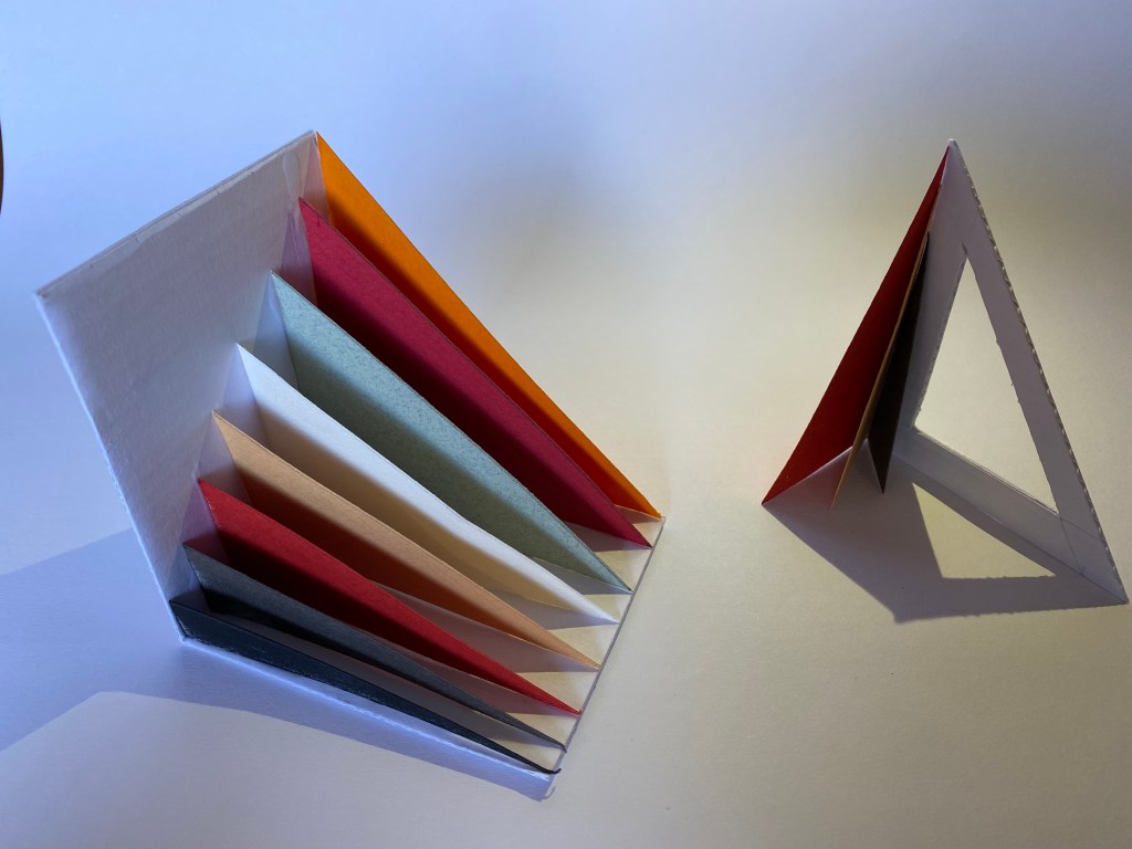
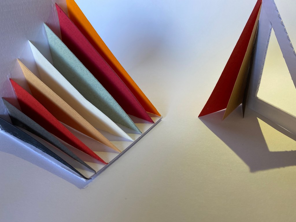
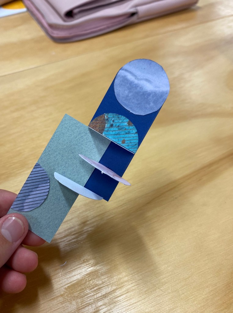
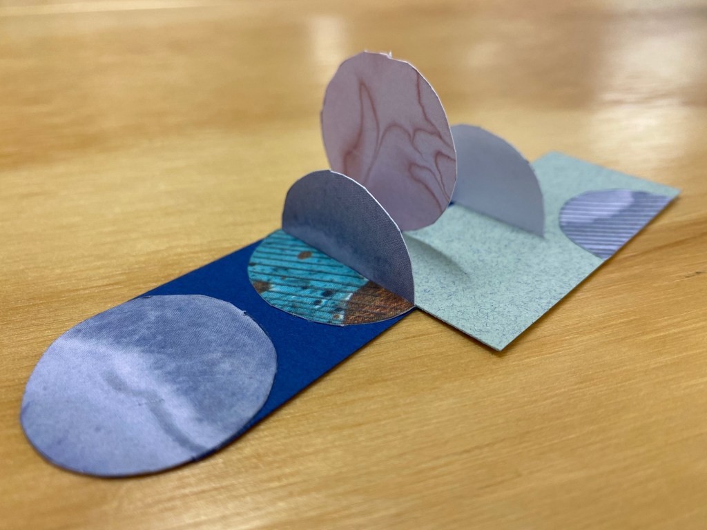
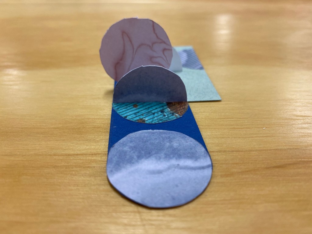
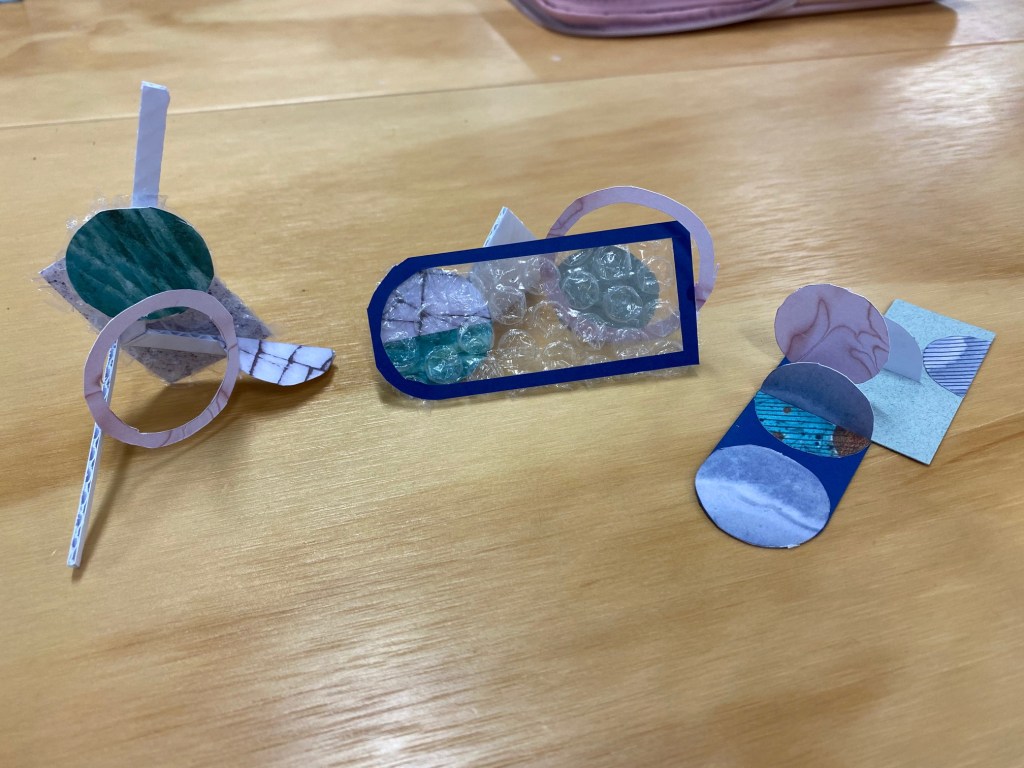
Model Making Workshop:
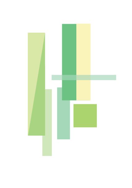
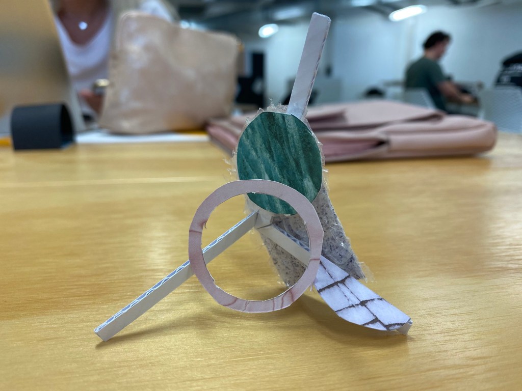
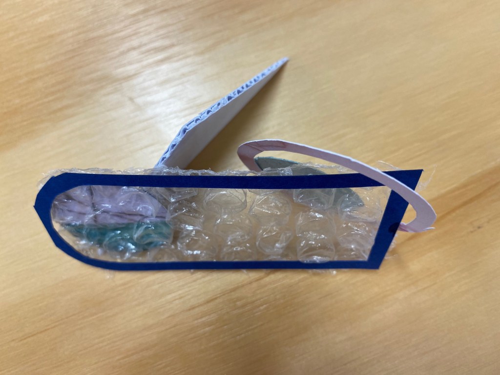
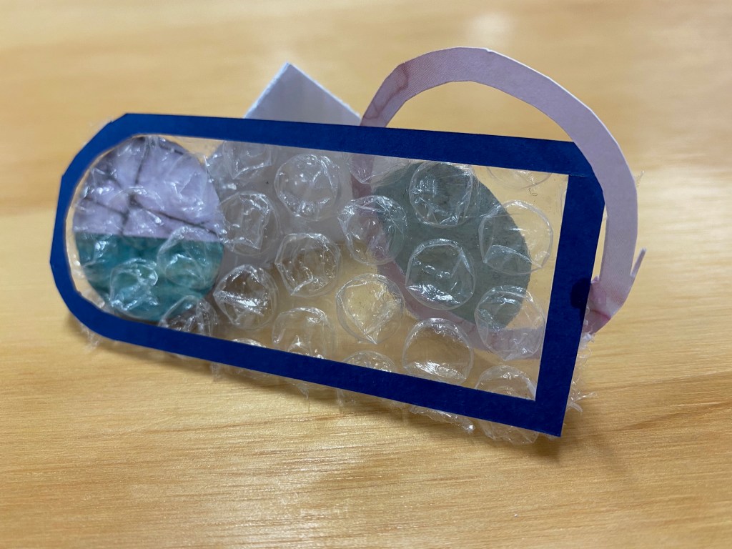
During class we worked on three different models inspired by our colour collages.
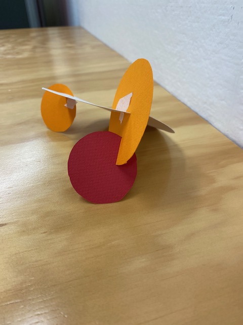
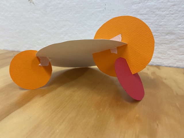
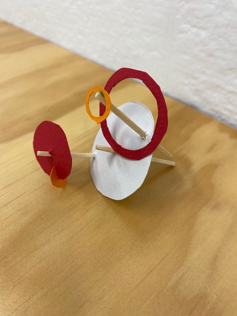
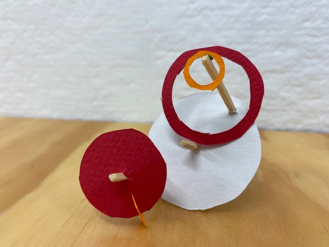
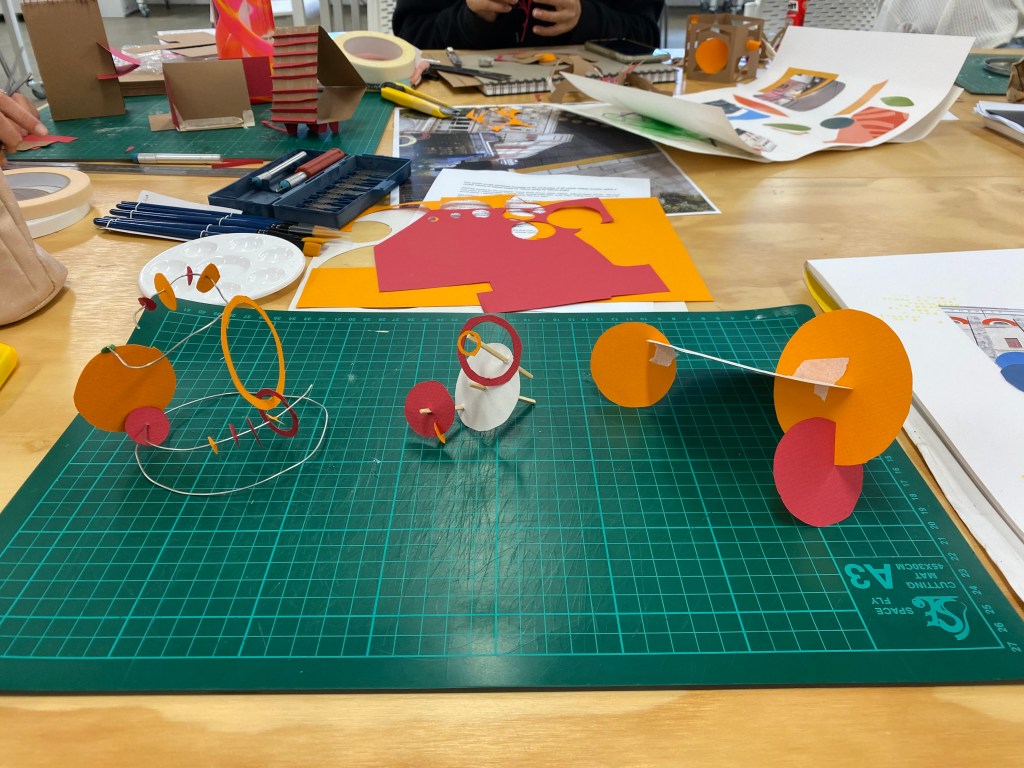
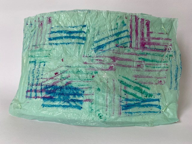
While making my three models I particularly focused on using the same colours I had seen earlier in the week when walking to St James Theatre. I wanted each of my models to have the brighter colours stand out from the whites by bringing them forward and making them more dominant. This may be a technique I use in the future for my final design.
Week 2: Seminar
This week we worked in small groups of 5-6 to create a seminar to present to the class. My groups seminar topic was colour + light. We each worked on our chosen question, mine being, ‘an analysis of the relationship between light and colour (from a scientific perspective)’.
Link to my groups presentation:
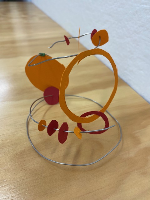
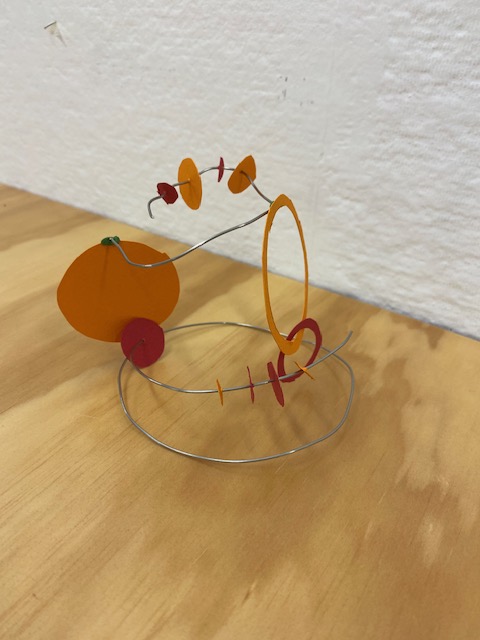
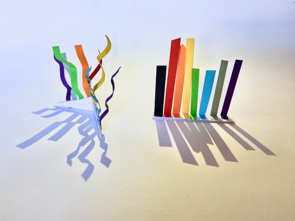
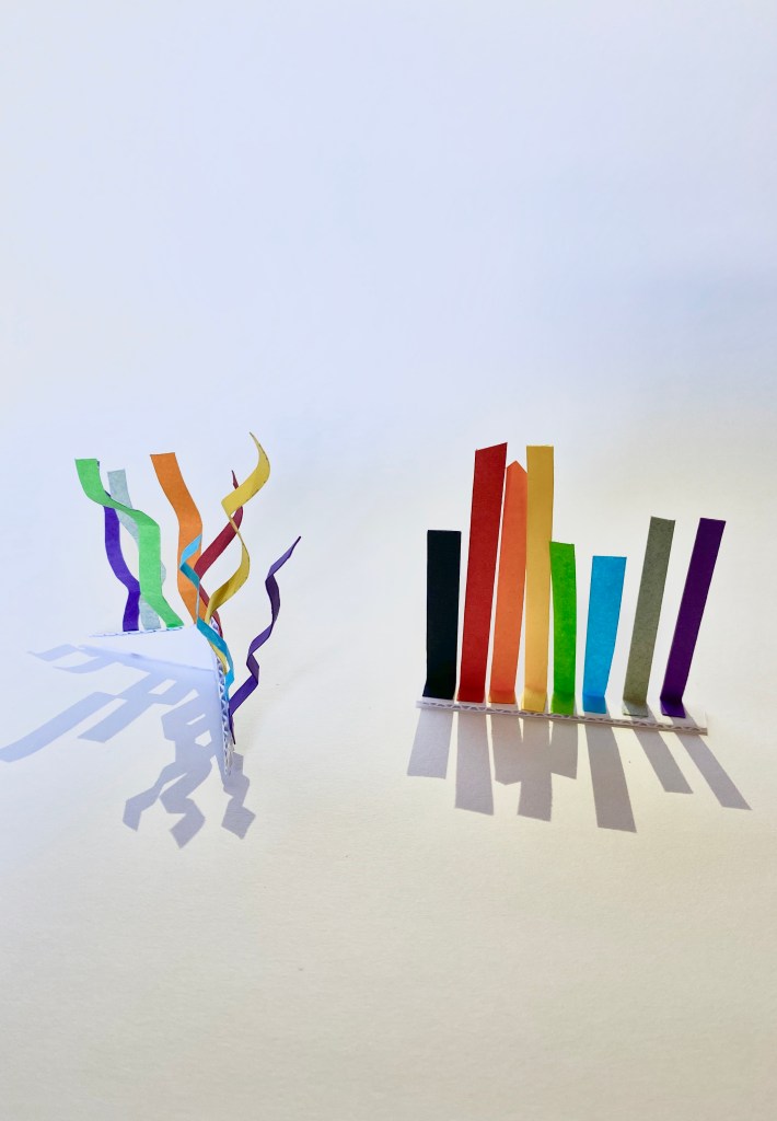
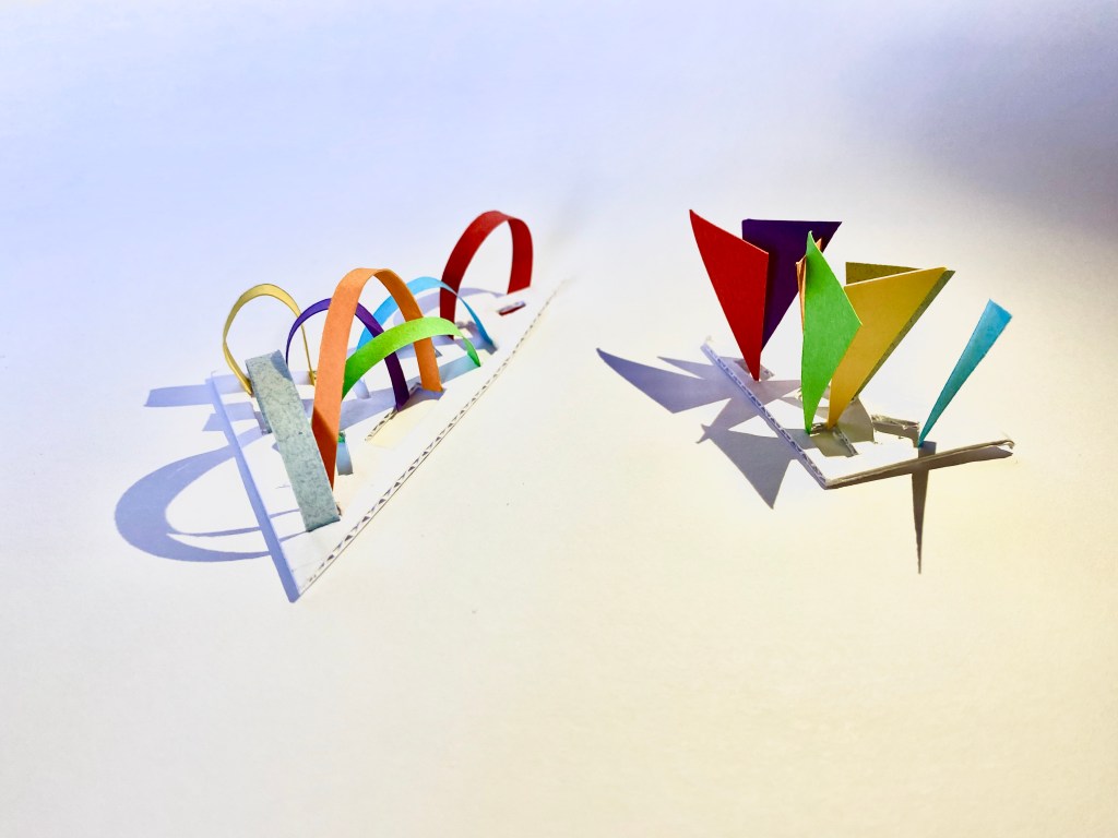
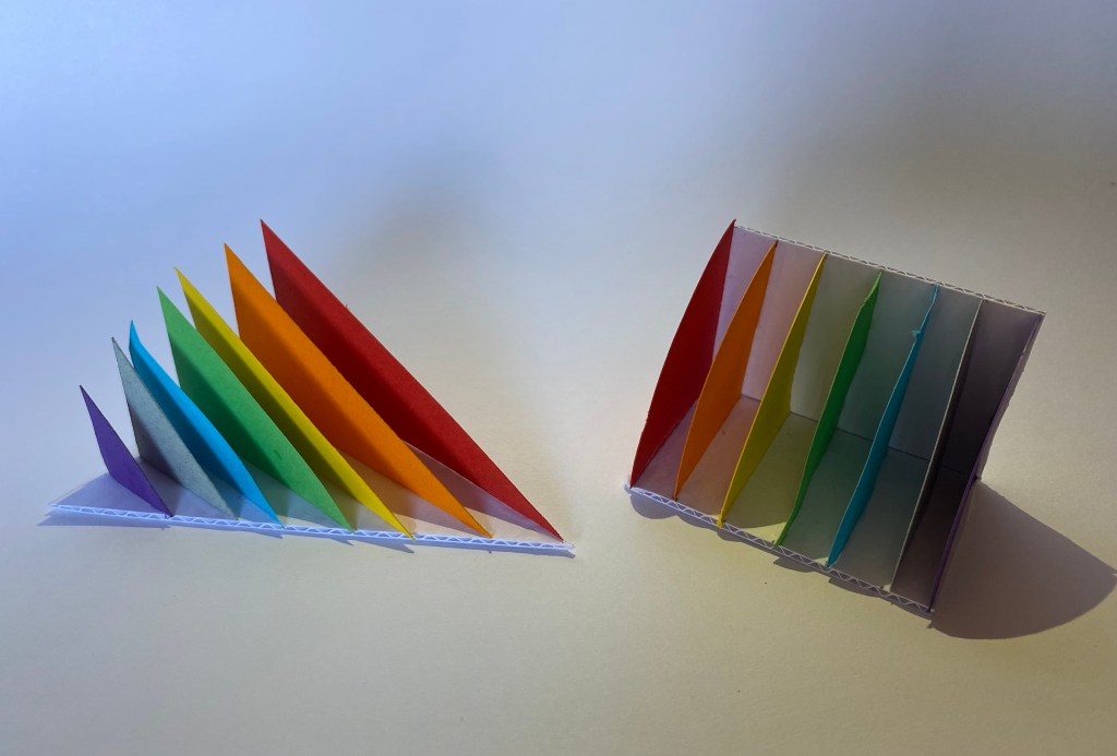
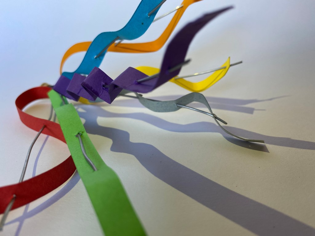
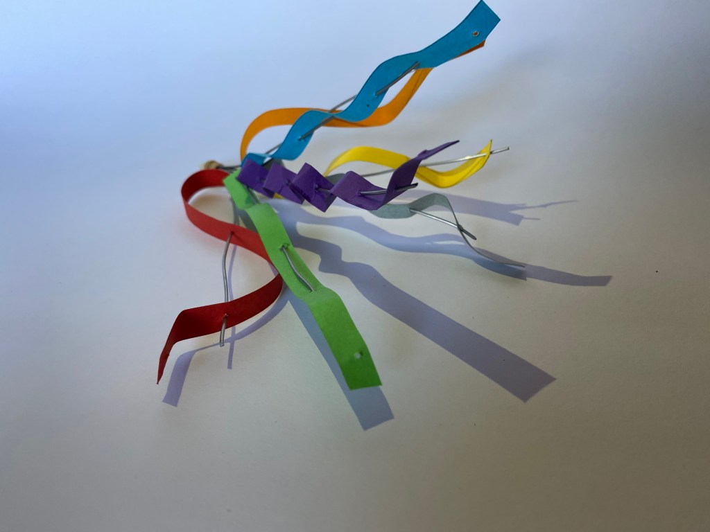
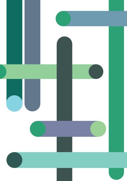
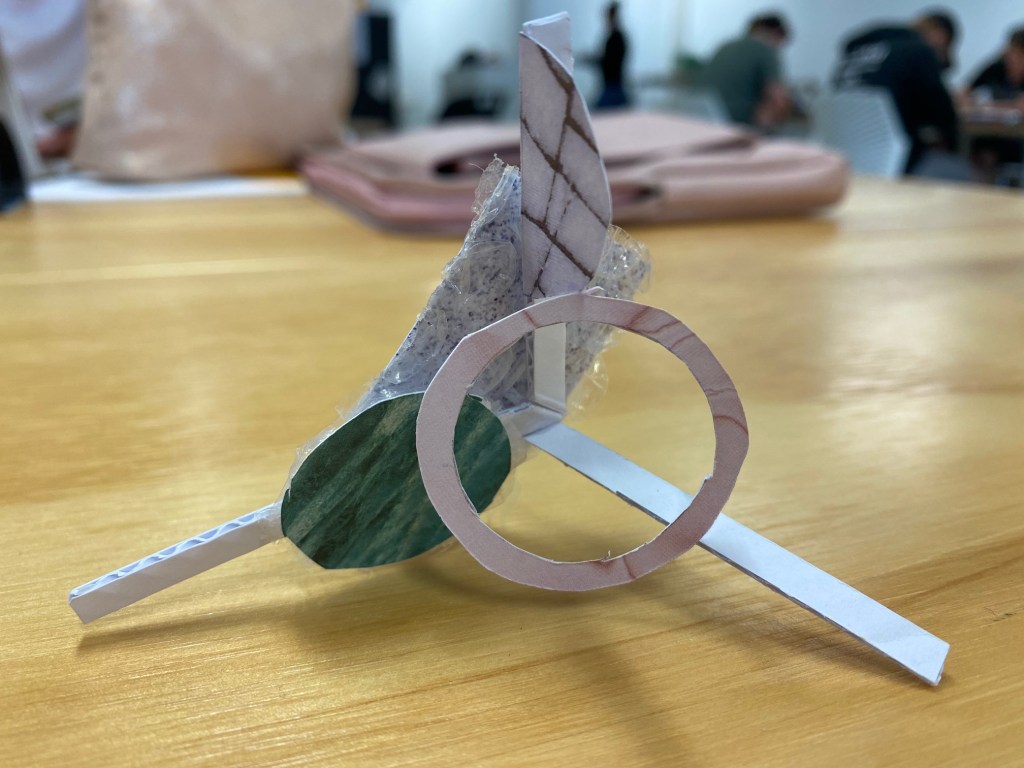
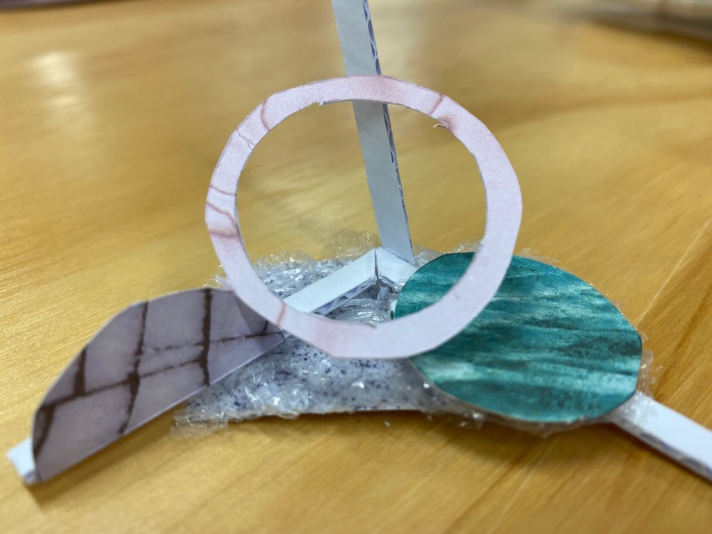
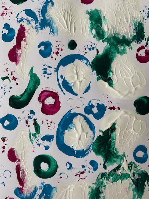
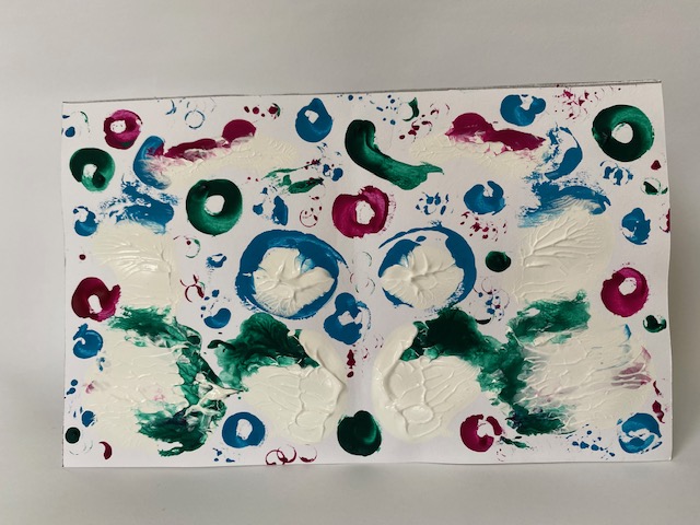
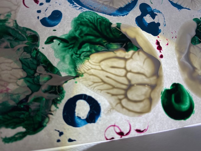
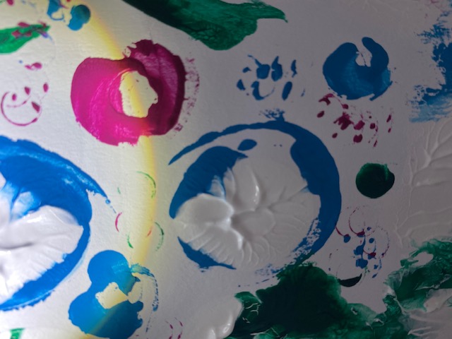
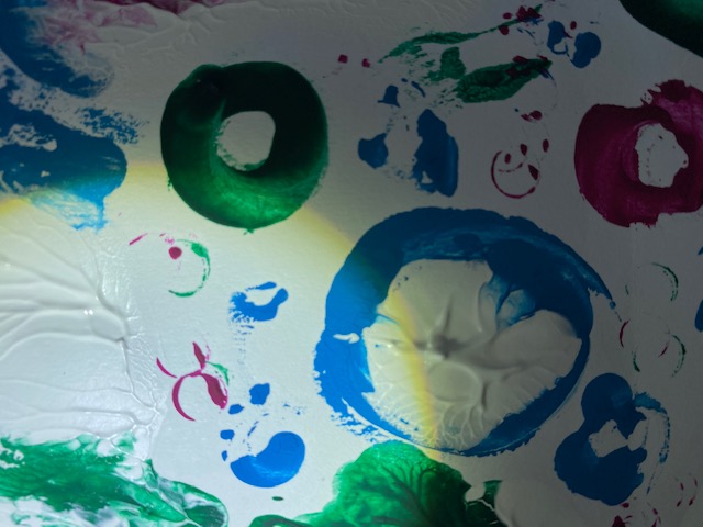
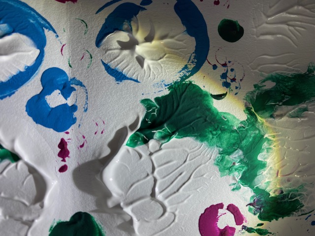
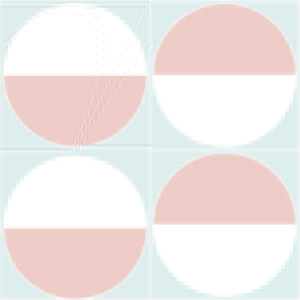
During thursdays class we began work on 25 small models that communicated our ideas around of semiar topic, colour + light. After completing half the models in class I went home and completed all 25 models seen below.
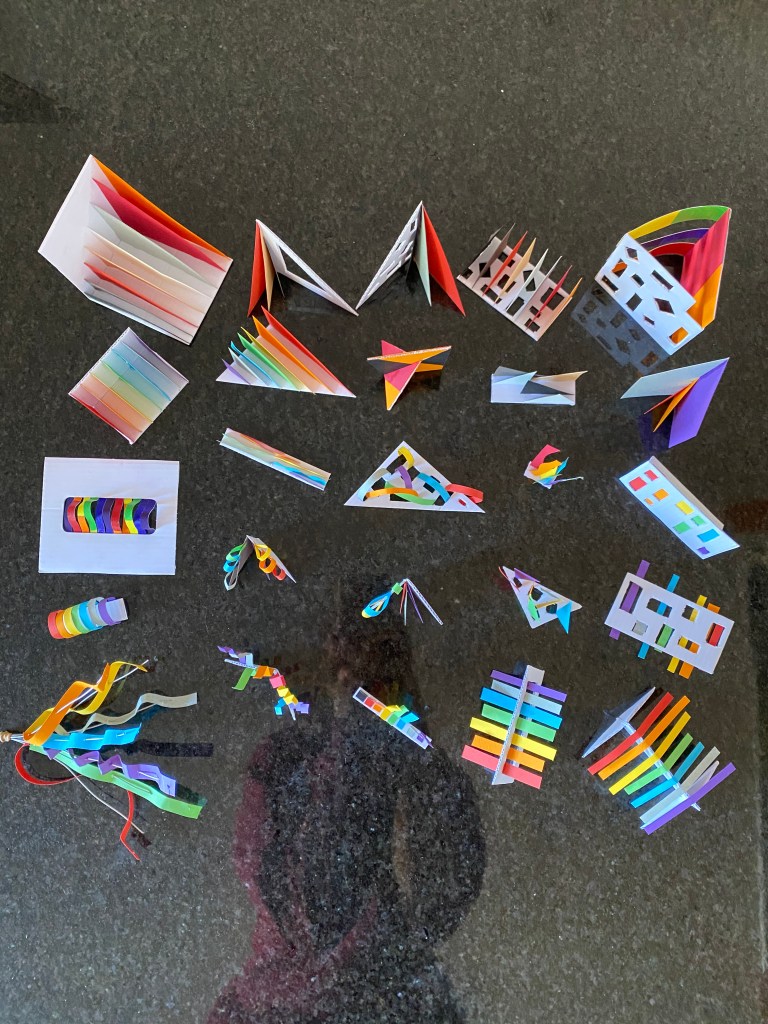
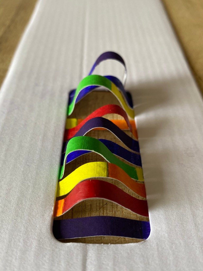
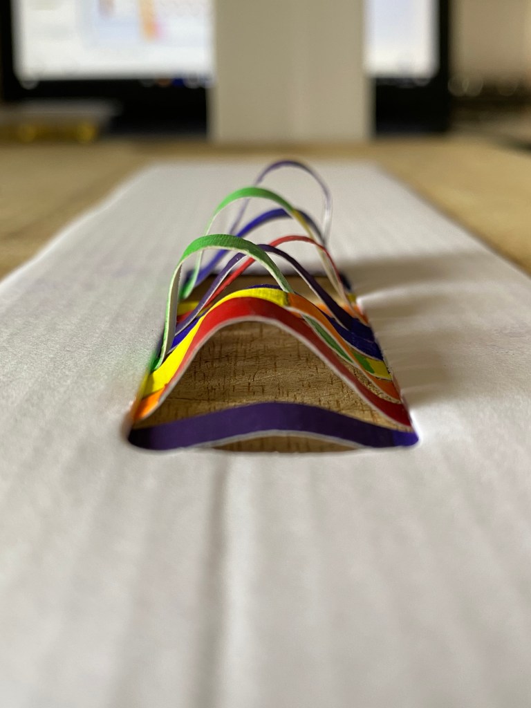
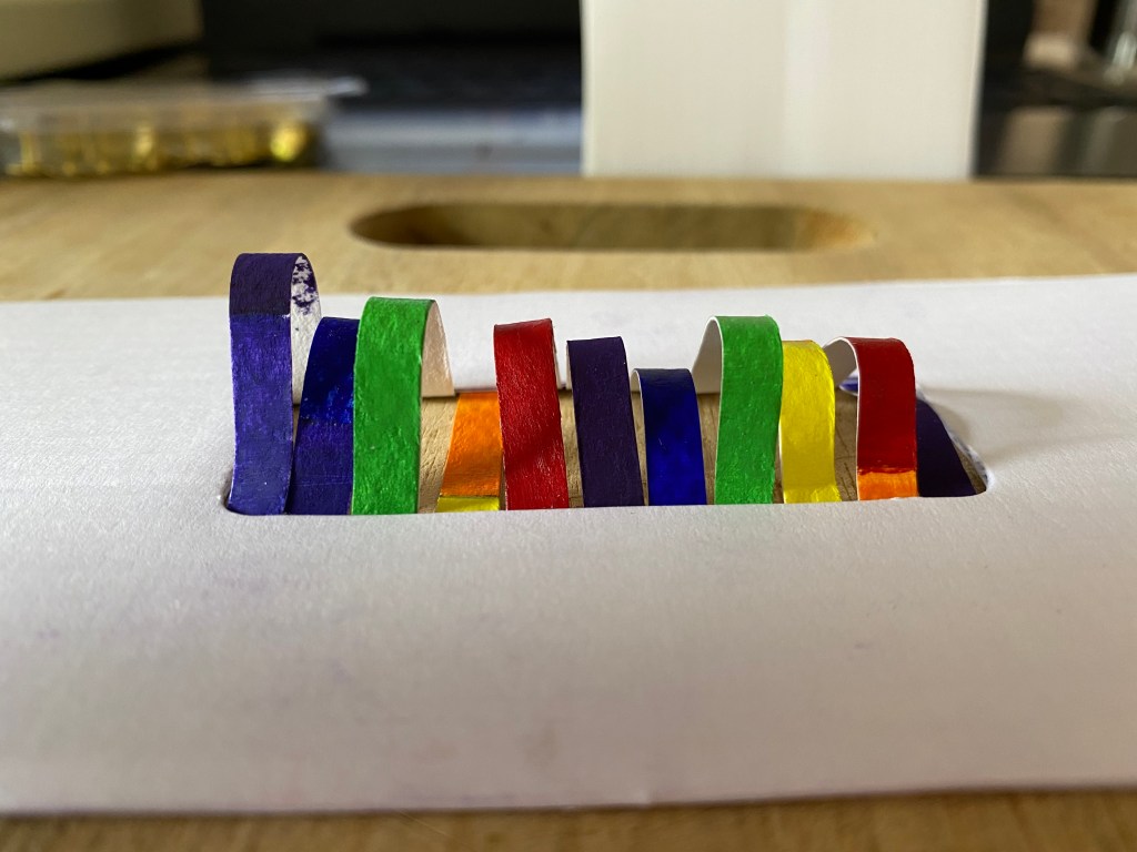
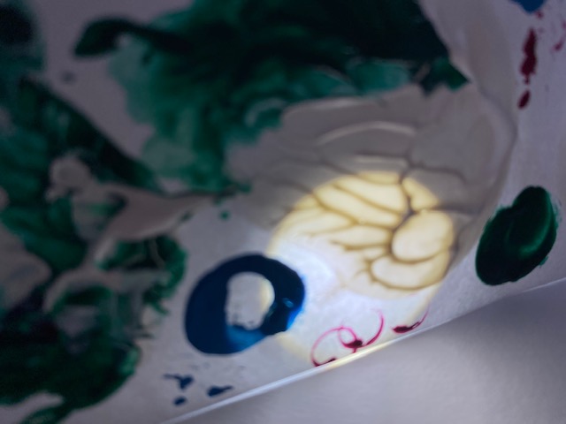
My 25 models were driven by two ideas. My first idea was to investigate how colour changes in the light vs the shadow. I worked to generate models that explored this idea by creating shapes that allowed both light and shadow to hit each colour. I cut small holes and used varying sizes of shapes to ensure light reached certain parts of the model.
My second concept had a focus on the wavelengths of colour + light that I researched for my seminar question. I began to mold the coloured paper into curves that mimicked the wavelength of the particular colour.
I started to play with the idea of the ‘rainbow’ and began to create models that combined all my thinking. Below are a few of the models that I think communicated my ideas best.
Week 3: Site Visit
Site analysis tips:
- Pace it out
- Sketch lots, key elements, areas of interest
- Scale
- Water colour/other mediums, layering
- Measure things with your body, easy to remember when its in relation to you
This week we were lucky enough to be shown around the St James theater by a man from St James Buildings, the developers for the project. I was really interested in the history of the site as well as the reasons they had for restoring certain parts the way they did. I wrote down many of the main points talked about while walking around the theatre.
History:
- Opened 1928.
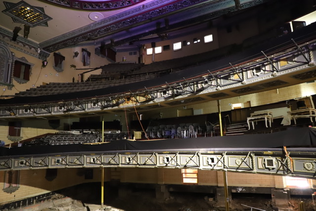
- Three level theatre, each with their own lobbies. The lobbies are not connected, this was so different classes of people did not interact.
- Architect Henry White, used same plans for other theatres.
- The theatre is essentially two tall buildings with a suspended roof between, cast iron poles holding it up.
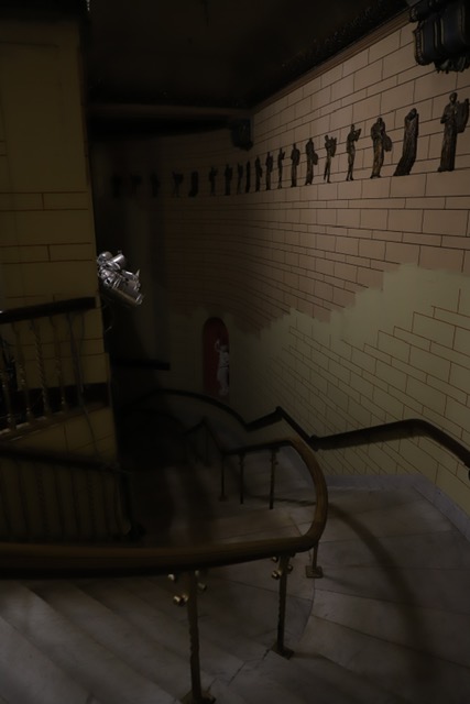
- Old remains of cobble stone and building foundation can be seen on the ground floor from what was originally there – pre 1880’s.
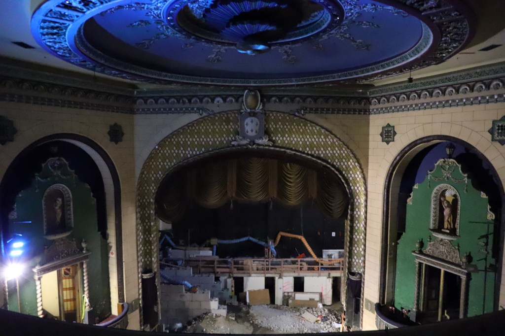
- The ‘gods’ lobby was used as a night club for the last 15 years it was open called the Grand Circle. The club was rang by gangs, safes were found hidden.
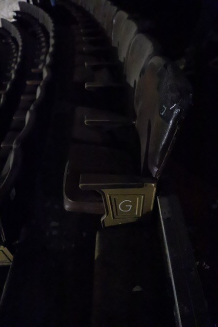
- The ‘gods’ seating it considered the worst seats. The layers of seats are designed for each level to not be able to see the other levels.
- Seats 2000 people.
- Designed for people to be on stage.
- The style is a honest reflection of the architecture used in theatres in the 1920’s. The Civic that was built a year later is considered to be behind the times of design.
- St James was built for small shows and liver performances, the civic was built to be more of a cinema.

Restoration:
- The plan is restore the theatre back to the style of 1928 design. They chose a time period so that the theatre won’t look mix and matched with both old and modern styles.
- The walls have been plaster rendered to look like brick, painted over, fake brick.
- Statues were originally bronze, have now been painted over to look like marble.
- Some statues have had clothes plastered on.
- Colours have been darkened each restoration as the building got older. This was because the lighter colours appeared to be dirty. The dark colours hid this. They plan on lightening everything up again. Warmer tones.
- Temporary lighting is used all throughout the theatre. An electrical fire made all original power unsafe to use.
- The whole building is mostly brick, plastered to look pretty, an illusion.
- The theatre has been painted with cold colours, it was originally warmer, plan to bring this back.
- Seismic upgrading. The building is being put on large roller skate like bearings. Bounces during earthquakes, takes the force away. NZ designed, brought by US military. This solution means less restoration needs to be done on the walls but the building will need a new foundation.
- All the archives and old things are stored up on the gods level.
- Plans are to restore the site back to a operational theatre. This is reliant on the neighbouring development. These buildings will need toilets and kitchen etc. as the theatre does not have any of this. The space will be used for concerts, graduation and small shows due to the backstage area being rather small.
Photographs from site visit:
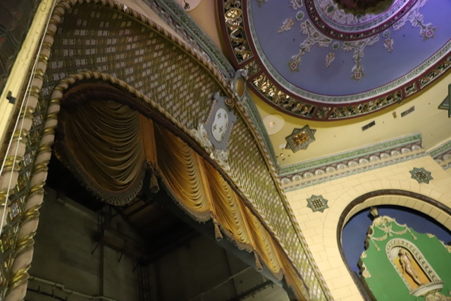
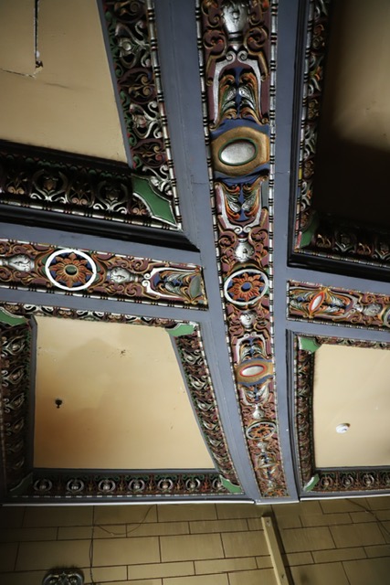
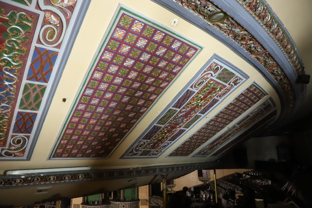
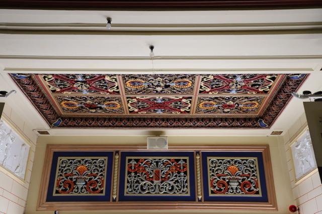
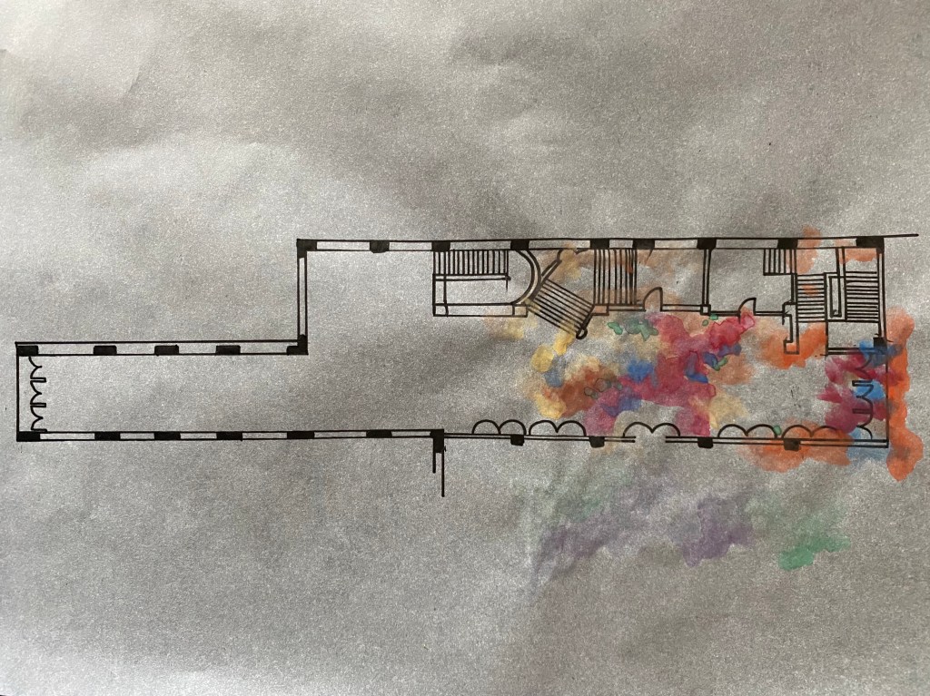
Collage of applied colour details I found interesting within the site. Cool tones, a lot of colour used in small spaces. Colour mainly applied to the ceilings and around door ways. Busy.
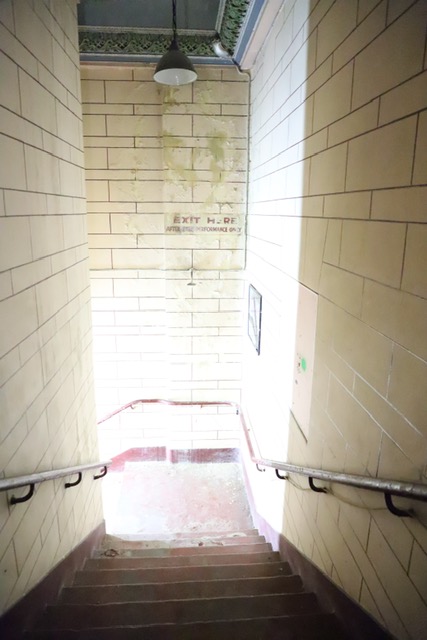
Spaces where natural light could be used. Doorways either end. Windows in stair wells.
Examples of places that lack natural light. A lot of the theatre space is quite dark therefore effective artificial lighting is going to be needed.
Seeing and walking around the site helped a lot with visualizing potential designs and colour schemes. After visiting the space I have a much better understanding of the scale of the space as well as the type of area it is. I really like the idea of the site being a connecting space between Queen Street and Lorne Street. When designing my intervention I am planning on enhancing this space as a walkway.
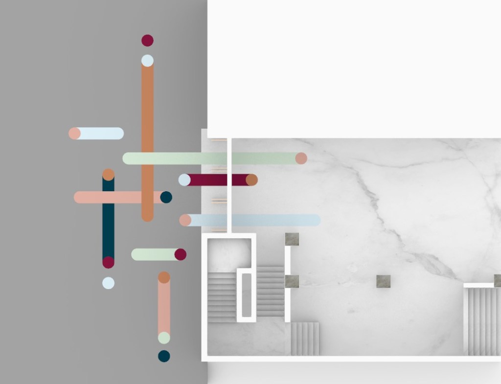
Site Analysis:
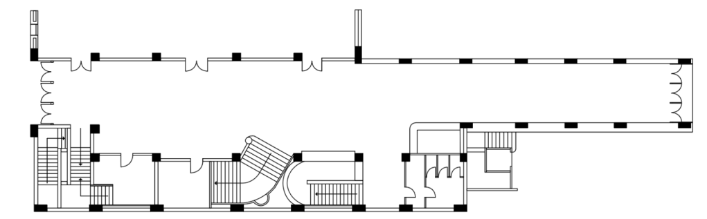
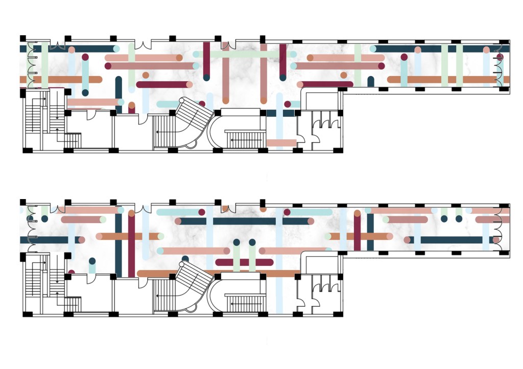
Below are a series of floor plans that explore a few of the ideas I think are important within the space.
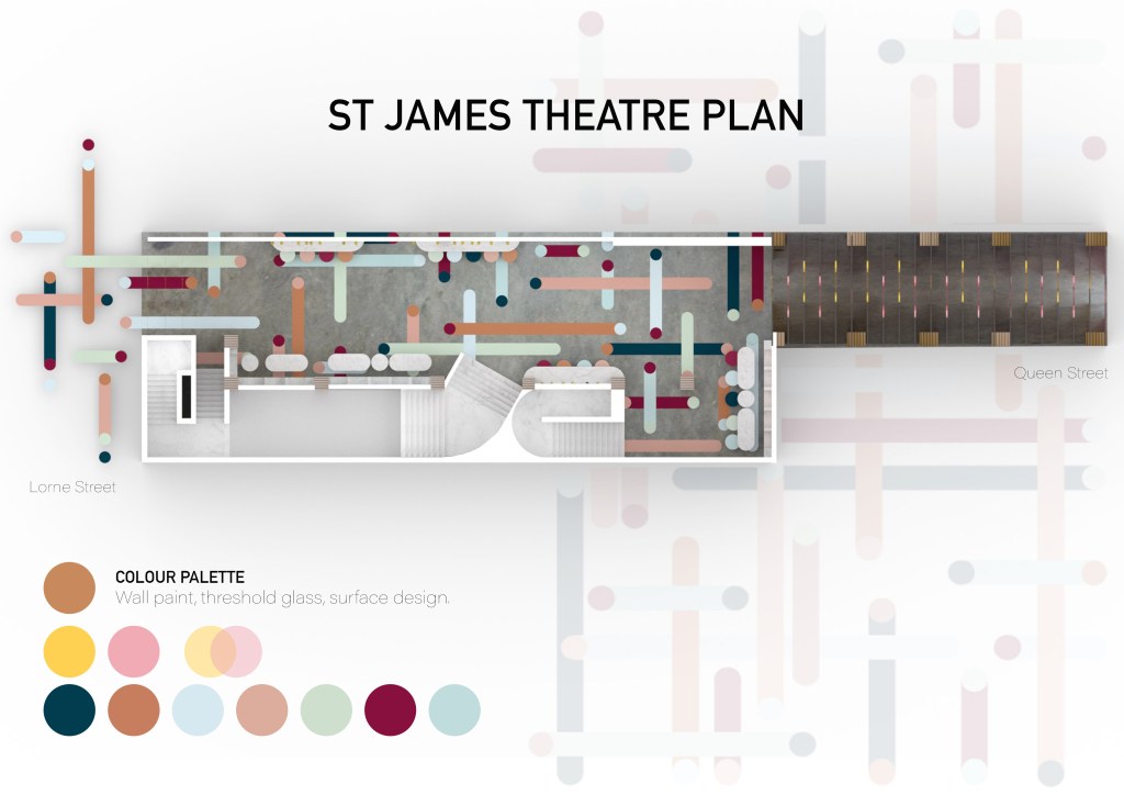
The first floor plan looks at the range of applied colour use throughout the space. I noticed the main use of colour was seen around the doorways and ceilings. The colours used were bold and ranged from warm to cool tones. The colour was all applied through paint bringing many small patterns and design to life.
The second floor plan explores the way natural light enters the space. Although we were only able to walk through a small part of the space I know that natural light will enter through each ends of the site. As shown on the plan, little natural light reaches the center of the space. In the future, as I work through my design process I will look at ways of using natural light to my advantage as well as figuring out how I can allow more light into all areas of the site.
The third plan is the one I consider most important when analysing the site as it shows how the site was/may be used. As I am planning on using the site as a connecting space between Queen Street and Lorne Street it is important I look at the way people might move through the space itself. When used as a theatre foot traffic would have been heavy around the doorways into the seating and on the stairwells. This will change with the way I will design the space as people will walk right through rather than gathering in the building.
Applied colour in the space 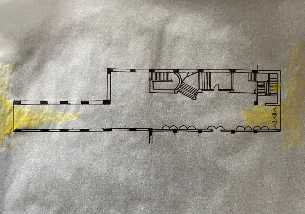
Natural light 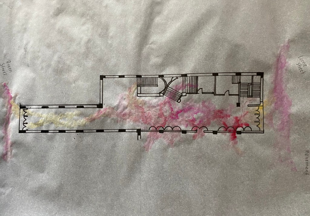
People movement
Week 4: Artist Model
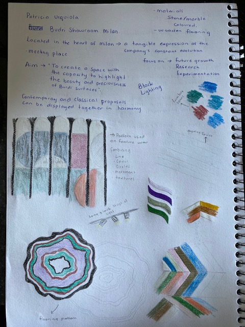
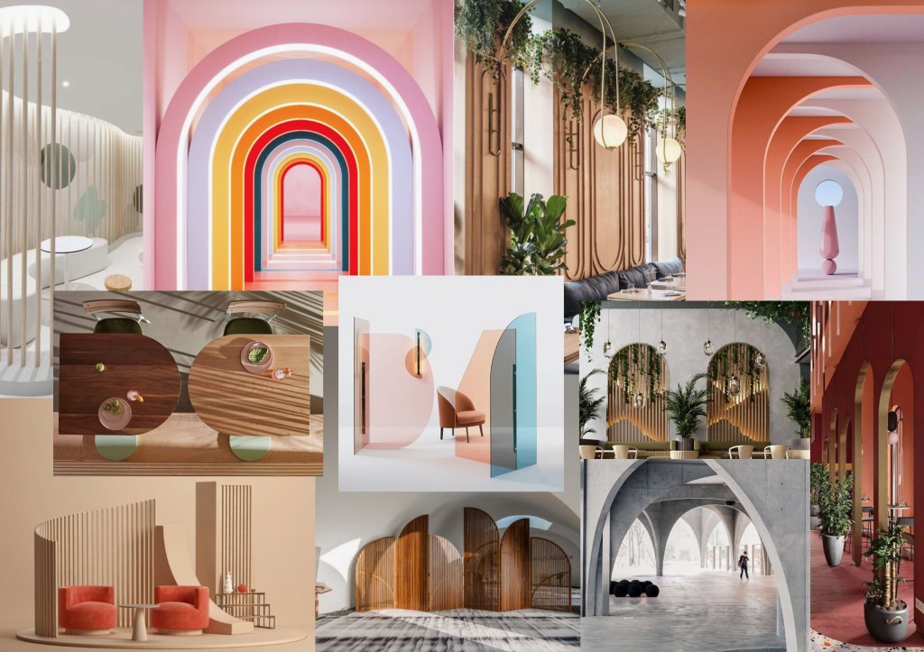
Patricia Urquiola
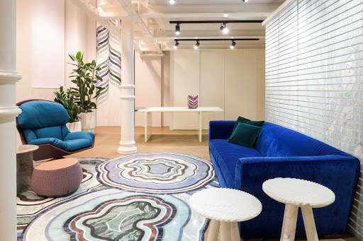
My chosen artist model that will influence my design is Patricia Urquilola, a Spanish architect and designer. I was drawn to Urquilola’s design due to her use of colour textures and patterns to fill a space.
Find out when and where they produced their work – Patricia Urquilola designs for the most important Italian and international companies around the world. In 2001, after years of learning Urquilola opened her own studio, ‘Studio Urquilola’, based in Milan now with around 40 employees.
Identify key conceptual ideas that underpin their work – The main idea behind Urquiola’s work is to showcase her modern style with unexpected elements. Creating designs that are simplistic yet playful by mixing styles, patterns, materials and her personal taste. She wants to create spaces that can evolve, not just sit and be forgotten about. This stimulates curiosity and emotion in design enthusiasts all over the world.
Identify their critical position on colour in relation to their work – A wide variety of colour is seen throughout all of Urquiola’s designs, ranging from bold colours to pastel and grey scale. For each space a selection of colours are used and showcased through the furniture to the walls, rugs, art, lighting and flooring. Each design of Urquiola’s has a colour pallet that is stuck to in all aspects of the space.
What type of surface treatments are used in their work? – Like colour, Patricia Urquiola also uses a wide variety of surfaces and materials in her designs. Flooring in her designs tend be plain coloured wood, stone, carpet or tiles with bright rugs adding pops of colours. On the walls paint and wallpaper is used, as well as tiles and wood. For her furniture design metal, fabric, glass, plastic, string, wood and wool are the main surfaces used. Urquiola uses many different finishes ranging from matte to gloss, often creating a busy yet cohesive space.
What scale are the artworks you have researched? How does scale impact on how the work is experienced and how colour and materiality perceived? – Urquila works on many different scales ranging from furniture design to designing entire spaces. I personally like her larger scale works more as every aspect of the design is thought about and designed by her. This creates a more impactful space as the colour and materials used throughout work cohesively.
Unpacking Patricia Urquiola’s Work:
Marienturm and Marieforum – Interior lobby space.
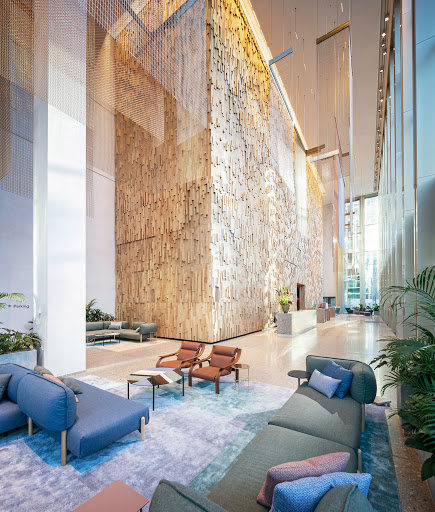
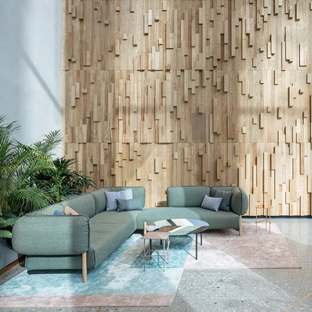
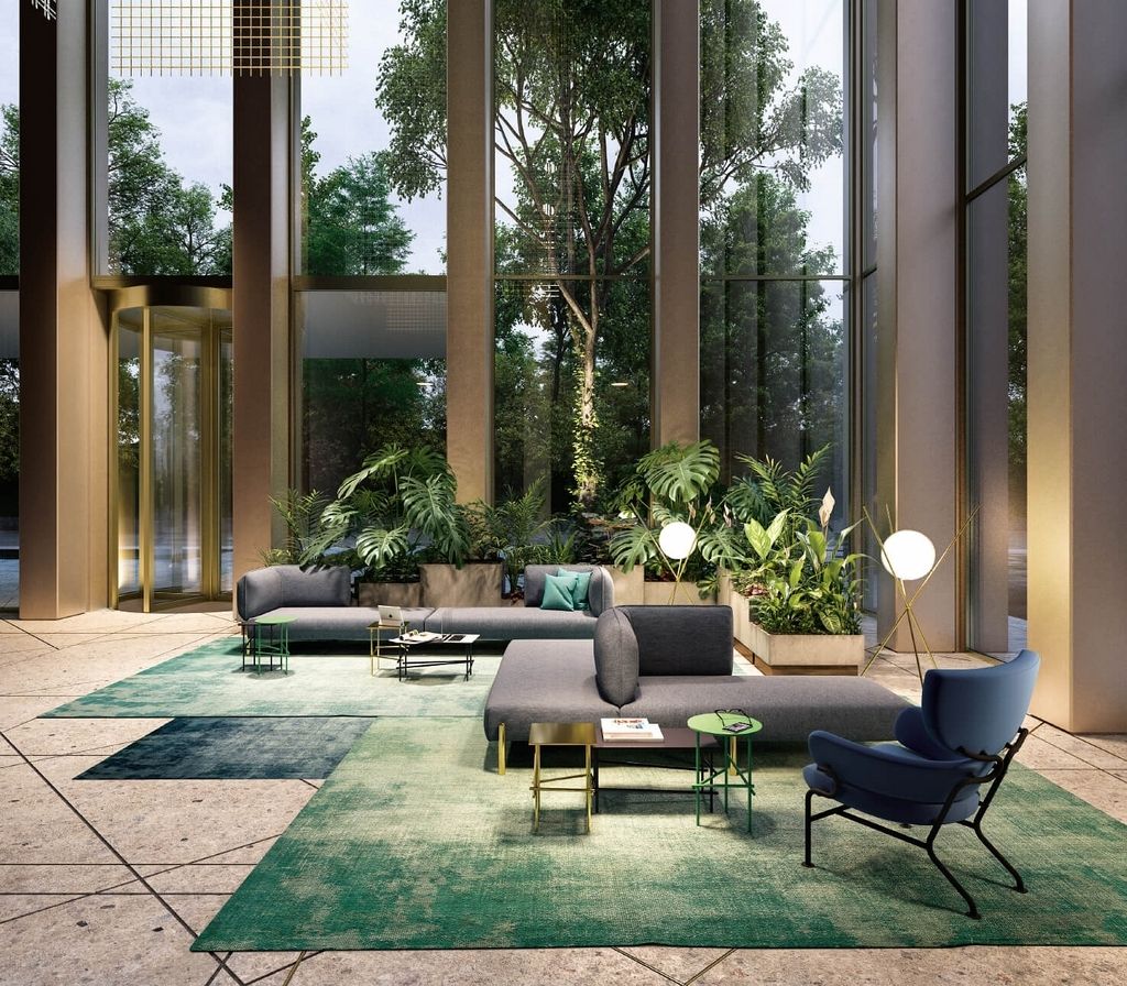
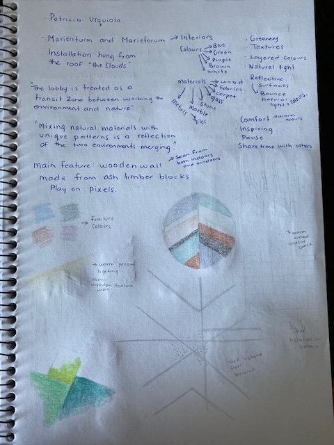
The lobby is treated as a transit zone between the working and the nature. Mixing natural materials with unique patterns is a reflection of the two environments merging. The two main features of the space are the large ash wooden wall inspired by a pixels and the installation hanging from the roof called ‘the clouds’.
Purpose – Comfort, to share time with others, inspire, pause.
Colours – Shades of blue, green, purple, brown, white, pink.
Materials/surfaces – Wood, fabrics, carpet, glass, stone, marble, tile, metal.
Other notes – Greenery, textures, layered colours, natural light, reflective surfaces (bounce natural light and colours).
Budri Showroom Milan
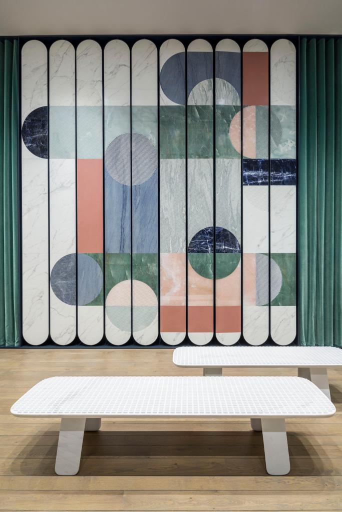

The Budri showroom in the heart of Milan is a tangible expression of the companies constant evolution. The aim was to design a space with the capacity to highlight the beauty and preciousness of Budri surfaces. Where both contemporary and classical proposals can be displayed in harmony.
Focus – Future growth, research, experimentation.
Colours – Shades of blue, pink, green, purple, white, cream.
Materials/surfaces – Stone, marble, wood, velvet.
Other notes – The space combines line, colour, curves, movement and textures.
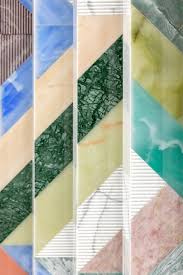
Round Mirage for Cassina – Rug
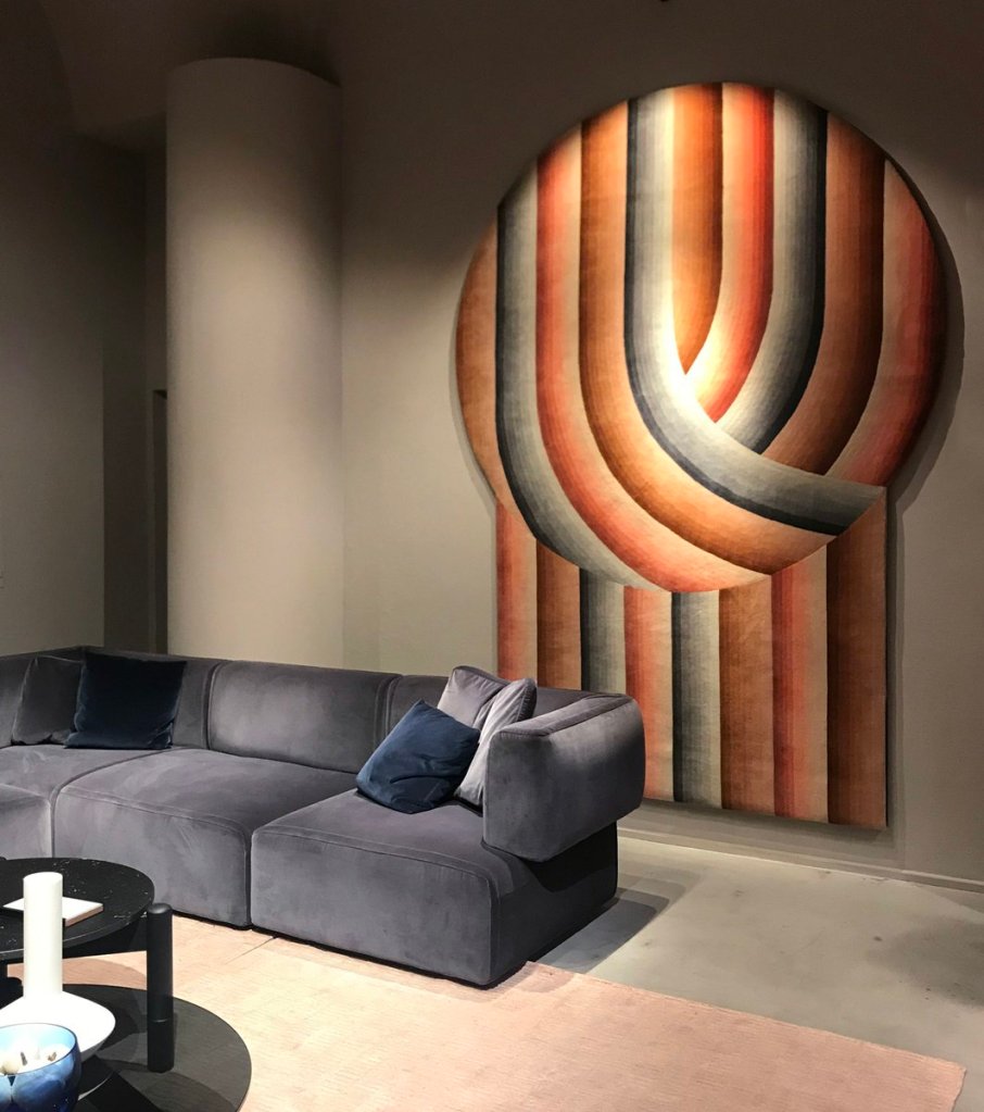
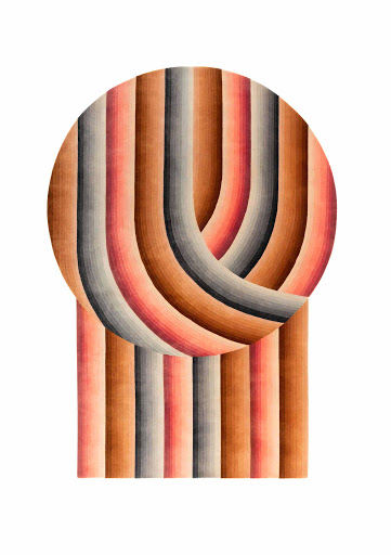
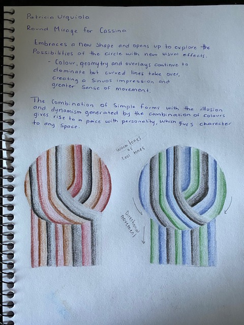
The Round Mirage for Cassina embraces a new shape and explores the possibilities of the circle with new visual effects. Colour geometry and overlays along with curves lines creates a sinuous impression and greater sense of movement.
The combination of simple forms with the illusion and dynamism generated by the combination of colours gives rise to a piece with personality, which gives character to any space.
Warm tones vs cool tones. I personally prefer the warmer toned rug.
Effective directional movement.
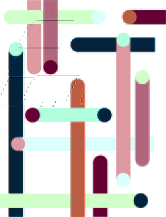
Series of ‘drawings’ inspired by Patricia Urquiola

Each drawing focuses on different patterns seen throughout Patricia Urquiola designs. I decided to play around with colour schemes ranging from warm to cool tones in each drawing. I personally like the warmer toned drawings more along with some that mix shades of blue and pink.
Model Making Workshop:
During Thursdays class I produced a series of models inpsired by Patricia Urquiola’s designs. Each model explored different aspects such as light, shadow, colour, surface and texture. I stuck with a colour scheme inspired by some of the colours seen throughout many of Urquiola’s design.

Week 5: Slow Surface
Week 5 was the beginning of online learning where classes take place on blackboard. It was definitely a change but I enjoyed getting back into it.
This phase of studio experimentation will consider surface, surface affects, movements of people, and other environmental surfaces. The method of slowing down as designers allows us to observe and analyse the complex of material and sensorial affects taking place in everyday situations.
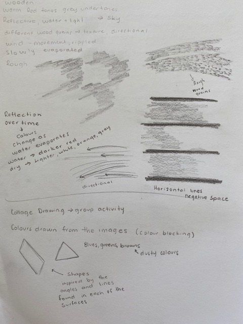
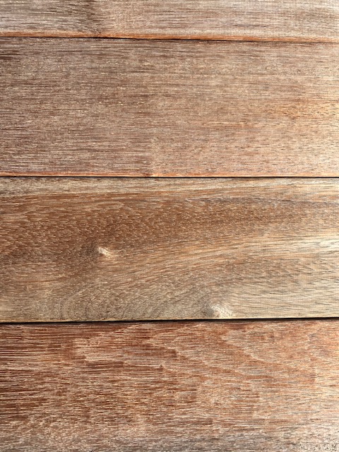
The surface I chose to analyse was a part of my deck where water from rain was still present.
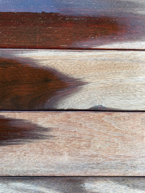
- Warm red tones, grey undertones – darker where the wood is wet.
- Reflective where water and light meet – changes overtime and when observing from different angles.
- Different wood grains – textures, direction, pattern.
- Wind created movement – water rippled.
- Changes overtime due to evaporation – colours change, more patterns are revealed.
- Negative space – dark black horizontal lines.
My groups chosen surfaces:
Amy 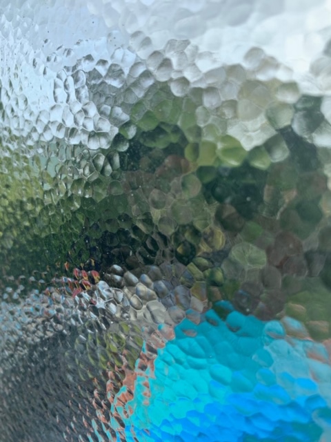
Lucy 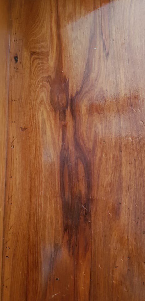
Zara
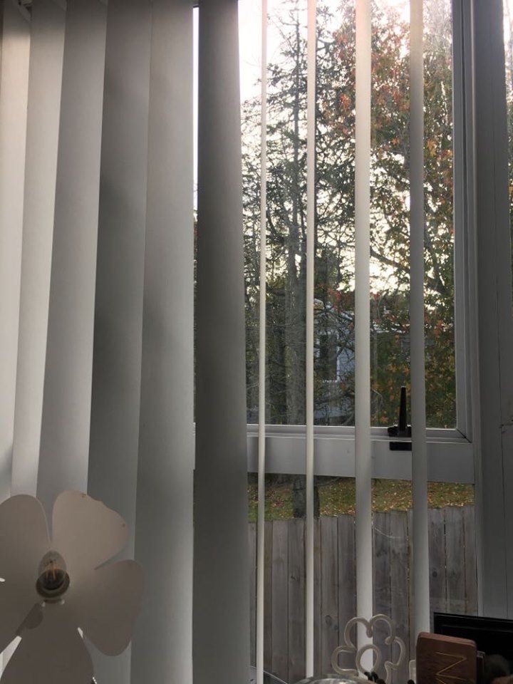
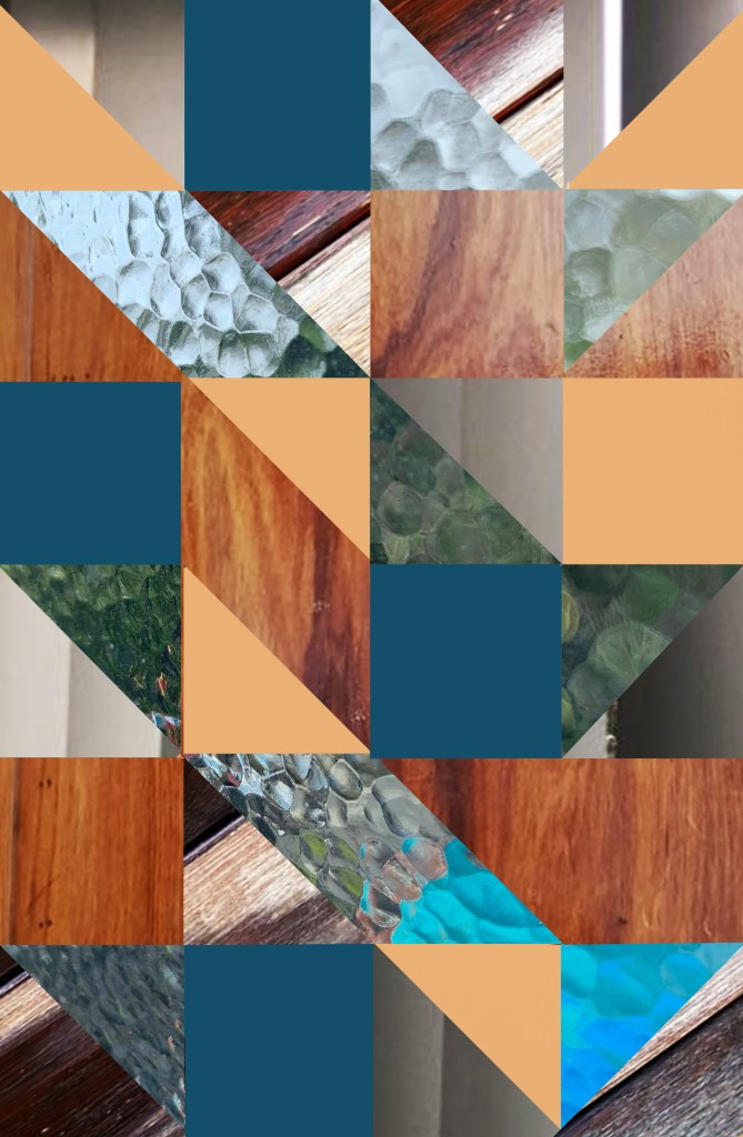
As a group we discussed each of our chosen surfaces sharing our notes with each other. We then collaborated to come up with a design for a collage that combined each of the four images. We spoke about shapes, colours, layering, patterns and temperature to come up with a interesting collage.
Each of the colours chosen were pulled directly from the images themselves. We decided to work mostly with blues, greens, browns and reds to create colours that fit with the aesthetics of the collage. We decided to colour block using solid colour as well as parts of the images themselves.
We chose to work with triangles, squares and angular shapes as each of our images captured vertical and horizontal lines as well as geometric patterns. We were particularly inspired by the small shapes of the windows and the angled curtain panels. As a result we combined small triangular and square shapes to create our collage.
From this exercise I was curious to see how my chosen surface would change over the day. I photographed it a further two times to compare each stage.

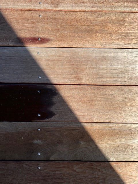
As time passed the water evaporated and different shadows began to fall on the surface. The final image I took was when the wood was completely dry. I think this image best showcases the textures and patterns the surface holds. The idea of time and changing is something I can play with when creating my three surface designs.
Self Directed Exercise – Drawing on our observations of the ‘slow surface’ from experiment one we were to produce three surfaces designs using a range of techniques. I chose a theme for each of my surfaces driven by the images I captured yesterday and drew up some quick concept sketches for each.
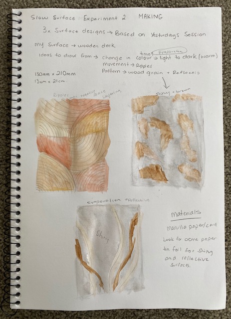
The first surface I designed focuses on the idea of pattern. The pattern I chose to work with were the natural wood grains along with the ripples that formed when wind blew across my surface. I layered different colours and sizes of the pattern I drew up as well as cutting the shapes to leave both vertical and horizontal areas of negative space. I imagined this surface to be used as a table top or possibly a tile or wallpaper.
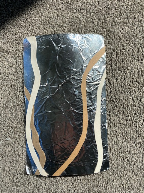
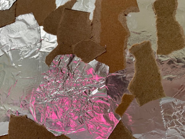
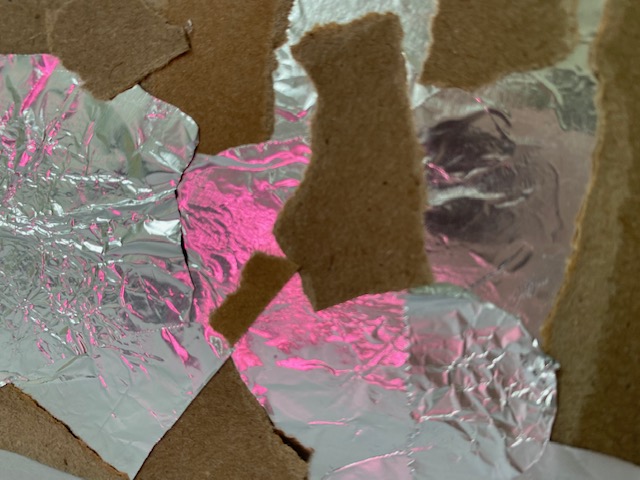
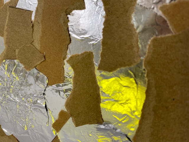
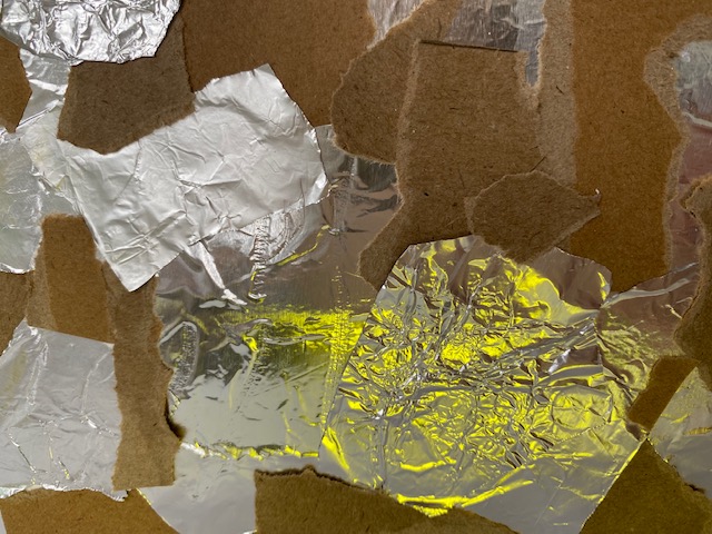
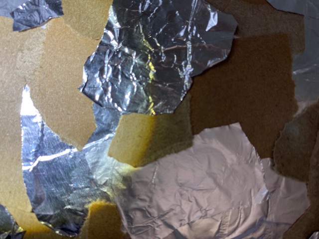
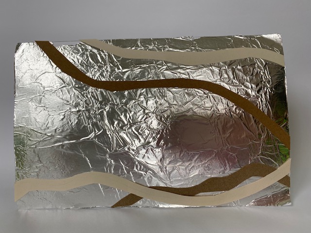
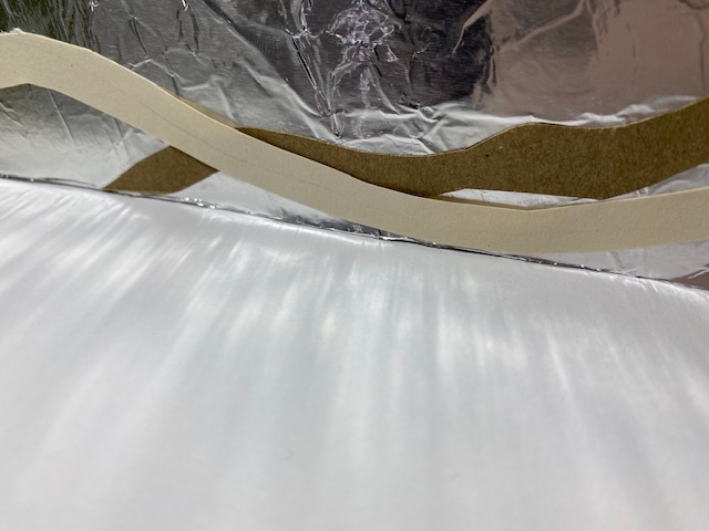
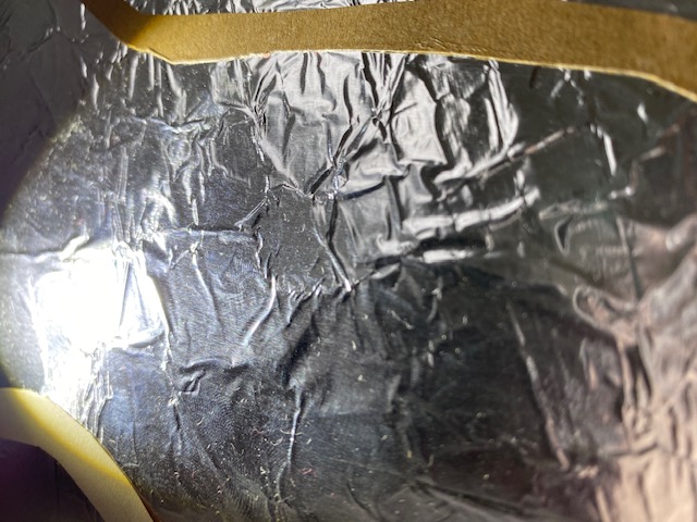
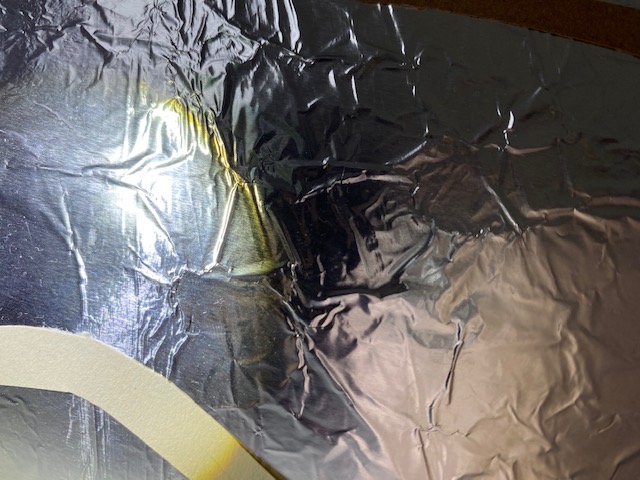
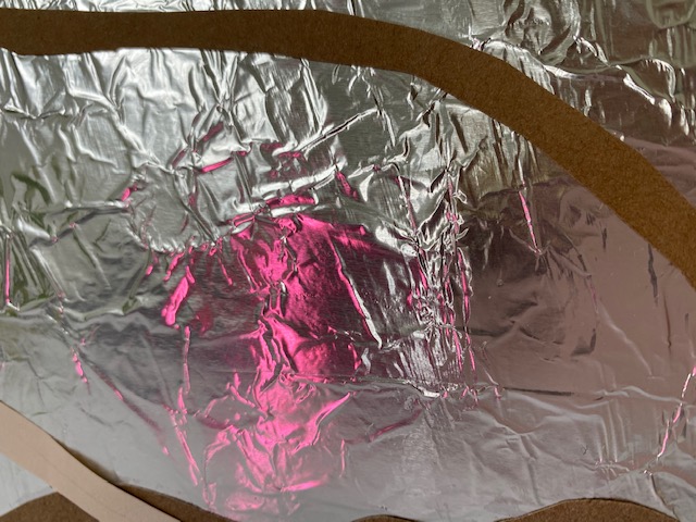
The second surface I designed focused texture. I looked at the rougher areas of the wood as well as the glass like reflections that formed where the light hit the water. I ripped both the brown paper and tinfoil to create rough edge like patterns as seen on the surface. I sporadically placed each of the pieces to create a what looks like a uneven and rugged surface.
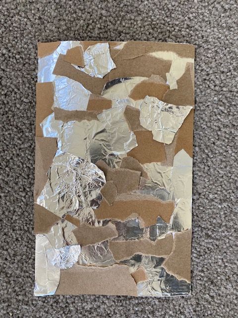
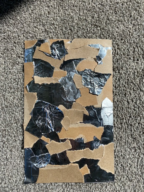
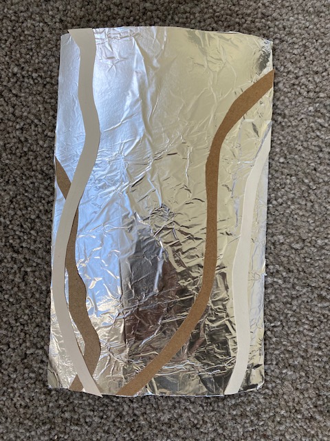
The third surface focuses on the idea of change overtime, more specifically for this piece, evaporation. The main material I used was tin foil to represent the reflective surface of the water. The curved brown paper represented the way the water slowing evaporated revealing more of the woods pattern and texture.
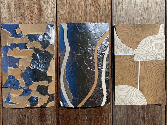
My friends and I had a quick discussion about our surfaces mainly talking about material choice and how we made each surface. I thought it was cool to see how we each interpreted our surface choices and created a range of designs using different techniques such as layering, cutting, folding, stacking and ripping.
I think that some qualities in each of my designs relate to my initial surface observation. The material that communicated these ideas best was defiantly the tin foil as it incorporated elements of texture and reflection into each of the designs.
Further development of these designs could include playing with the idea of negative space more (larger gaps, smaller gaps, angles or colour), more strategic placement of pattern, size variations of pattern, focal points.
We revisited our chosen artist model to further analyse one of their works around the idea of surfaces. For this exercise I chose to focus on Patricia Urquilolas Budri Showroom.


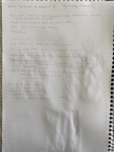
Analysis of surfaces in Patricia Urquiola’s Budri Showroom:
- Materials – marble onyx, velvet, wood, fabrics.
- Pattern – repetition, layering, circular, rectangular, triangular, angles, negative space.
- Colours – blues, greens, pinks, whites, creams, purples. Different shades, hues, tones, opacities. Colour blocking.
- Finishes – gloss, matte.
- Light creates reflection.
- The marble patterning used throughout brings beauty and elegance to the surface designs. The subtle lines of the marble bring a sense of nature to an unnatural space and pattern.
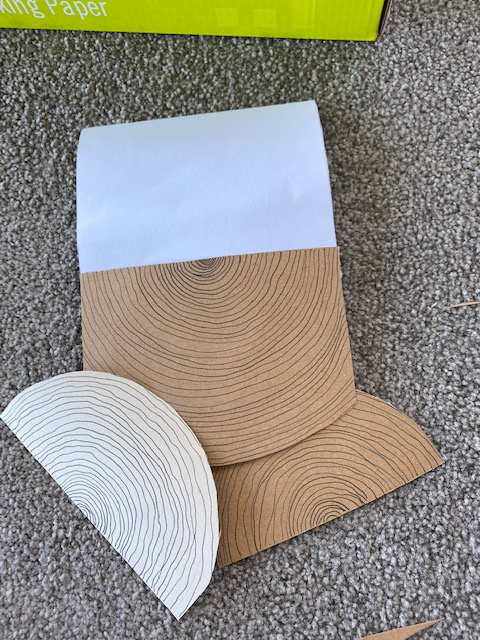
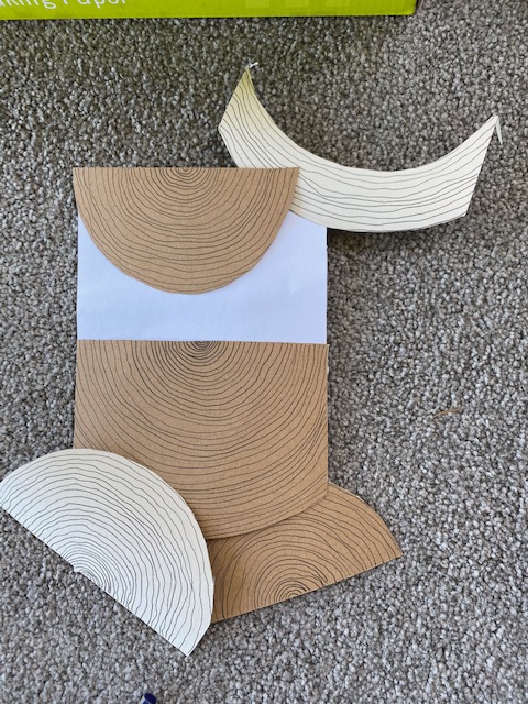
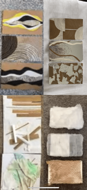
From this analysis we were then asked to design three surfaces based upon our observations of our artist models work. I decided to work with a colour palette of blues, greens and pinks across all three designs.
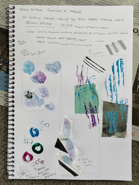
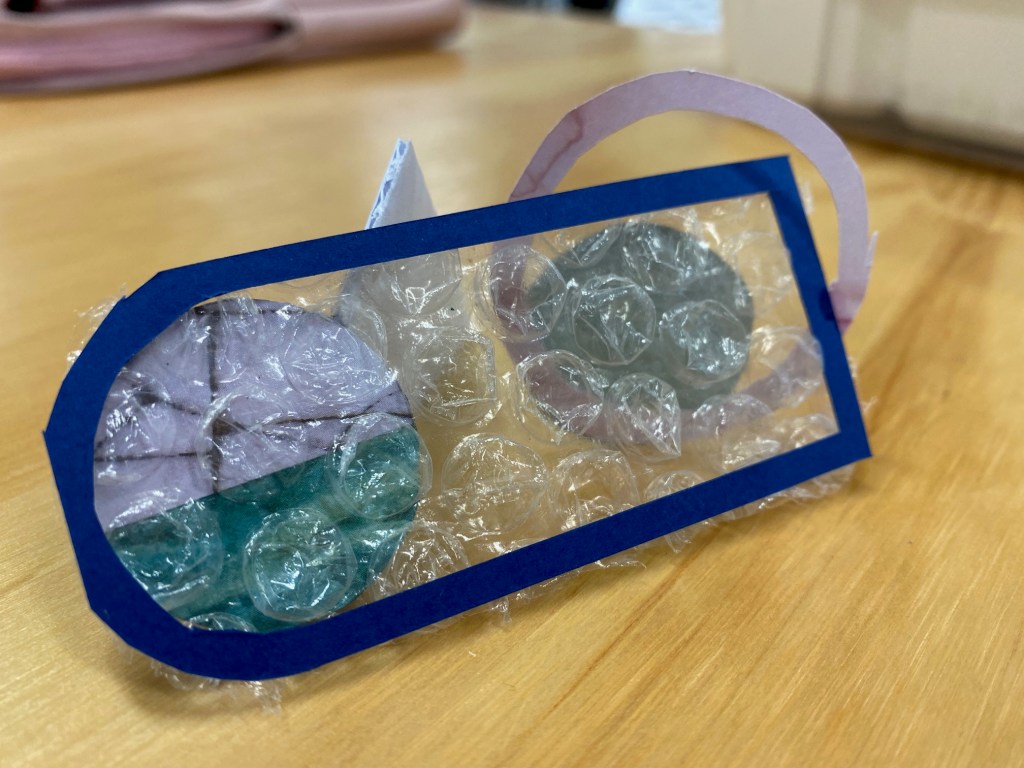
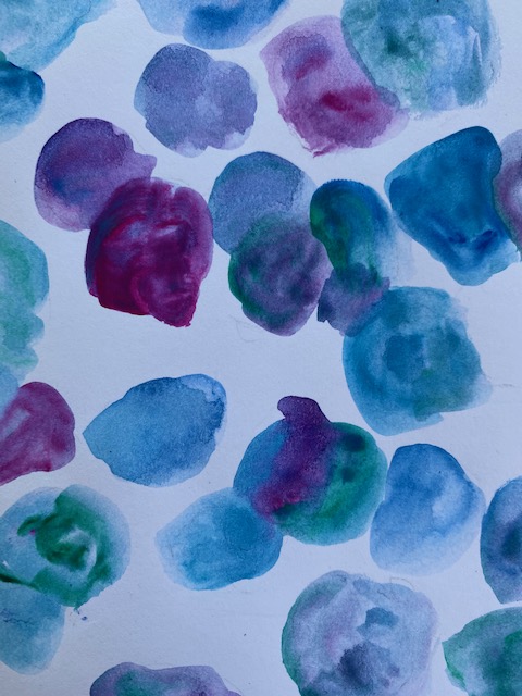
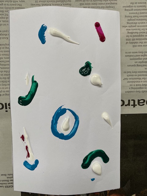
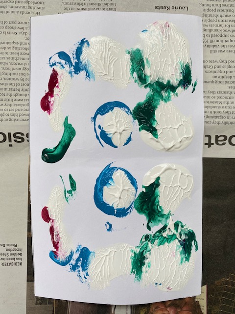
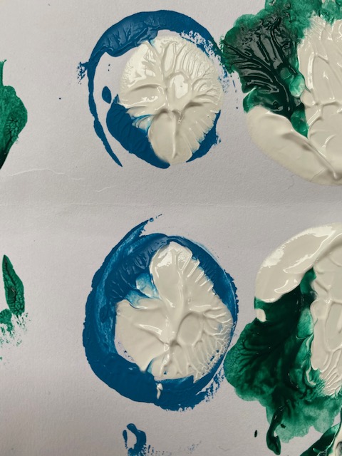
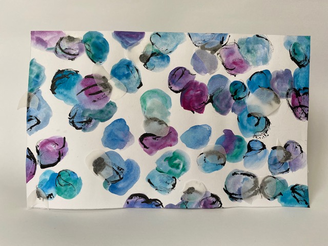
My first surface focused on the repetitive use of circular shapes. I used water colour paints to fill the page with circles of various shapes, sizes and opacities. I then scratched acrylic paint onto areas of the circles to add depth. In certain areas of the piece I stuck small circles of baking paper onto the wet paint (because we weren’t allowed to use glue) to add areas of volume and a slight 3D effect.
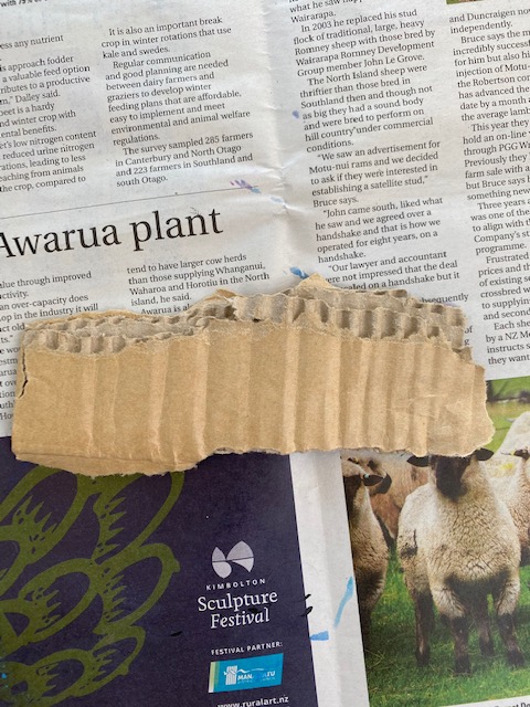
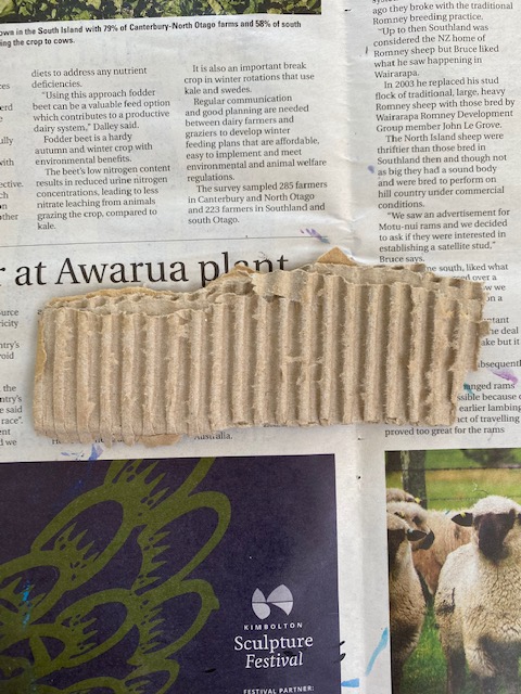
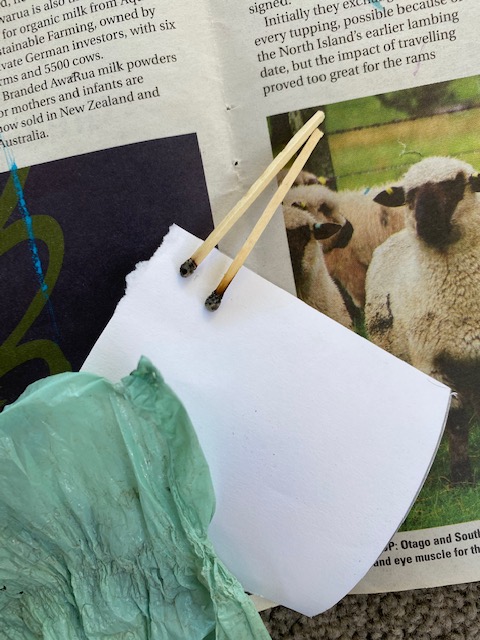
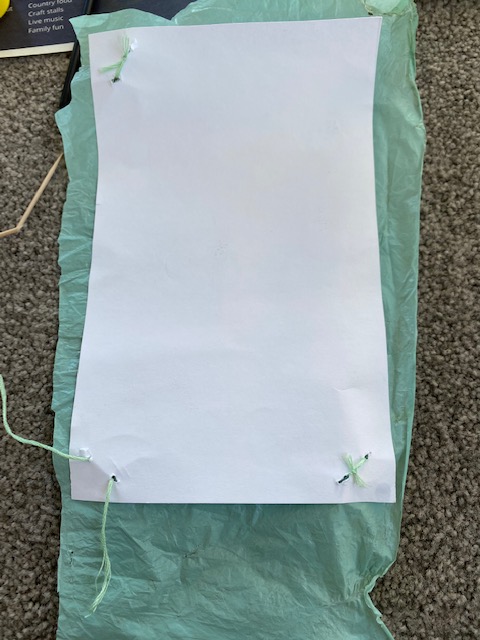
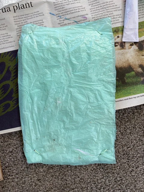
For the second surface I concentrated on the turquoise velvet curtains. I found some cardboard that replicated the wavelike pattern of the curtains along with silage wrap that was a minty colour. I experimented with burning and melting the silage wrap but didn’t like the way it looked. I ended up poking small holes through both the paper and silage wrap in each of the four corners to tie the two materials together. As a result the silage wrap was loosely connected to the paper allowing movement which I liked. Finally I pressed my three chosen colours onto the surface using the ribbed cardboard.
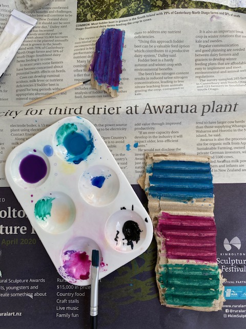

My third surface was driven by the idea of the marble patterning. I wanted to recreate the vain like patterns of marble seen in the Budri Showroom. I knew I could do this by squishing paint together and pulling it apart again. I again used my chosen colours along with white and placed blobs of colour around the page. I positioned the colours strategically around the white hoping that when I pulled the paper back open the colour would be sucked into the white creating a natural looking blend. This worked in some small areas but not as well as I’d hoped. I then continued to fill the empty spaces with more shapes and colours.


Group Discussion: My group and I had a conversation about our three new surface designs. It was interesting to see how each of us incorporated elements of our chosen artist models into the suraces. We all seemed to have used similar techniques of layering, cutting, folding, painting and drawing.
Self directed – Explore the six surface designs you have produced in experiments this week in relation to light and shadow.

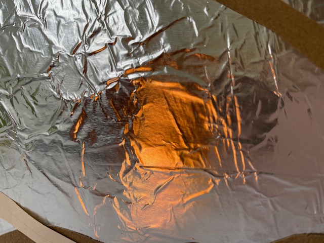
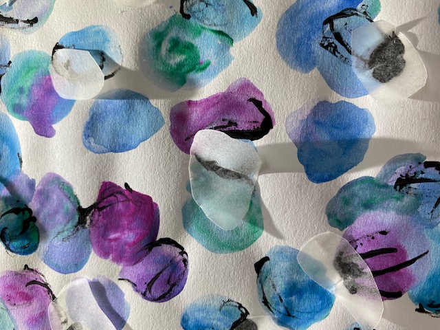
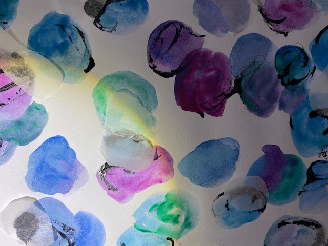
I had a lot of fun playing around with different lighting techniques to photograph each of the surfaces with. I really liked how the reflective properties of the tin foil create small sun ray like patterns when hit with light from certain directions. The tin foil was also able to reflect solid colours really well. It was interesting to see which shapes and materials cast harsh shadows vs soft shadows. I thought it was cool how the patterns of the paint were enhanced by using a light source from behind.I noticed that each of the surfaces colour change slightly in tone when in light vs shadow.
Week 6: Slow Surface 2
Designing surfaces in relation to the St James foyer space. Explore the interrelationship between the qualities of your surface design experiments, at a hand-held scale, and the atmospheric qualities these will produce at a larger scale – as a lived sensorial experience.
Consider the St James foyer in relation to the surface designs you have produced.
Task – Develop a surface design and application for the St James Theatre. Show this through site plans, atmospheric perspectives and detailed drawings of the design.
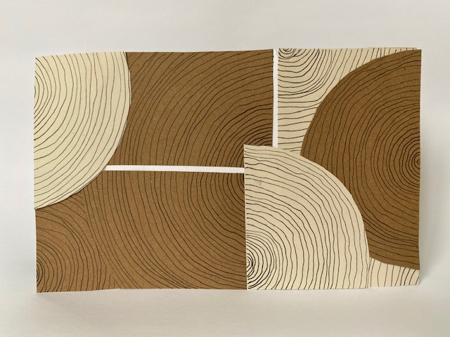
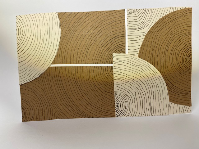
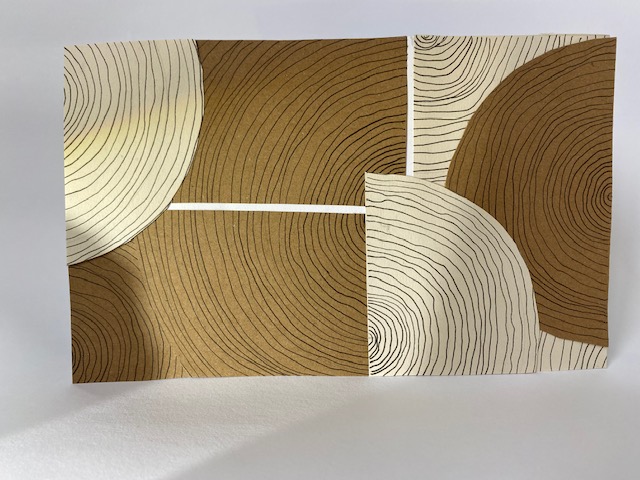
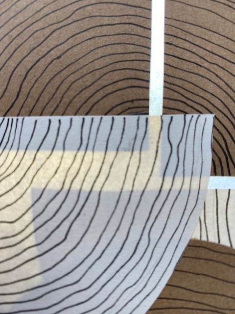
Below are the two surfaces that I am going to draw and develop into a surface design for the St James Foyer space. The image on the left captures a surface seen in Patricia Urquiola’s Budri Showroom in Milan and the right captures one of my favourite surface designs from last week.
I decided to create six quick surface designs that I could potentially develop to use in the St James Theatre. I focused on pattern and layering, along with colour and materials.

1 
2 
3 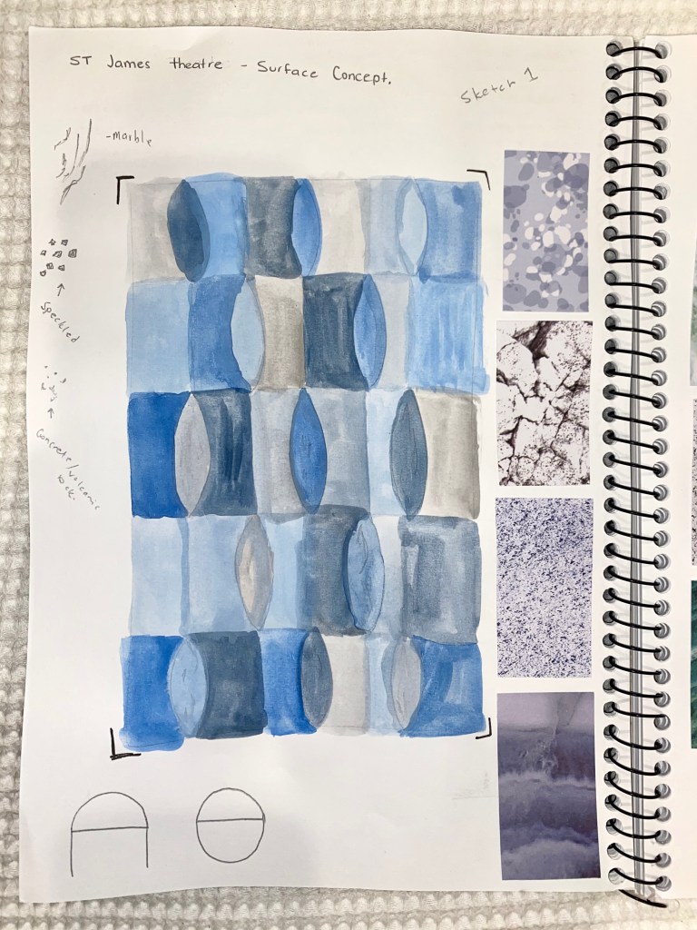
3 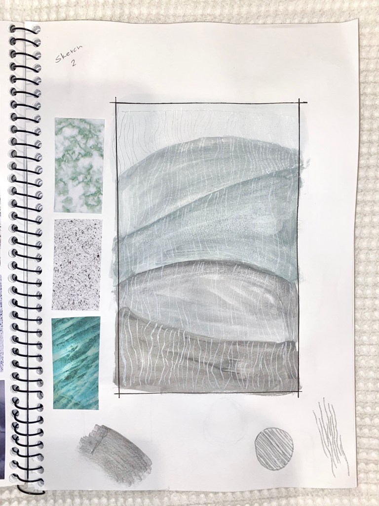
4 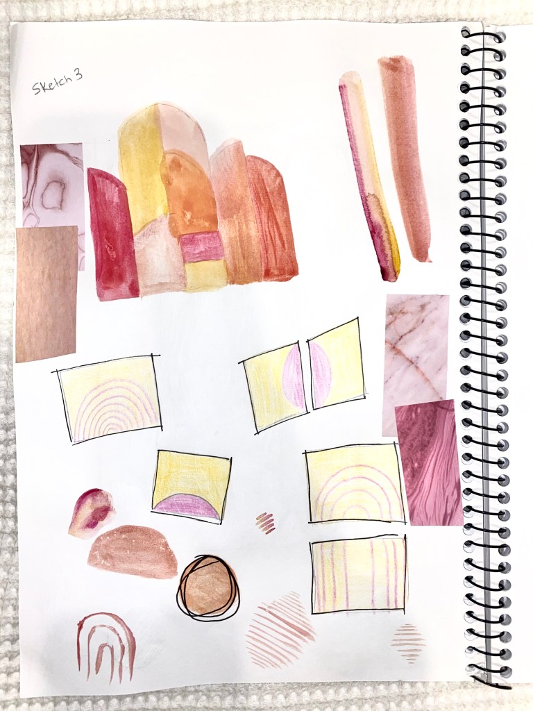
5
I also created six quick tile designs as I am thinking of having a tiled floor that spans across the entire foyer. Flooring is often plain and simple do I’m hoping to create a colourful and unique design.
1 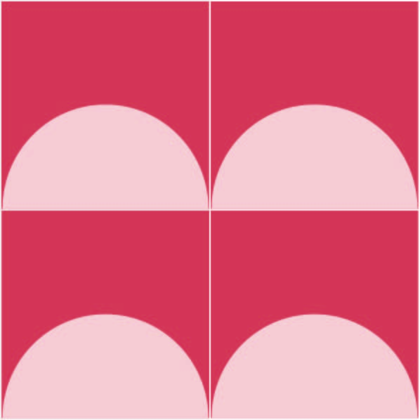
2 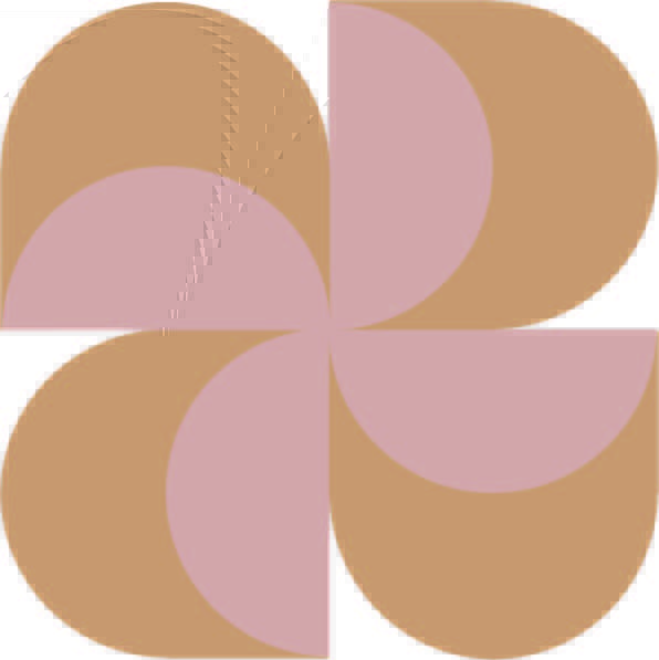
3 
4 
5 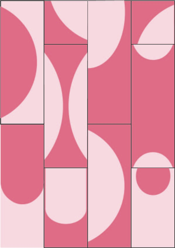
6
I quite liked tile design #1 so I began to develop it with changes or colour, pattern and scale. As shown below I went through a lot of changes to get to the final product. After all the experimenting I did like the final tile however I did not like it in the context of the St James Theatre flooring.
After thinking about this design for awhile I knew that it wasn’t really what I wanted. I began to note down what I wanted my surface to look like and feel like to the people that used the space.
- Purpose – A connecting space between Queen Street and Lorne Street. People movement is a main focus. Walking.
- Light – Enhance the available natural light. For now just work with the exisiting structure.
- Style – Geometric shapes, layering, pattern, colour.
- Use the buildings length to my advantage.
- Leading lines, sense of direction.
- Repetition
I revisited my initial surface concepts and chose to rework surface #1 (seen below). I made some adjusts to the pattern size and rounded all the edges so that it would work within the foyer space. I think this could be visually impressive at a larger scale.
Original 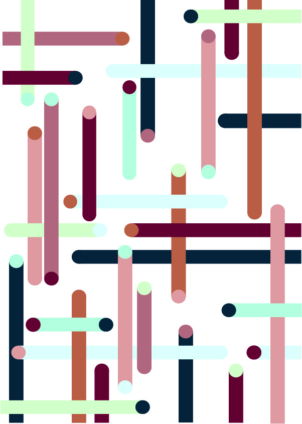
Resizing + added pattern 
Rounded edges
I do like the colour choices however I tested a few other combinations.

After testing a few colour combinations I have chosen to stick with my original colour scheme as I like the use of pink, blue, green and orange tones. The next step is to lay the pattern out in the floor plan to test scale and placement.
Below I’ve positioned the design in two different ways, each of which I’ve used the same part of the pattern and mirrored it throughout the length of the space. By doing this pattern repeat is seen.
I then decided to place the pattern more freely throughout the space. This created a less uniform feeling to the design while also allowing me to strategically place certain pieces of the pattern. I also lowered the opacity to see how it may look if the colours were less bright.
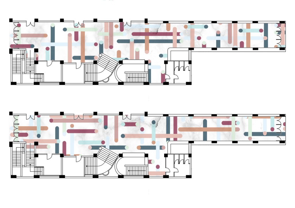
Placing the patterns in this way has resulted in a busier looking flooring as more area has been filled with colour. I’ve decided to choose the bottom floor plan pictured above as I like the look of randomness to it. Although it looks ‘random’ I have placed parts of the patterns in a way that fill the site with colour while also leading a person into and through the space. The long horizontal lines give the space a sense of directions and people make their way between Queen Street and Lorne Street.
I’ve decided to work with the very bottom of the four floor plans as I think it best represents my initial design ideas. I am going to do some research into the use of tiles as flooring in relation to public spaces and the atmospheric qualities tiles can create.
Flooring Research:
The type of flooring can dramatically change a rooms appearance along with its feeling. Its important to take into consideration colour, light and the space you are working with when designing flooring.
Light/colour – It is very common for designers to want to enhance natural light within a space. For this project I would also like to do this. The image below shows a site map I drew a few weeks ago in relation to where the natural light was in the St James Theater.
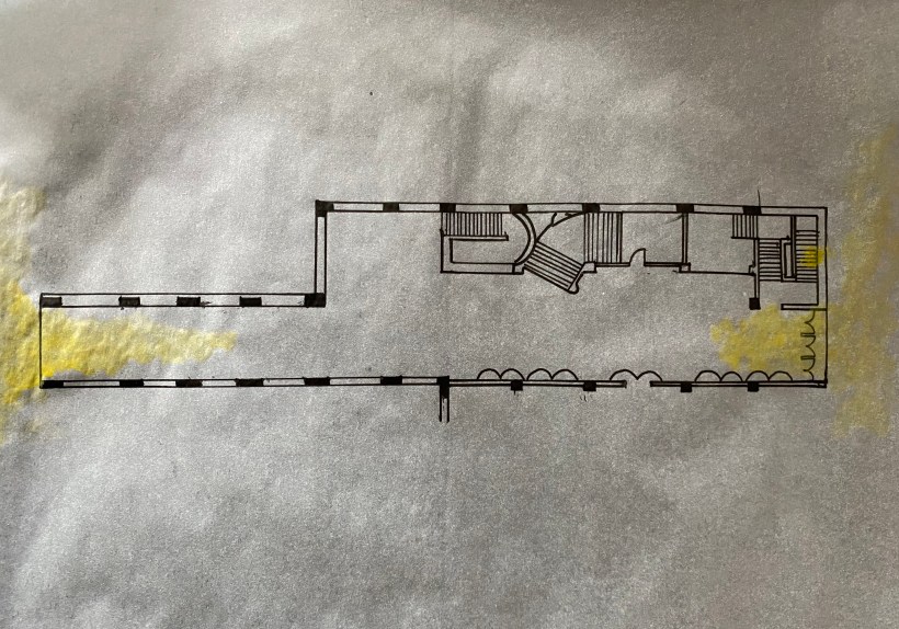
As shown in the map the natural light is not very strong at all throughout the space. I will be changing this in the future, but for now I want to see how I can create a light space in the existing building through the flooring design.
My research has shown that soft natural colours can create the appearance of light, and captures the light that does enter the space. Using pale pastel colours will enliven a poorly lit room by reflecting light, making the room appear optically larger. Laminate or tiling is often best since it is more reflective and less dense than carpeting. Seeing that tiling works well at enhancing light I will be sticking with my initial idea of designing a tiled floor surface.
Tiles – For this weeks task of a surface design I have decided to design a tile to use throughout the St James Theatre flooring. I have bullet-pointed some key points to think about when using tiles.
- Tile size – small tiles are often suited better to small residential areas. For my design I will be complementing the size of the space by using large tiles.
- Grout colour – A contrasting grout will emphasise the lines and the design while a grout in a complementary colour will give a subtle effect.
- Texture/Finish – matte, polished or glossed. I will be using a bright, glossed finish to reflect the natural light.
- Pattern – does it communicate a direction or route to travel or is it more for aesthetics. My chosen pattern communicates a direction of travel while incorporating aesthetic elements of layering and colour.
Tiles in relation to public spaces – It is important to consider how many people will use the space. How many people will use it throughout the day? How many during rush hours? Will certain places be used more than other? Knowing this allows you to determine the strength of materials used. Aspects of tiles to consider:
- Abrasion and resistance
- Stability and anti-slip
- Cleaning
- Visuals
- Arranging tiles on stairs
After taking into consideration my research above I have finalised all aspects of my surface design for this exercise below:
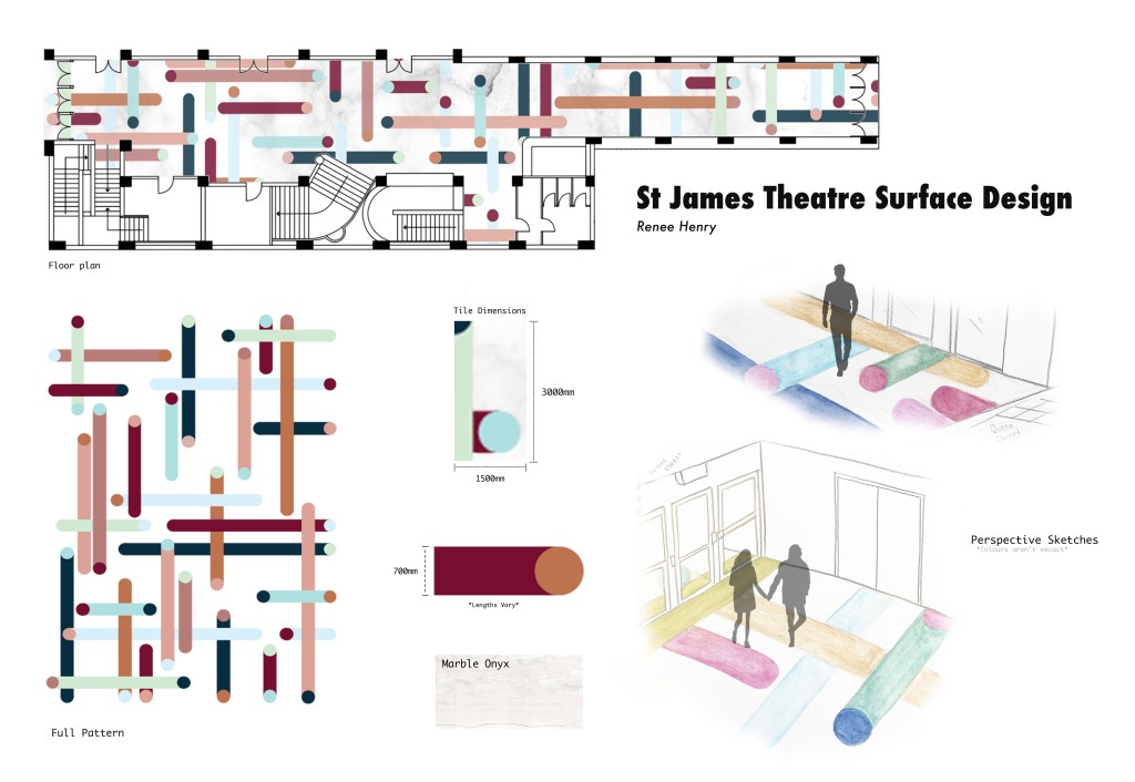
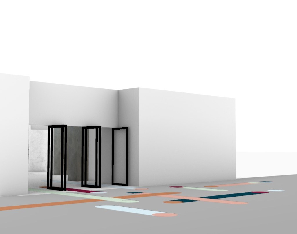
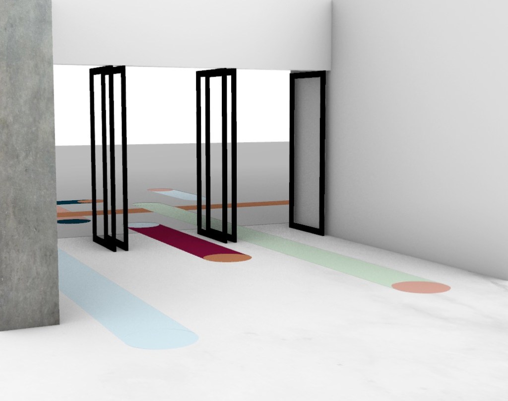
Identify the location of your design on the site – The main flooring of the exisiting St James Foyer space. The entire length of the building from Queen Street to Lorne Street.
Explain why you chose a specific space – I chose the flooring as I wanted my surface design to impact the entire space. By choosing the flooring I was able to create a design that was used throughout the entire site. One of my main focuses for this exercise and the for the future of this project is to create a connecting space between Queen Street and Lorne Street. By choosing the flooring I was able to link the two ends through a pattern that leads pedestrians into and through the space.
Briefly introduce how you arrived at the design – From the beginning I knew I wanted to work with the layering of geometric shapes. I created many small surface and tiles designs and went through and a lot of trial and error when it came to experimentation with colour, pattern and layout. Once I came to a design I felt would work with the space the rest came easy. I knew how I wanted it scaled and placed throughout the site to bring together my initial ideas.
Discuss the aspects of the artist models work you have drawn on – I have drawn a lot on Patricia Urquiola’s use of geometric shapes. A pattern seen in the Budri Showroom is created by layering rectangles and circles of varying colours. I was inspired by this and created my own design using the two shapes and a range of colours. I have also drawn on her materiality of the marble onyx tiles.
The moves you made when developing the design – I played around a lot with shape, size, colour and placement. When placing the pattern I trialed both pattern repeat and pattern variation.
The shifts you made when shifting the scale of your design from handheld to room scale – I always had a strong idea of how I imagined my surface within the space so shifting from handheld scale to room size was not to difficult. I wanted people to be able to walk along the lines, giving them a path. Because of this I decided that each rectangle would have a width of 700mm (therefore the circles diameters are also 700mm) with varying lengths throughout the site.
Identify which surface or aspect of the foyer site that you have activated – I have activated the entire space by designing a bright, colourful design that covers the entire flooring of the site.
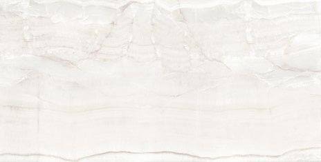
Materials chosen – Large white marble onyx tiles. The biggest tile of this kind I could find was 1500x3000mm this is the dimensions I have chosen. The coloured lines will be applied across multiple tiles to create the full design. Thin grout lines will be used in a complimenting colour creating subtle lines between tiles.
The impact of the scale you have chosen on the viewer – My surface draws the viewer into the space and leads them throughout. People can be lead to many different destinations throughout although I mainly focused on the fact that people would walk right through the site. The long leading lines give people a path to follow, communicating my ideas of giving the space a sense direction. The white tiles are able to reflect even the most subtle amounts of light creating a soft but bright feeling throughout the foyer.
Feedback from group presentation: Classmates thought my presentation was straightforward and easy to comprehend. They liked the colour choices and my idea of giving the space a sense of direction. They wondered if I was going to carry the pattern through to other aspects of my design such as the walls or furniture, this is something I can think about for the future.
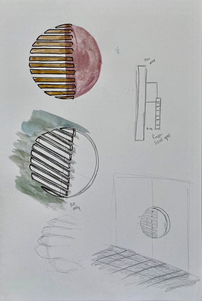
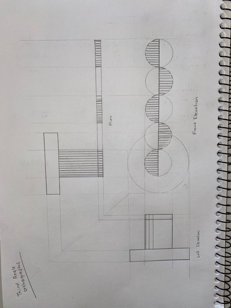
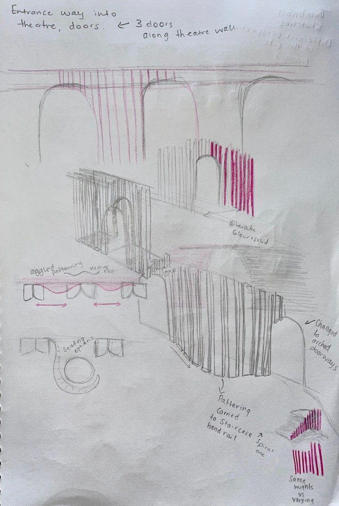
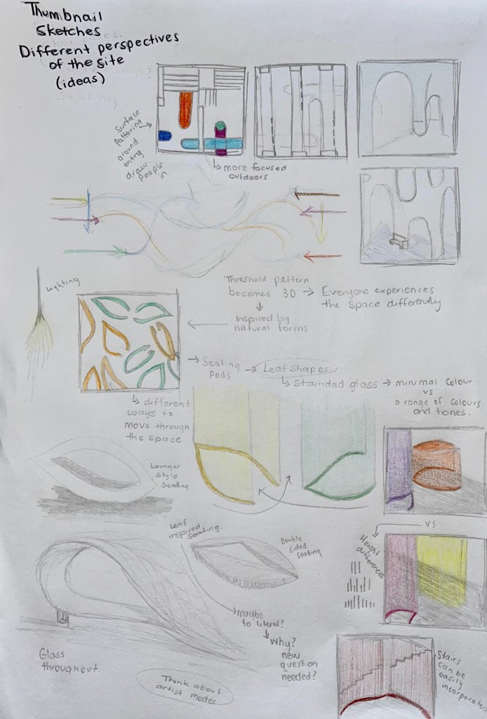
Week 7: Threshold Moment, Door Handle Design
This weeks exercise we are looking at activating the entrance threshold by designing the door handle detail. The experience of a spatial narrative begins with the turn or push of a door handle or some other detail that initiates the entrance into another environment. We are to continue drawing inspiration from our artist models incorporating ways that they use colour or material into our designs. It is essential to consider the threshold moment as significant as it establishes the relationship between the exterior and interior site conditions.
I began with creating many small sketch designs inspired by my surface and the idea of a threshold moment. I played with the idea of using solid colour and shapes mixed with broken lines to represent the relationship between the exterior and interior environment. I stuck with a similar colour scheme as the one I used for the surface experiment.
Notes that inspired the sketches:
- Exterior – Busy, loud, city, fast.
- Interior – Quiet, relaxing, slow, pause, pathway.
- Surface design – draw people into the space, lead them through. Could my handle do the same thing? Make someone want to come inside. Bold vs delicate, attention grabbing vs subtle.
- shape, pattern, texture, layering, size, colour, material, purpose.
I then chose 3 sketches to inspire 9 door handle design iterations.
1 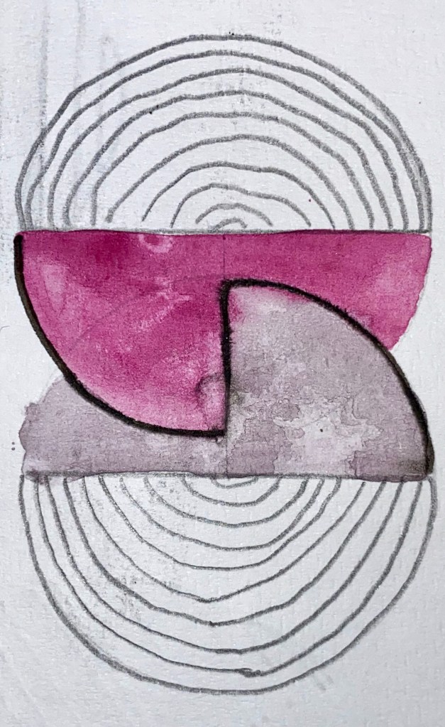
2 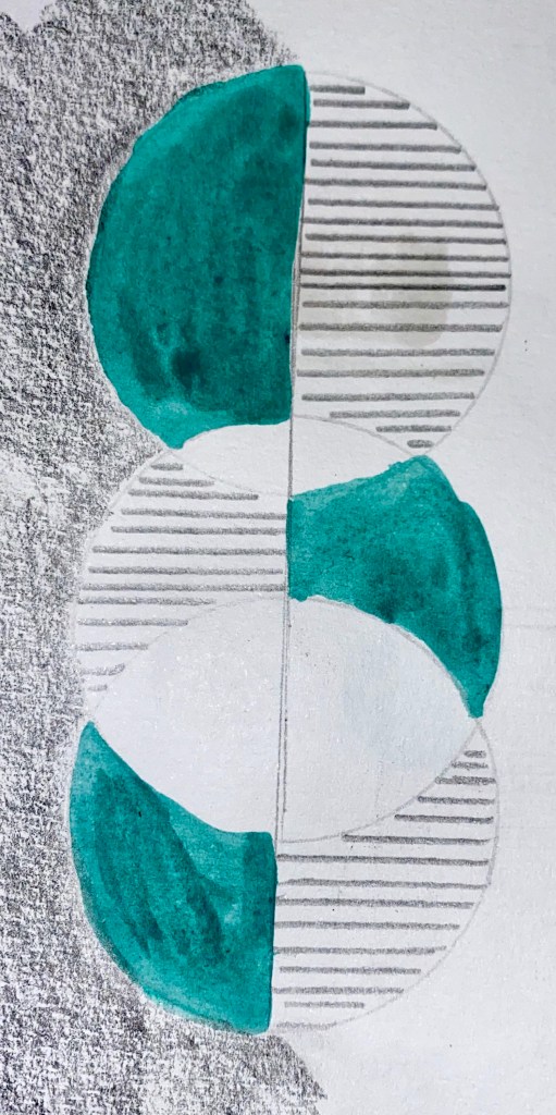
3
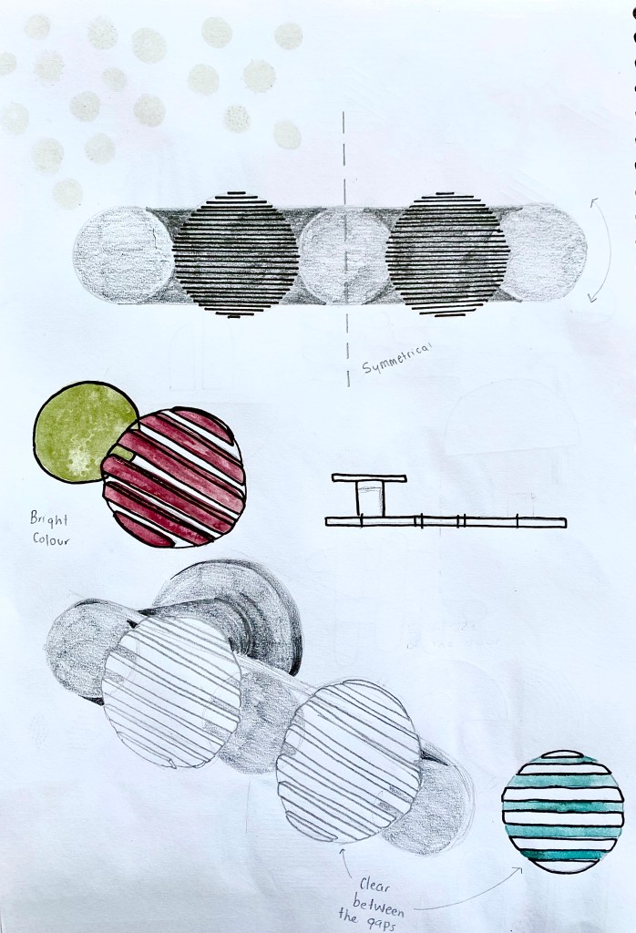
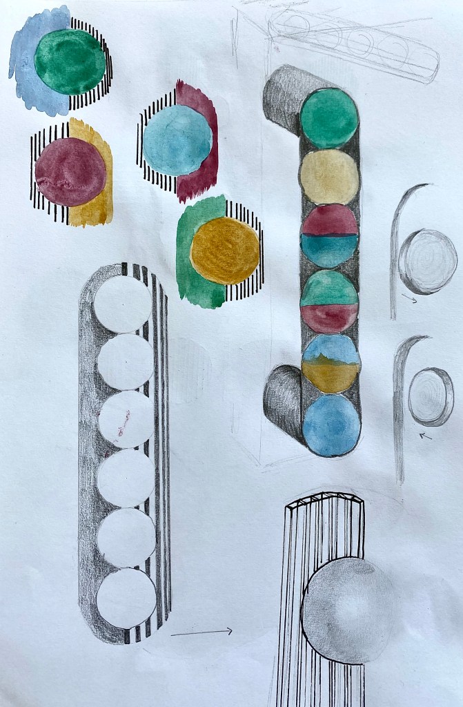
The designs above focused on the idea of transition from the exterior to the interior site. I used solid colours and forms to broken lines and shapes to represent the change of space.
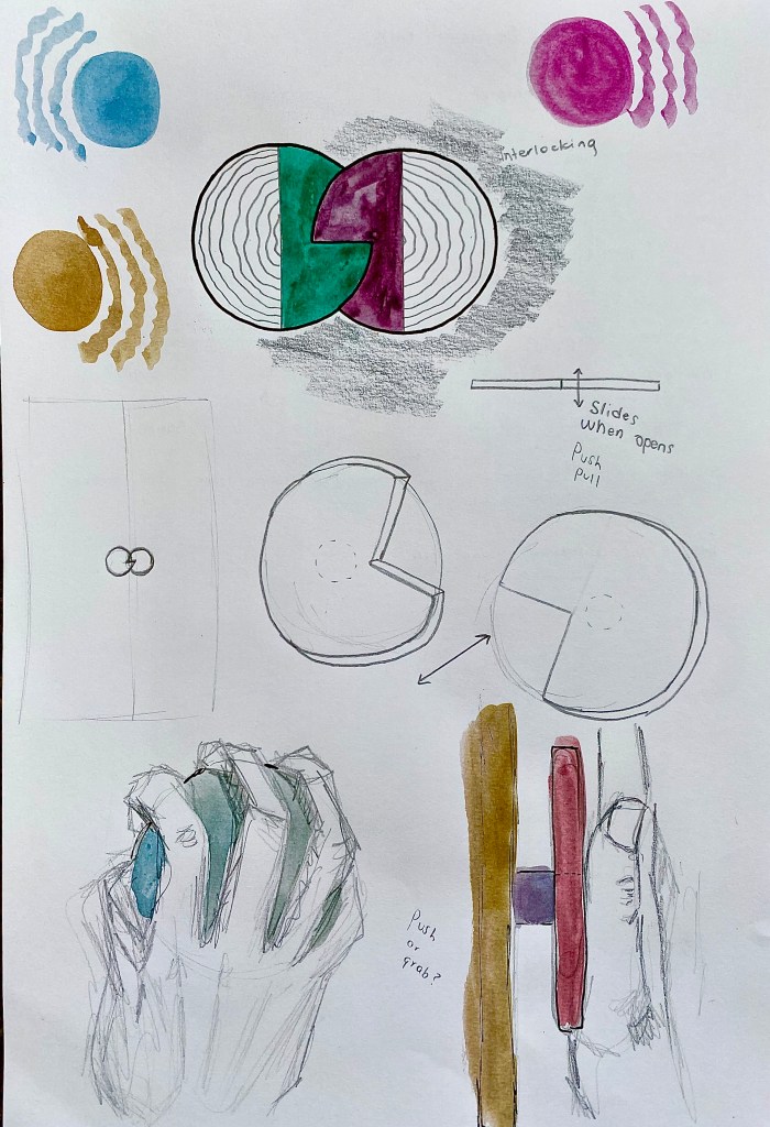
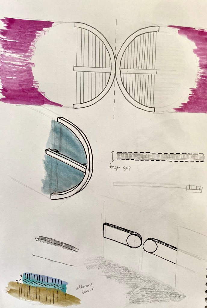
My second set of designs inspired by sketch two explore the idea of the connection between the interior and exterior spaces and how they interact. The designs are interlocked, pieces of the handle moving through other parts representing the way people move between the two spaces.
My last three designs touch on the idea of movement. How people move between different places all on their own paths with different destinations.
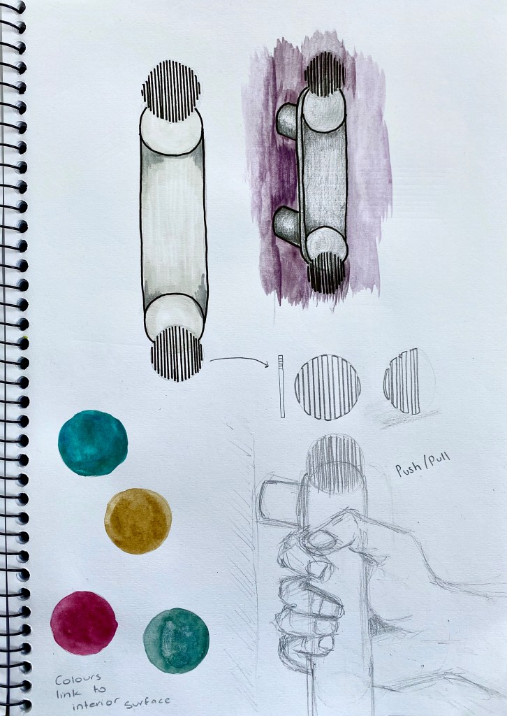
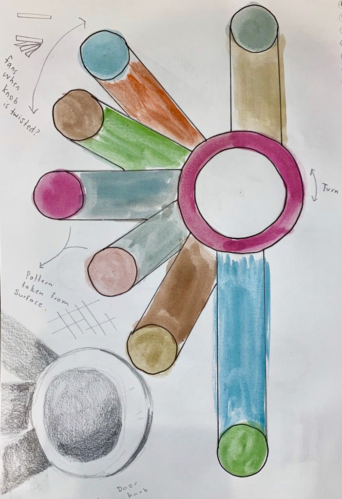
Chosen handle development:
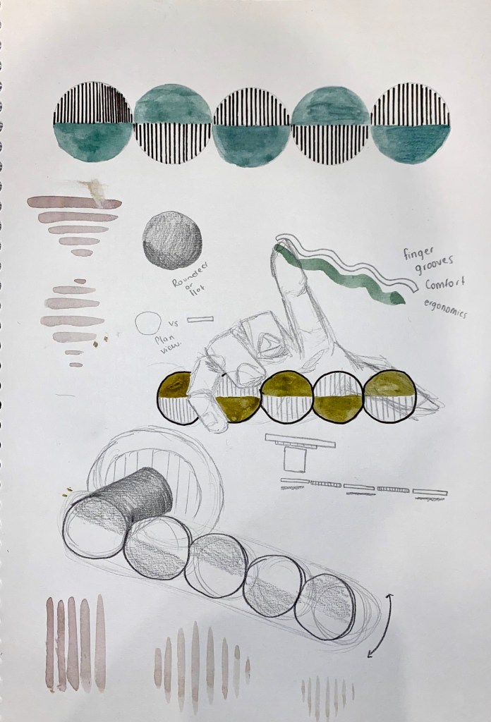
Chosen Handle 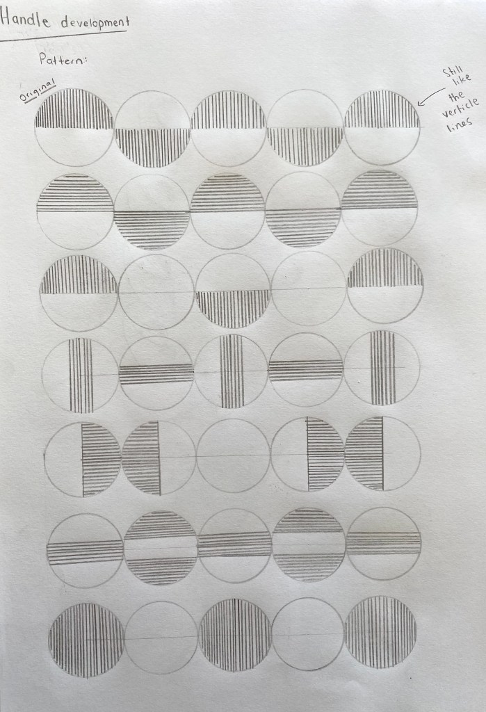
Pattern testing 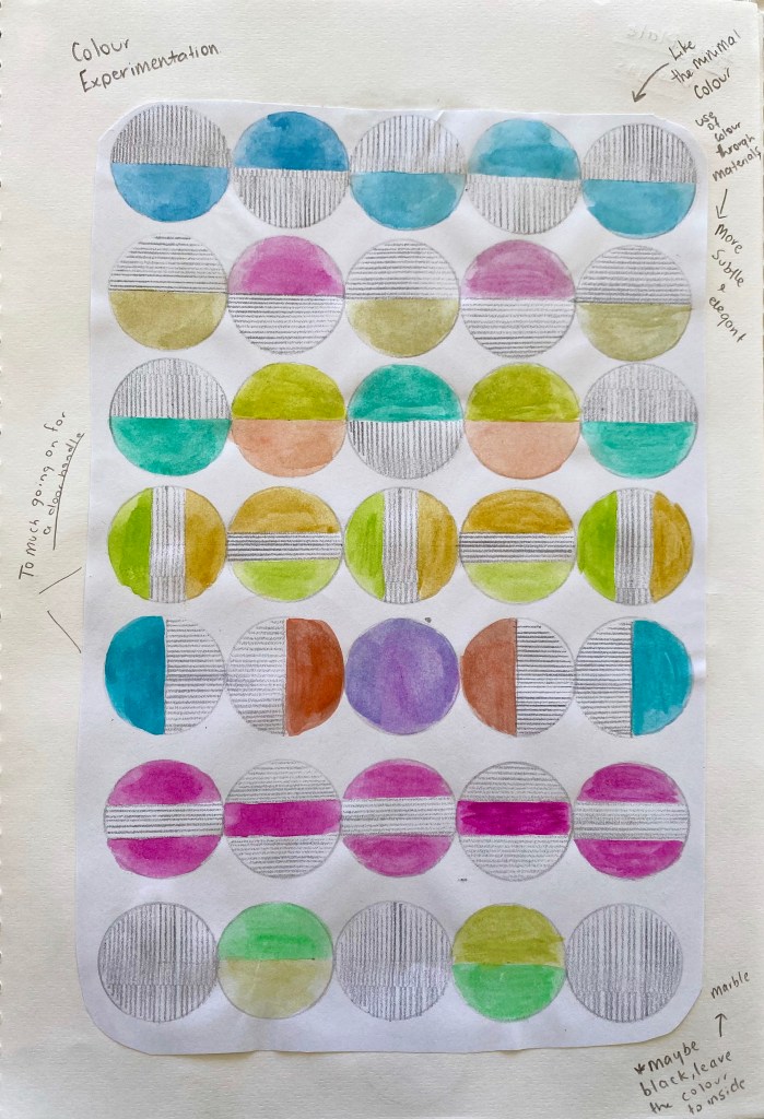
Colour testing 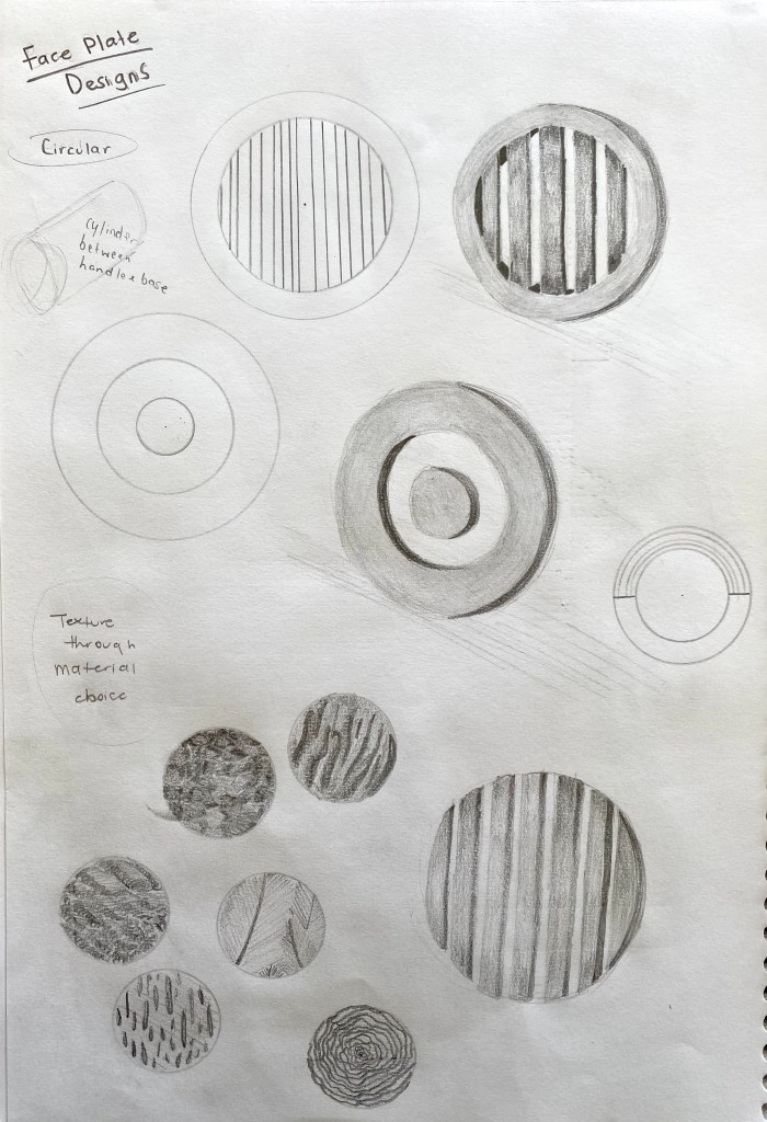
Base testing
I chose the handle above as I felt it communicated my initial ideas best. The pattern of line and colour represents the transition between the two different environments of the interior and exterior sites. The alternating of the patterning symbolises the different paths, destinations and reasons people walk through the site itself. I also liked how I could use this handle to create a subtle elegant feeling as it is not to large.
I decided to experiment with colour using the palette from my surface design last week. After looking at each of the combinations I found that I actually didn’t like any of them. I then thought that instead of using applied colour that I am going to use embedded colour and texture that will be introduced to the design through the material choice.
Material Research:
Most common door handle materials:
- Stainless steel – durable, long lasting, cost efficient.
- Solid timber – Natural colours, easy to clean, durable. Not ideal for outdoor handles due to water and humidity.
- Aluminium – Easy to maintain, durable, resistant to rust.
- Glass – Unique design, sophisticated.
- Brass – Strong, long lasting, elegant effect.
Along with some of the common door handle materials above I would also like to add marble as this material is used indoors as well as in my artists models designs.
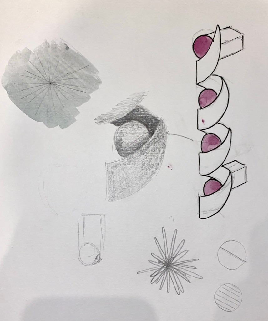
My chosen materials: I have chosen to work with the materials brass and marble for my final door handle design.
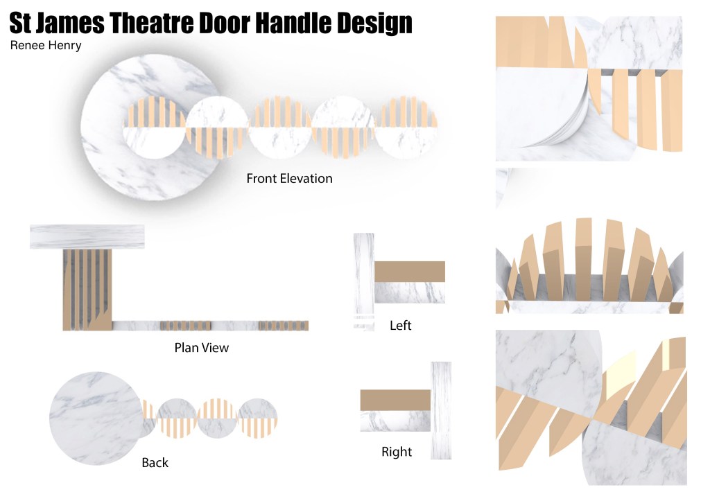
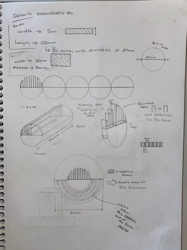
The curved shape of my final handle creates finger grooves for the hand to grab. The size of the five circles creates four ergonomically comfortable spaces for each of the fingers. The overall length of 120mm is a standard length of door handles suitable for all hand sizes.
The smooth flowing curves relate to my understanding of the threshold between the interior and exterior sites as I imagine it being a fluid and effortless transition between spaces. The simple lever handle style makes the user feel comfortable as it’s common knowledge as to how to use this style of door handle.
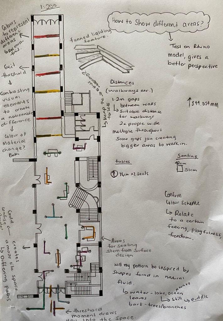
Week 8: Starting Intervention
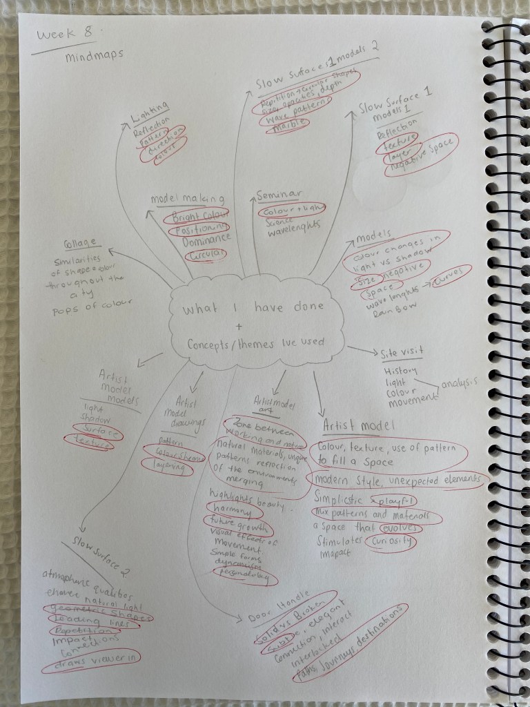
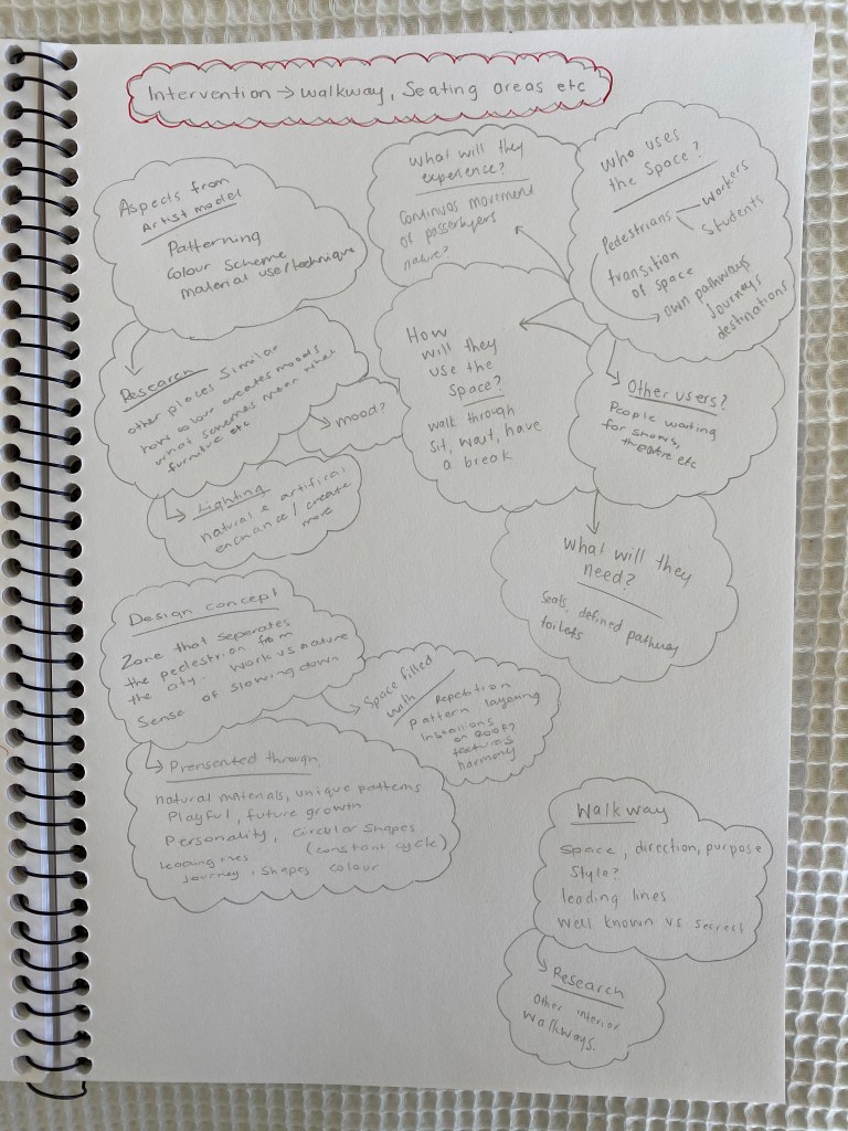
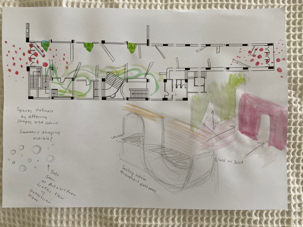
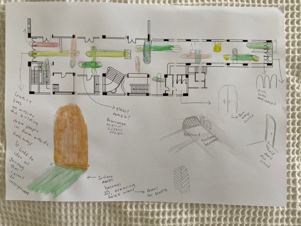
I started by brainstorming everything I have done over the last eight weeks in this paper. Below each exercise I listed the key elements and driving concepts for each of my experiments. I noticed some recurring themes and ideas that I have used throughout many experiments and begun to circle ideas that I would like to incorporate into my design moving forwards.
On the next page I wrote down my intervention, a walkway that connects Lornes Street to Queen Street. This walkway will also include seating areas for people moving through the site. I brainstormed a few key concepts and design aspects both from my designs and my artists models that I will continue to draw upon while working through my design process.
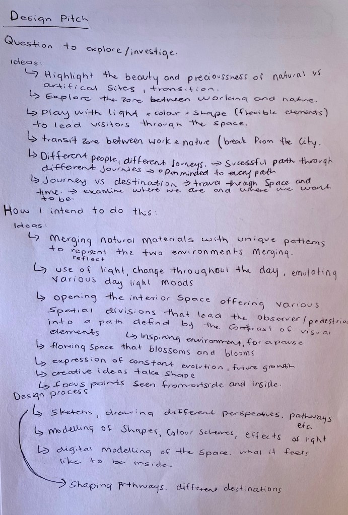
Design Pitch – First Iteration:
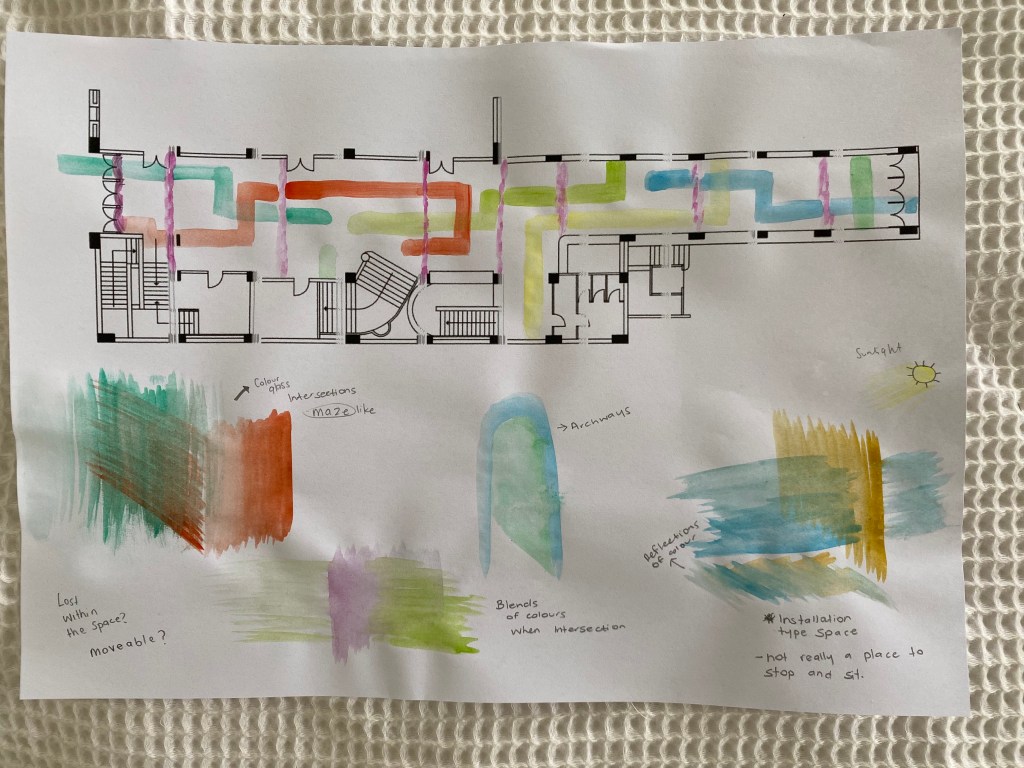
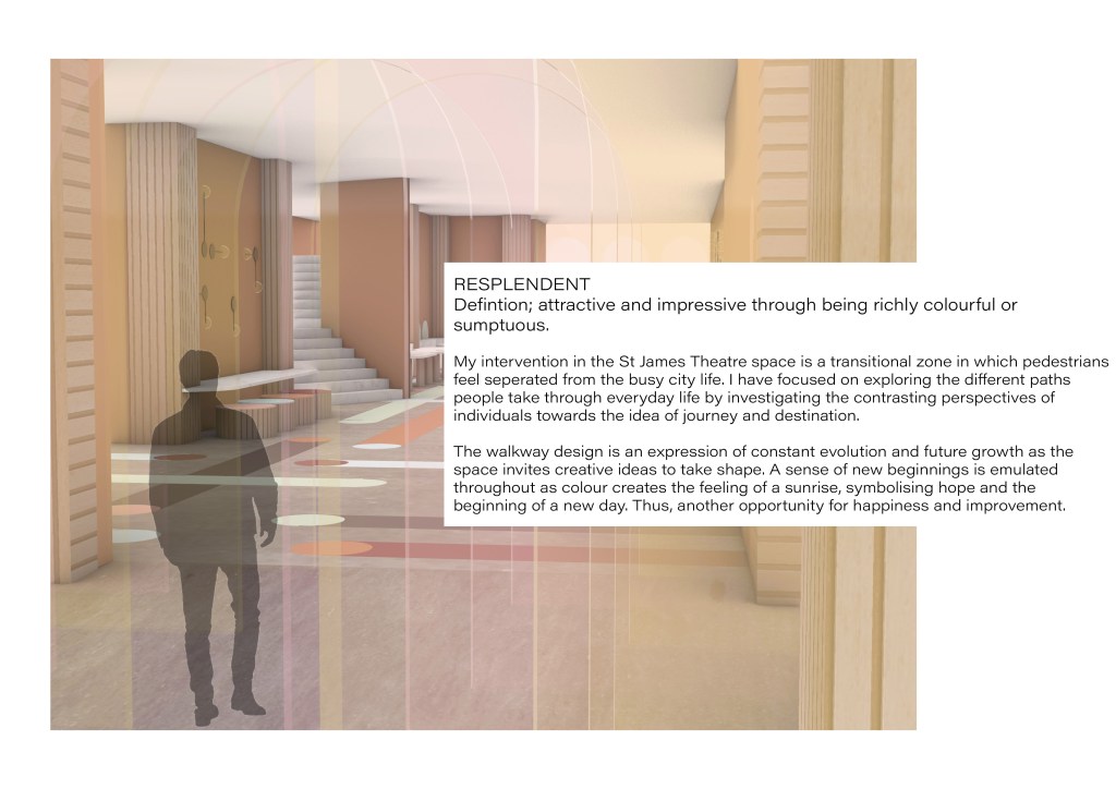
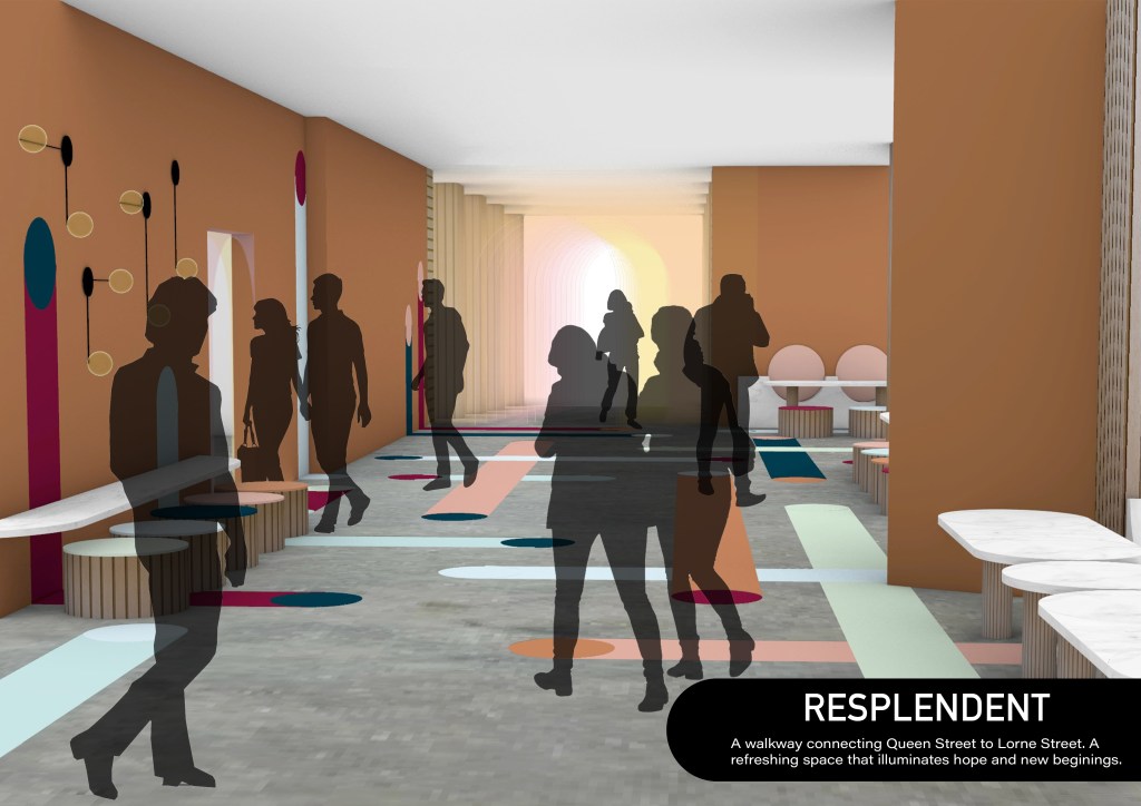
My intervention in the St James Foyer space will be a transitional zone in which pedestrians feel separated from the busy city life. A focus of mine is to explore the different paths people take through everyday life by investigating the contrasting perspectives of individuals towards the idea of journey and destination.
I intend to do this by breaking the interior of the site into various spatial divisions that lead pedestrians through an array of paths defined by the contrast of visual elements. The overall design will be an expression of constant evolution and future growth as the space invites creative ideas to take shape. With areas for sitting and relaxing woven throughout the site individuals can see the space as a part of their daily journey or as a destination at which they arrive. Geometric elements of my design will be inspired by my chosen artist model, Patricia Urquiola. Her use of pattern, layering, colour and texture to fill a space will be an integral part of my intervention.
I plan to work through a series of both hand drawn and digital perspective drawings of the site as I work to develop an impactful and cohesive design.
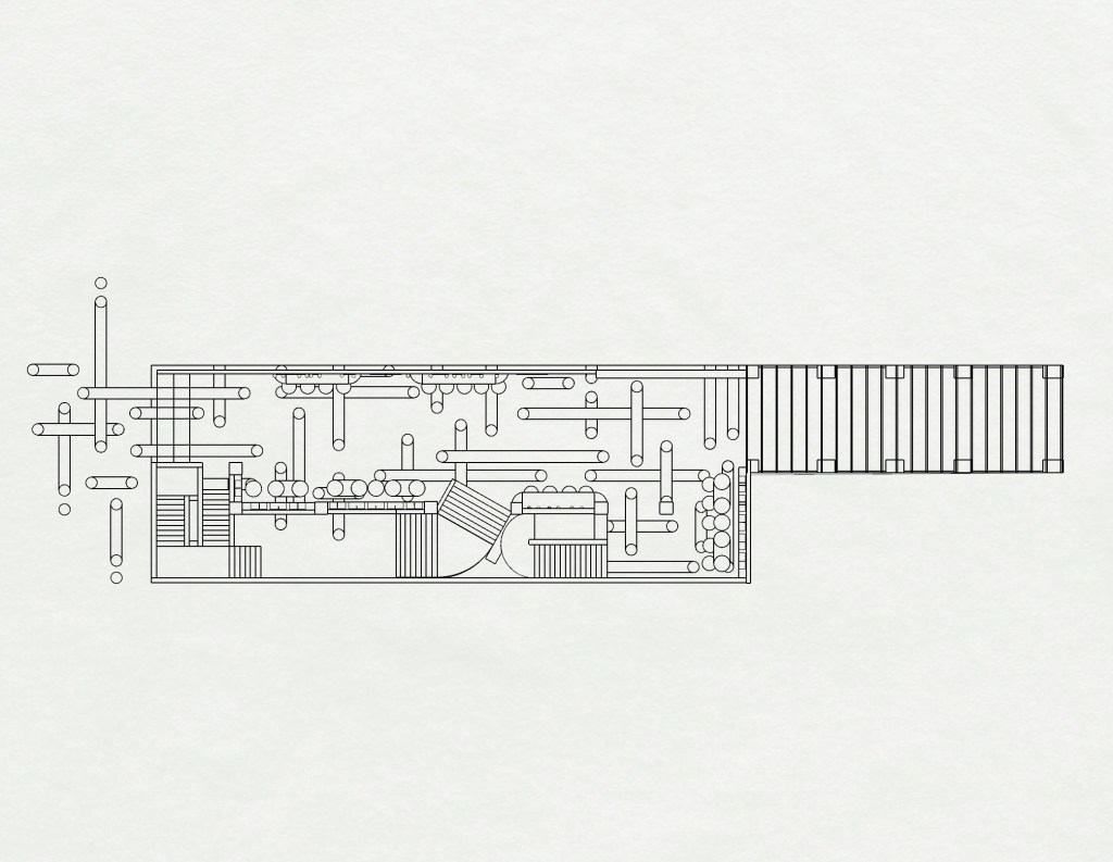
Rhino Modelling: This week I began my rhino model. Having a model is going to help me with moving forwards as I test different design iterations within the space. I decided to model the original layout of the building to give me a good sense of the space I’m working within. This has helped me think about areas of the original building I may want to change.
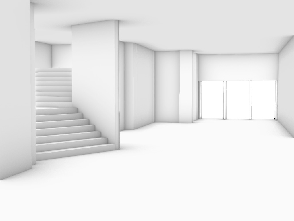
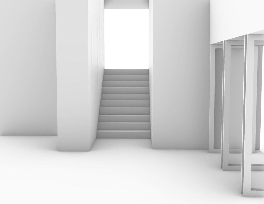
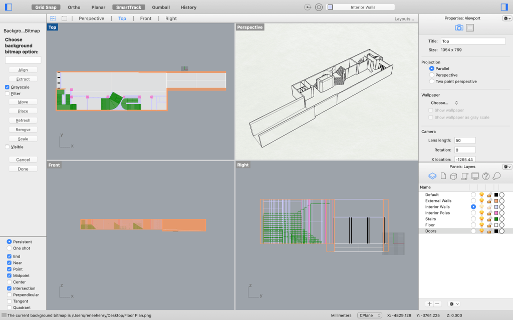
Quick Design sketches: Below are some of my design ideas quickly drawn into the site. These are just rough ideas, placing them in the site allowed me to see how they may work within the space.
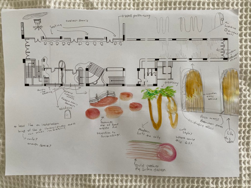
Week 9: Design Development

My surface design 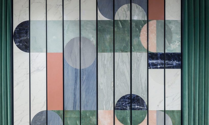
Patricia Urquiola – Budri Showroom
My intervention into the St James Theatre is being strongly inspired by the feature wall in the Budri Showroom designed by my artist model Patricia Urquiola. I have taken the geometric shapes and used then in my surface design and will now be integrating the rounded end rectangles/archways into my design through the furniture, walls, doorways etc. The way Patricia Urquiola is able to define different space through pattern and materiality is something I will be using moving forwards.
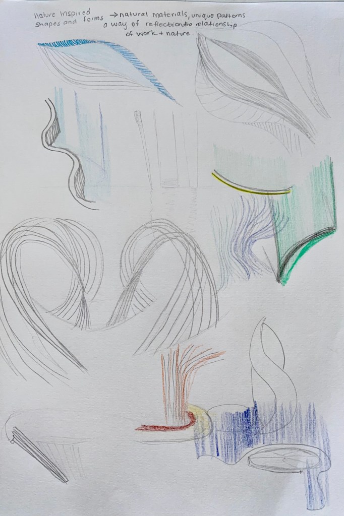
Sketches exploring different shapes and forms I made incorporate into my design. Refining my ideas.
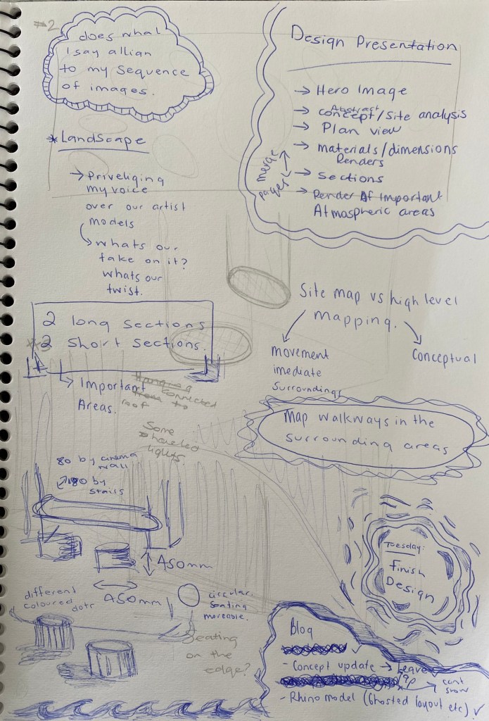
To do list:
- Design threshold moments, entrance/exit – important spaces.
- Define the walkway, places for seating etc – design with reasoning.
- Plan
- Section (2 short, 2 long)
- Perspective views – rhino model
- Site map
- Abstract & pitch
- Design presentation
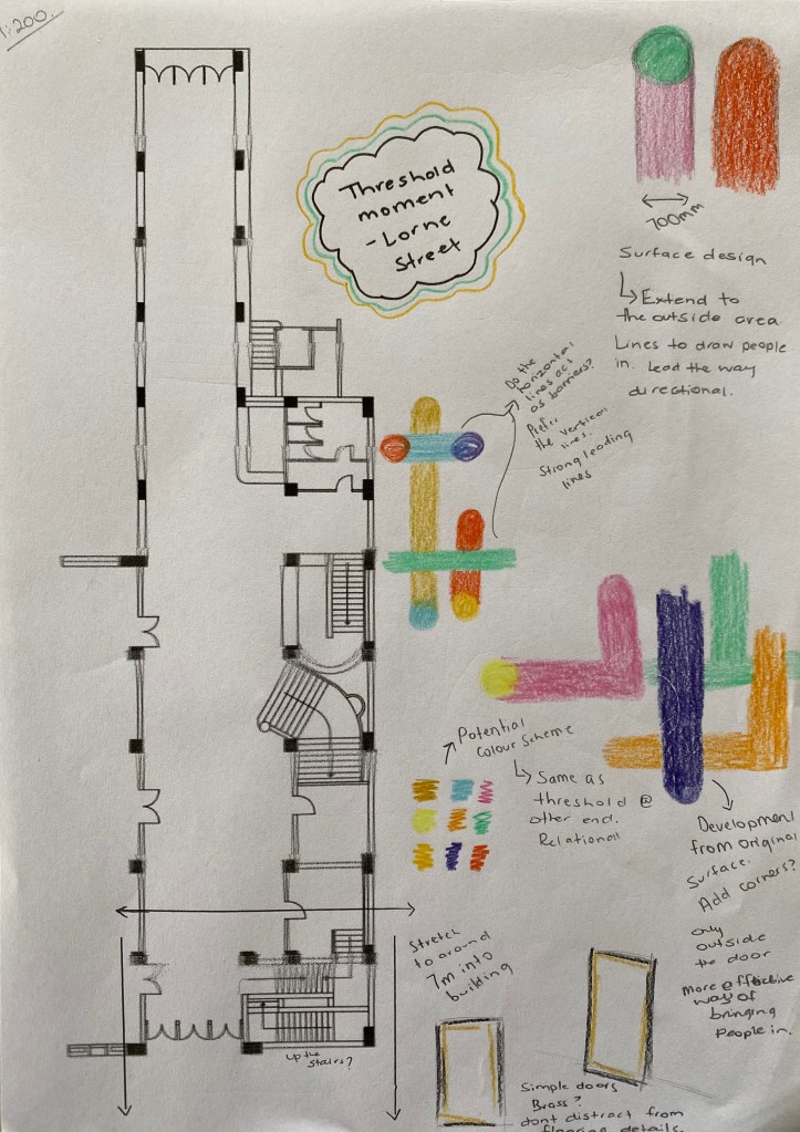
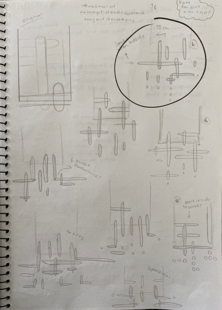
Week 10: Design Development
This week I began to develop the threshold hold moments, one at the Lorne Street end and the other at the Queen Street end. I wanted each of the entry/exit thresholds to be the most powerful parts of the design as I want individuals to become spatially aware of where they are, noticing that they are moving from one space to the next.
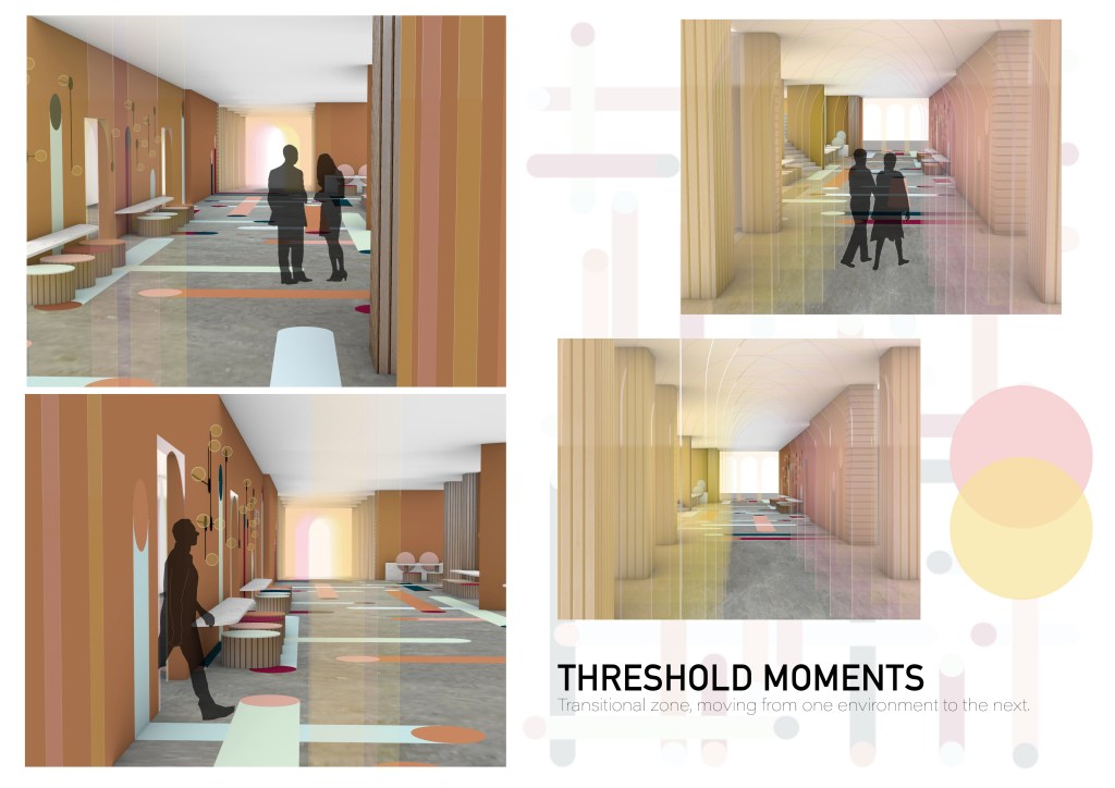
Threshold – Transitional zone, moving from one environment to the next.
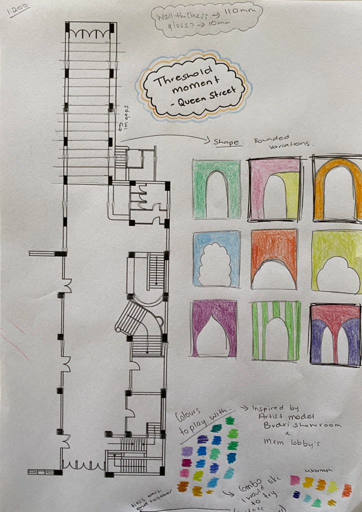
Concept for each threshold:
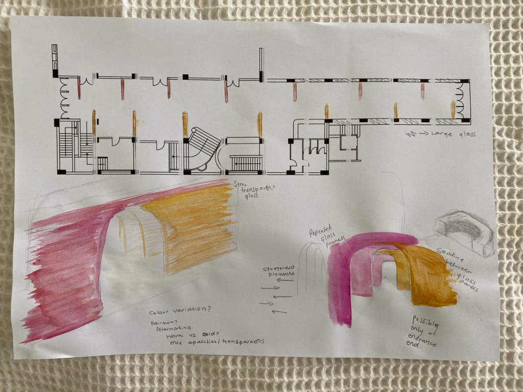
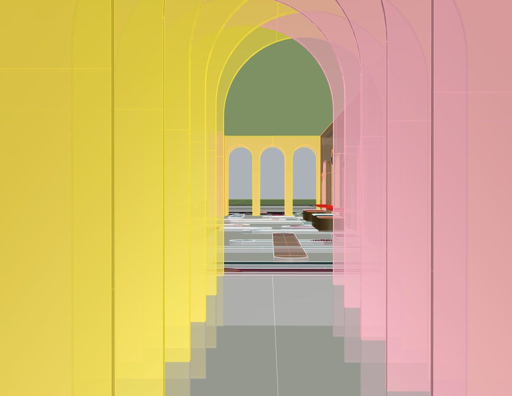
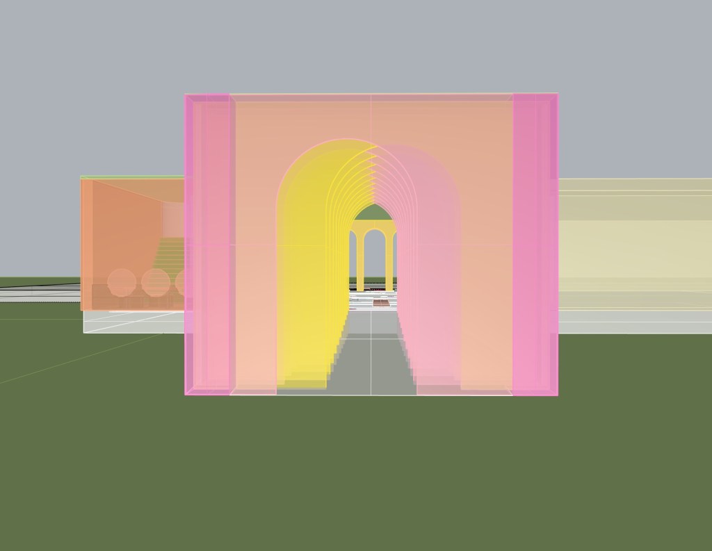
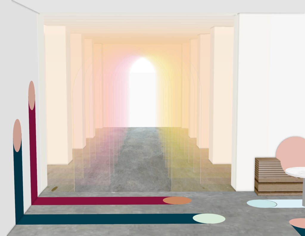
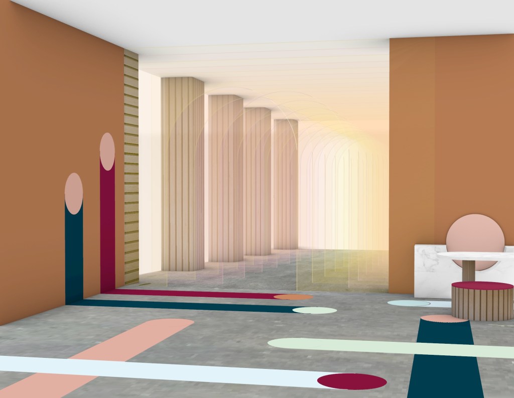
Queen Street – Time passing. Staggered archways make people spatially aware as they notice the inconvenience of having to walk a slightly zig-zagged path. Alternating coloured glass creates a subtle blend between the two colours.
Lorne Street – Representation of peoples journeys through life, paths crossing, leading to different destination. Lines also lead into the space as they are focused around the entrance. When further designing the site I may build this pattern up to become apart of the furniture and walls etc.
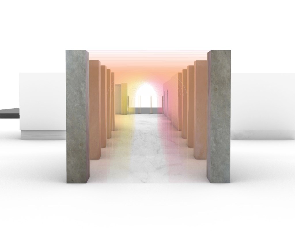
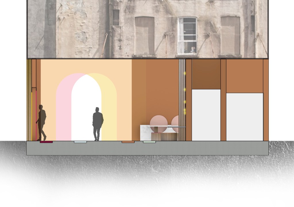
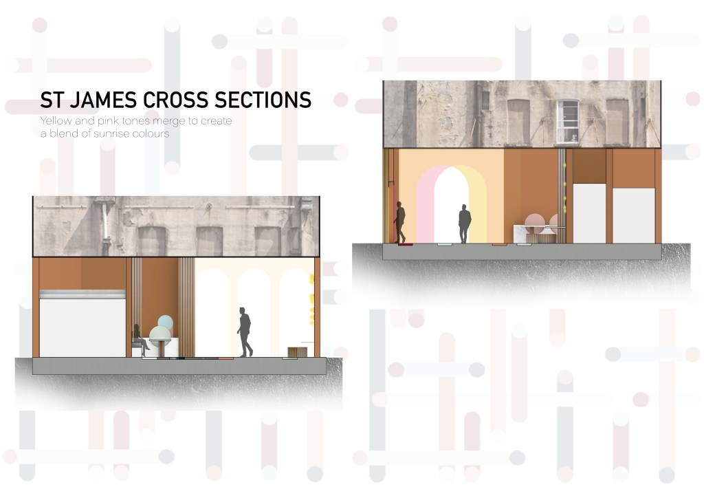
Queen Street Threshold – I really like the way to colours blend to create a new shade when looking at the archways as a whole. The blend of yellow, pink and orange tones creates a sunset/sunrise looking palette symbolising the end or start of a day and the end or the beginning of ones journey through the site. This is a concept and colour scheme I could work with moving forwards, exploring how I could create a space that makes it feel like golden hour.
Lorne Street Threshold- I like the way the surface design looks being placed outside of the theatre as I do think it would lead people in however I personally find it quite underwhelming as there is no wow moment. Moving forwards I could look into incorporating the idea I used for the Queen Street threshold to this one, creating a connection between the two entry and exit points.
Week 11: Concept Development + modelling
Questions I want to explore after my 1:1 –
- How long will people spend in the site?
- Can I control how long people spend in certain areas through the way I program the space?
- Can I make it feel like people are in the space for longer or shorter than they really were?

Concept update: After thinking about the questions above and playing around with some of my new ideas I have slightly changed my original concept. I am still sticking with a walkway, but what do I want it to resemble or make people feel? I still like the idea of journey and destination and I enhanced this through the walkway itself and the surface design but I’ve also decided to design the space around the concept of new beginnings and fresh starts. The yellow and pink archways at both thresholds of the site create a range of pink, yellow and orange tones that resemble a sunset/sunrise. When entering the space it will feel like you have started a new day. Upon exiting, people will feel refreshed and energised after moving through the bright and vibrant space, ready to take on any challenges they may face.
Rhino model – current programming of the space (not rendered)
This week I really began modelling the space the way I planned. I worked on extending my surface design throughout most of the site as well as adding unique entry and exit points. I also refined some of my decisions around my designs of tables and chairs placed throughout the site.
I may also be adding some false walls (archways/circular shapes) throughout the site to create a more interactive space. Where people can journey through and choose their own paths. A space driven by ones decision making. I will test it out through sketching to decide if the space will become too busy with this added.
Material Testing – Basic Renders:
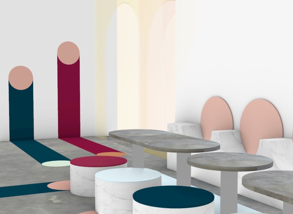
Ive decided to test a few neutral coloured materials such as concrete, wood and marble throughout out the space as I want the pops of colour to come from my flooring and threshold designs.
Concrete 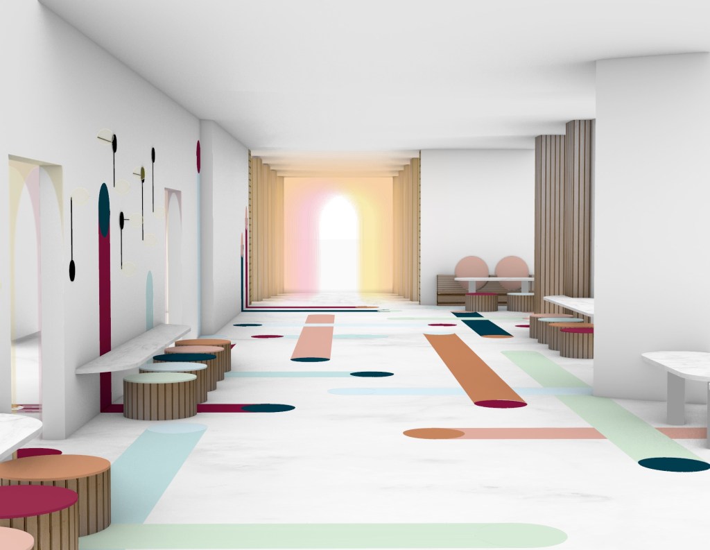
Marble 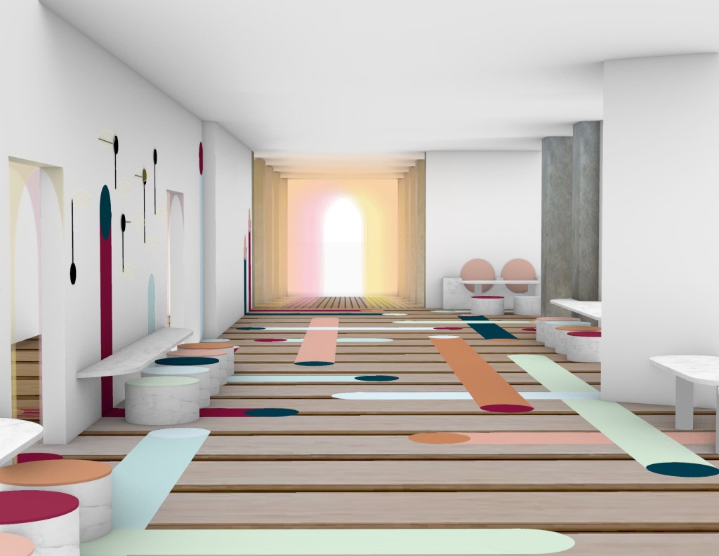
Wood
Out of the three tests I did above I prefer the space that uses a polished concrete as a flooring. The cool grey tones contrasts well with my flooring design. I quite like the warmth of the wooden option, however, the grooves between planks makes the space feel very busy as there is too much going on, patterns clashing.
Concrete 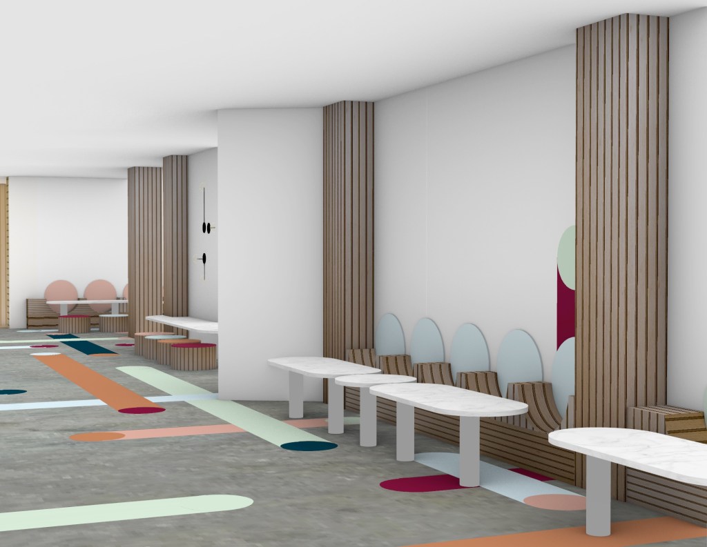
Wood 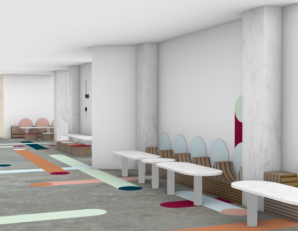
Marble 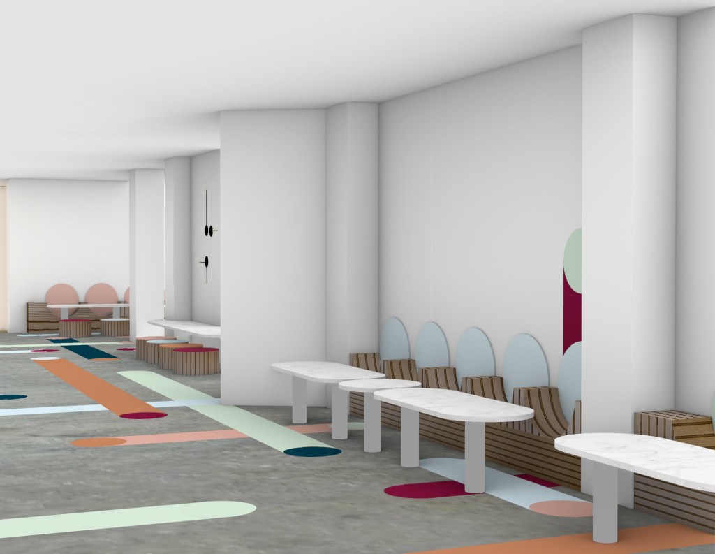
White paint

Marble/wood 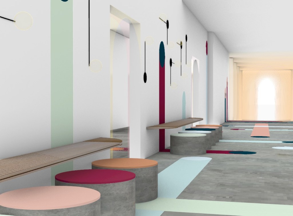
Wood/concrete 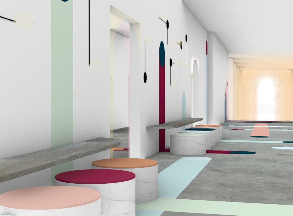
Concrete/marble 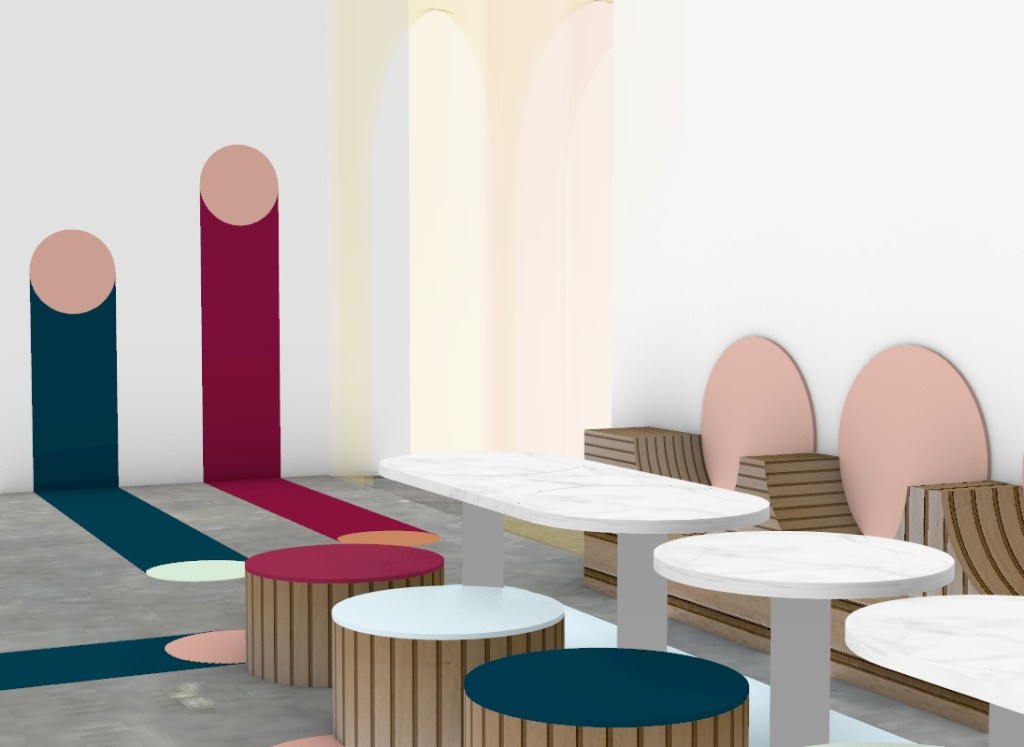
alternating 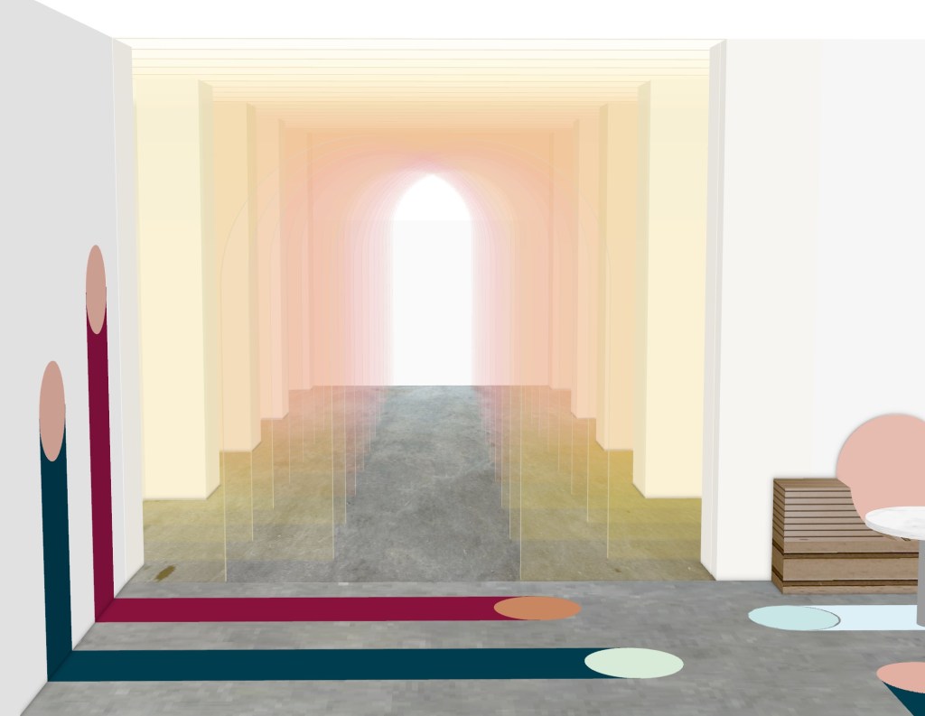
gradient 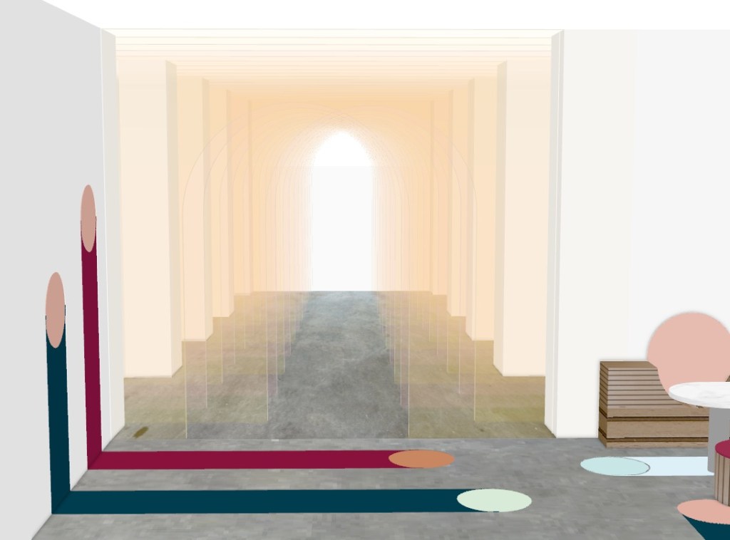
mixed
Above I was playing around with the different ways I could place the colours for the glass panels of Queen Street threshold moment. I was interested to see which placement could resemble a sunrise. Initially I thought it would be the gradient option as the colours gradually got darker as you leave the space however I think that the option where the two colours alternate sides works better as more variation of colour and tone is seen.
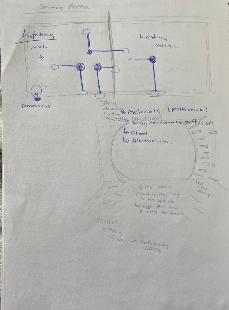
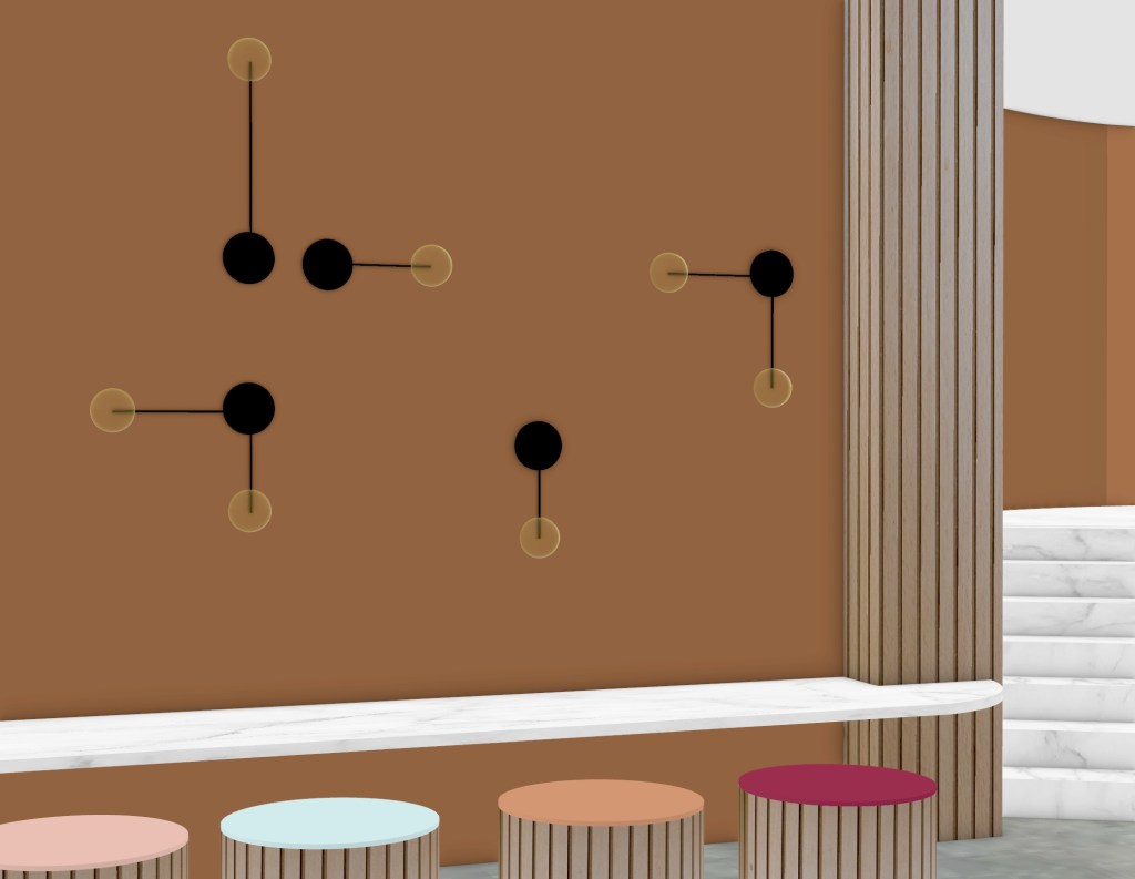
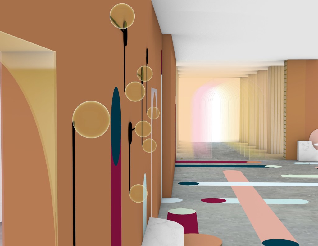
Lighting –
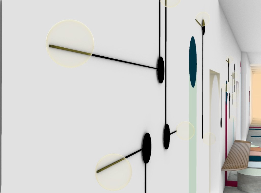
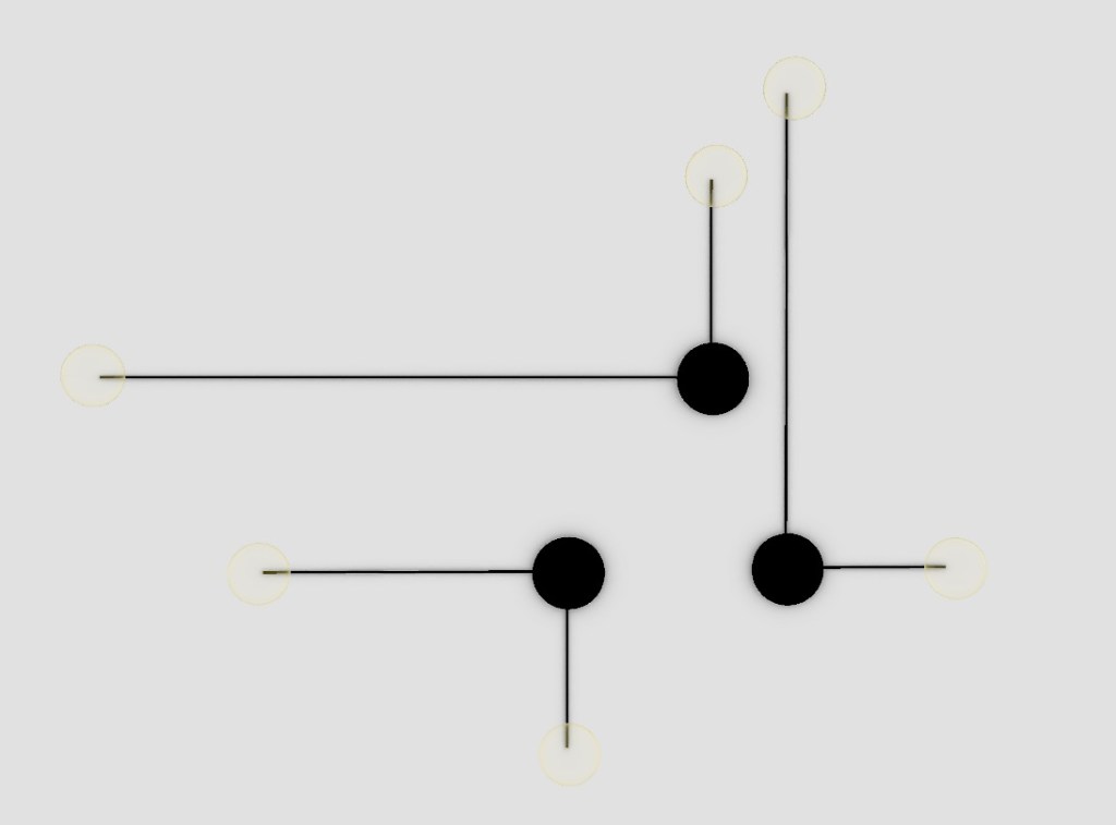
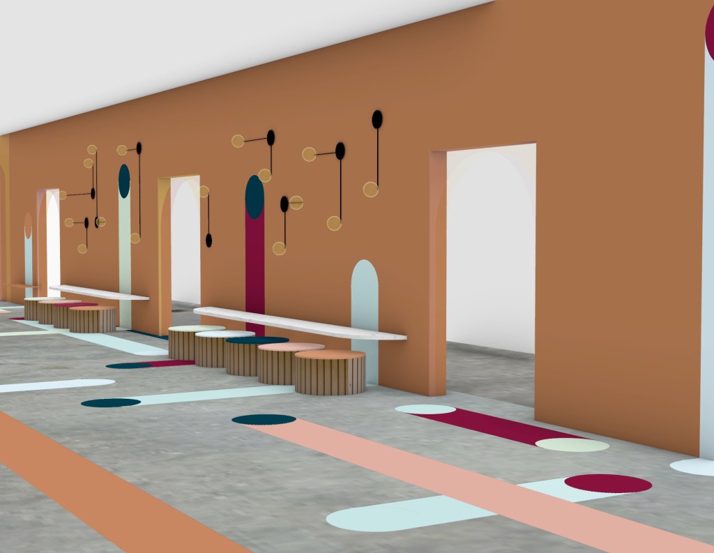
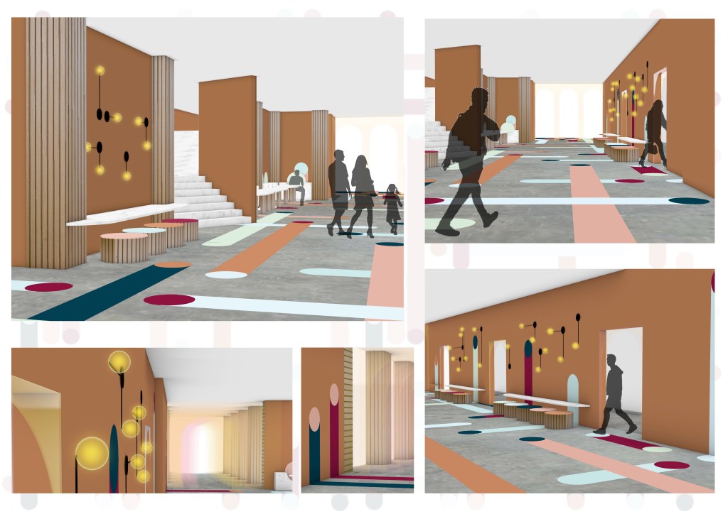
I decided to design a simple yet effective lighting solution that is placed on three of the interior walls. The design is strongly inspired by my surface design, with the crossing of paths and circular shapes. I decided to keep the lights a sleek black colour to create a bold contrast on the walls while also breaking up the areas of colour that climb up onto the walls. Small down lights will also be used throughout the space.
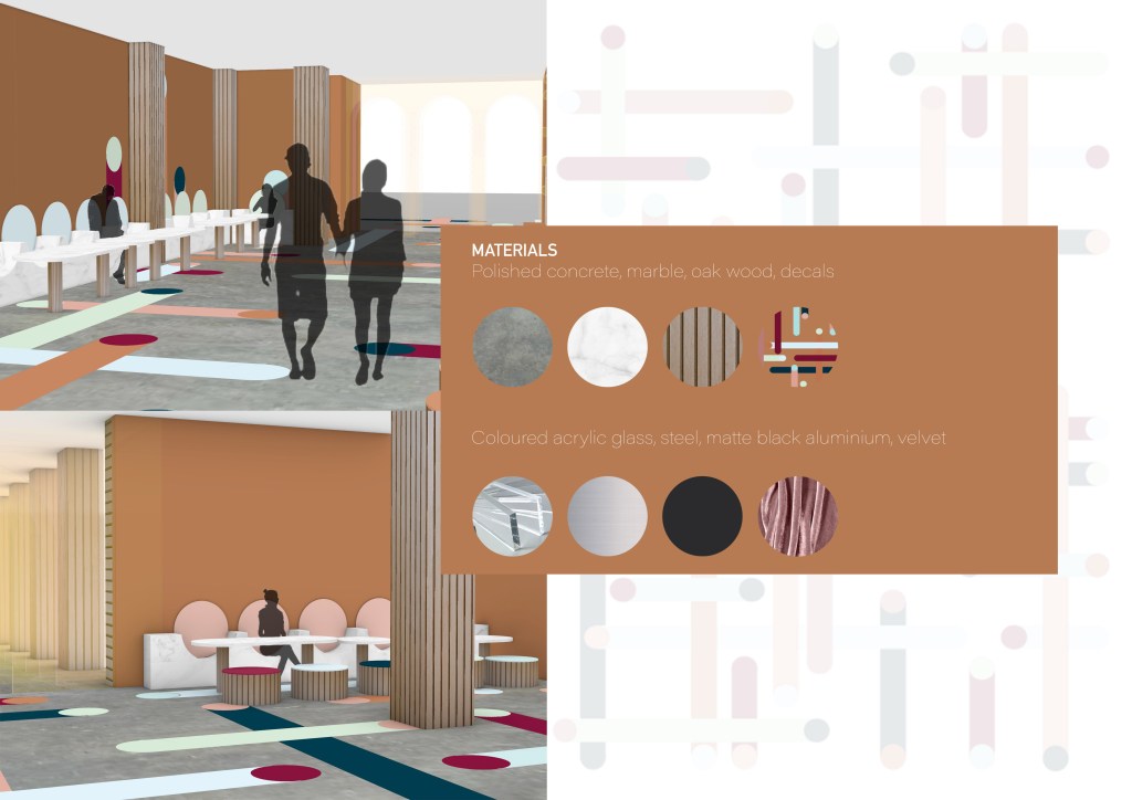
Materials:
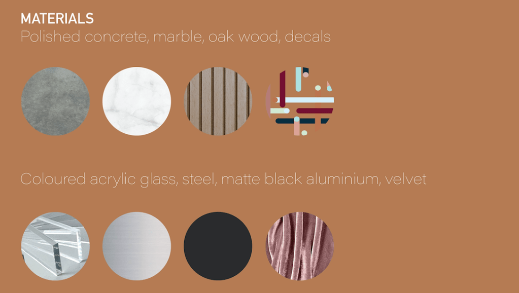
The materials I have chosen has been directly influenced by Patricia Urquiola’s works, the Budri Showroom in Milan, Italy and the Marieturm and Marienforum business towers in Frankfurt, Germany. Materials used in these two designed include marble, velvet and a range of woods and metals.
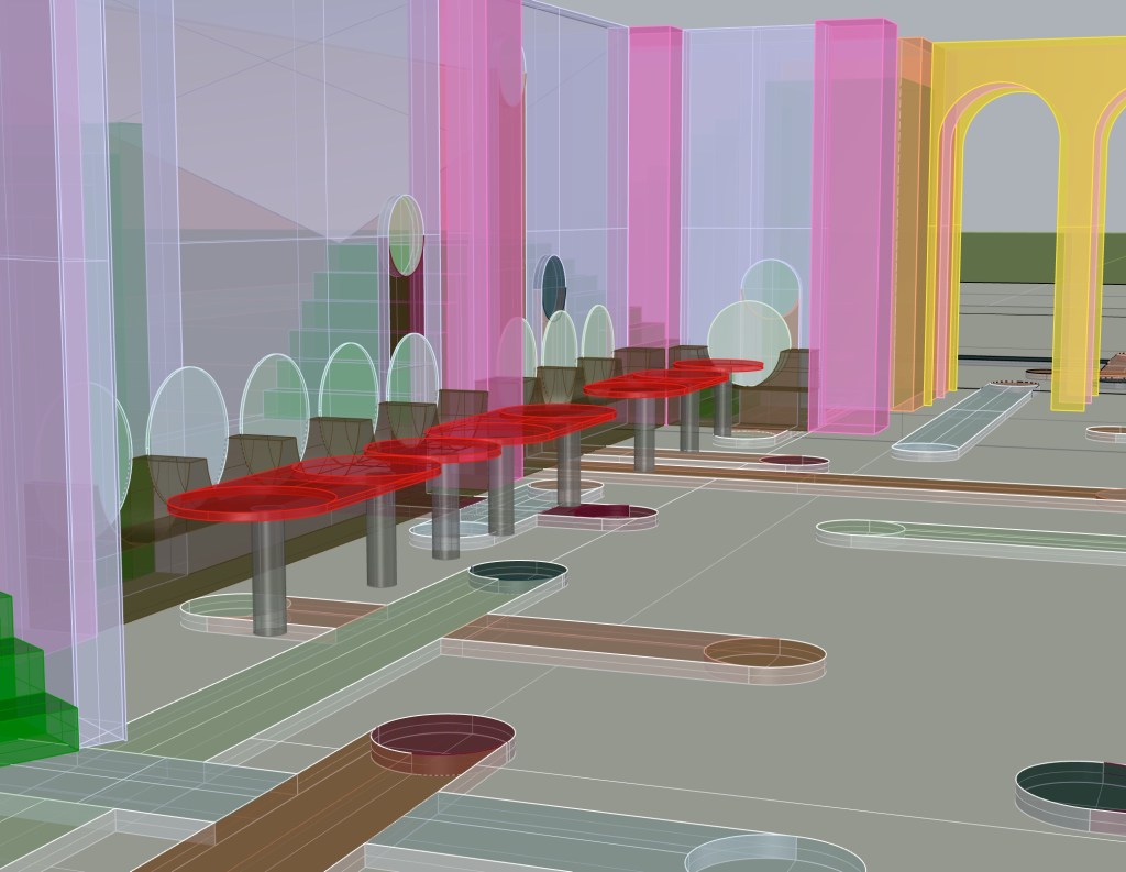
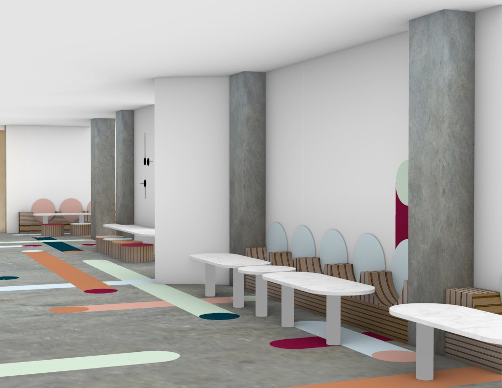
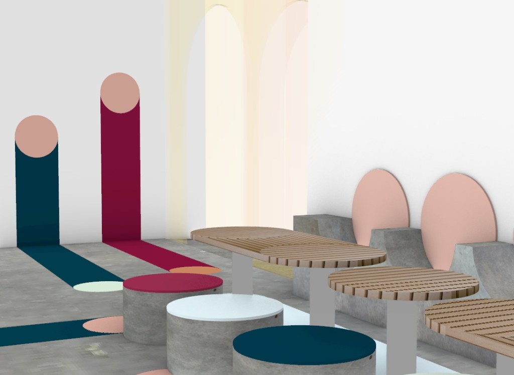
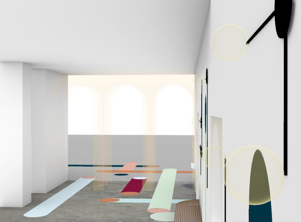
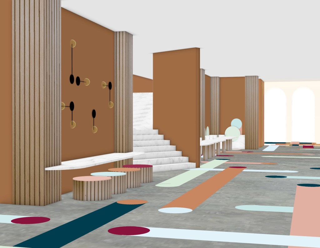
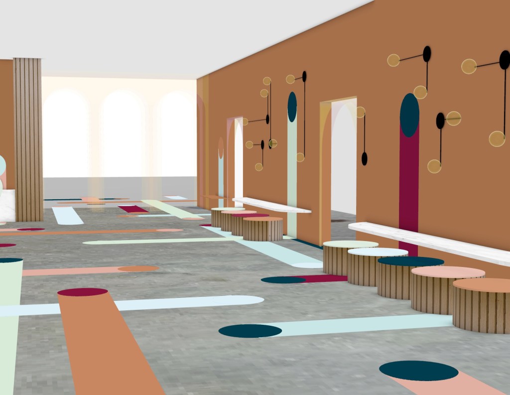
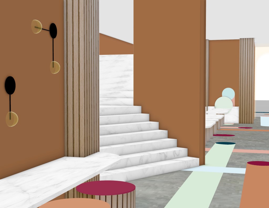
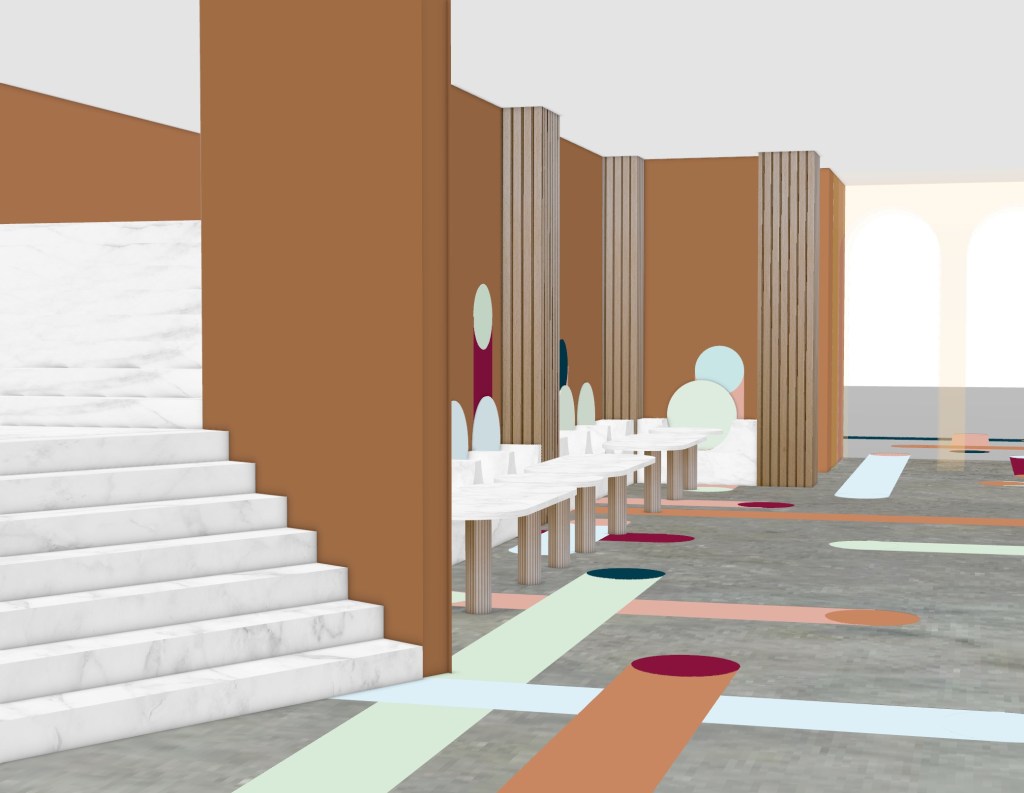
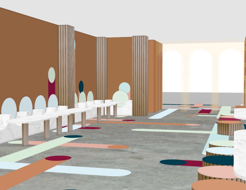
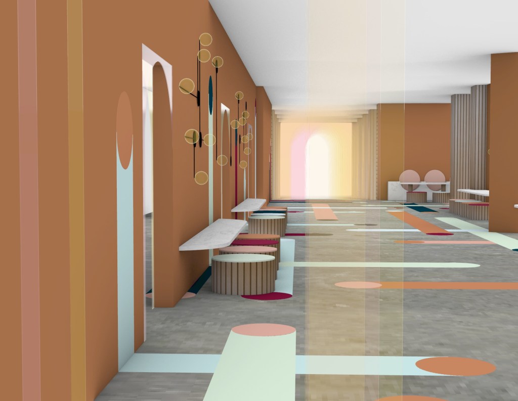
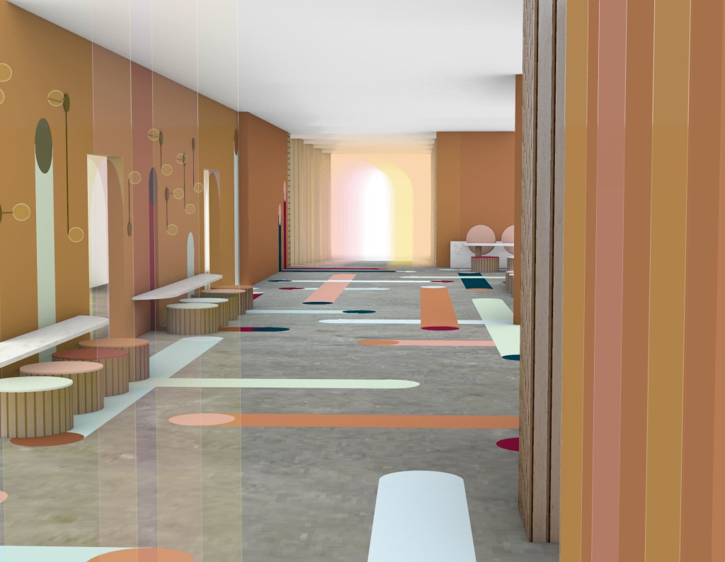
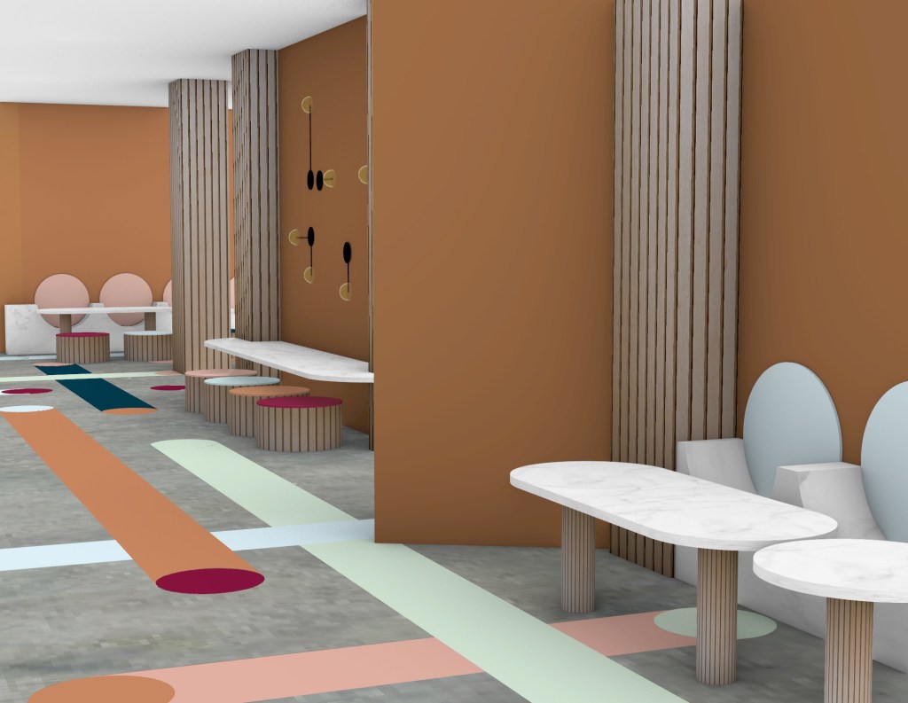
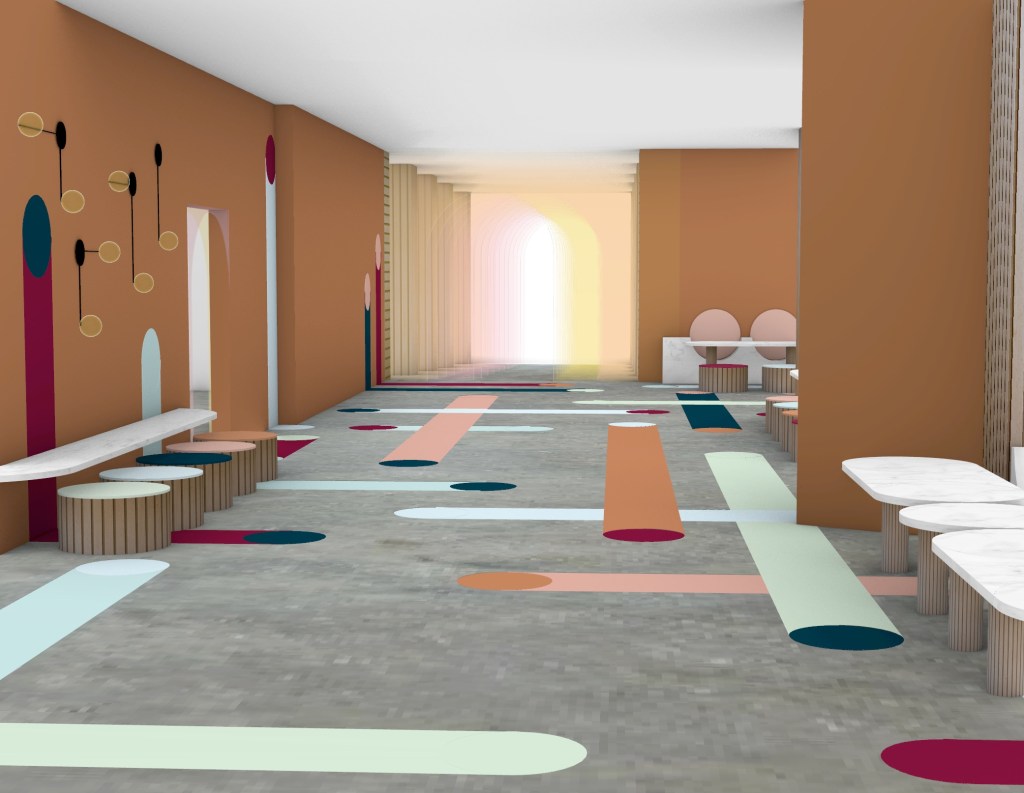
Flooring: The flooring will be a polished concrete that runs throughout the entirety of the space. The cool grey tones create a bold contrast with my flooring design making it pop. Polished concrete is also able to reflect light, brightening the space overall. This material is suitable for the space as it is highly durable and will be able to withstand daily foot traffic.
Flooring Design: The flooring design will be stuck to the polished concrete with flooring decals. Decals are able to be protected with a special film that prevents slipping and scratching to the surface. By using decals it will be simple to extend the pattern upon to the walls on the areas where it does so.
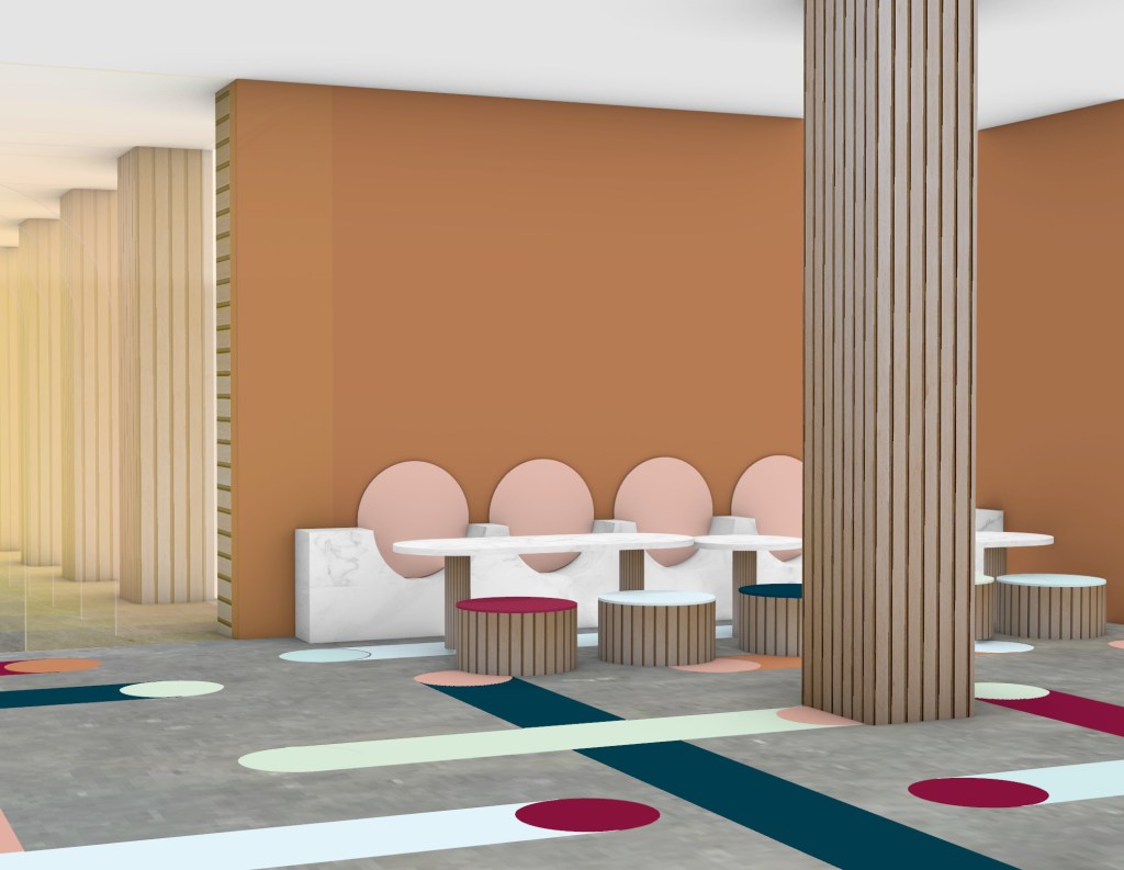
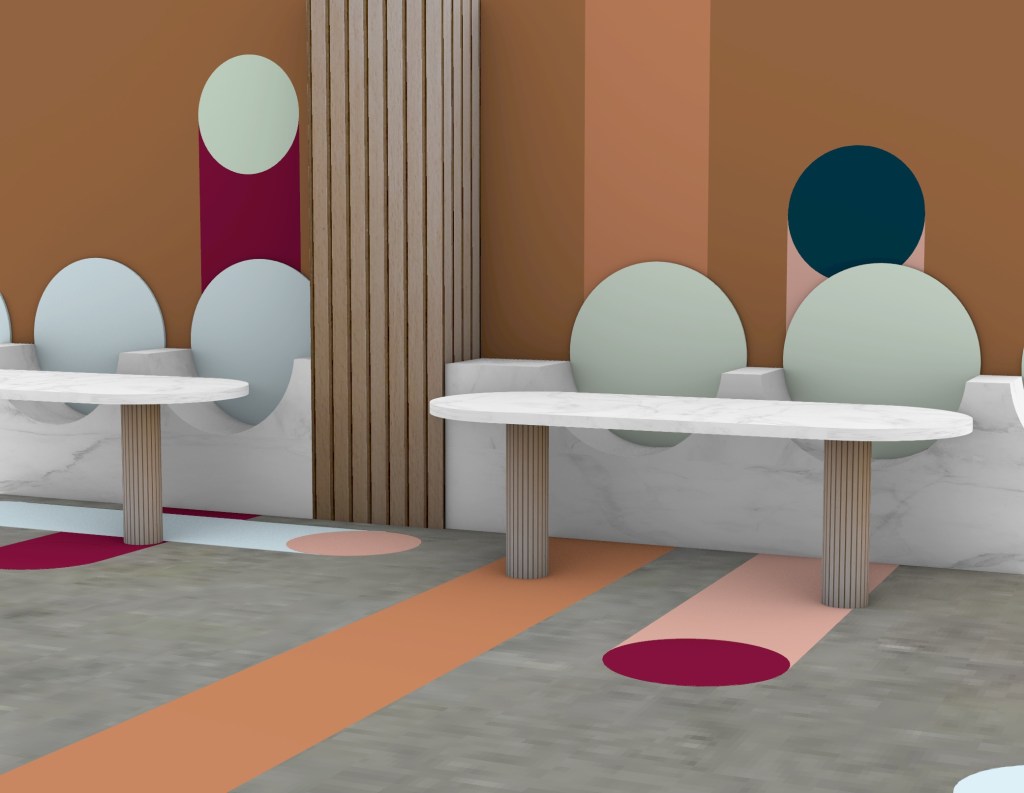
Tables: I decided to go with white marble table tops to create a feeling of elegance and cleanliness. The legs of the table will be made out of oak wood.
Seats: The stools will be made from oak wood as it it known to be strong, stable and can be left natural. The honey toned wood will also contribute to the overall warmth of the space. Making it out of wood also means that it can easily be moved if needed. The seating placed up against the wall (bench seat with curved cutouts) will be made from white marble. Both types of seating will have velvet cushions for comfort. The cushions will be in a range of different colours, all directly taken from the flooring decals.
Lighting: Materials I have selected for the lighting include steel, aluminium and a polycarbonate diffusers. The structure of the light will be a matte black colour and placed on the walls. The light itself will be a dim yellow/orange tone enchaining the sunrise feeling.
Walls: I have decided to apply a burnt orange paint to the interior walls. This is a simple way to enhance the more dominant features of the space (whites and bright colours), adding to ones overall experience. Burnt orange also links to my idea of the sunsetting and rising (golden hour).
Structural Poles: The poles will be lined with oak wood (same as the stools). This creates more cohesion throughout the entirety of the space by repeating materials in a range of different ways.
Doorways/Thresholds: Both the Lorne Street and Queen Street entry/exit thresholds and door ways into the theatre are made from yellow and pink acrylic glass panels. All three of the designs differ in the way arches have been cut out of them but are similar in the way that the yellow and pink colours blend to create a soft orange tone in the areas where the colours overlap.
Colour Palette:
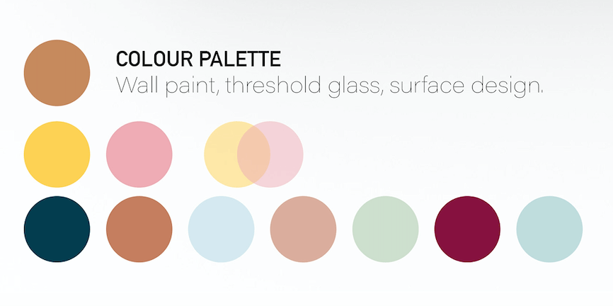
Plenty of warm tones to create the golden hour/sunrise effect throughout. A few cool blue and green hues add contrast to the space.
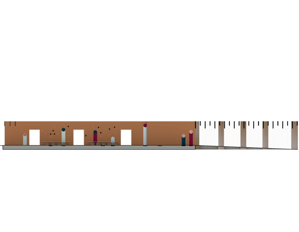
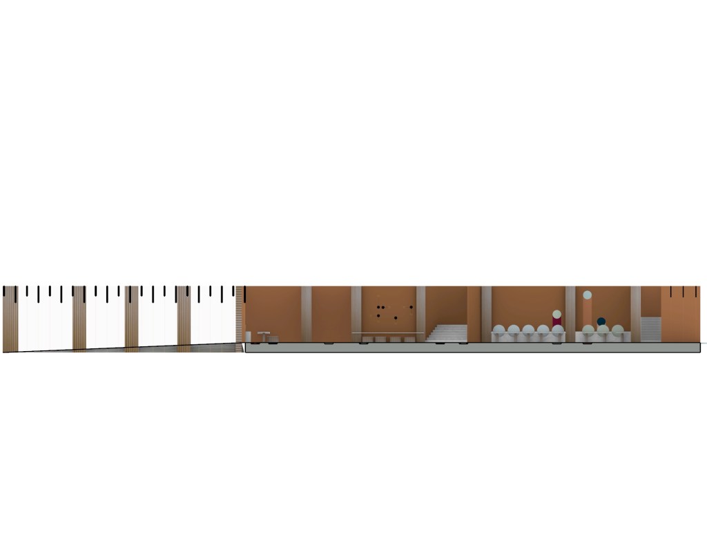
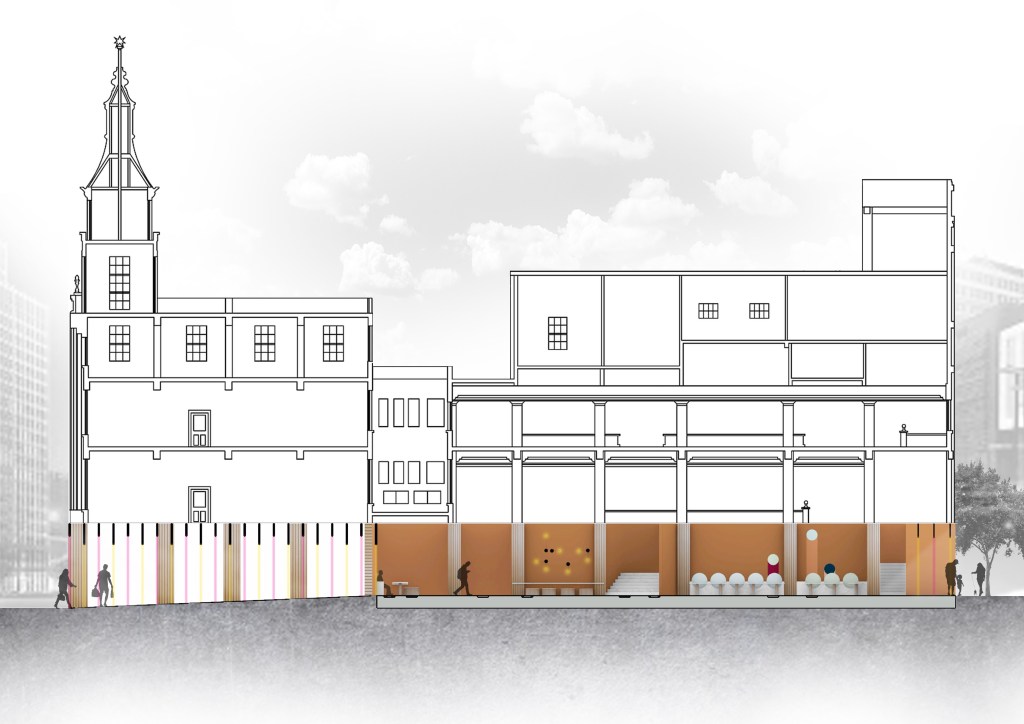
Week 12: Plans, Sections, Renders
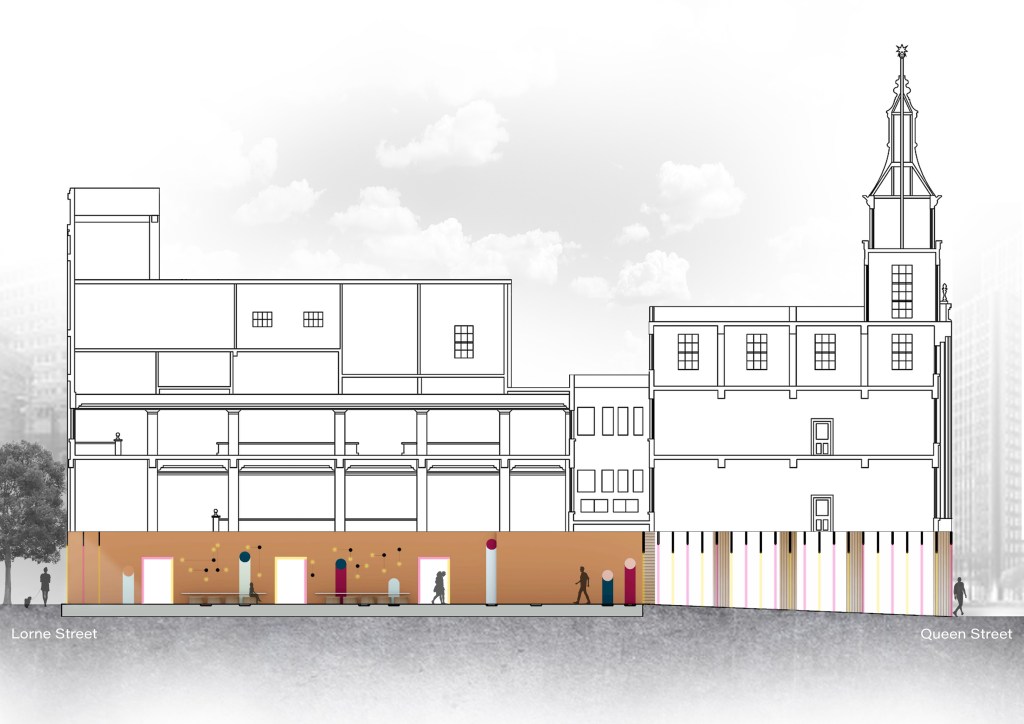
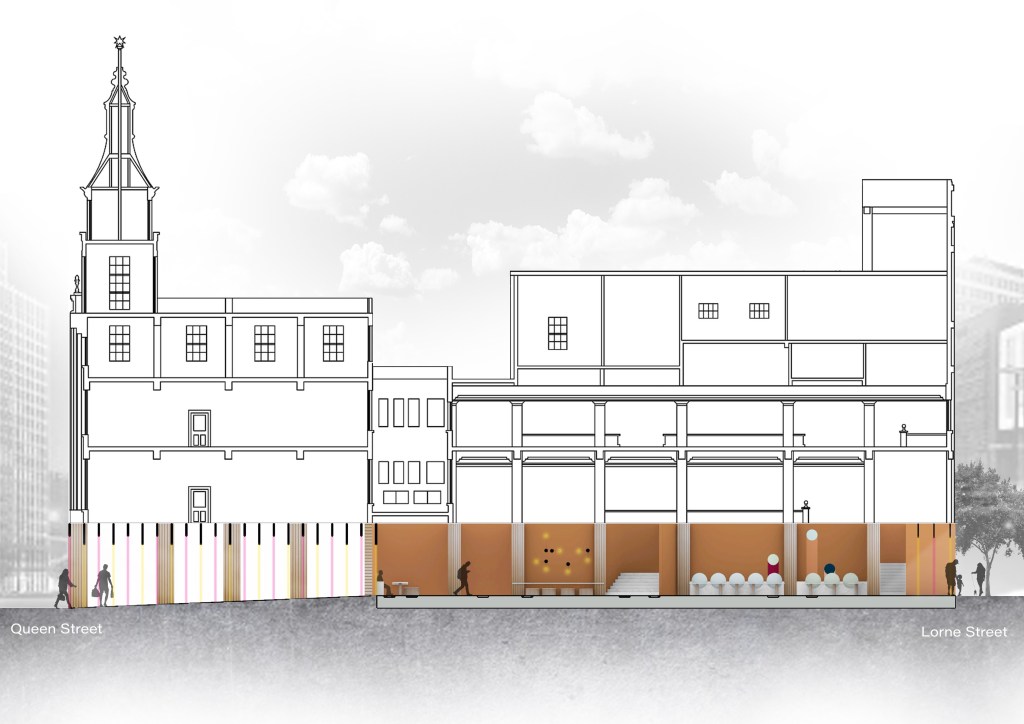
All drawings are scaled 1:100
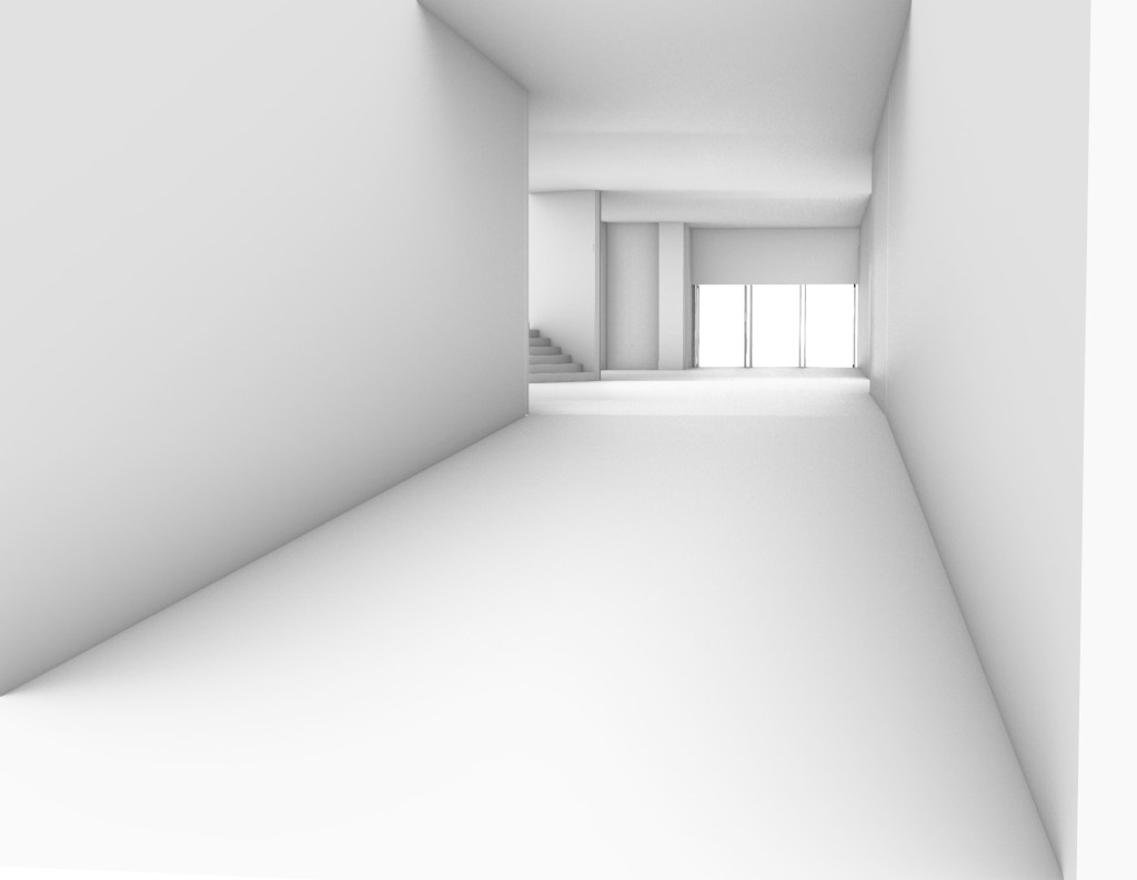
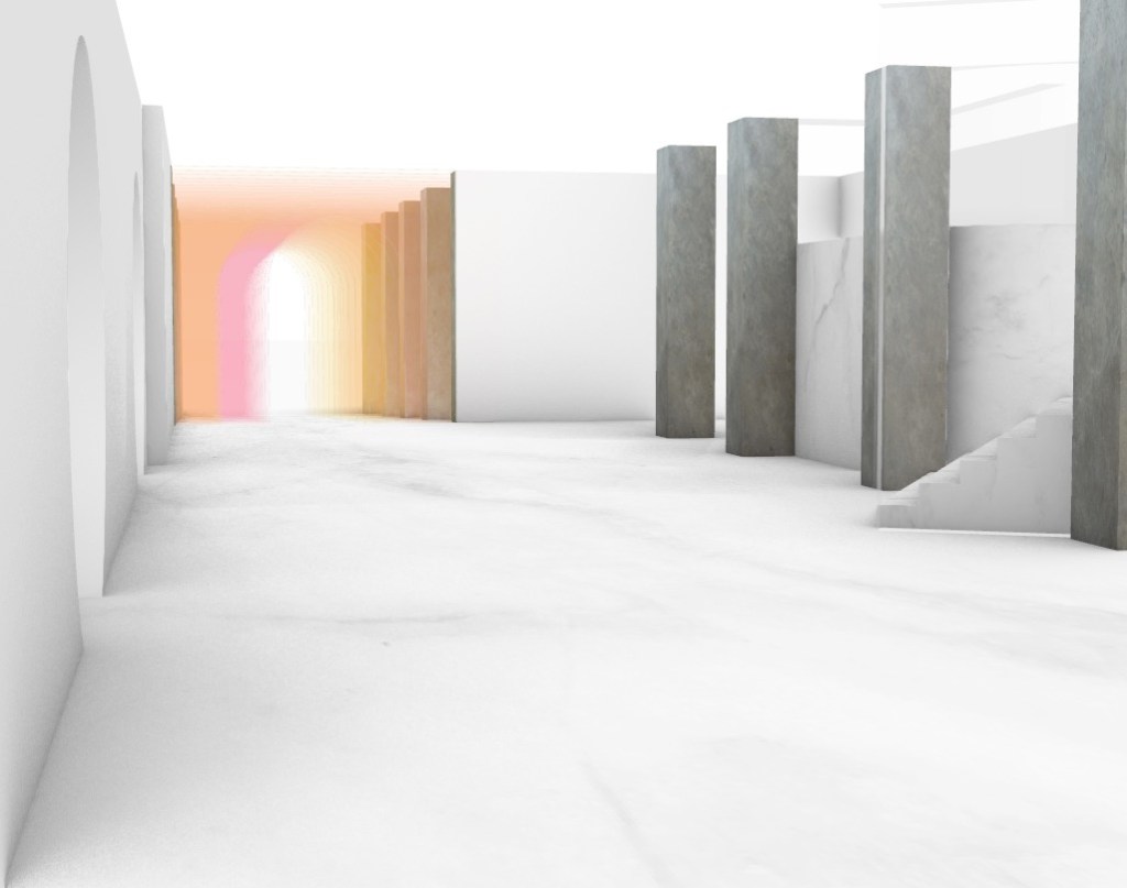
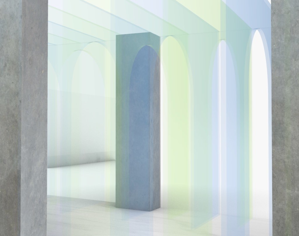
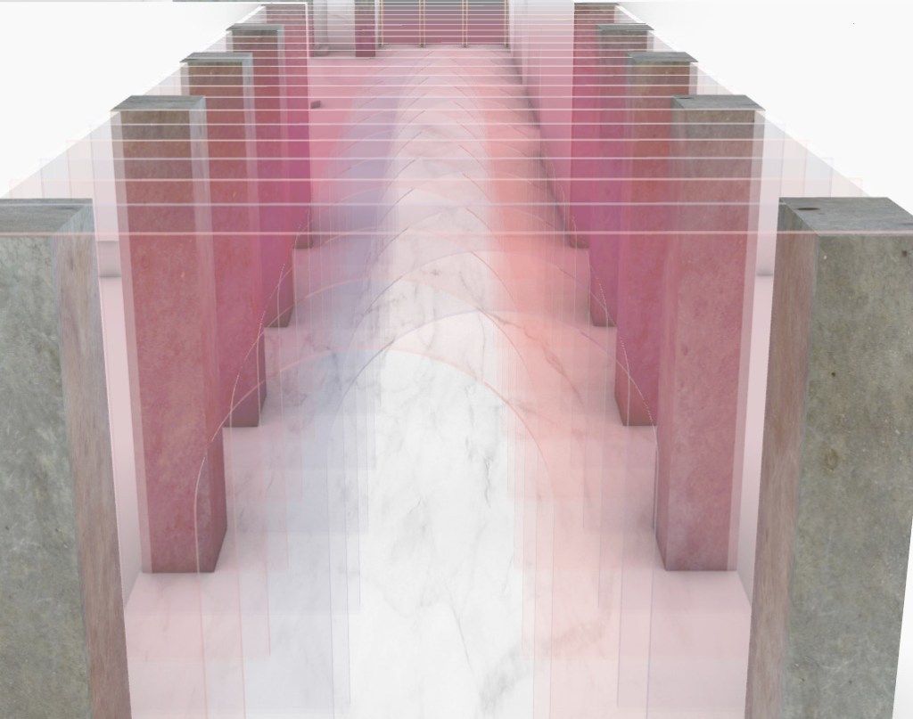
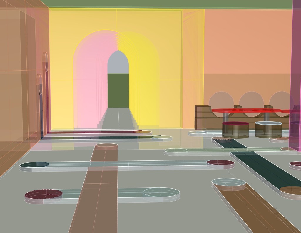
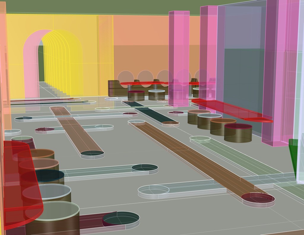
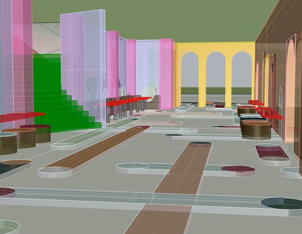
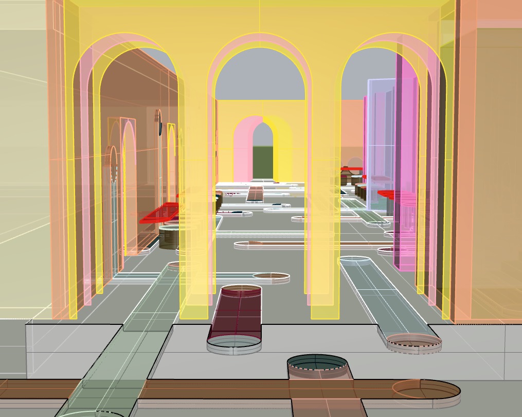
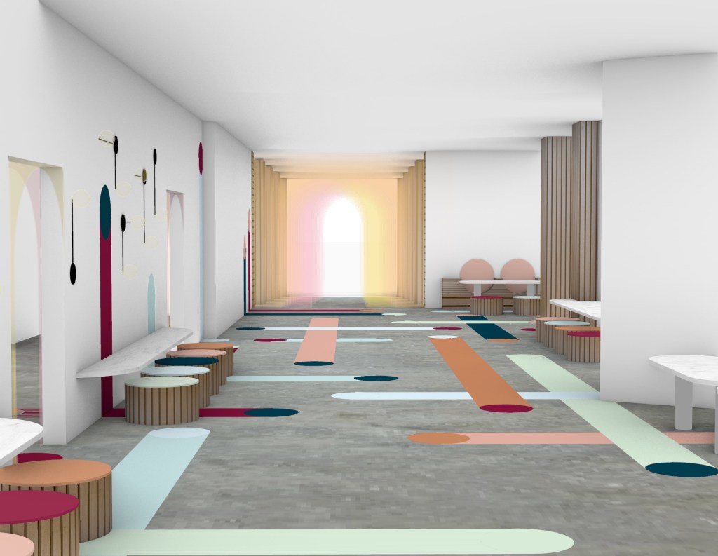
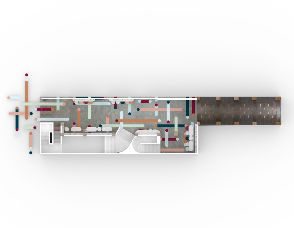
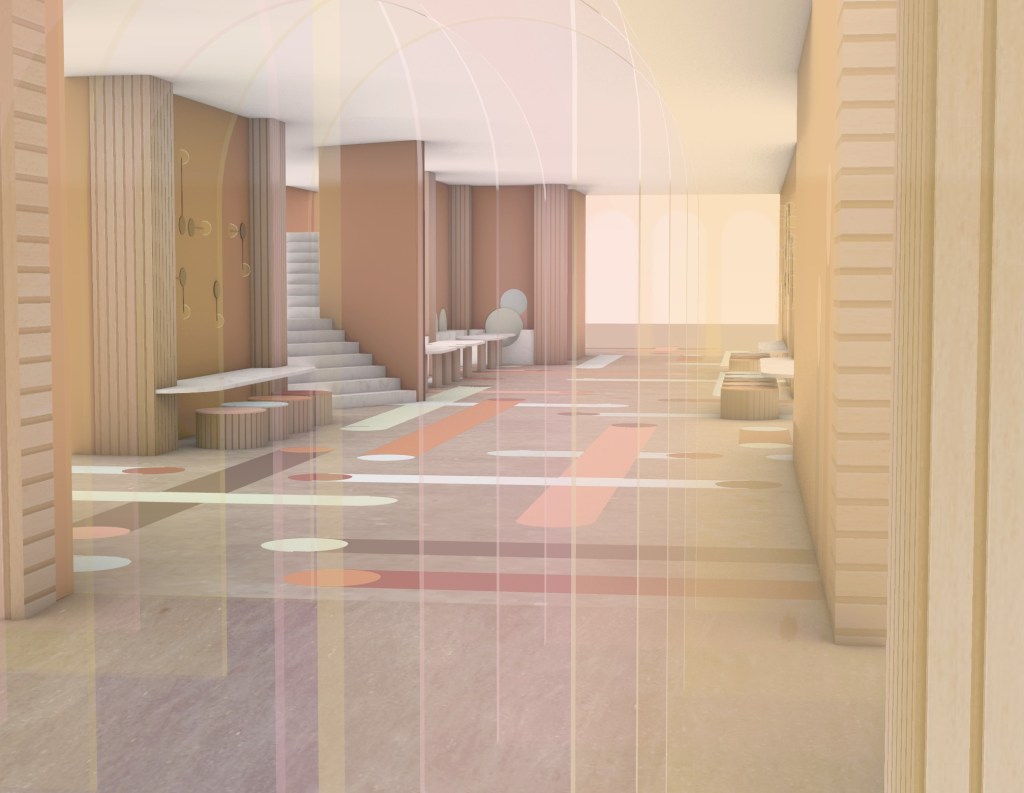
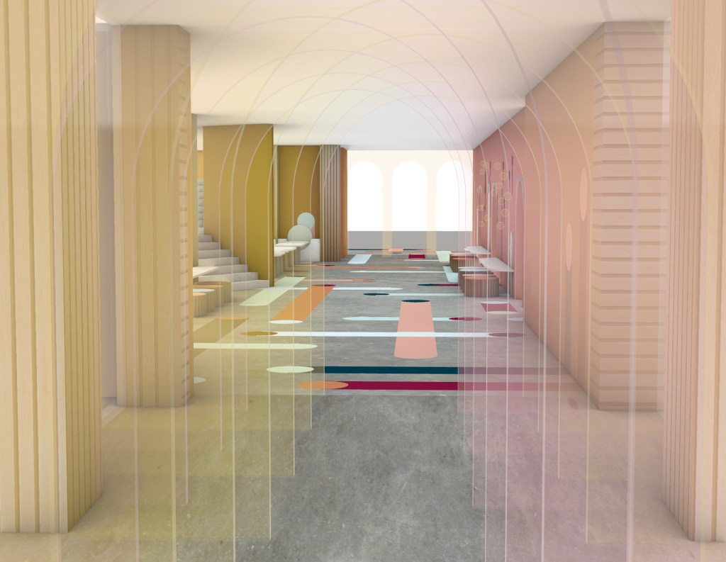
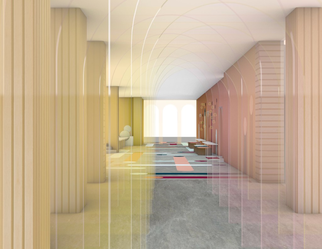
Plan Views: I particularly like how the rendered version of the floor plan captures some of the atmospheric light qualities displayed at the Queen Street entrance of my design.
Short Sections: The cross sections displayed below are some of the drawings that best showcase the merging of colours at each of my entry/exit thresholds.
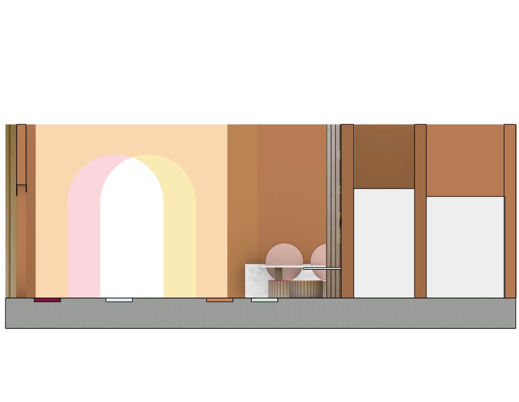
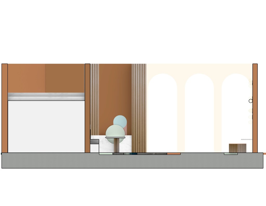
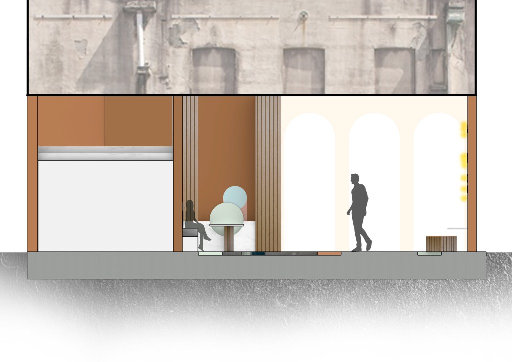
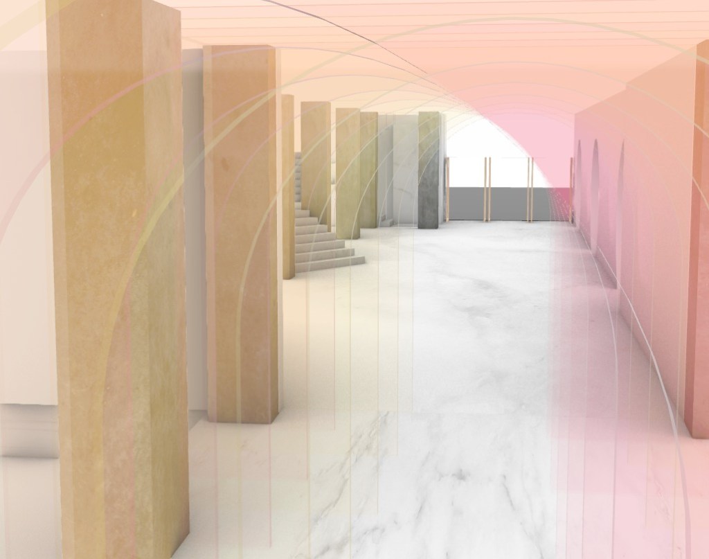
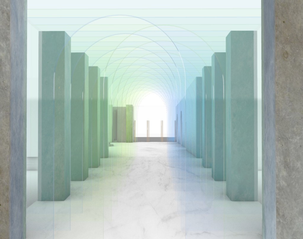
Long Sections: The long sections are useful to see the full layout of the space as well as specific colour placement.

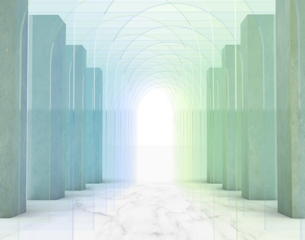
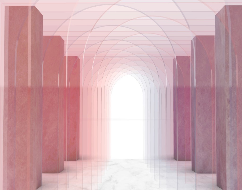
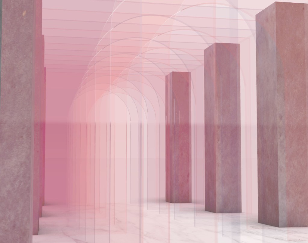
Perspective Renders: Below are a series of interior renders that I will work with to see which will be fitting for my final presentation. Focusing on colour and atmospheric quality will be essential when it comes to choosing the best images that communicate my concept clearly.
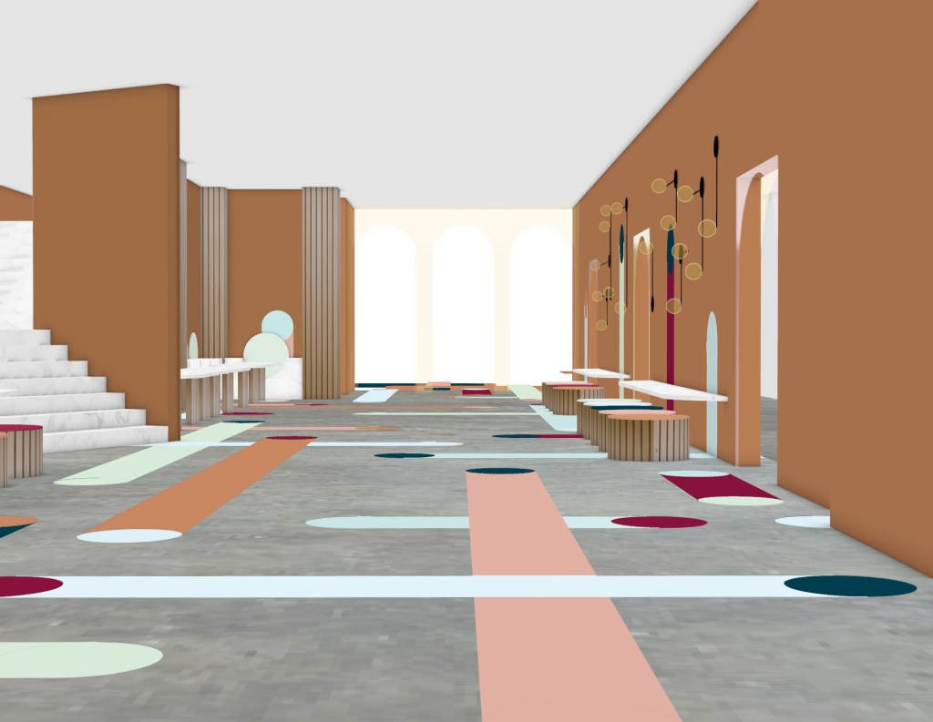
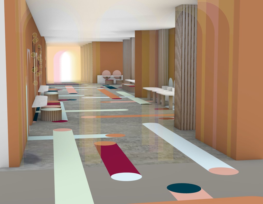
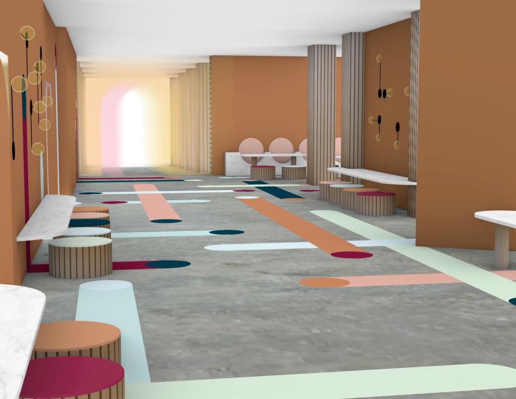
When constructing my final presentation I want to create a layout with an overall design aesthetic that is cohesive throughout. I plan to work with colours from the design itself while overlaying key patterns and shapes to bring the presentation together as a whole. It is critical to ensure that the presentation is easily read therefore I need images to be displayed clearly to get my point across. Visual clutter needs to be avoided in order to for the viewer to understand my concept and intervention clearly.
Week 13: Presentation
Design Pitch:
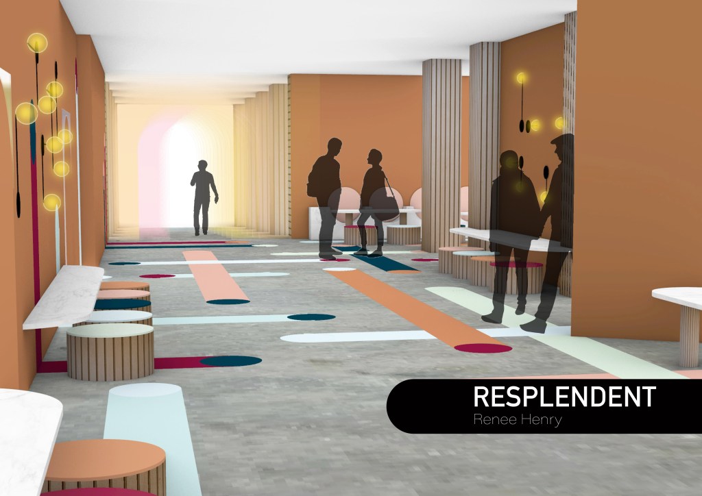
My intervention in the St James Foyer space will be a transitional zone in which pedestrians feel separated from the busy city life. A focus of mine is to explore the different paths people take through everyday life by investigating the contrasting perspectives of individuals towards the idea of journey and destination.
Colour, shape and materiality have played a key role in the development of my intervention, resulting in my chosen name of Resplendent, meaning attractive and impressive through colour. When moving through the space an array of coloured paths lead pedestrians to a number of destinations, moving through thresholds that enhance a refreshing feeling.
The walkway design is an expression of constant evolution and future growth as the space invites unique and creative ideas to take shape. The sense of new beginnings is emulated throughout as colour creates the feeling of a sunrise, symbolising hope and the start of a fresh day. Thus another opportunity for happiness and improvement.
The Budri Showroom designed by my artist model, Patricia Urquiola was a highly influential space when it came to my design process. Her use of shape, layering, colour, materials and texture to fill a space became an integral part of my intervention.
A question that remains open is will an individual who passes through this space take their experience with them for the rest of the day? And do those that sit and stay for a while encounter the space differently to those who just pass by?
Link to audio: https://drive.google.com/file/d/1bs12E-tj26MuQfhetPQMB1-Gg0DBsvS1/view?usp=sharing
Reflecting on this project I have noticed that I have thoroughly enjoyed the creative process of constant experimentation in order to develop new ideas. The importance of research, analysis, trial and error have become clear to me and is something I will continue to do as I move forwards as a designer. Working with a focus towards colour and a specific artist model allowed me to break out of my usual minimalistic design approach, furthering my skills in all areas. Though we all went through the change of how to the paper has been taught I am happy that I have been able to continue my practice over this strange time. It has definitely taught me how to work with what I have, making and creating things from materials and mediums that I had never played with before, resulting in some of my most interesting works and creating new boundaries for what I thought was possible. Overall I had a lot of fun with this paper and am happy with my final presentation.
