Urban Itinerary: Cinematic Space
Propose a design intervention or temporary event which further develops Fort Lane precinct as a public space.
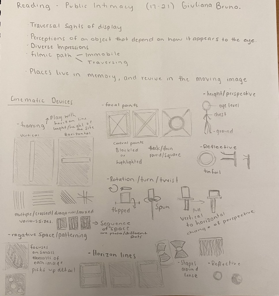
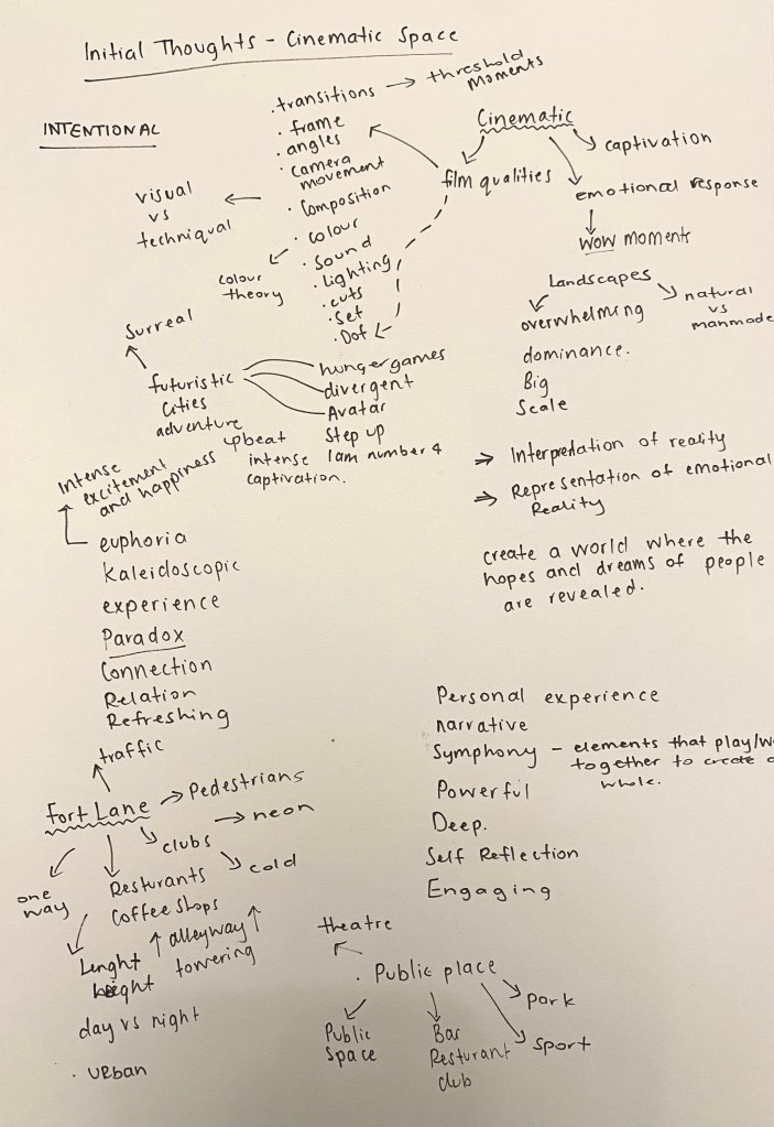
Cinematic – Relating to cinema, to have qualities and characteristics of film. When I think about what the term cinematic means to me I imagine the emotional and captivating quality of cinema that is unique to the medium.Visual elements that come to mind are lighting, framing, composition, camera motion, camera angles, lens choices, depth of field, zoom, focus, colour, transitions, exposure, and filtration.
Week One: Site Device/Mapping
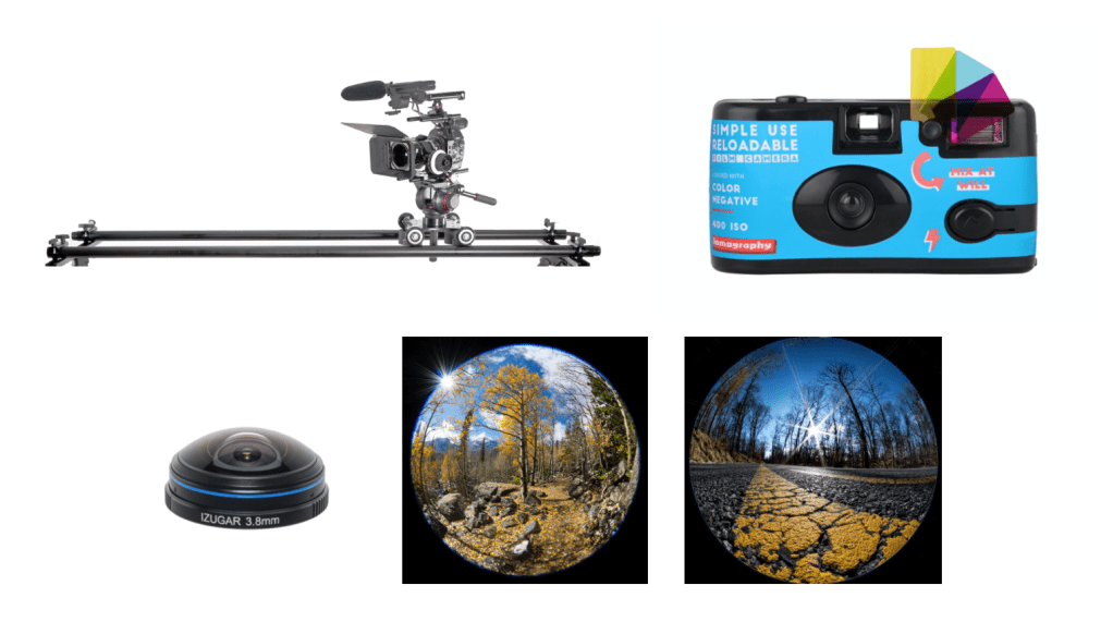
- Dolly – Camera can be moved in a specific directions, both vertically and horizontally.
- Lomography/ Coloured Lenses – Soft images in vibrant colours.
- Fish Eye Lense – Wide angle images, distorted, abstract yet dynamic aesthetic.
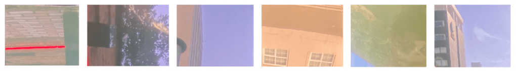
Through using these examples as inpsiration I decided to start sketching ideas that focus on concepts of framing, sequencing, horizontal and vertical lines. My initial thoughts were to create a device that plays on the eyes idea of horizon, creating new horizon lines of the site. I am also interested in the way in which colour and tone plays a role in how something is perceived.
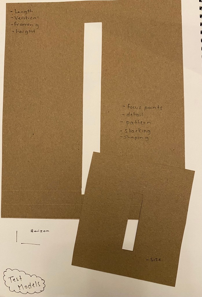
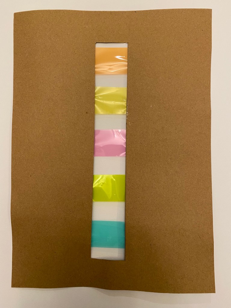
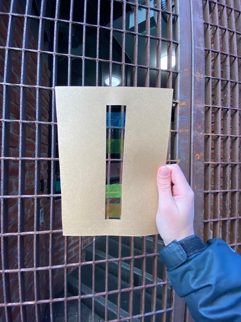
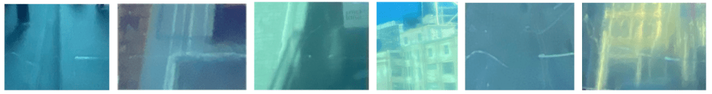
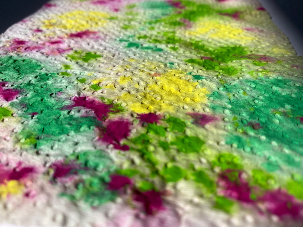
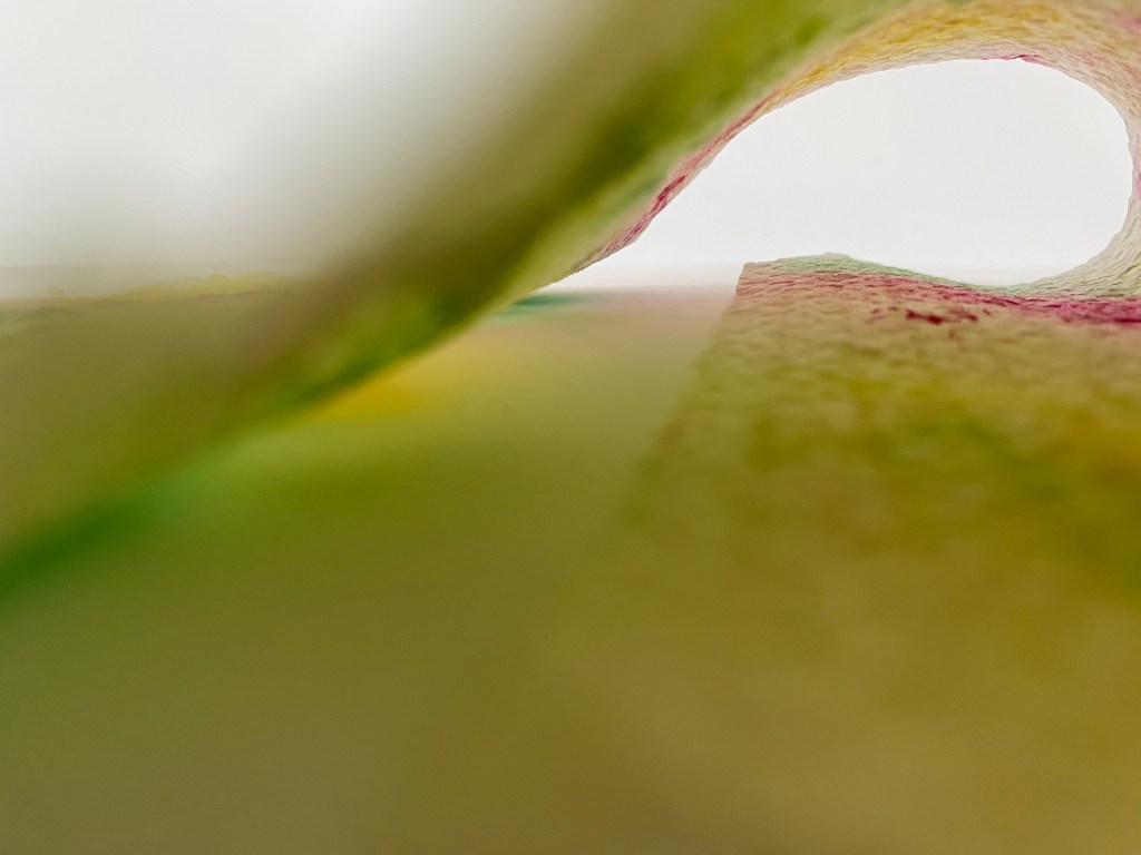
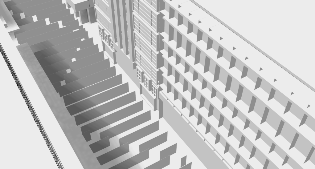
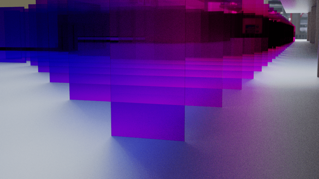
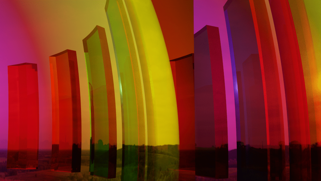
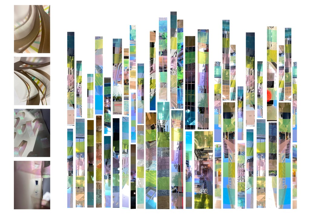
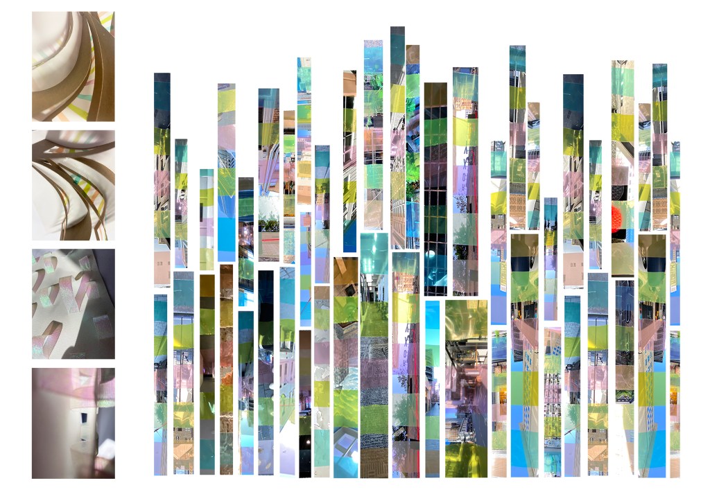
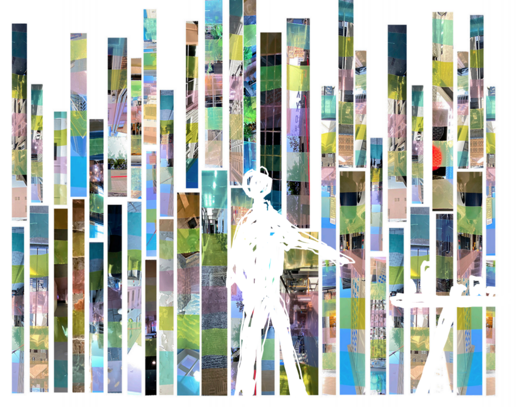
Above are images of my test models as well as my final cinematic device that I used to capture images of the site with for my documentation. My design played with the idea of horizon and focused on the significant height and length of the site itself. I found myself interested in the framing of the area in a vertical sense and noticed how the stacking of patterns and details from different buildings came together within the photographs.
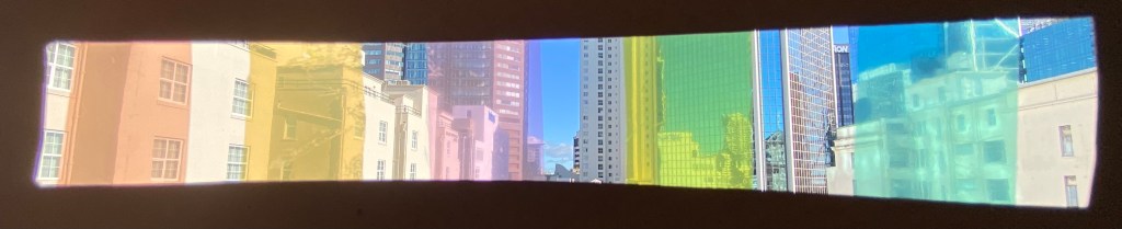
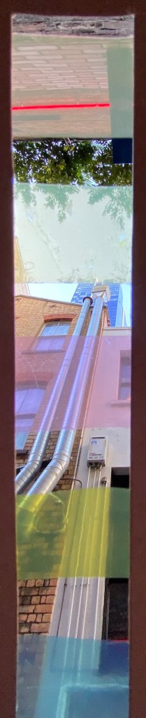
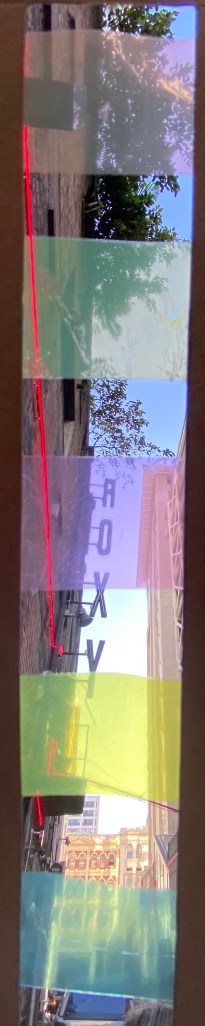

My site map focuses on communicating the site through the eyes of my cinematic device. Images stacked and placed vertically create a visual pattern of space and colour. The images begin to break down into different segments (appearing like a collage) drawing the eye into each section. The filtered vs non filtered images play on the eyes perception of foreground and background as the colours pull certain features to the front pushing the rest of the image back. This has made me think about how light and colour may have an effect on the depth of field and order of elements seen within a space. Within my group we also spoke about the idea of how the images seem to travel and drift though times with each colour change, introducing new eras/moods to the site.
Research/Thinking
When thinking about cinematic space we were challenged to think about our favourite films and figure out why they are our favourites. Some of my personal favourite movies include the Hunger Games and Divergent series as well as Avatar. Each of these films are based in futuristic settings with architecture and technology not seen in the times we are living in now. This idea of time and a futuristic/alien place could be an interesting concept to think about.
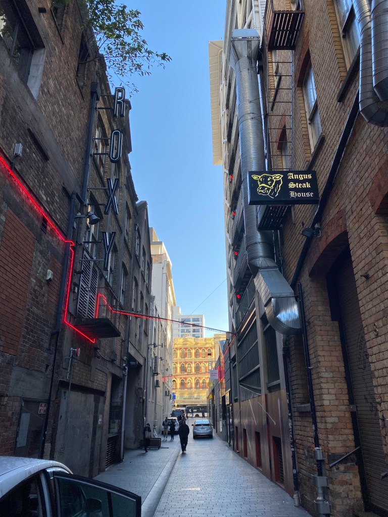
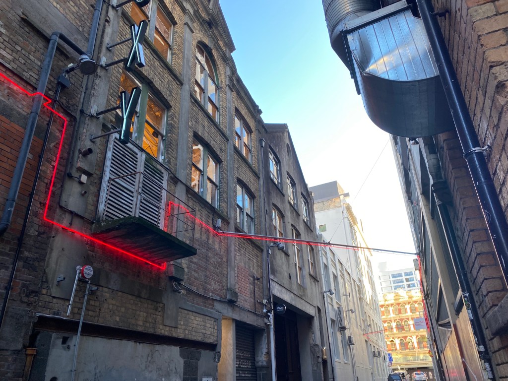
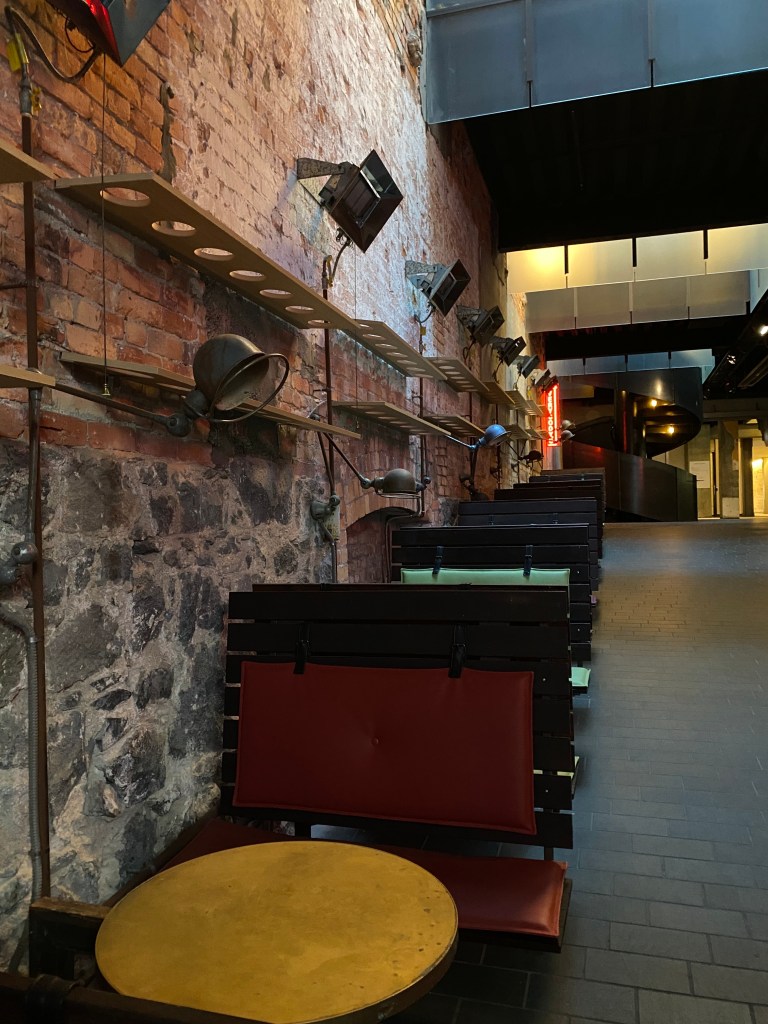
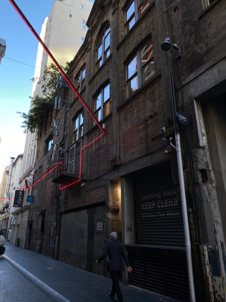
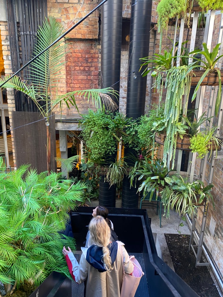
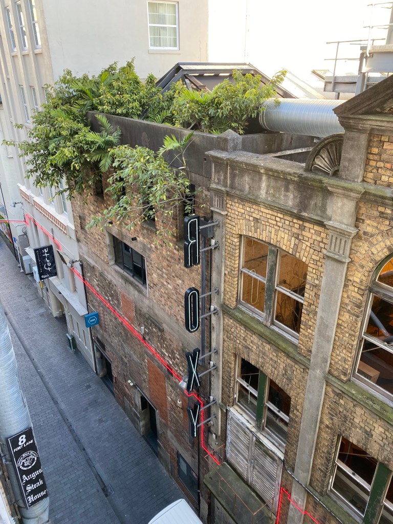
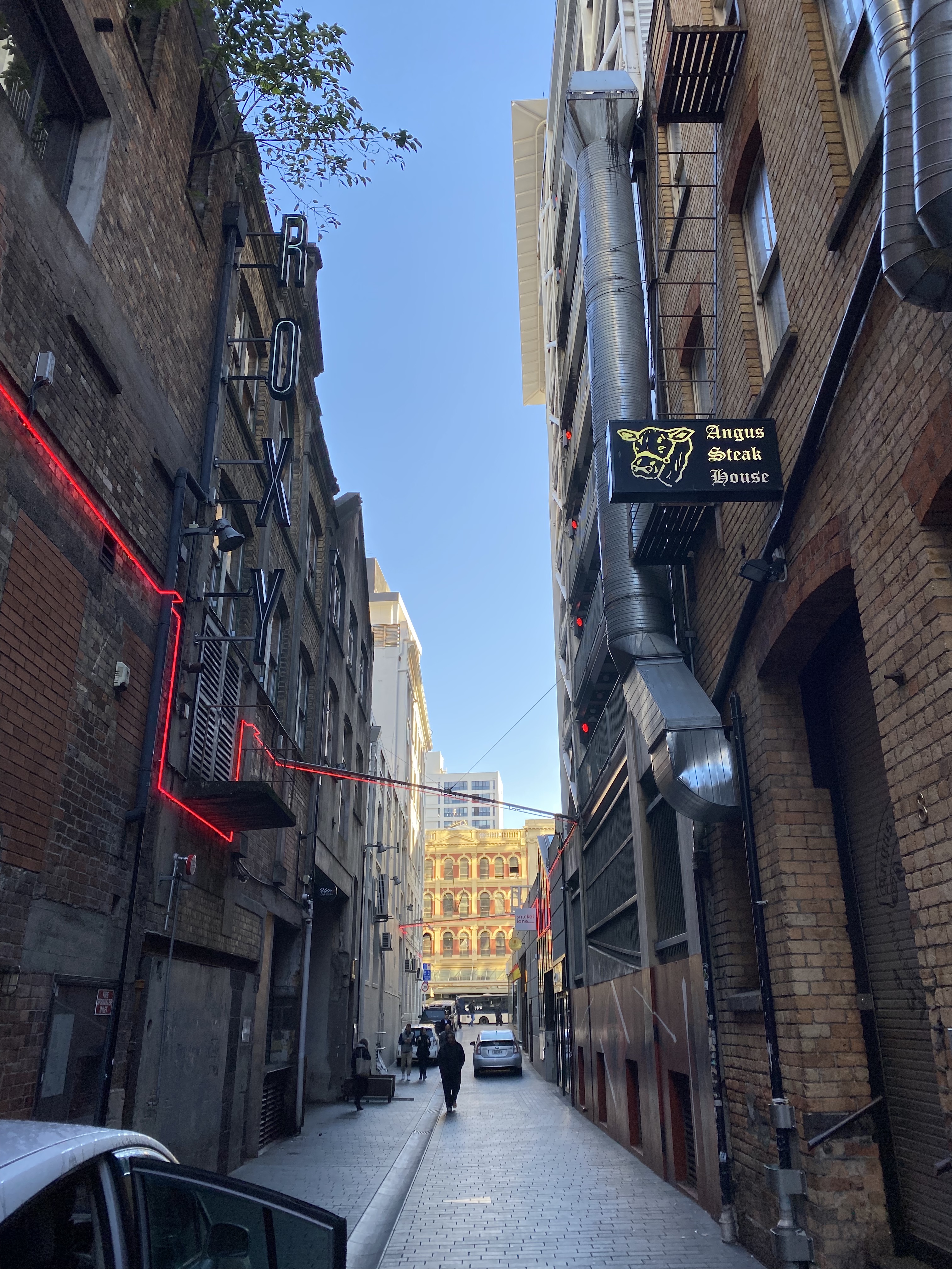
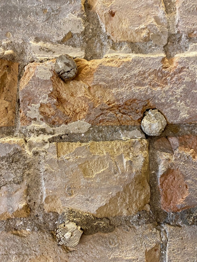
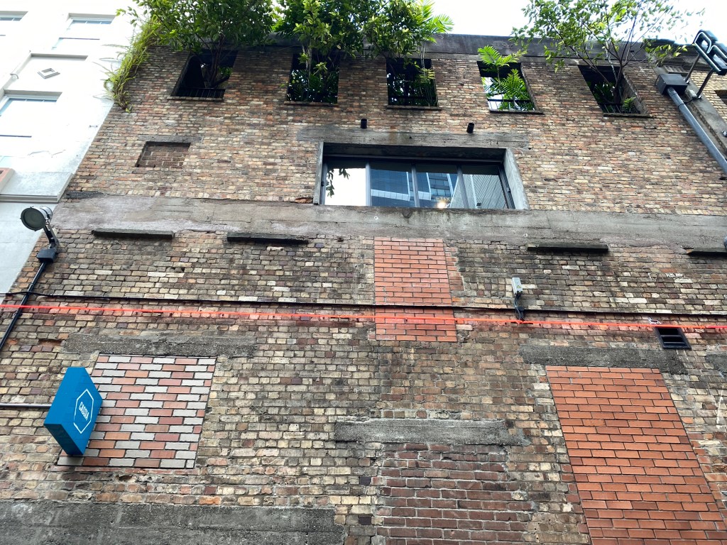
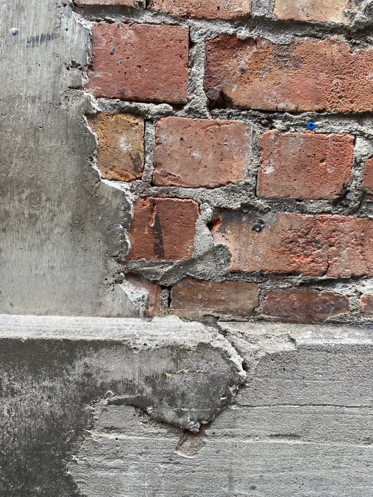
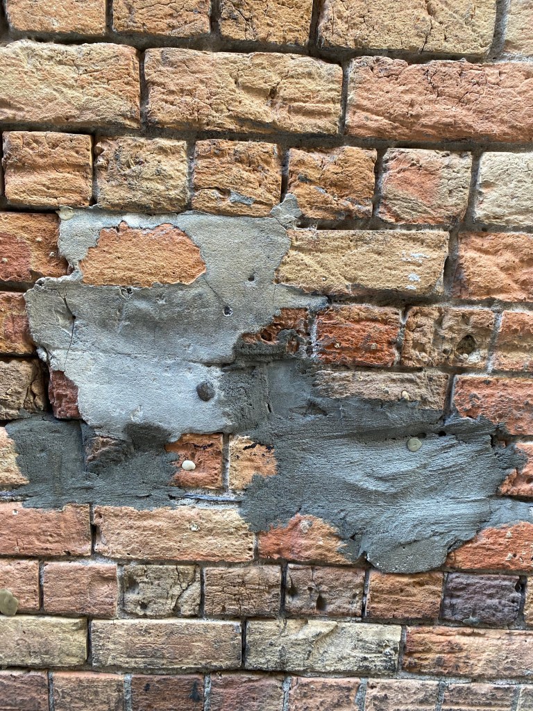
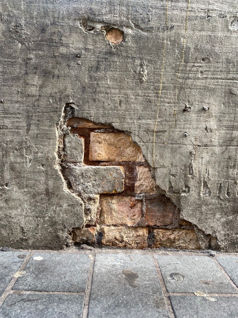
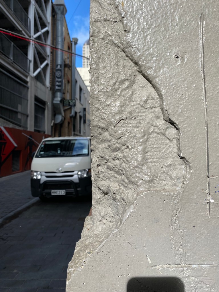
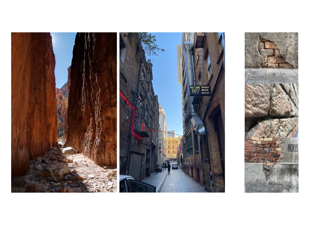
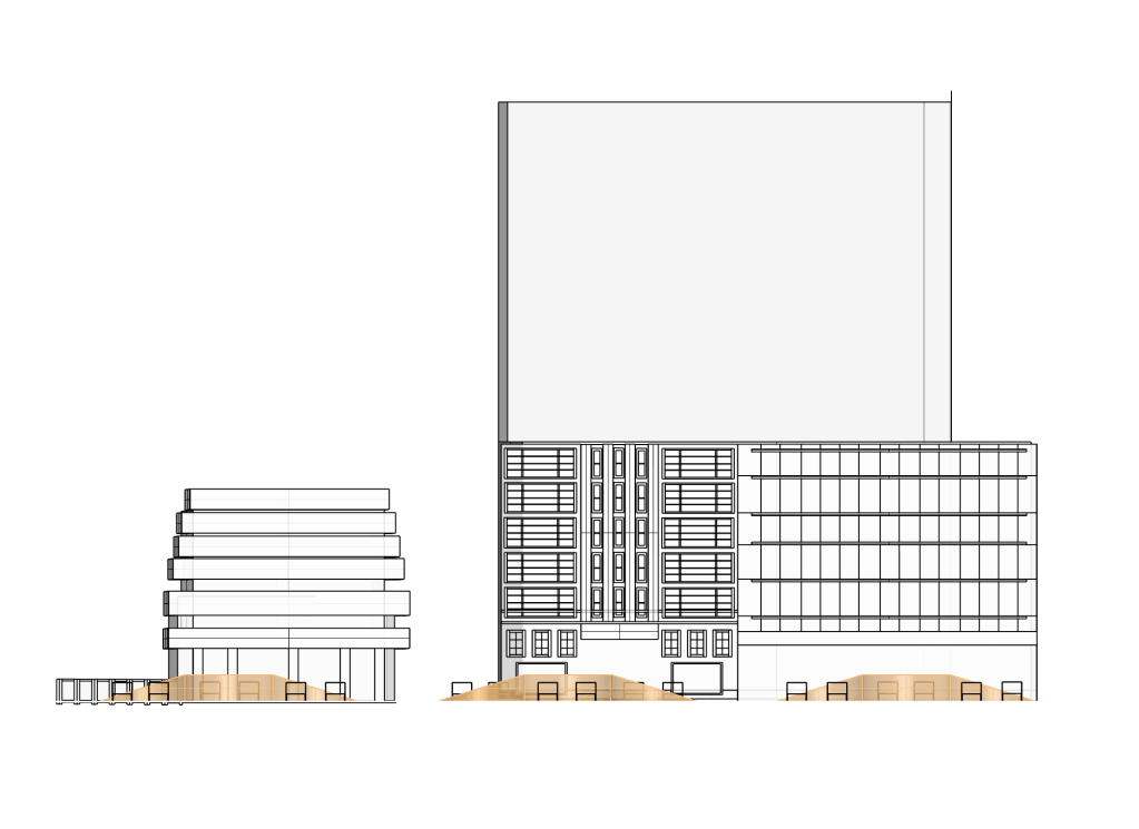
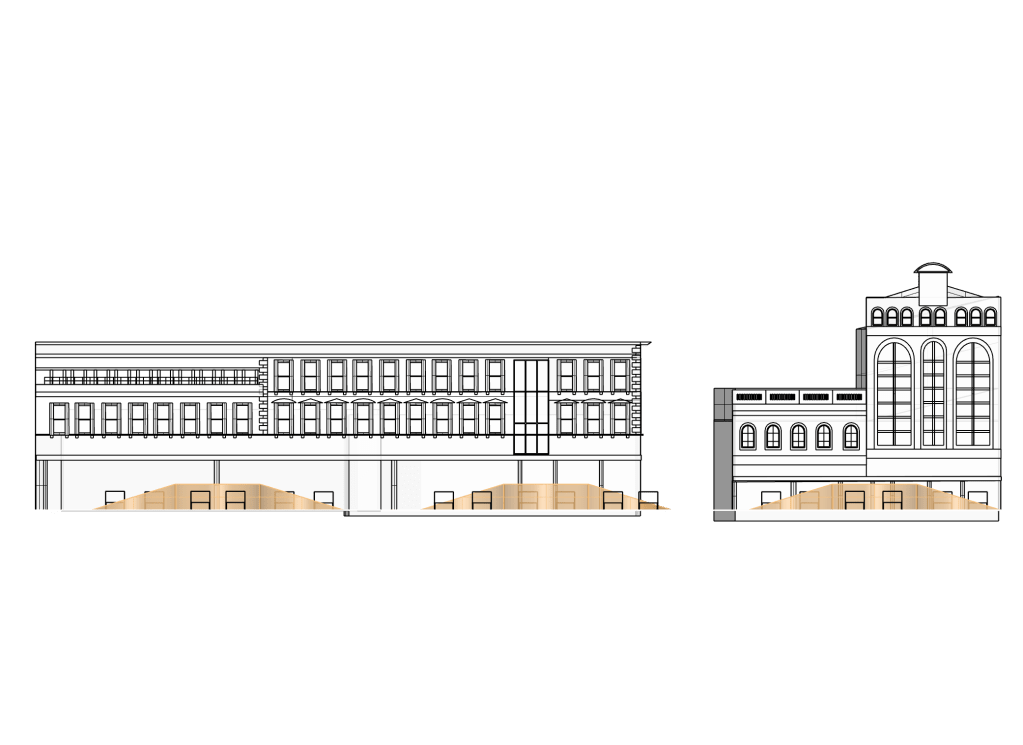
I thought the fact that the site itself had significant environmental history itself was quite interesting. Fort Street marks the original Commercial bay shoreline and was a key landing point during Aucklands early settlement and central to Aucklands role as a major trading centre. This history of the site could become significant to my approach towards the lane as a public place – perhaps a place for service or giving/receiving.
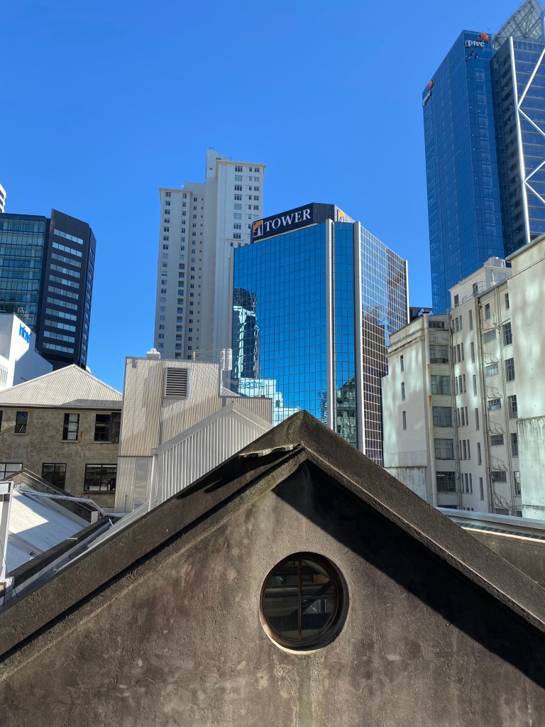
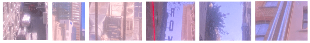
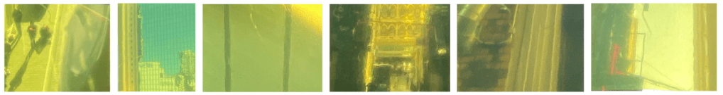
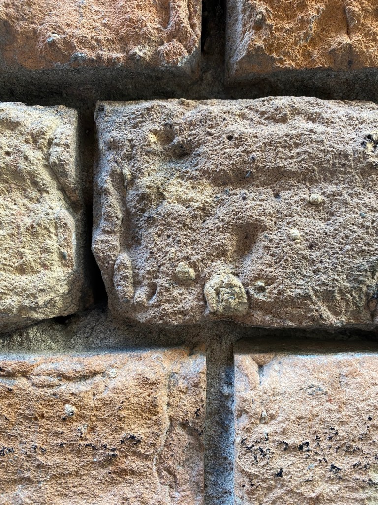
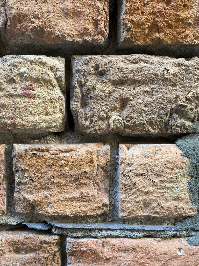
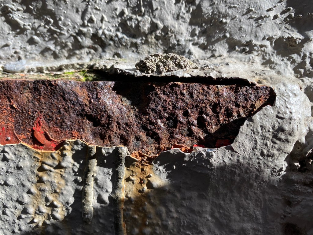
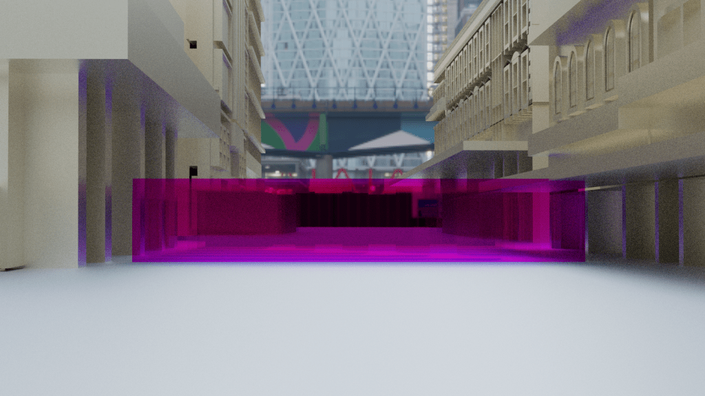
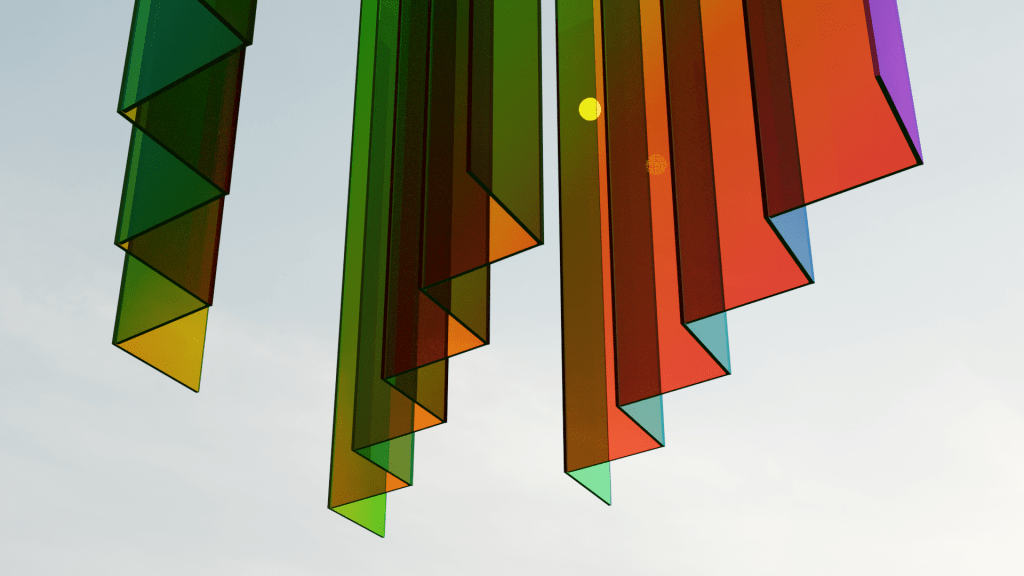
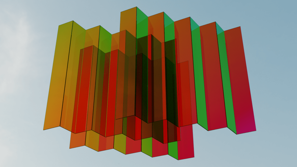
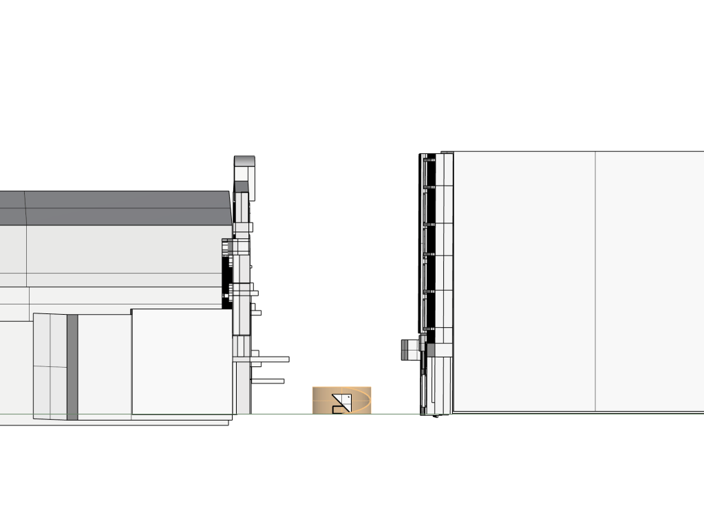
Below are some further images from my site visits that showcase elements such as material, light, height/elevation and layering that I found intriguing. During these visits to the site I took the time to explore areas that we would not instinctively go to. The area that sparked my curiosity the most was exploring the carpark that towers over Fort Lane itself. This new vantage point offered a view of the site from many levels off of the ground revealing new potential areas to work with.
Week Two: Scene Transitions
For week two our conceptual thinking around cinema was based on scene transitions. In film a transition is a technique used in the post production process of film editing where scenes or shots are combined. A cut transition is commonly used for quick changes to the next shot however most films will also include a range of other transitions. Each type of transition is used to convey a tone or a mood or suggest the passage of time to connect parts of the story. These other transitions include dissolves, fades, wipes and fans etc. Sound is often also used used in different ways when transitioning from scene to scene. For example the sounds could overlap from one shot to the next or the sound could start in advanced suggesting an upcoming transition. Sound intensity is also used to create atmosphere within the films and the changing of scenes.
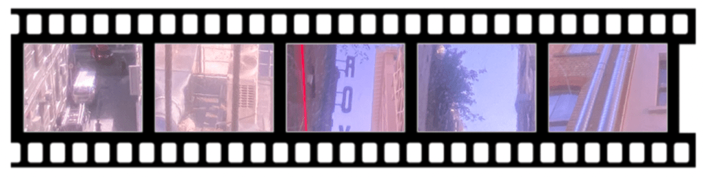
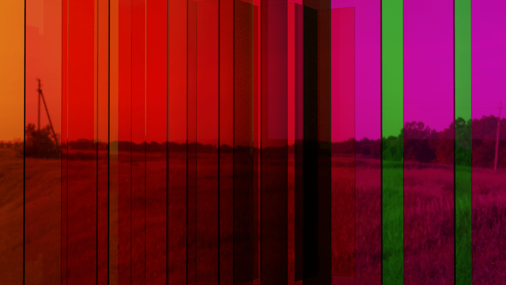
When thinking about scene transitions in relation to our site Fort Lane and the way I documented it I wanted to create a second iteration of my site map that explores the idea of cutting from scene to scene using the colours from my cinematic device. The coloured series produces snapshots of different areas creating a timeline of my journey through the site. I found the layout of thin strips of imagery appealing as it reminded me of a film strip.
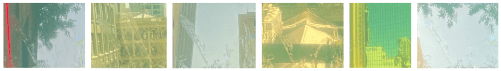
While at the site I also used my cinematic device to capture some video documentation. Looking back at these clips I have noticed the technique I used captured a series of transitions between filtered and non filtered imagery. I have linked these videos here: https://drive.google.com/drive/folders/1vKeol4vGImNhpsPW-W2Q7iy6YbkH8jA1?usp=sharing
Model Making Workshop
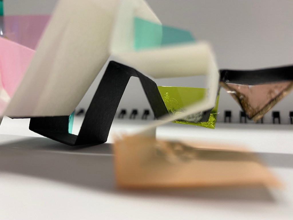
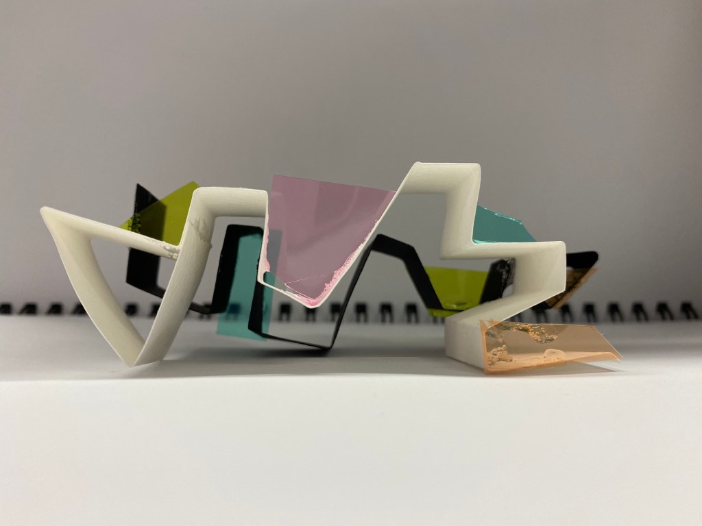
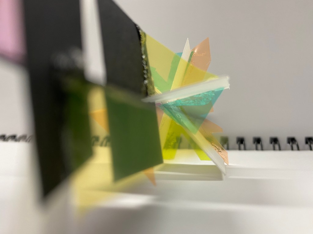
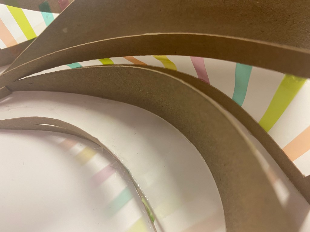
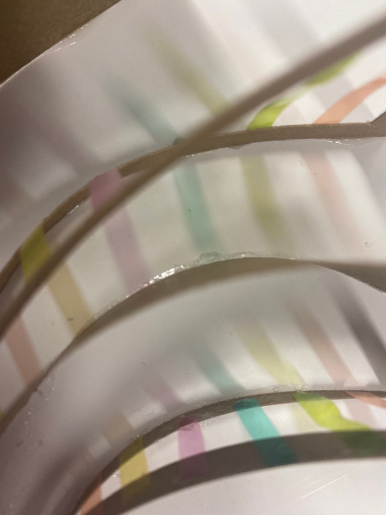
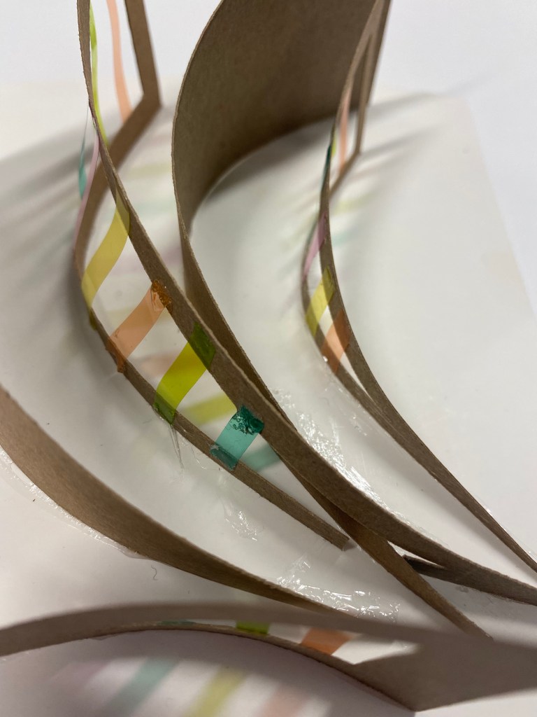
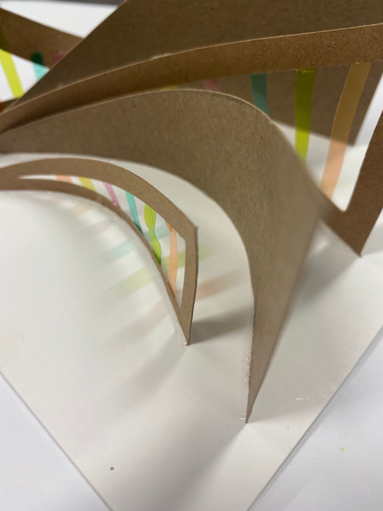
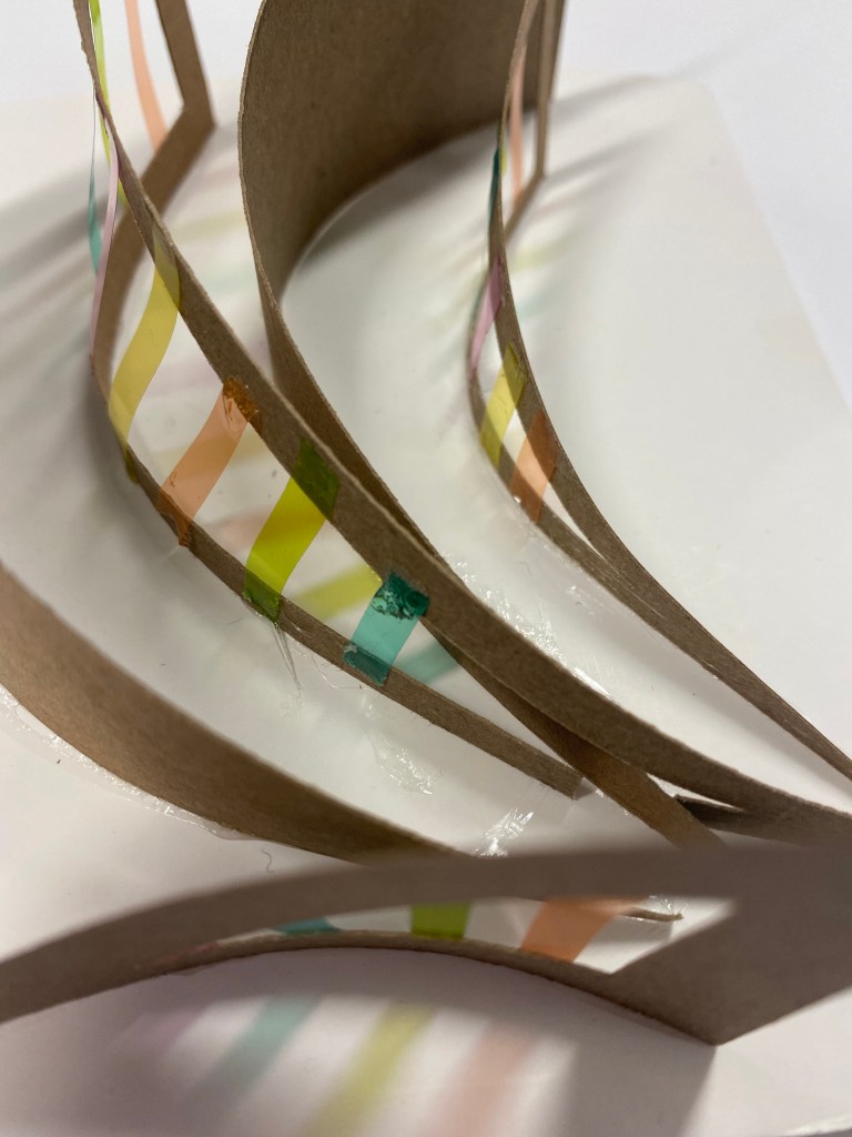
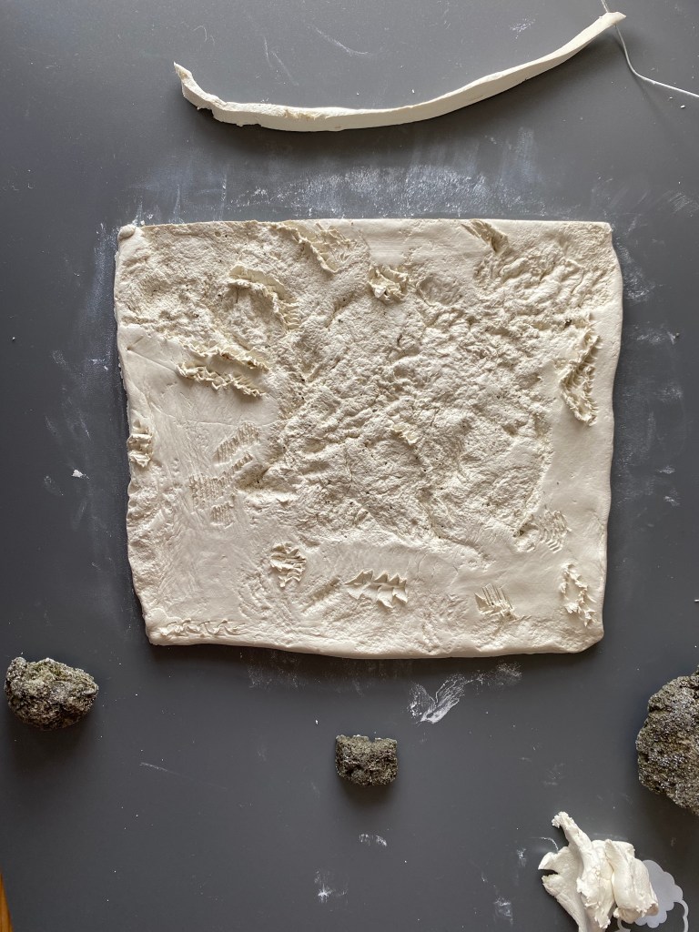
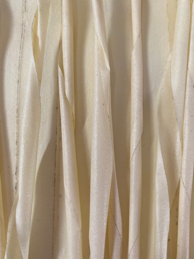
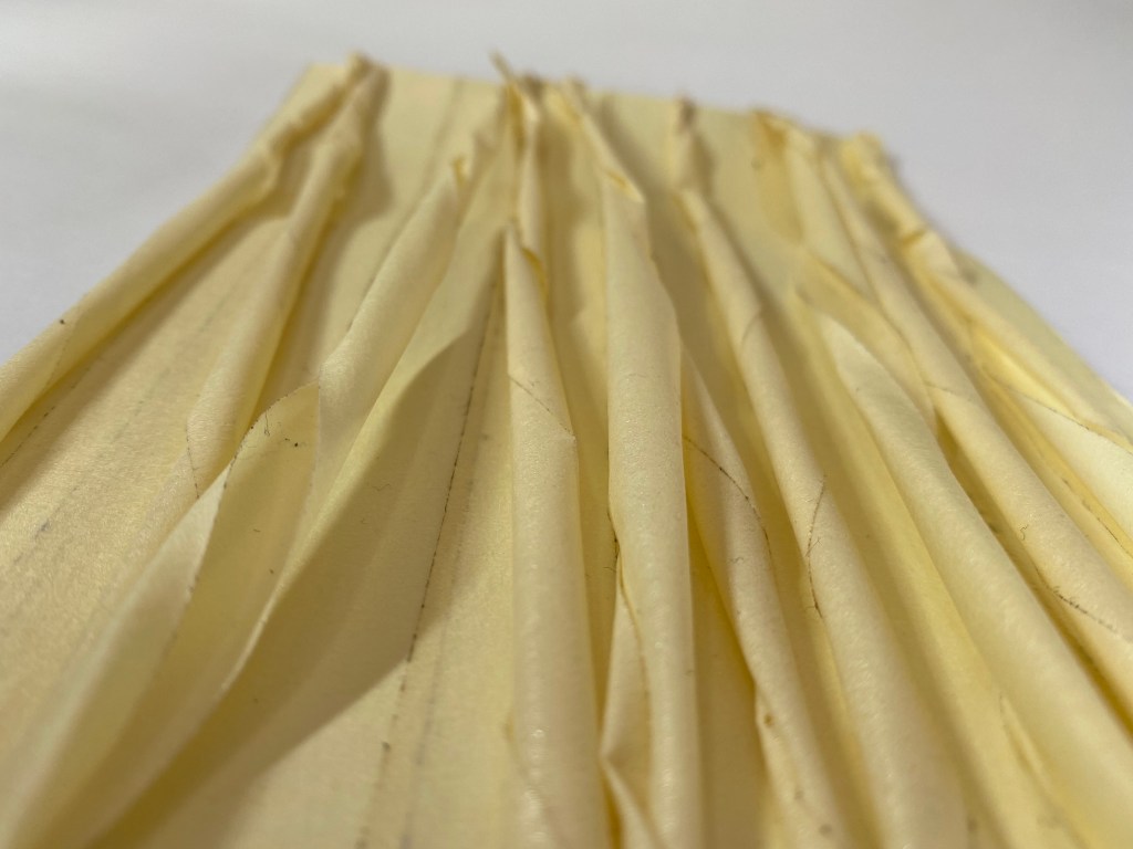
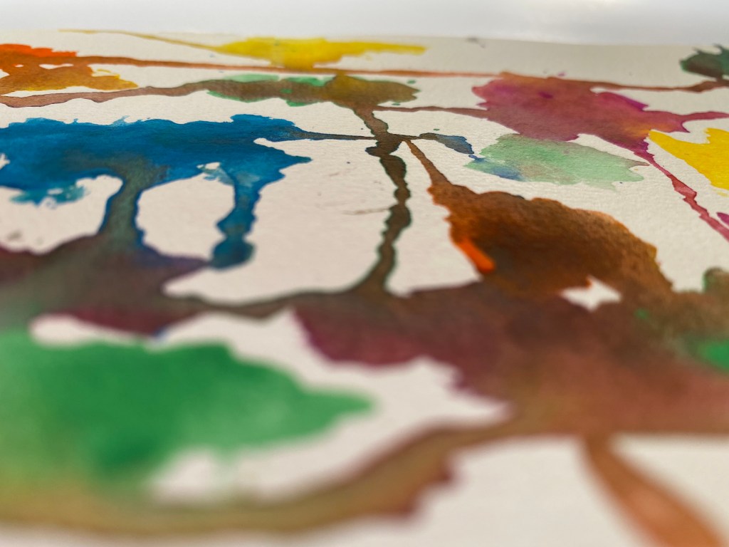
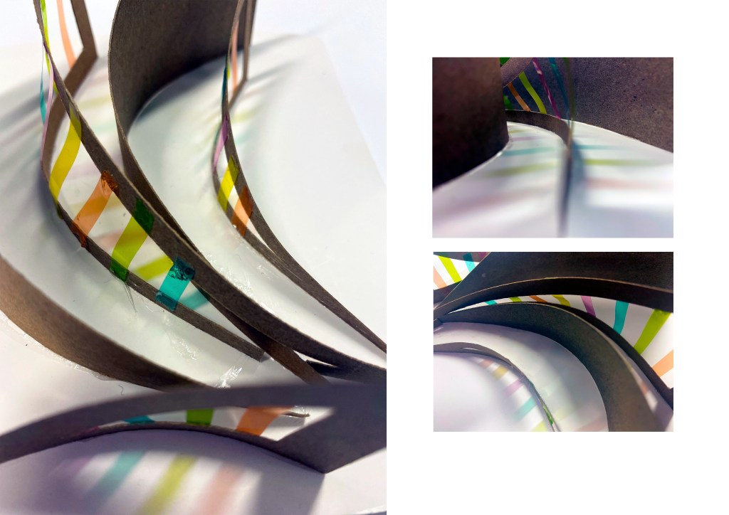
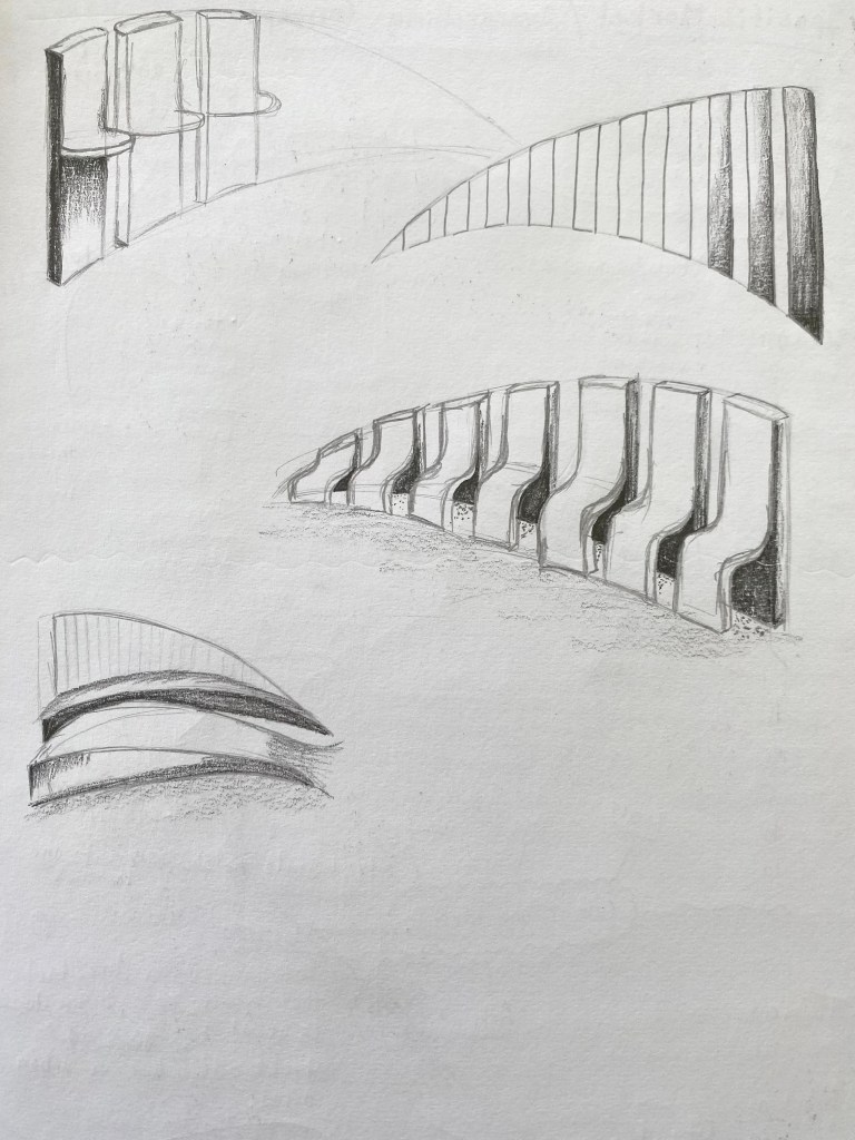
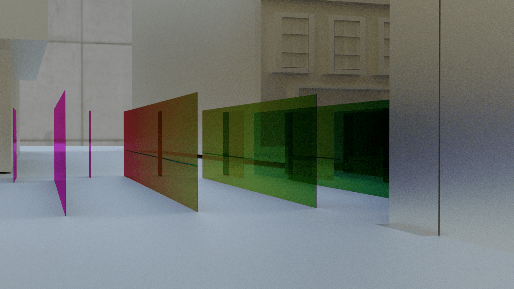
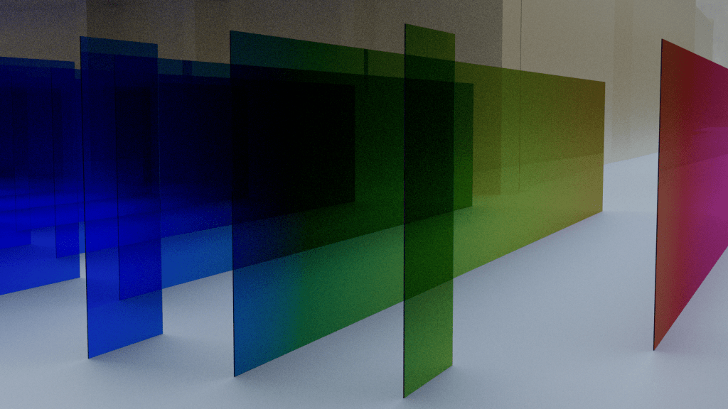
For this workshop we were asked to produce three models based on the idea of scene transitions from our site sequences. These models were to represent fragments of spatial thresholds and spaces of movement and transition. I began the session by writing a list of keywords pulled from my site documentation and then sketched small model ideas I could make with the materials I had available. I chose to work with materials that were the same/similar to the ones I used for my cinematic device to keep the same material quality throughout.
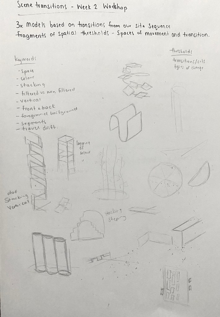
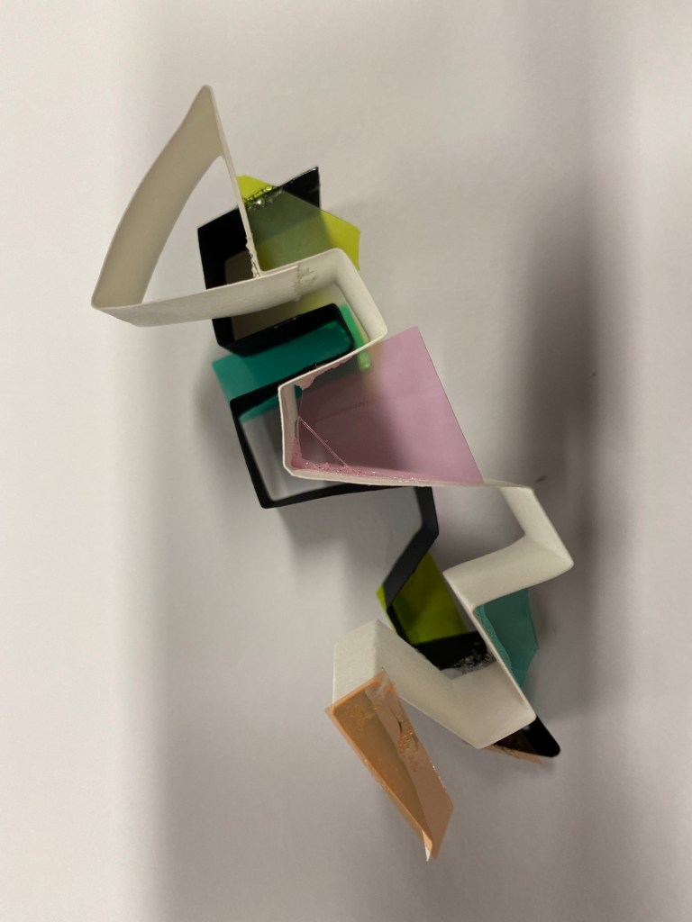
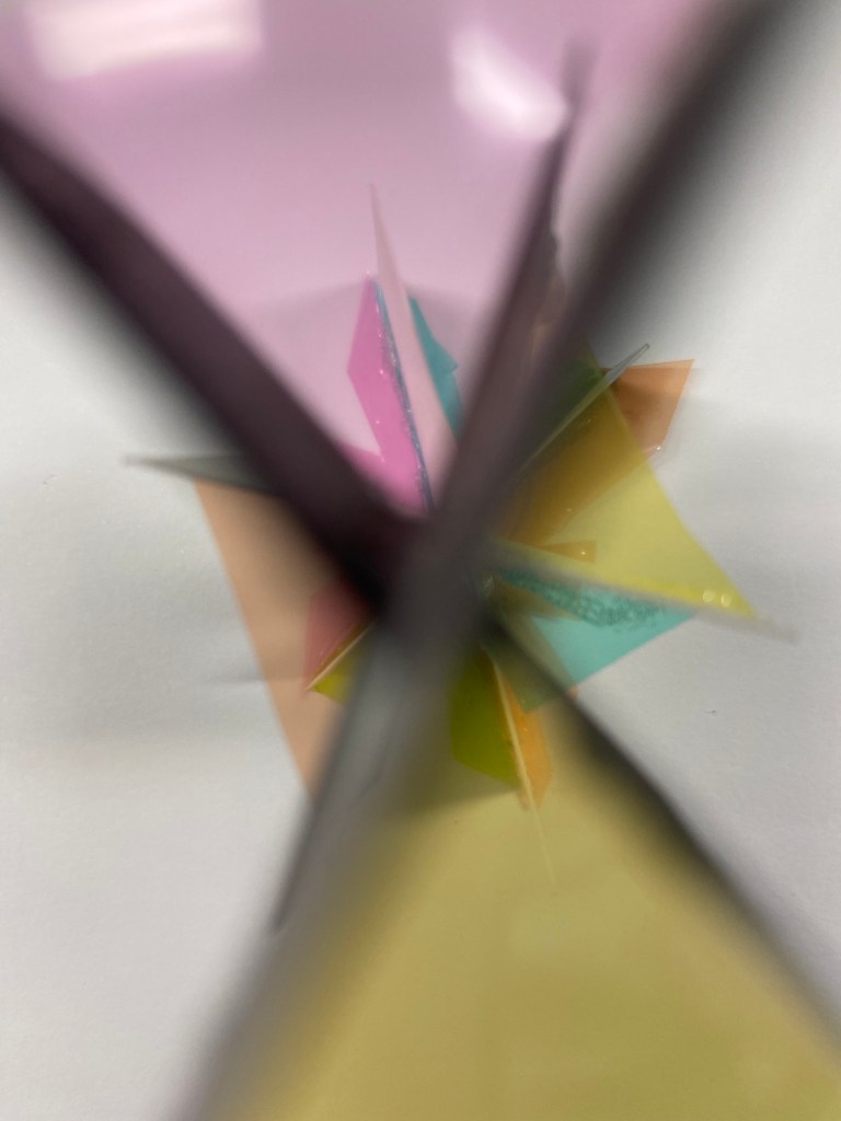
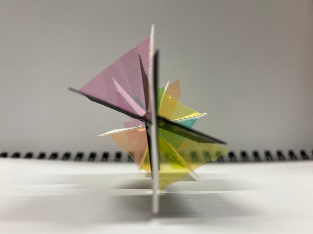
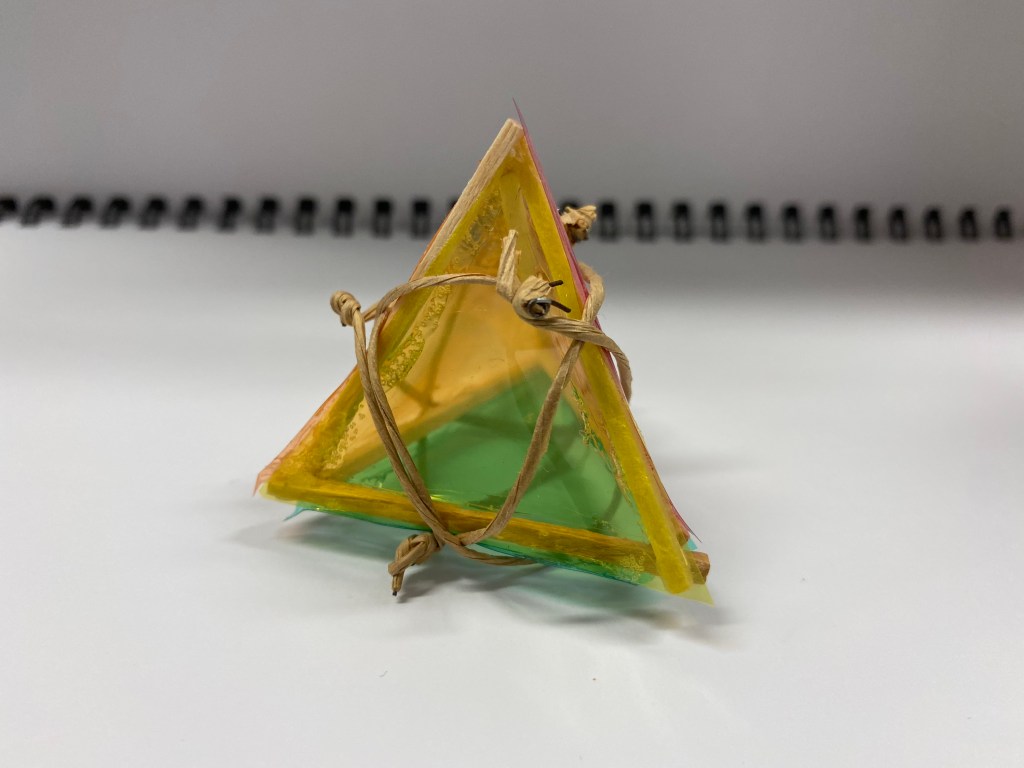
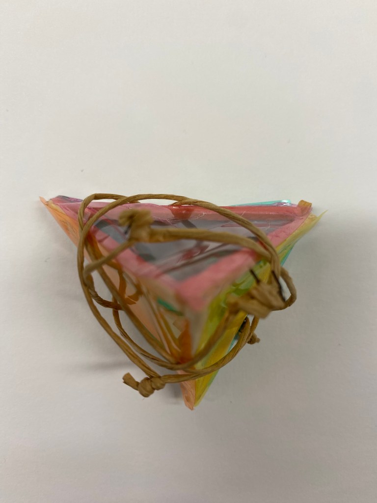
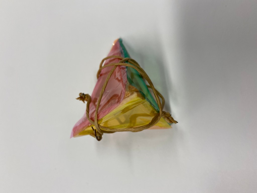
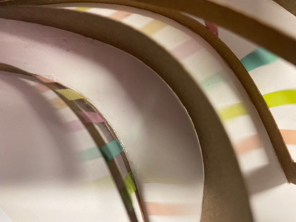
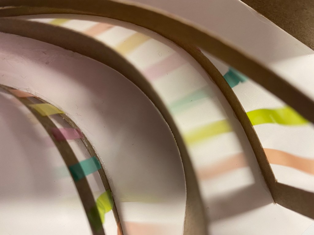
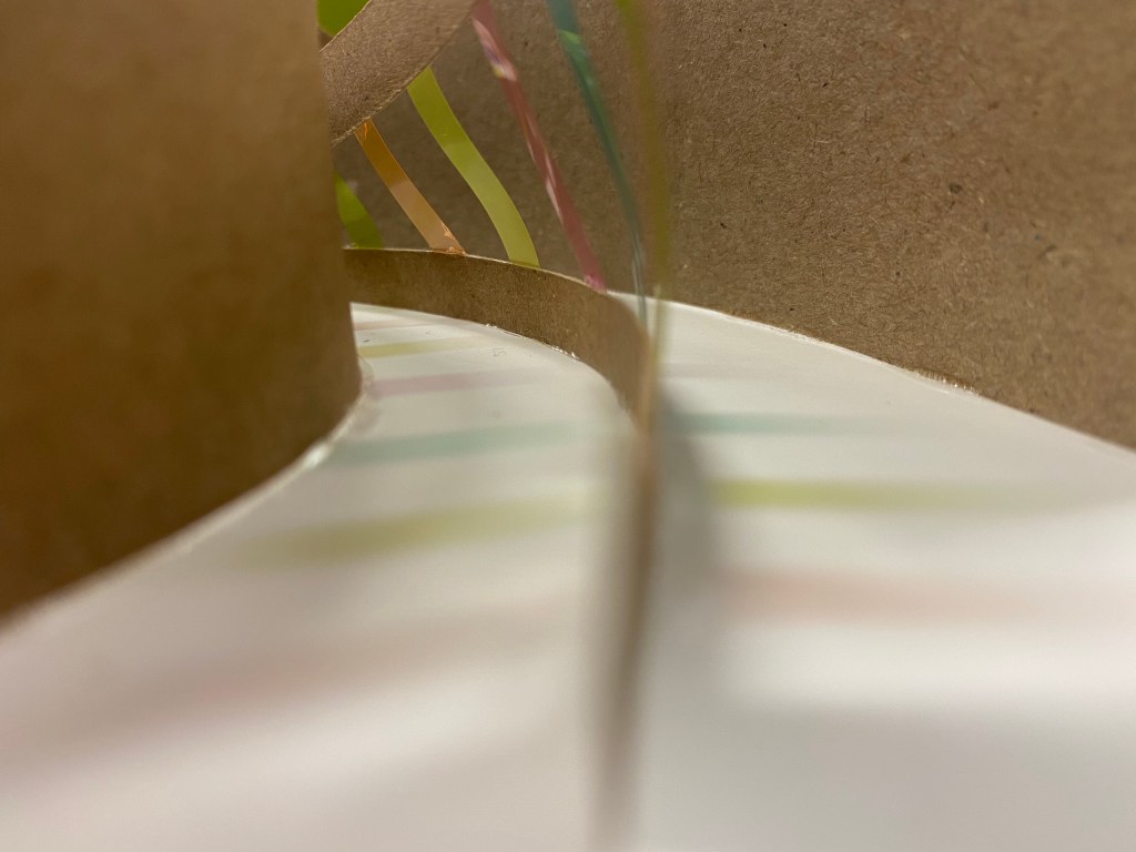
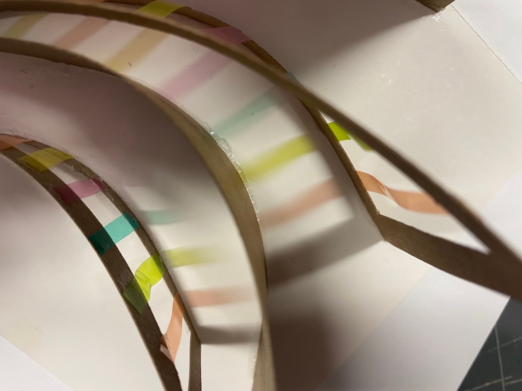
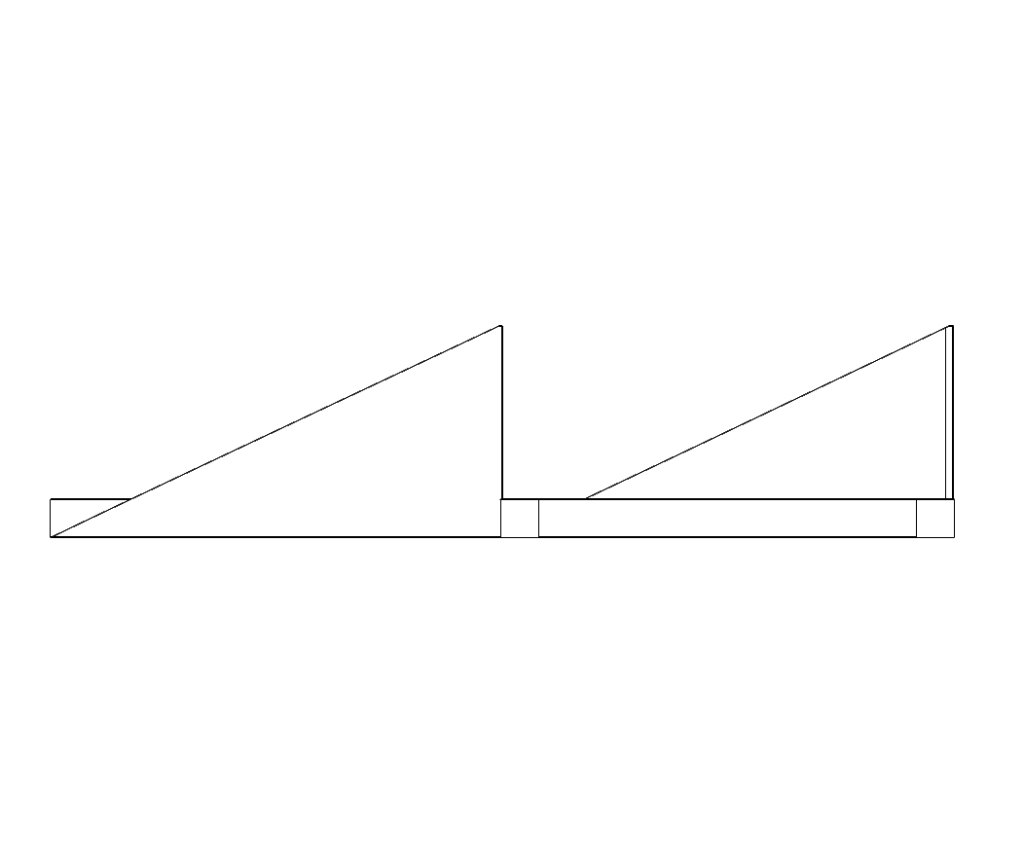
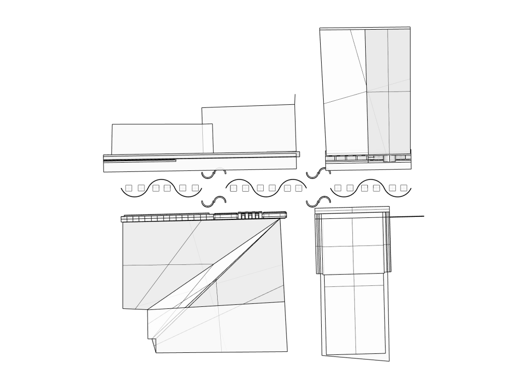
The three models I created focused on key ideas of stacking, depth, foreground, background, colour perception and layering. Each include sections of translucent colour slotted between light and dark card. Geometric shapes create illusions and plays on the eyes depth perception. Stacking is used to create three dimensional forms that build height and volume. In terms of transitions and thresholds my models communicate both ideas of direct cuts and cross fades between elements of the site. I personally think that the triangular model I created below fails to highlight the main concepts I was working with. I think that the triangle shape does not represent stacking but rather speaks towards an idea of support as the knotted paper wire holds the structure together. However I do think that each of the three models in some aspects successfully play with the idea of colour and depth through colour as the translucent sheets overlap with one another.
Developing Concepts/Contexts:
After speaking with Chris about my project and idea so far I decided to start brainstorming and thinking more deeply about parts of the site I liked and my chosen key words. Below I started with the word depth as its a concept I am intrigued by and began to think of other ways I could describe the term. From there I noticed connections between words and phrases from other keywords and I was able to develop an understanding of the concepts that my drive my studio project.
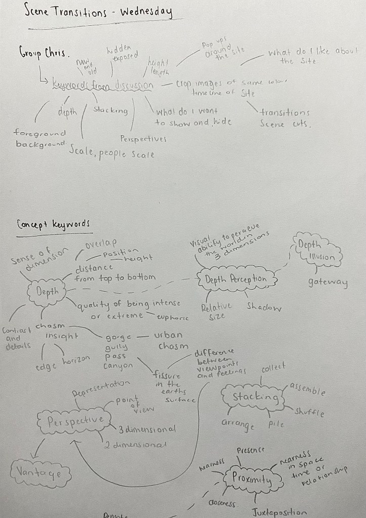
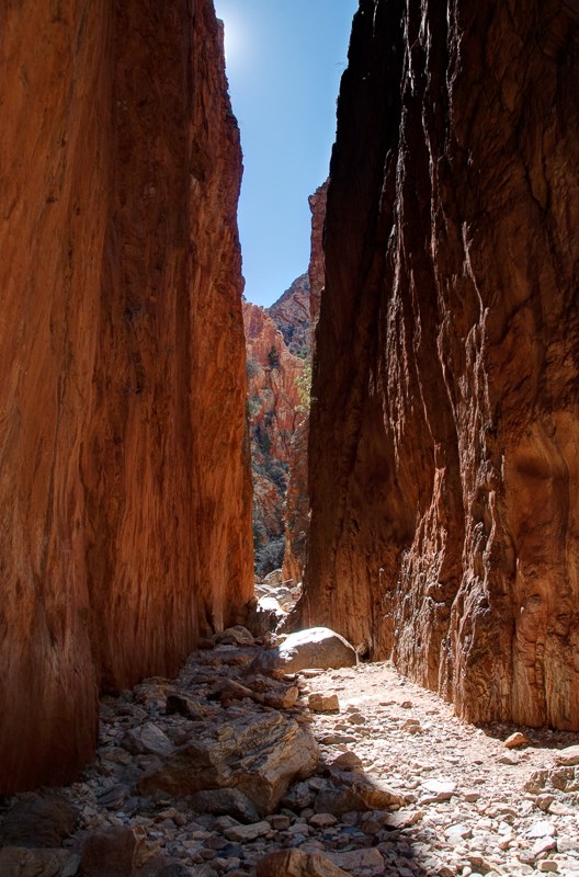
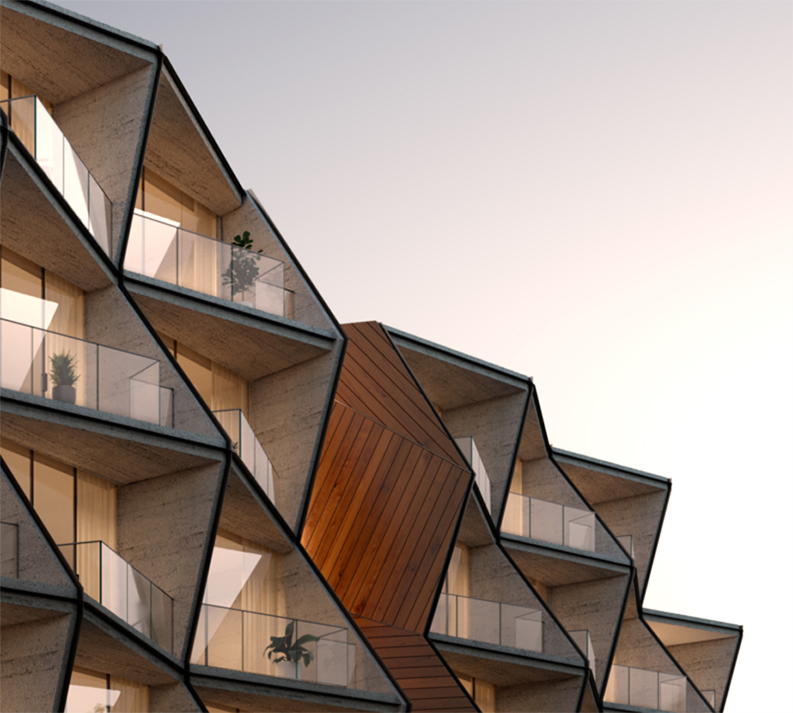
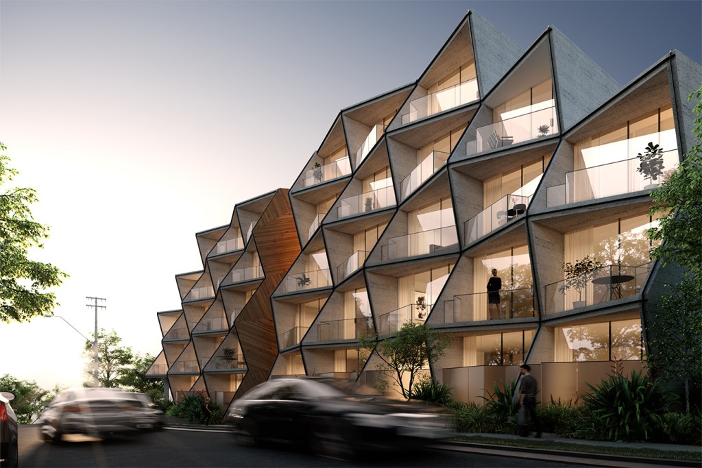
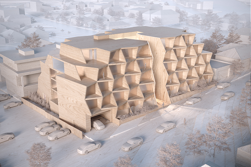
Leading from the word ‘depth’ I began to think about other terms that relate to my initial thoughts towards the site. A word that sparked my interest was ‘chasm’ as I started to imagine the lane itself as an urban chasm. In nature a chasm is defined as a deep fissure in the earths surface, similar to that of canyons and gorges. Chasm can also refer to a profound difference between people, viewpoints, feelings. Both definitions of the world strongly relate to other keywords I had come up with such as stacking, perspective, proximity, vantage and depth perception. Visually this idea of a chasm could be striking as I move forwards with this concept.
To finish off this week we were to develop a final conceptual model that embodies a transitional experience of our spatial threshold. The model that I created draws on idea from my previous models such as depth, foreground and background, height and volume. I also decided to introduce my thoughts discussed about around chasm’s, embracing the gap between the two buildings. Reflecting on this task I aware that I need to begin to determine the scale and temporal qualities of my design. Though height and depth are important how can I actually create a feeling of depth within the site and what does a sense of depth actually feel like? What will my design express to those who pass by and what may its purpose be?
Week Three: Script
This week our learning was based around the cinematic idea of script. Script by simple definition refers to handwriting as distinct from print; written characters or the written text of a play, film, or broadcast. When thinking about script in a spatial sense we can relate this to aspects of design such as textures, materials, geometry and shaping as they work to script our behaviour within any given space. Almost every environment we are exposed to has signs of scripting affecting the things we do at the ways we act in both private and public settings.
Identifying five keywords and concepts:
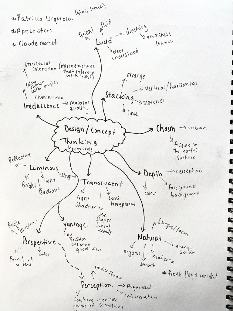
Depth – the distance from the top or surface to the bottom of something. The quality of being intense or extreme. Depth within the site creates a sense of dimension that plays on the horizon and the contrast of old and new material details. Perception of depth can be swayed as foreground and background elements merge through the illusion of colour and pattern creating the opportunity to produce an overwhelming and dominant space – a euphoric feeling.
Chasm – a deep fissure in the earth’s surface. A profound difference between people, viewpoints, feelings, etc.The lane itself has visually come across to me as an urban chasm. My design will look to embrace the gap between the buildings transforming the lane into a place where different viewpoints and feelings are celebrated.
Stacking – arrange (a number of things) in a pile, typically a neat one. Shuffle or arrange. Stacking and layering of material vertically offers a chance to play with the idea of overlapping heights. How positioning can create new perspectives while blocking others. Choosing what is hidden and what is seen. Transitions of material through shape and angles work to form captivating narratives of the new and old. How would the visual look of vertical stacking come across as horizontal?
Iridescent – showing luminous colours that seem to change when seen from different angles. Seeing I have had a strong interest in both colour and perspective the idea of iridescence has both excited and fascinated me as I begin to look into materials that provide iridescent qualities. The concepts of change, angles and colour can be encapsulated within this keyword.
Perspective – the angle or direction in which a person looks at an object. Point of view.The perspective of something can change depending on where you are positioned. I find interest in the way people can see things from different perspectives due to both social and cultural beliefs. I think a play on visual perspectives using the length of the site could be impressive.
Temporal Vocabulary: Time frame – Permanent / Semi Permanent
Permanent structure, weekly events.
Due to referring to the site Fort Lane as an urban chasm and planning on creating a permeant architecture I thought it would be fitting to use temporal vocabulary that comes from terms used to describe natural processes that create significant changes to the natural landscape.
- Fault Line – exisiting place, shows where something could happen. Planning phase.
- Fracture – Cracking. Changes are made. Progression. A shift in momentum.
- Rift – Separated. Complete. New space is created and ready to be explored.
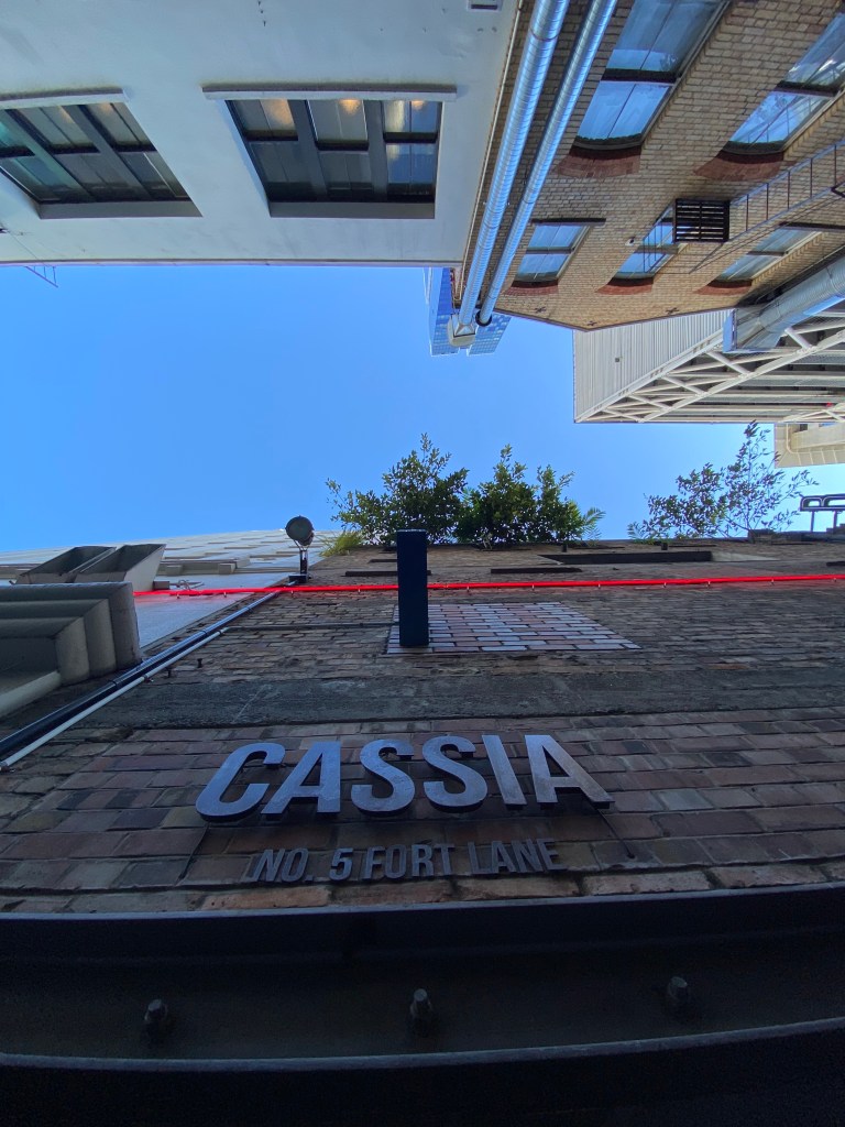
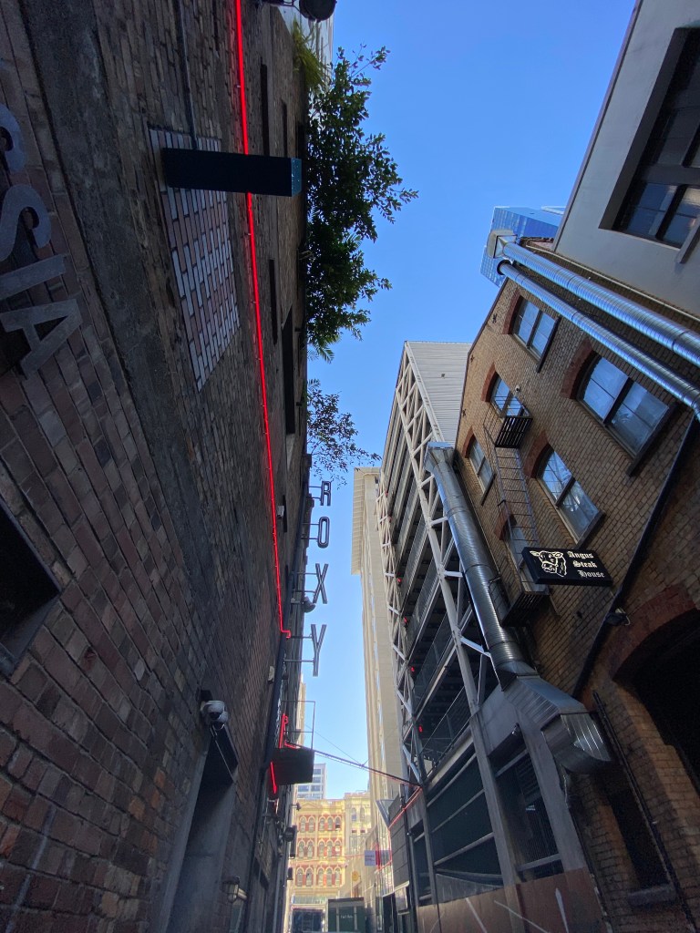
Chosen site & sketch design ideas:
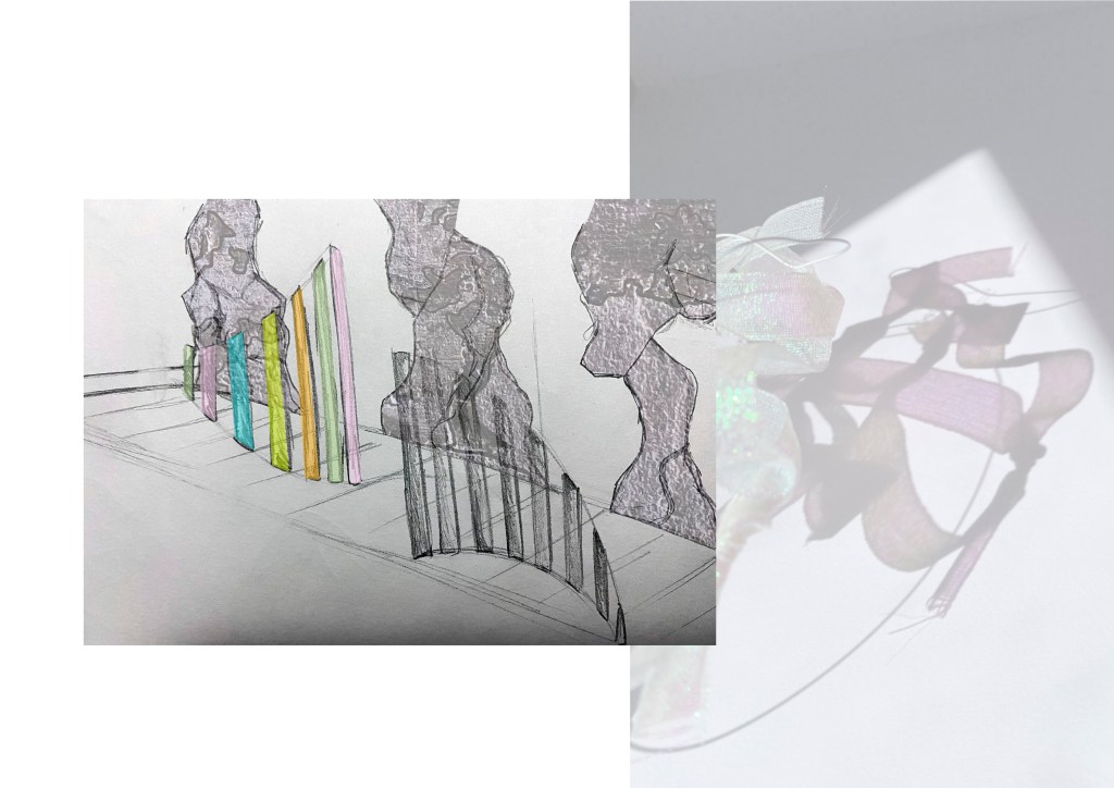
I have decided to work with the site of Fort Lane with the plan to widen the lane itself opening the space up to new opportunities. Below are a series of sketches that explore possible approaches I could take with my design that incorporates values from my keywords and previous site experimentations.
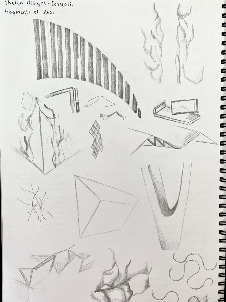
These initial sketches are apart of my process to start visualising the shapes and forms of my design. I started with the rigid yet organic shape of natural rock and experimented with both fluid and more angular iterations of the rock shape. The way rocks and natural landscapes have the ability to crack and change creating negative space makes me wonder how I could look at this process through an urban lense and how I could utilise the ‘space between’. Materiality, colour, weight and the way in which these structures touch the ground will play a key role in how the space is perceived and the atmosphere that is created. I personally like the sketches at begin to combine both the fluid and rigid shapes to produce interesting and contrasting forms.
Initial design prompt questions:
What will take place? A space for pedestrian and bike use for connection between Fort Street and Custom Street East. Possible idea – A space for weekly markets.
Who is this for? People who commute through the space. Markets give small business the opportunity to sell products within the largest New Zealand city giving them a wider community to sell too. Gives credit the the history of the sites use as a trade centre.
How will this happen? A multi-functional space needs to be created where elements of the design can be used for many purposes.
When will it occur? The architecture of the design will remain a permanent structure. The time and day of the markets will be determined through research to find peak times and days.
For how long? How many times and how often? Permanent structure, weekly event. Night or day will depend on further research.
Why is this important to me? Through observation I have noticed that the site Fort Lane is most often used as a space to pass through. A route for those commuting elsewhere. I would like to enhance the experience for those walking by as well as using the multifunctional space to offer an opportunity for smaller businesses to thrive. I think multifunctional spaces are important as they reach larger target audience as people can use the space for a number of reasons.
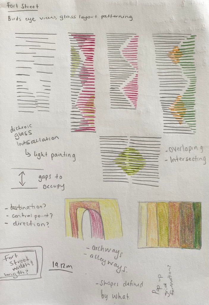
Site Visit Two:
Our second class site visit included an exercise where each member of the class wrote a script that moves someone through the site in away that relates to our conceptual frameworks. I decided to write the script picture below:
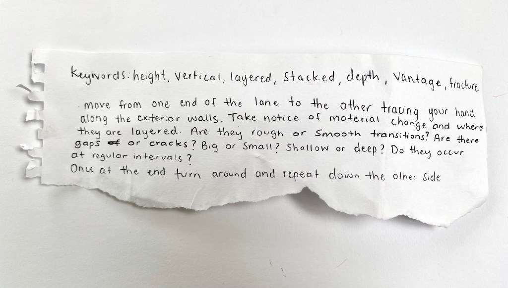
I wanted my script to show whoever did it what I noticed within the site visually through touch. This sense picks up more on material quality and helps to notice the finer changes of detail.
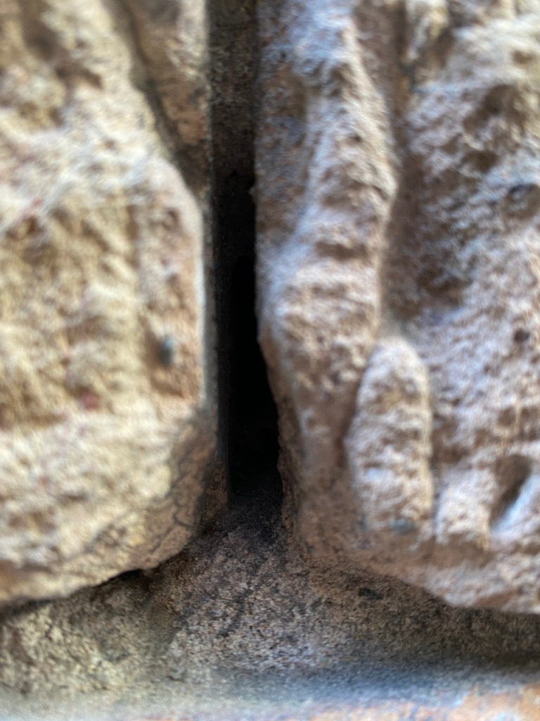
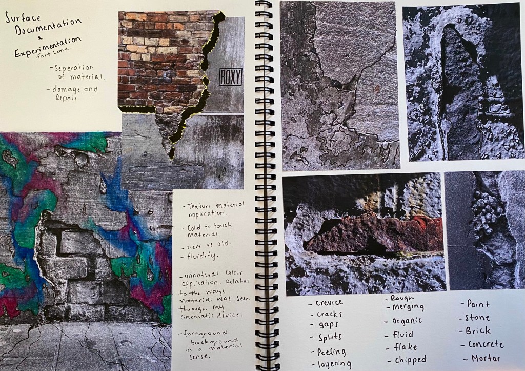
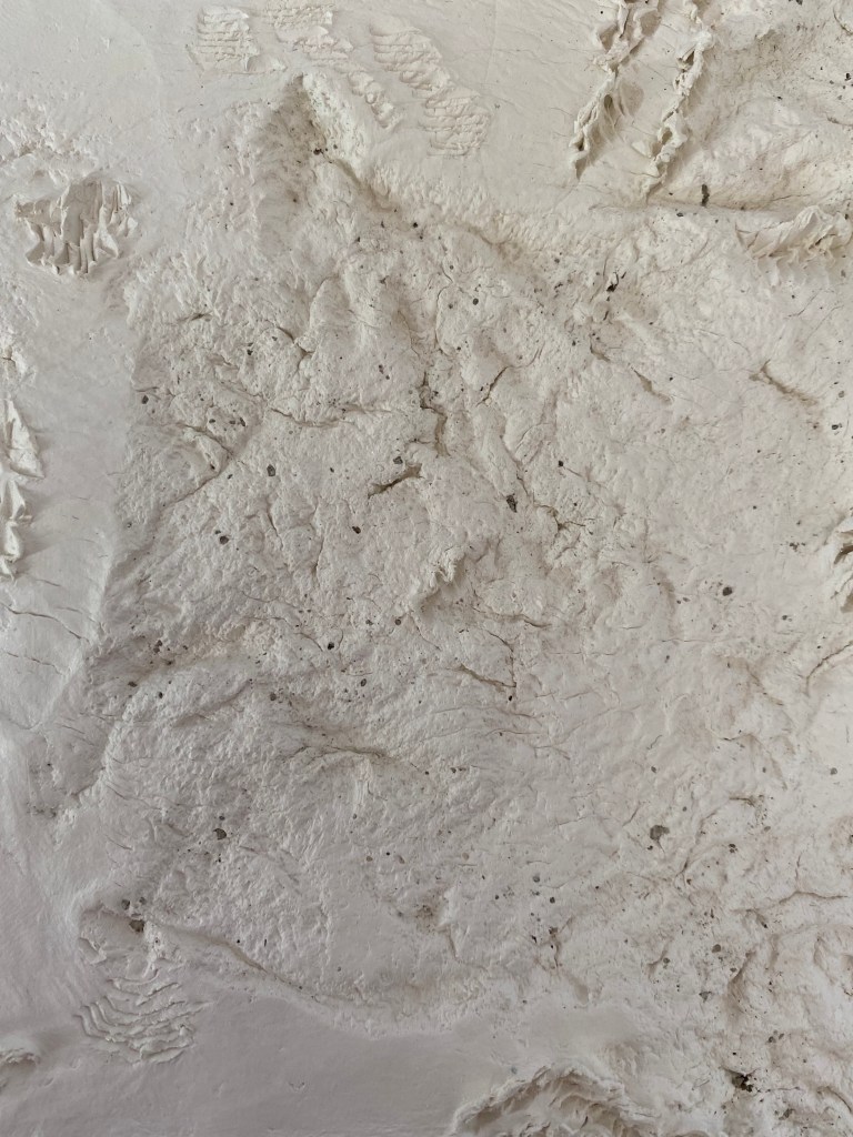
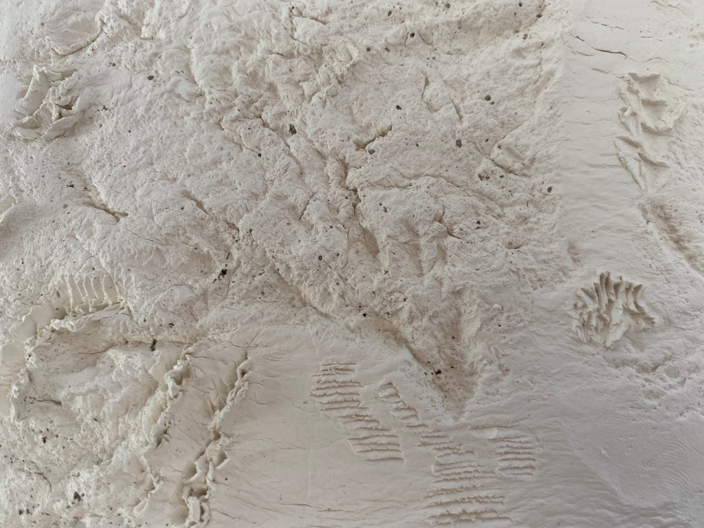
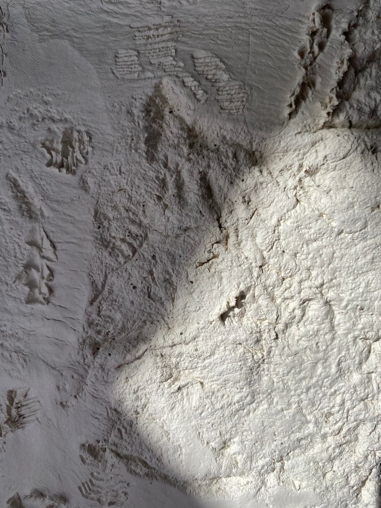
During my second site visit I paid close attention to material detailing looking at areas where multiple mediums combine roughly to create textures. Often where materials combine small cracks and crevices appear creating patterns of negative space. This developed my interest in the idea in gaps and the space between.
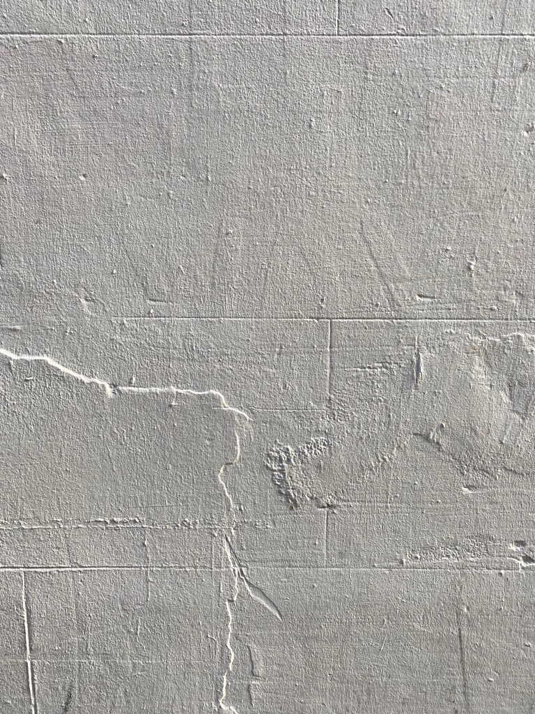
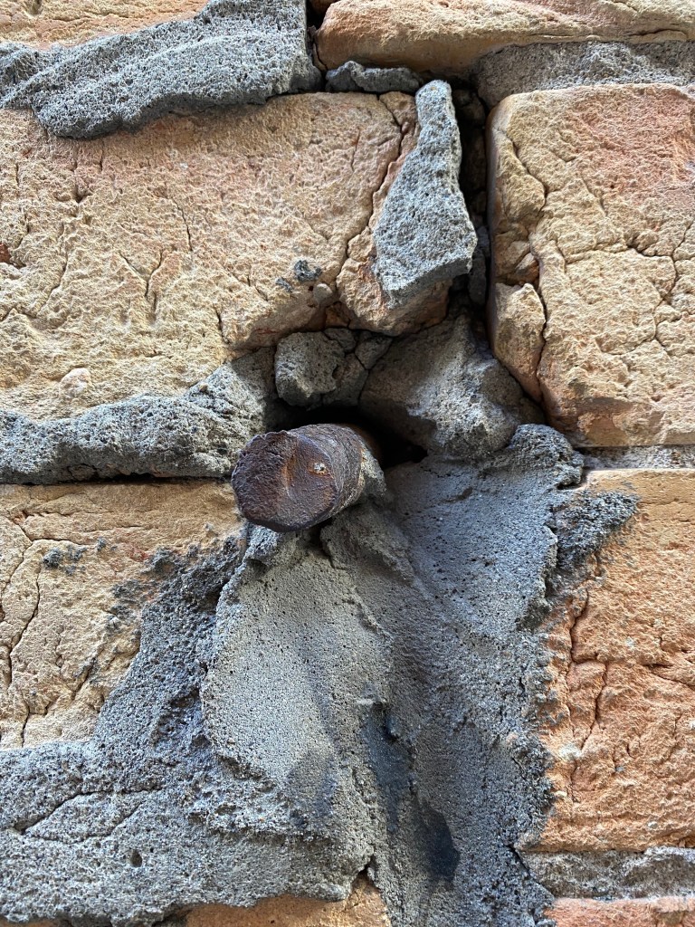
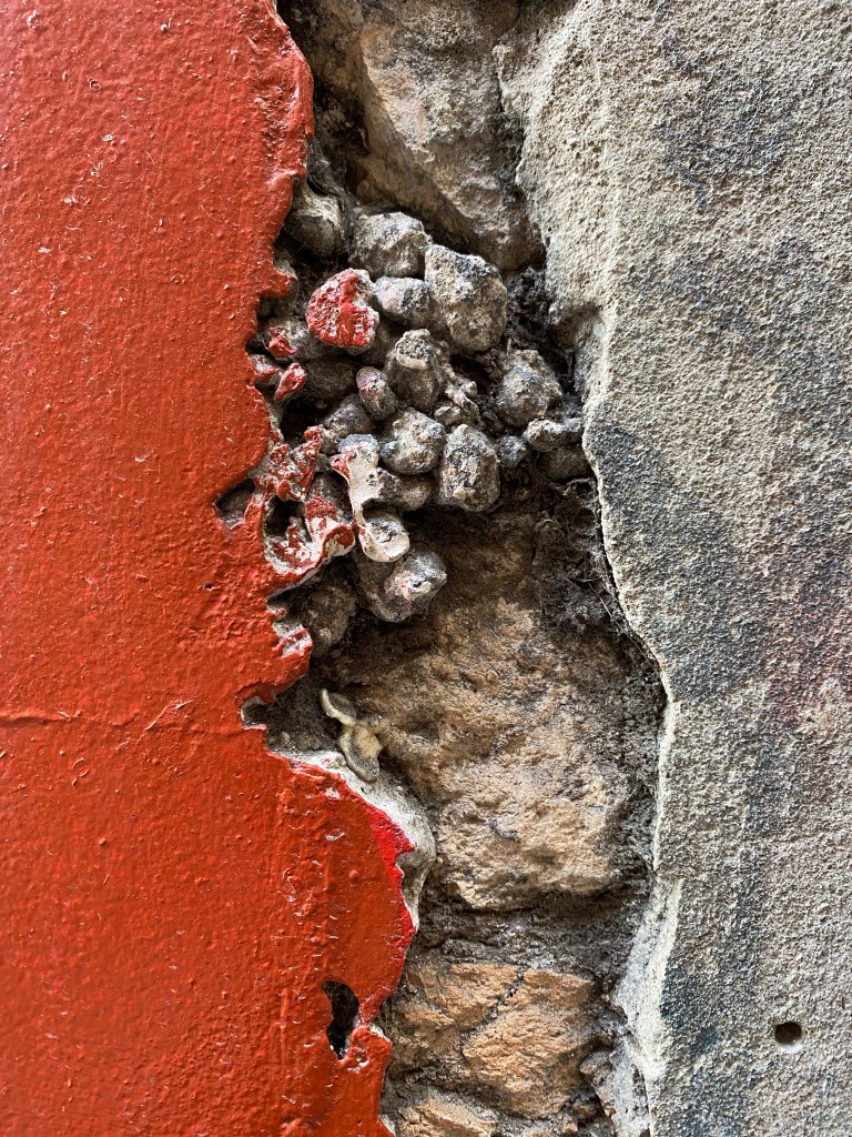
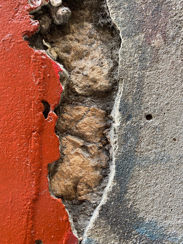
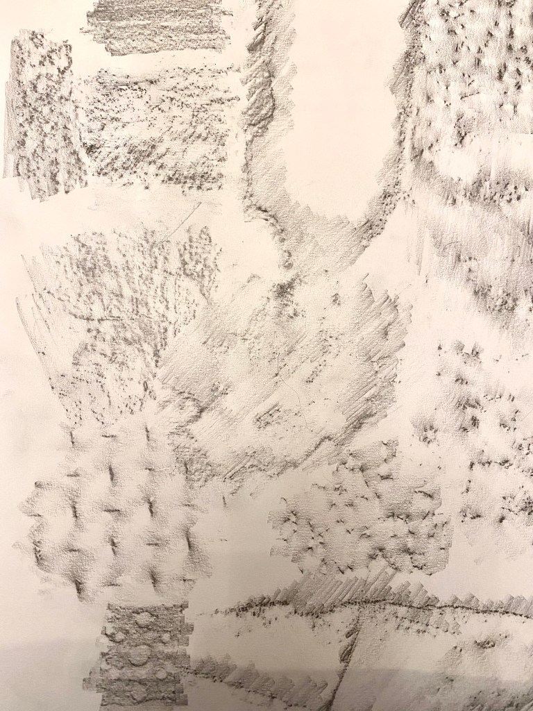
The image above displays rubbings from different areas of the site. I think its interesting to see the difference between man-made and natural textures. You can see the variation in pattern with the natural textures compared to the structured and routine patterns that appear in the man made materials such as grids and circular shapes. This happens to relate back to my first sketch drawings where I played with the idea of both fluid and rigid shapes of naturally sourced material.
Research:
Below are some designs that initially sparked my interest that relate to my keywords and concepts I have developed so far. I am intrigued by certain parts of each design such as materiality, overall form, scale and purpose.
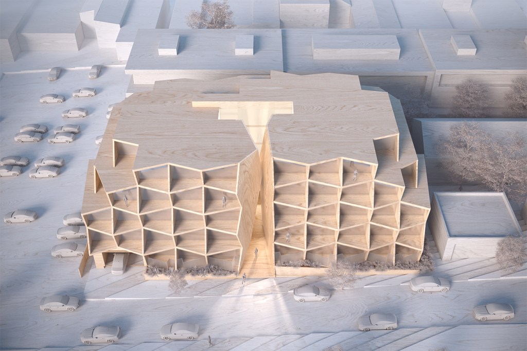
Chasm, HACHEM. ‘Applying a vision to a void’. By embracing the gap between two buildings the chasm conceived a holistic design that provided a sense of arrival and became the key to a distinctive, aspirational development. The two buildings appear to have been carved from rock, suiting the sloping site. Materials were chosen to emphasise the concept: timber slats created a geological layer-like effect while concrete gives a raw and natural appearance. I like the way this design effectively communicates the idea of the chasm that I found interest in. I think the geometric shapes combined with the chosen materials successful expresses the idea of being ‘carved from rock’. I admire the idea of creating a sense of arrival – perhaps this is something Fort Lane is missing as it is often used to pass through.
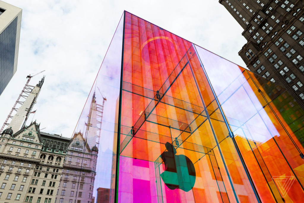
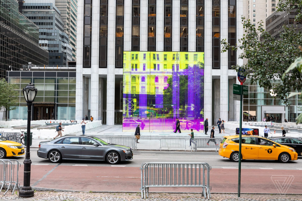
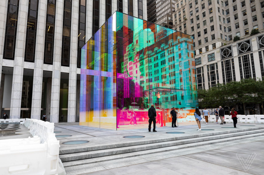
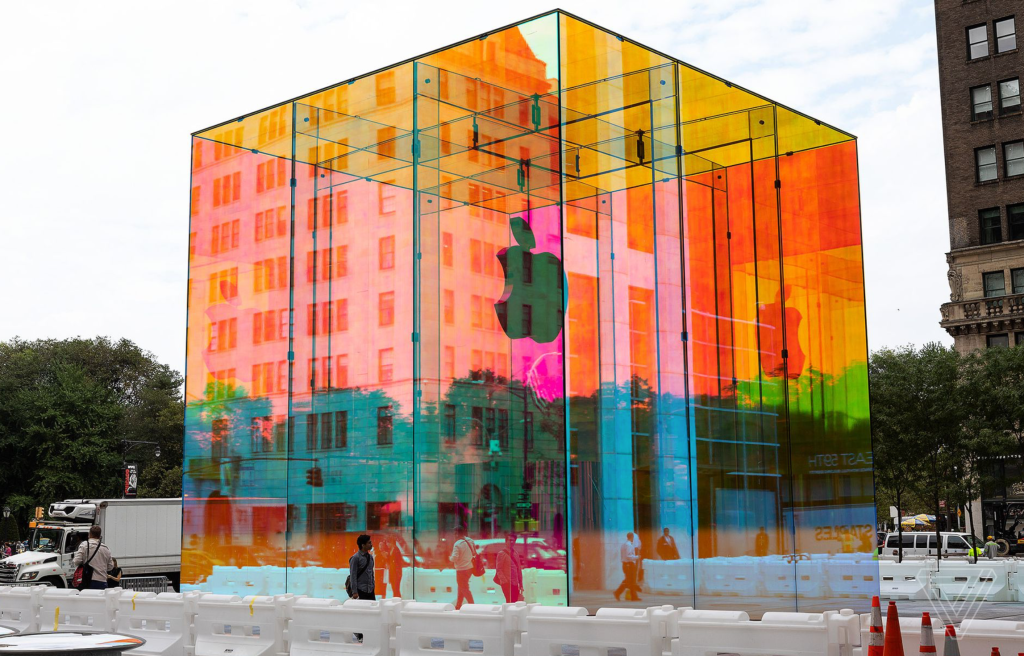
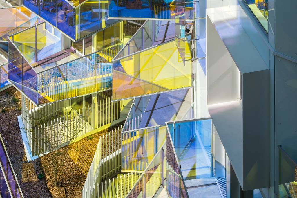
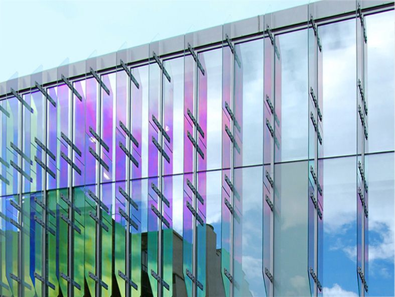
Apple Store, Fifth Avenue. ‘Rainbow Cube’. One of Apples most iconic Apple Stores, the all glass cube on Fifth Avenue took on a new look while the store below was under construction. The temporary iridescent feature is caused by a wrap covering. Apple wanted the colourful design to embrace the heritage of its classic rainbow logo. I found the colours of the iridescent material captivating as it changes based on your perspective of the cube and the way lighting hits the surface. It would be interesting to see how I could apply some type of iridescent material to a more permanent architecture and how this may look within a site like Fort Lane.
Week 4: Material Narrative
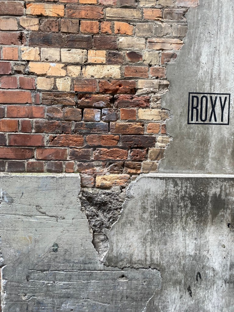
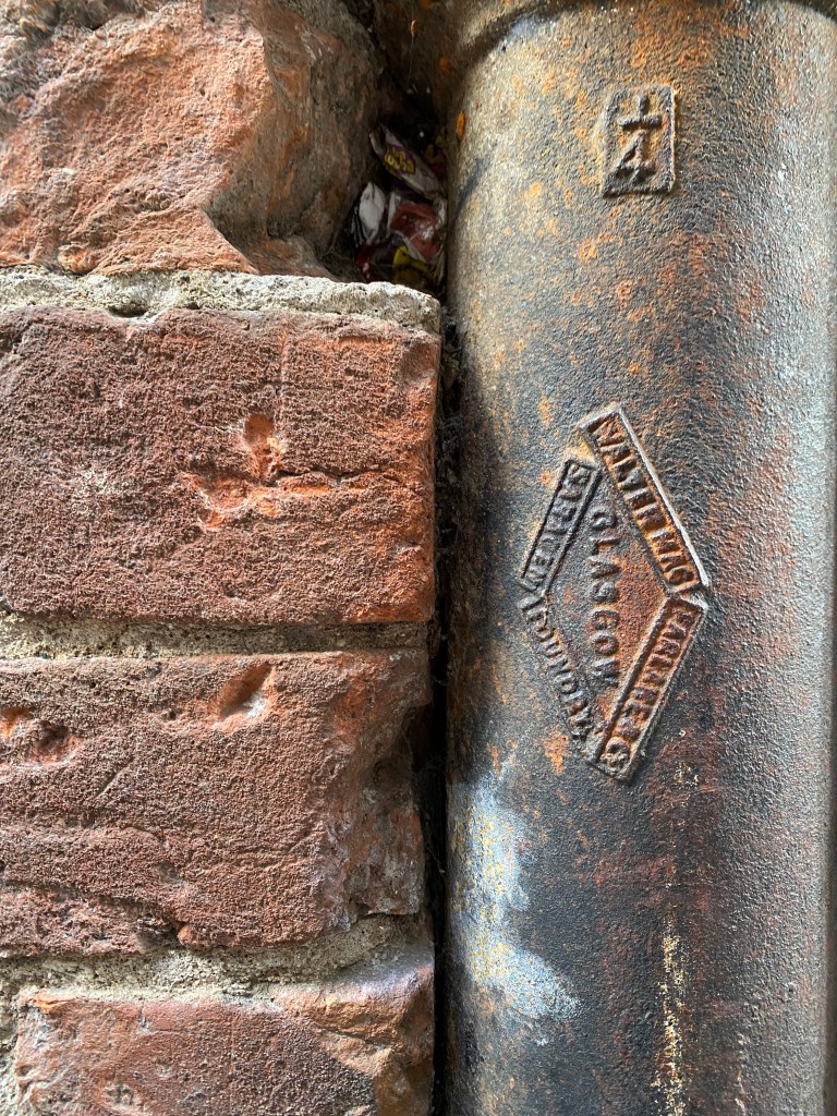
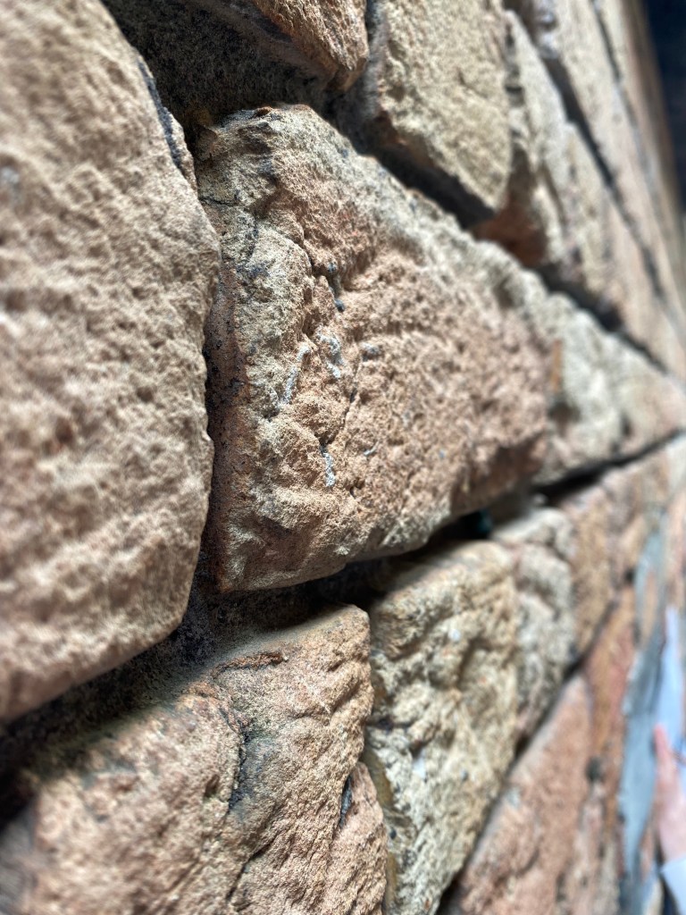
This weeks focus is around the material and immaterial narratives that exist within the Fort Lane site and our proposed designs. What materials are constantly seen within the site and how do they interact with each other? How can the materials used create a behavioural response for those who interact with the space? Existing site materiality, surface and texture is made up a brick, stone, concrete, mortar, render etc. Separation, damage and repair of material alludes to the age and character of the site speaking the the historical narrative of Fort Lane.
Blog Reviews – The feedback I received after briefly presenting my blog was both critical and helpful with moving my design forwards. Through expressing my thoughts around the idea of creating a market space in the ‘spaces between’ (Fort Lane, potentially working with Imperial Lane and Snickel Lane as well) to create opportunity for small business owners to sell goods it was said that this idea could both literally and metaphorically fill the gap as businesses seen in the surrounded blocks are often high end, well known brands. This lead to me thinking about what are the types of stores that are missing in within the site furthering my thoughts into the type of market I would look to create. What would be sold? Clothes? Food? Art? Could they sell a range of goods or would they be more niche? Would it be the same each time or could business owners rotate weekly, sharing the opportunities.
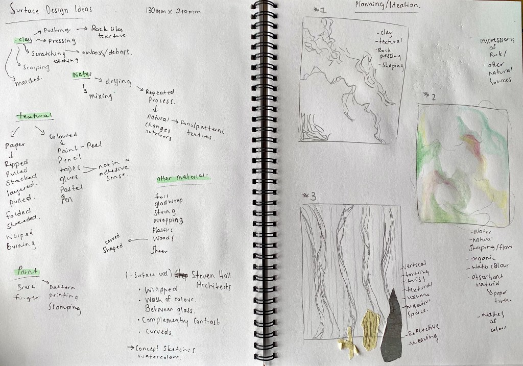
Surface Design:
Surface design is any type of artwork (pattern, illustration, hand lettering etc.) made by a designer that is intended to be applied to a surface to enhance its visual appearance and/or functionality. The spaces where the surfaces are applied often provide a blank canvas for creatives to get inspired and produce something that is visually enticing – a statement piece. Surface design can take on the shape of wallpapers, bold patterns, striking colours, layers of geometric and organic shapes and textural mediums.
Surfaces, textiles and material finishes can affect the way people act and feel within any given space. For example colours can effect our moods, hard vs curved edges evoke different feelings and rough vs smooth vs delicate surfaces can play a role in the way we move through spaces, whether it be carelessly or in more of a careful cautious manner.
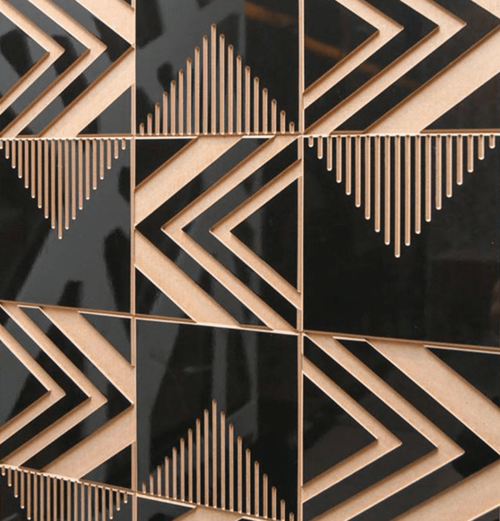
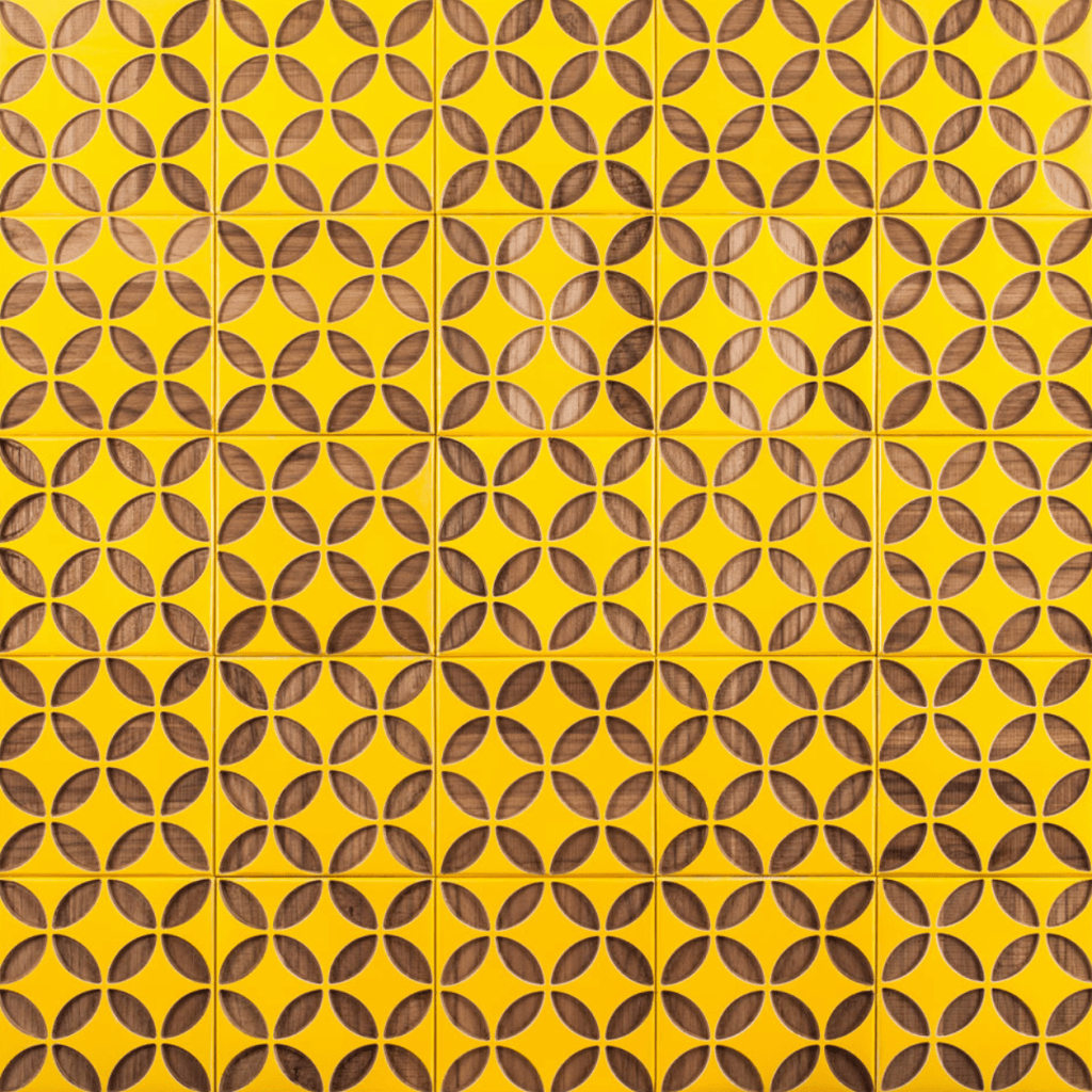
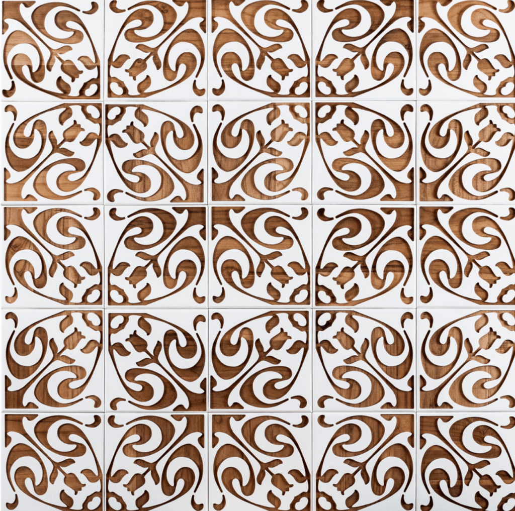
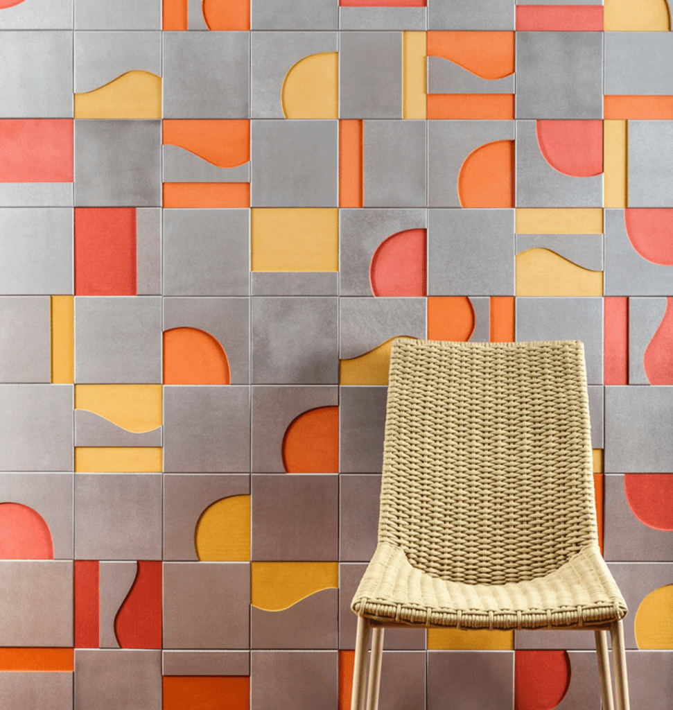
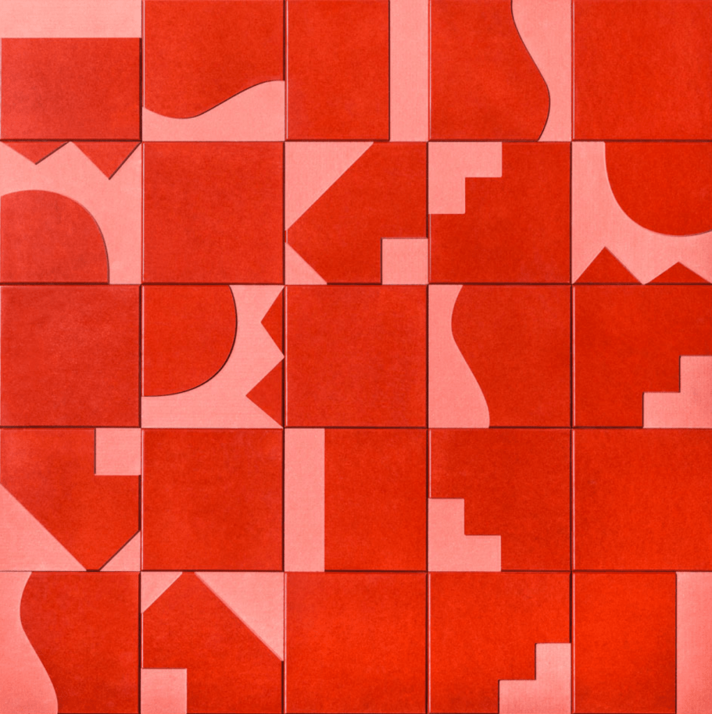
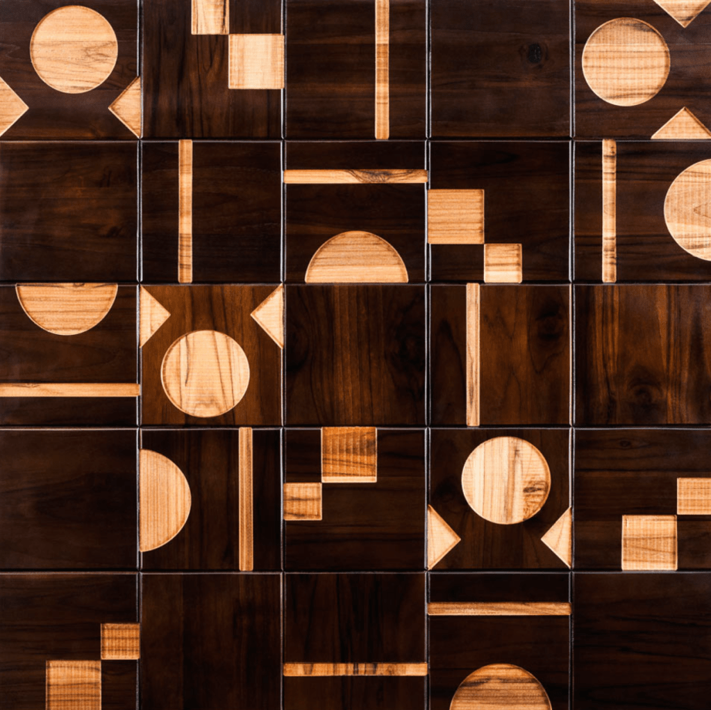
Surface Design Case Study 1: ‘Brasiliana’ Wooden Tile series, Renata Rubim. Brazilian surface designer Renata Rubim created a series of geometric, wooden tiles that celebrate her cultures history. The variety of patterns aim to resist distinct periods of Brazilian design history: Tribal, Modernist and Colonial. The collection cumins in the traditional Portuguese tiles size, measuring 20x20cm and are made from either eucalipt or Valchromat (a wood fibre panel which is coloured throughout and engineered for high physical performance) in various colour ways, each with their own unique personality. I think this collection is a great example to show the ways in which history and culture can influence elements of design that can be used in many different modern sites.
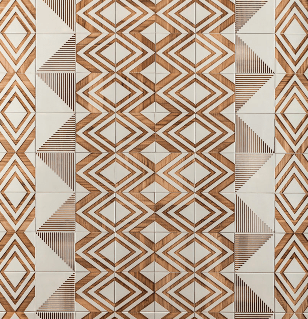
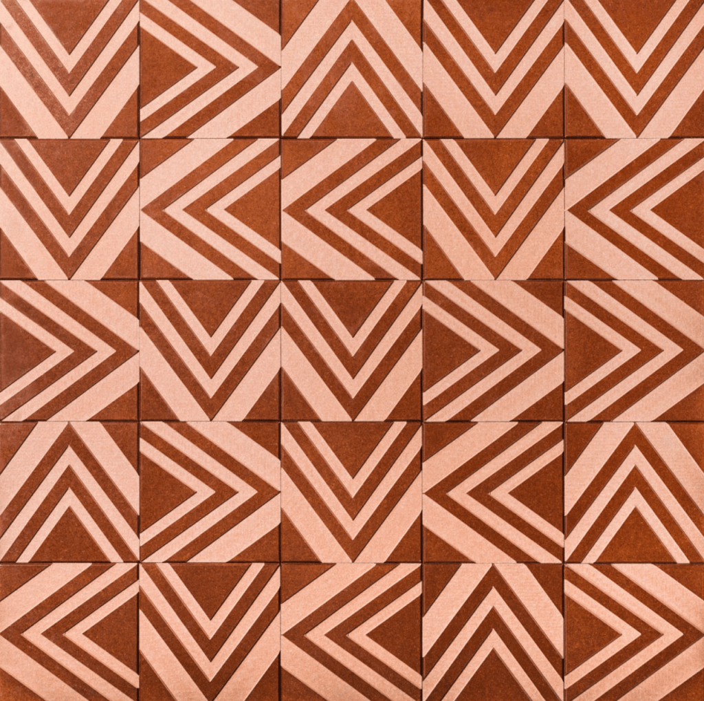
The tribal tiles with their geometric, ethic feel, represent the time before Portuguese colonisation when indigenous tribes were prevalent. Triangular tribal lines are patterns are a key feature within this series speaking towards the domination of the natural landscape.
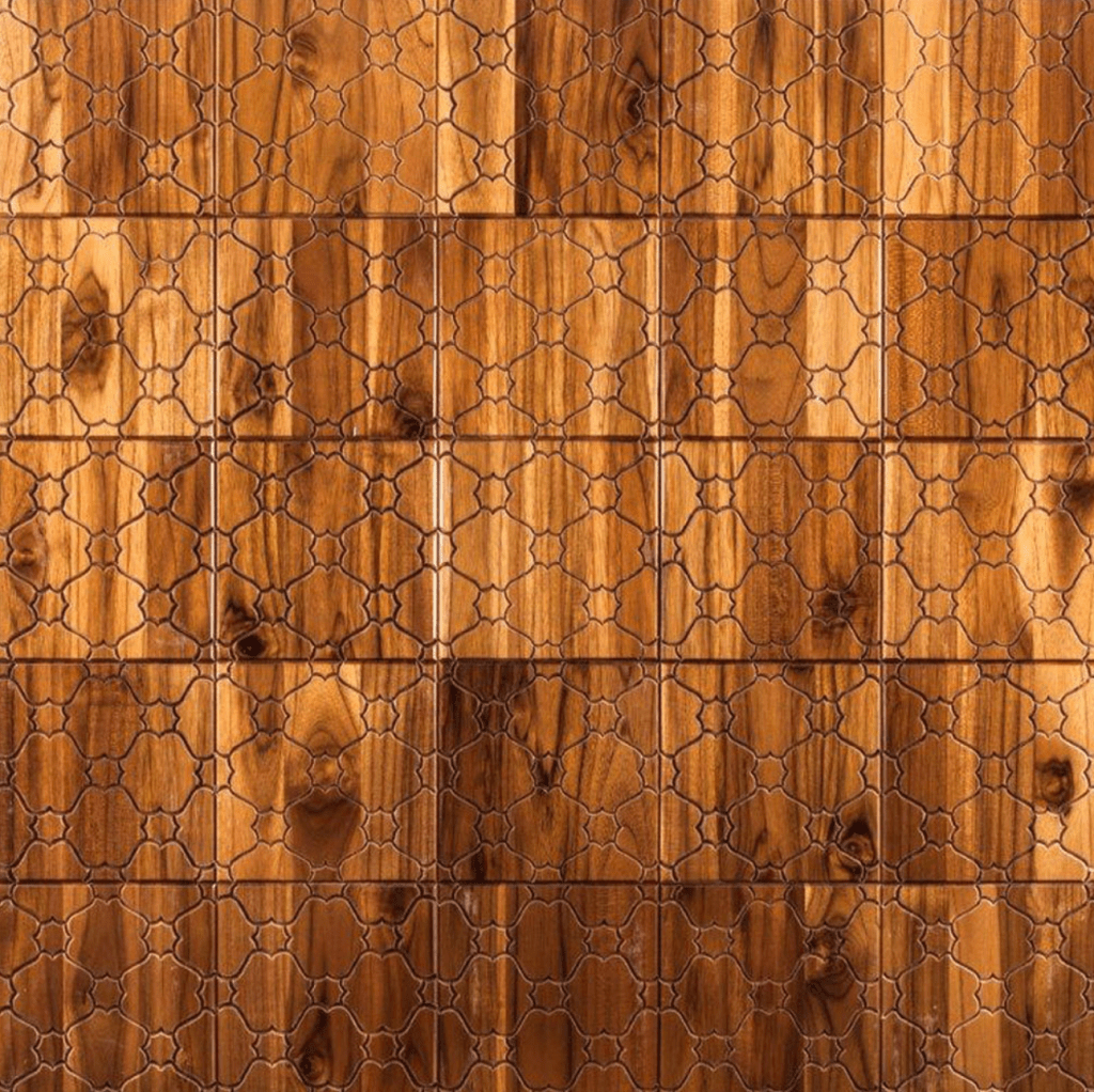
Going forward in history, the colonial line looks at a time where the Portuguese influence set the rules for society. The main inspiration for this collection were the traditional Portuguese tiles with their attention to detail and vast representation of geometric and organic forms.
The modernist art and design movement guides the third line of the Brasiliana Collection. Inspired by the work of Burle Marx (Brazilian landscape architect), the patterns are abstract with strong traces of concretes and constructivism.
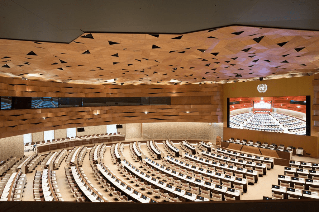
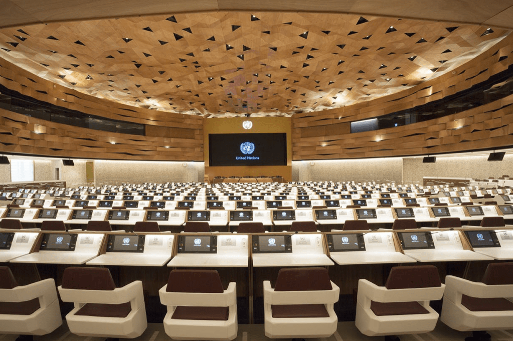
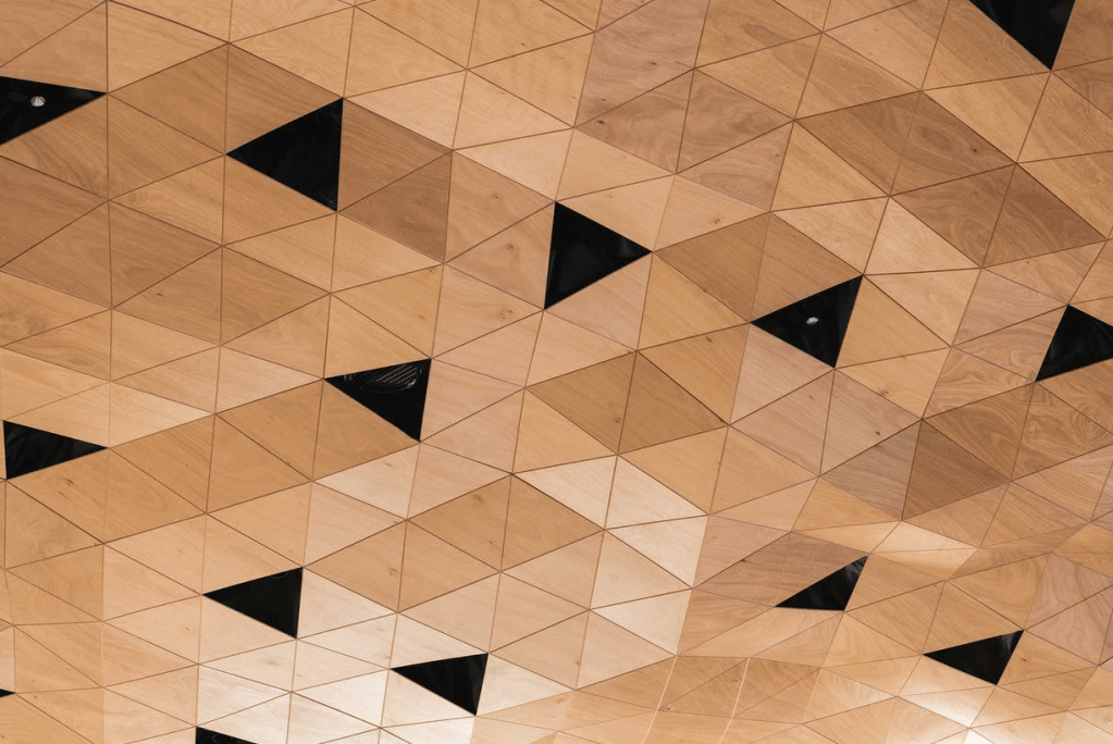
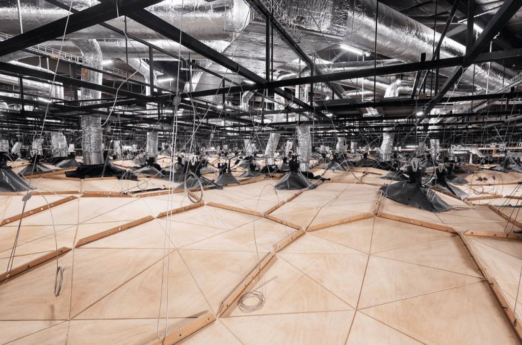
Surface Design Case Study 2: ‘WOOD-SKIN’, Peia Associati. Wood-skin reinterprets the diplomacy, tradition, calligraphy and landscape of Qatar through contemporary materials, technologies and design languages. The surface covers the ceiling and walls of the Assembly Hall of the United Nations Palace in Geneva. The space is created through a flowing expanse of okume (warm light weighted, with flamed grain wood) wooden ‘dunes’ clads with an area of 4000 square meters.The freedom of form wood-skin provides allowed the design to anchor to the pre-existing historical structure with ease. The ceiling draws upon the movement of sand dunes and the lighting system reflects the rhythm of sunrise and sunset. The wooden waved panels on the walls change rhythm according to the acoustic optimisation of the circular space. The design took into consideration the complex engineering required by a conference hall such as air conditioning, video projectors, cameras and sensors, each of which were carefully positioned within the design phase. Acoustics were also an important feature to take into consideration when designing this space. The complex geometries generate irregular surfaces that promote sound diffusion, thereby reducing echo. The textile core of the cladding also behaves more like fabric than wood meaning it is capable of absorbing even the lower ranges of frequencies. Overall I think this design shows how when working within site specific briefs and restrictions you get the opportunity to be more creative with the ways in which elements of the designs are laid out and work both with each other and with the existing architecture. Though challenging this design has complemented the architecture both functionally and aesthetically.
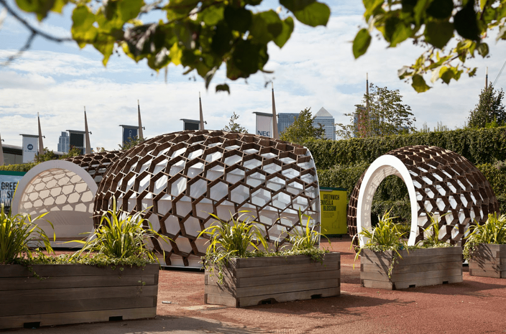
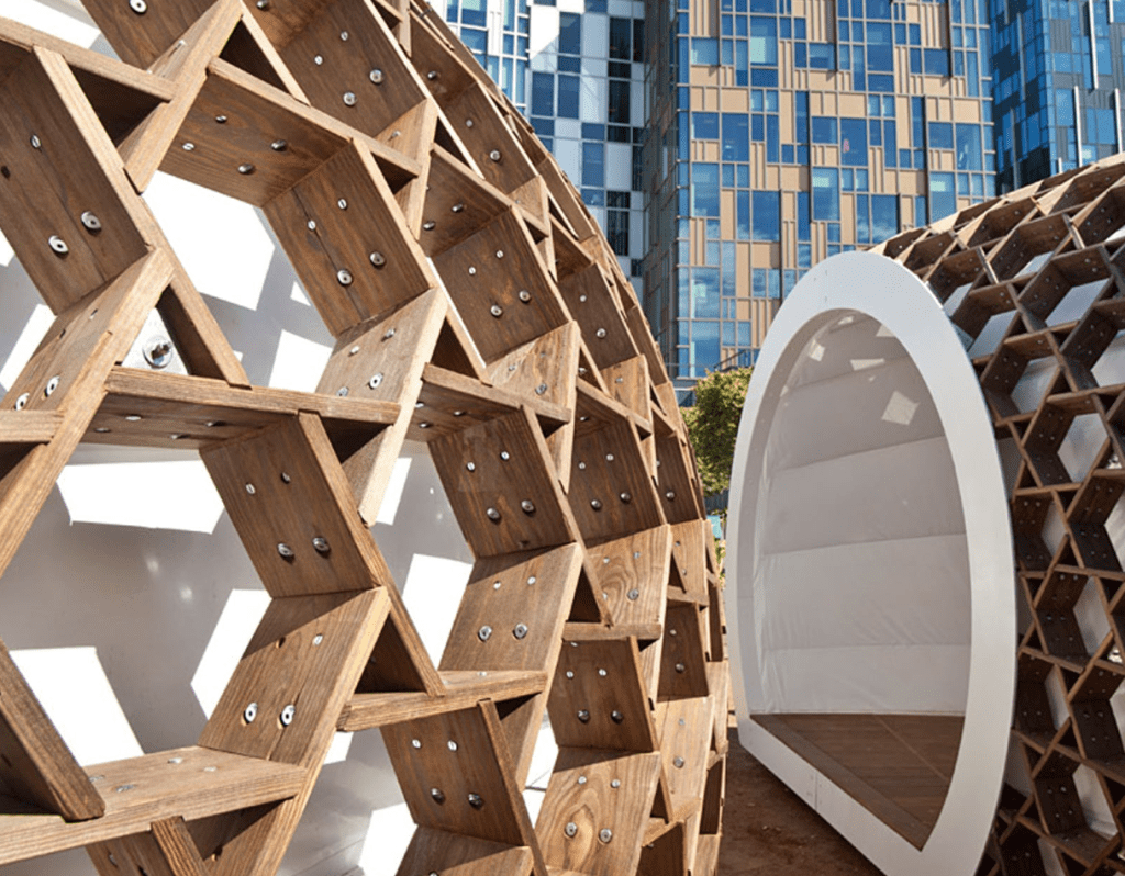
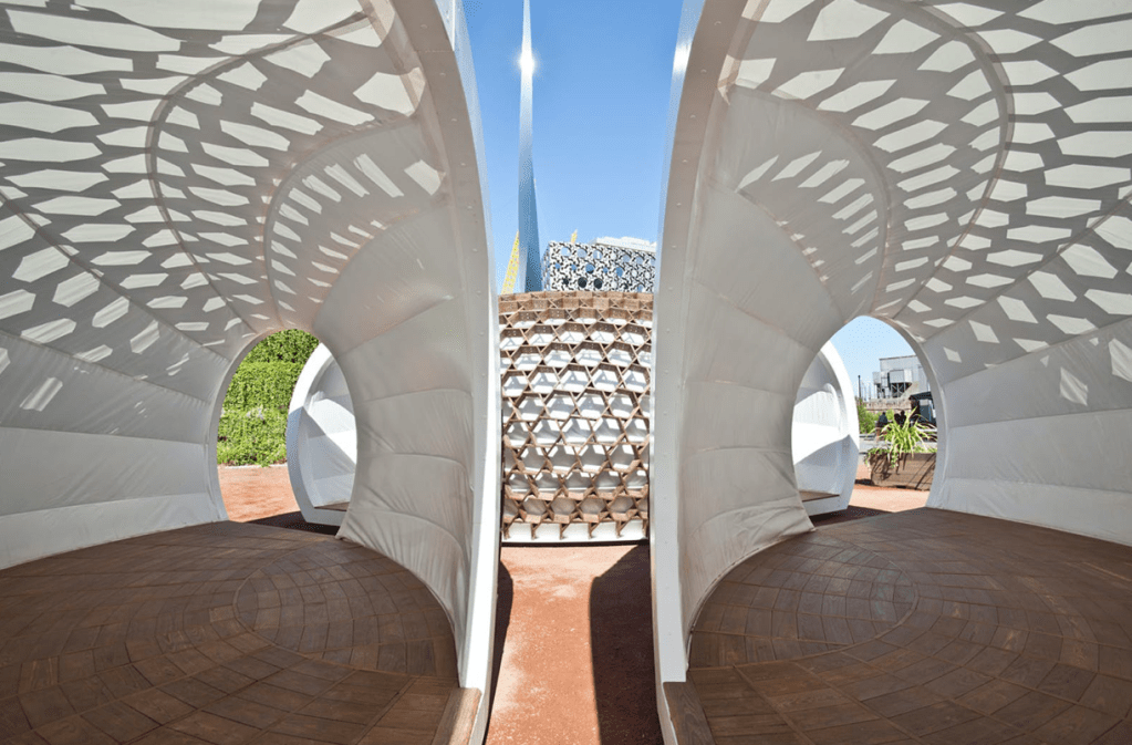
Surface Design Case Study 3: ‘KREOD’, Pavilion Architecture. KREOD is a portable wooden structure consisting of three compartments that was first revealed in London. The structural design aims to show a sustainable and forward thinking building method in the digital age, challenging the new way of thinking, designing, engineering, fabricating and installing. The design will have the practical consideration for transportation, store, disabling and reassembly i.e. stackable components, modularity. KREOD is constructed of Kebony, a sustainable alternative to tropical hardwood and preservative treated wood. The innovative architectural sculpture, organic in form, is environmentally friendly and inspired by nature. The three pods are able to combine through a series of interlocking hexagons to create an enclosed structure that is secure and waterproof. I like the way the surface design of these structures have been thought about for their temporal qualities. That they are able to be constructed and deconstructed with ease. The material qualities of the exterior and interior surfaces play delicately together with light to create a new surface design through light and shadow without touch.
Experimental Surface Design:
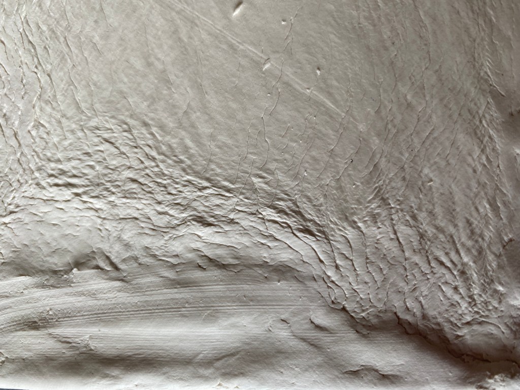
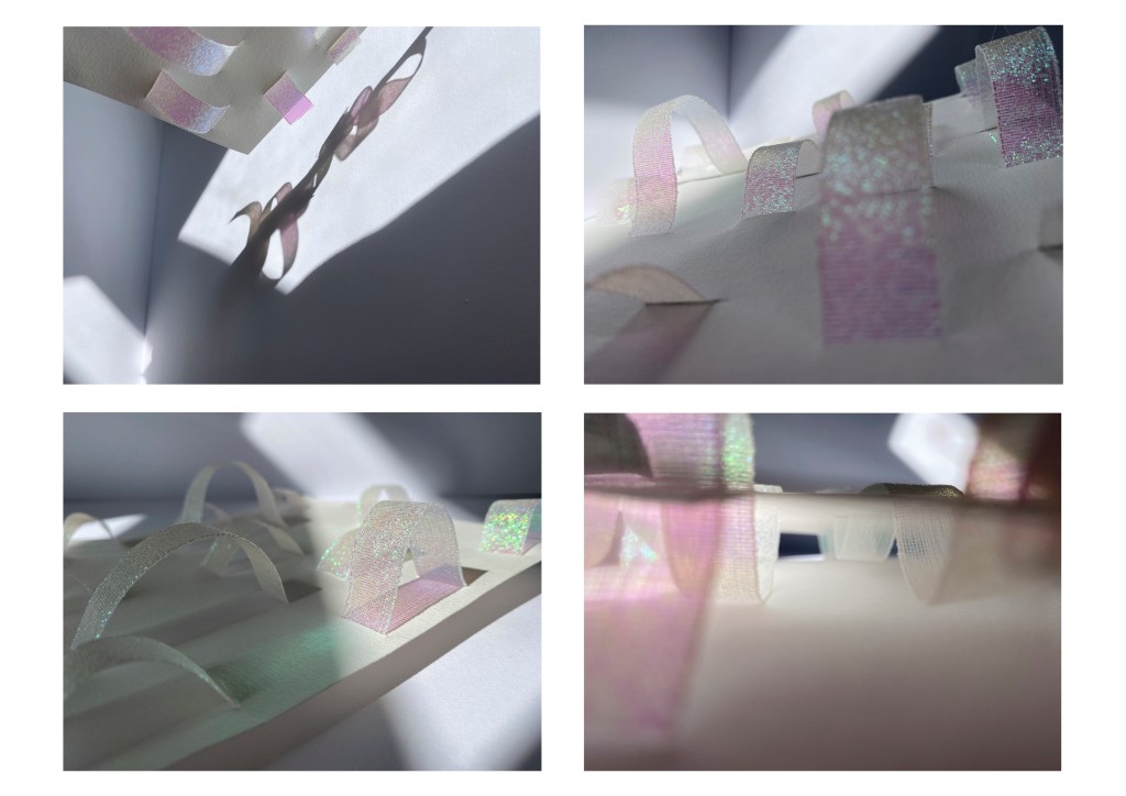
For my first experimental surface designs I wanted to try and work with fluid, organic patterning and to create texture through material choice and the way in which mediums interact with each other. I decided to brainstorm a list of materials and methods I could use to produce these designs and also roughly planned how each surface may take shape.
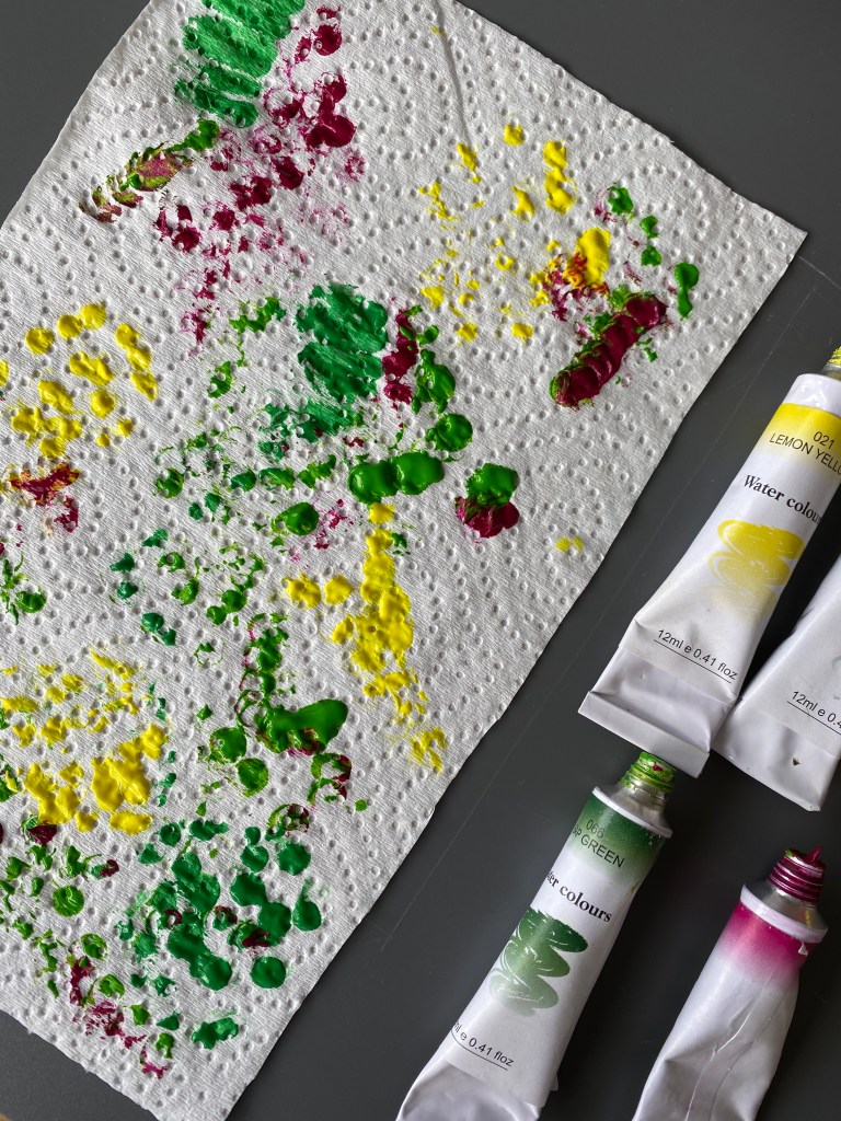
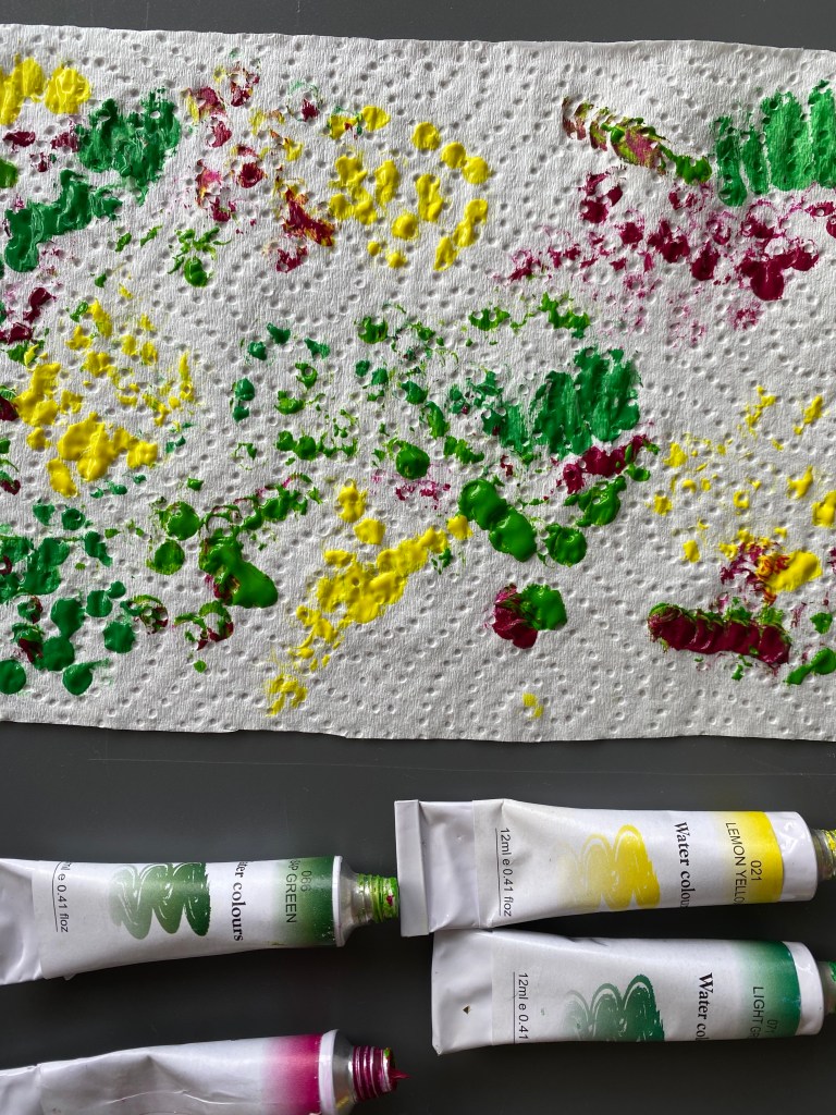
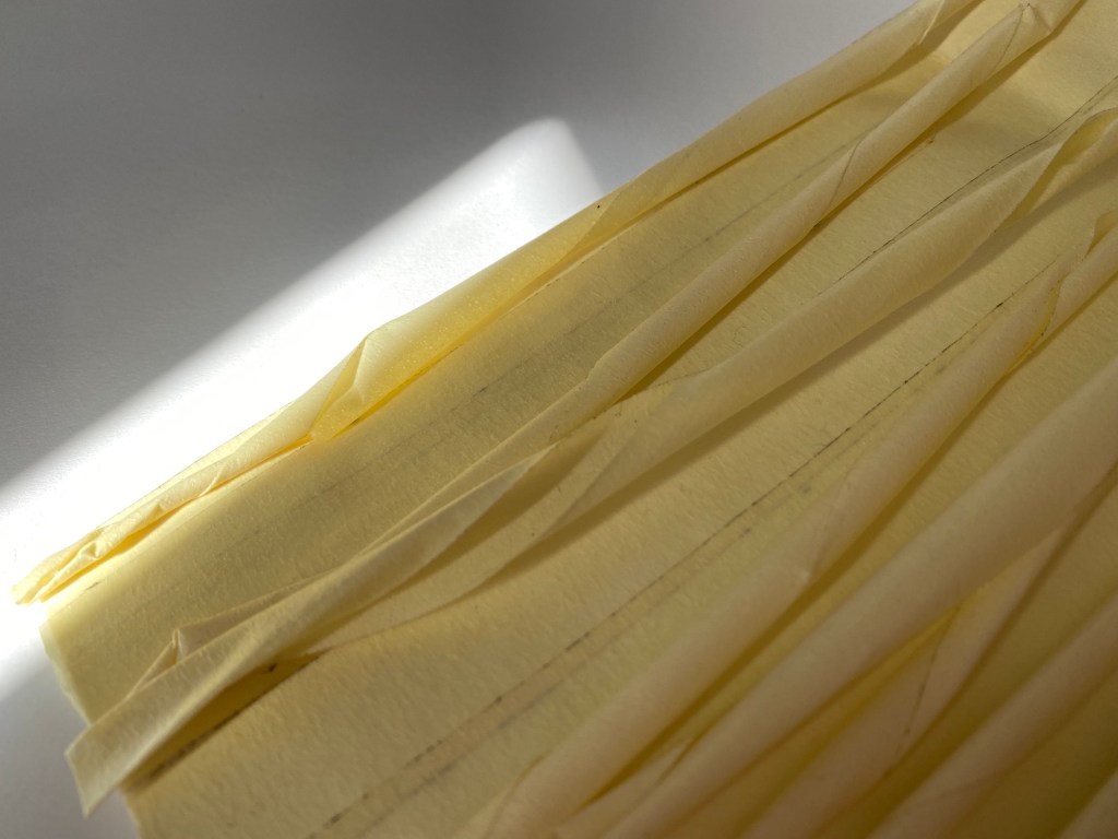

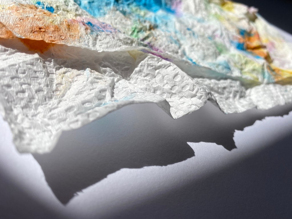
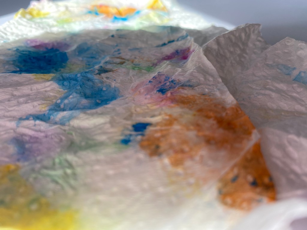


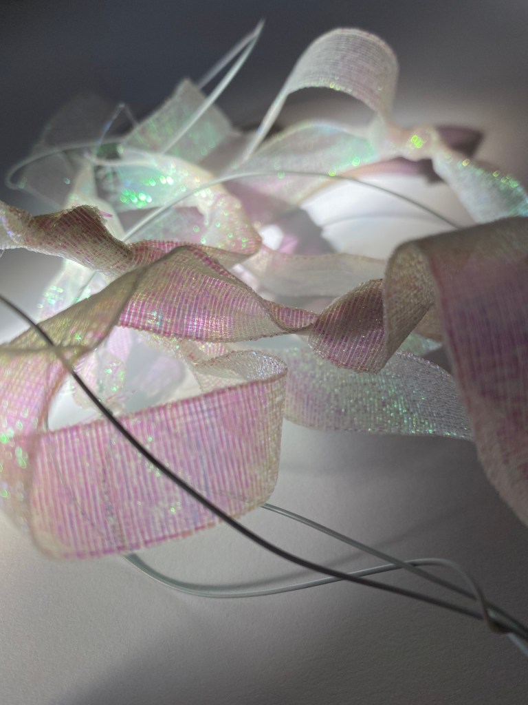
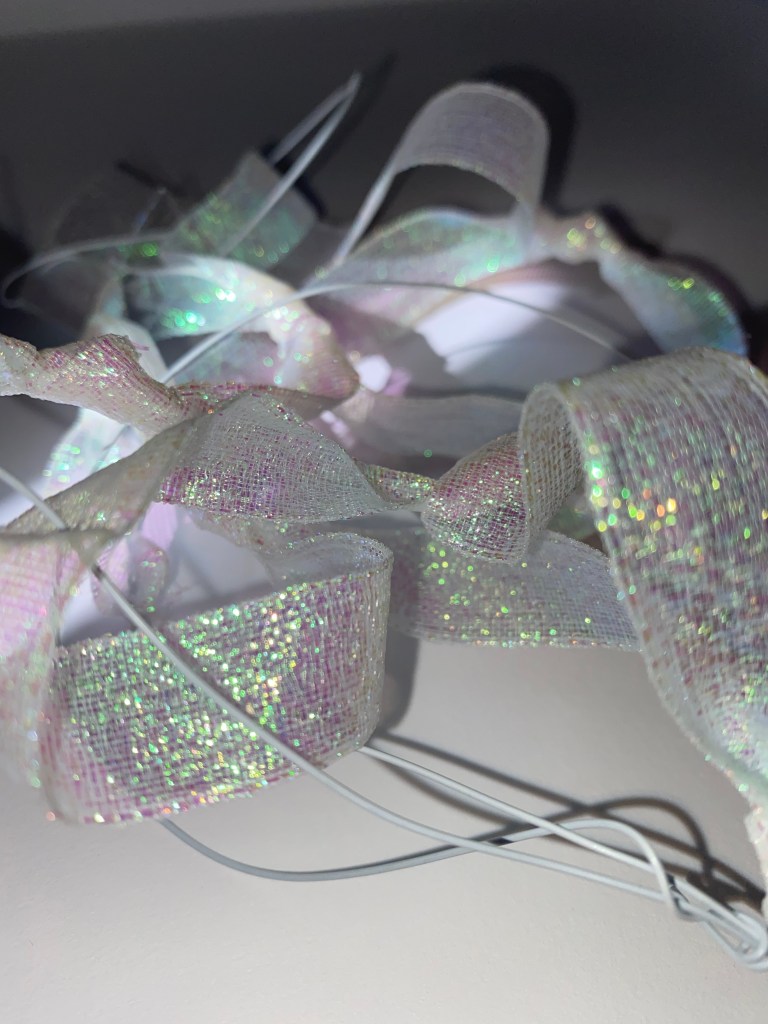
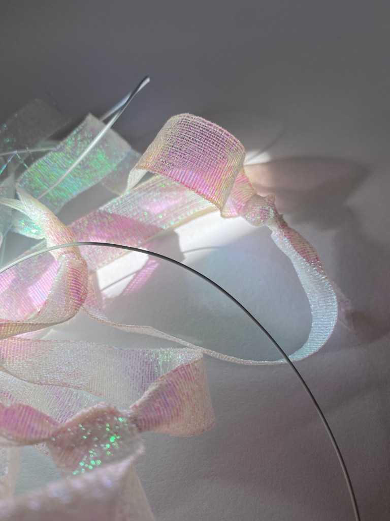
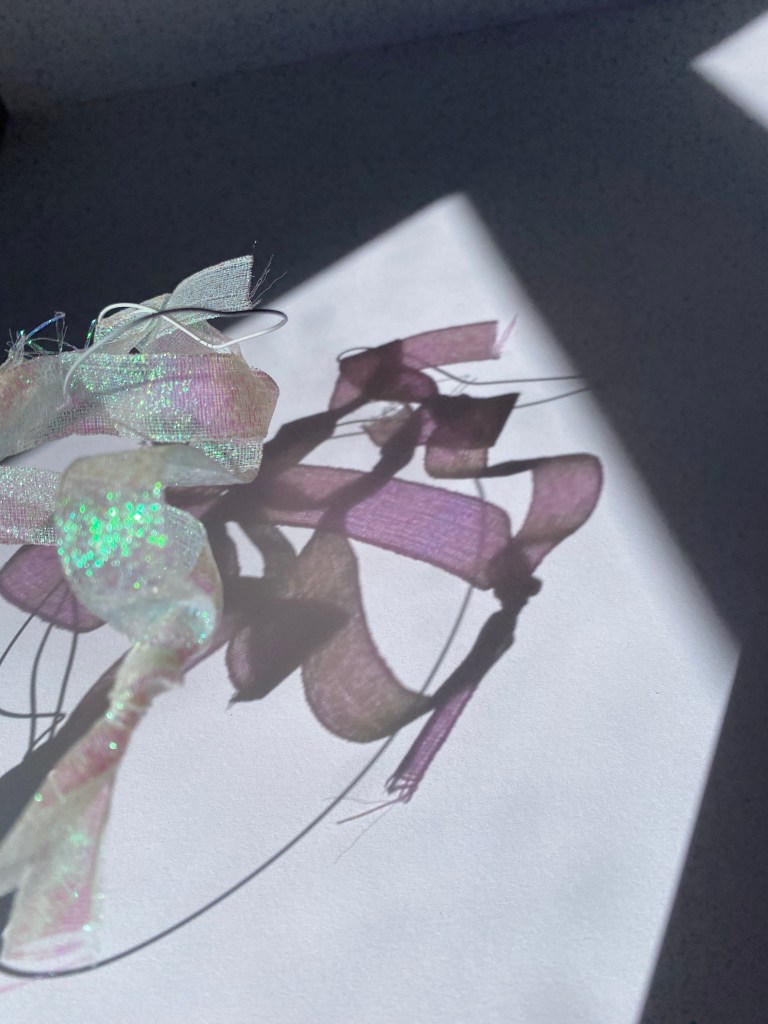
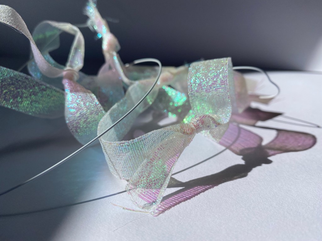
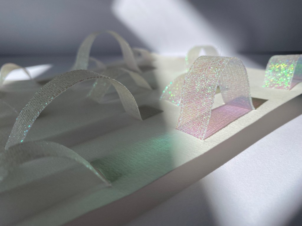
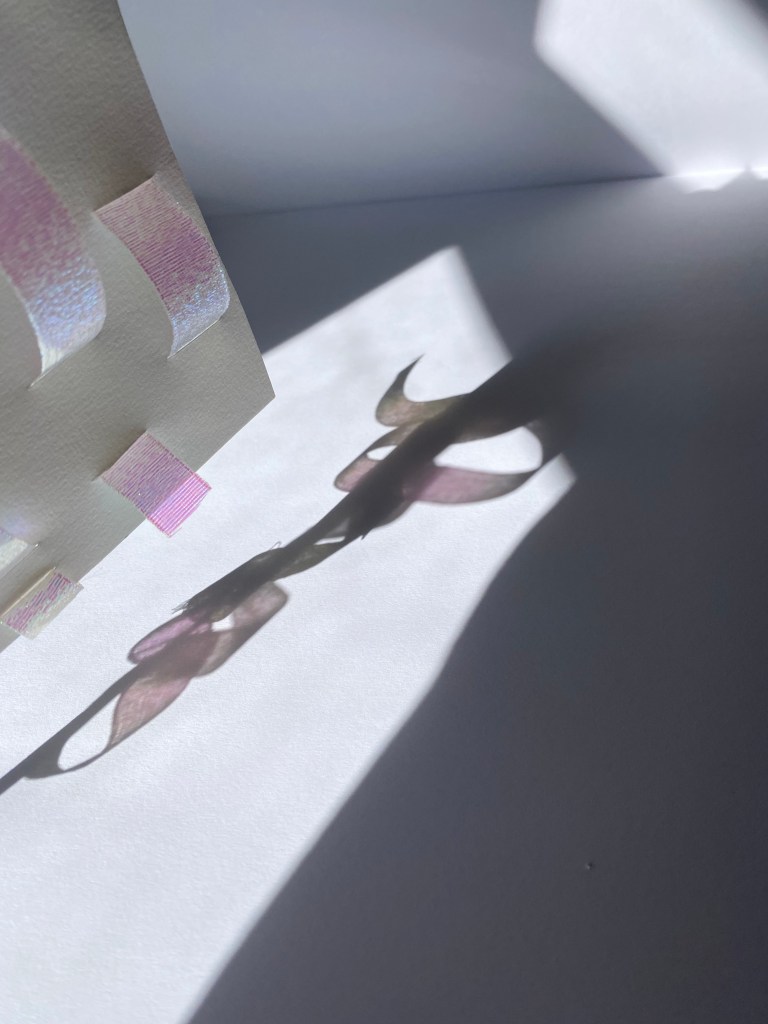
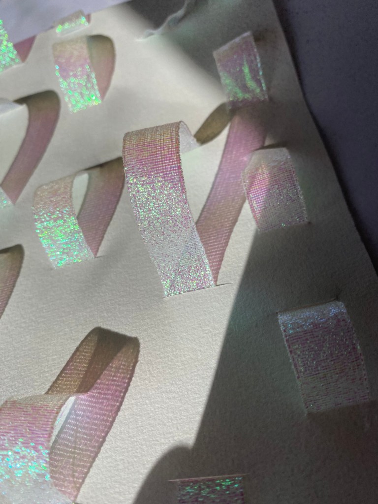

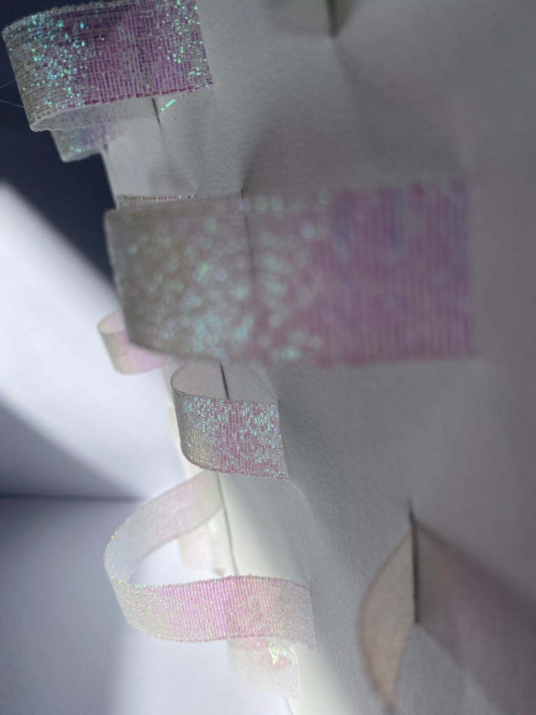
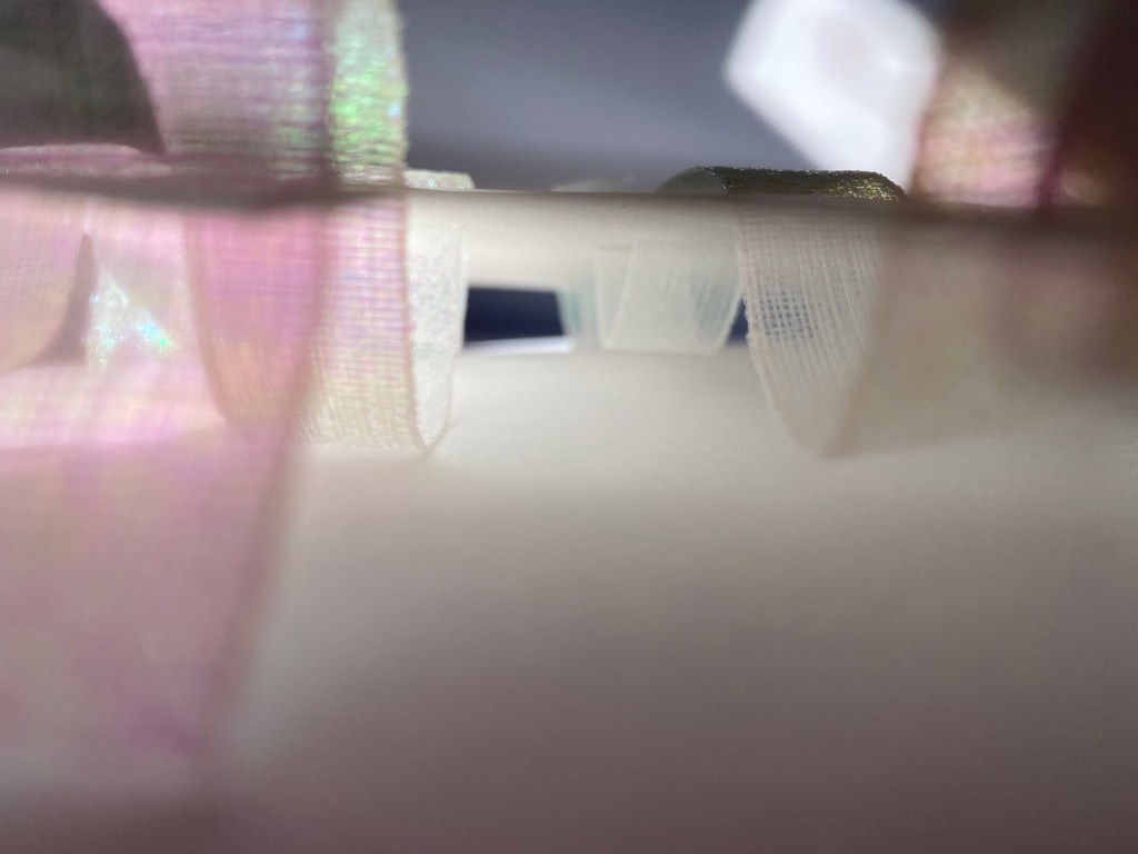
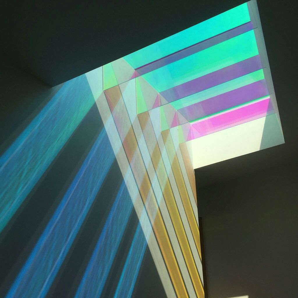
My final surface design plays with the relationship of reflection, light and the way light and colour can produce more than one surface through shadow. I decided to start experimentation with iridescent material to see how it reacts in both direct and indirect sunlight as well as shadow. I admire the way that the textural quality of the ribbon picks up even the slightest glisten of light altering the colours displayed.
Concept Development/Research:
Over the last few weeks I have begun to develop a strong direction for this project by consistently brainstorming my ideas and finding connections between my areas of interest. So far I have focused on colour and perspective shifts through colour, I have become intrigued by depth and the role colour and light has to play with depth perception. Thoughts around the use of iridescent materials to create colour change and reflection The idea of ‘chasms’ and ‘gaps’ have sparked both material and conceptual interests leading to my thoughts around creating a space for weekly markets which links to the sites historical use as a place of trading and service. Filling the gaps both literally with architectural structures and the gap in the market giving small businesses was also a point that has come up in conversation with lecturers and peers.
When reflecting on my project to date in a cinematic sense I think I have begun to focus on the concepts of framing and angles with a play on perspective and interaction with colour.
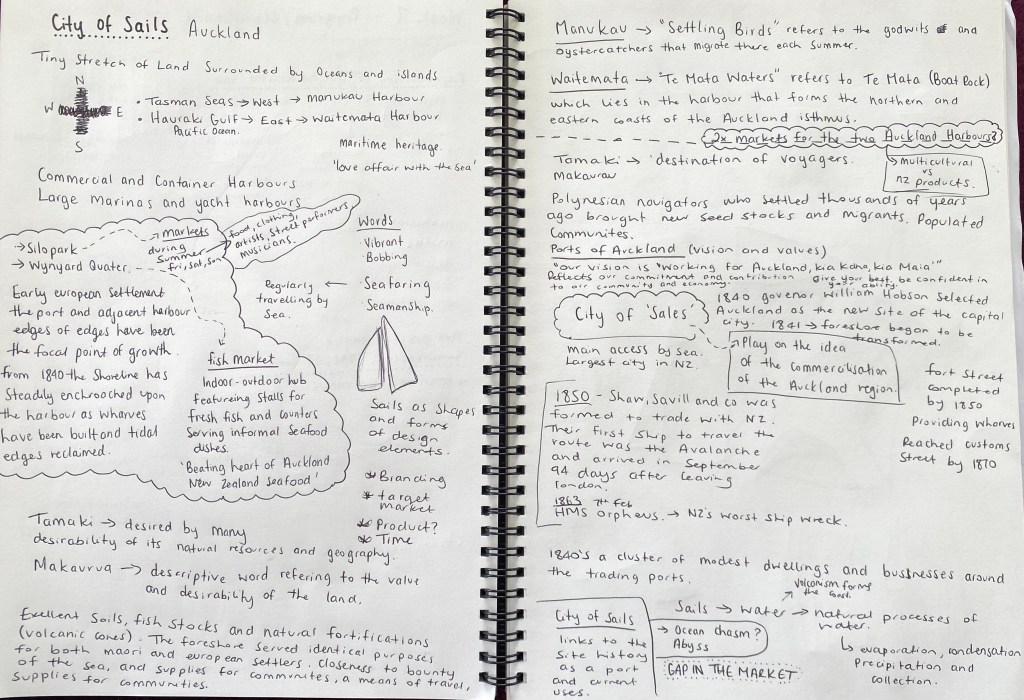
Market Research:
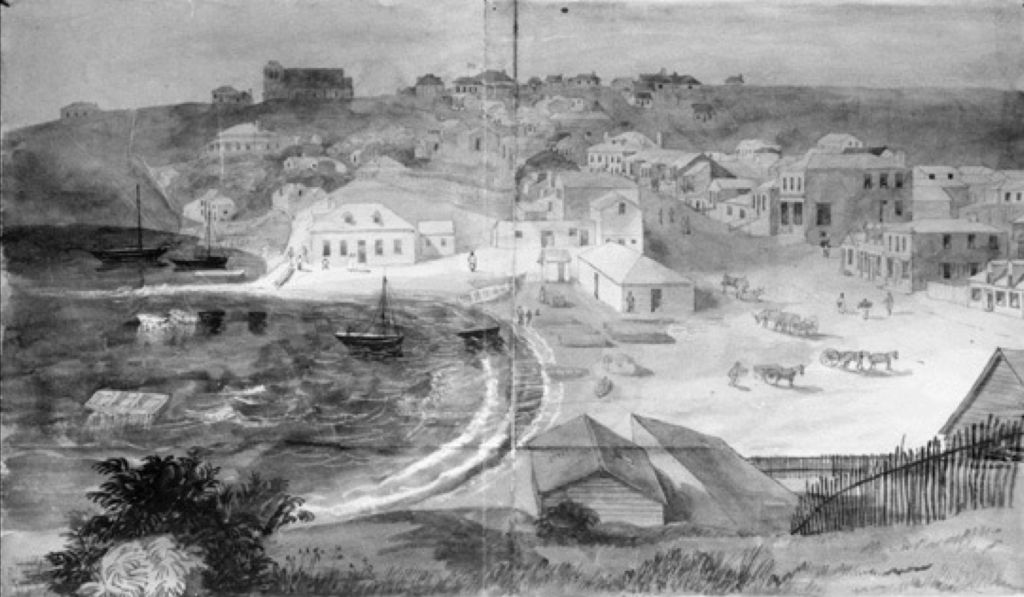
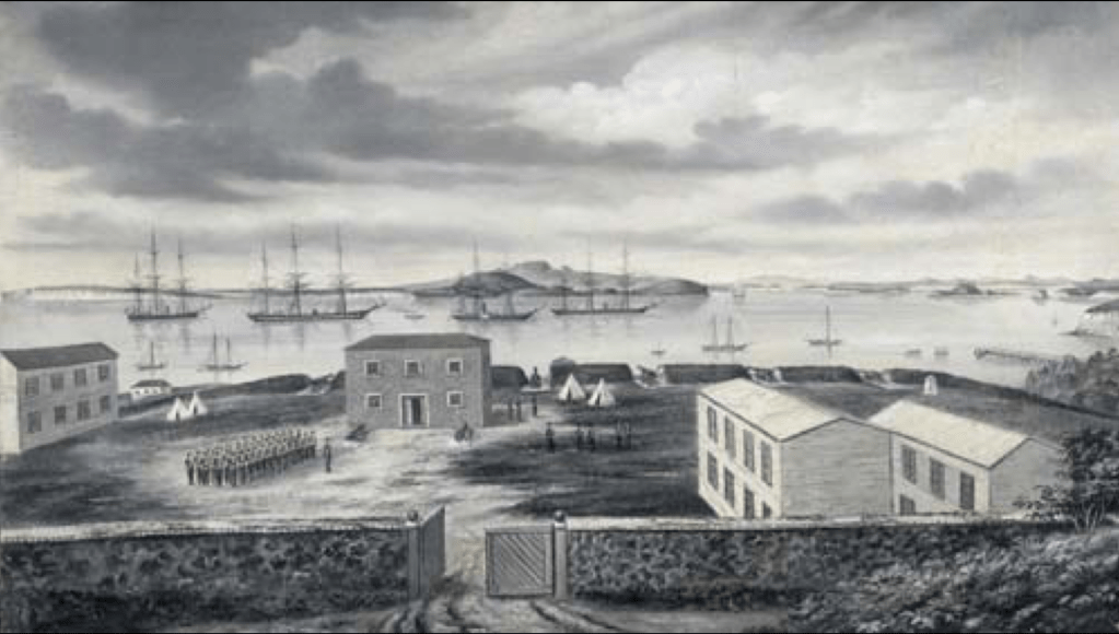
The land reclamations Britomart underwent overtime (starting 1859) were all to make Auckland Central more suitable and accessible to trading services. Fort Street was originally known as ‘Fore’ street and marks the original commercial bay shoreline. The site was a key landing point during Aucklands early settlement and played a key role as a trading centre. Surveyor General Felton Matthew provided allotments of reclaimed land to be developed on tidal mudflats of Commercial Bay in his first plan of Auckland. Fort lane was apart of the original plan, created to service warehousing at the rear of the buildings fronting Queen Street.
After considering the sites history in trading/service I decided to look into the modern day markets that inhabit Auckland City to see the way they interact with both site and community.
City Centre Market – Where fresh produce and community meet: The City Centre Market takes place from 8:30am-12:30pm each Saturday morning in the Ellen Melville Centre, Freyburg Place, High Street. The market focuses on bringing superb fresh produce to the heart of the city, for those living apartment buildings and who call the city centre home. In a community that predominantly walks everywhere, the desire to shop at the market without needing to leave the neighbourhood is part of the joy and convenience. Activating the local square and the community centre gives the opportunity for community connection and is an important part of the ethos and intent of the City Centre Market. Product wise the market aims to offer as many of the regular shopping items as possible so customers can have freshness, quality and a healthy dose of community connection to take home each weekend.
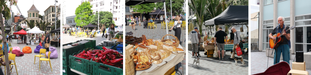
Auckland Night Markets: The Auckland Night Markets started in Pakuranga in 2010 and have steadily expanded and become a regular event in the Auckland regions across seven locations. The markets have grown overtime due to their appeal to all age groups offering plant of food, fashion and toys etc. Food is the big component as many different cuisines and delicacies from dozens of cultures are served. The atmosphere is alive with hundreds of people all meeting together to share food and family fun.

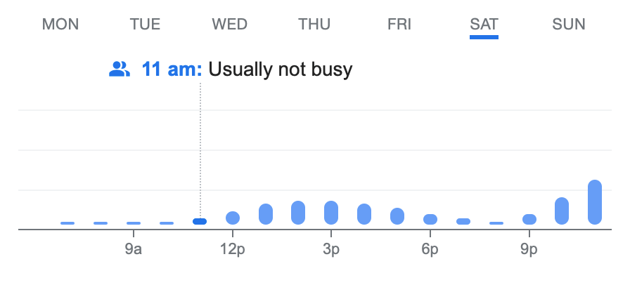
When I think of a market I tend to think of a Saturday/Sunday morning event that ends just after midday. I decided to look at the shops that inhabit the site of Fort Lane and surrounding lanes to see how busy they are at these times of the day during the weekend. This study has revealed that there is a real low in activity on Saturday and Sunday mornings. Queens arcade shows the most activity while most other surrounding businesses are either closed or not busy till later on in the day. This offers me the opportunity as a designer to make use of the space in times where it is less occupied, enhancing the Fort Lane precinct as a public space for people to enjoy.
Imperial Lane – Saturday 
Imperial Lane – Sunday 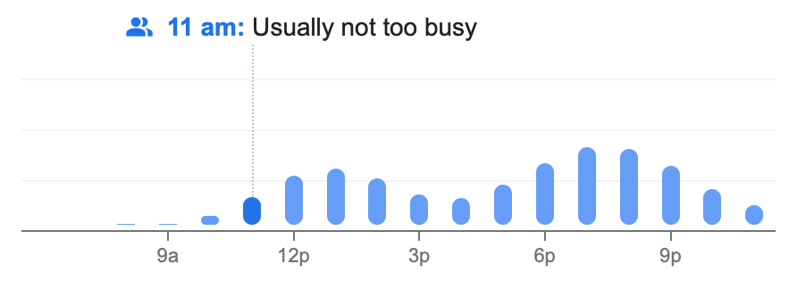
Snickel Lane – Saturday 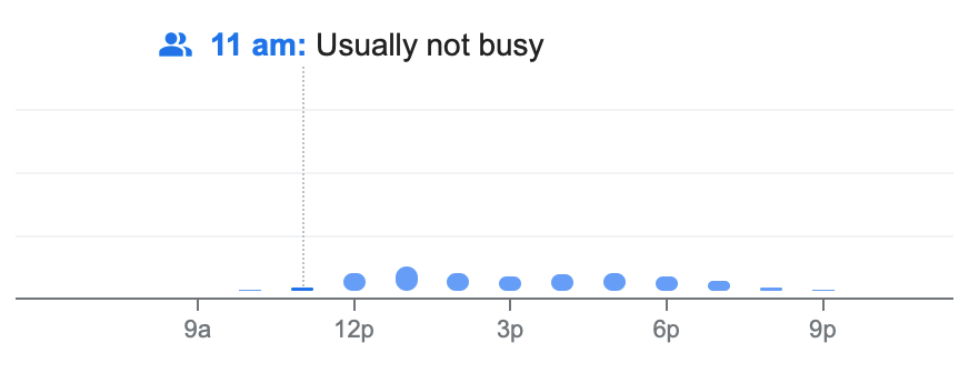
Snickel Lane – Sunday 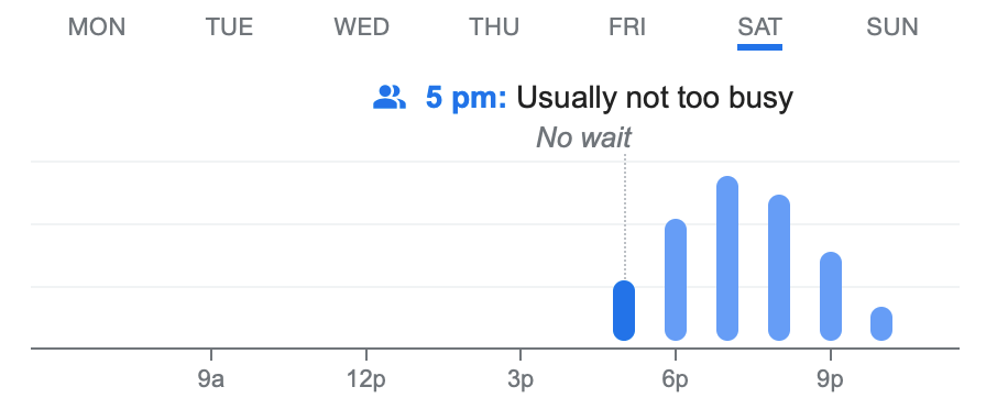
Angus Steak House – Saturday 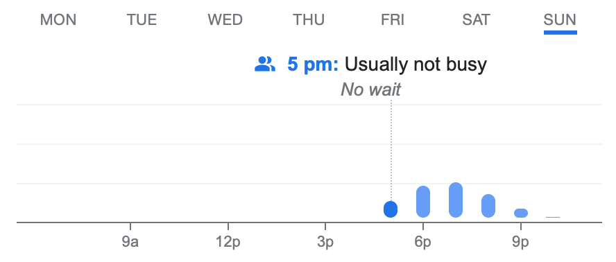
Angus Steak House – Sunday 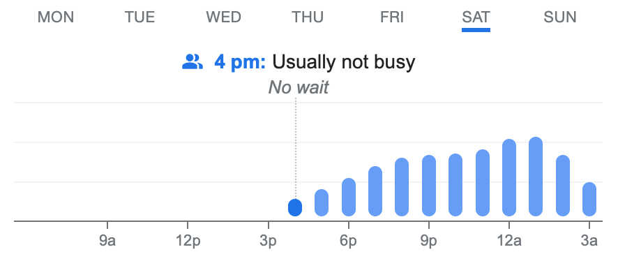
Everybody’s – Saturday 
Everybody’s – Sunday 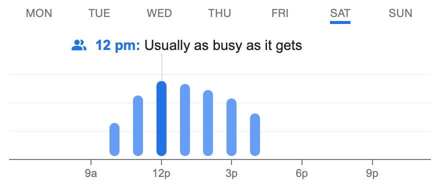
Queens Arcade – Saturday 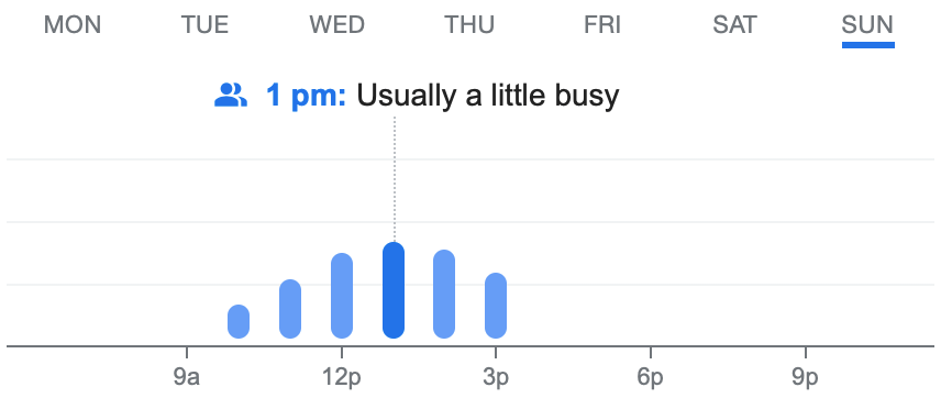
Queens Arcade – Sunday
Material Research:
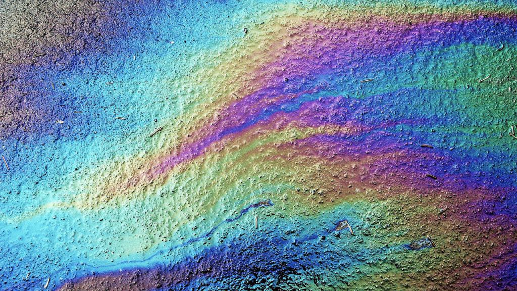
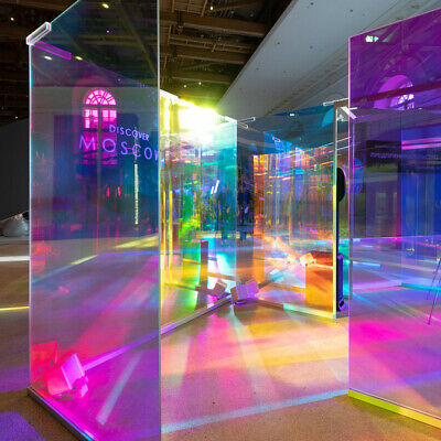
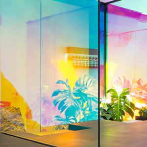
Iridescent – Iridescence is the phenomenon of certain surfaces that appear to gradually change colour as the angle of the view of the angle of illumination changes. Examples of this include soap bubbles, feathers, butterfly wings, some types of seashells and certain minerals. It is often created by structural coloration – microstructures that interest with light.
Structural colouration – Structural colouration is the production of colour by microscopically structured surfaces fines enough to interfere with visible light, sometimes in combination with pigments. For example peacock tail feathers are pigmented brown, but their microscopic structure makes them also reflect blue, turquoise and green light often making them iridescent. Structural coloration was first observed by English scientists Robert Hooke and Isaac Newton later explains by Thomas Young as wave interference. Young described iridescence as the result of interference between reflections from two or more surfaces of thin films, combined with refraction as light enters and leaves such films. The geometry determines that at certain angles, the light reflected from both surfaces interfere constructively, while at other angles, the light interferes destructively. Different colours therefore appear at different angles.
Thin Film Interference – Thin film interference is natural phenomenon in which light waves reflected by the upper and lower boundaries of a thin film interfere with one another, either enhancing or reducing the reflected light. This explains the multiple colours seen in light reflected from soap bubbles and oil films on water. It is also the mechanism behind the action of antireflection coatings used on glasses and camera lenses.
Pearlescent Coating – Pearlescent coatings or pigments possess optical effects that not only serve decorative purposes (such as cosmetics, printed products, industrial coatings or automotive paints), but also provide important functional roles, such as security writing or optical filters.


After broadening my knowledge on iridescence and they ways in which the phenomenon works I began to wonder how this material quality could be applied to built structures. Is it possible to achieve this look through strategic design? From this thought I set about researching architectural materials that generate this colourful effect.
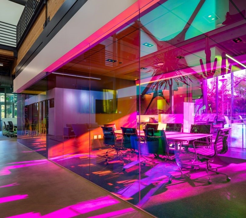
Dichroic Glass – Dichroic glass is glass that displays one of two different colours depending on lighting conditions. It is a modern composite non-translucent glass that is produced by stacking layers of glass and micro layers of metals or oxides which give the glass shifting colours depending on the angle of view, causing an array of colours to be displayed as an example of thin film optics. As a material, dichroic glass is transparent, rigid, stable and is able to withstand a range of temperatures. The glass is not affected by moistures, solvents or most acids as the materials proceeding the filter are actually more stable than most glasses used as the substrate.
Iridescent/Pearlescent Ceramic Tiles – Pearlescent ceramic tiles create a subtle yet eye catching shimmer of colour that change under different lighting conditions. The tiles are often hand glazed and made by applying three layers of glaze onto the ceramic base. Every tile is fired at three different temperatures which result in the magnificent spectrum of colours that respond to light.
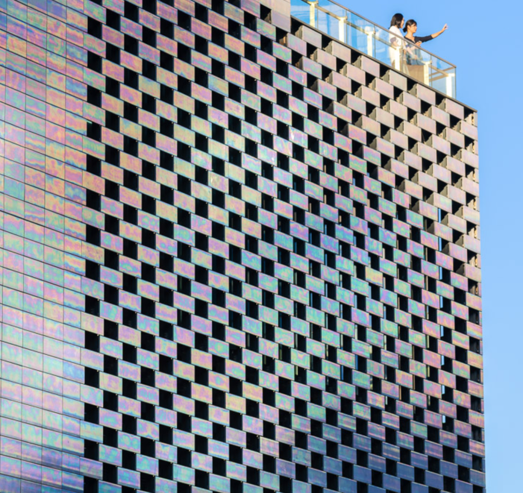
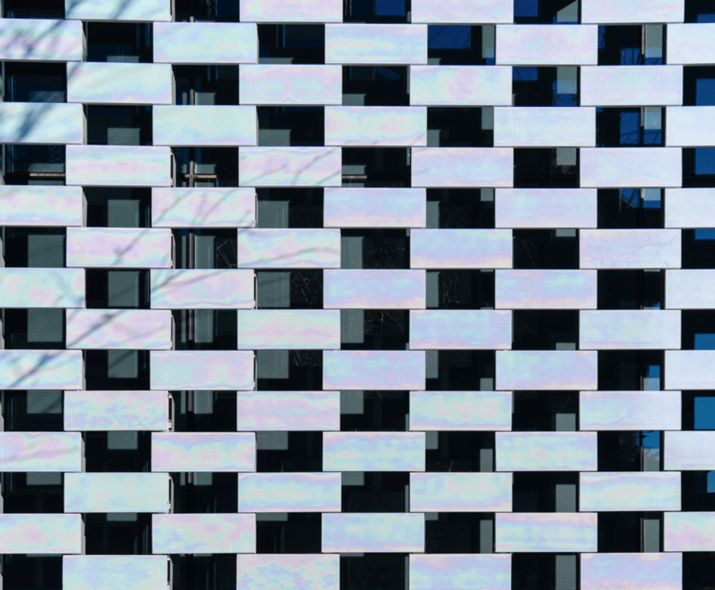
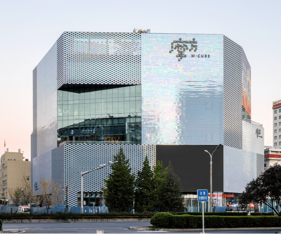
Iridescent/Dichroic Foil – Iridescent foil is a varicoloured foil transforms the space with sun-reflecting panels. Most often applied to both interior and exterior glass cladding the foil is comprised of dichroic film with specialised crystals that allow for its reflective properties.
Week 5: Formative Assessment

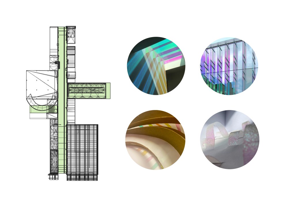
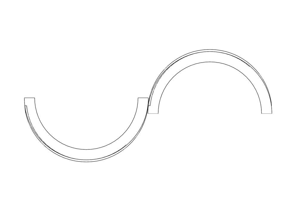
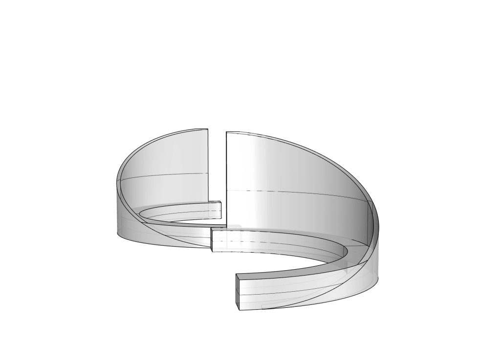
Script: The focus of my project so far has been driven by the cinematic terms of framing and perspective in relation to the Fort Lane site and the ways in which these viewpoints transition through interaction with colour and a play on both depth and vertical height differences. I am aiming to transform the Fort Lane precinct into a multifunctional public space capable of hosting weekly markets for local communities to connect with one another building upon the site’s history in trading and service. My studies of Fort Lane began through the vertically stacked coloured lens of my cinematic device. From this exploration I became intrigued by the ways colour was able to break down segments of the site, similar to that of a film strip, drawing focus to both elements in the foreground and background, playing on the eye’s perception of depth. My initial concept models entertain the concept of depth as I explore the ways in which translucent colours merged to create new tones from all angles dependent upon the way you view the model. My interest in the term depth led me to search for ideas that relate to the concept. I came across the term ‘chasm’ meaning a fissure in the earth’s surface as well as the difference between viewpoints and feelings. I instantly made a visual connection between chasms and Fort Lane and found myself drawn to the gap as I started to think about how I could embrace the space between. My next model took on more of a chasm like form while still communicating my ideas around vertical framing and colour. The tall sweeping curves with windows of colour present you with guided pathways through the space leaving room for further development. My final surface design plays with the relationship of light and shadow and the ways that colour can produce more that one surface through reflection. I decided to start experimentation with iridescent material to see how it reacts in both direct and indirect sunlight, as well as shadow. This experiment sparked my interest in the use of iridescent material and how I could apply the effect to larger scale structures. I have begun research into types of films, tiles and glasses that achieve colourful results in all lighting conditions. I think this is an interesting idea to work with as it relates to my initial focus of perspective and interaction with colour as the hues of iridescence change from different angles and light conditions. I am thinking of working with the three lanes situated within the site, Fort Lane, Imperial Lane and Snickel Lane to bring each of the ‘gaps’ to life with colour and activity. A variety of small business owners would be given the opportunity to provide service to customers in a location where larger big branded stores are more dominant. I have begun some simple sketch designs of potential pod-like structures that would fill the lanes. I would like these pieces to be both sculptural yet still functional for a market stall to inhabit.
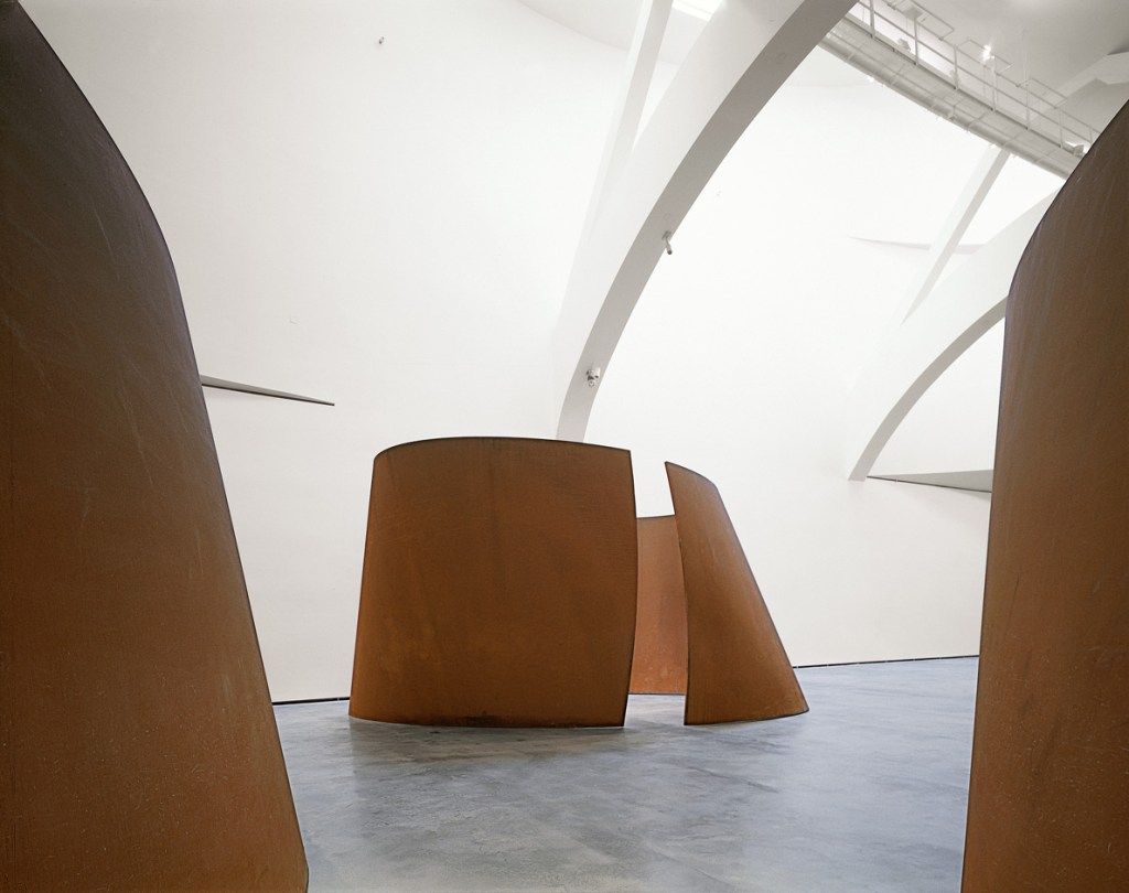
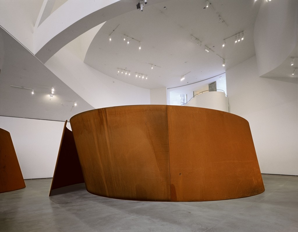
Feedback: The feedback I took away with me from my presentation was to begin to take into consideration the functional aspects of a market space. How can the sculptural pieces I drafted be used in a practical way as stalls for vendors to use. It was said that some of my models to date had traits of Richard Serra’s sculptural pieces. Nooroa mentioned experimenting with the thought of modular design, creating pieces that could perhaps be changed and altered to fit a variety of products and functions.
Week 6: Storyboard
In film, a storyboard is a sequence of drawings, typically with some directions and dialogue. The series represent an order of planned shots for the film/television production. In terms of our current brief we are to produce a storyboard of sketches to depict key moments of our design, showing important changes and views of the space. This visual sequence will help to pre-visualise the overall atmosphere of the design.
One on one review: When speaking to Chris we discussed coming up with a specific market type/over arching concept to drive my market design. Perhaps it would tell something about the site, about a specific community or a specific product. By defining a particular approach the to the market design it will be easier to have a flow on effect into shapes, forms and materiality of the project over all. It will also help with determining temporal spans of the markets and locations of the stalls.
Below I began to brainstorm specific ideas around the concept of my market. I thought about the site from a range of different viewpoints and times in history to ensure I covered all the points of interest I’d discovered so far.
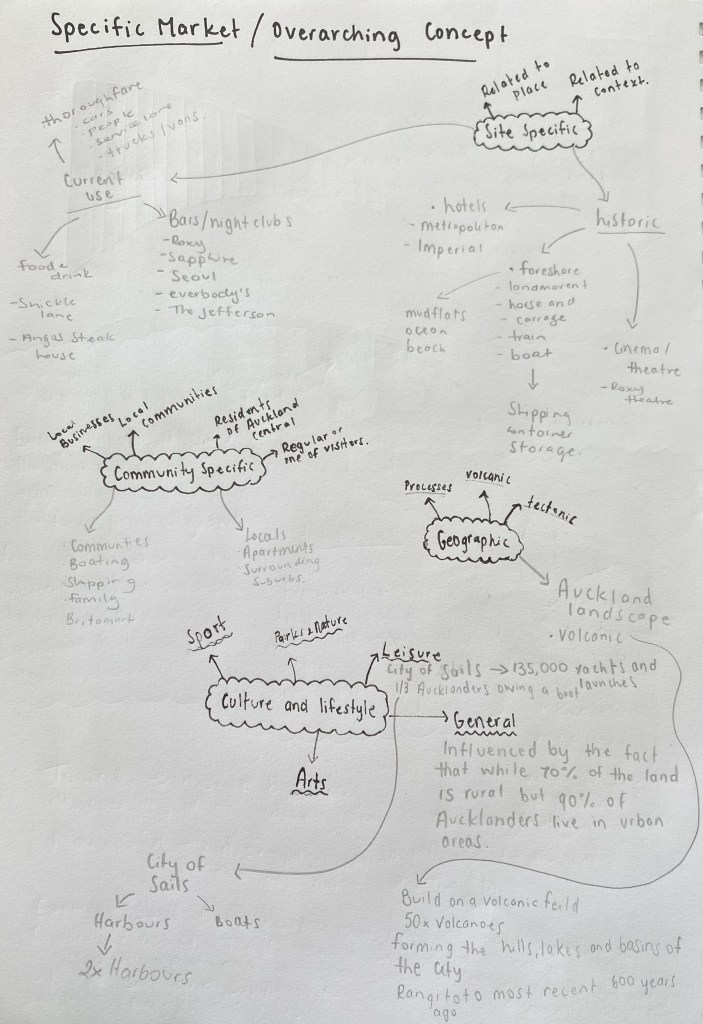
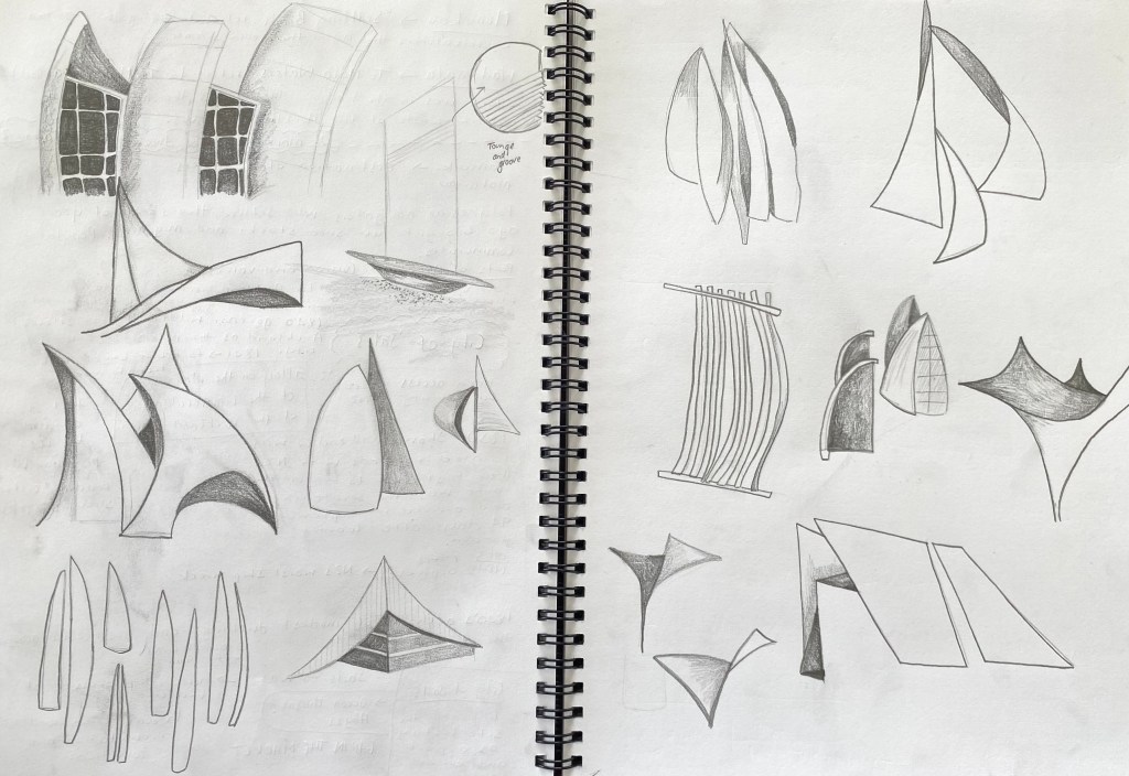
Research around the sites history as the foreshore and trading background I discovered that Fort Street was originally used as an area for shipping container storage. Boats themselves are a huge part of Aucklands history and to this day play a huge role in the transportation of both people and goods in and out of the Port of Auckland. This sparked an idea that Auckland itself is seen as the city of sails for a number of reasons here in New Zealand. I thought this could be an interesting concept to explore and put a specific driving theme into my project. I began some background research on this idea and sketched some rough shapes and forms that I could incorporate into the markets.
Research:
Urban, community based projects / market places.
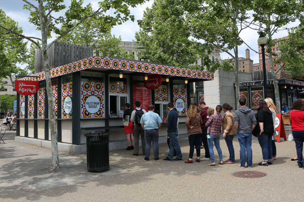
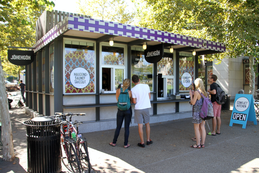
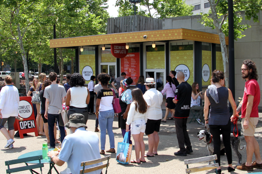
Conflict Kitchen – Pittsburg, United States: Conflict kitchen is a restaurant that serves cuisine from counties with which the United States are in conflict with. Each iteration is augmented by events, performances, publication and discussions that seek to expand the engagement the public has with the culture, politics and issues at stake within the focus region. The restaurant rotates and changes its identities in relation to current geopolitical events. Conflict Kitchen uses food as a way of teaching different communities about a variety of cultures to generate conversations that look outside of the narrow lens of media headlines. Design wise I admire the way the restaurant takes on a new look depending on the current country theme. The colours and patterns change to represent the country in conflict at the given time. This idea of different cultures and communities coming together is often apparent in markets around the world where multiple cuisine’s and goods are sold in one area. This offers the opportunity for a mixture of people to connect through food and fun. The notion of community is something I wish to consider for my design as Auckland is made up of a diverse range of cultures. Creating a design where everyone feels comfortable and included is important for public spaces.
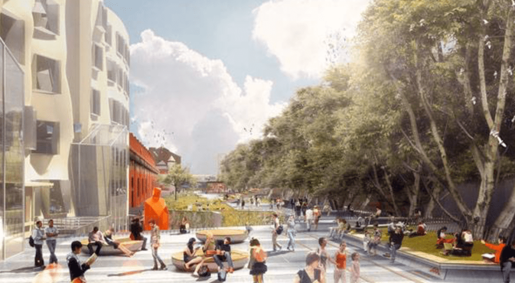
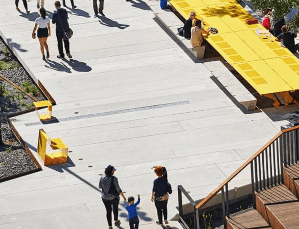
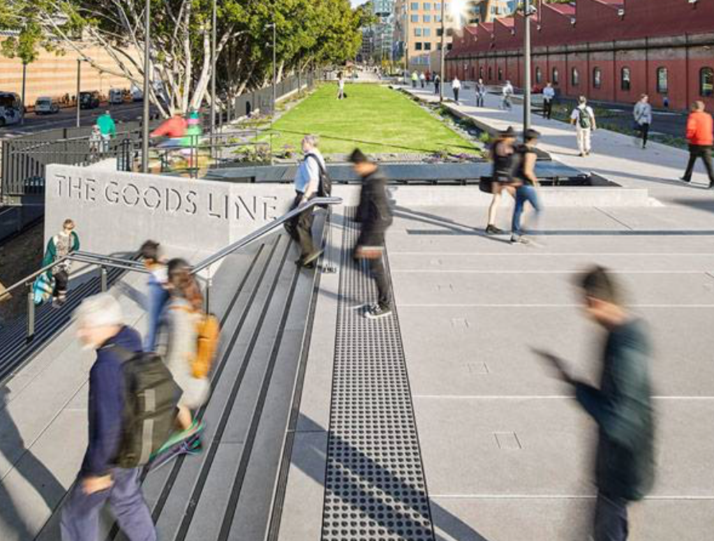
The Goods Line – Sydney Australia: This innovative, elevated park has been created along a stretch of abandoned Railway that connects to the Railway Square at Darling Harbour in Ultimo, Sydney. The Goods Line has become a focal point of the city by pushing people to stop and socialise. There are several ‘social infrastructures’ that facilitate socialisation and the sharing of space including areas with Wifi, children play areas, table tennis tables and seating areas. The Goods Line is also a metaphor for the social and economic transformation of Sydney from an industrial city to a modern knowledge economy. I found the concept of ‘social infrastructures’ particularly interesting as I consider the current Fort Lane site as an in-between space that the public travel through. How could the use of social infrastructures change the use of Fort Lane, creating a public space that acts as a destination rather than a part of ones journey. I found the story of the site engaging as what was once a conduit for trade has now been reinterpreted to carry the precious cargo of a thriving neighbourhood: culture, creativity and community. This notion of thinking can be applied to my own project as I think about the ways a market can enhance ones experience of public space.
Week 7: Communicating Design Narratives
To begin the week we were introduced to two projects. The Rejuvenation of Shajng Ancient Fair by ARCity Office and the art project event, Luminosty by Marina Abramovic. From these projects I noted down some of the key points that were spoken about that I felt were relevant to my current project.
- New ways of viewing an old site (Contrast, textures, ambient spaces).
- How to create beautiful spaces when the event is not there.
- Branding of event.
- How to talk about the project in terms of identity
- Material Detail, moulds, day & night, systems of movement, animating the space.
- Temporary design within permanent built environments.
- How does the program manifest.
- How does the public know its taking place.
- Practical elements (How do people move through the space, heights, age, gender, toilets, rubbish bins, seating, tables.
- Social dynamics, character journeys.
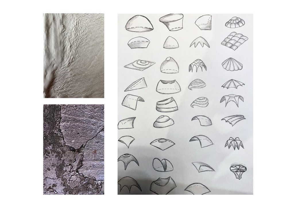
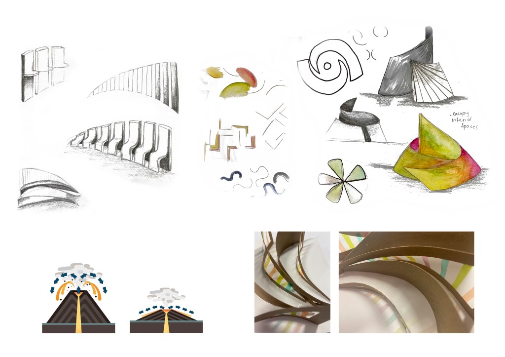
This week I focused on refining my overarching concept to help progress functional aspects such as specific locations, shapes, temporal elements and business ideas. After exploring the idea of the ‘City of Sails’ last week I found myself stuck with where to go next. Though I found the concept interesting and history of boats in the region of Auckland exciting I didn’t feel inspired to continue with the idea. After reading through my feedback from Chris and discussing my project so far I decided to look back at my temporal language of ‘Fault-line’ ‘Fracture’ and ‘Rift’ to see how I could incorporate this geographic/ecological thinking. Due to background knowledge of geography specifically to do with volcanic processes I began research into the Auckland Volcanic Field. I found this research intriguing and was able to make connections between the Volcanic field and how I could use the concepts in my own work.
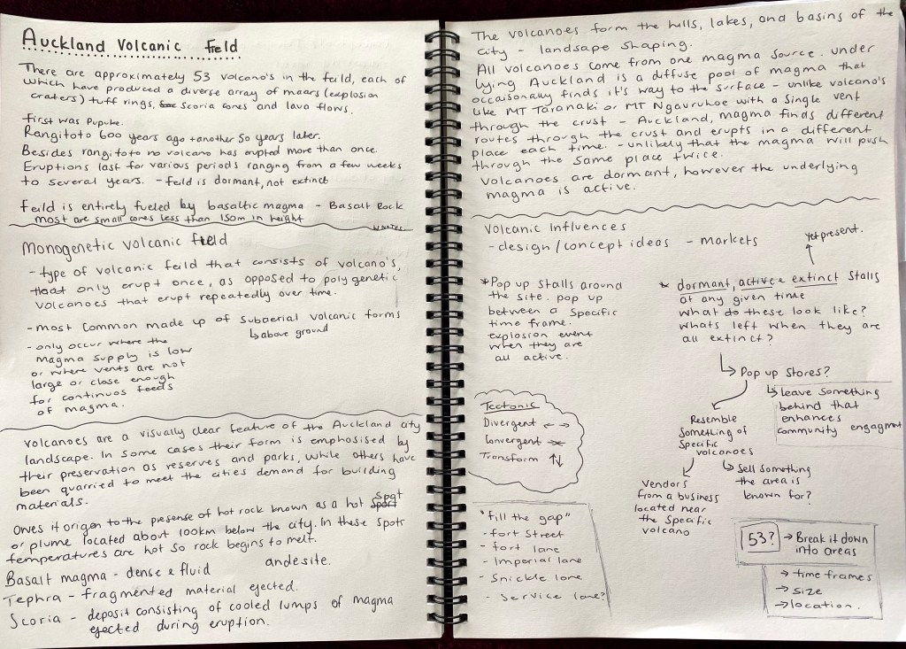
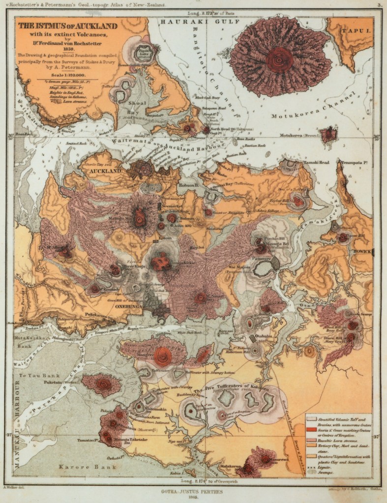
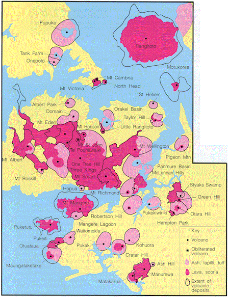
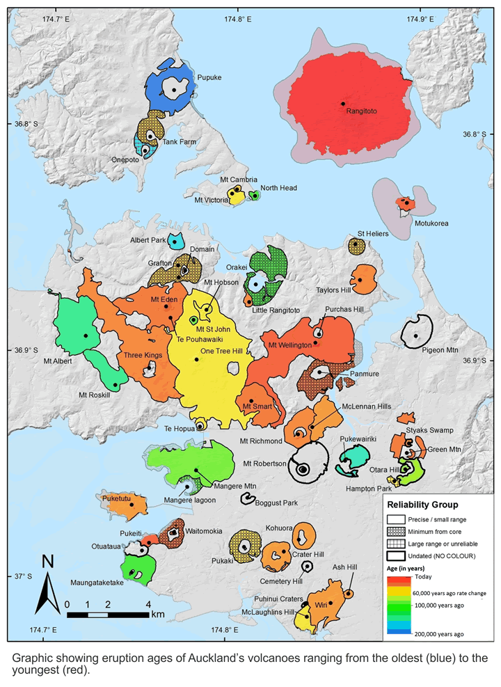
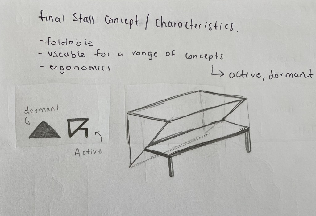
At this stage in my project I am thinking of designing a series of pop up markets. I am inspired by the fact that the Auckland Volcanic Field is a monogenetic volcanic field meaning that each cone will only erupt once (with Rangitoto being the exception having erupted twice). This made me think that the stores would act as pop up stores and remain open for a given time (times to be determined). I then thought that there could be stalls that are considered active, dormant and extinct at all times and what would these look like? Perhaps each stall goes through changes to resemble these volcanic stages. Once extinct what could be left behind?
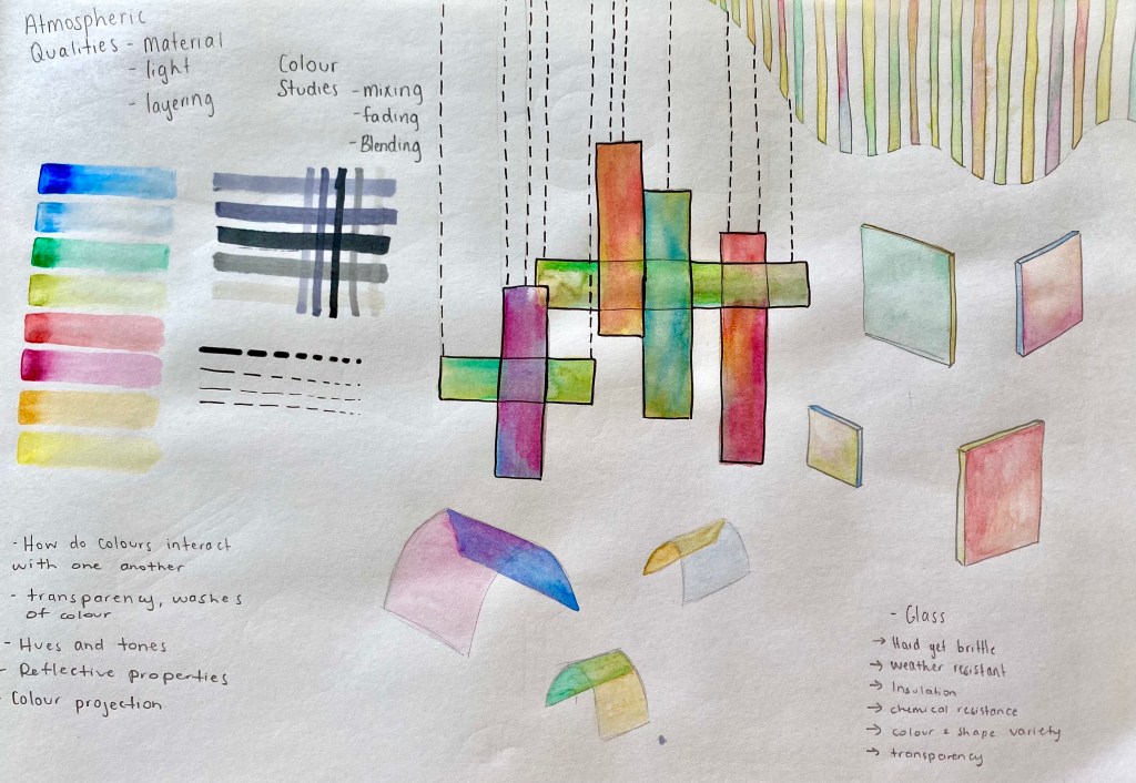
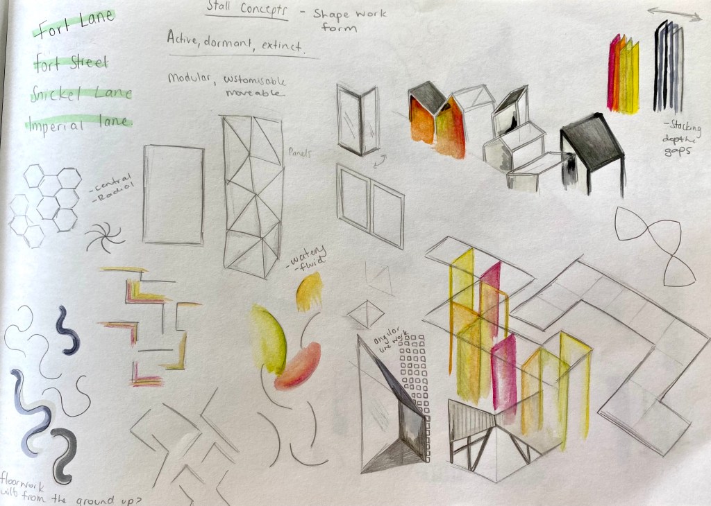

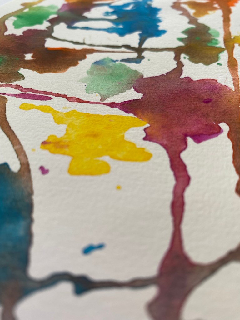
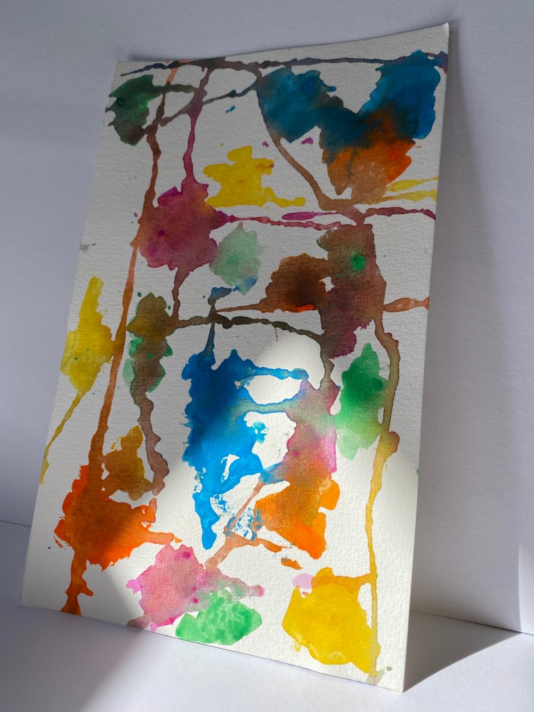
I find sketching and playing with colour, shape and form an effective way of creating and refining my ideas. After developing these rapid fire sketches I still feel slightly unsure about the actual structure I want to design. Whether it’s a series of pop up stall that are removed from the site or if it’s a permeant structure that market stalls can inhabit. Perhaps something moveable/adjustable to fit the needs of different vendors. I chose to apply colour to a variety of the sketches to get a feel for the ways colour may interaction with the range of shapes and forms. I enjoyed the fluidity of the colour as used watercolour to achieve a semi-transparent look. I think the next step I need to take is to develop a series of floor plans that communicate specific design locations and layouts. This will help me begin to determine the final structures as well as the variety of temporal qualities I wish to explore.
Sem Break: Developing ideas
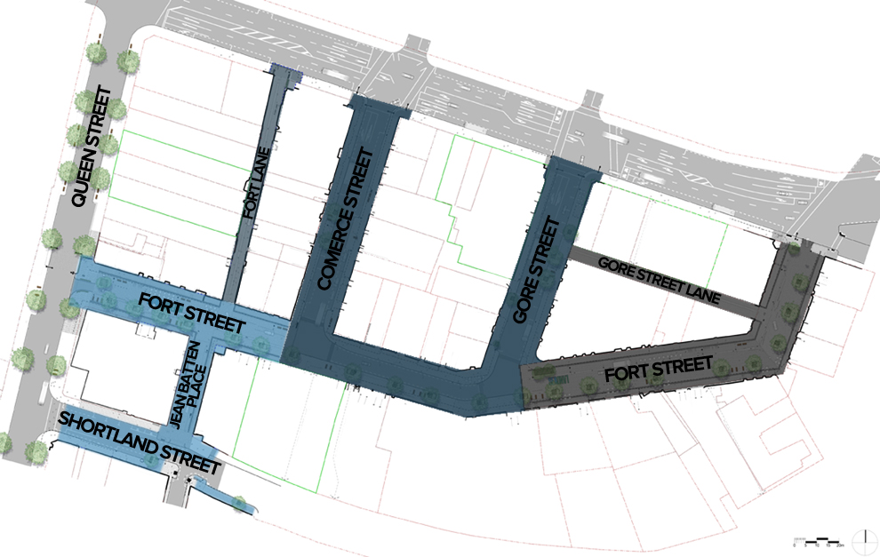
Specific Site – Fort Street.
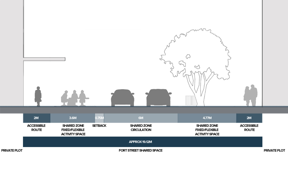
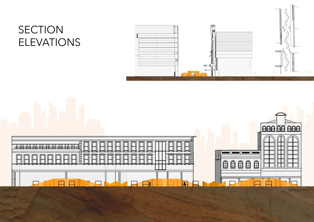
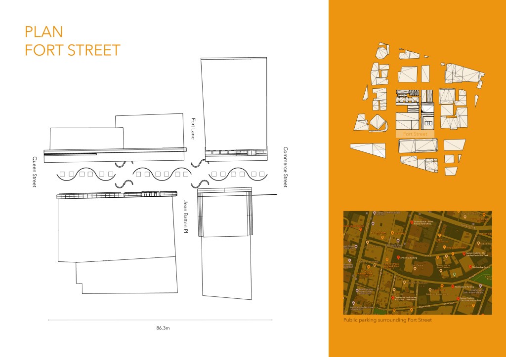
Fort Street showcases the important role shared surfaces can play in using street space more efficiently to create new destinations and improved economic performance for adjacent businesses. Fort Street has been widely acknowledged as an international exemplar of ‘shared space’ and since its completion has delivered a massive uplift for businesses in the neighbourhood. The term ‘shared space’ refers to the approach of removing any clear demarcation between vehicles and pedestrians, prioritising the pedestrian and enabling them to share the street in a more equitable and efficient manner.
Fort Street is one of the several new ‘shared spaces’ implemented in Aucklands CBD in recents years to enhance pedestrian connectivity and provide much needed additional outdoor space for adjacent businesses to capitalise on the underused street space. The work began in 2009 and was carried out in three stages between 2010 and 2013. The project worked to remove conventional curbs and installed a single level paving surface across the full width of the street to create the shared space.
Research:
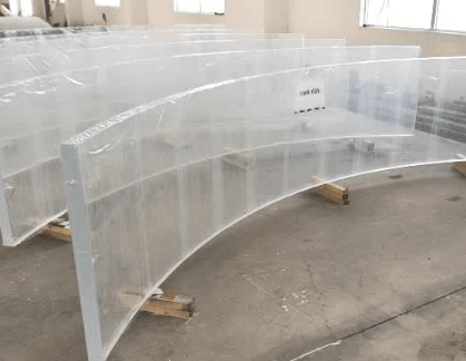
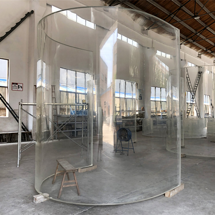
Material – Perspex: A solid transparent plastic made of polymethyl methacrylate. Considering the use of perspex as opposed to glass for the sculptural pieces could result in a better material choice in terms of safety and durability. Glass could be easily shattered and potentially chip so I will need to take this into consideration as the materials will need to be well suited to space open to the public at all times.
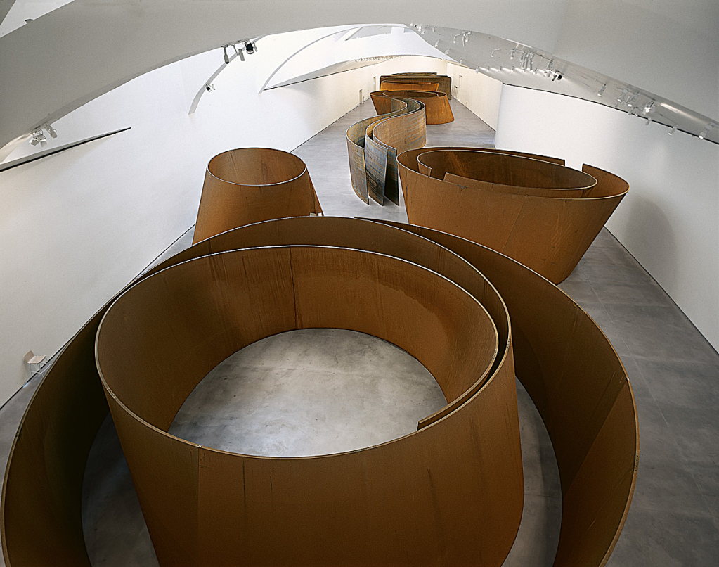
Richard Serra is an America artist most well known for his very large, self supporting minimalist sculptures often made of weathered sheets of steel. His large scale abstract sculptures have a substantial presence that forces viewers to engage with the physical qualities of the works and their particular sites. It was recommended that I take time to look through Serra’s works as some of my earlier concept models took on forms that were similar to the shapes of the sculptures. I was particularly drawn to Serra’s project ‘The Matter of Time’. This sculpture allows the viewer to perceive the evolution of the artist’s sculptural forms, from the relative simplicity of a double ellipse to the complexity of a spiral. The entire room is part of the sculptural field – this made me think of the ways I could create cone like forms to resemble that of the volcanic field I am interested in.
Model Experimentation
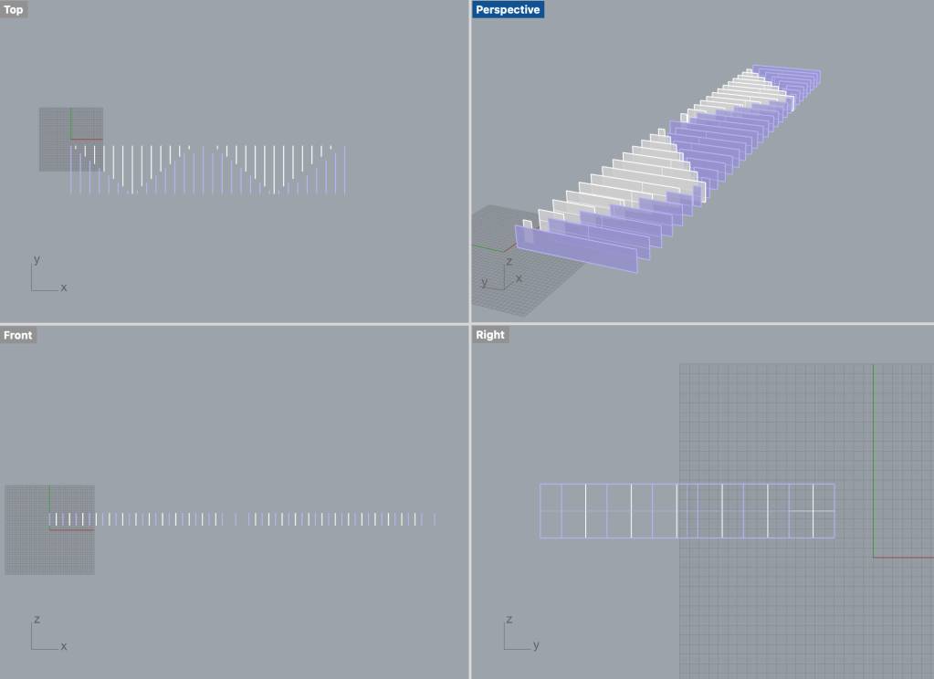
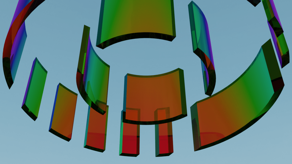
I spent some time developing a model of Fort Street that enabled me to create a series of test models to help my understanding of scale and how my ideas would appear visually within the site. I worked towards designing possible structures that would fill Fort Street that left gaps for market stalls to inhabit. I decided to also experiment with blender to create iridescent glass panels. I noticed that perhaps in order to get more of a range in colour from each angle that the pattern may need to be angular or curved so that each panel picks up light from a range of angles to display different colours. While working I also thought that this initial pattern came across as slightly crowded and would not effectively be able to host a market. More space between each panel and better paths through the glass will be needed to ensure crowds can move through the space efficiently.
Anglular and circular shape material testing: As seen in the experimentation below both the angled and circular forms create more of a colour difference from all points of view compared to the straight panels. I personally like the look of the curved test model and with inspiration from Richard Serra’s work am now wanting to create a series of volcanic cone inspired shapes for individuals to move through.
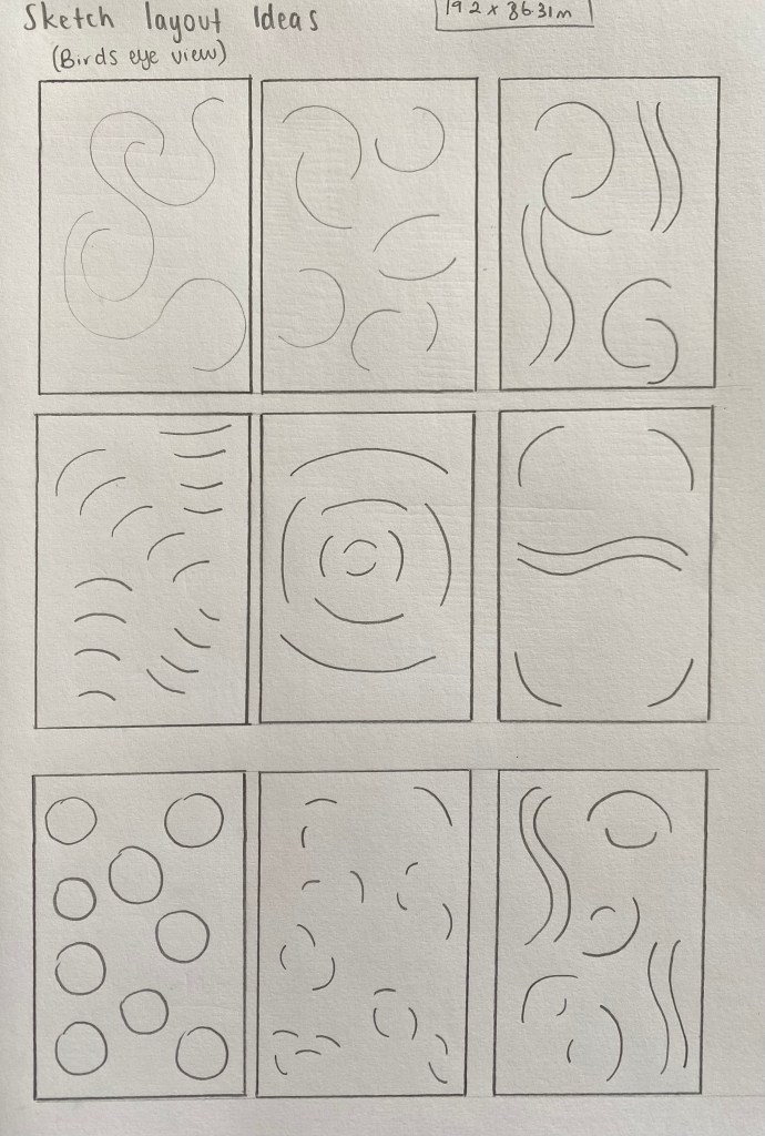
Sketch Layouts:
Week 8: Detail
How will my design create a sense of public space:
- Mix of Activities – Attract more people to a site by introducing activities that appeal to a range of audiences. The right combination of businesses and activities has the power to activate a neighbourhood around the clock. My research has shown that this effect is more likely to happen in mixed-use environments, ones that have a mix of residential areas, restaurants, offices and shops in close proximity to one another. This creates a lively environment and keeps the site activated for a large part of the day.
- Local Pride – Creating a sense of community by clearly indicating public spaces and encouraging people to use them actively. Environments that bring people together give the community something to be proud of and increases a sense of responsibility and guardianship for the space.
- Connected Streets – To get more people to use public spaces, it is important that they can easily be reached by users. Safe access ways and pathways need to be designed. They should also have multiple entry and exit points allowing people to move freely and not feel funnelled by their surroundings.
- Quality Space – Attract people to public spaces through designs that are enjoyable and maintain a high level of quality through time. People want to spend time in places that are thoughtfully designed and built to a high standard. By bringing people together, quality environments can also help to build communities that take pride in their space.
Sculptural pieces (permanent)
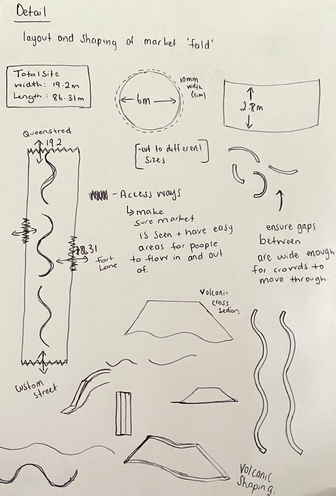
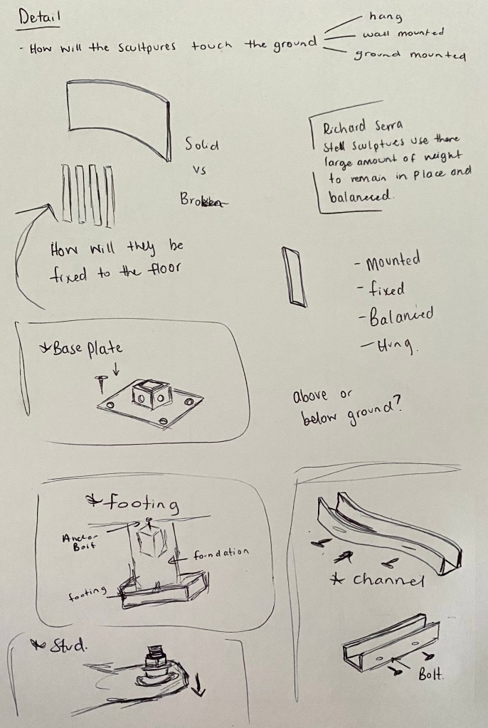
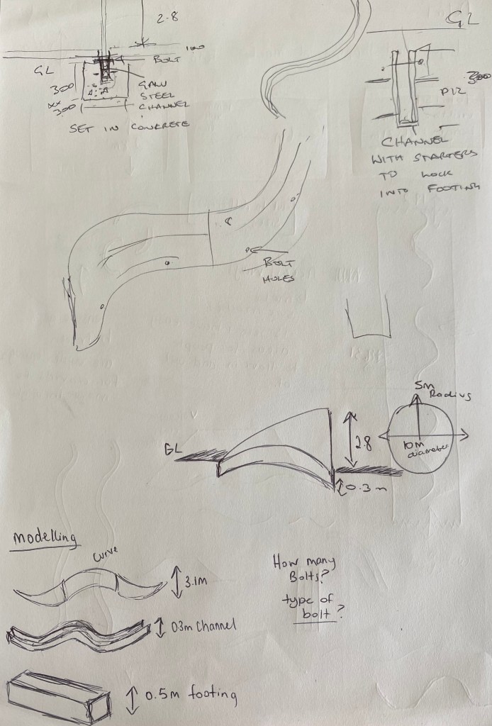

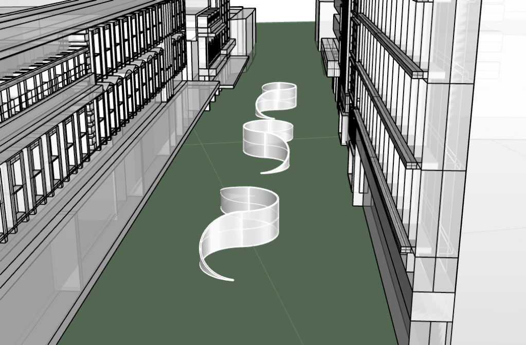
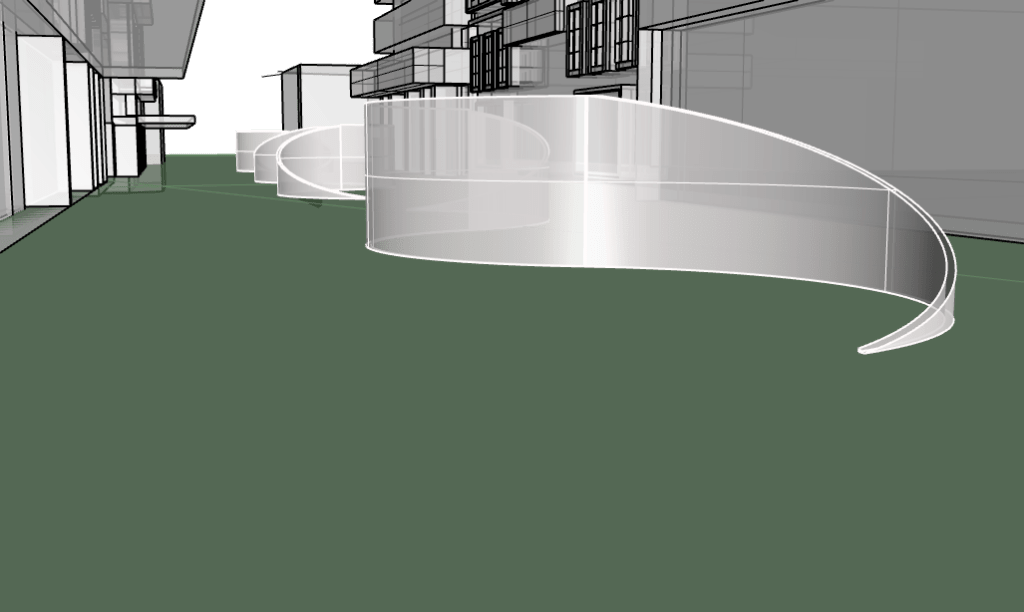
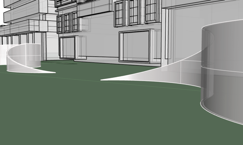
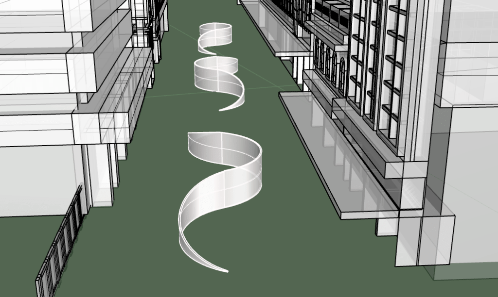
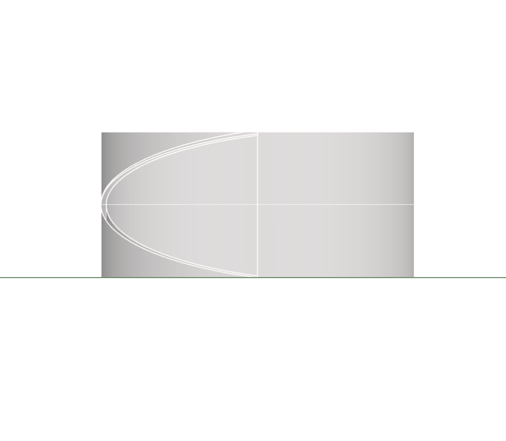
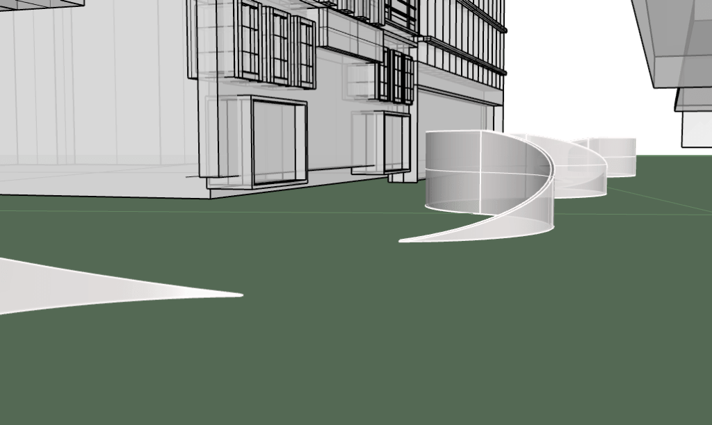
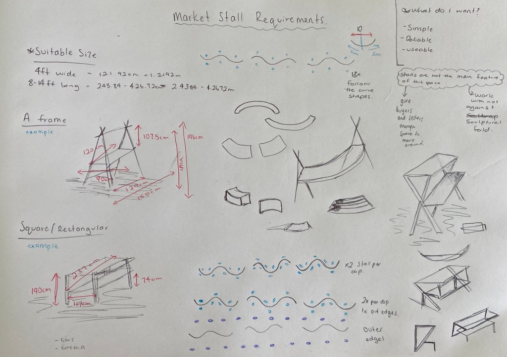
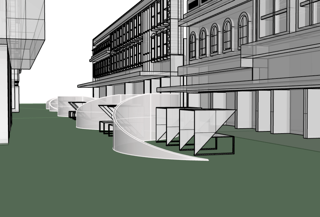
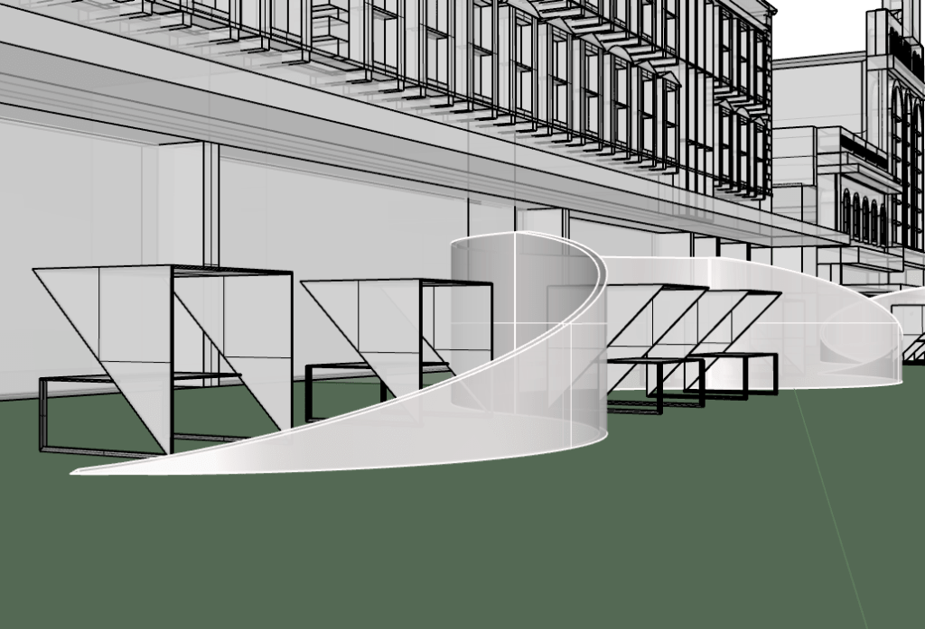
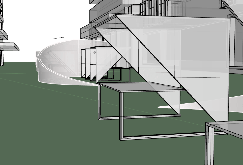
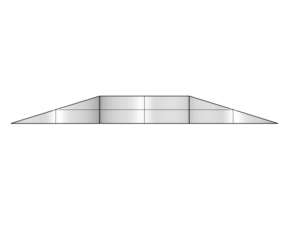
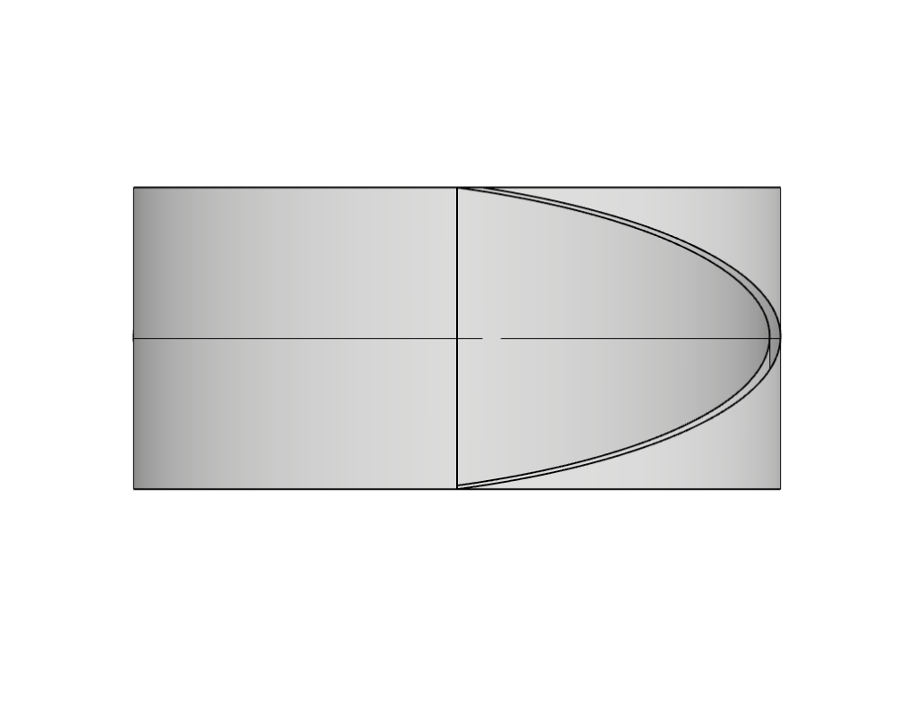
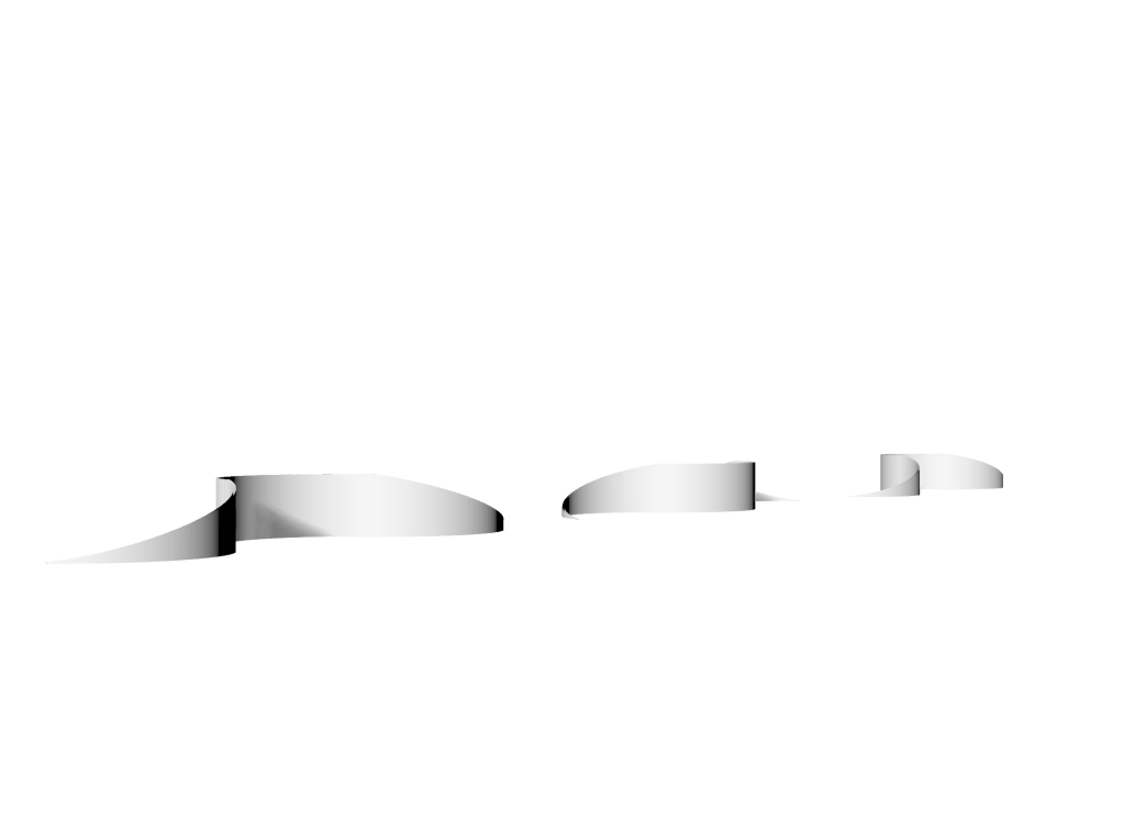
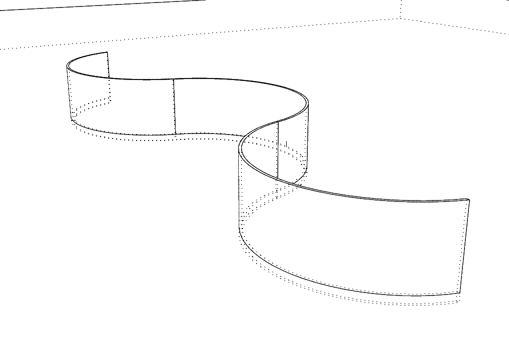
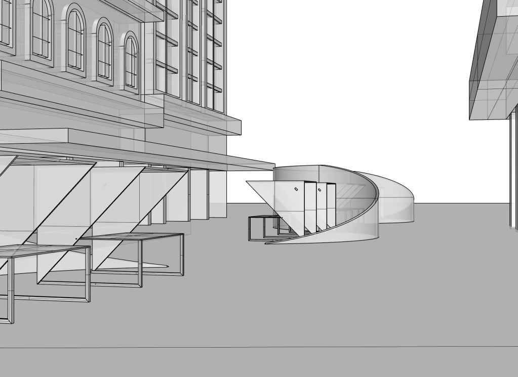
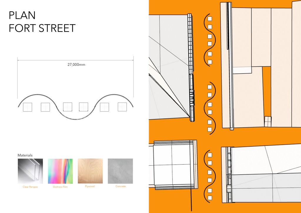
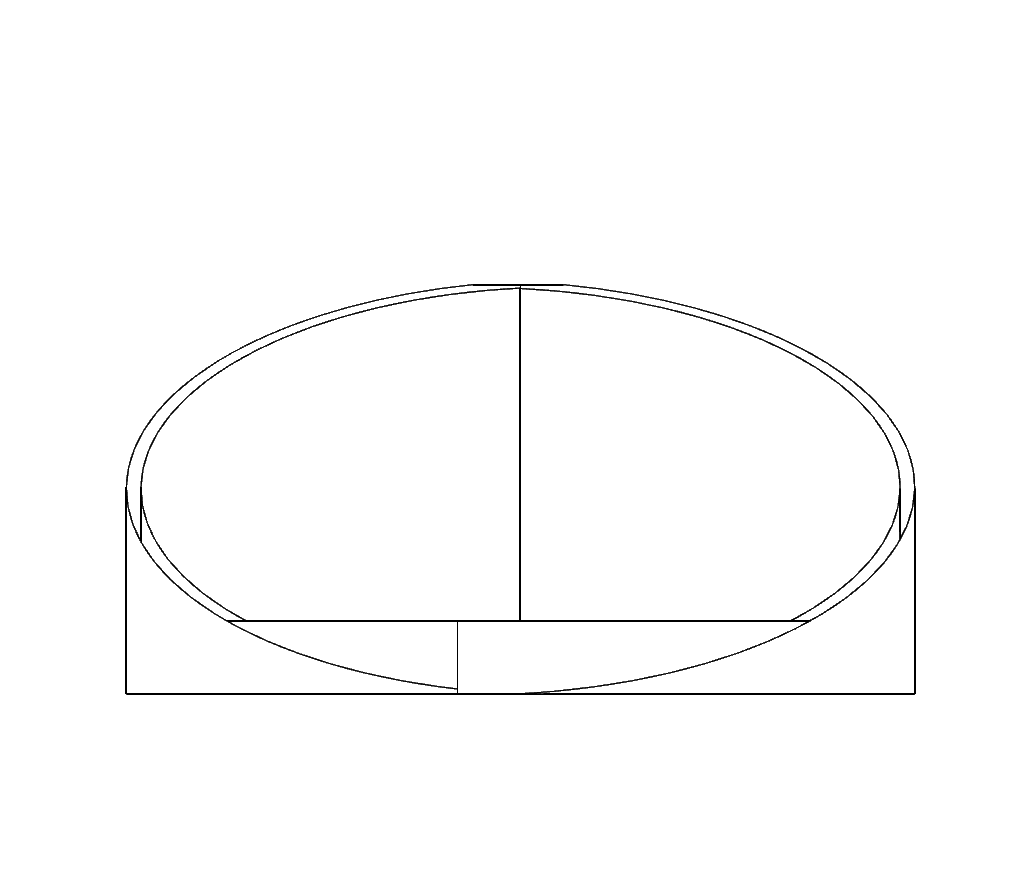
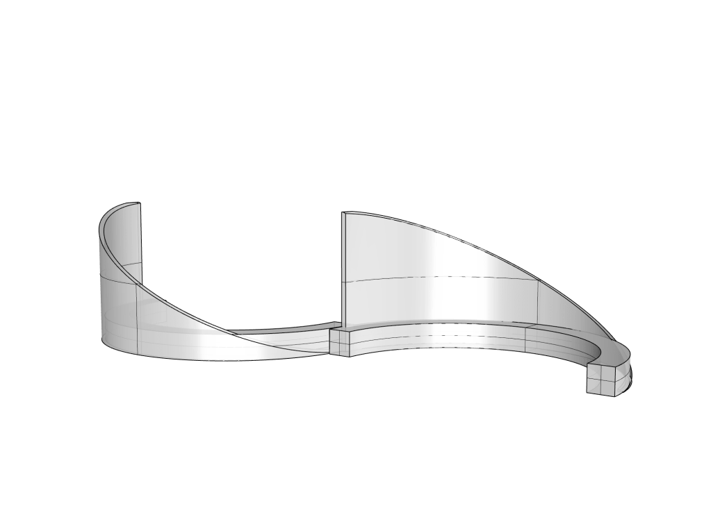
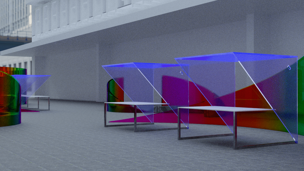
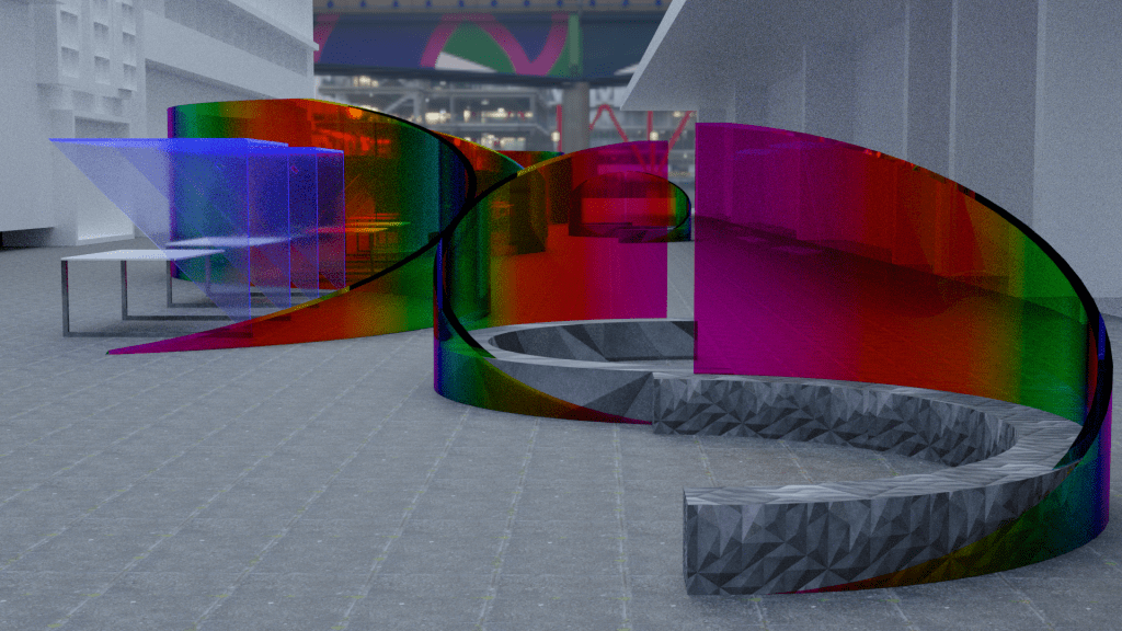
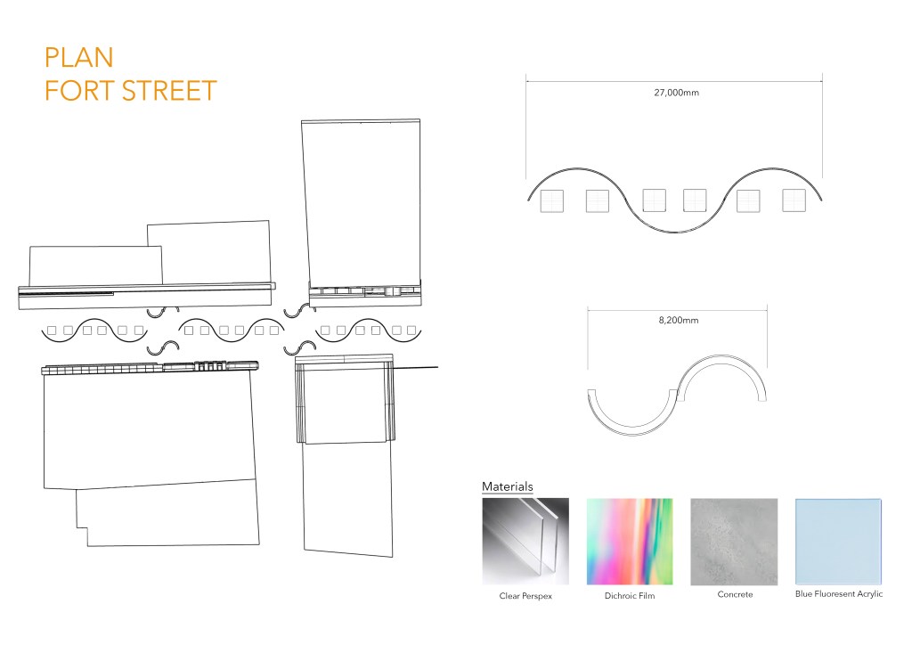
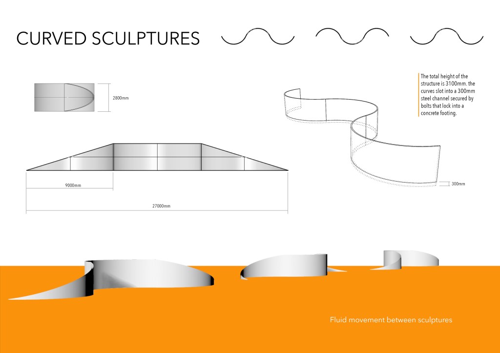
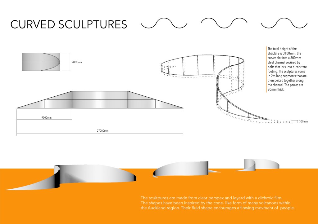
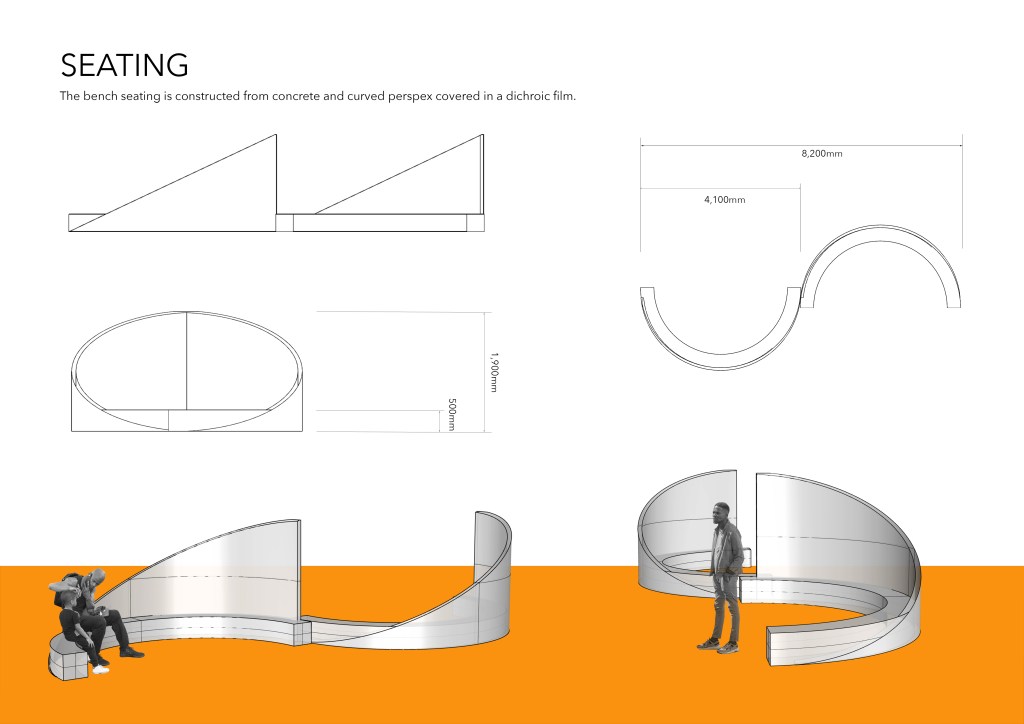
My first iteration consisted of curved sculptures with the half circles that have a 6m diameter. I did like the concept however I felt that the 6m curve was to narrow all all three sculptures didn’t span the length of Fort Street the way I would have liked. Because of this I developed an iteration with the curves that had a 10m radius. I cut the curve so that the length between the edges was 8.9m with the overall length of the sculpture being 27.2m. This new size allows for more space within the curves for stall to occupy.
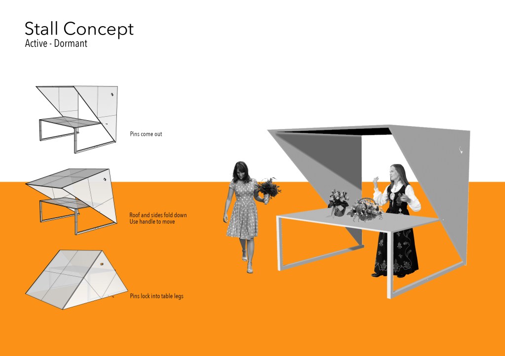
Stall Concept
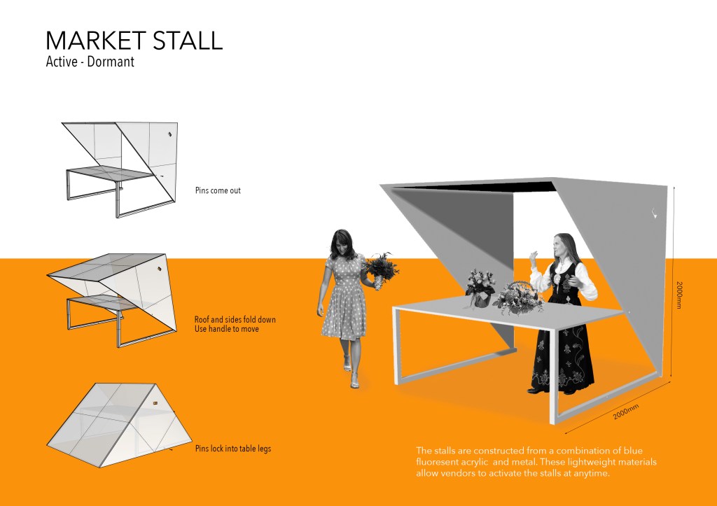
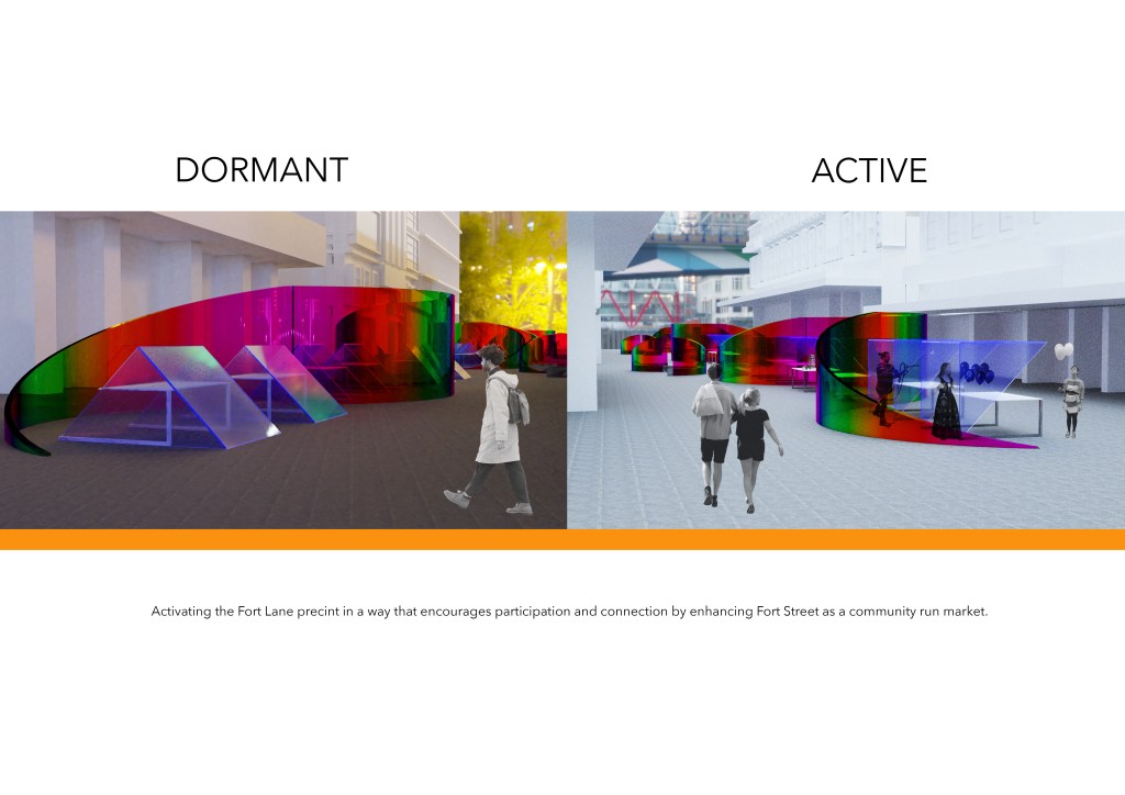
I have been working to develop a stall that has an active phase and a dormant phase. This means that vendors can change the stalls themselves from dormant too active when they want to use the space. At this point I have developed the stalls below.
Week 9: Design Development
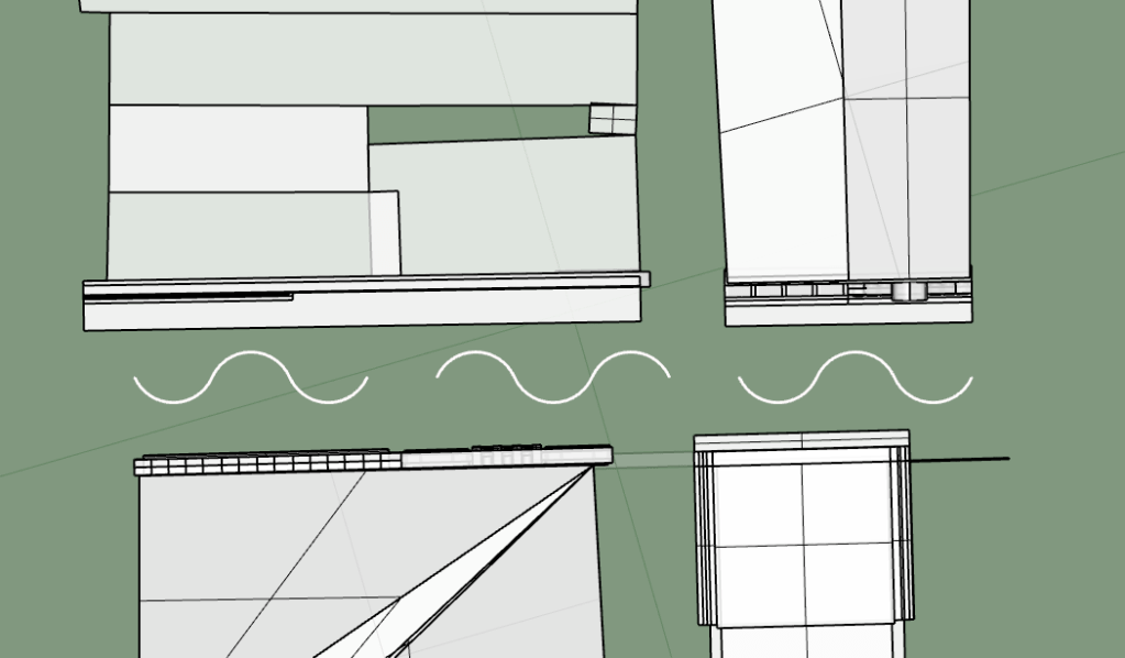
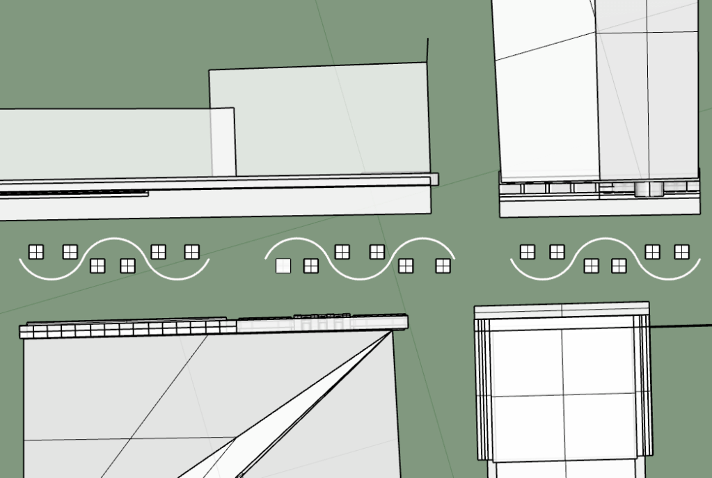
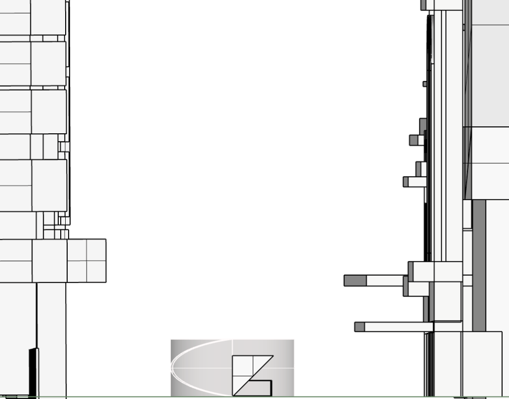
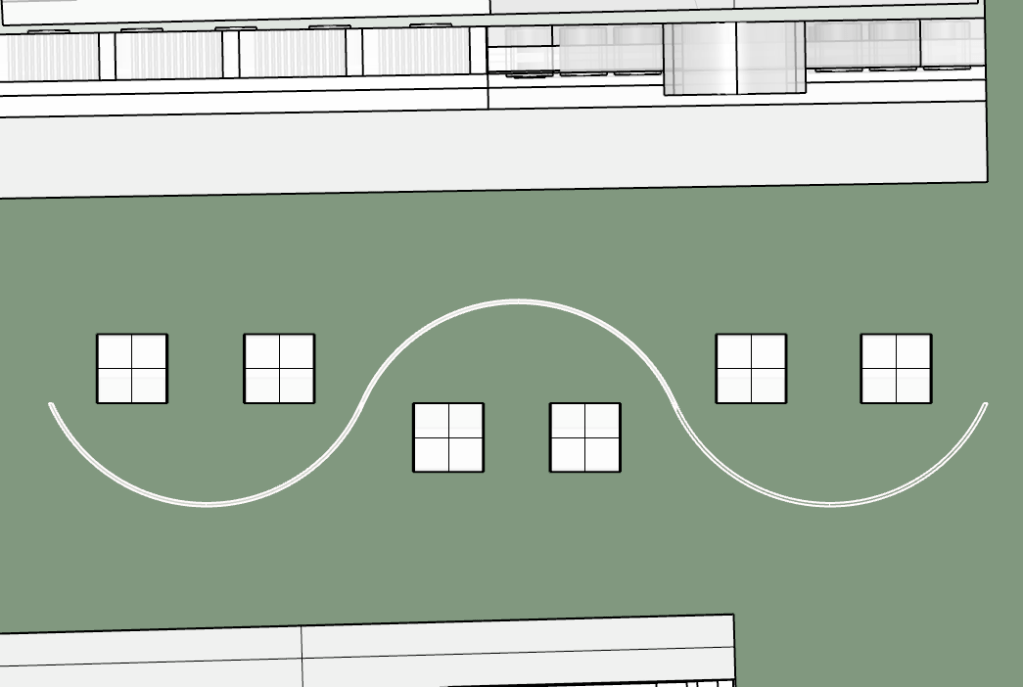
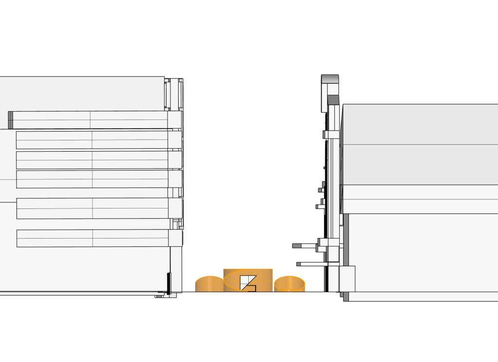
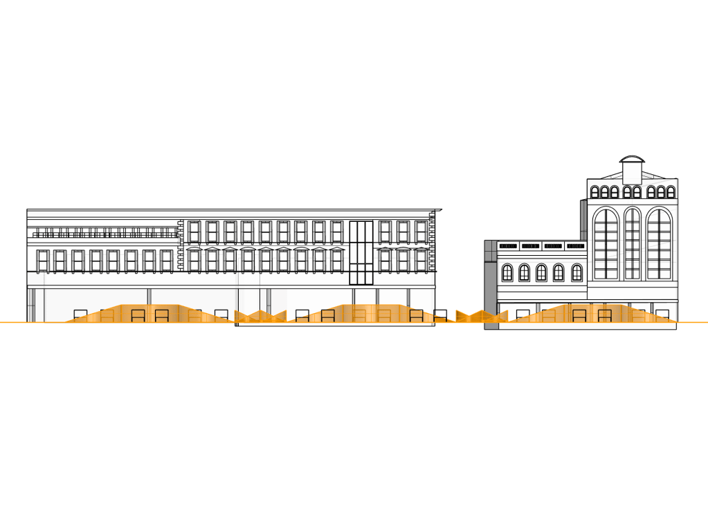
This week I spent time capturing plans, sections and perspective views of my design to prepare for the co-desgin workshop in week 10. I decided to apply materials that I may possibly select to see how they work with one another and with the site conditions. Below are a series of images captured before I put them through photoshop.

Week 10: Co-Design Workshop
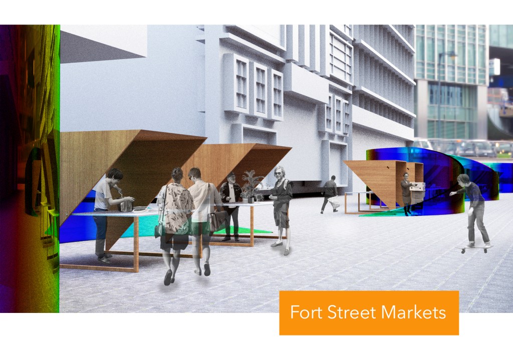
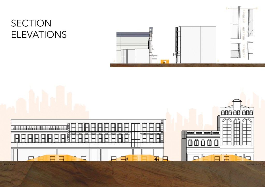
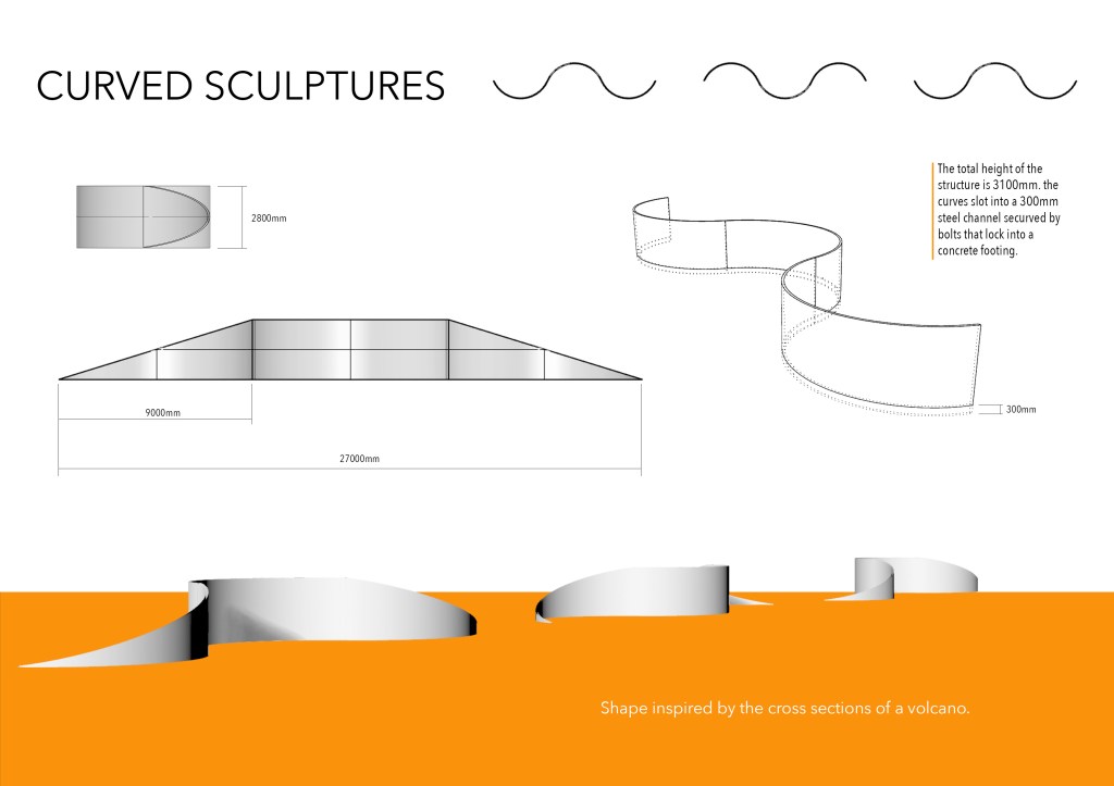
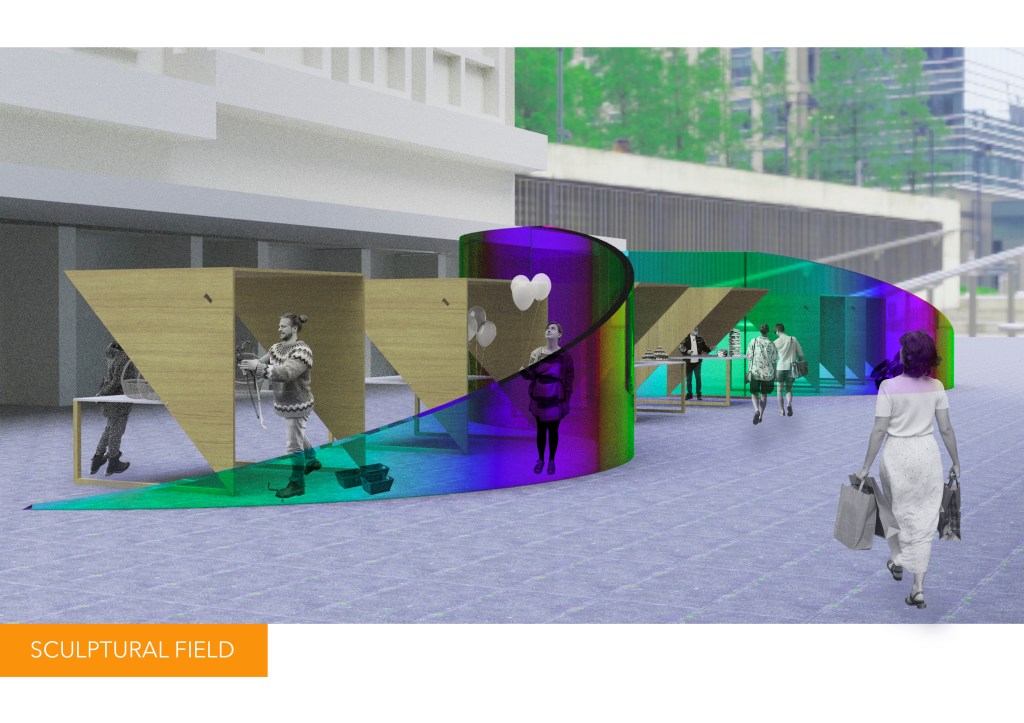

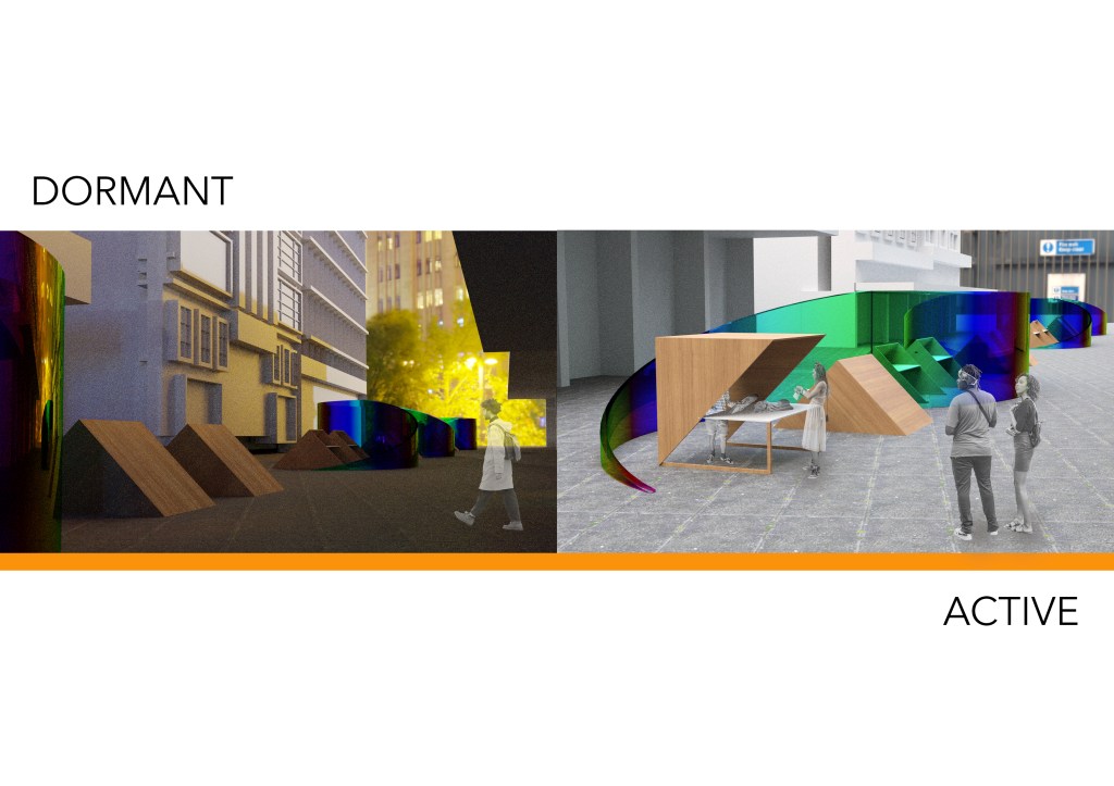
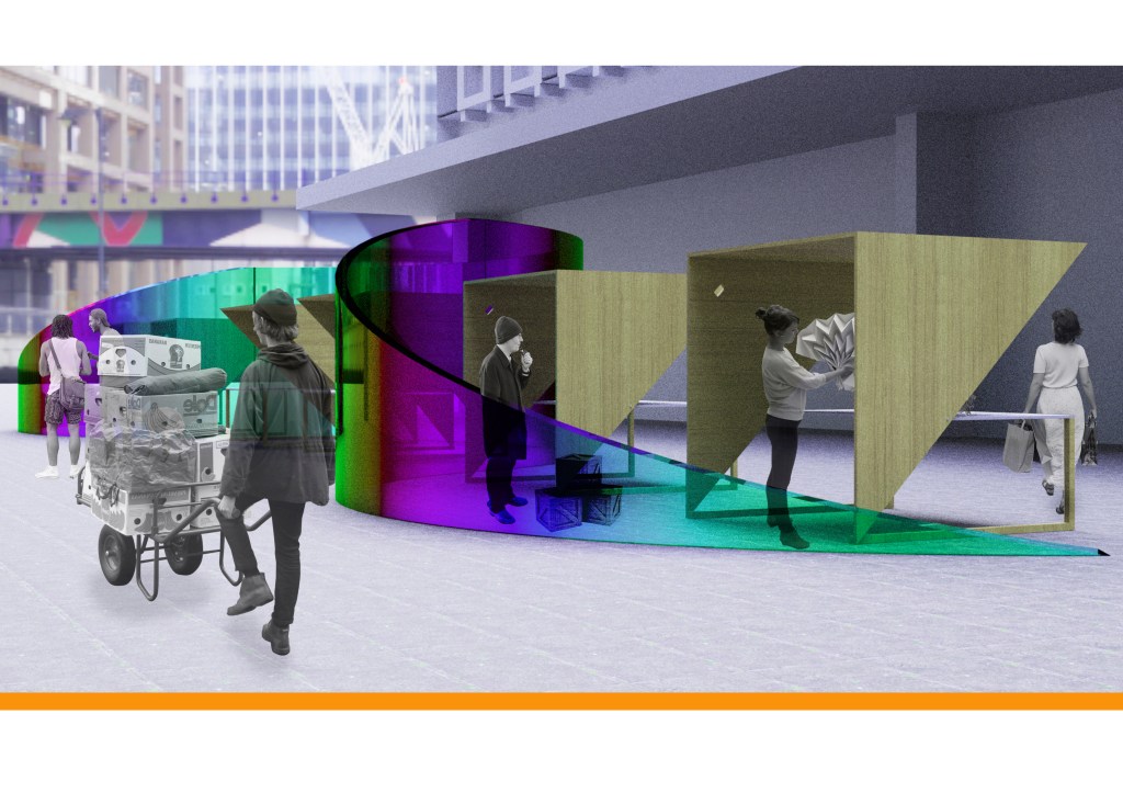
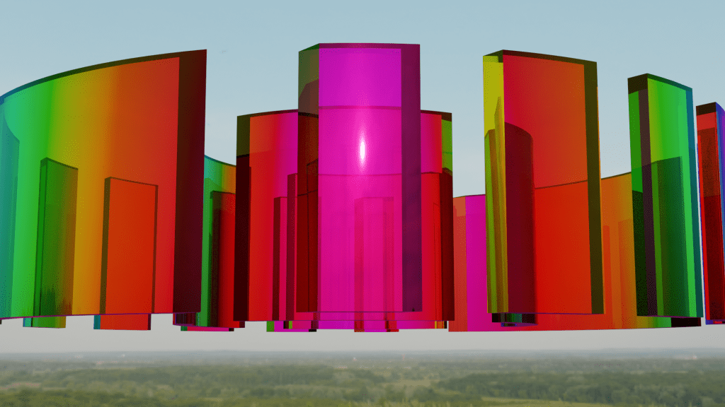
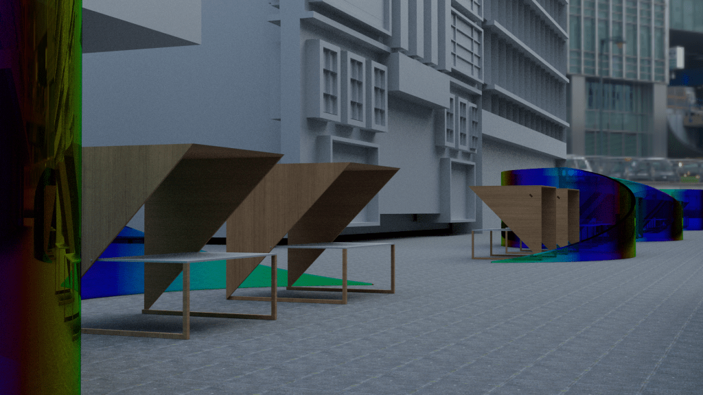
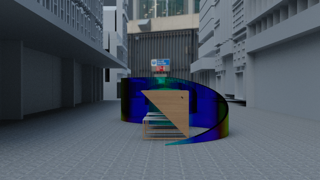
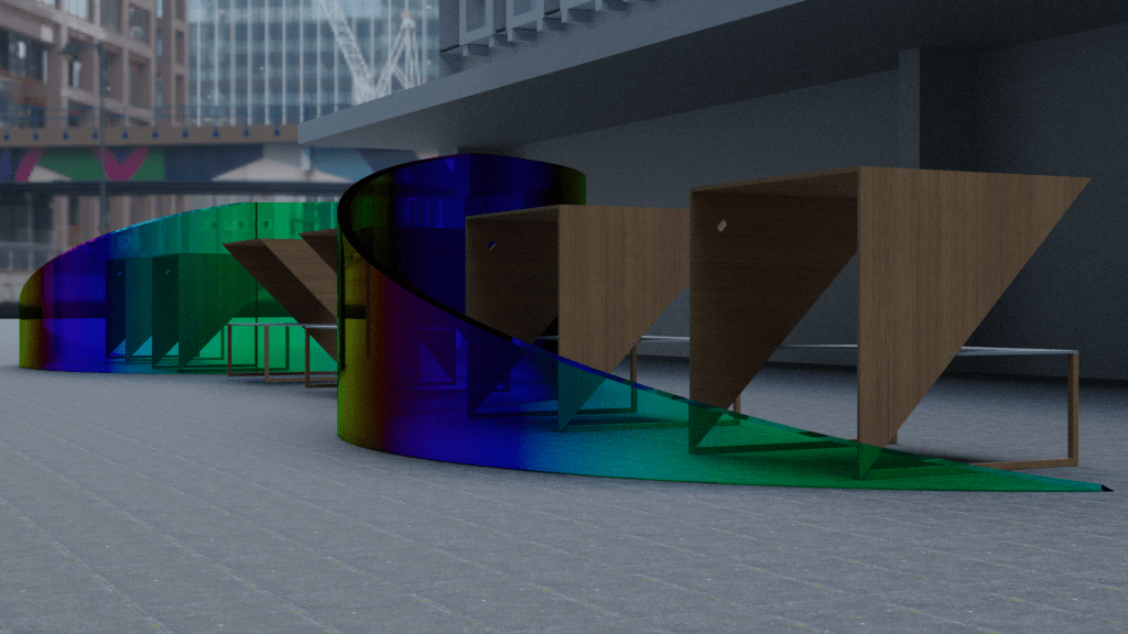
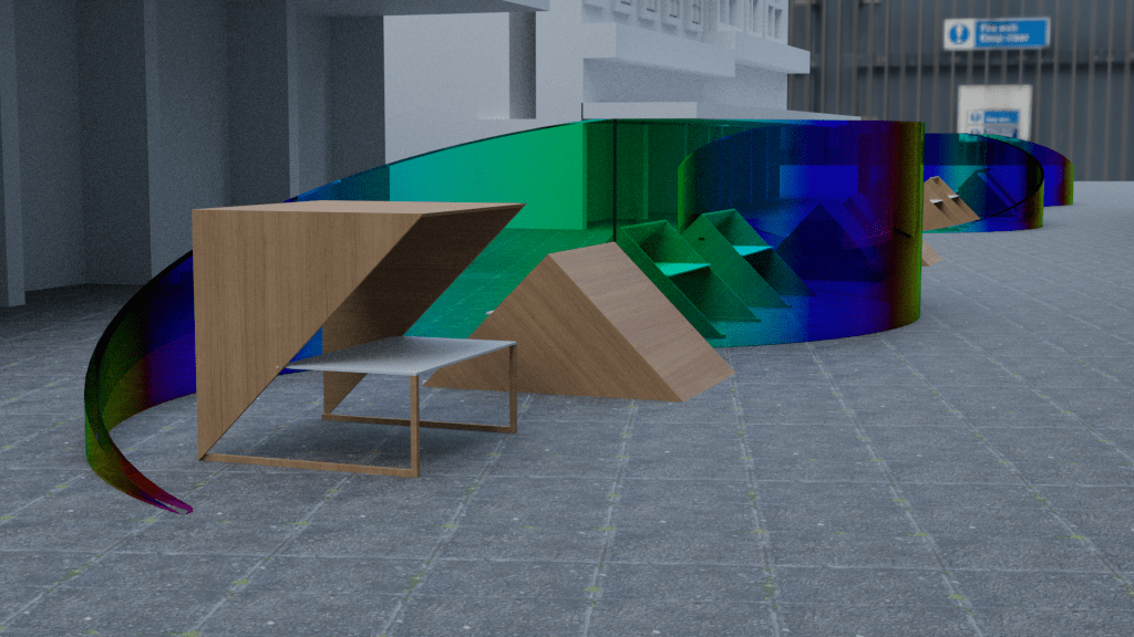
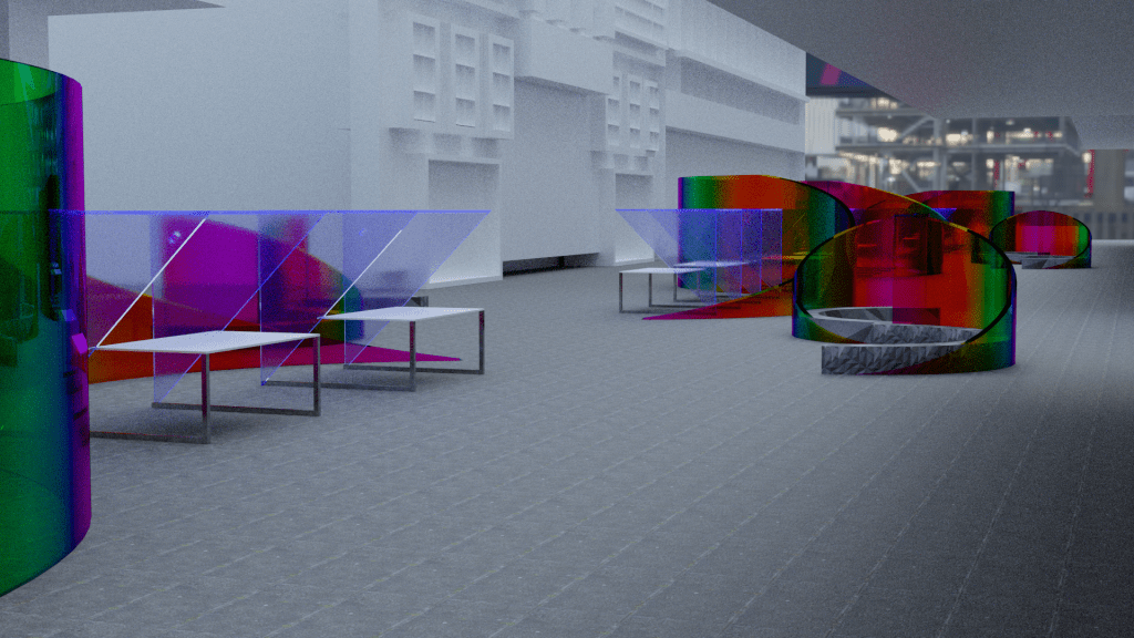
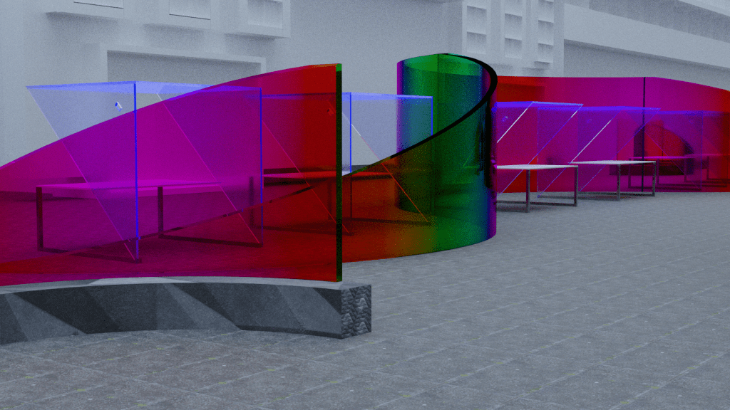
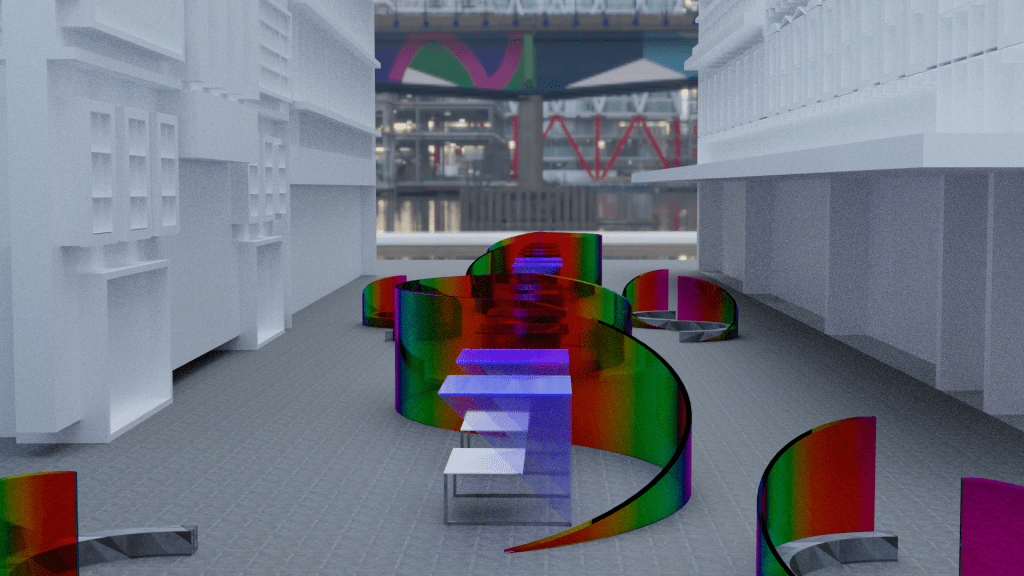
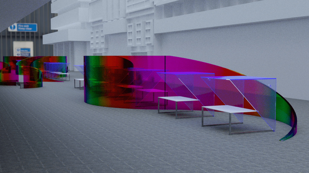
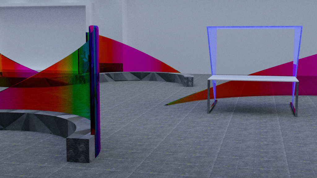
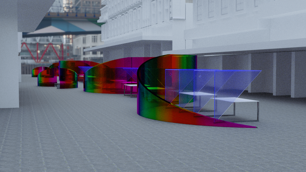
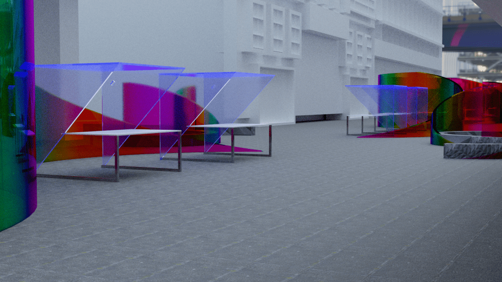
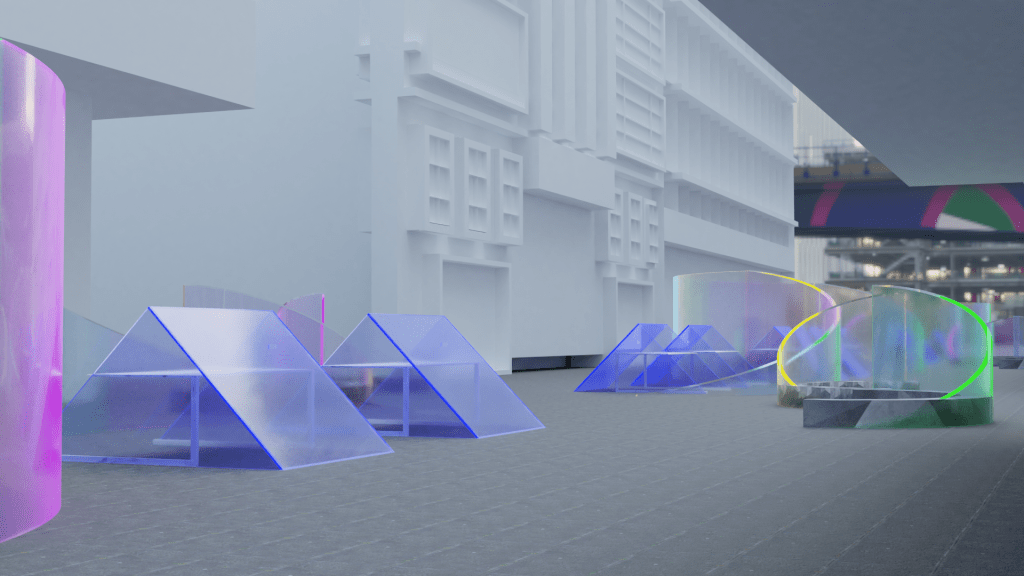
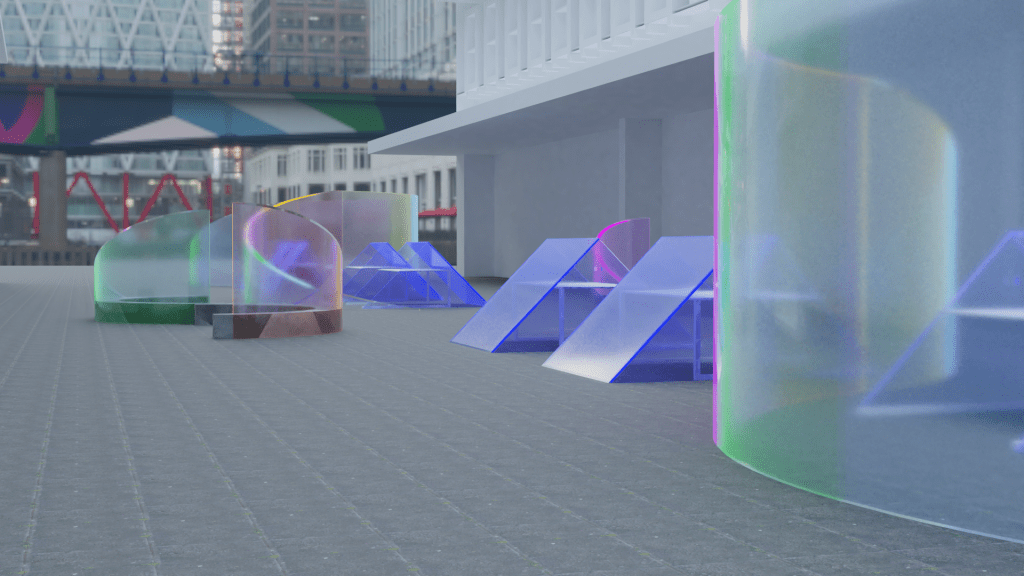
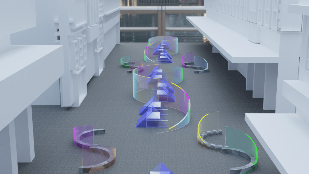
Script: Cinema, the art of storytelling through visual media, perspective and sound. As Robert McKee said “Storytelling is the most powerful way to put ideas into the world today.” My design project aims to tell the story of how the Auckland region’s intricate landscape was formed through a series of volcanic events. The Fort Street Market gives individuals the opportunity to become temporary characters in the narrative of Auckland itself by celebrating two important aspects of the city’s history – volcanism and trading/service. My journey into this project began with me taking on the role of storyteller, capturing moments of the Fort Lane precinct through the lens of my cinematic device. From this exploration I became intrigued by the ways in which colour was able to break down segments of the site, similar to that of a film strip creating a series of images that piece together a record of the space. Perspective became important as well as the role that colour plays in the way we see things. I found interest in materials with iridescent qualities as the concepts of perspective, change and colour can be encapsulated within this keyword. My design is made up of two permanent components. Curved perspex sculptures with a dichroic film applied and a series of wooden market stalls. These two elements of the design span the length of Fort Street in even intervals. The sculptures are inspired by the shapes of the 53 volcanoes located within the Auckland volcanic field. Their cone-like form influenced the sloping edges that build to a mesa in the centre. Due to volcanoes being a visually clear feature of the Auckland city landscape I chose to give these sculptures a height of 2.8m making them a visually dominant feature of the design. I sought sculptural influence from Richard Serra as the scale of works invites people to engage with the physical qualities of the space. I’ve aimed to develop a sculptural field for the markets to take place within. The stalls themselves are built to move between active and dormant stages. The Auckland volcanic field has continued to shift between both active and dormant stages throughout its history. The lightweight of the stalls allows vendors to activate the stall whenever they please by lifting, rotating and securing it with a pin. The monogenetic qualities of the volcanoes within this field inspired my thoughts around having temporary vendors at all times. This concept gives small local businesses the opportunity to occupy a stall for their desired amount of time. The purpose of the market focuses on bringing those that call the city centre home, together. Activating the site in a way that encourages community participation and connection enhances the use of Fort Street as public space. As a whole my project has had strong conceptual influence from the volcanic history of Auckland. The new market space celebrates Auckland’s constant commercial growth within a site that has always been a conduit for trade. This notion of trade has now been reinterpreted through this design to carry the precious cargo of a thriving neighbourhood – culture, creativity and community.
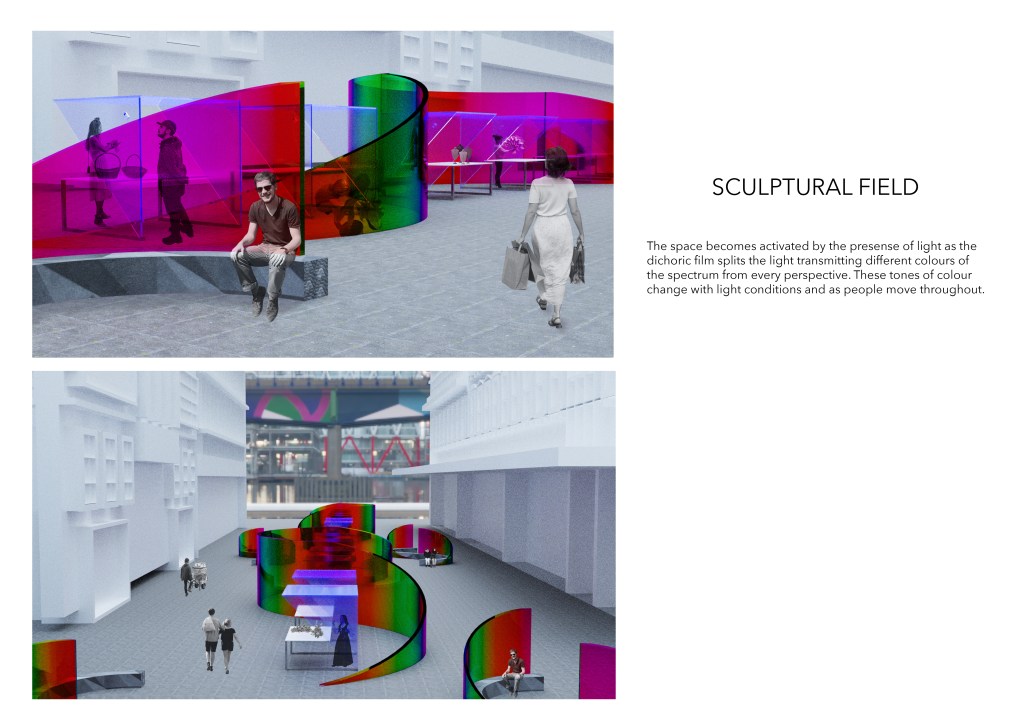
Feedback: I found the co-design workshop super helpful in terms of working through some material and surface details questions in relation to the narrative of my design. We talked about considering the weight of material and it was suggested that I think about materials commonly used in public spaces within urban settings. Ceili enjoyed the playful aspect of the design and how the space was activated by not only the market stalls but also by people moving through the space due to the dichroic film. We also talked about the curved sculptures perhaps working towards a different narrative.
Week 11: Design Development
Materials used in urban environments – Concrete, steel, stone, brick, stained/painted wood.
Curved Perspex: Perspex offers a wide range of possibilities because heat softens this type of plastic without discolouring it. This gives you the potential to make an array of beautiful objects. When heated to 160 degrees celsius it becomes soft and bends easily. The perspex then hardens as it cools and becomes fixed in the chosen shape or position permanently.
Thing to consider in this final stage of my design – in relation to public space.
- High performance design and aesthetic comfort
- Variety of use
- High performance aesthetics
Adding Seating: A point was made during the co-design workshop that the sculptures and stalls themselves didn’t really move people throughout the space in any certain way. I always felt like something was missing so I have decided to add 4x curved bench seat sculptures in the centre of the design. This gives buyers a place to sit and enjoy the market environment but also creates a flowing, curving movement of people through the space. The bench seats themselves follow a similar sweeping shape to the main curved structure and are also made from the same material making them appear as apart of the sculptural field.
Images and renders captured for the final critique. I used these images to develop my presentation.
Week 12: Final Critique
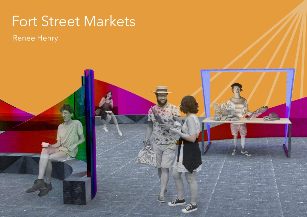
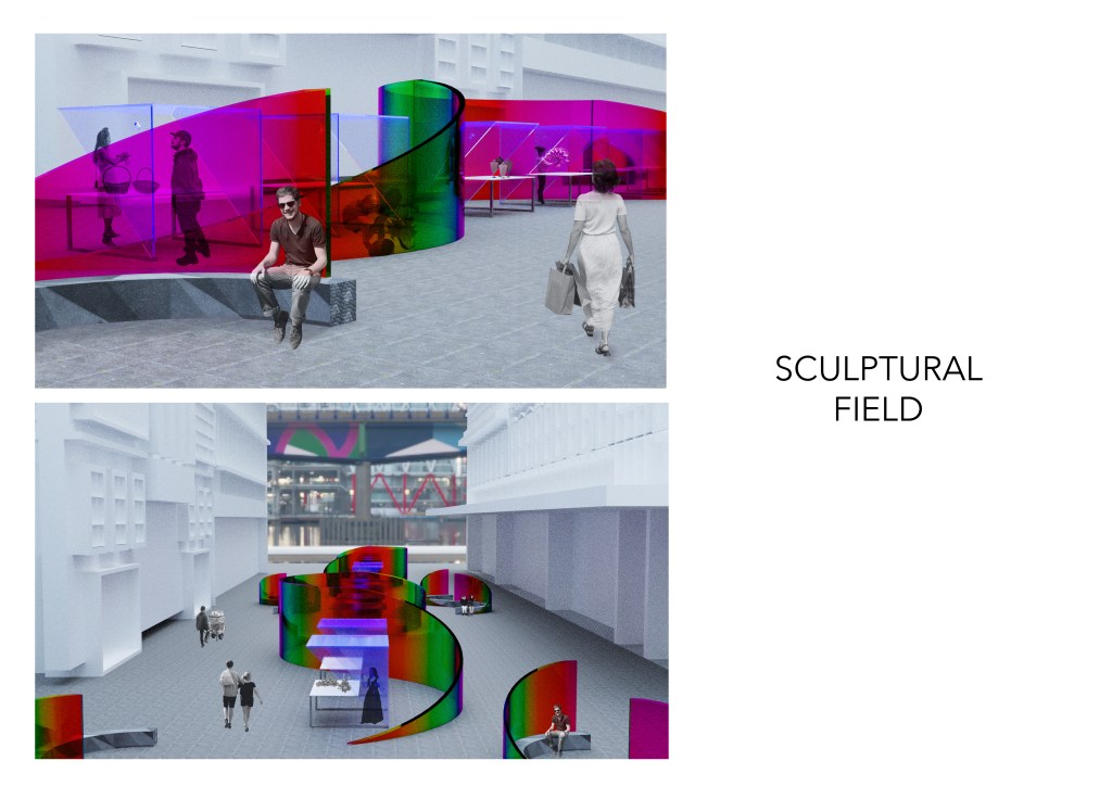
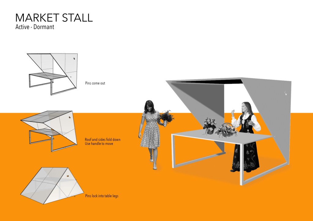
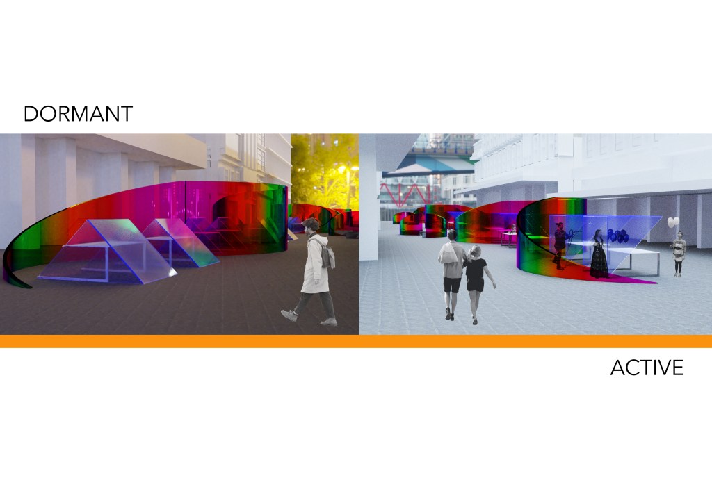
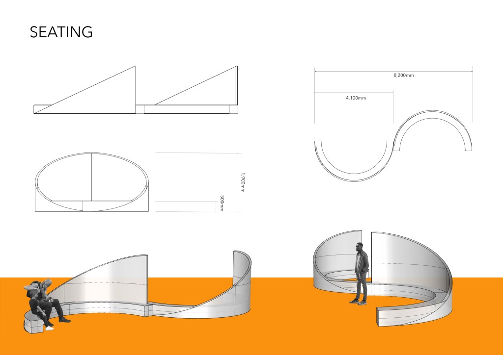
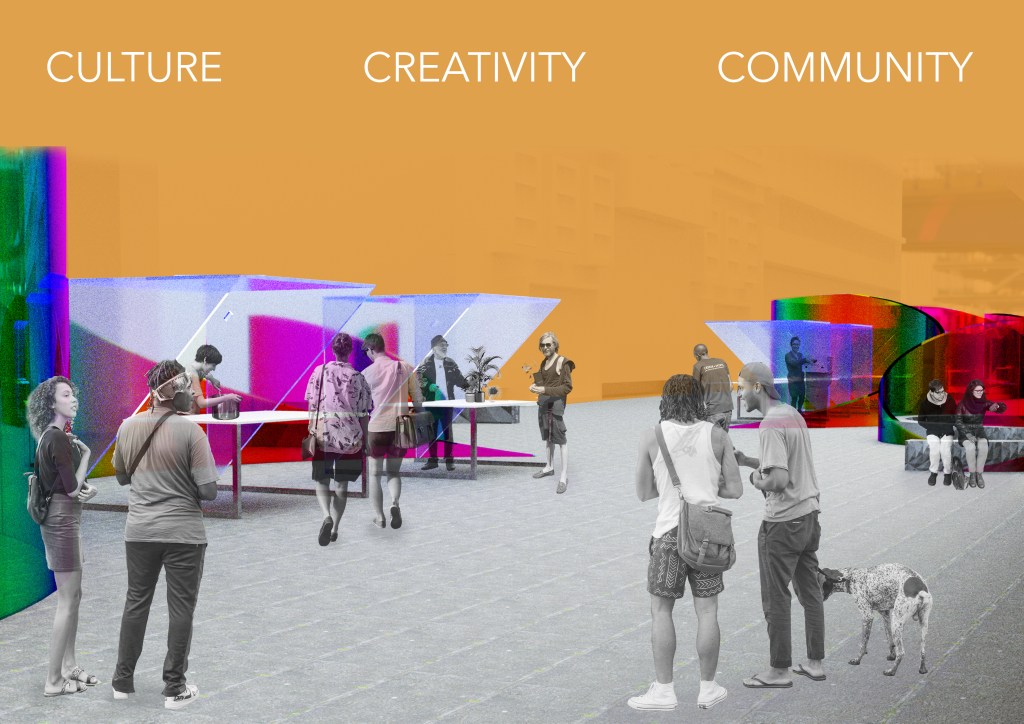
Script: Cinema to me is the art of storytelling through visual media using techniques of perspective, framing and sound. The Fort Street Markets gives individuals and communities the opportunity to become temporary characters in the narrative of Auckland itself by celebrating two important aspects of the city’s history – volcanism and trading. Both of which I have sought conceptual influence from throughout this project. My journey into this project began with me taking on the role of the storyteller, capturing moments of the Fort Lane precinct through the lens of my cinematic device. From this exploration I became intrigued by the ways in which colour was able to break down segments of the site, similar to that of a film strip creating a series of images that piece together a record of the space. Perspective became important as well as the role that colour plays in the way we see things. I found interest in materials with iridescent qualities as the concepts of perspective, change and colour can be encapsulated within this material. My design is made up of three permanent components. Curved perspex sculptures with a dichroic film applied, a series of fluorescent blue acrylic market stalls and a number of curved benches made from decorative concrete. These three elements of the design span the length of Fort Street in even intervals. The sweeping curves of the perspex sculptures were inspired by features of the Auckland volcanic field. Their cone-like form influenced the sloping edges and the fluid shape encourages flowing movement of people throughout like that of magma. Due to volcanoes being a visually clear feature of the Auckland City landscape I chose to give these sculptures a height of 2.8m making them a visually dominant feature of the design. I’ve aimed to develop a sculptural field for the markets to take place within. The space becomes activated by the presence of light as the dichroic film splits the light transmitting differing colours of the spectrum from every angle. These colours and patterns change from every perspective as people move throughout. The stalls themselves are built to move between active and dormant stages. The lightweight materials of the stalls allows vendors to activate them whenever they please by lifting, rotating and securing with a pin. The monogenetic qualities of the volcanoes within Auckland inspired my thoughts around having temporary vendors at all times. This concept gives small local businesses the opportunity to occupy a stall for their desired amount of time. The purpose of the market focuses on bringing those that call the city centre home together by activating the site in a way that encourages community participation and connection, enhancing the use of Fort Street as public space. The curved bench seating follows a similar pattern to that of the sculptures making them a part of the sculptural field. As a whole my project has had strong conceptual influence from the volcanic history of Auckland particularly around the ways a site can be activated. The new market space celebrates Auckland’s constant commercial growth within a site that has always been a conduit for trade. This notion of trade has now been reinterpreted through this design to carry the precious cargo of a thriving neighbourhood which I believe is culture, creativity and community.
Feedback: I found the final critique super helpful with where to take my design in these final stages. I have bullet pointed some of the key points I would like to explore to push my project a little further.
- Implement the use of my cinematic device images – how could these become apart of my sculptural field.
- Smaller perspex pieces to make my curves – how could each of these pieces contribute to my narrative, colour, form, volcanism.
- Drop off zone, carparks, access from other streets etc shown on plan.
- Scheduling – potential thematic relation to volcanoes.
- Explore constructional elements – reduce the thickness of acrylic, detailing of connection points in the plans including seams/assembly points or lines.
- Alternative colour/construction palette – film strip aesthetic, matching colours to specific things.
Final Design Development
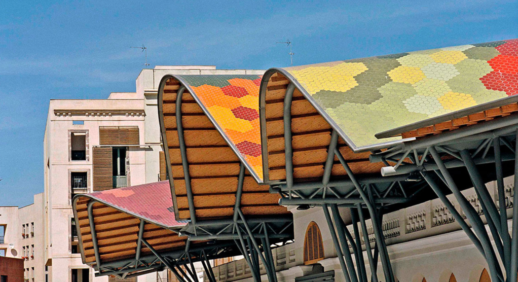
Context Research – Santa Caterina Market
The Santa Caterina city market located in the old quarter of Barcelona was developed in 1997 after EMBT won a competition with a proposal that aimed at incorporating the extreme complexity of the seating itself by creating a commercial market that complemented by a residential zone and public spaces that integrated all the activities of the neighbourhood. The project maintains parts of the existing structure and the architects proposed a new creative render of the area which respected the history and context of the site.
I enjoy the concept of putting a contemporary creative twist on a place while still respecting the history and context of the site. This is something I have aimed to do and now would like to push further as I try to incorporate the stories of the volcanoes in the Auckland Volcanic field into my design through a modern display of colour that contrasts the surrounding cityscape.
Colour and material exploration: It was discussed during my feedback that the way I used colour in my cinematic device was both captivating and interesting. It was mentioned that perhaps I could use a similar technique to apply colour the curved sculptures. Below I created a few renders experimenting with this idea. After careful consideration I decided that yes, I do think this material and colour choice is aesthetically pleasing however I find the changing characteristics of the dichroic film to be more interesting. I believe the iridescent qualities of the film fit more to my project narrative as the colours change with movement, lighting conditions and perspective. I like the way the colour is bolder than the coloured acrylic and is able to reflect its pattern onto its surroundings.
Scheduling of market: The market becomes activated by vendors whenever they like. I was inspired by the monogenic qualities of the Auckland volcanic region for this idea. In the context of volcanoes, monogenetic means that the volcanoes within the field only erupt once. This occurs when magma supply is low or where vents are not large or close enough for continuous feeds of magma, therefore only pushing through the surface once (Rangitoto being the exception having erupted twice). I’ve used this idea to influence my thinking around scheduling as each stall consistently is opened and closed and never permanently inhabited. I imagine each business to use a stall once and then likely not again.
Final Submission:

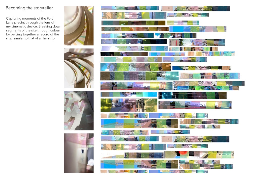

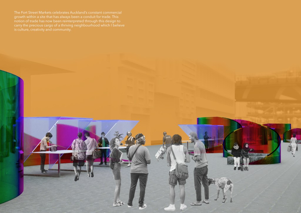
Cinema to me is the art of storytelling through visual media using techniques of perspective, framing and sound. The Fort Street Markets gives individuals and communities the opportunity to become temporary characters in the narrative of Auckland itself by celebrating two important aspects of the city’s history – volcanism and trading. Both of which I have sought conceptual influence from throughout this project. My journey into this project began with me taking on the role of the storyteller, capturing moments of the Fort Lane precinct through the lens of my cinematic device. From this exploration I became intrigued by the ways in which colour was able to break down segments of the site, similar to that of a film strip creating a series of images that piece together a record of the space. Perspective became important as well as the role that colour plays in the way we see things. I found interest in materials with iridescent qualities as the concepts of perspective, change and colour can be encapsulated within this material. My design is made up of three permanent components. Curved perspex sculptures with a dichroic film applied, a series of fluorescent blue acrylic market stalls and a number of curved benches made from decorative concrete. These three elements of the design span the length of Fort Street in even intervals. The sweeping curves of the perspex sculptures were inspired by features of the Auckland volcanic field. Their cone-like form influenced the sloping edges and the fluid shape encourages flowing movement of people throughout like that of magma. Due to volcanoes being a visually clear feature of the Auckland City landscape I chose to give these sculptures a height of 2.8m making them a visually dominant feature of the design. I’ve aimed to develop a sculptural field for the markets to take place within. The space becomes activated by the presence of light as the dichroic film splits the light transmitting differing colours of the spectrum from every angle. These colours and patterns change from every perspective as people move throughout. The stalls themselves are built to move between active and dormant stages. The lightweight materials of the stalls allows vendors to activate them whenever they please by lifting, rotating and securing with a pin. The monogenetic qualities of the volcanoes within Auckland inspired my thoughts around having temporary vendors at all times. This concept gives small local businesses the opportunity to occupy a stall for their desired amount of time. The purpose of the market focuses on bringing those that call the city centre home together by activating the site in a way that encourages community participation and connection, enhancing the use of Fort Street as public space. The curved bench seating follows a similar pattern to that of the sculptures making them a part of the sculptural field. As a whole my project has had strong conceptual influence from the volcanic history of Auckland particularly around the ways a site can be activated. The new market space celebrates Auckland’s constant commercial growth within a site that has always been a conduit for trade. This notion of trade has now been reinterpreted through this design to carry the precious cargo of a thriving neighbourhood which I believe is culture, creativity and community.
