Week 1: Concept
This week I was introduced to the idea of the threshold between being asleep and waking up. This is something I had never thought about before even though everyone experiences it every day. Although we all do it, we each have our own personal ways of moving through the stages of being asleep to being awake. I personally wanted to look at the idea of sleep/wake as a whole by looking at it as a transition from one day to the next.
For week one we were asked to create a concept/s to show our interpretations of these stages in relation to some threshold relationships. The relationships I chose for my concept/s were interior/exterior, movement/stasis and dream/certainty.
Research
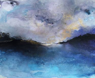
Below are a few images I found interesting and I thought related to the way I felt while waking up. I was drawn to the soft dream like feeling both paintings created.
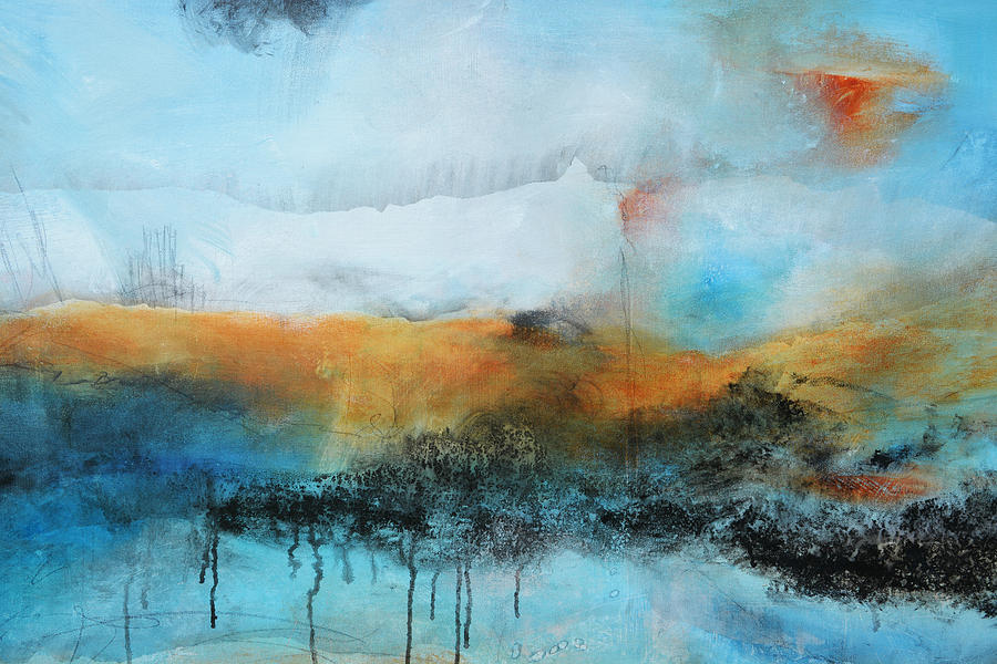
Left Image: Anghel, A. (2014). Abstract Landscape Sea and Mountain {Painting}. Retrieved from https://pixels.com/featured/abstract-landscape-sea-and-mountains-andrada-anghel.html
Right Image: Angel, H. Reflections {Painting}. Retrieved from https://assets.saatchiart.com/saatchi/720593/art/4007394/3077248-UTCWSPQA-7.jpg
One designers work I was drawn to was Fearon Hay Architects. I really like the way they used natural colours, tones and textures to work with surrounding environments. Each of their designs were very purpose built and that inspired me to really think about why I am designing something.
Although I like the style of each of their designs I did not use them as inspiration for this specific project. I’m looking forward to possibly looking at more of their designs in the future for upcoming projects.
Website Link: https://www.fearonhay.com/
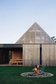
Forest House 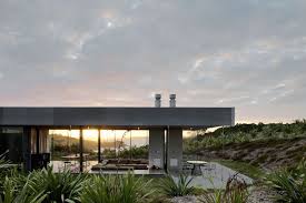
Sandy Bay Farm House 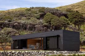
Storm Cottage
Toyo Ito is a designer that I found particularly interesting for this project. He is a Japanese architect known for creating conceptual architecture. I liked the way he uses abstract shapes and is also able to draw attention to his designs without using bold colour. I always knew that I wanted to use white in my work and seeing the way he used it successfully make me more confident with my colour choice.
Planning

Final Concept
3rd March 2019
Acrylic paint
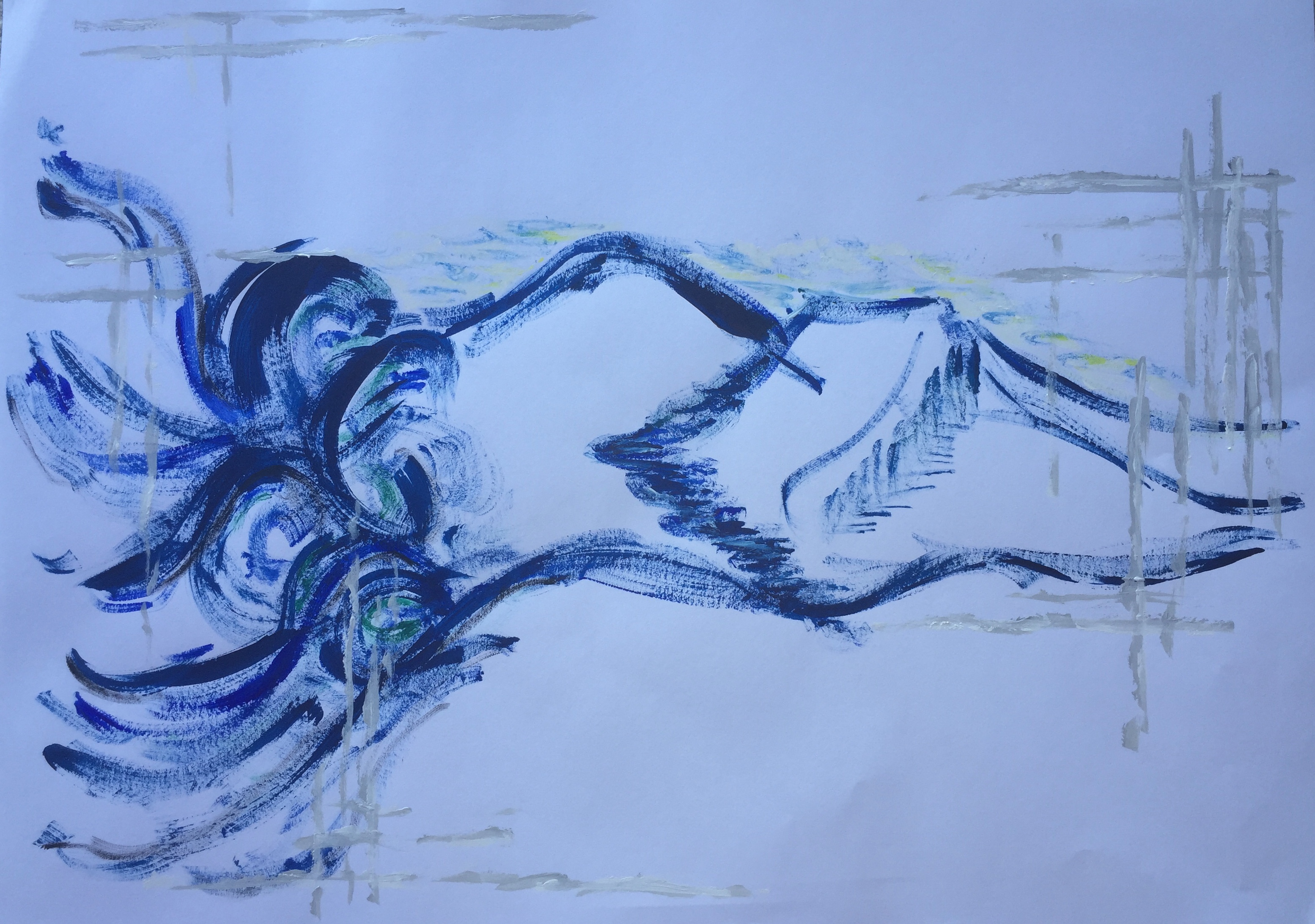
The threshold relationships I chose for my sleep/wake concept were interior/exterior, movement/stasis and dream/certainty.
On the left of my image, I used multiple circular lines to create a spiral effect to resemble the feeling of falling asleep. The lines feeding into the circles represent moments of the past coming together to create memories for the future.
The longer lines moving from the left to the right of the image form the shapes of the landscape I see from my bedroom windows. For over 10 years I woken up to the same rolling hills and have made many memories on them. I wanted to incorporate the landscape into my work as it is something I will always remember
The loose cross-hatching placed on the edges of the painting resemble the pattern of my duvet but also the structure of my days. The lines are not cleanly painted as most days don’t always go perfectly to plan, therefore the lines are uneven and stop and start.
The main colour I used for my painting was blue as it is known to have a calming effect.
I painted many of the lines with a small amount of paint on my brush to create the blurry feeling I feel when I begin to wake up.
Week 2: Model
This week we were asked to make a series of small models that related to our own interpretation of sleep/wake.
Firstly, I created four small models and placed them on a scale from interior to exterior. I then created another two models and added them to the scale, this time going from light to dark. Finally, another two models were created and placed on a scale that went in four directions, light to dark and dream to certainty.
I personally found this exercise challenging as I had never done model making before. To begin with I was worried about making the wrong thing but as I carried on I decided to just have fun with what I was creating. The main materials I used for these models were crepe paper, wire and paper wire. When making my models I was focusing on trying to create a soft feeling, by using curves and soft colours.
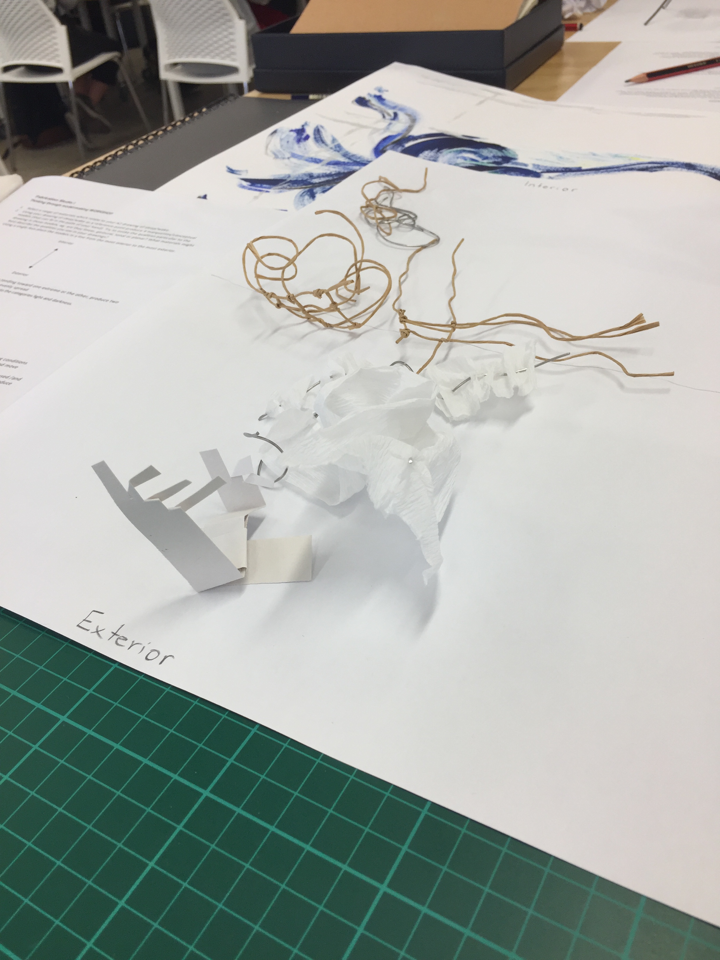
Interior/exterior 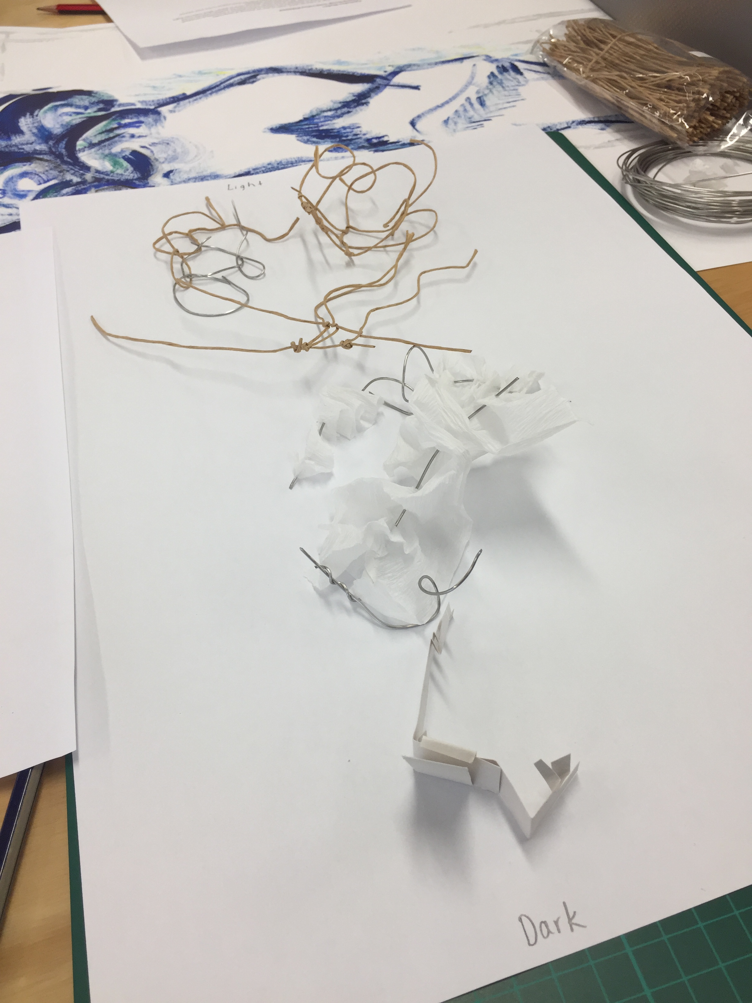
Light/dark 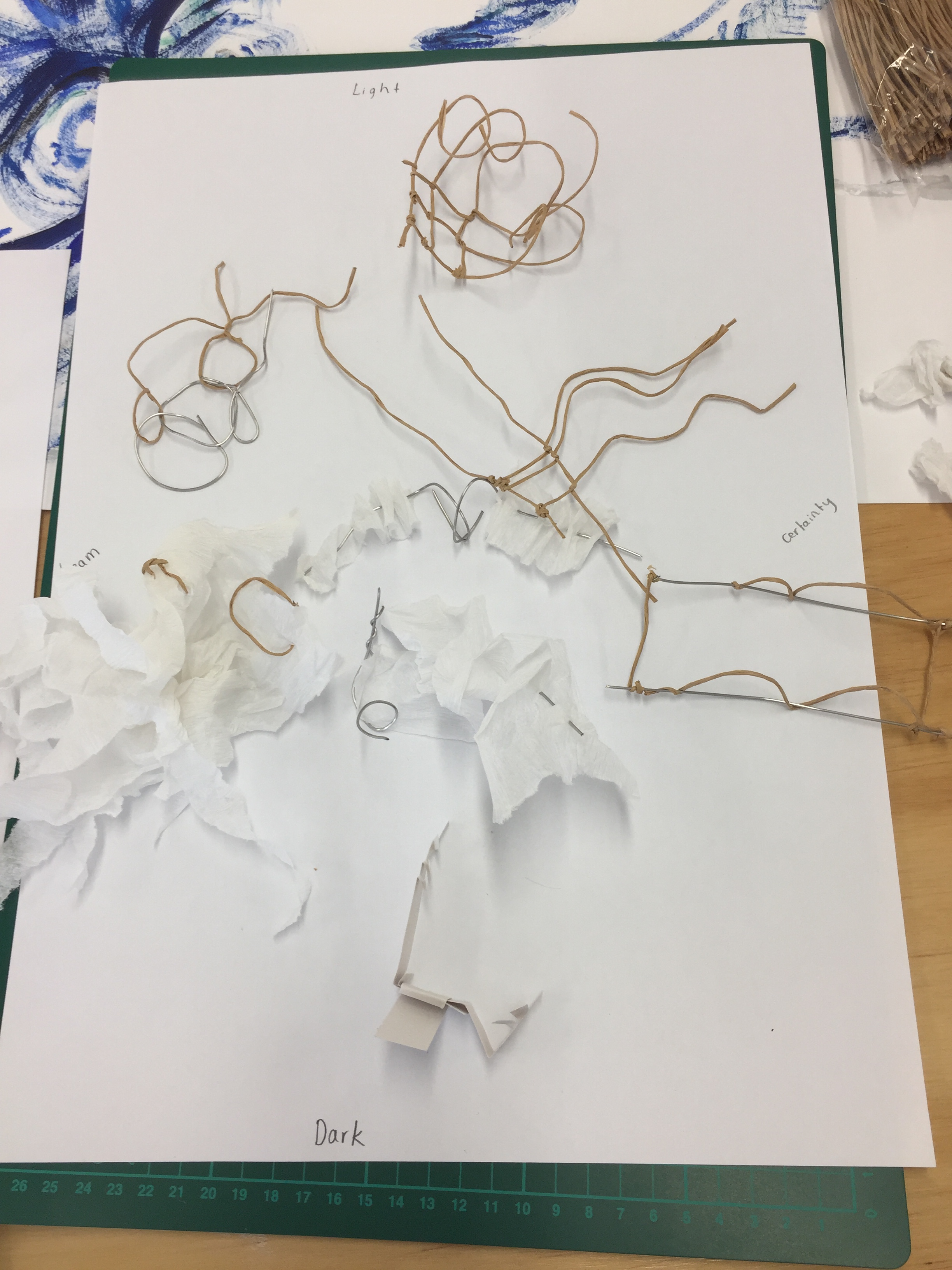
Light/dark – Dream/certainty

This model was the first of my larger models that I created. Adding the crepe paper was a last minute decision, meaning I wasn’t able to add the effect to the whole model easily (which is what I would have liked to do). This then resulted in me creating a new model. The materials used were florist wire and crepe paper.
Final Model
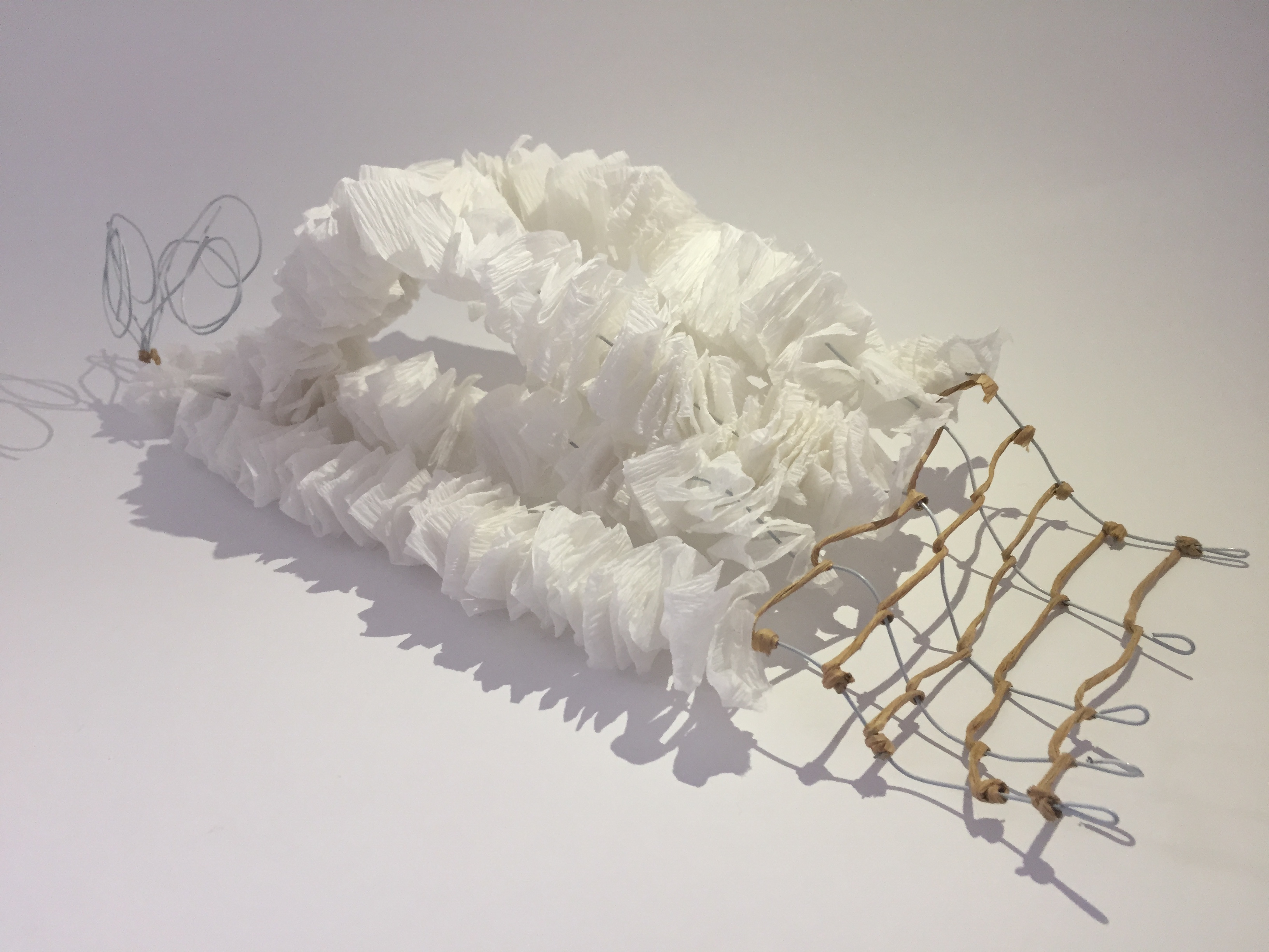
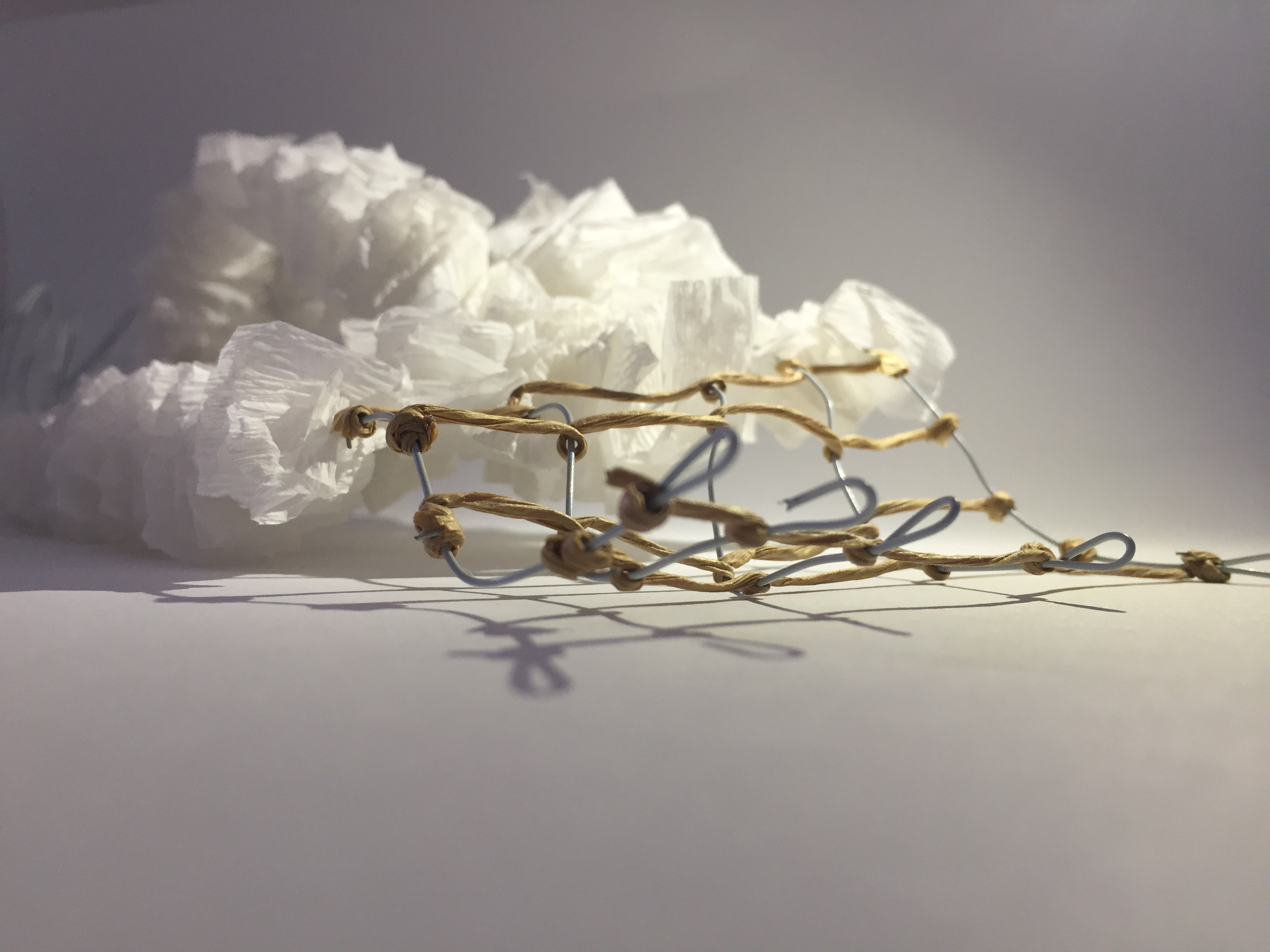
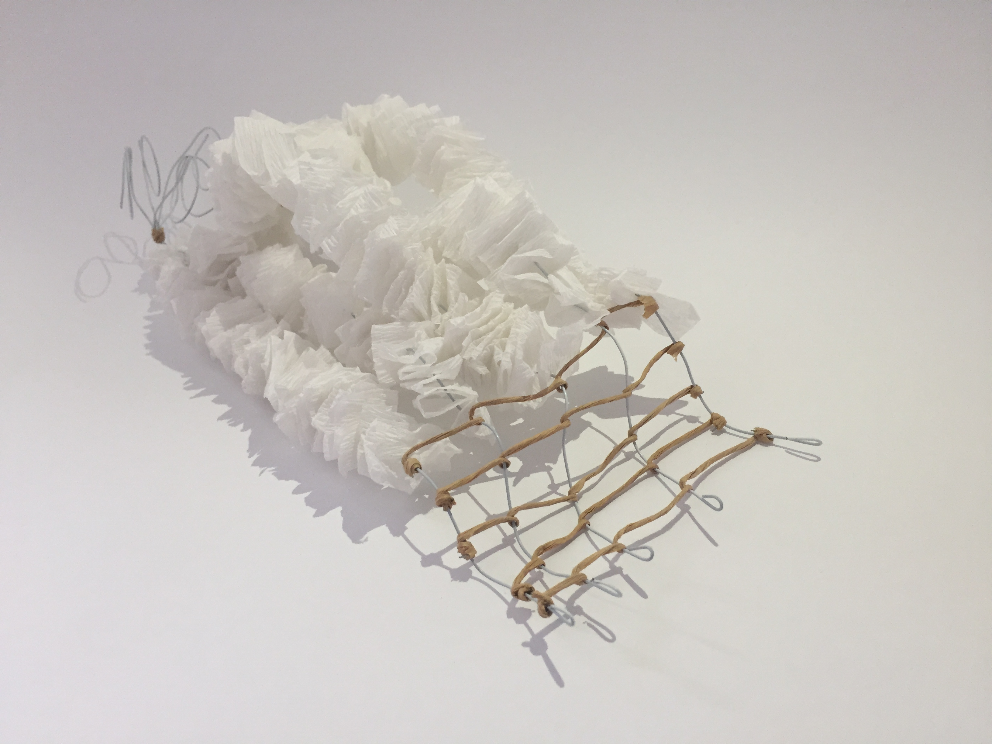
The main focus of my model was to show the idea of movement while incorporating ideas from my A2 painting. My model is made from florist wire, crepe paper and paper wire. I bent and molded five pieces of wire to form the shapes of the landscape I see from my bedroom.
On the left of my model I curled the wire into five different size circles. These circles represent the different types of dreams I have. None of the circles end cleanly as the wires don’t line up. I did this because there is always an uncertainty to dreams as you will never know how they were going to end. Dream/certainty was one of the threshold relationships I chose so I thought this was a good way to add the idea to my model.
The focus point of my model is the middle part of the five wires where I folded white crepe paper to give a soft, cloud like effect. Each of the wires are bent differently to show the different contours of the surrounding landscape. I added the paper to bring some of the softness of my painting onto my model. Each of the single folds in the crepe paper create interesting shadows as well as an interesting overall shape.
The right side of my model represents the structure of my day. I created a stiff grid like pattern, however, the grid sizes are even. As I mentioned when talking about my painting, no days two days are ever the same and it is not often that everyday goes to plan. However, unlike the dream stage of my model there is more structure. This is because while you are awake, there is less uncertainty of what is going on compared to when you are dreaming.
Overall I am happy with how my model turned out and am looking forward to learning how to create more complex models in the future.
Week 3: Project One Presentation

Abstract:
The threshold relationships I chose for my work were interior/exterior, movement/stasis and dream/certainty.
When thinking about my personal sleep/wake experience the main idea I am drawn to is movement. Moving from one day to the next. Moments and thoughts from the day coming together to create memories for the future. In my work, I used many lines, these lines represent moments from the day. As the lines come together, they’re forming the memories I will remember. The long flowing lines shown in my work resemble the landscape surrounding my home. The shapes formed by the hills is the last thing I see when I fall asleep and the first thing I see when I wake up.
Week 4: Site
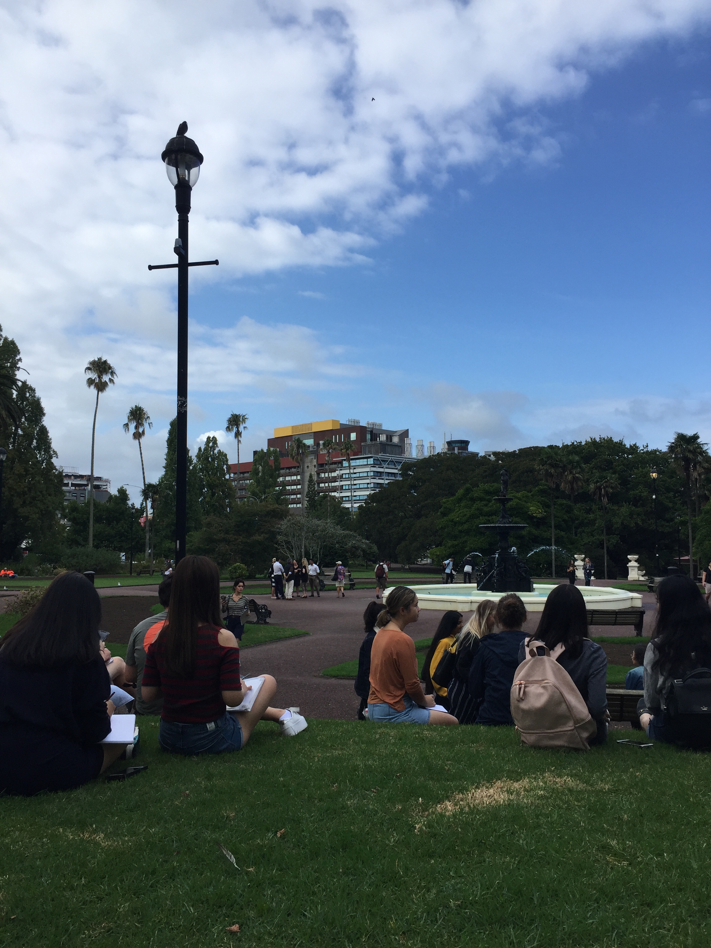
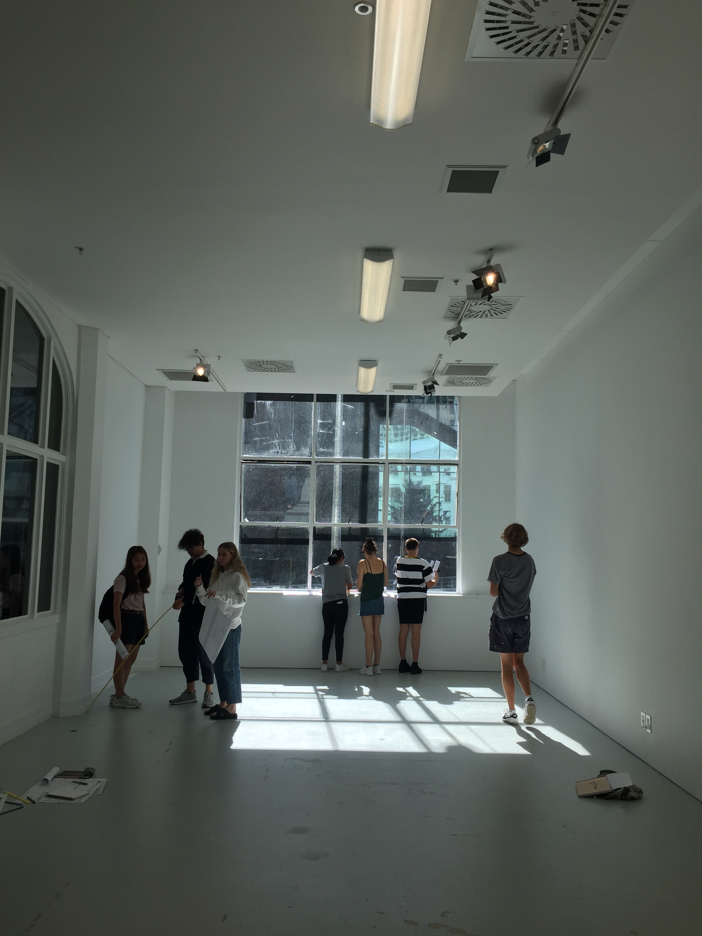
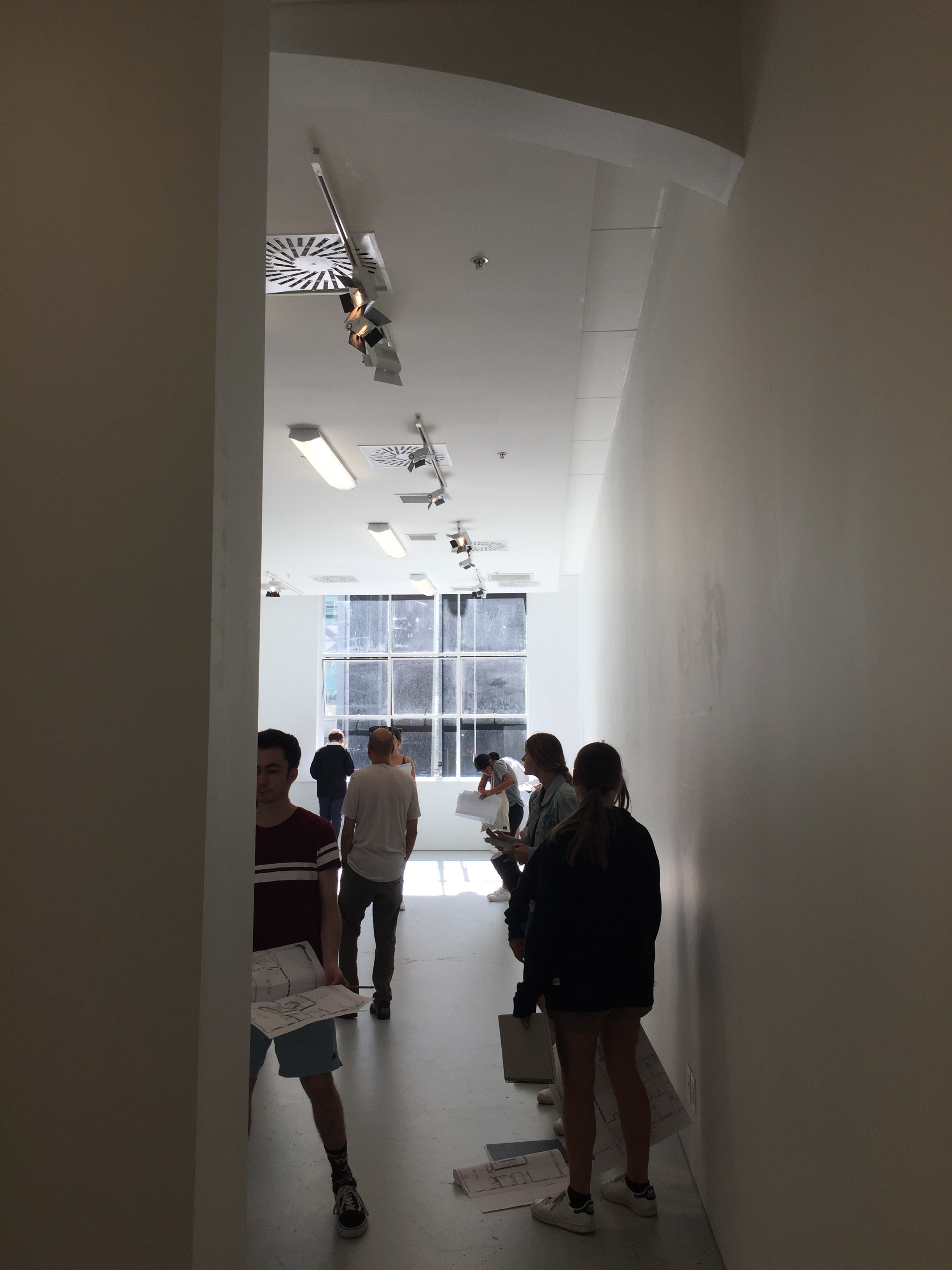
This week in studio we were introduced to our site that we will be working with over the next three weeks. The site we have been given is St Paul Street Gallery Three. We started the morning with a few context talks to get us thinking about our site in the right ways. We then took our sketch books and cameras and went to for a walk to the site as well as exploring surrounding locations like Albert Park.
Below are the pictures I took from Albert Park as well as the quick 1 minute sketches and notes that I took. While being in Albert Park I was particularly interested in focusing on movement and light/dark.
When looking at movement within the park I noticed that although there are many pathways people are able to move freely wherever they like around the park – straying from the pathways. Other movement I noticed was the movement of the different types of trees in the wind, some moving more freely than others.
Most of the space in Albert Park is fairly open allowing it to be a light and bright place. However, as you head from the fountain down towards AUT and St Paul Street Gallery Three there are areas of the park that are more densely planted than others creating a lot of shade and a darker light.
Notes I took while being in Albert Park:
- natural feeling ruined by tall buildings towering over the trees
- sounds and signs of construction, eg. cranes
- natural colours mixed with colours of man made objects
- open vs dense
- can still hear faint sounds of the city
buildings towering over trees 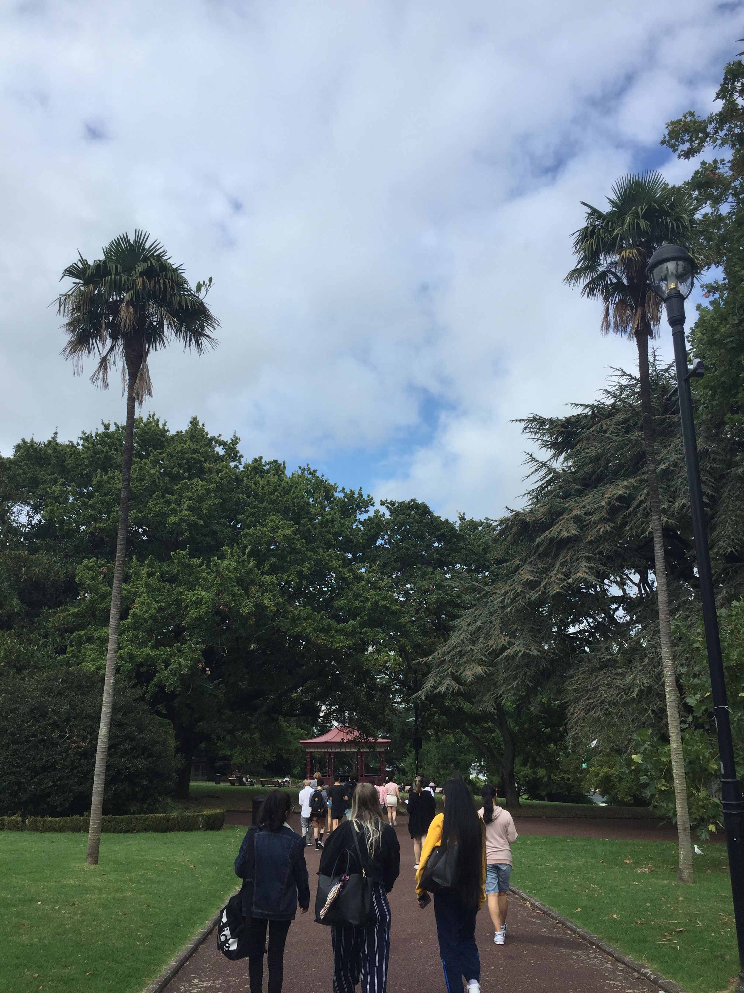
Pathways 
Sketches/notes 
enclosed space – dark 
open space – light 
looking down towards the site
The images below are different views of the site as well as quick sketches and notes I took while looking around. Again I was focused on looking at movement and light and dark when moving around the site.
Movement around the site was a lot more orderly than the movement within Albert Park. Again there are many pathways for people to use, however, unlike the park, everyone sticks to the pathways and don’t move around as freely. Other movement around the site is the movement of vehicles travelling up and down the hill. There is a lot of stopping and starting within these movements with traffic lights and bus stops nearby.
The lighting inside the building is quite dull and not very bright. This creates a blurry/tired feeling while being indoors. The lighting was also uneven as some lights were brighter than others, some flickering and changing brightness. The only source of natural light came from the large doors and windows at the entrance of the building.
Notes I took while being indoors:
- doors open – letting sound in
- cold tones and materials
- closed, compressed, personal space
- colours – grey, black, white
- heavy feeling
- mixture of circular and square shaped patterns.

elevated view 
view from pathway 
natural light from doors/windows 
lighting used in the site 
entrance 
sketches/notes

On Wednesday we were asked to work in groups to produce a site map with the material we had collected over the week. When laying out our map we also had to keep in mind our chosen thresholds and create a composition that expressed our ideas. As a group we agreed that the thresholds we should focus on were movement/stasis and light/dark.
As a group we decided that we could show movement on our map in three diffrent ways. The first being people and traffic movement around the area, secondly, the movement over time and thirdly the movement from aerial photographs to zooming in closer and closer to the site.
For light/dark we looked at the way different types of shadows were cast around the site and how they change depending on where you are, as well as changing throughout the day.


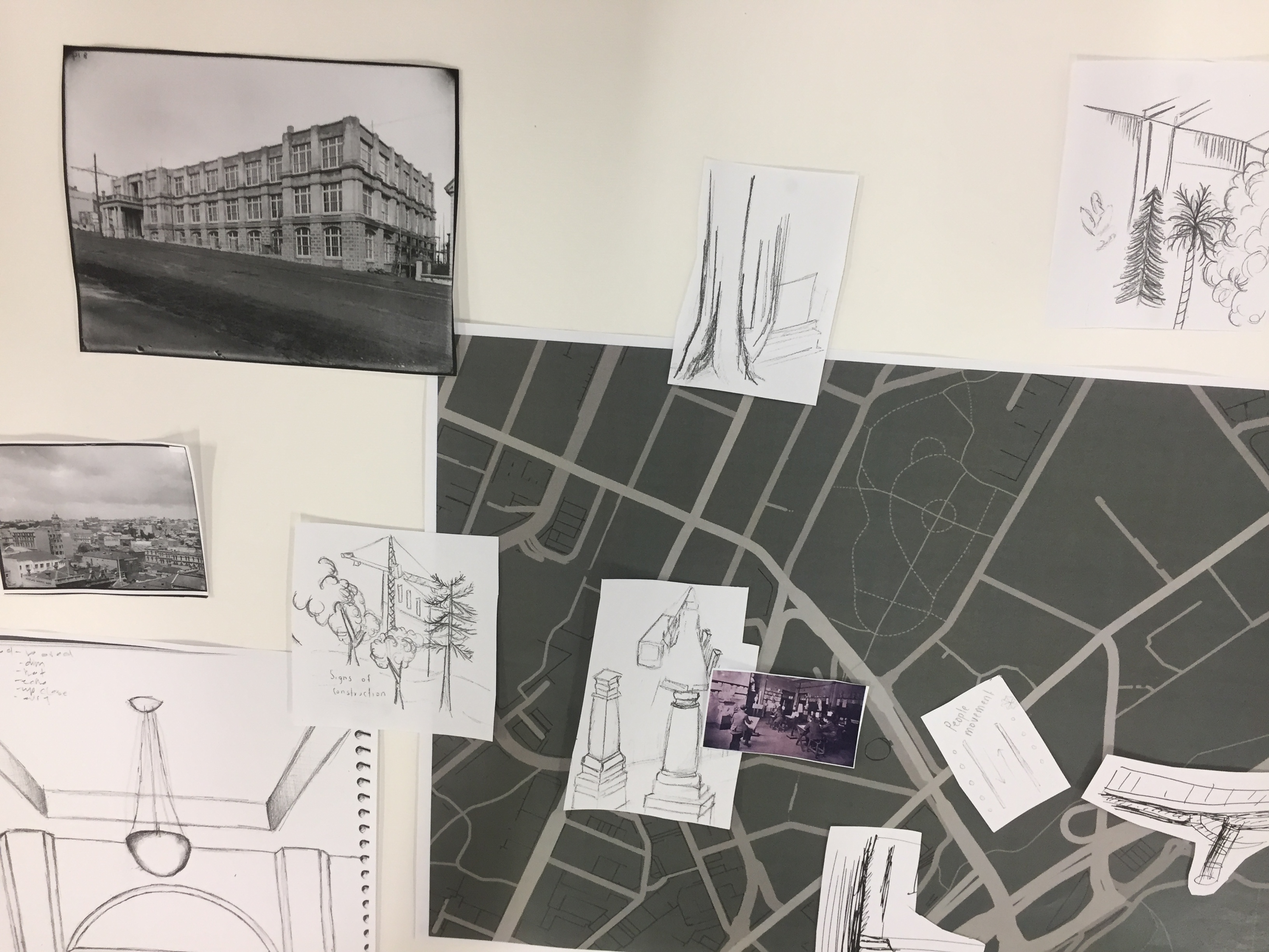

group site map
Research:
Through research I discovered that the building ST Paul Street Gallery Three is located within was originally the Seddon Memorial Technical College, the largest of many memorials for Richard Seddon. The building began construction in 1909, was completed in 1911, and officially opened in 1913. The same building still stands, however, now apart of AUT.
When talking about my work with family I was surprised to find out that my Poppa actually attended Seddon Memorial Technical College. He trained to be a structural engineer at the collage in around the 1950’s. Its hard to believe that he would have been there and seen it the way it looks in the images below.
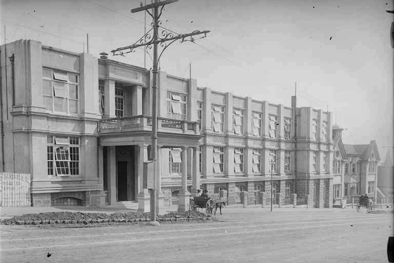
Image from 1913 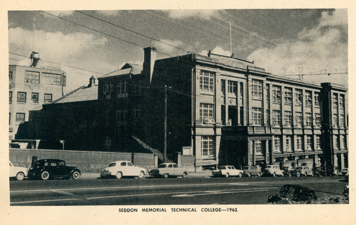
Image from 1963
Left Image: Unknown. (1913). Seddon Memorial Technical Collage [Photograph]. Retrieved from https://timespanner.blogspot.com/2011/09/seddons-memorials.html
Right Image: Unknown. (1963). Seddon Memorial Technical Collage [Photograph]. Retrieved from https://www.aut.ac.nz/about/our-history
Site Map:
The thresholds from my previous work that I am planning on incorporating into this work are movement/stasis, light/dark and interior/exterior.
My idea for my site map was to roughly sketch some of the main roads in the site as well as Albert Park. I then gathered the images that I had taken of the site as well as pictures I found online dating all the way back to 1913. Working from left to right I slowly filled in the roads with the images moving through stages of time. On the left I started with the earliest image I could find of the area and on the right are the images that I took from both outside and inside the building. My aim was to show movement through time, I thought laying it out as the roads/footpaths could give it a double meaning as the main place people move around nowadays is on both the roads and footpaths.
The four sketches on my map also represent different types of movement within and around the site.

Planning 
setting out the collage 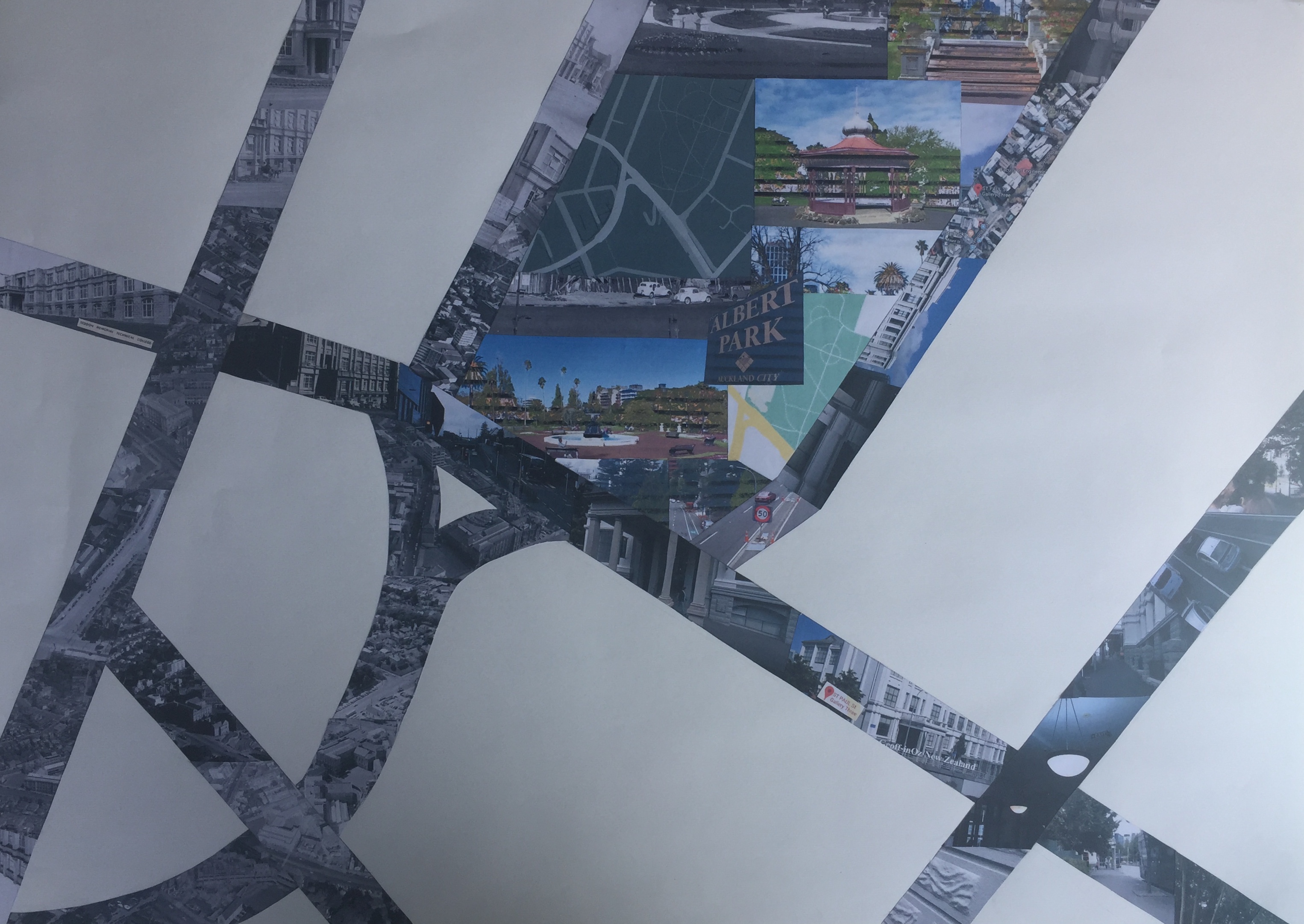
collage completed 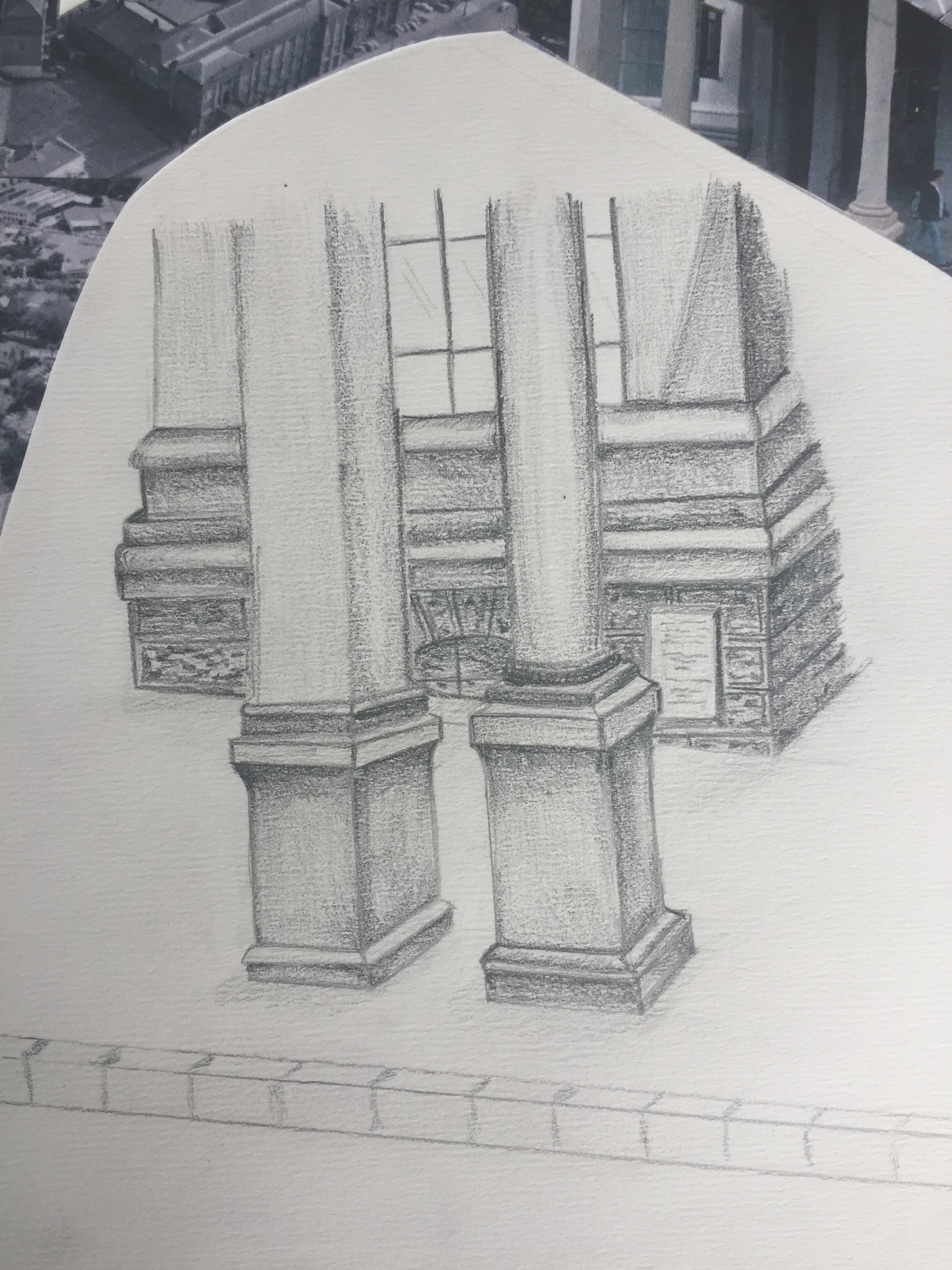
Sketch of St Paul Street Gallery 3 from outdoors 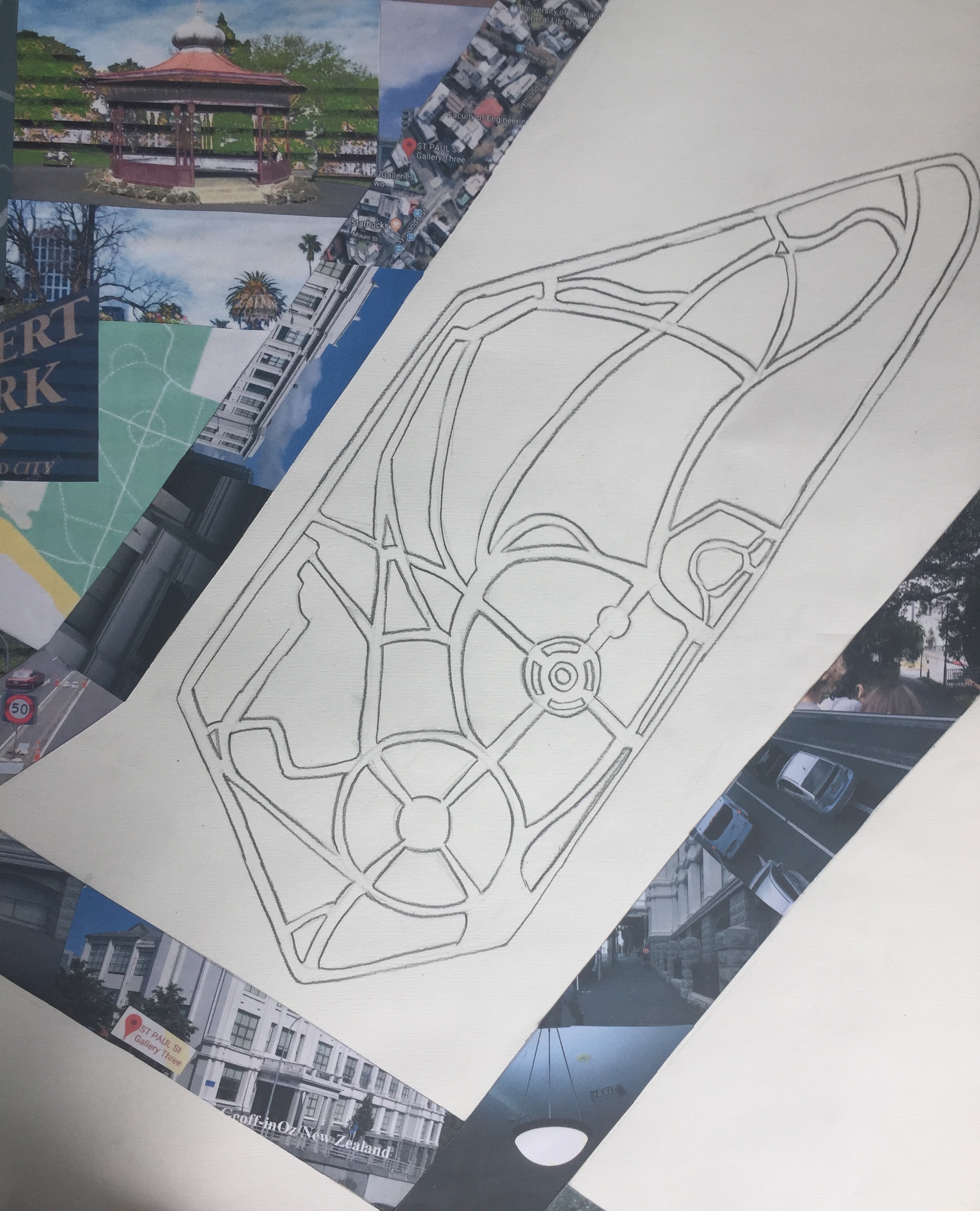
Sketch of pathways around Albert Park
Final Site Map:

Week 5: Threshold Plan + Section
During our studio class at the beginning of this week we went and visited our site, St Paul Street Gallery Three. In small groups we worked together to gather measurements that will help us create a site plan and section to a 1:50 scale. While being in and around the site we were also asked to photograph and sketch parts of the site that we thought related to our chosen thresholds or areas where we could potentially change the room in order to create the feeling of our chosen threshold.
The threshold I have been mainly focusing on is movement/stasis, however, while being in and around the site I was also drawn to the idea of the light/dark. This was due to the large window at one end of the room that was the sites main source of natural light. The pictures below show how much brighter the room was nearer the window as well as the detailed shadow it cast on the floor below.

Research:
During Wednesday’s studio class we were shown plans and sections drawn by Carlo Scarpa. I was really drawn to the way Scarpa filled the page and we have been encouraged to do the same. The way colour has been used to draw attention to certain parts of the page is really effective.
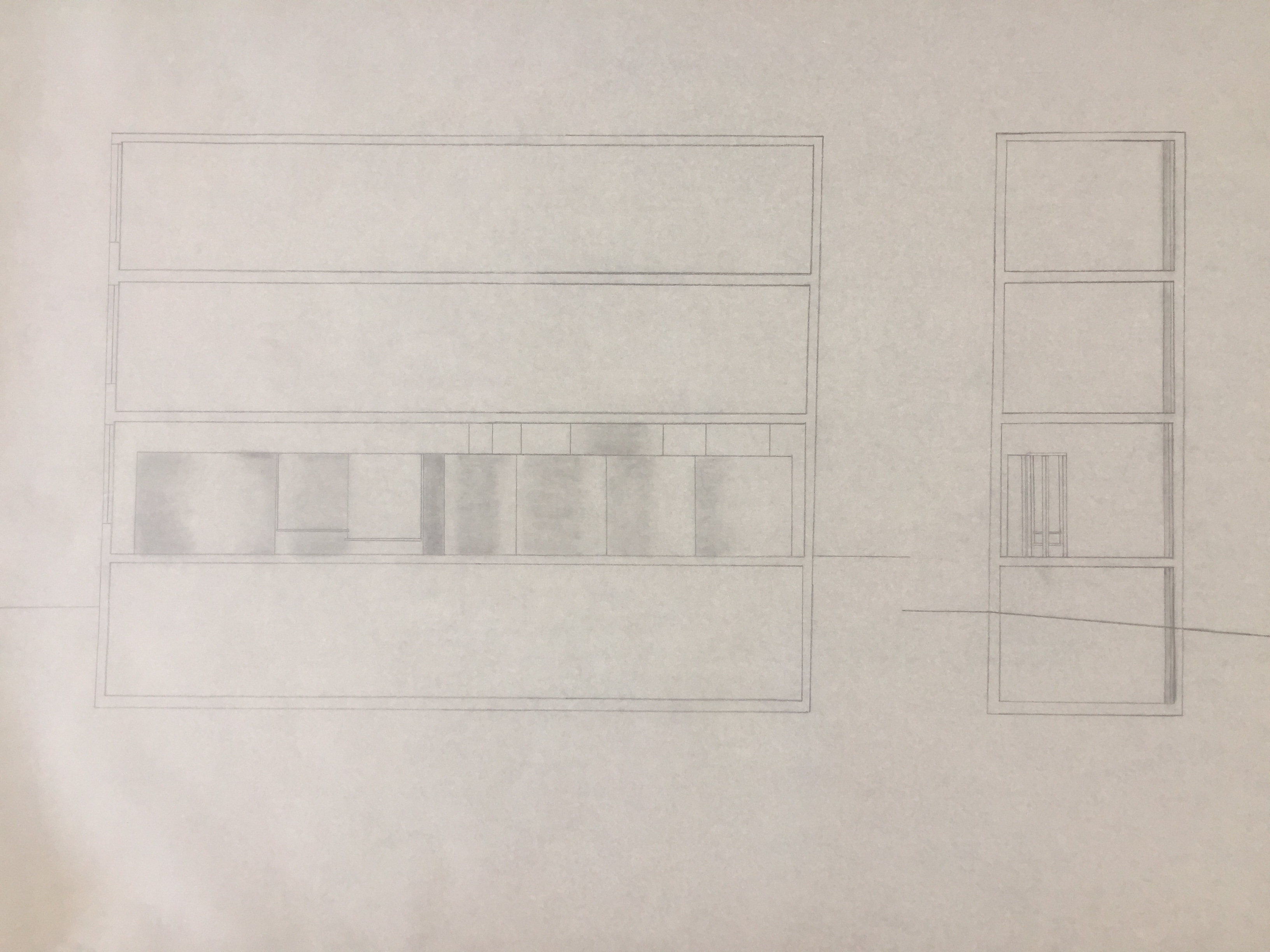
Site Plan + Section


The images above show the progress of my site plan and sections so far. I plan to add a lot more detail around the outside to clearly show my ideas. The top right image shows a possible intervention I could make, however, I am now thinking of working with a different area of the building where I could use natural light to create changing effects throughout the day.
The bottom image is my threshold drawing. Again, I plan to add more to it but the main thresholds I was trying to capture in this piece were movement/stasis and light/dark. To show movement/stasis I have drawn multiple straight lines with arrow heads pointing in the direction of the movement. Each colour represents a certain number of people as I sat and observed each area to see where the most movement occurred. Where there are red arrows is where the most movement was happening. I drew three lines to represent the three different types of movement I saw, pedestrian movement, scooter/bike movement and vehicle movement. The yellow lines represent where I saw a small amount of movement and orange is where I saw an average amount of movement. Both the yellow and orange lines only represent pedestrian movement.
The soft grey shaded areas show where both natural and artificial light are able to enter the room. I personally want to add more light into the room and think that I will look further into how I can create that in the near future.
Week 6: Threshold Plan + Section Continued
Throughout the week we were asked to continue to develop and refine our ideas when it came to our threshold plans and sections as well as start thinking about how we could model it.
I have found myself working slowly through these stages as I still do not have a clear idea of what I want my intervention to be. I spent a lot of time trying to correctly scale my plan to 1:50 so then I could easily project it onto my section drawing.
Research: Tod Williams and Billie Tsien
I think maximising natural light in many areas of design is really important so I was drawn to the way architects Tod Williams and Billie Tsien used many large windows to allow light in, particularly in their residential designs. When looking through images on their website I was able to find many unique and interesting concepts as well as plans/sections and models of their designs. The images below show some of their design process of a pool house they were adding to an original 1961 home. An aspect of their design that could be incorporated into my threshold design is how they made the entrance from the exterior intentionally indirect to create a sense of privacy. I think everyone’s sleep/wake moment is a personal thing as everyone’s experiences would be different. Creating a sense of privacy is an idea I could further explore.


Williams, T., & Tsien, B. (1988) Pool House [Photograph]. Retrieved fromhttp://twbta.com/work/pool-house
Further Lane House by Tod Williams and Billie Tsien. I like the way the plan and section are able to give you a sense of the atmosphere the design brings the environment. Again, the design shows access to natural light is a priority.


Williams, T., & Tsien, B. (2010). Further Lane House [Photograph]. Retrieved from
http://twbta.com/work/amagansett-house
Research: Richard Sweeney
Richard Sweeney is a English designer who discovered his natural talent for sculpture at Batley School of Art of Design in 2002, which led him to study Three Dimensional Design at Manchester Metropolitan University.
I was drawn to Sweeneys designs as they explore many of the thresholds that I am looking into. In particular movement/stasis and light/dark. His designs show strong signs of movement as they twist and turn around themselves. Sweeney pays attention to the shadows of his designs and how they change when the light is coming from different angles. He not only looks at the shadows of the overall sculpture but he also creates smaller shadows within the designs. I am planning on incorporating some of Richard Sweeneys design style into my threshold intervention.
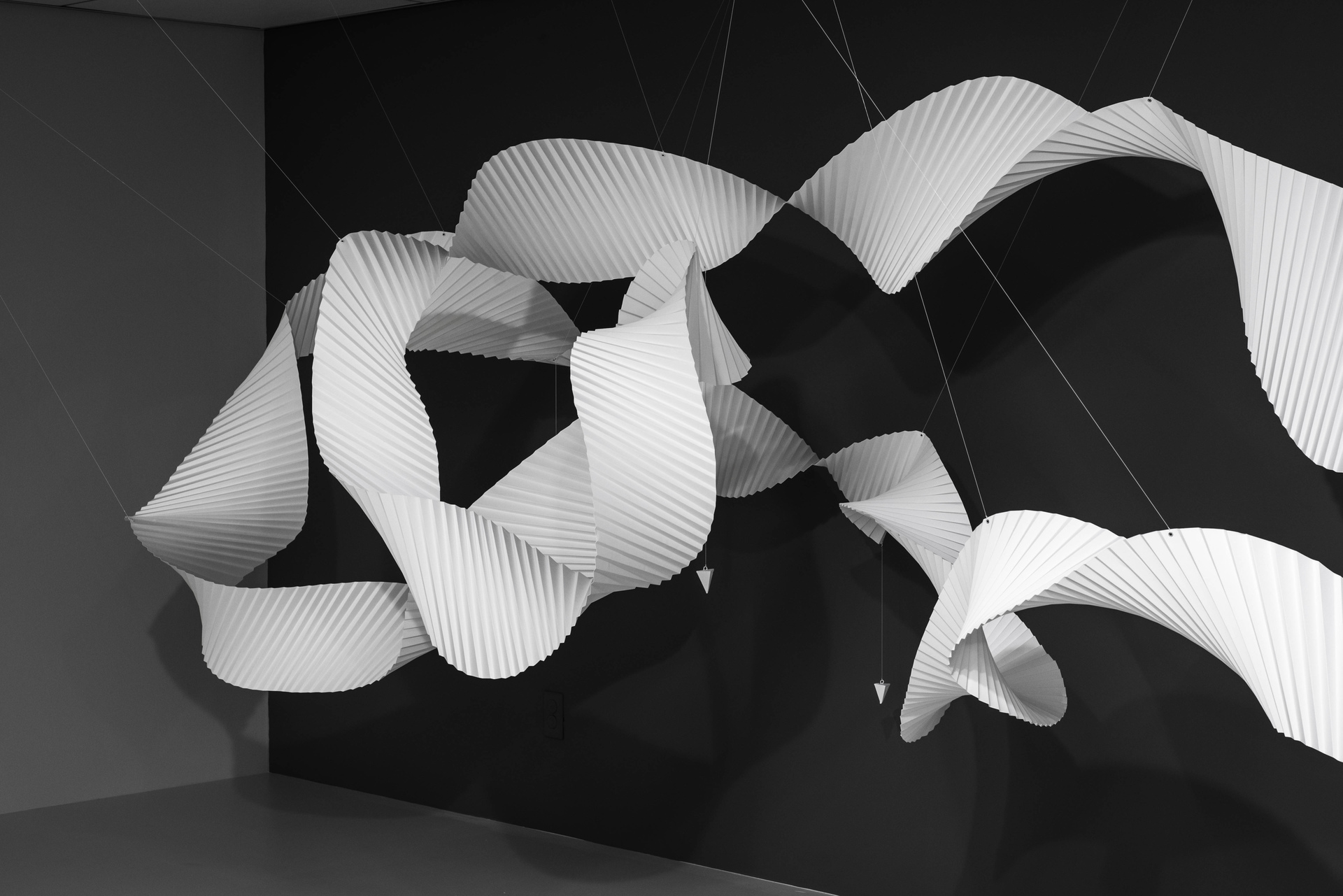
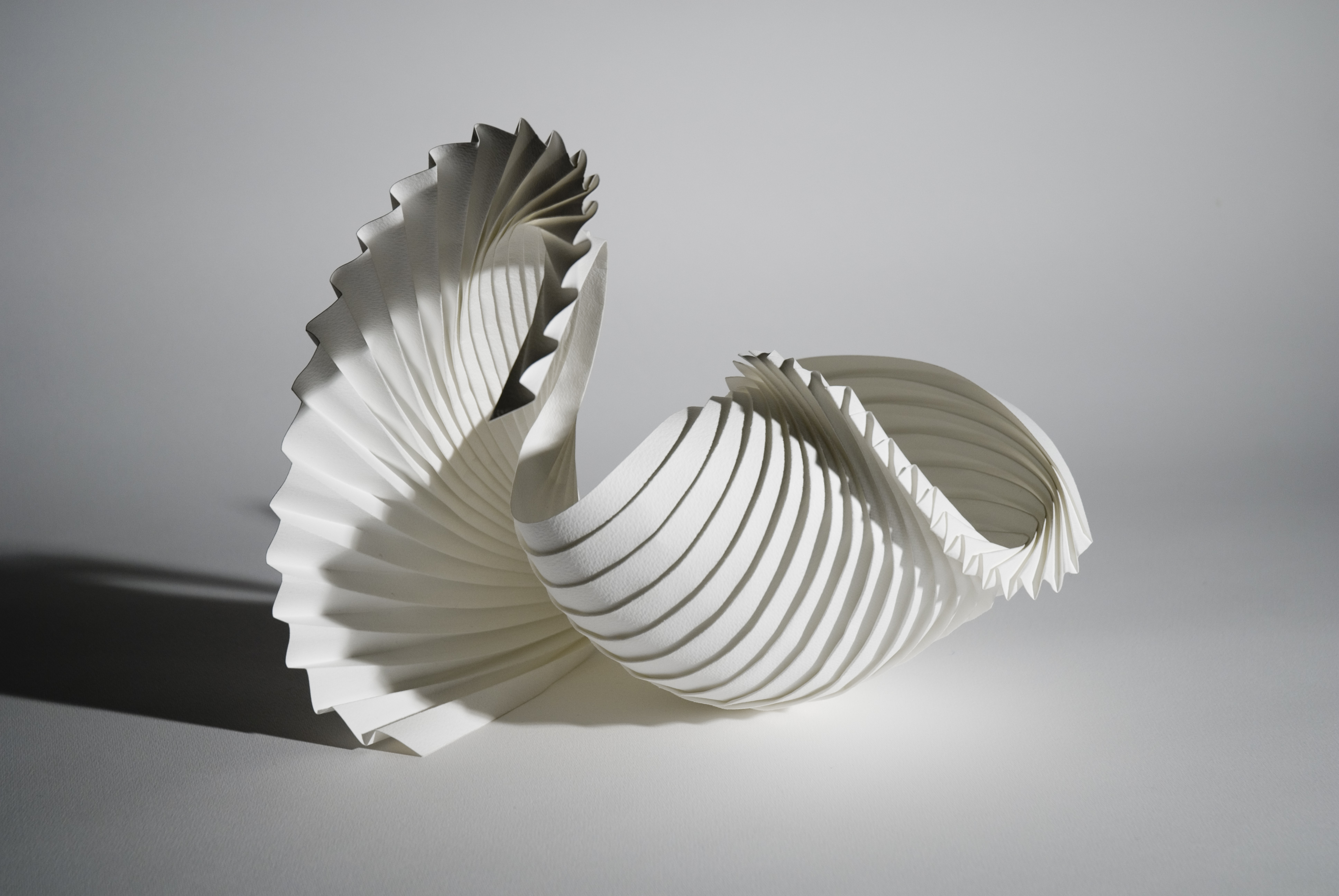
Left Image: Sweeney, R. (2016-17) Untitled [Installation]. Retrieved from https://www.richardsweeney.co.uk/installations
Right Image: Sweeney, R. (2010) Shell [Watercolour Paper]. Retrieved from
https://www.richardsweeney.co.uk/motion-forms
Week 7: Final Threshold Idea
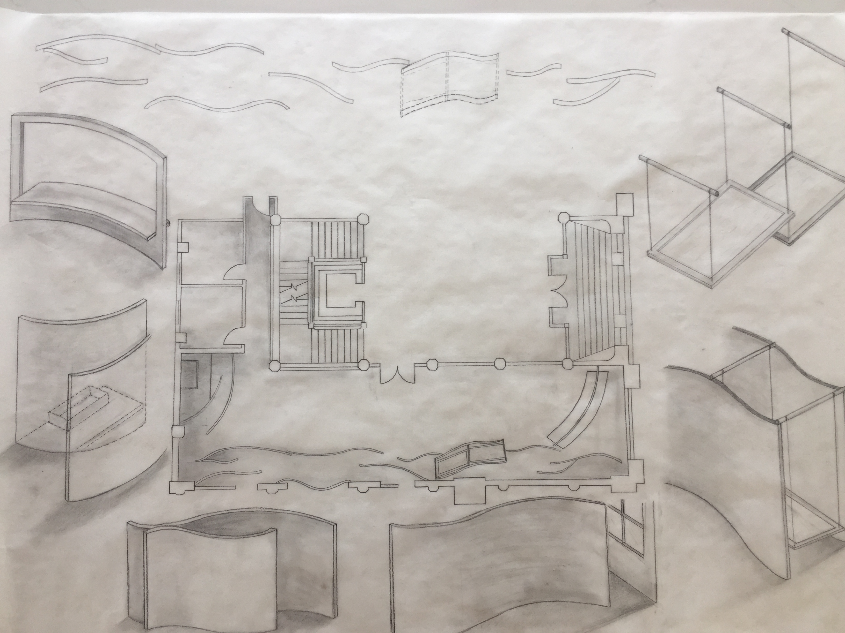
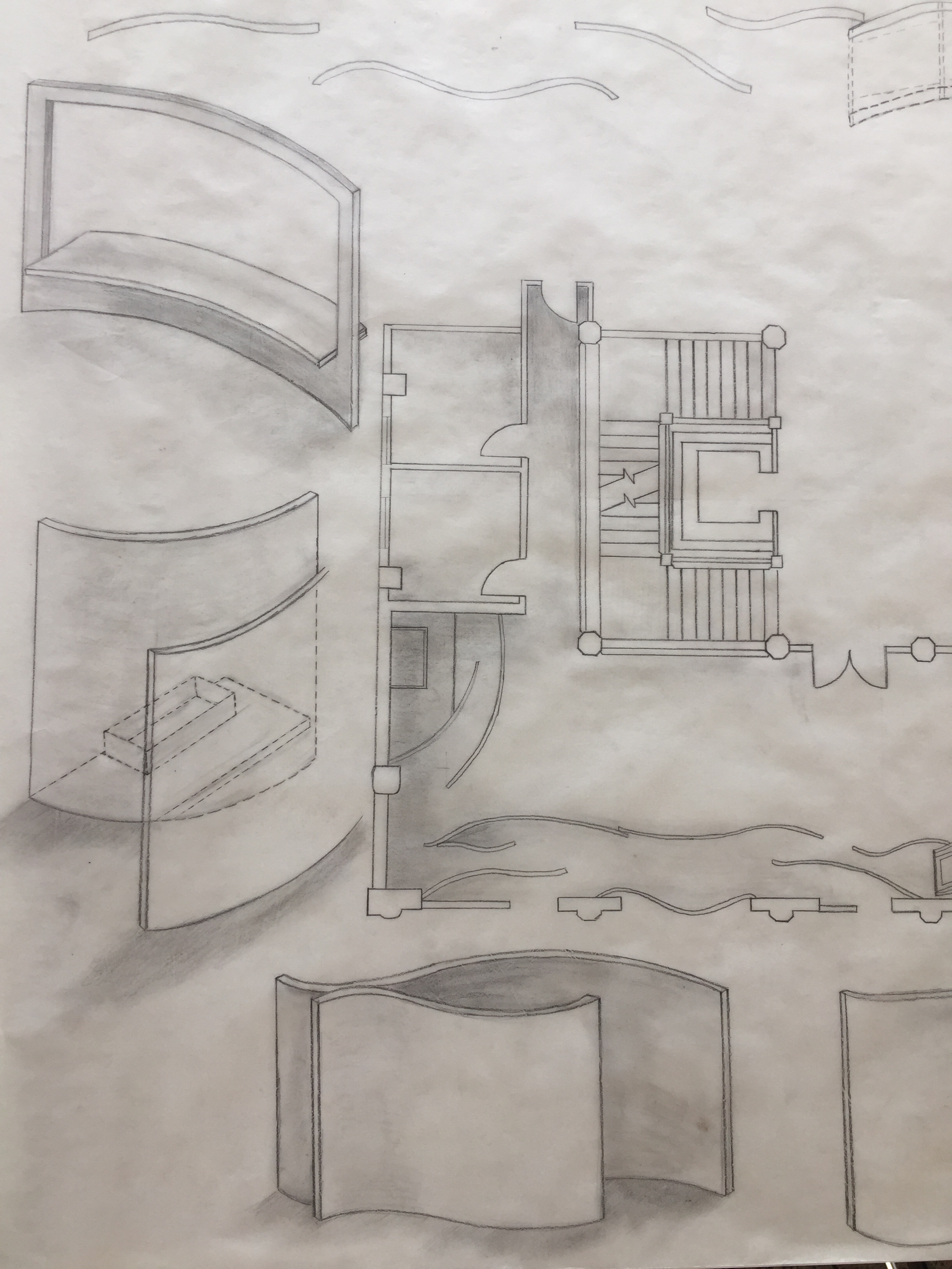
This week my plan is to finalise my threshold intervention idea so that I am able to begin modeling as soon as possible. The images below show the progress of my section and threshold drawings from previous posts as well as some more planning.
The threshold idea I have gone with involves multiple curved structures being added to the eastern wall of the building. I am still unsure of what I would like the curves to be constructed from as I am still deciding if I want them to be solid, transparent or even possibly have small holes cut out of them to create interesting patterns when light changes throughout the day. I think I will be able to finalise my idea by modelling each of them and decide which works best with the space as well as which idea fits best with my main thresholds that I am trying to create.
I am purposefully leaving my section drawing blank until I have fully modeled the site so that I can draw a perfectly accurate section.


I am drawn to the idea of the curved walls due to the fact that they would create a soft flowing feeling as you move through the space. Since movement is my key threshold I think that this idea fits nicely with my personal brief.
Since the eastern wall is a part of the building that has one of the smallest amounts of movement recorded I think choosing that area was smart choice. I wanted a more private entrance that not everyone could see as they walk down the street to the rest of the university. The rest of the building is still easily accessible to the public who use it everyday as it is still apart of the university.
Mid Semester Break:
Over the break I consistently worked on my project, always finding ways to improve it. I spent a lot of time working on my model as the concept of modelling is fairly new to me. I was able to complete the task on time to a standard that I was happy with.
Final Site Map:

I personally found my site map eye catching as the bold lines running through the page draw attention to the work itself. Due to movement/stasis being my main threshold, the roads leading to the site I found particularly important. The pictures are laid out in the pattern of the surrounding roads and also move through time from the left to the right. On the left is the earliest image of the site I could find taken in 1913. As the eye moves towards the right of the page the images move through time right up until the present where photographs that I have taken feature. The sketches in the gaps show areas of interest as well as areas that movement occurs, whether it was pedestrian movement, vehicle movement or even movement of machinery eg. cranes
When creating my site map I was interested in the way that there are many possible roads and paths to take to end up at the same destination. I use this idea later as inspiration for my threshold intervention.
Final Site Plan:

When drawing my final site plan I was able to fully finalise my intervention idea. My design incorporated some aspects of the previous project into this project in order to be able to link them together. My plan shows the series of curved walls along the eastern wall of the building. I removed the false wall along with the three existing windows to allow space for new entrances into the building. I wanted to use curved walls rather than straight walls to create a flowing feeling when moving in between the structures.
Movement was my main focus and in particular the movement of pedestrians rather than the movement of the threshold intervention itself. I wanted the person walking through the design to give it movement. Another reason for using curved walls was so that the movement of a person walking through the space would be an entirely different movement to someone walking through the foyer or down the street outside. As shown by the red and orange arrows, a majority of movement around the building was in straight lines. Straight up or down the path, straight into the elevator or down the hallways. By entering the curved pathway you get the feeling of uncertainty as you cannot see what is around the corner.
I created two new entrances along the eastern face of the building for many reasons. As I have said the main threshold I was looking at was movement/stasis and I have found that a lot of movement occurs around all areas of the site. When thinking about sleep/wake, I think of it as personal experience, therefore, I wanted my intervention to be placed where movement is not so heavy. Because of this I instantly ruled out my entrance being on the northern face of the building. I also wanted my design to increase the amount of natural light let into the room, meaning that I still wanted my intervention to be made from the outside of the building. This lead to me deciding that the eastern wall would be the best fit for the threshold moment I wanted to create.
As shown on the plan the gaps between walls in some places are rather small. This is because I wanted to create a tight, confined space, further creating a sense of privacy. I personally like how there are multiple paths that you can take to fully enter the room and how there are smaller interior spaces created within the design.
I decided to keep the original doors on the western wall because as you enter the room from that side you are hit with curiosity, wondering what could be behind the walls. The walls almost invite you to come inside the maze-like pattern and look around, finding new spaces and creating your own pathway.
Final Site Section:

My site section shows that the curved walls I designed do not go all the way to the ceiling. The reason I did this was so that small amounts of light would be able to spread across the room and in between walls without being blocked off. The section makes it easy to see that the walls spread across the entire room.
Final Model:


The materials I used for my model were,
- Foam Board
- Cardboard
- Super Glue
I definitely think that creating a model helped with finalising my idea as well as seeing how practical it was. I like the way my model turned out as it shows my idea effectively.


I placed my model on a larger piece of foam board that represents the downward slope of wellesley street to incorporate the buildings surrounding.
If I were to build these structures I would make the walls out of 7mm plywood curved around a timber or steel frame. The walls would then be painted white to give the space a lighter feeling.
Project Two Presentation:

Abstract:
The threshold I have mainly focused on for my intervention is movement/stasis. I wanted to keep a similar theme from the previous project so again, I incorporated smooth flowing lines to my design. There are two small entrances on the eastern side of the building that have taken the place of the old existing windows. Once inside, there are multiple paths to take, leading you through a series of curved walls that stand 3m tall. Small gaps separate each of the curves, some too small to fit through, creating a tight, confined space. When moving through my design light and shadow will change depending on the angle of the curves due to the fact that the walls do not go all the way to the ceiling. My design stretches across the entire eastern wall once inside, creating a more personal space.
Feedback:
The feedback from my presentation this morning will be very helpful for my future designs. I was questioned about my own idea of movement and how I could have incorporated that more into the design itself. I also liked how it was mentioned that I could have possibly extended the curved walls further out of the building and onto the footpaths outside, directing people indoors. From the feedback I have learned to be more playful with my designs and try different variations of my ideas to find what works best. Materiality was also mentioned and how it is important to find the right materials that can create the look/feeling I am wanting.
Week 8: Sketch Design + Model
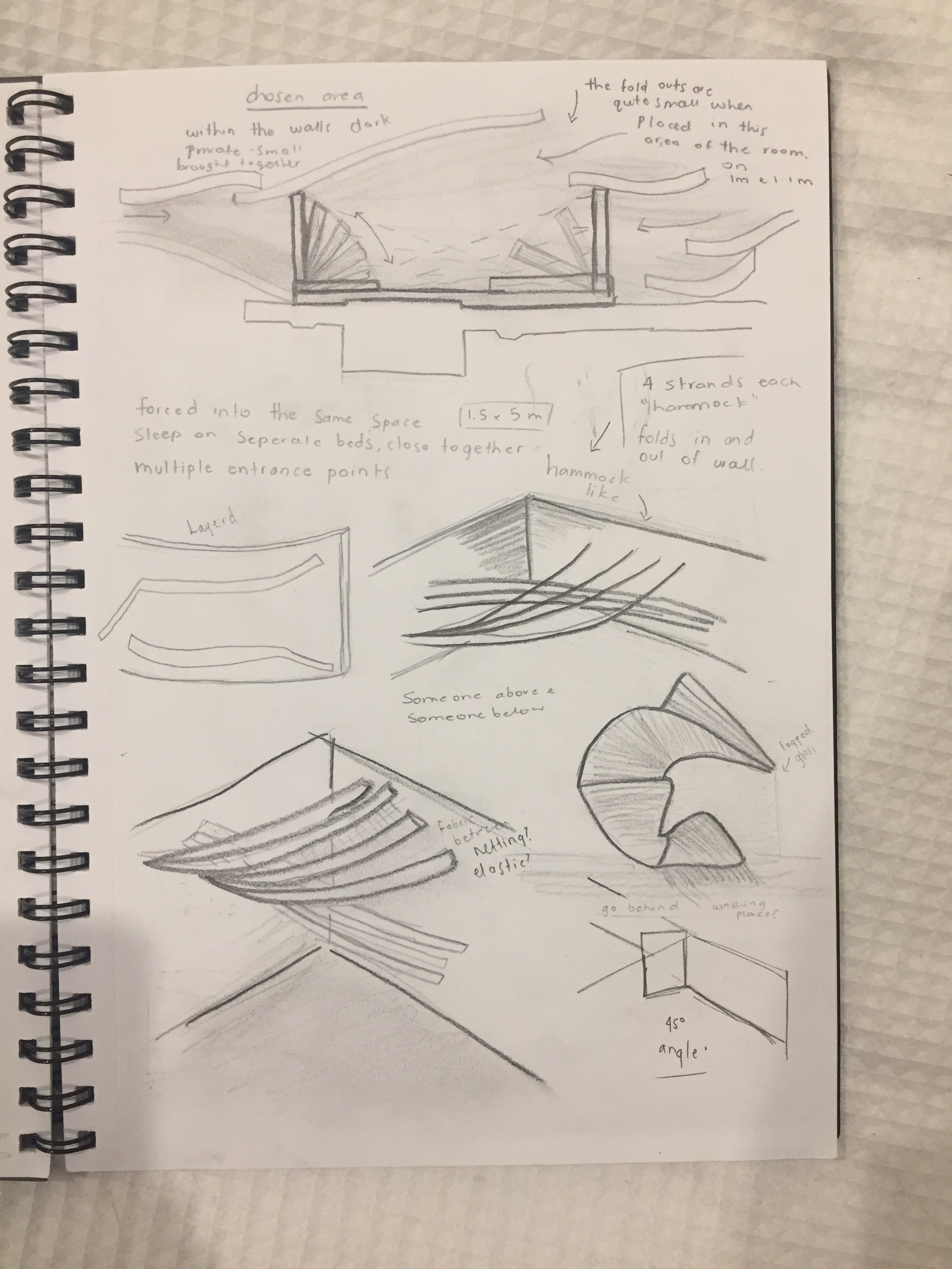
This week we began the final part of our sleep/wake project. Project three – Two Strangers. Our task was to begin thinking about how we could design a sleeping platform for two strangers to use within the gallery. It is up to us to decide what type of experience we want the strangers to have, for example, we could keep them separated, never meeting, or we could force them together and make them interact.
Over the last week I spent time sketching ideas for my sleeping platform.
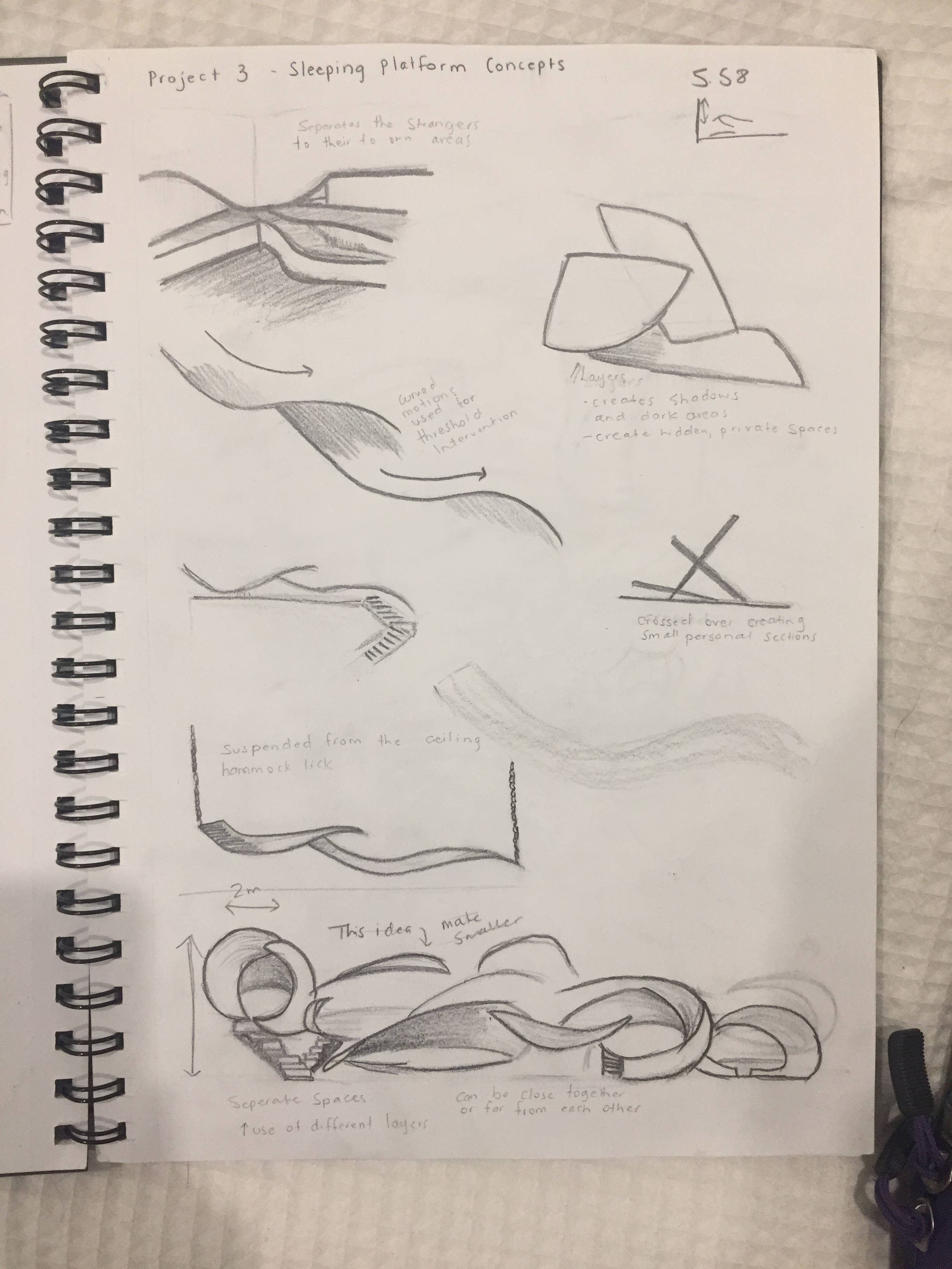
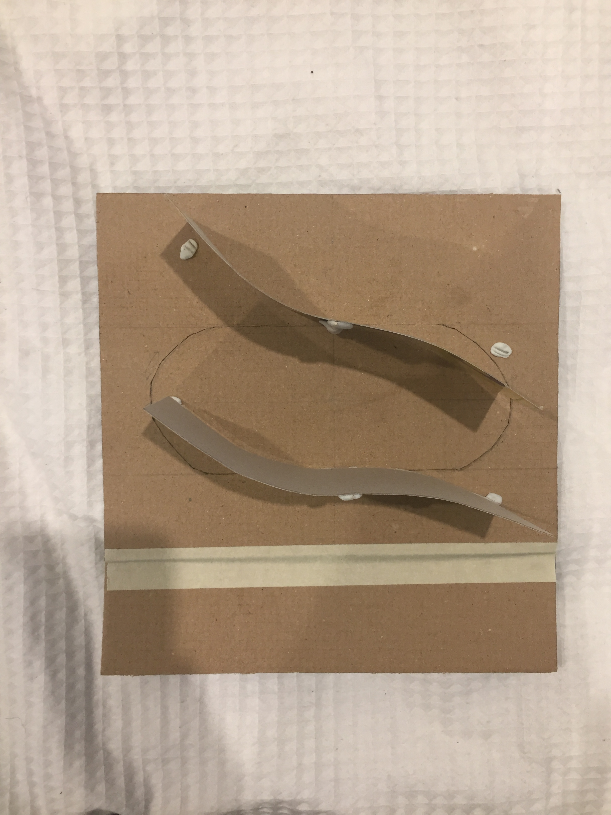
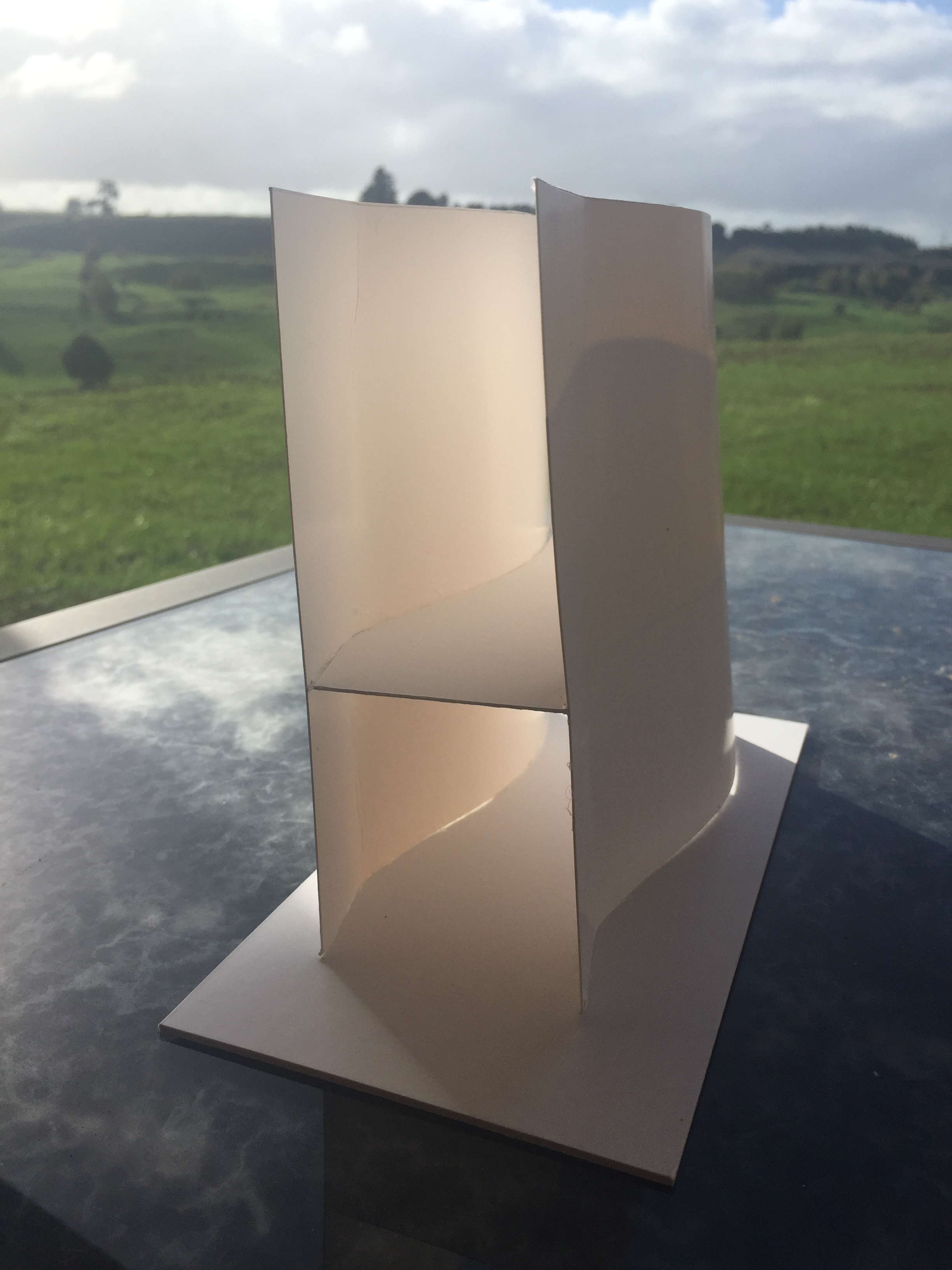
After drawing many concepts I decided to model one to see how it may look.
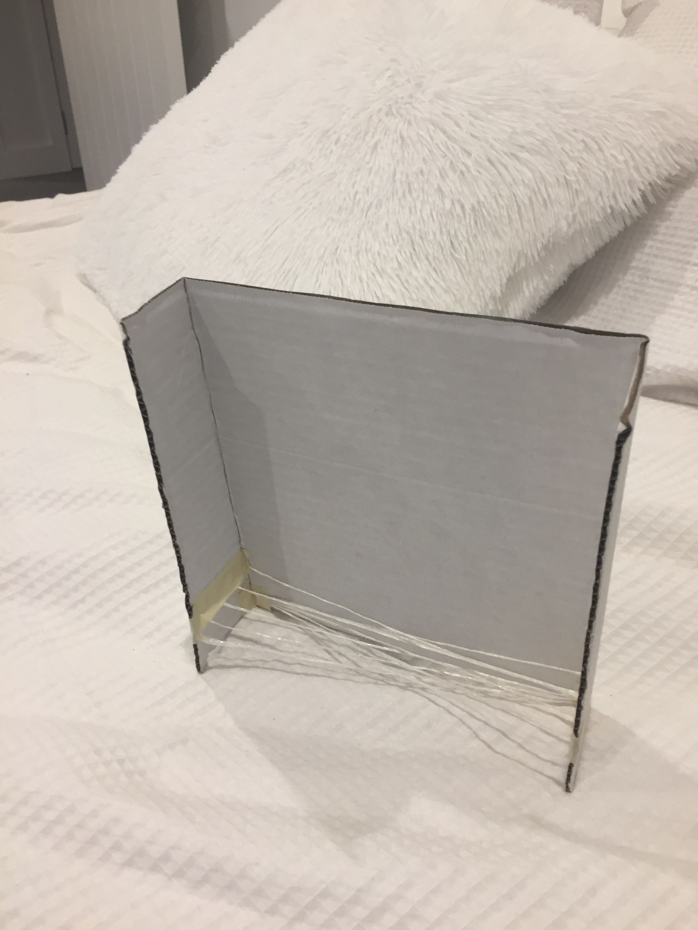
As I was making this model I already knew I did not like how it was looking. My idea was to have the walls fold in and out so that each person could enter their sleeping space when they liked. I planned to have them sleep on some sort of netting that over lapped almost making a hammock like bed. I did not like that the folding walls did not meet in the middle as they were to short leaving the netting exposed, showing that it would have just fell to the ground in a pile which is not aesthetically pleasing.
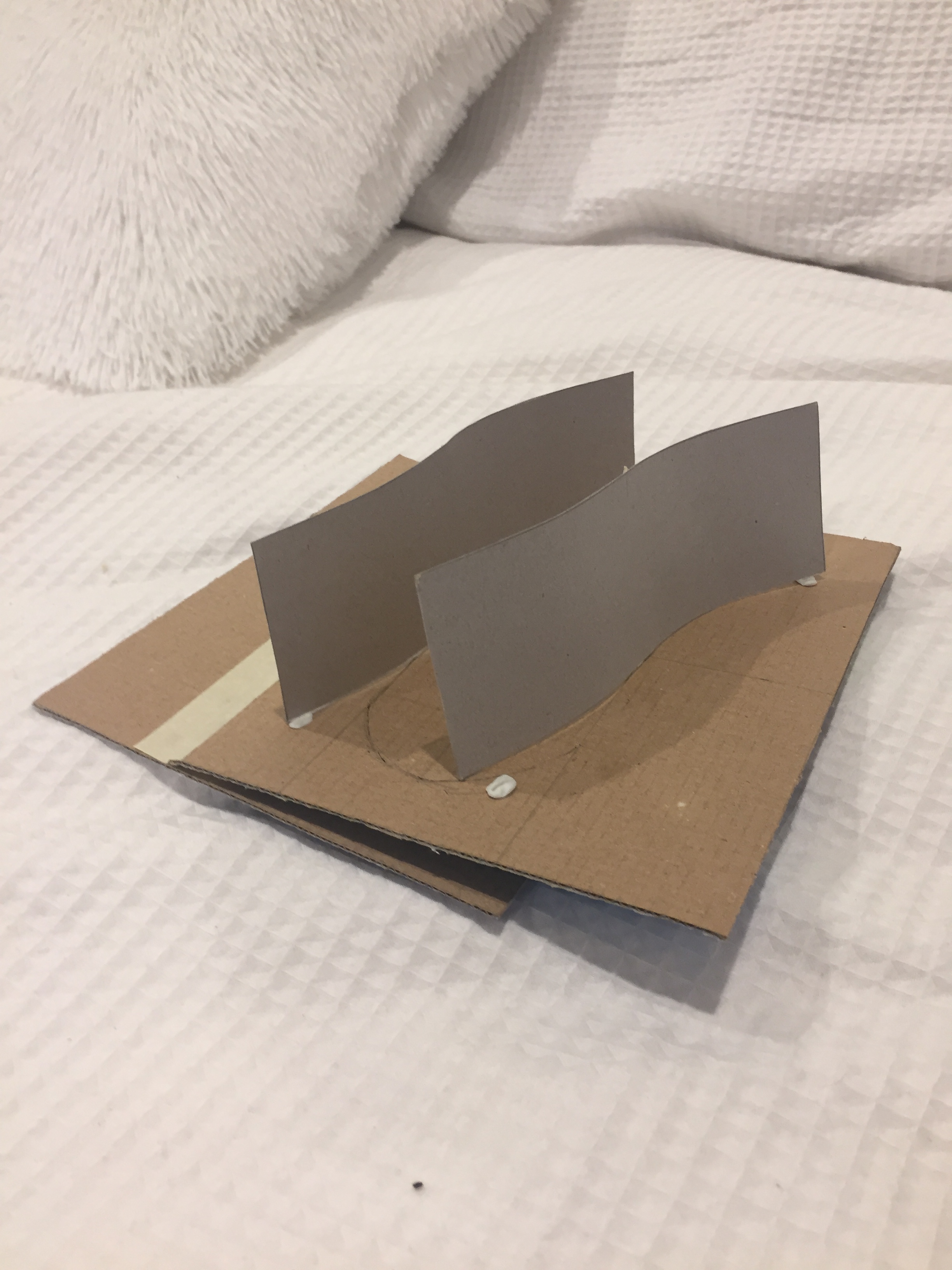
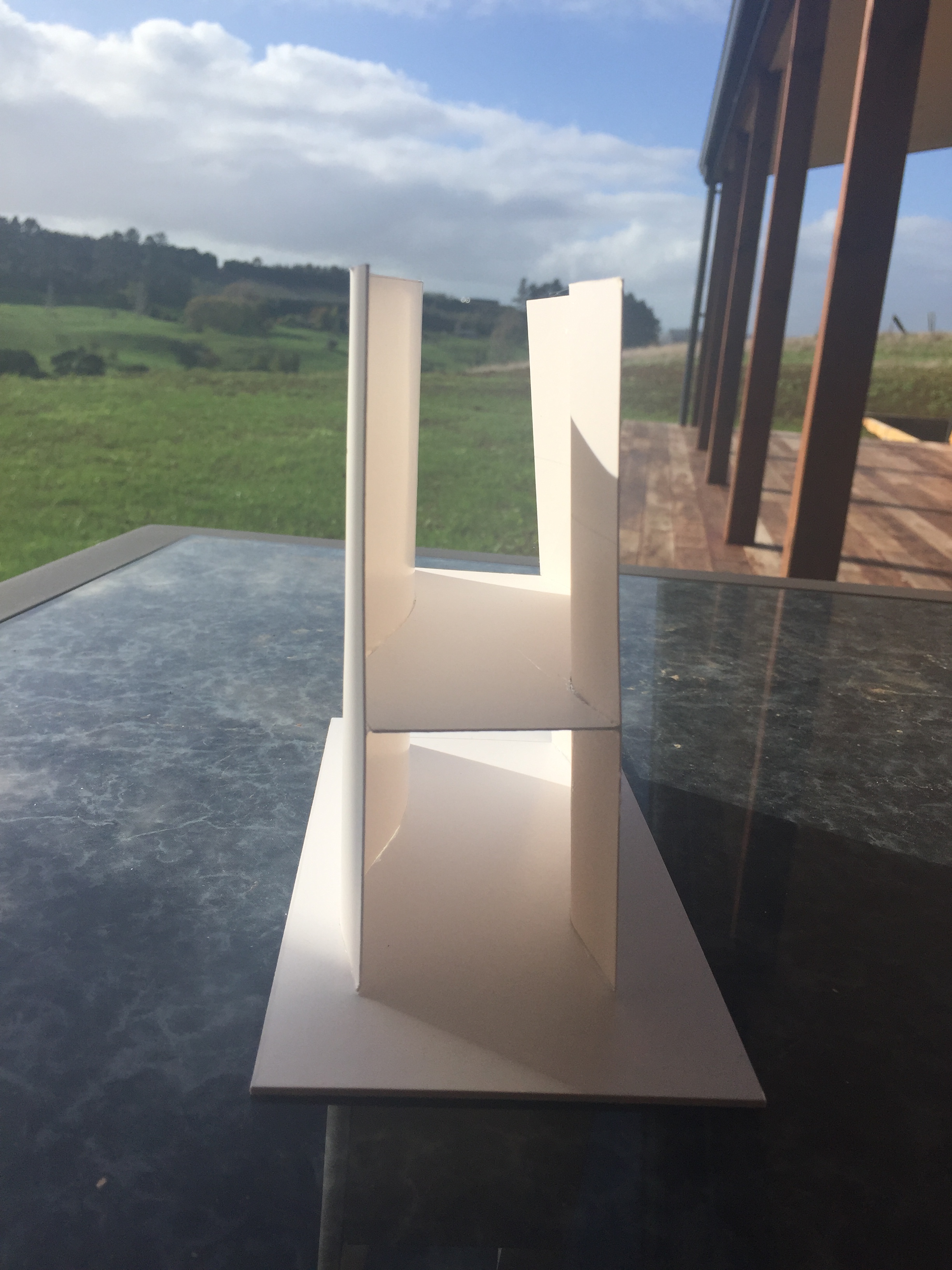
After thinking about this idea further I developed a second idea. This time without movable walls.
For this model I made the wall lengths longer as well as positioning them in a way where they would not need to be moved. The 90 degree angled wall would be an existing wall of the building and the 45 degree angled wall would be a wall added to the area. Again the netting would cross through each other creating a hammock that is long enough for two average height people to not touch feet. Even after developing this idea I still found that I was not happy with the design. I then moved on to designing a concept that had the potential to be moved forcing the two strangers to interact.
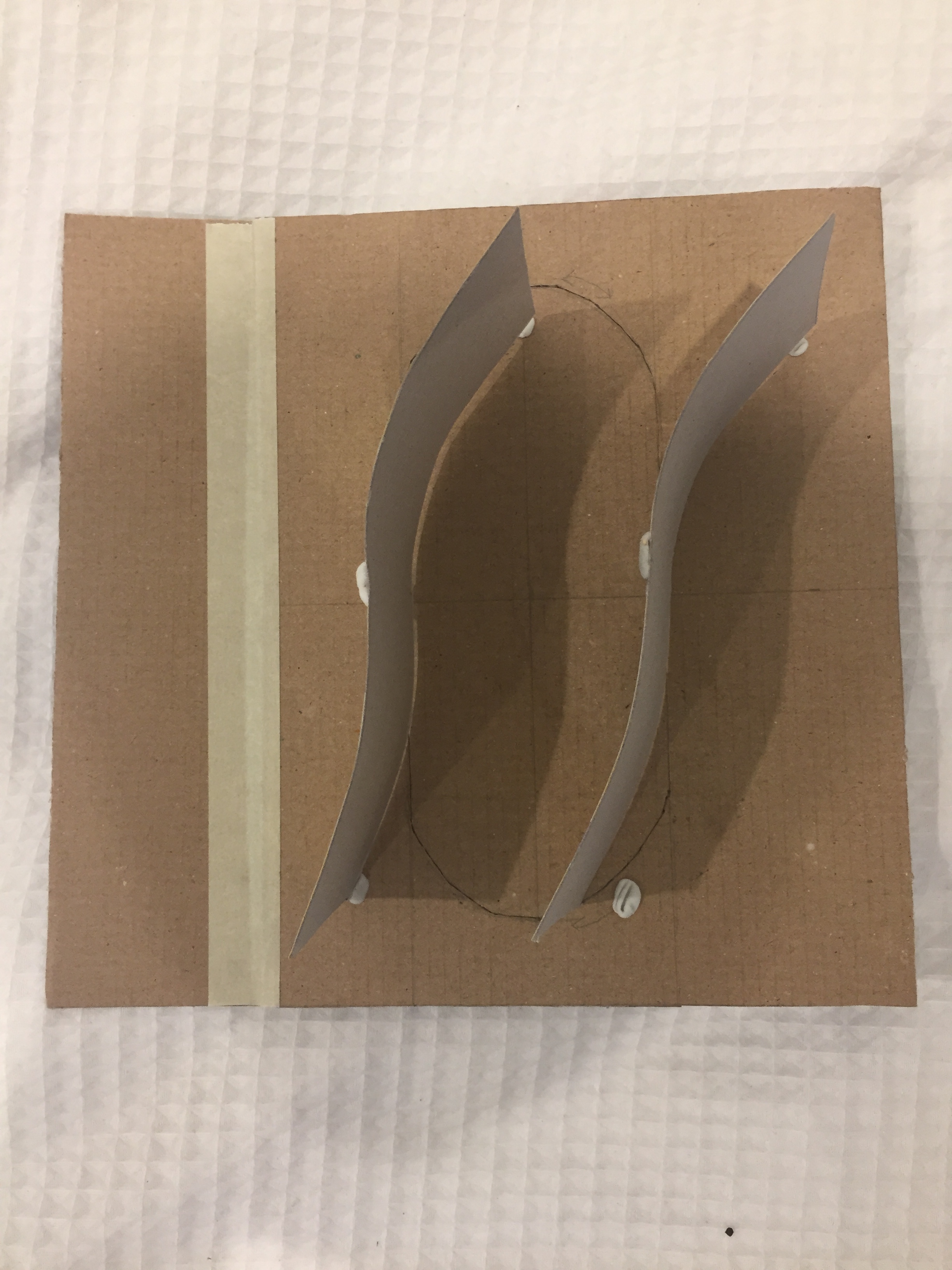
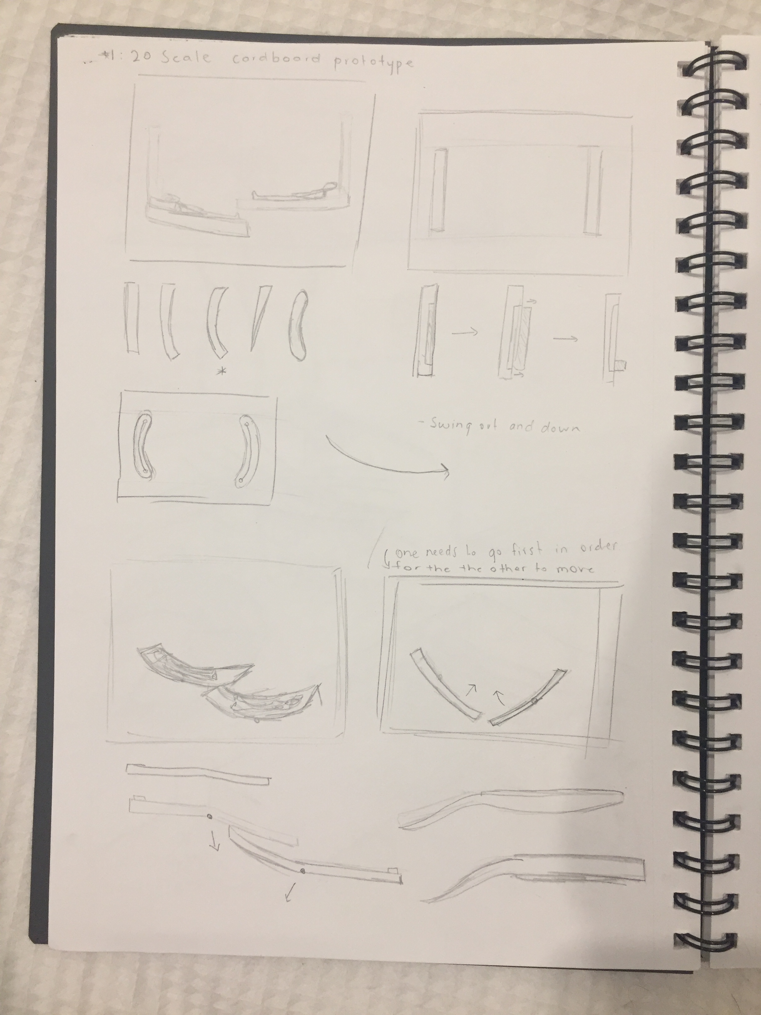
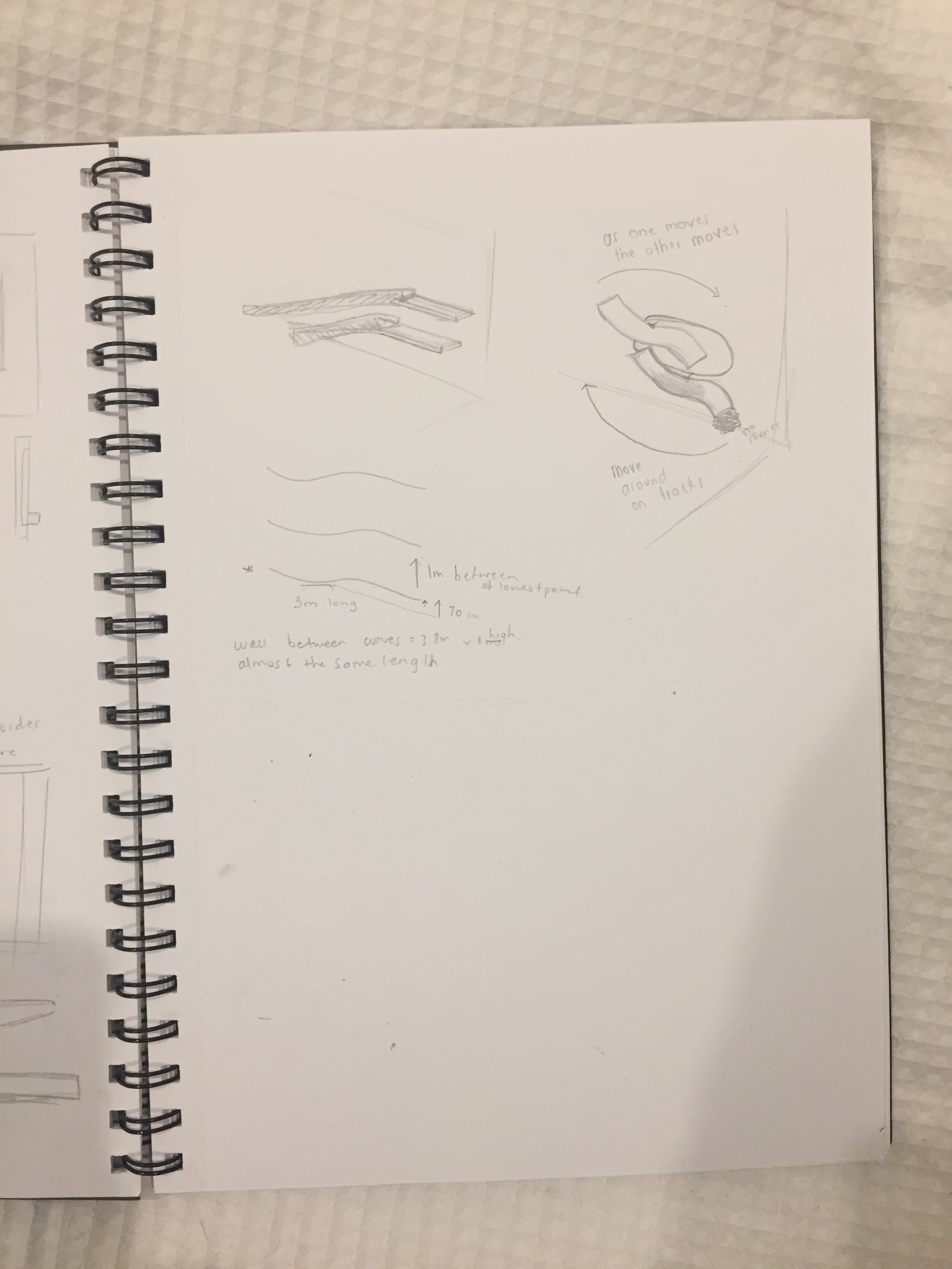
The images above show the third concept that I decided to model. This idea involved two sleeping platforms positioned on the wall. The lowest easily accessible and the higher one unable to be reached. The idea I am wanting to explore is the possibility of the platforms being able to move and switch positions. I am wanting the platforms to be able to move at the same time and have the possibility to stop at any position. I am looking into the different ways I could get the platforms to move whether it be on a rope/wire system or if I want the strangers to physically have to push and pull on the platforms in order to create movement.
Week 9: Developing Ideas
This week I have continued to work on developing my sleeping platform ideas. I was not fully happy with the design I had come up with last week so I continued to work on my ideas, exploring new shapes and movements I could create.
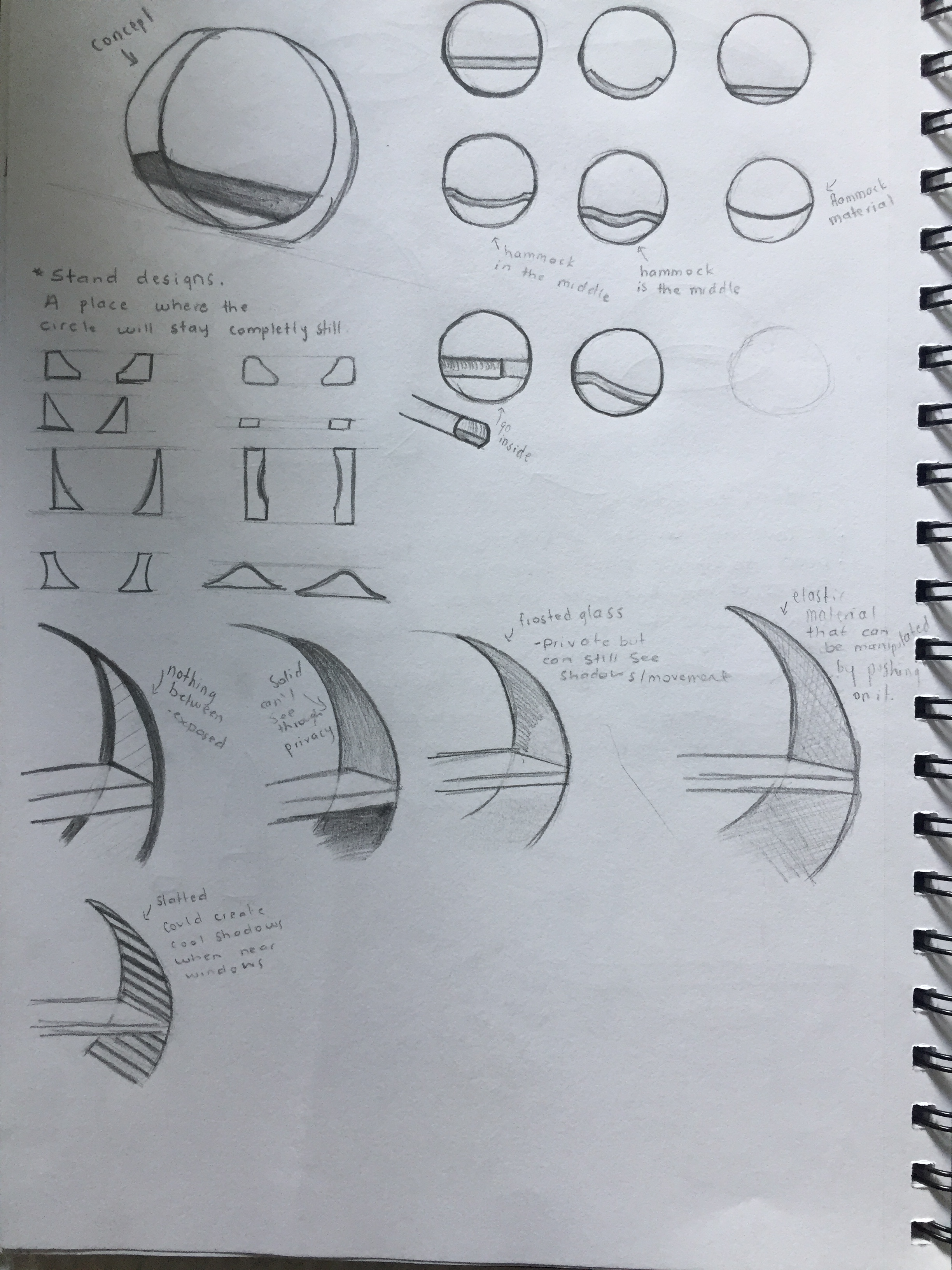
The next idea for my sleeping platform that I came up with was to have two separate circle structures (as shown in the image above) for each stranger to use as their sleeping platform. My idea was to have a type of stand built that the circles could sit within that kept it from rolling. These stands would be next to each other. If one of the strangers decides that they do not want to be so close to the other person they would be able to push the circle and roll it out from within the stands. The stranger could then re position their circle anywhere in the room. However, without the stands the circle would have nothing to stop it from rolling potentially making the sleeping platform uncomfortable, forcing them to move it back to where it originally came from. On the other hand the stranger may enjoy the rocking feeling and prefer to keep the circles off of the stands.
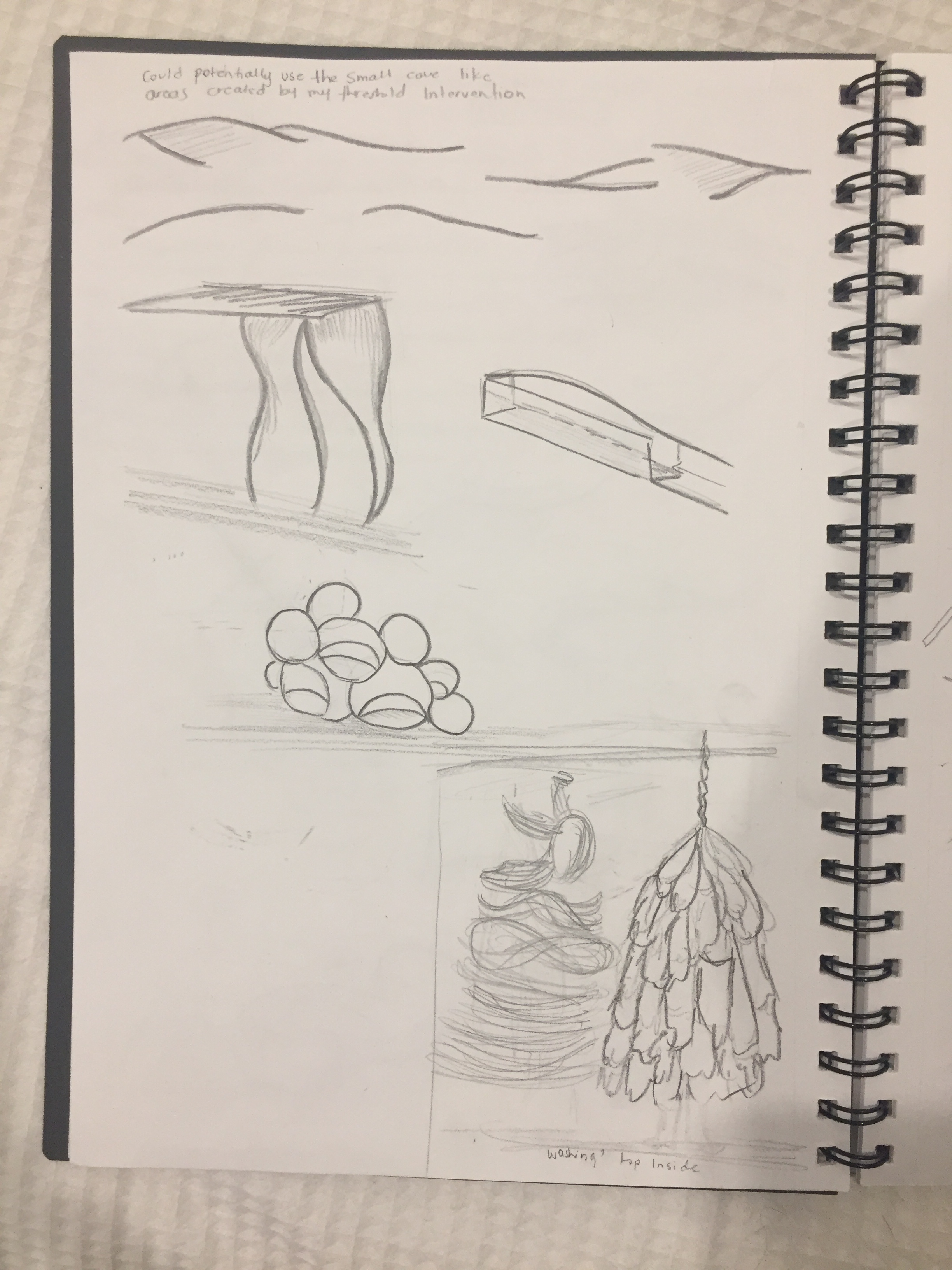
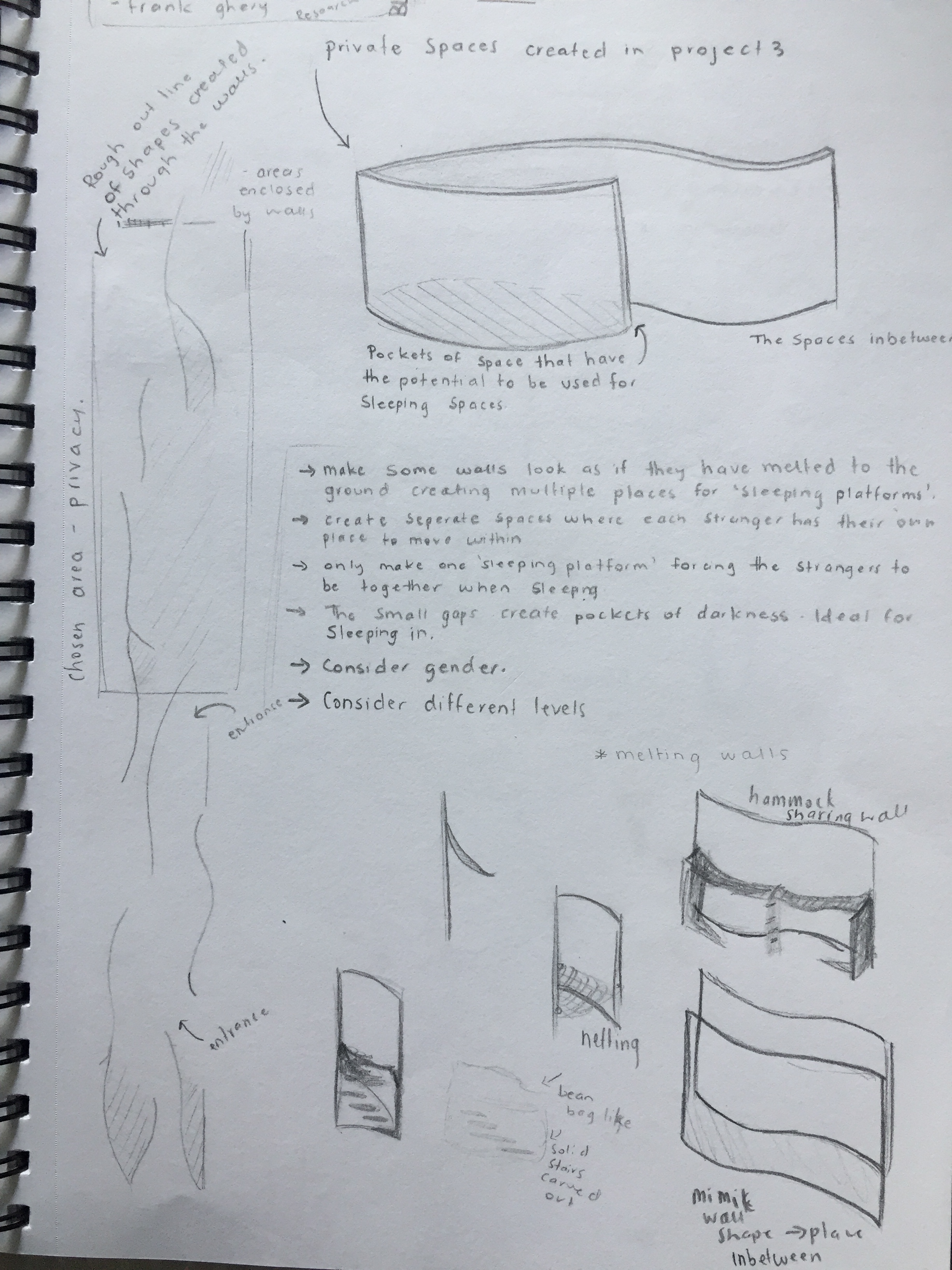
On Wednesday after having a one on one talk about my possible designs the idea to use what I had within my gallery space was brought up. This made me think that if I did incorporate my curved walls into the sleeping platform, my idea would be different to others as they don’t have the same space and structures to work with. I began to sketch the layout of the curved walls and started to focus on the more private areas the wall created as possible locations for sleeping platforms.
After sketching the layout I drew a rectangle around the area I wanted to focus on. I chose this area due to the fact that it is to the right of both the new entrances I created and the space is wide enough to work within.
Research: Richard Serra
This week I was shown work by Richard Serra. A series of his sculptures had many of the same characteristics as my threshold intervention. His works helped me imagine what if would feel like the be moving through the curved walls of my design. Seeing these sculptures made the idea of creating my platforms within the curves final. This is because the narrow gaps between walls create the perfect intimate areas for sleeping platforms to be built. Placing the platforms within the curves will also force my strangers to be close to one another which is the environment I am looking to create.
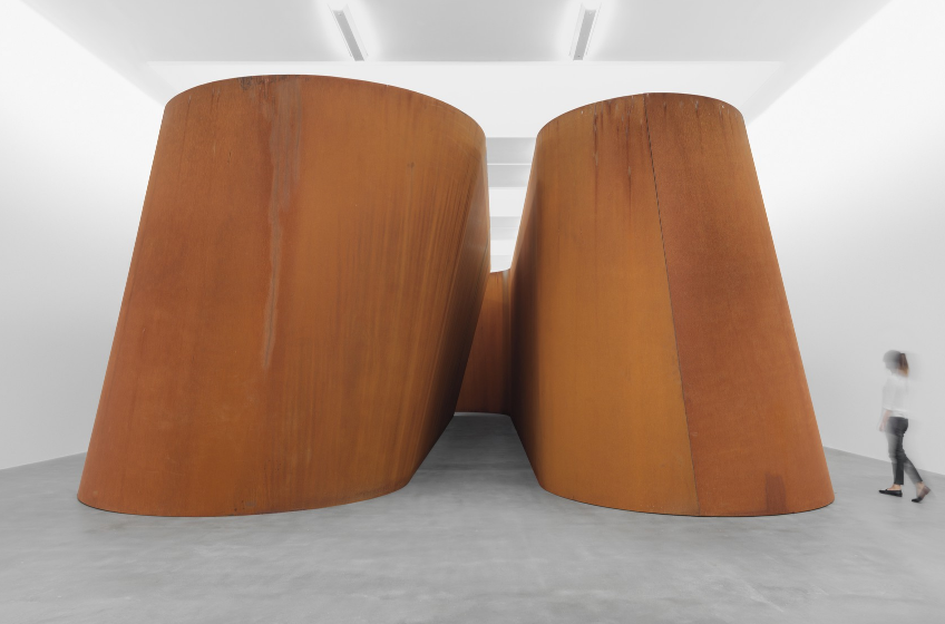
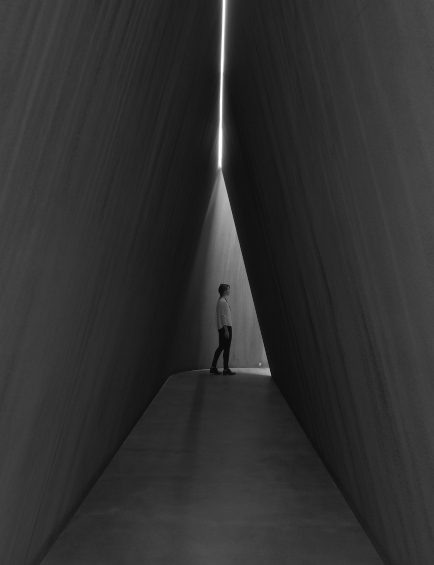
Serra, R. (October 1st, 2016 – April 13th, 2017) NJ-2. Retrieved from https://gagosian.com/exhibitions/2016/richard-serra-nj-2-rounds-equal-weight-unequal-measure-rotate/
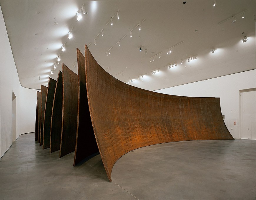
Serra, R. (2003-2005) Between the Torus and the Sphere [Weathering Steel]. Retrieved from https://www.guggenheim.org/artwork/17147
Research: Frank Ghery
Frank Ghery was the second designer that was mentioned during my discussion in studio. We talked about how some of his designs almost looked as if the buildings were melting. The idea of melting is one I am looking at exploring. I am thinking of ways I could possibly create a melting effect using the curved walls within my gallery.

Ghery, F. (2010) The Lou Ruvo Center for Brain Health of the Cleveland Clinic. Retrieved from https://en.wikipedia.org/wiki/Frank_Gehry
Week 10: Final Sleep Platform
This week my aim was to complete both my 1:50 and 1:20 scale models of my sleeping platform. The idea I was planning to model is shown in the image below.
As I began to make my model I new pretty quickly that I did not like the way the platform looked. Along with aesthetics, this design also would have not worked within my chosen area. This is due to the fact that the stairs I was planning to add on both sides would not have been able to fit as the other curved walls within the area would have been in the way.

After further thought, I again wanted to incorporate the idea of movement to my sleeping platform. While still working within the same curved walls I came up with another concept.

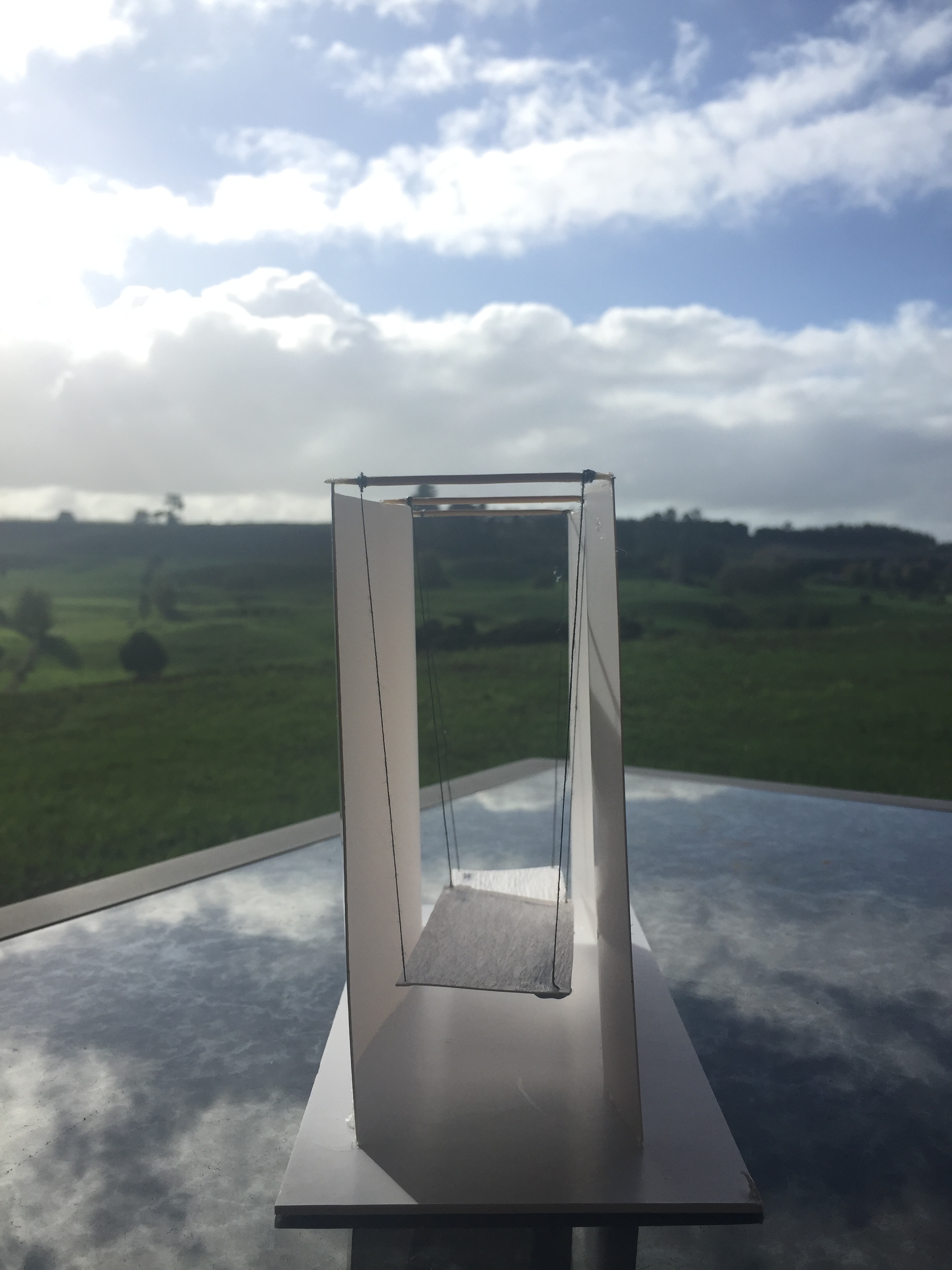
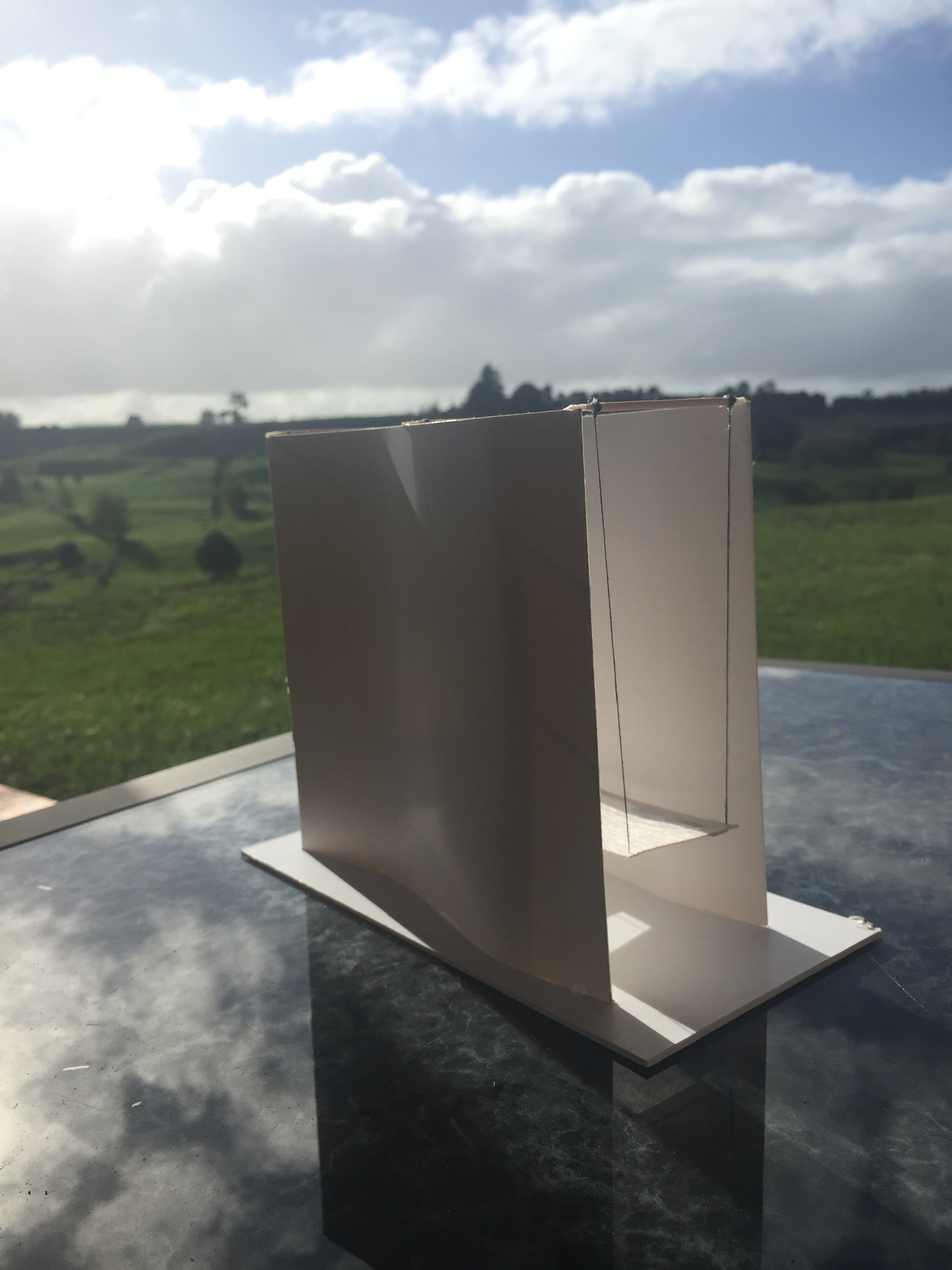
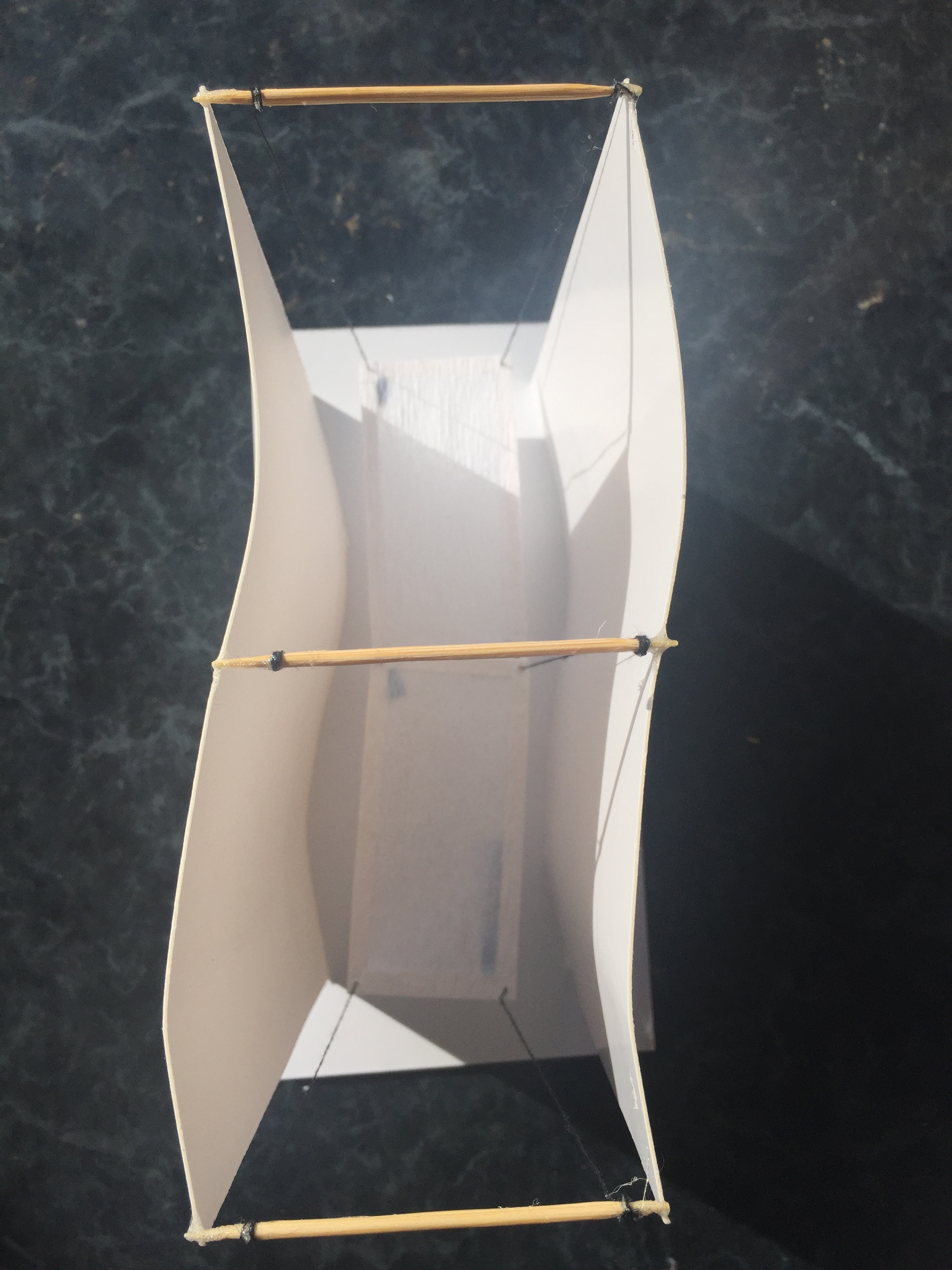

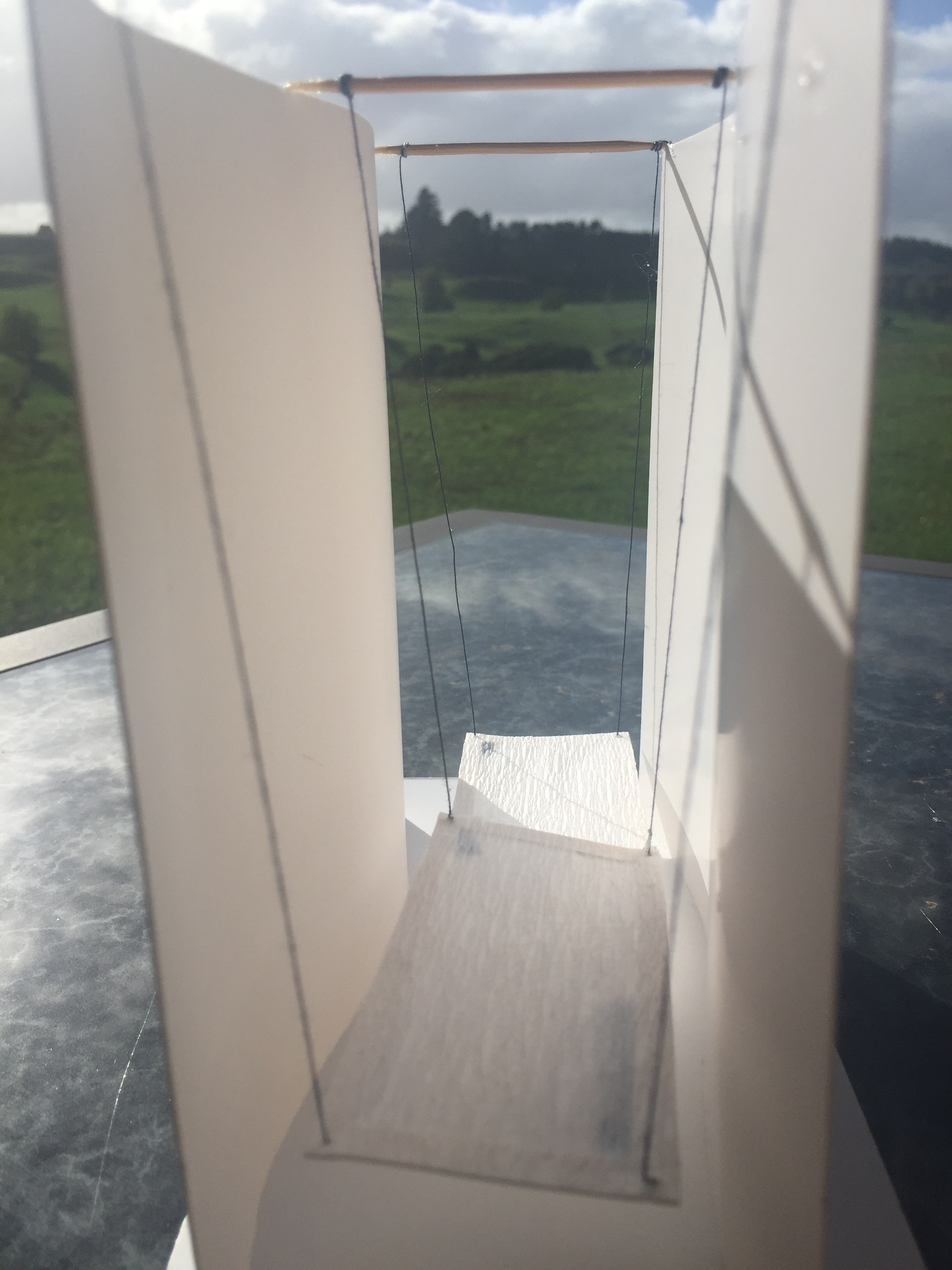
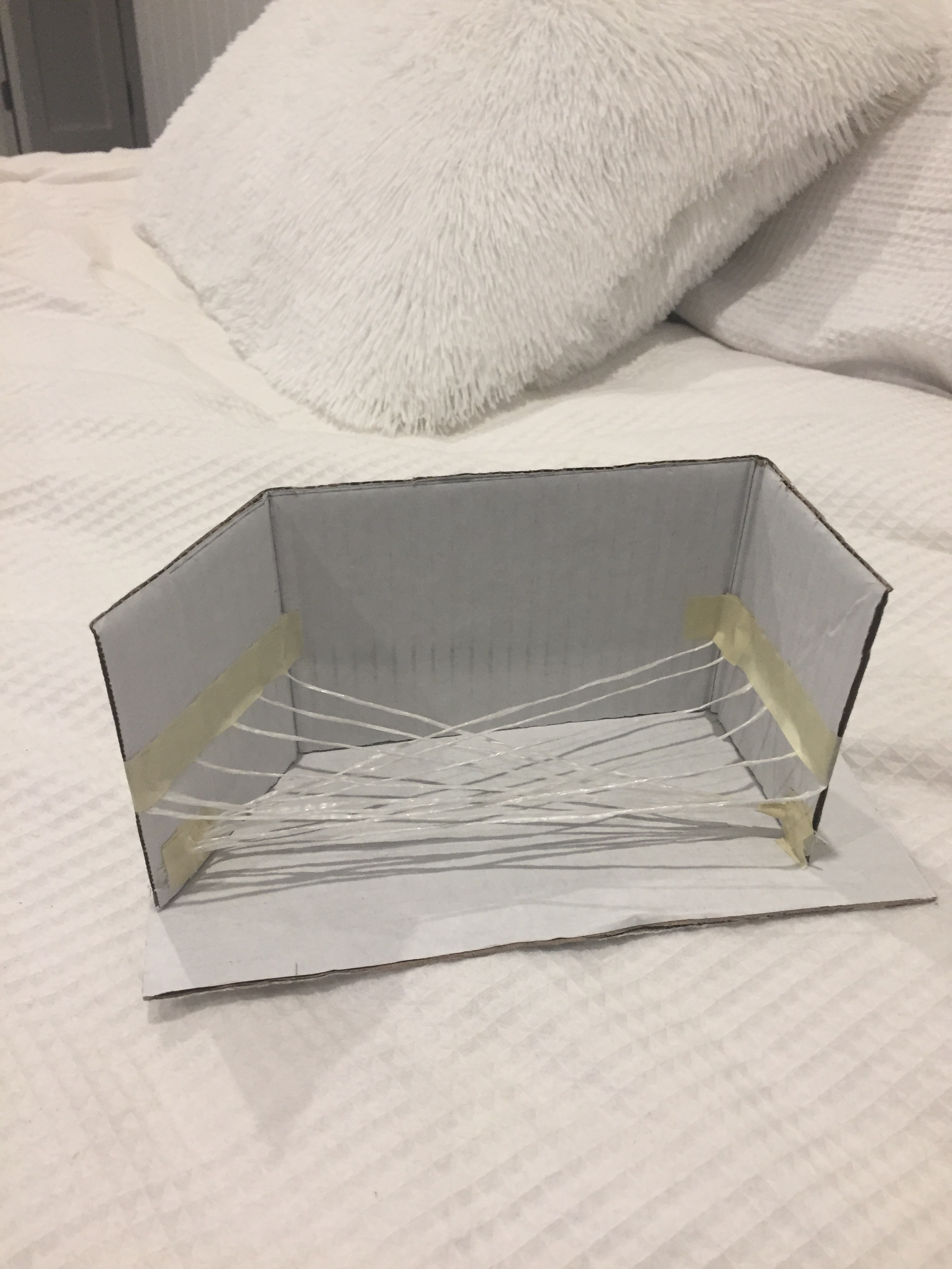
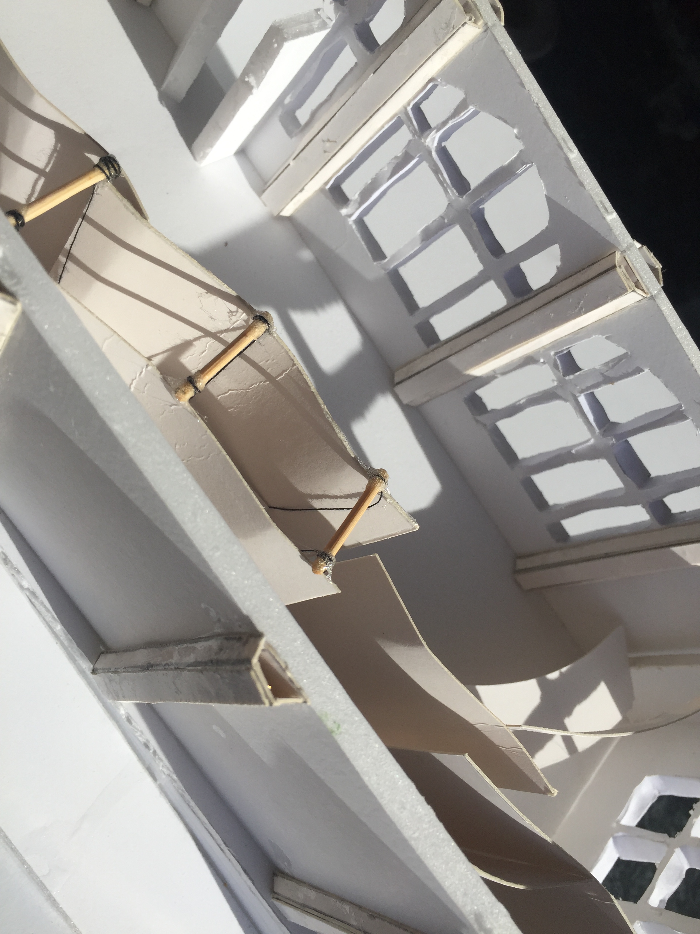
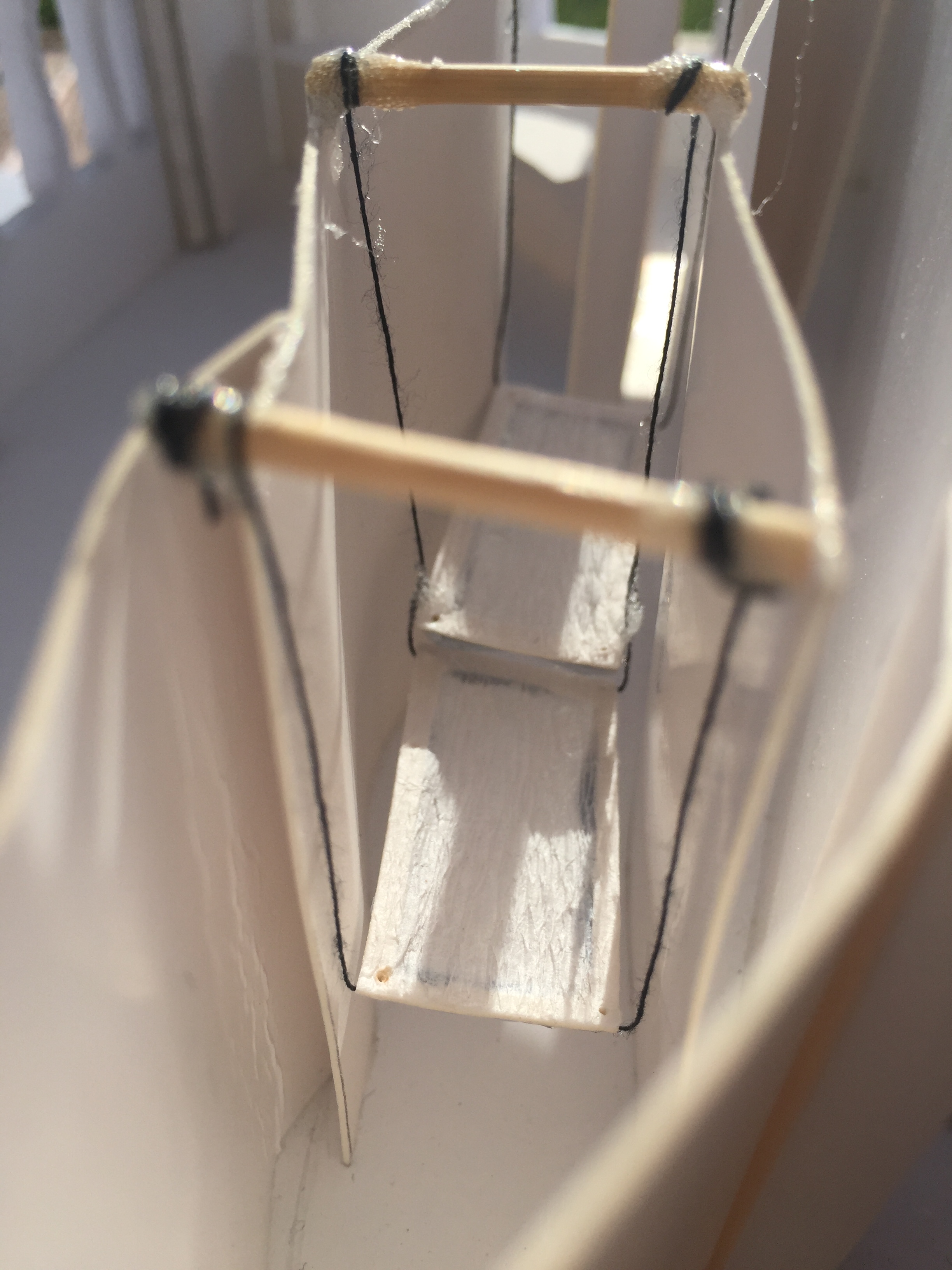
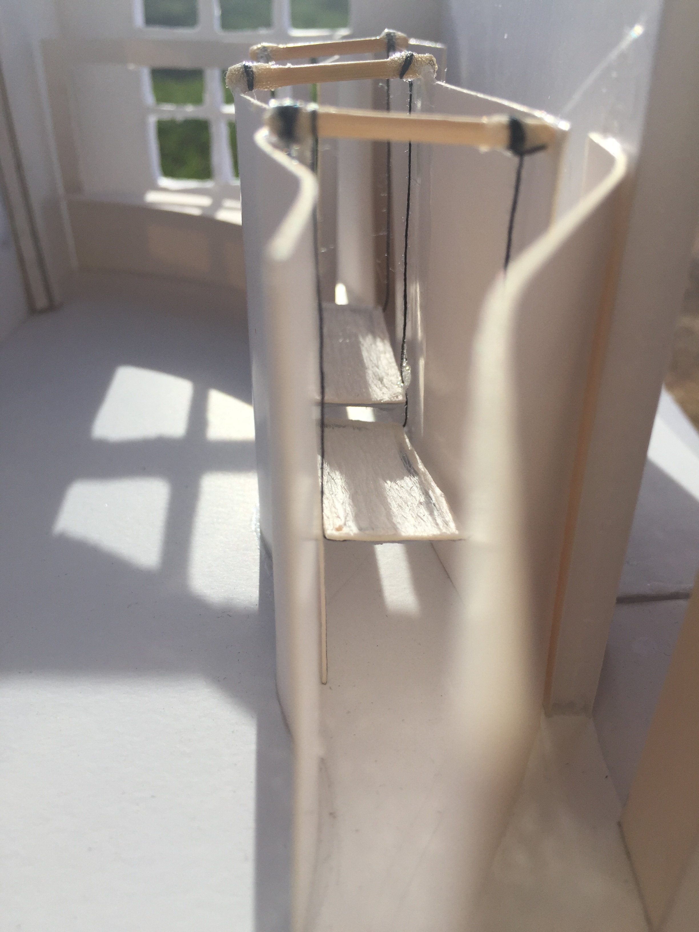
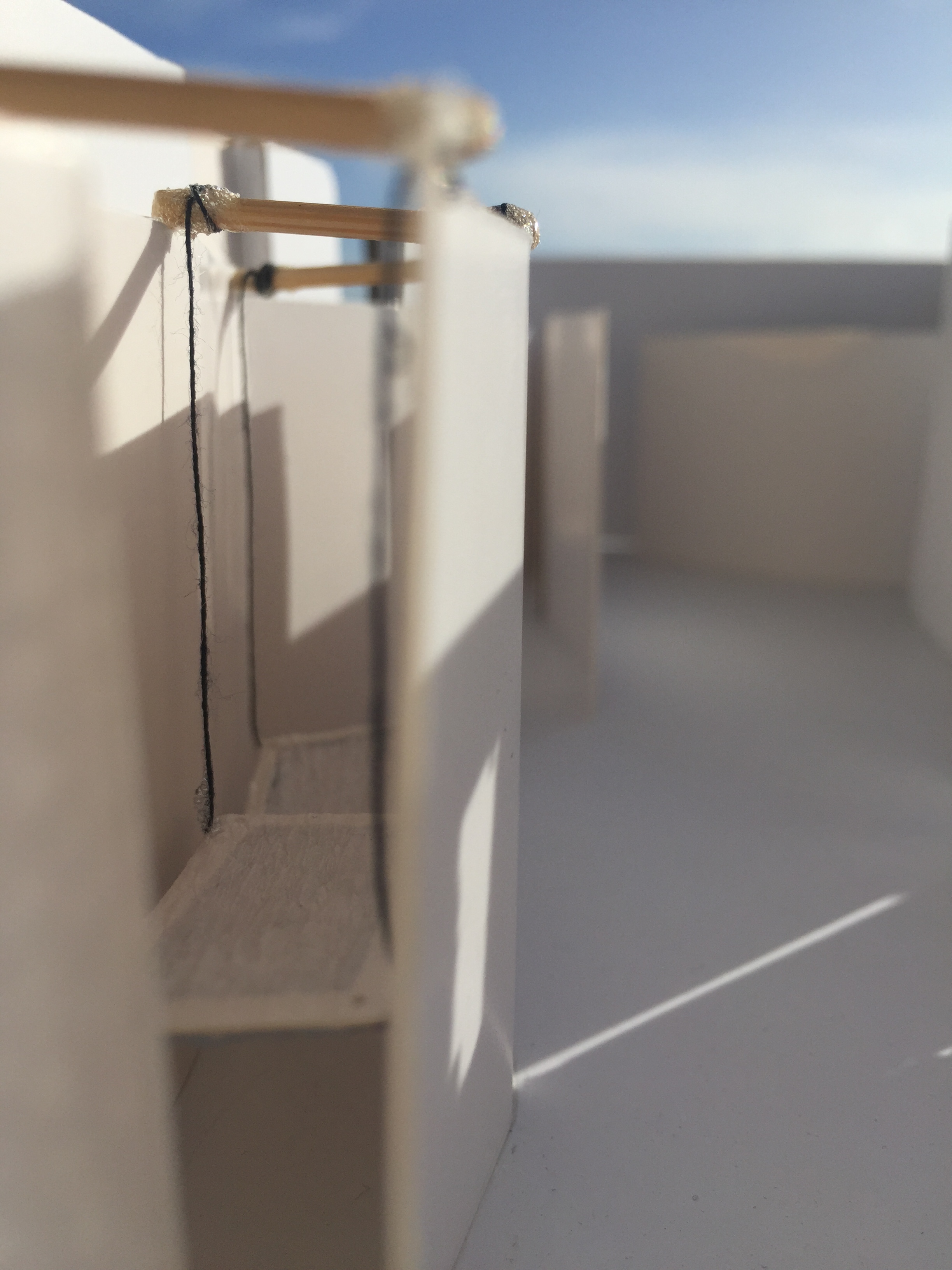
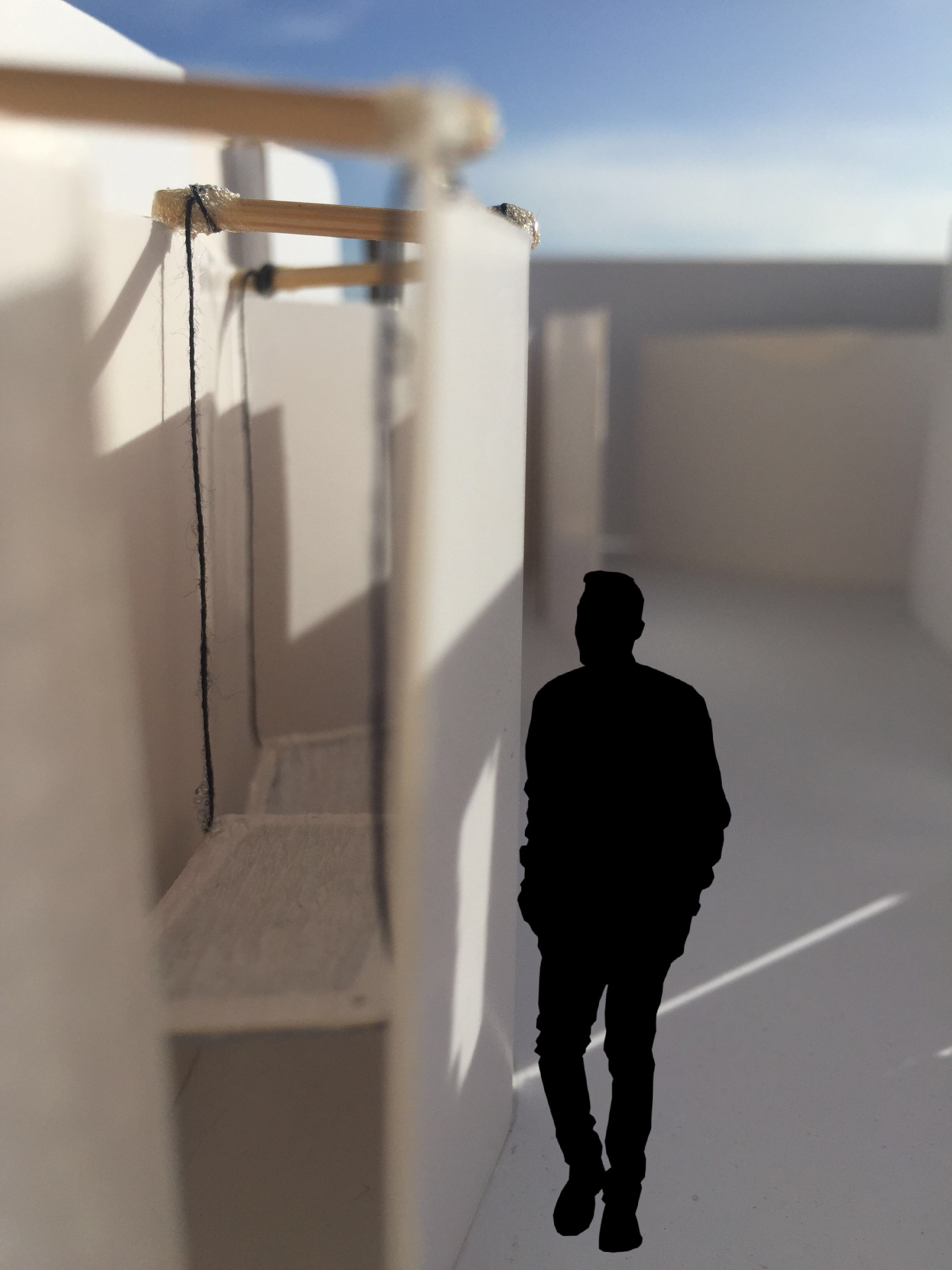
My final concept involves two separate platforms for the strangers to sleep on. The design is hung from three beams that run across the top of the two curved walls. The platforms are attached to the same string in the center, therefore ones movement affects the other. Both are able to move and swing back and forth as well as side to side. The two platforms are staggered one sitting 40cm from the ground, the other 70cm. The materials I could see this being made from are rope, bamboo or timber for the framing and beams, and a cotton hammock-like material for the part that would be slept on.
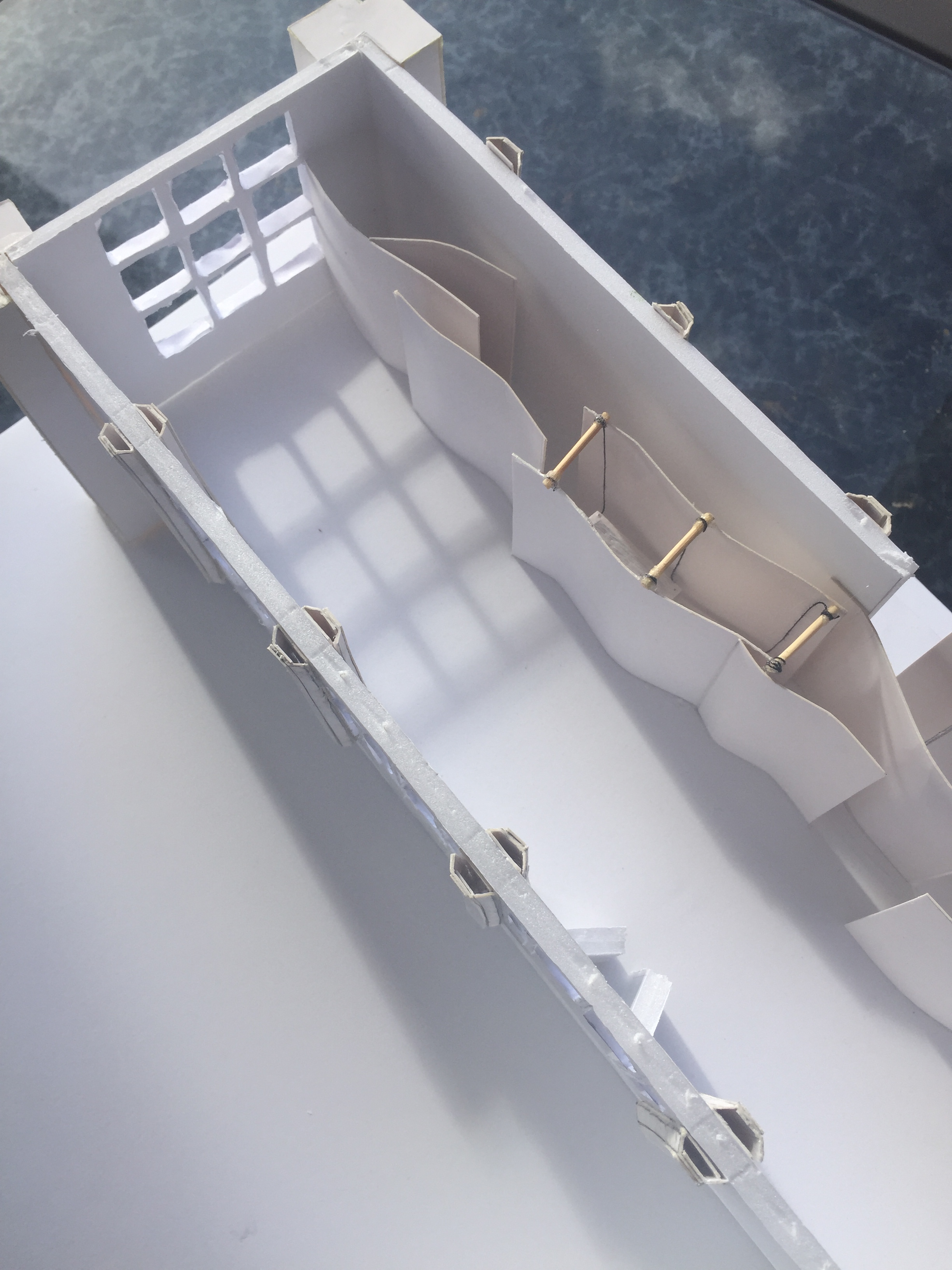
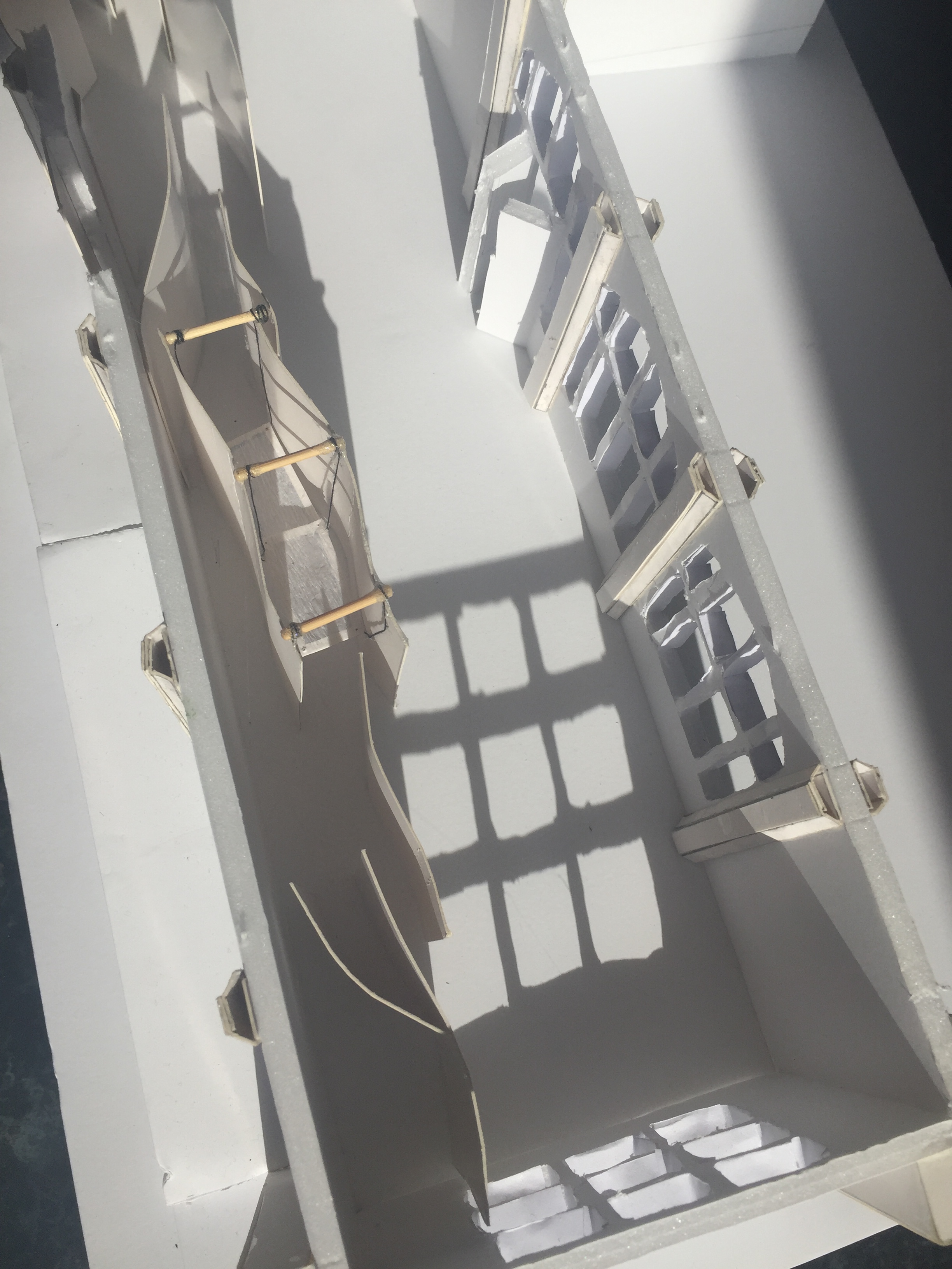
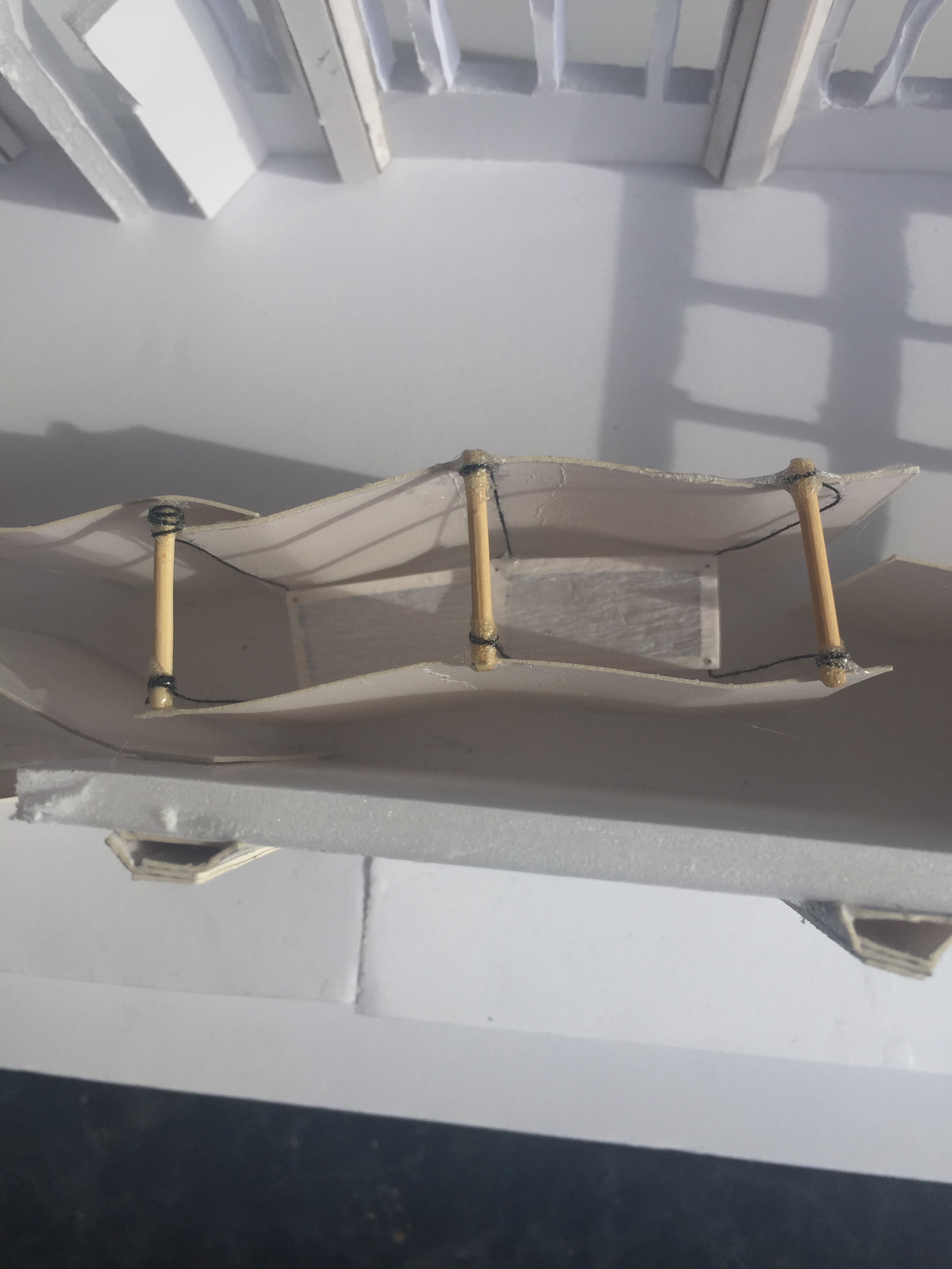
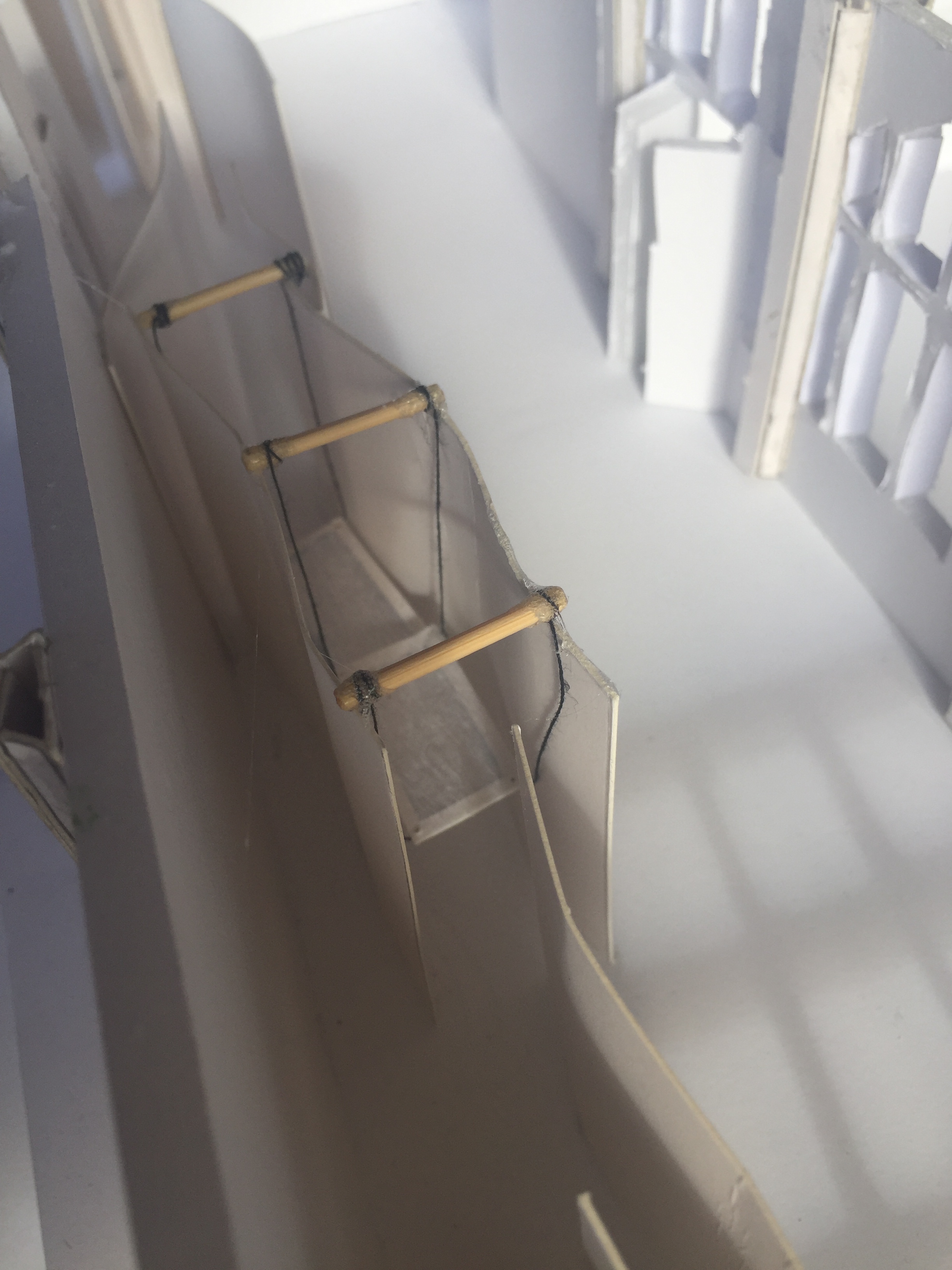
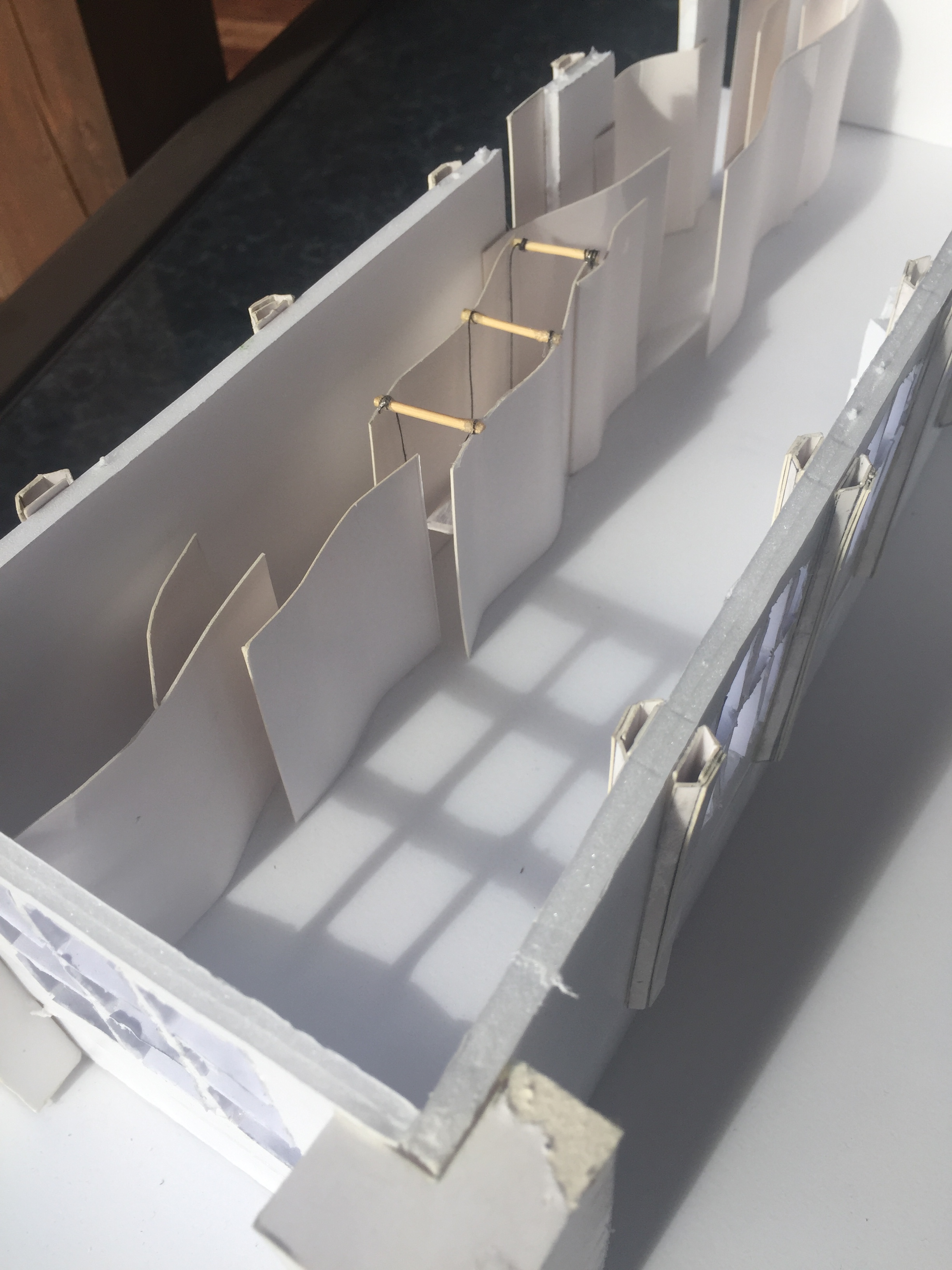
The images above show my 1:50 model of St Paul Street Gallery Three with my sleeping platform added. I chose an area away from the main path of entrance and a area that is accessible from both sides of the platform. The space between walls is only small meaning that the strangers are going to be very close to one another when sleeping. As I previously said one platforms movement will affect the others due to them being joined by the center string. This means that throughout the night when one person moves around causing their platform to move the second platform will also being to move slightly.
Week 11: Plans + Sections
The images above show the progress I have made on both my section and plan drawings. At this stage the only differences in the drawings from the previous project are the sleeping platforms and a 12th curved wall. On the section drawing I chose to draw the platforms in even though you would technically not see them from the view I chose. I thought for awhile about which section of the building I could draw that would show the platforms but none of the views would have shown them fully. I plan to add dotted lines to the section drawing to show there is actually a wall there.
I am still working on my ideas for other areas I need to add to the room such as spaces for cooking and washing.
Who are my strangers? – We have also been told that we are able to chose who our two strangers are. I am thinking about the idea of the two strangers inhabiting my space being children aged between 7-10. I know that this is an unlikely situation but the way children interact with strangers compared to teens or adults was more intriguing to me. I came up with the idea of the strangers being children once I had built my sleeping platform model. This is because I felt my design turned out to be quite playful leading me to think about who would have the most fun the space. I figured children would enjoy pushing and swinging on the platforms as well as running about the curved walls. Having two children inhabit my space will also work well due to the fact that the platforms are only small as well as the gaps between many of the walls being quite narrow.
Later this week I further developed my plan and section drawings, moving them onto a larger piece of paper. The new paper allowed me to begin sketching images around the edges to show what it would look like being amoungst the walls. I also decided to add a second section drawing to show my designs from another perspective, showing how they fill the room.
This week I added my cooking/communicating and bathing areas to the room. Each aspect of the room has curved walls as that is the main feature in my gallery. Feedback from my last presentation suggested that I should experiment with the materials used for my curved walls. My plan was to add two more curved walls into the room creating the space for a bathroom. I decided to try create these walls with a sheet like material acting as curtains.

After temporarily adding them to the space I decided that I still preferred the original materials that I used. This was because I liked the structured curves the cardboard (plywood) was able to create. By using a flowing material the curves weren’t as defined. I then added the new space to the gallery.
Week 12: Final Development of Project 3
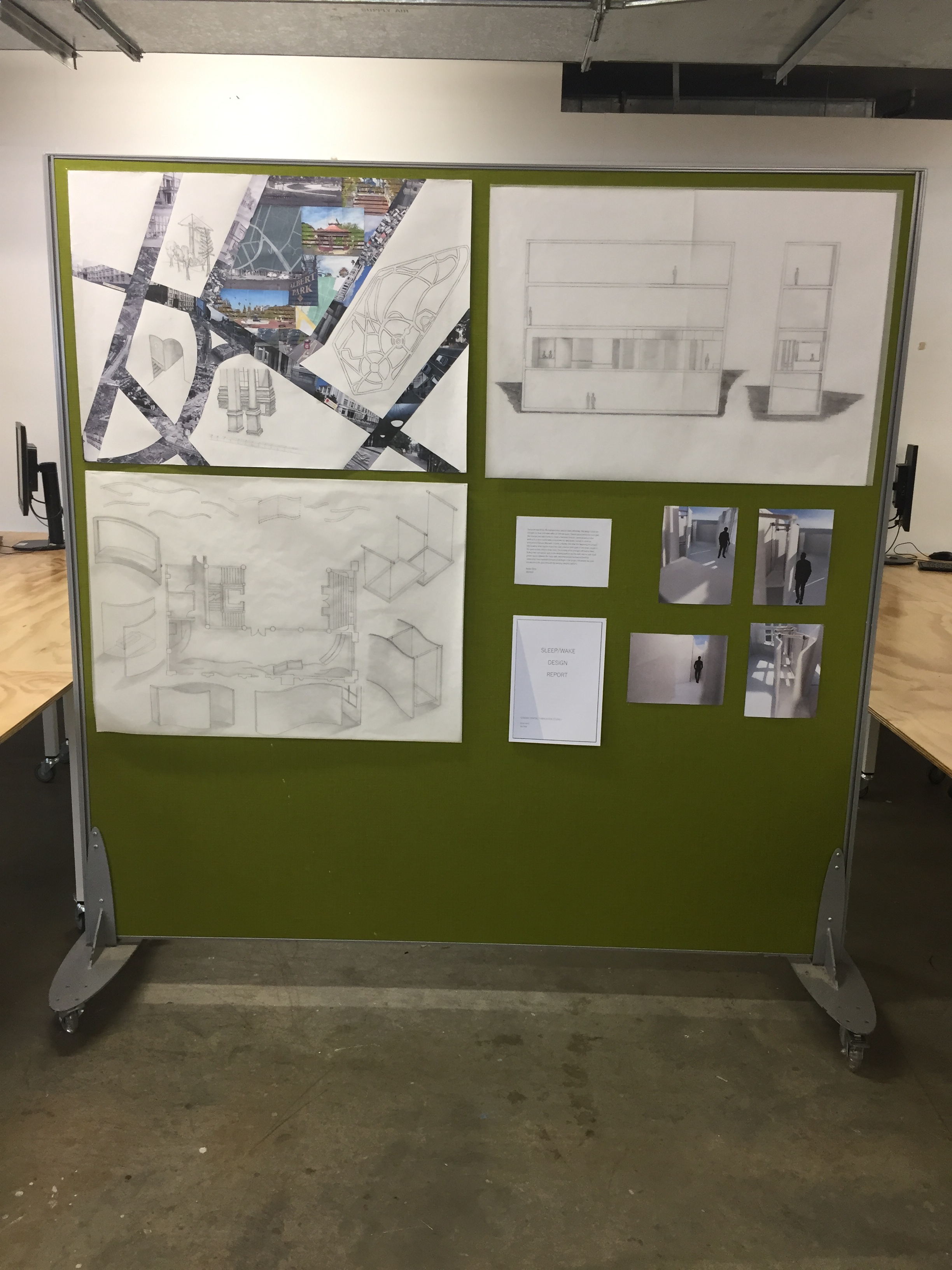
Over the last week I have been adding the finishing touches to my project for presentation.
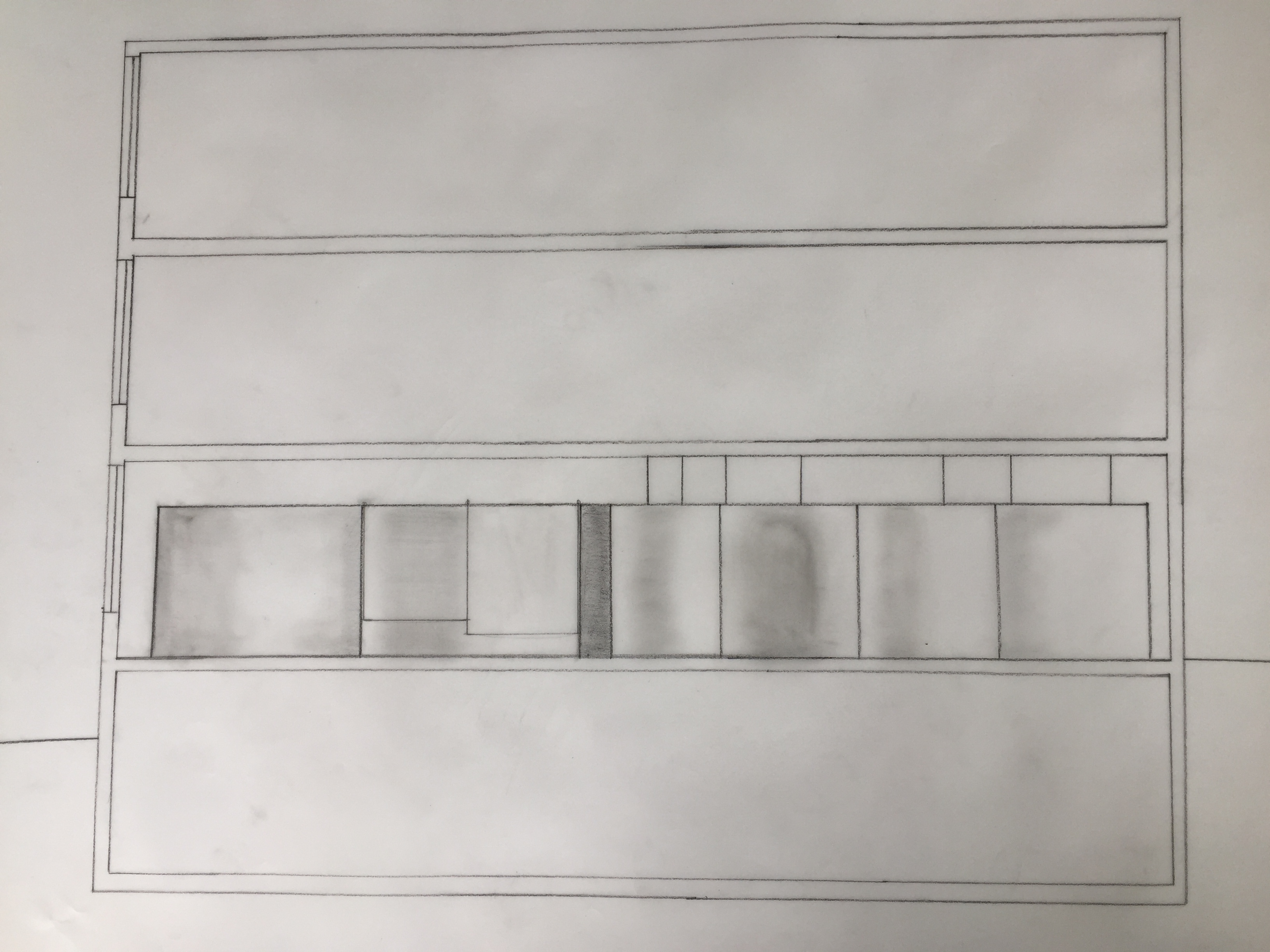
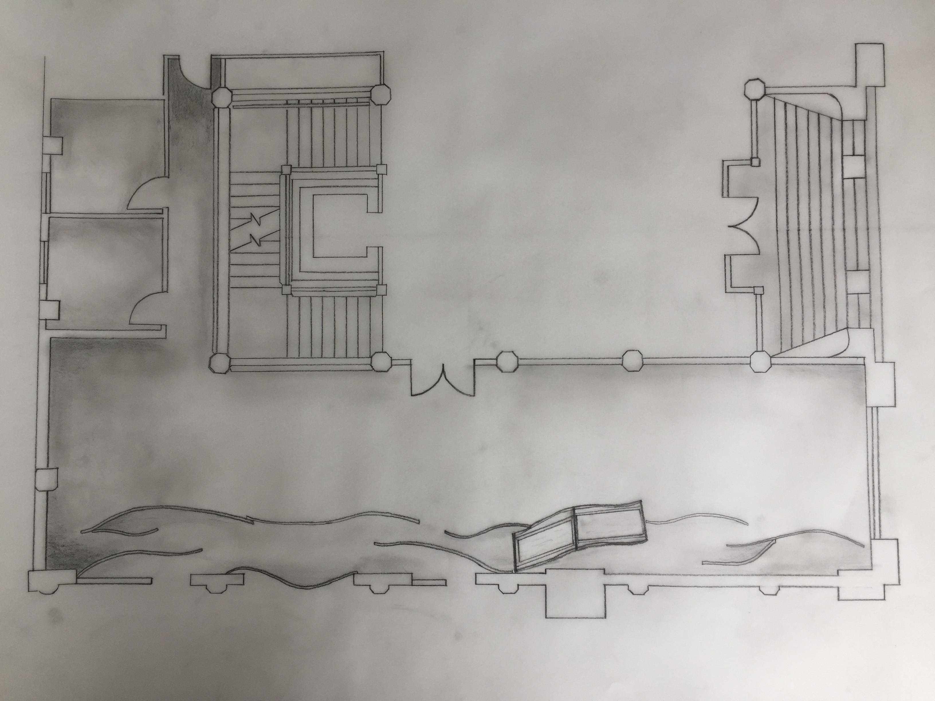
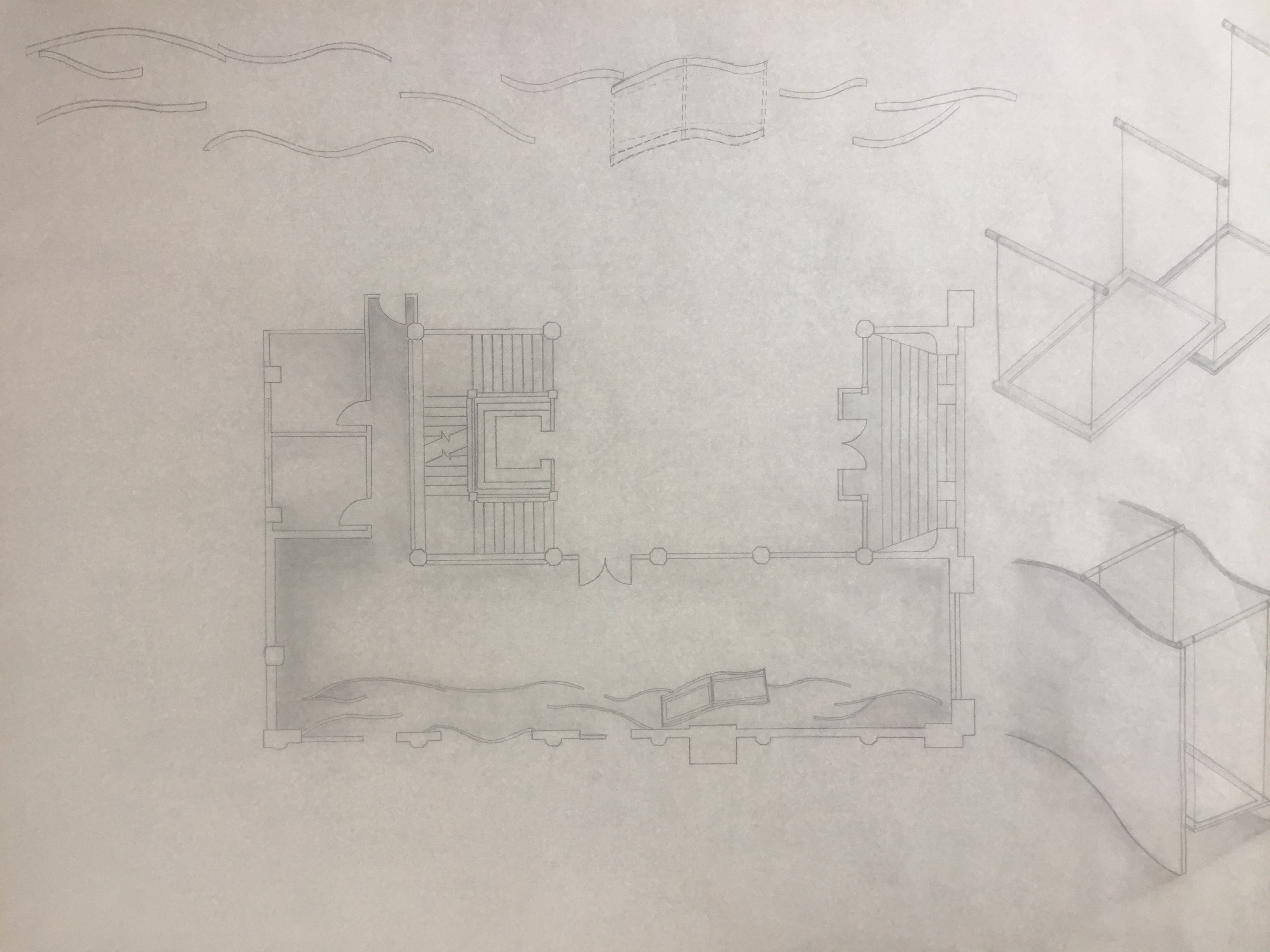
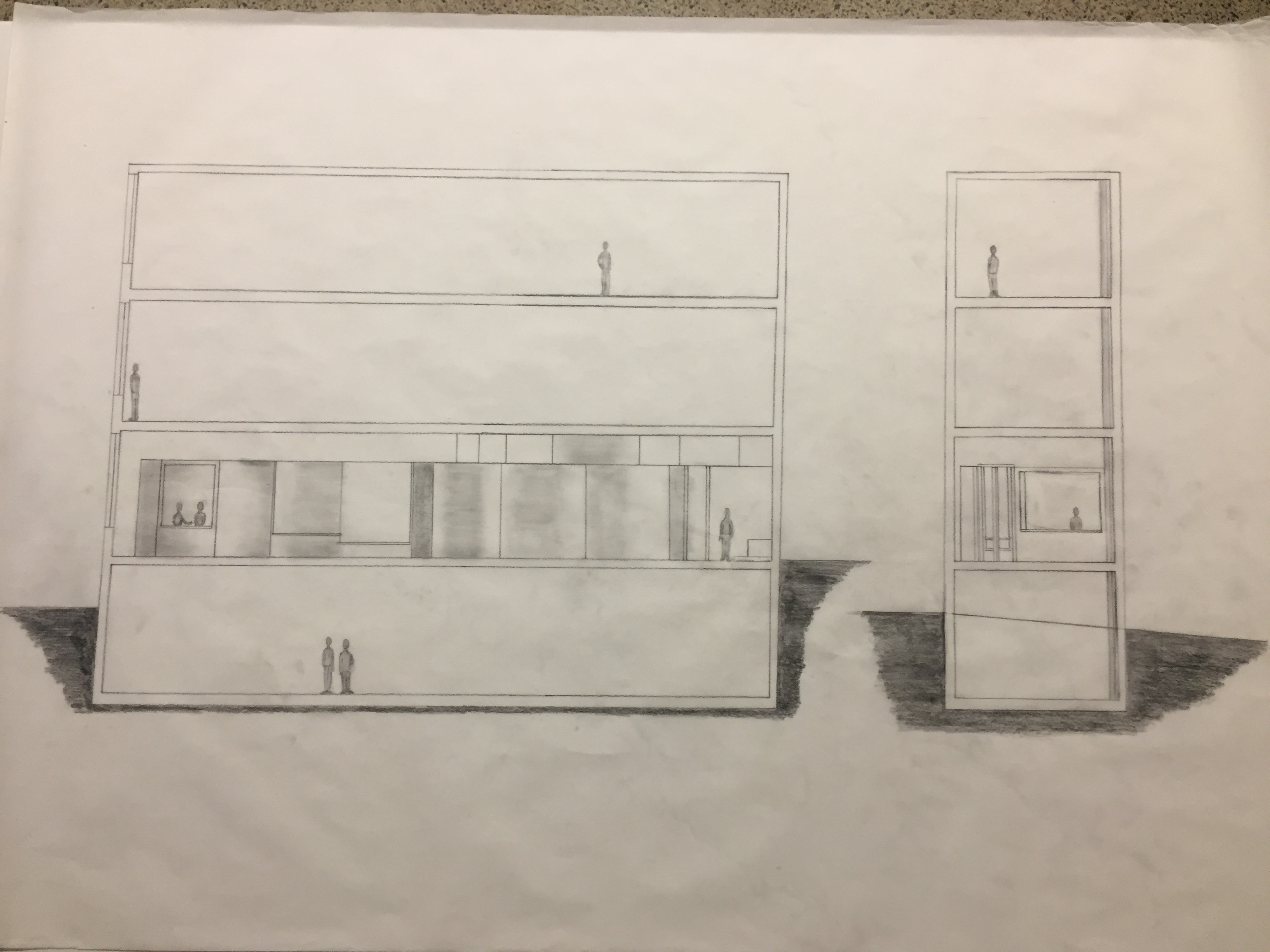
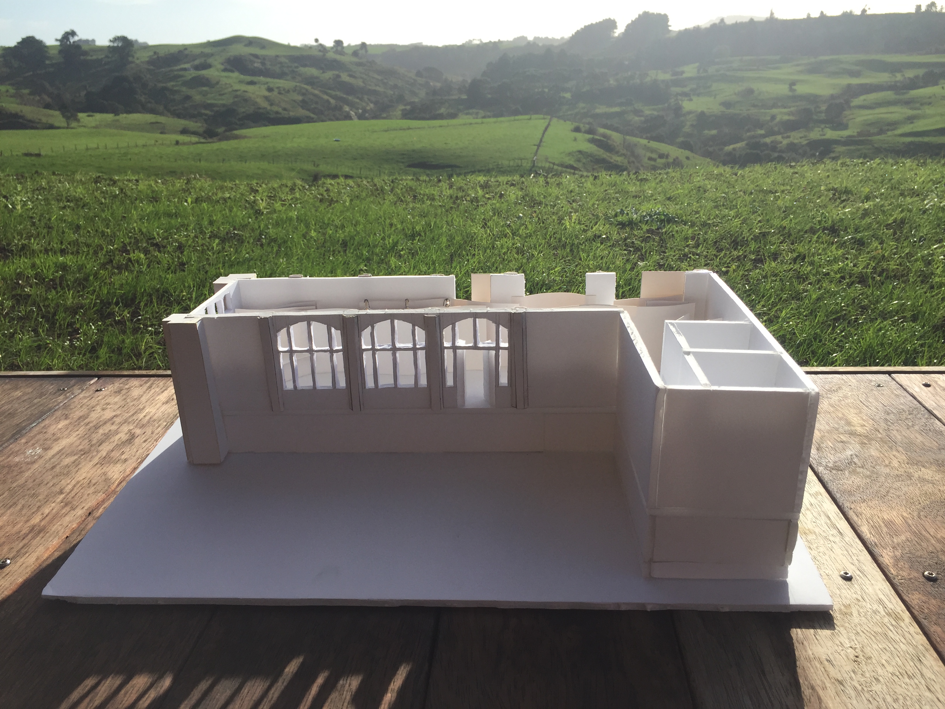
Below are images of my final 1:50 plan and section drawings. I tried to keep my section drawing simple and easy to understand. I decided to add an end view to show how the sleeping platform lays between two curves and to also show the sloping ground of Wellesley Street.
Around the edges of my plan drawing I have added smaller sketches showing a few interior views of the space. This gives the viewer a better under understanding of the areas found throughout the room.

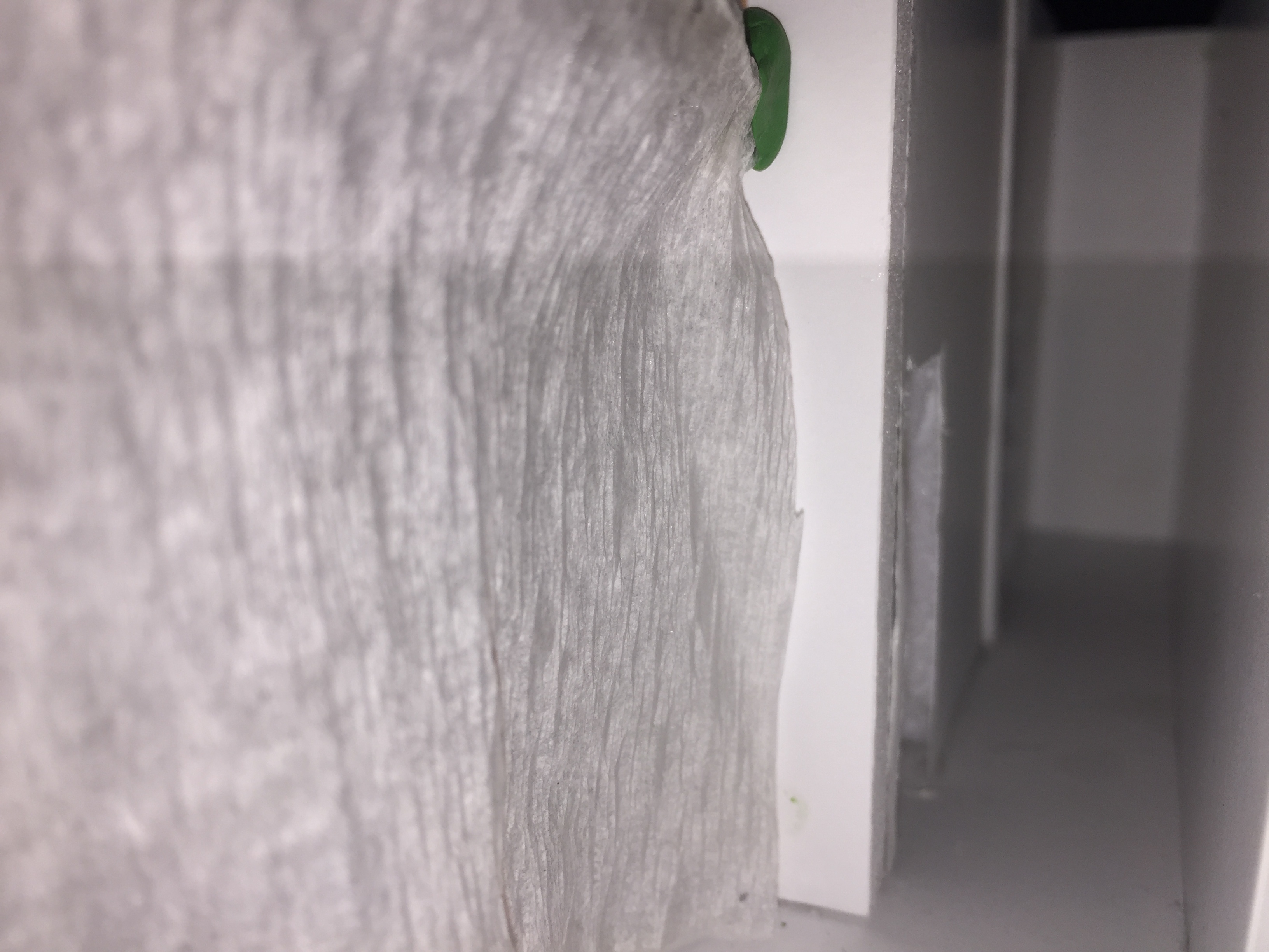
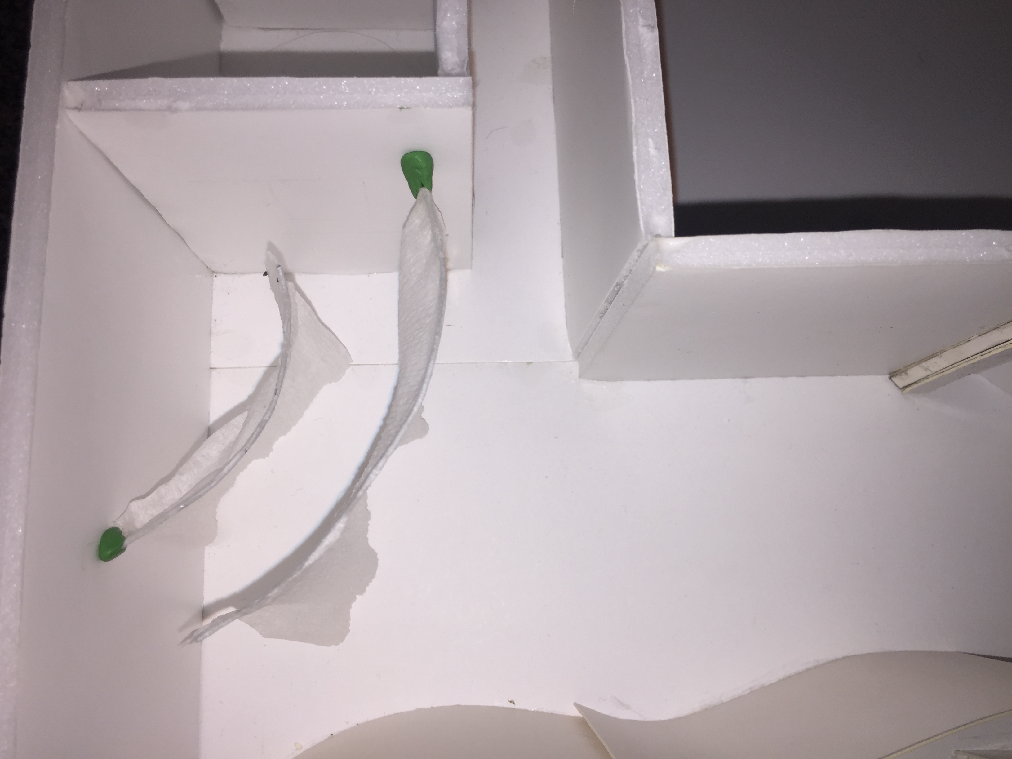
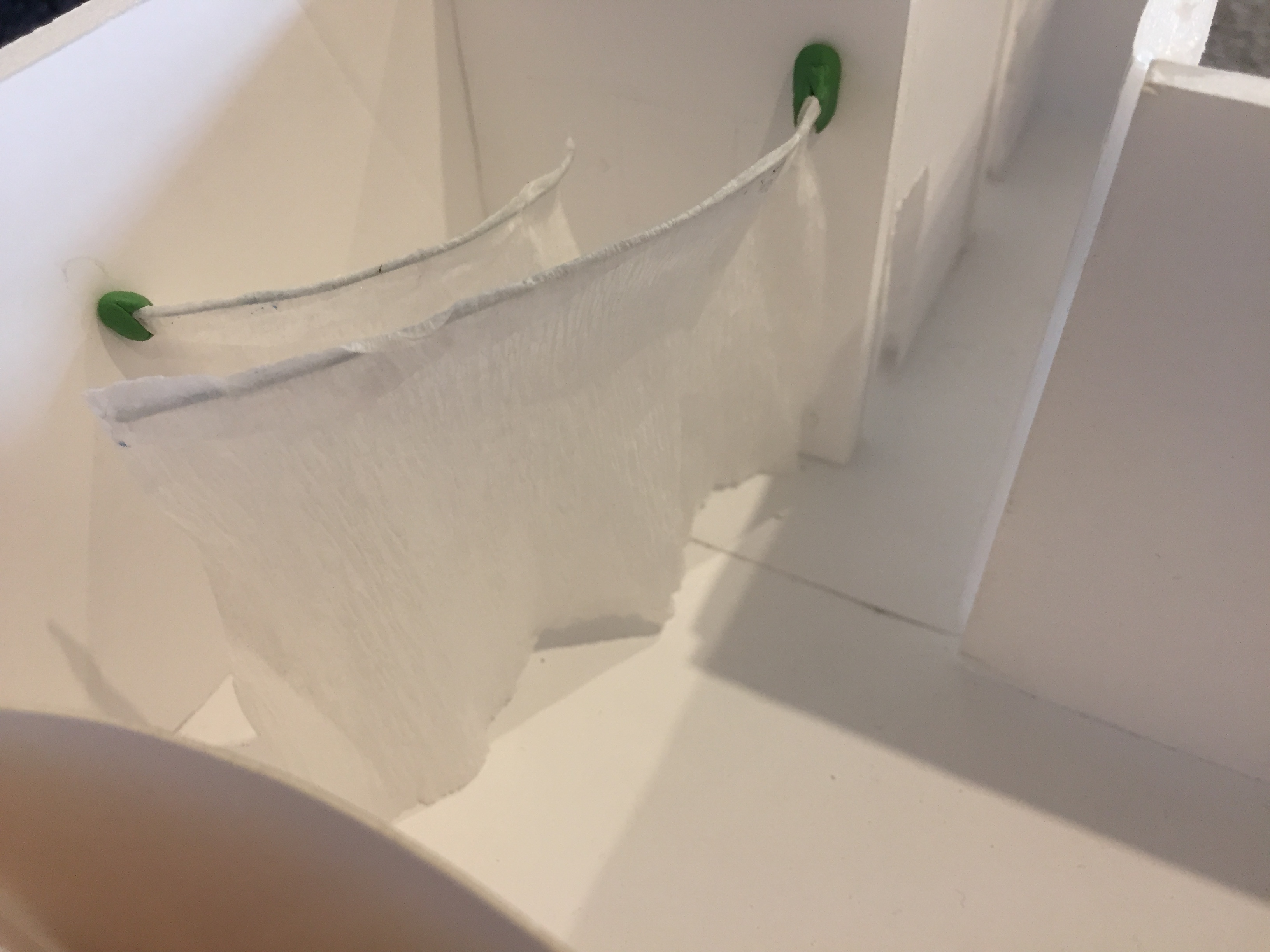
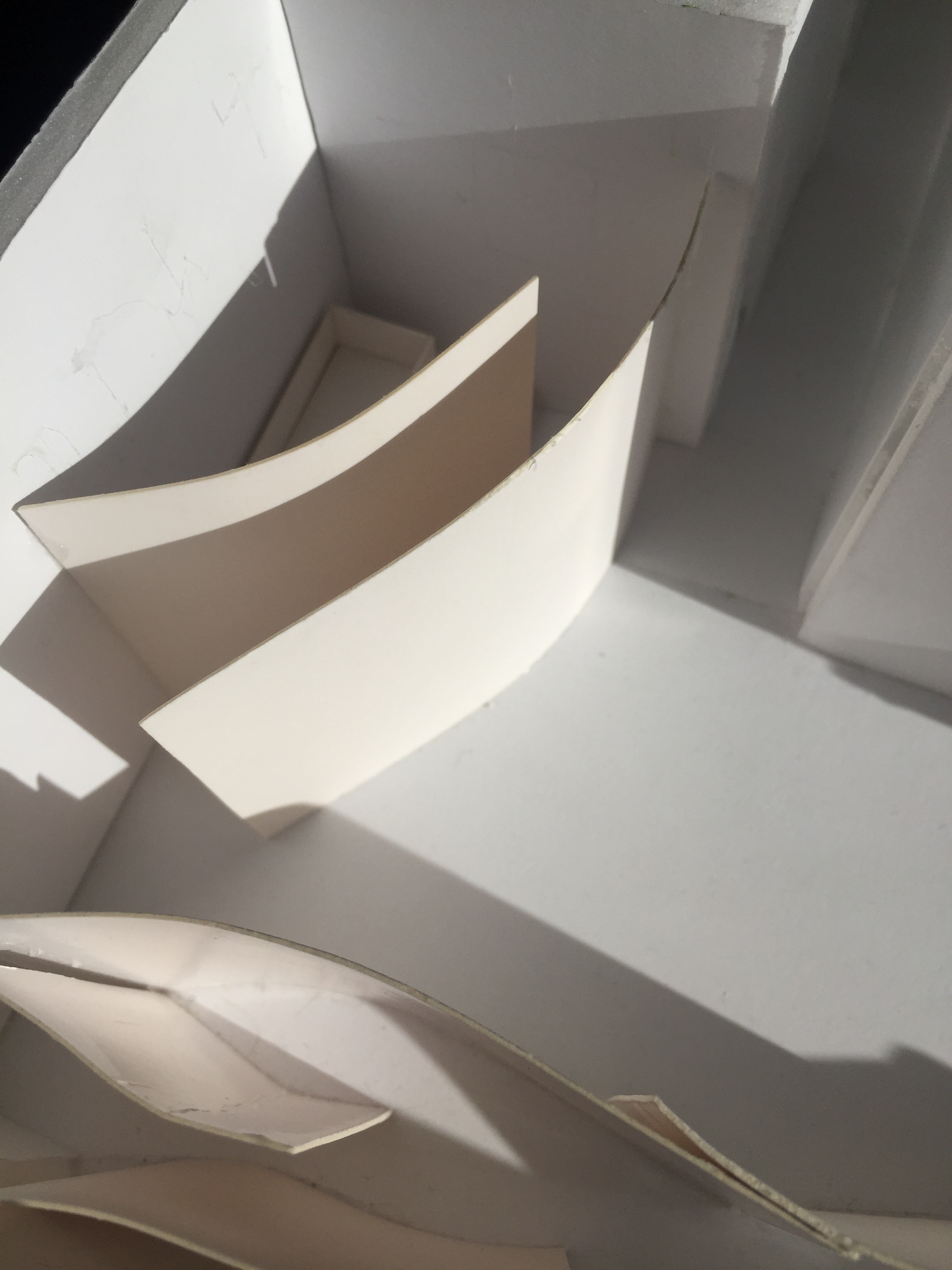
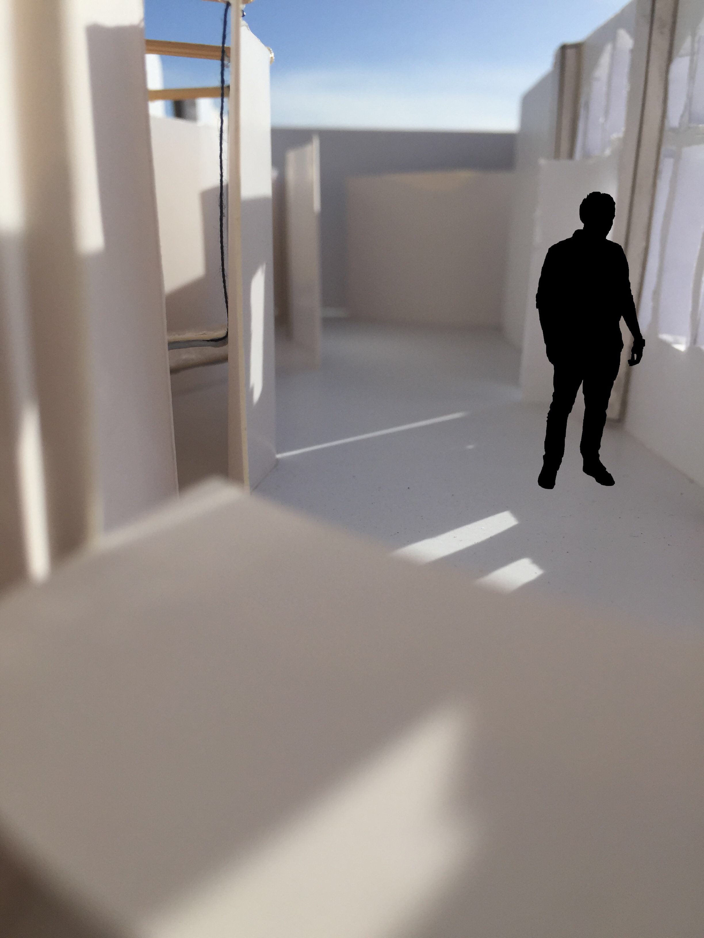
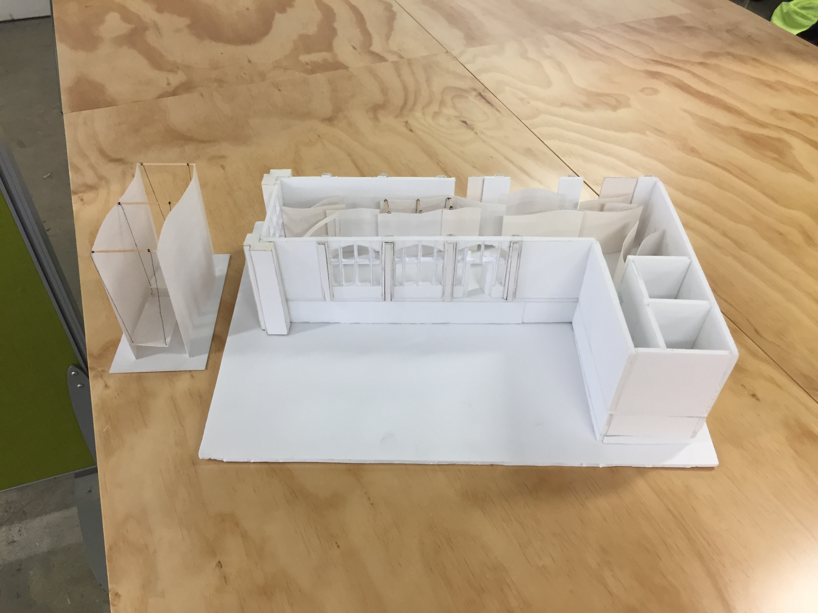
The images below show my final 1:50 gallery model. This has been my first experience creating a model of a building. I really enjoyed the process and am looking forward to improving my modelling techniques. I aimed to create a tidy accurate model and am happy with how it turned out. The materials used were foam board, cardboard, toothpicks, string, crepe paper and glue.
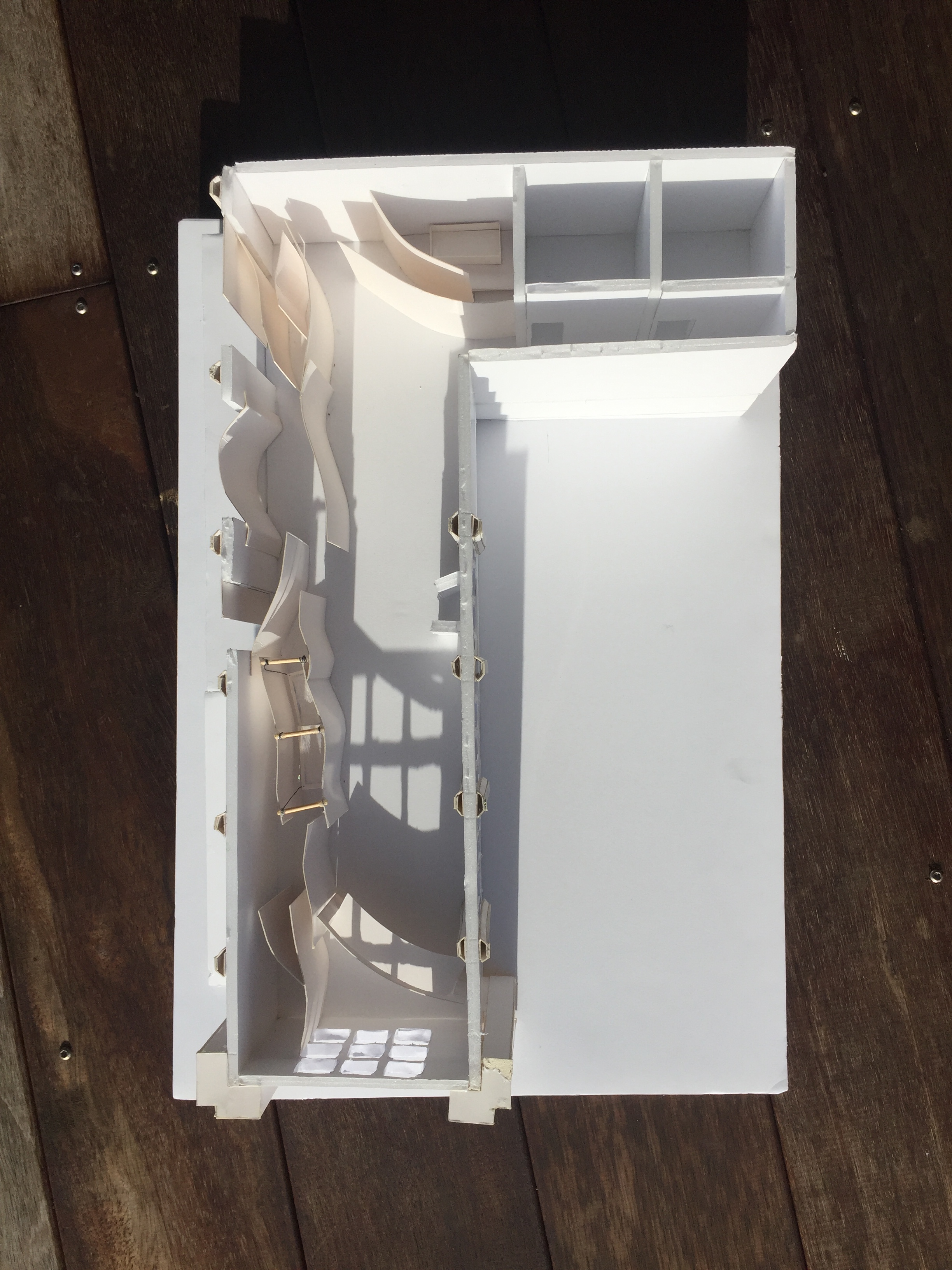


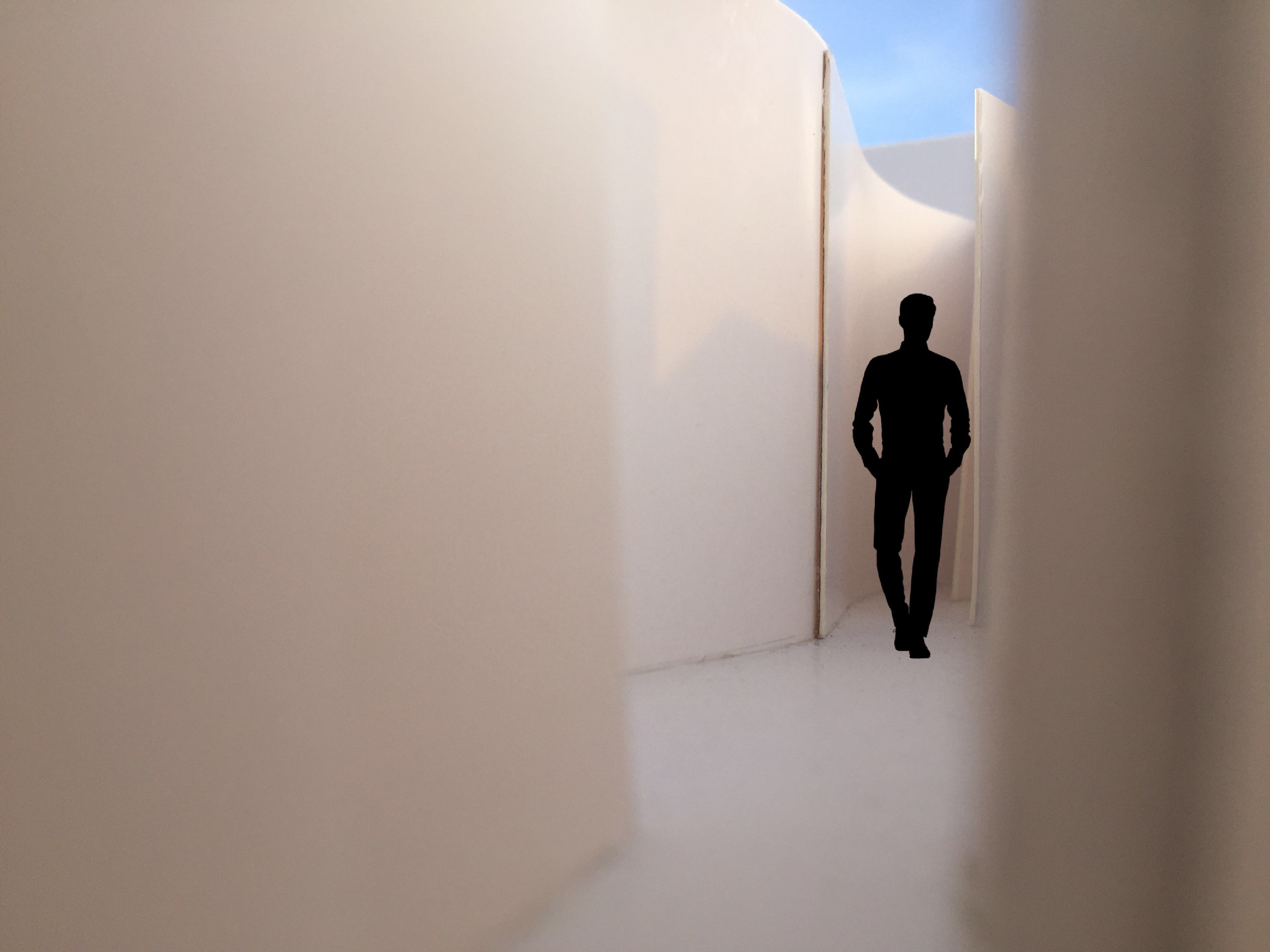
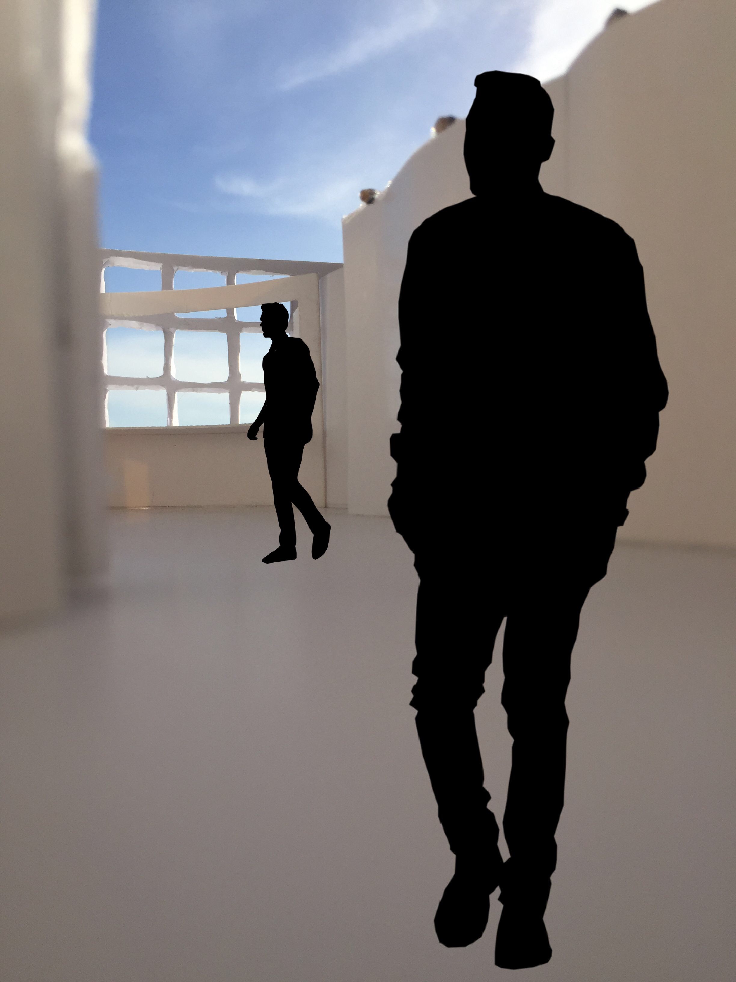
The images below show close up images of my sleeping platform within the 1:50 model.
The interior images with the added silhouette give the space scale and allow the viewer to understand the sizing of the design within the room
Materials

Rope 
Plywood 
Cotton 
Bamboo
The materials above show possible things I could use to make each area of the gallery. I think these materials combine to create a welcoming, warm and comfortable place for sleeping and waking.
Project 3 Presentation:
Abstract:
Everyone experiences the transition from sleep to wake differently. This design forces two strangers to sleep and wake within an intimate space. Shared spaces within the room give the strangers the opportunity to create a friendship through communication further leading to a more comfortable environment for sleep/wake. I aimed to create an environment that was filled with curiosity, a feeling I felt when first beginning this project. Not knowing what may be around the next corner or which path to take draws people to the space as they want to know more. The curiosity of the strangers will lead to them finding their own spaces, such as the sleeping platform and the bath area or even more private spaces between the many walls. Movement/stasis has been a threshold relationship I have explored throughout all stages of the project. Movement has been introduced to the space through the swinging sleeping platform.
Feedback:
I really enjoyed the critique session today and got helpful feedback to use in future designs. Some feedback that I took on board was that there was a sense of discovery within the room and I captured that with the bathroom, however it would have been nice to see more of it throughout the entire room. Another suggestion was made that I could have possibly used the dead ends in my pathways as places for useful objects such as shelving. It was brought up that I could have used the open space I have in the gallery for something more practical such an a large table. Overall they liked the idea of my sleeping platform as well as the materials I had thought of using.
